Visualization Charts in Power BI
Overview
Power BI, a powerful business intelligence tool developed by Microsoft, enables users to transform raw data into visually compelling insights. In this article, we will explore the diverse world of types of Power BI visualizations. From basic charts to advanced graphs, you will discover how businesses can effectively present data and unlock the potential for data-driven decision-making. Let's dive into the fascinating realm of Power BI visualizations and unleash the true power of data analysis!
Visualization in Power BI
Power BI offers a wide array of visualization options that cater to various data presentation needs. These include essential charts like bar graphs, line charts, and pie charts, as well as advanced visuals such as maps, scatter plots, and funnel charts. The flexibility to customize colors, labels, and interactive elements further enhances the visual appeal and user experience. All of these Power BI visualizations can be seamlessly integrated into Power BI reports, utilized in the Q&A feature for interactive querying, and pinned to dashboards for quick access and comprehensive data exploration. In the subsequent sections, let’s explore various Power BI visualizations.
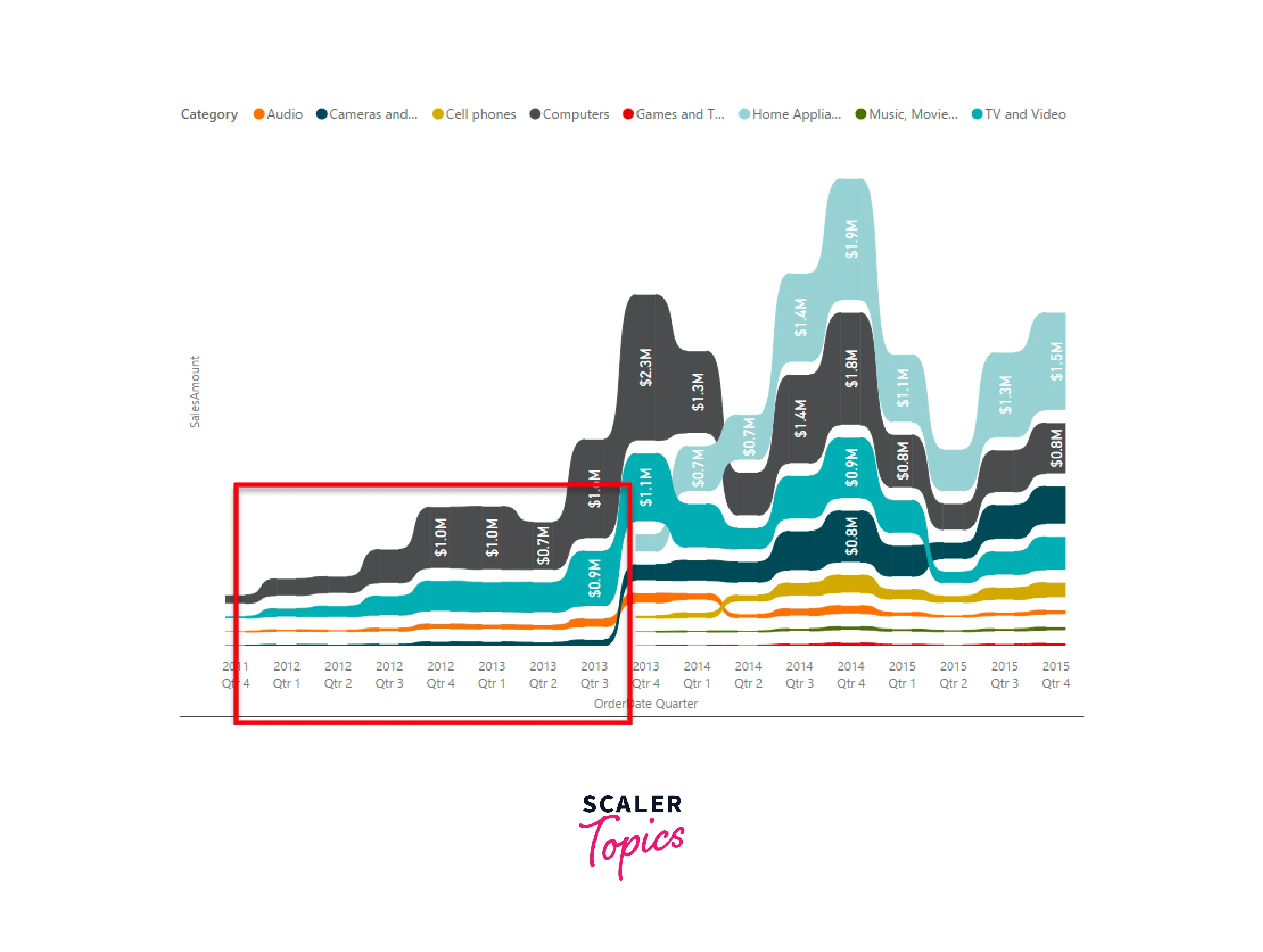
Area Charts: Basic (Layered) and Stacked
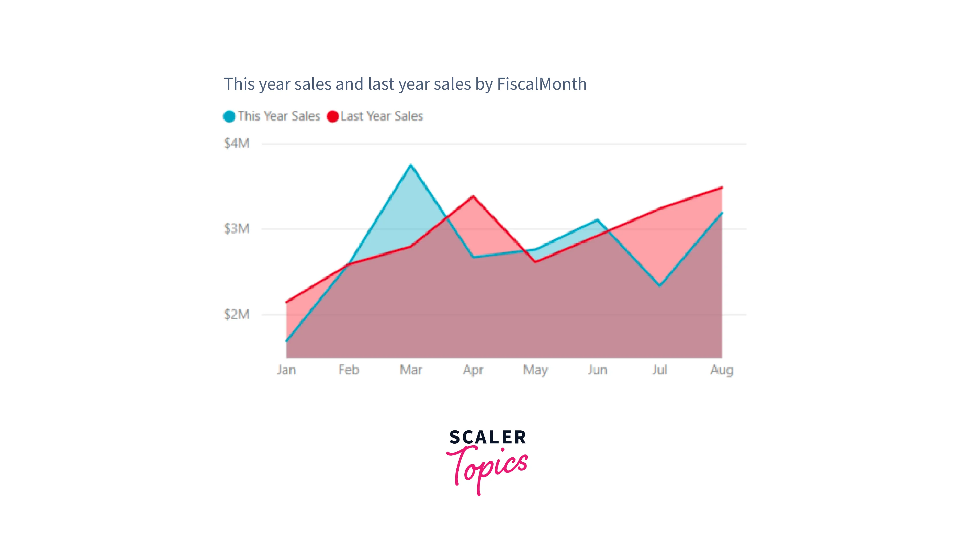
A basic area chart displays multiple data series stacked on top of each other, showing the cumulative effect of each series. It is ideal for visualizing trends over time and comparing the relative contribution of different categories to the overall data. On the other hand, a stacked area chart presents data series stacked on top of one another, filling the area between the data lines. It emphasizes the total magnitude of the data and helps observe the changes in the composition of each category over time or other dimensions. For example, visualizing monthly revenue trends for different product categories can be accomplished by plotting area charts.
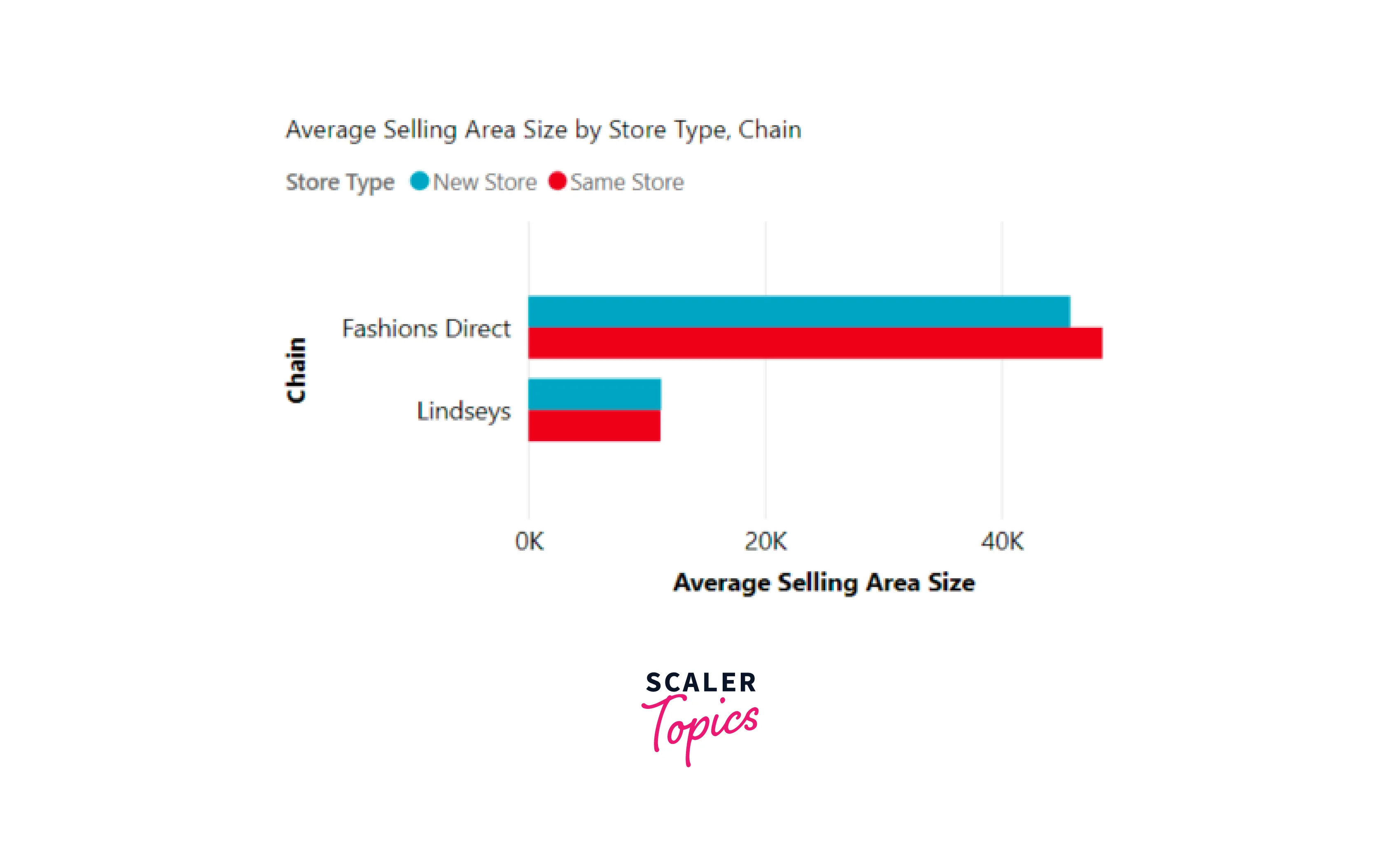
Bar and Column Charts
Bar and column charts are popular data Power BI visualization types that represent categorical data with rectangular bars or columns. They are ideal for comparing discrete data values across different categories. For example, sales revenue for each quarter/year can be visualized using a bar or column chart.
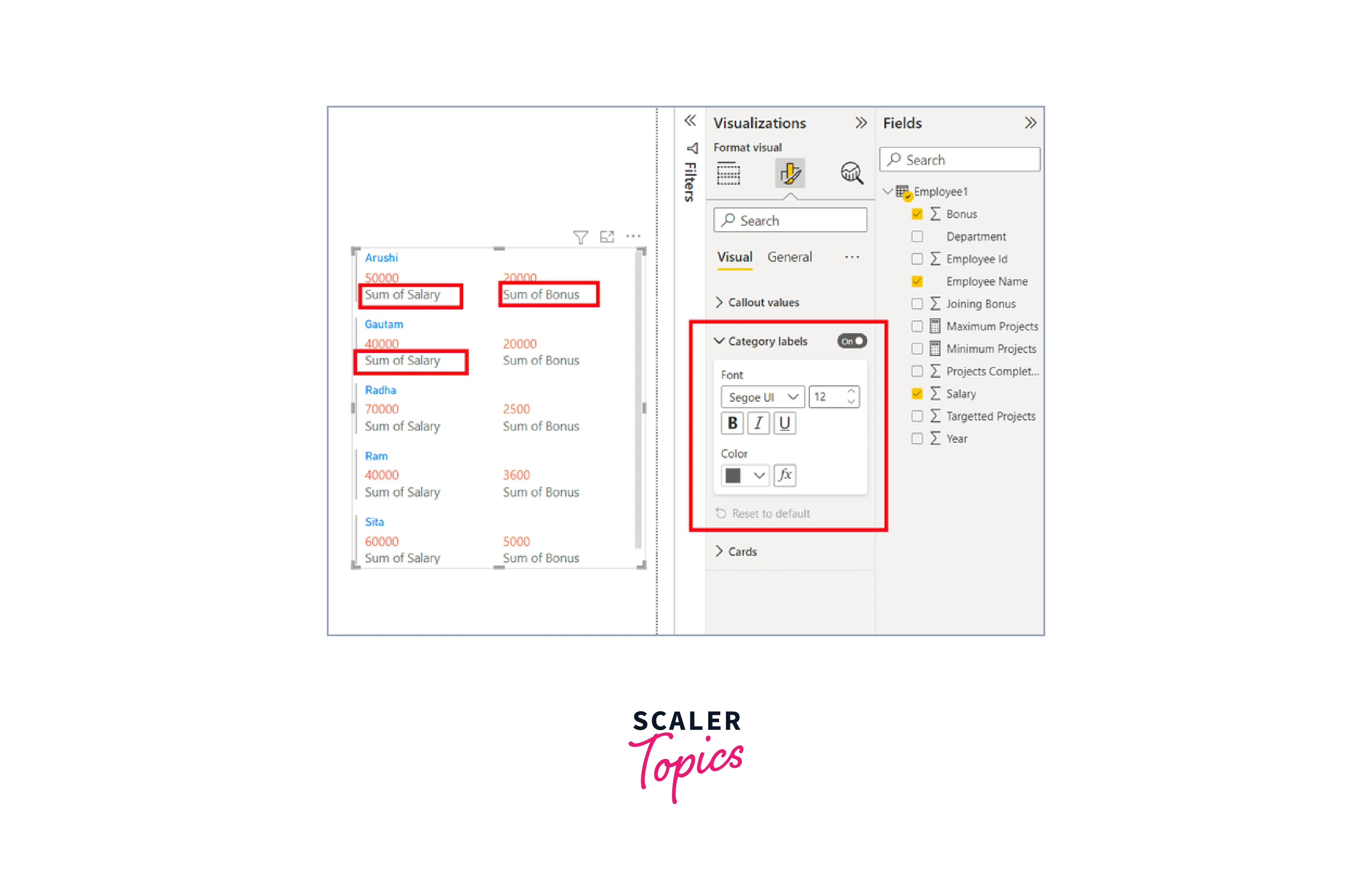
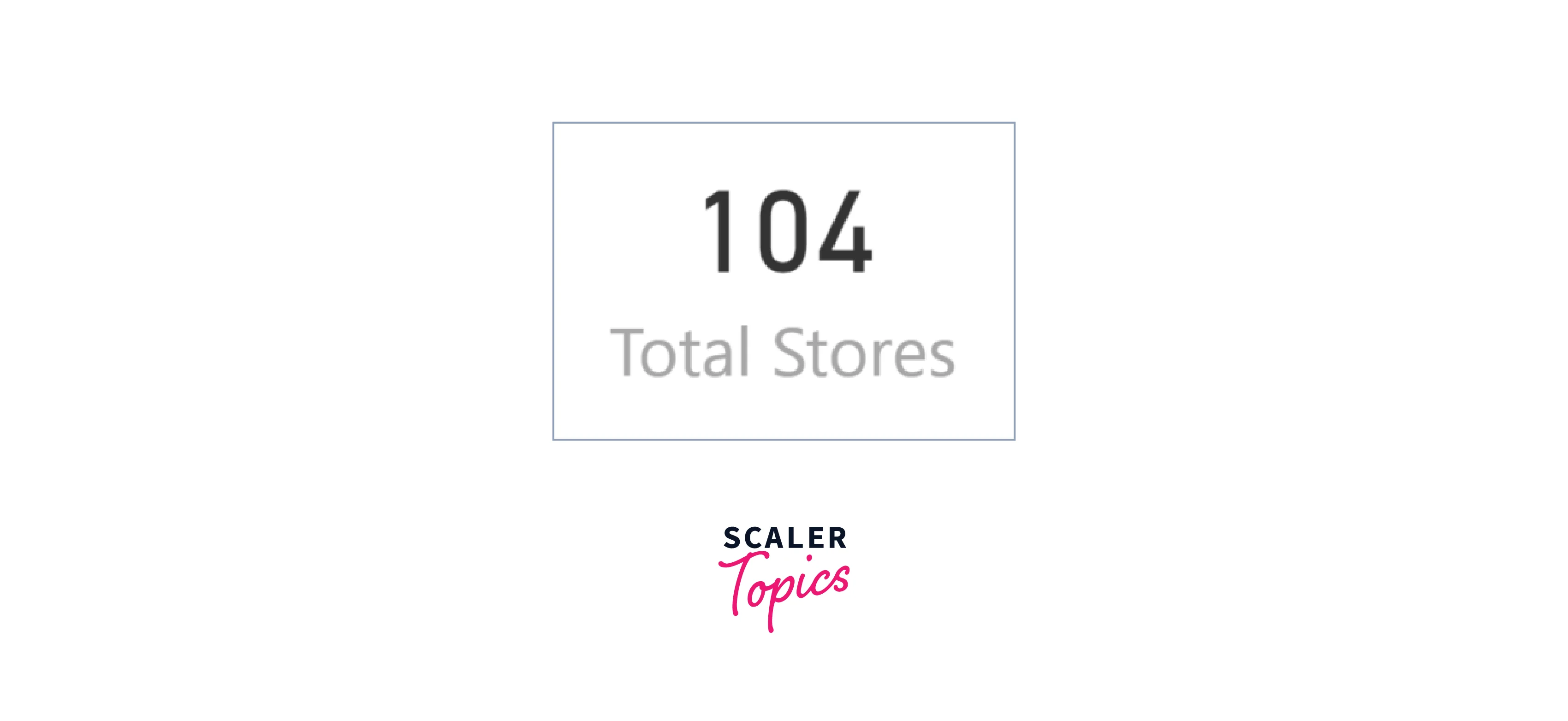
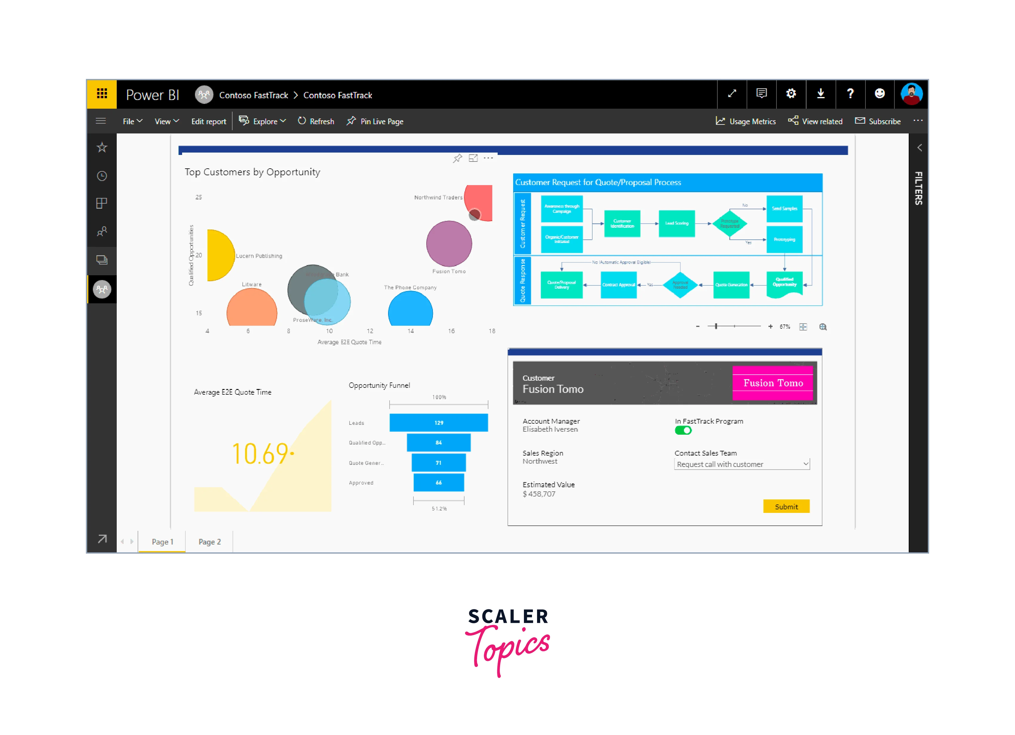
Cards
A multi-row card is a type of visualization in Power BI that displays one or more data points, with each data point represented in a separate row. It allows you to showcase different measures or values in a single tile, making it convenient for comparing and presenting multiple metrics side by side.
Single number cards, also known as KPI (Key Performance Indicator) cards, are a type of visualization in Power BI that prominently displays a single fact or data point. They are typically used to highlight the most crucial metric or key performance indicator in a dashboard or report. Single number cards provide a clear and focused view of the most important information, enabling users to grasp essential insights without distractions quickly. For example, a single number card could be utilized to display the current revenue for a business, showing the total sales achieved in a specific period.
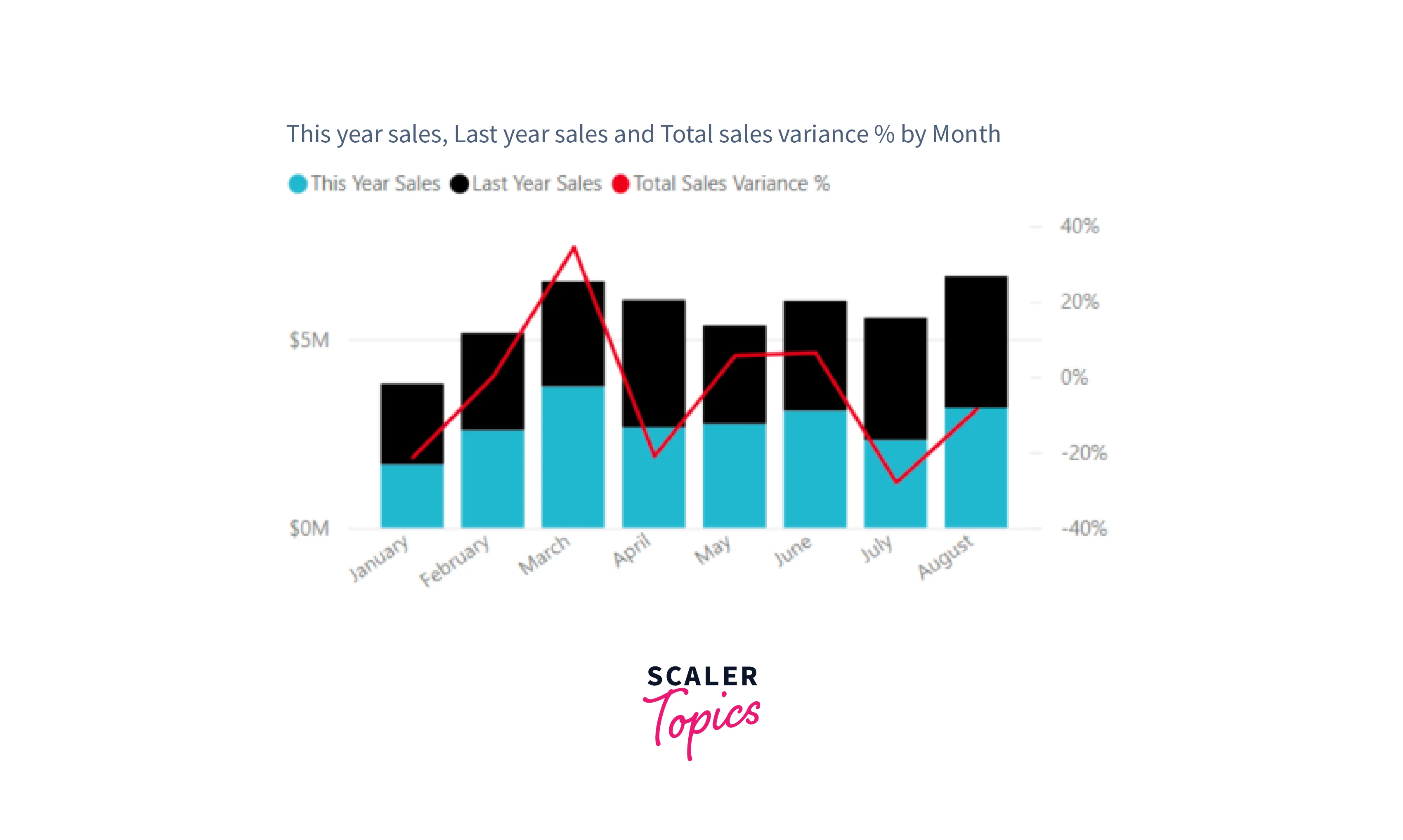
Combo Charts
A combo chart is a type of data visualization in Power BI that combines a column chart and a line chart into a single visual. By using a common X-axis, it allows for quicker comparisons between different data sets. Combo charts can have one or two Y-axes, making it possible to compare multiple measures with different value ranges and to illustrate correlations between two measures in one visual. They are particularly useful when you need to assess whether one measure meets the target defined by another measure, all while conserving space on your canvas. For example, a combo chart can be utilized to display the monthly sales revenue (line chart) and the number of products sold (clustered column chart) over a year.
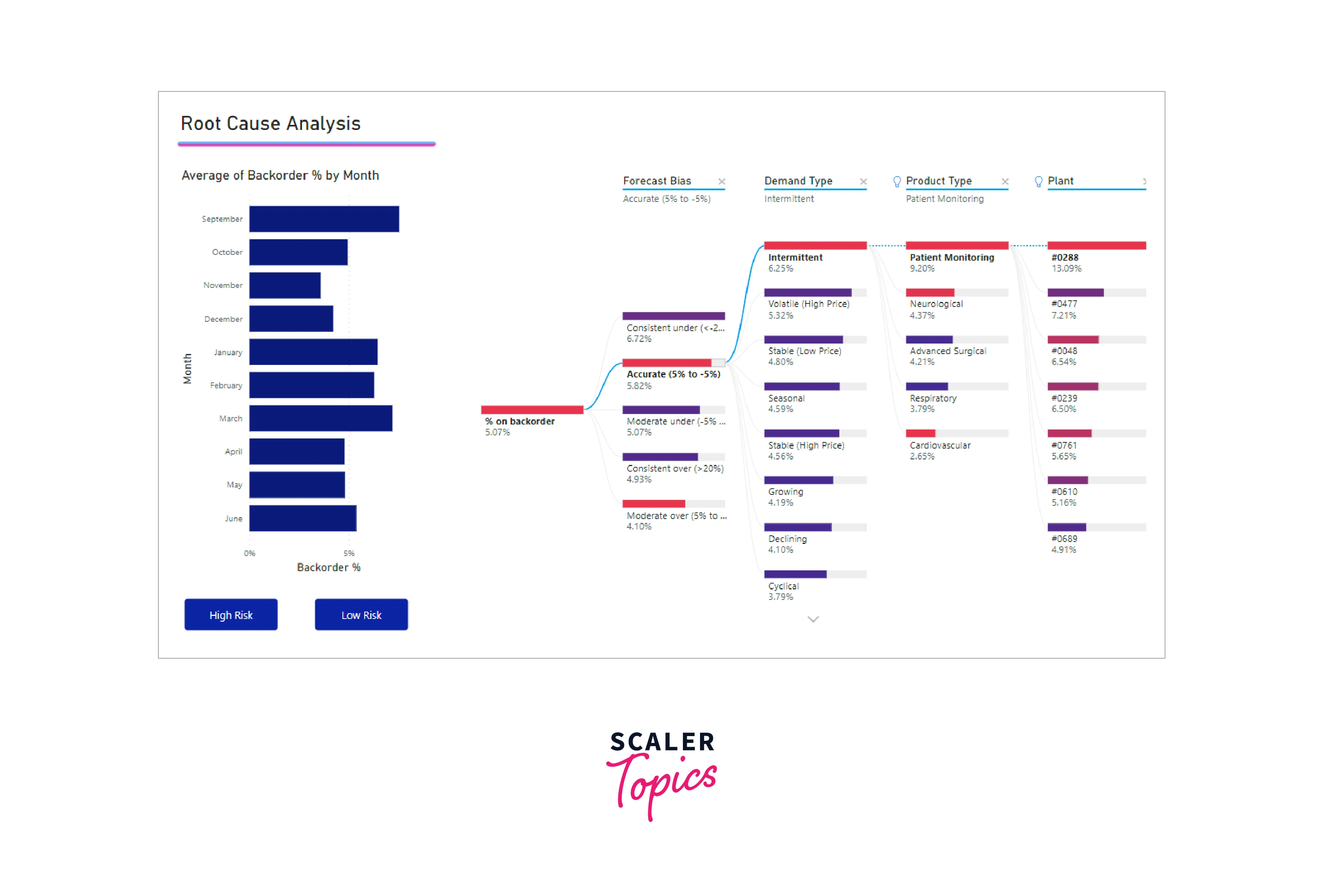
Decomposition Tree
The decomposition tree visual in Power BI is a powerful tool that allows users to visualize data across multiple dimensions. It automatically aggregates data and facilitates seamless drilling down into various dimensions in any desired order. As an artificial intelligence (AI) visualization, it goes further by suggesting the next dimension to drill down into based on specified criteria. This feature makes the decomposition tree an invaluable tool for ad hoc exploration and conducting root cause analysis, as it assists users in uncovering hidden insights and understanding the factors influencing their data.
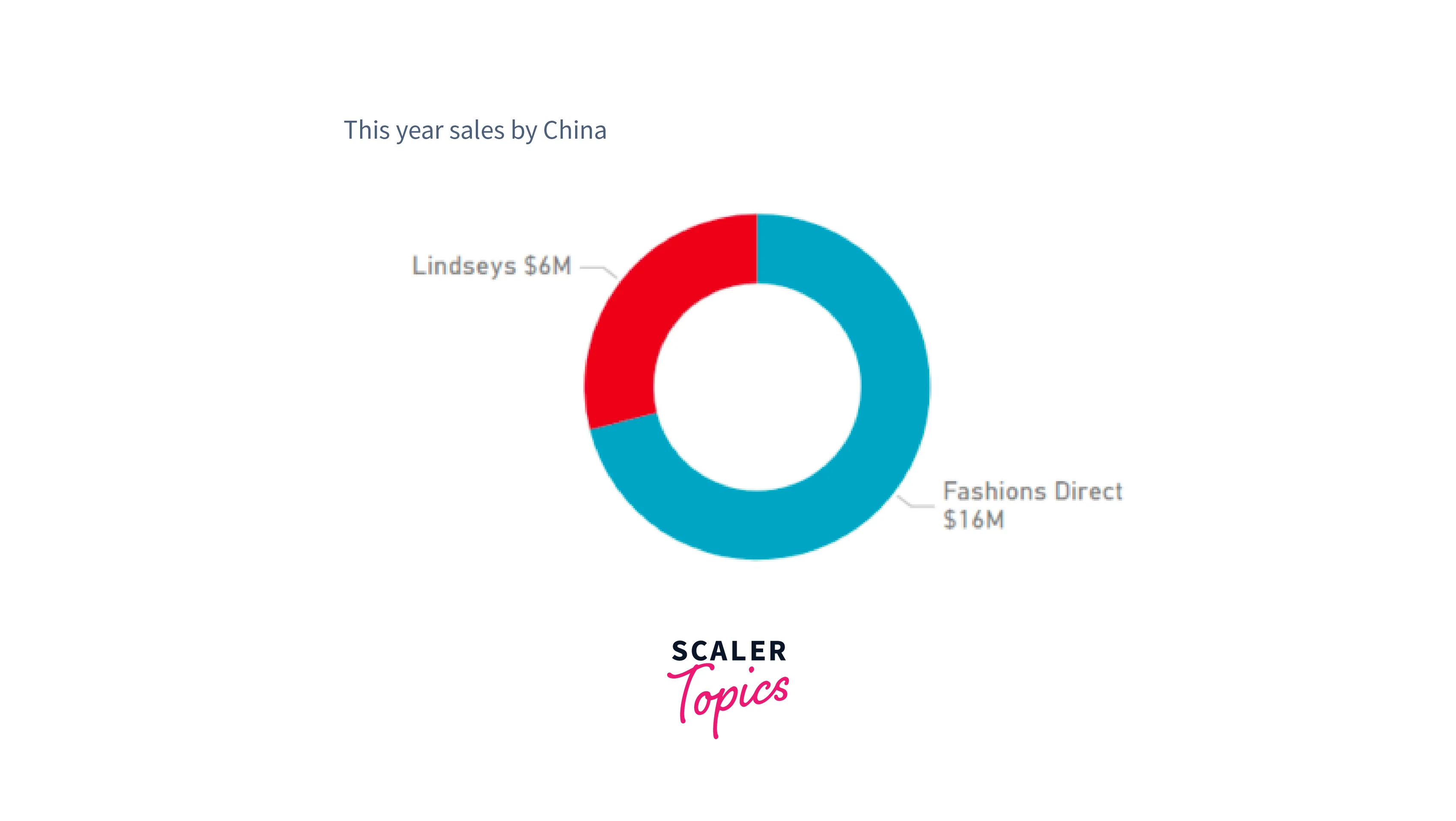
Doughnut Charts
Doughnut charts are a type of data visualization that shares similarities with pie charts, as they both display the relationship of parts to a whole. The key difference is that doughnut charts have a blank center, creating space for a label or icon. This makes doughnut charts ideal for presenting data focusing on the overall composition while allowing additional information to be displayed at the center, enhancing the visual's clarity and meaning.
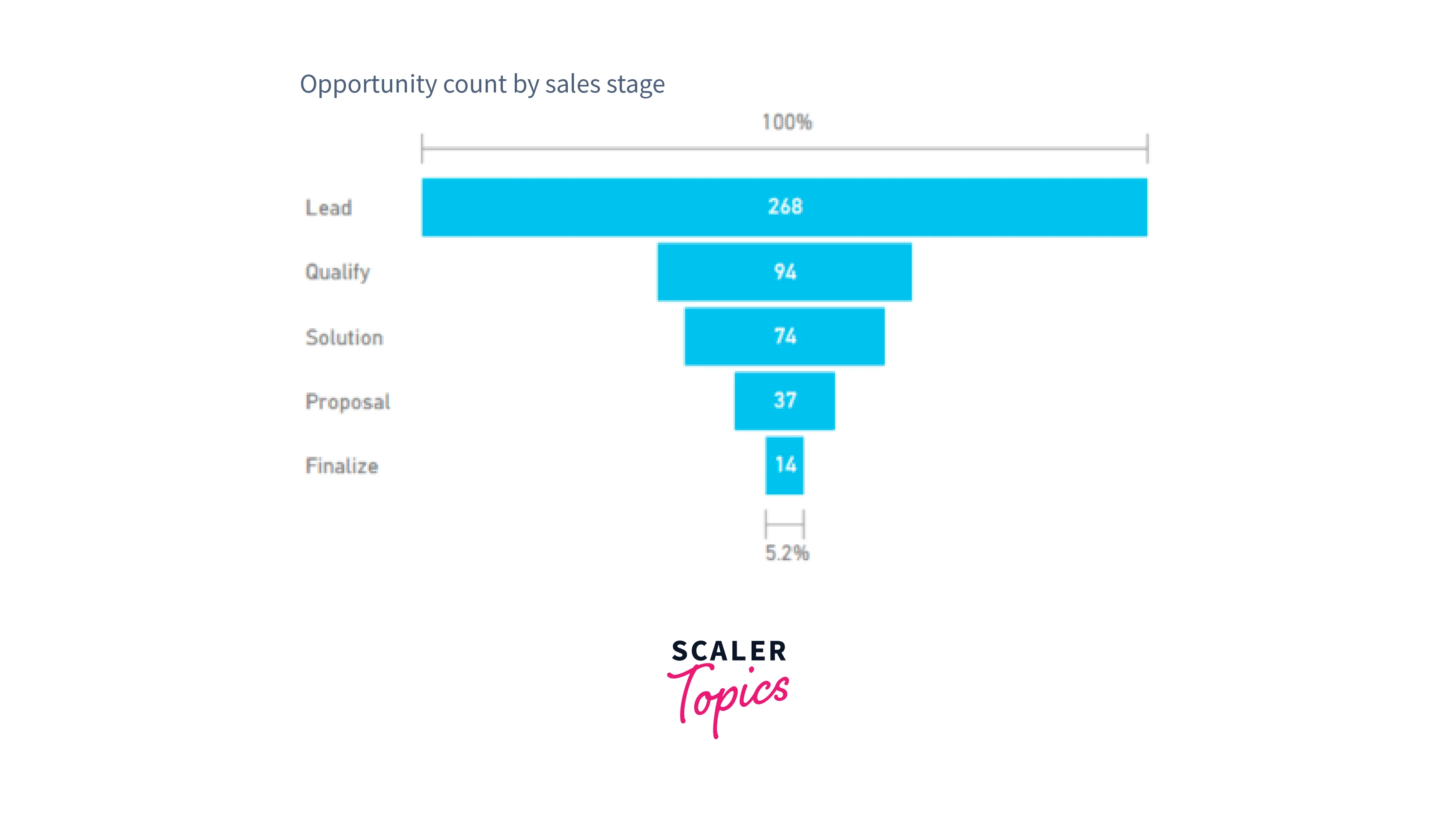
Funnel Charts
Funnel charts are a visual representation that helps illustrate a process with sequential stages, where items move from one stage to the next. They are particularly useful for visualizing processes that involve a progression of steps, showcasing how items decrease in quantity as they move through the stages. One common example is a sales process, where potential customers progress from leads to qualified leads, prospects, contract negotiation, and finally to a successful close.
Additionally, funnel charts can take on different shapes. For example, a funnel that looks like a pear, where the second or intermediate stage is larger than the initial stage, may indicate a problem in the process that requires attention and optimization.
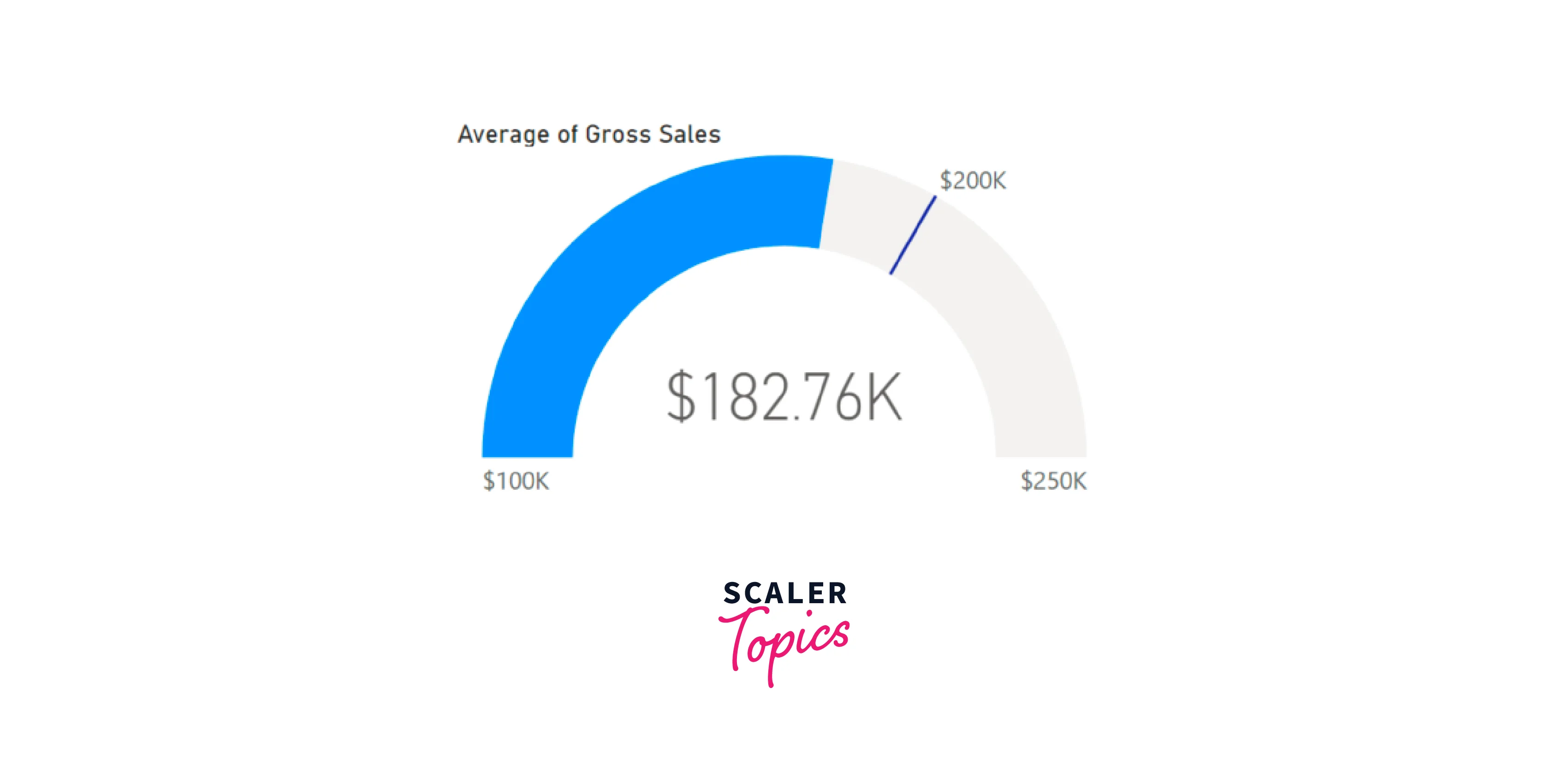
Gauge Charts
A radial gauge chart is a circular arc that visually represents a single value, indicating progress toward a specific goal or target. The needle position represents the goal value, while the shading inside the arc indicates the progress made toward that goal. The current value that reflects the progress is displayed boldly within the arc. All possible values are evenly spread along the arc, ranging from the minimum value (left-most) to the maximum value (right-most).
For example, consider a car retailer tracking their Sales team's monthly average sales. The goal is set at $200,000, represented by the location of the needle. The minimum possible average sales are $100,000, and the maximum is capped at $250,000. The blue shading within the arc shows that the Sales team is averaging approximately $180,000 this month.
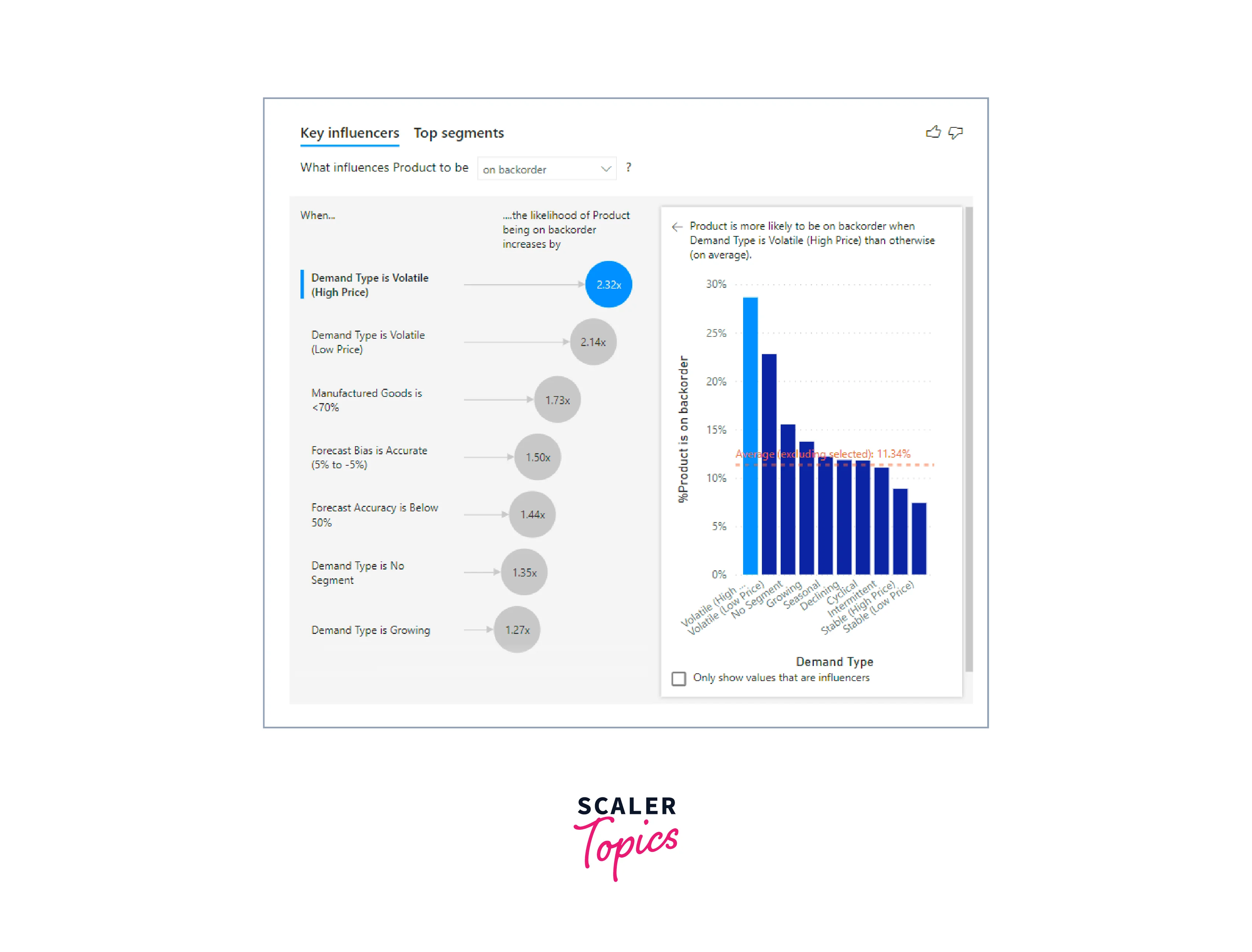
Key Influencers Chart
A key influencers chart is a powerful Power BI visualization type highlighting the significant contributors to a chosen result or value. It helps users understand the factors that impact a key metric or outcome the most.
Key influencers charts are particularly useful for gaining insights into the reasons behind specific events or trends. For instance, it can help answer questions like what motivates customers to place a second order or why sales were exceptionally high in a particular month, such as last June. These charts analyze large datasets and use machine learning algorithms to identify patterns and correlations between various variables and the target metric. The visualization displays the most influential factors, such as product attributes, customer behaviors, or marketing campaigns, ranked by their impact on the selected outcome.
KPIs
A Key Performance Indicator (KPI) is a visual representation that communicates the level of progress achieved toward a measurable goal. KPIs are effective tools for measuring progress and determining the distance to a specific metric, helping users track performance and identify areas where they are ahead or behind their targets. They provide valuable insights to aid in decision-making and keep stakeholders informed about the success of their objectives.
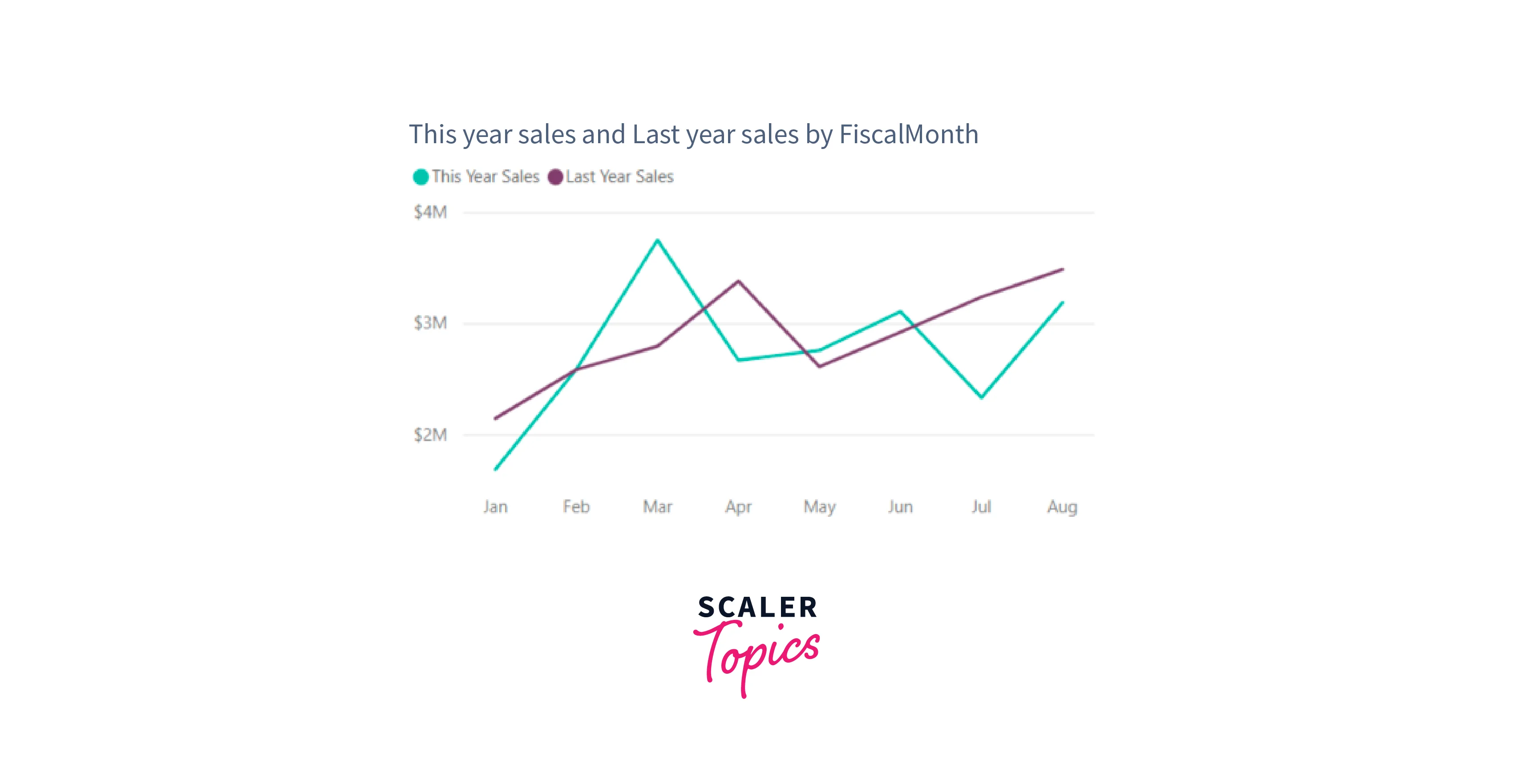
Line Charts
Line charts are a fundamental type of data visualization representing data as a series of data points connected by straight lines. They show trends and patterns in data over time or any continuous scale. Line charts are particularly effective in illustrating how values change and fluctuate across different data points, making them valuable for visualizing time-based data and identifying patterns or correlations in datasets.
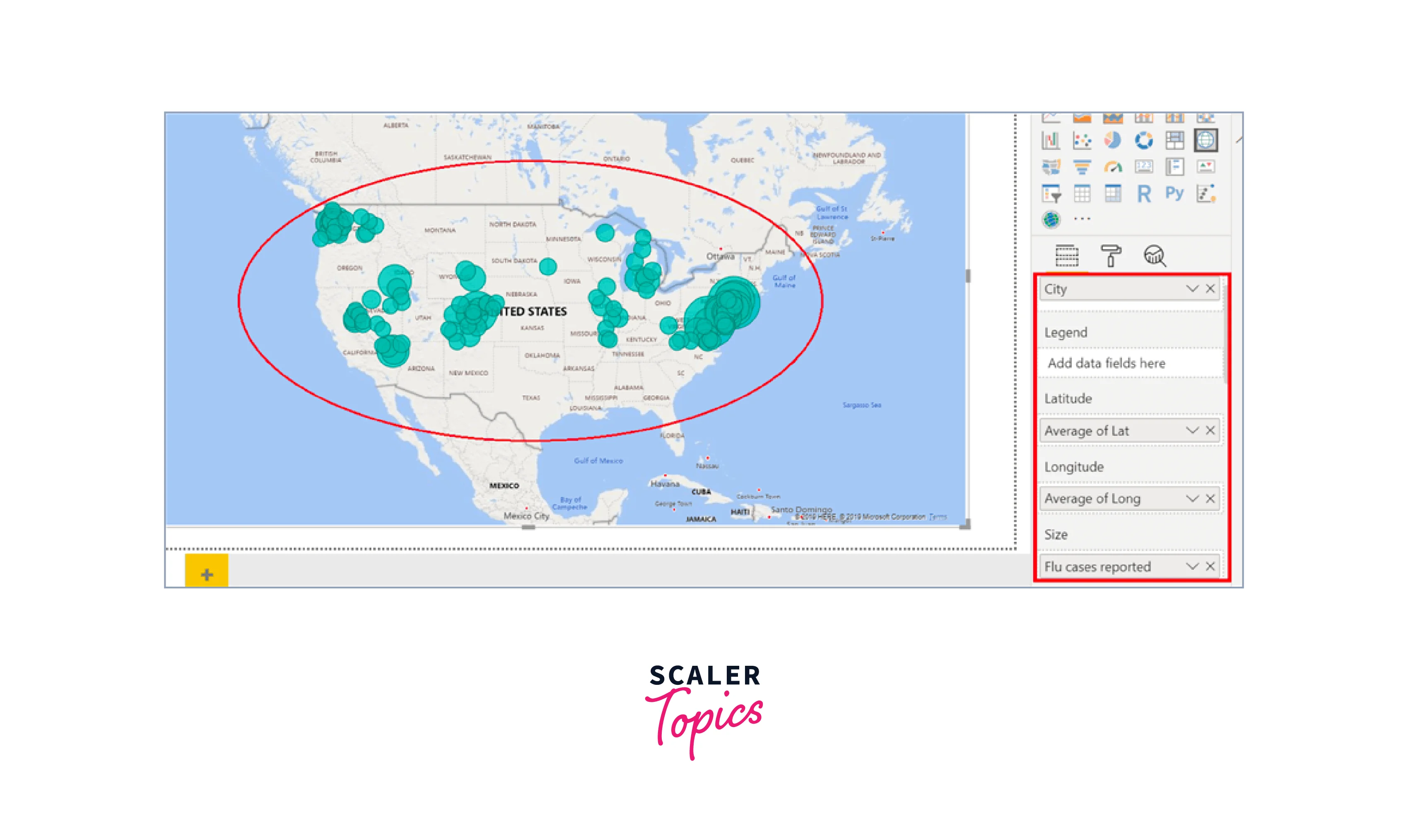
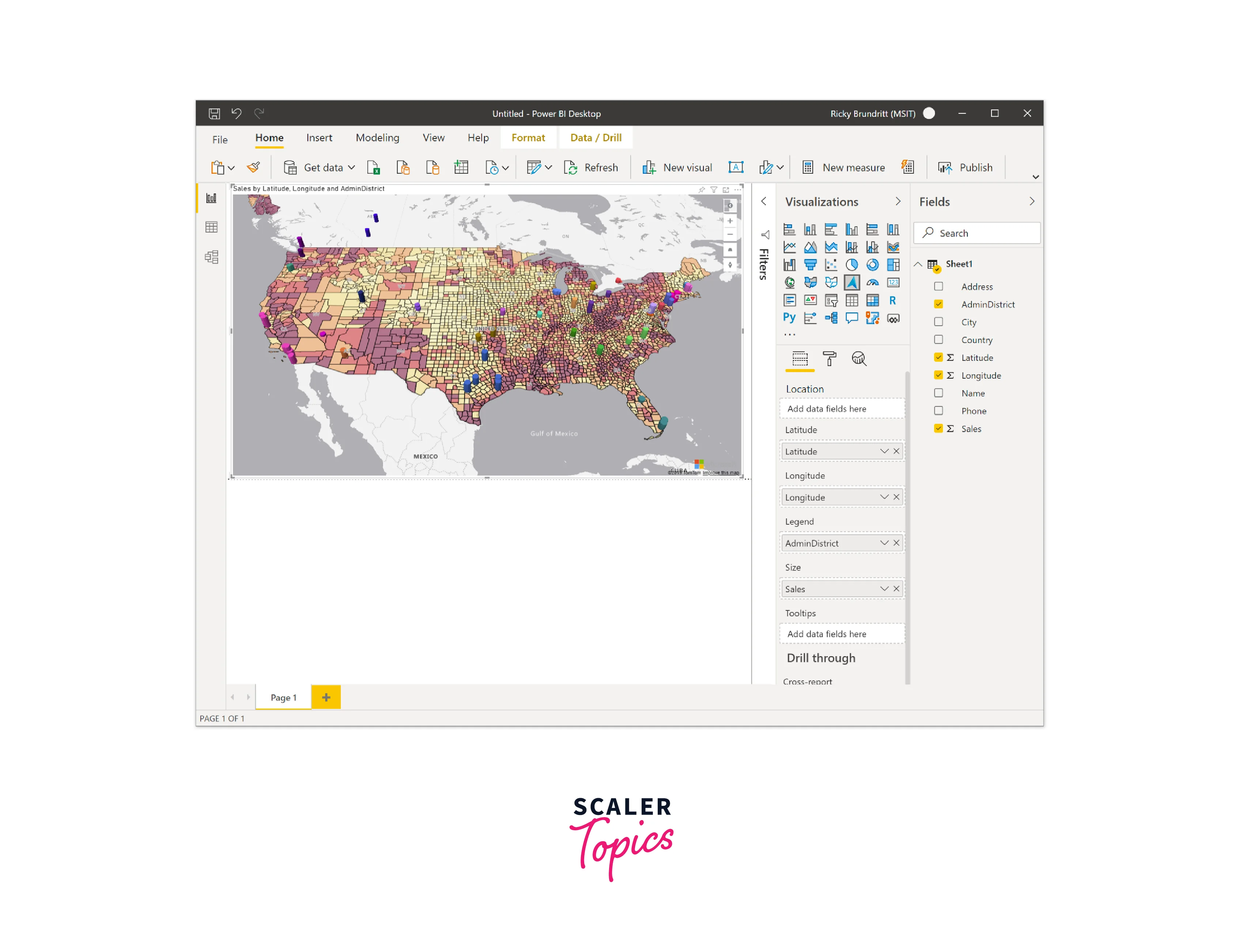
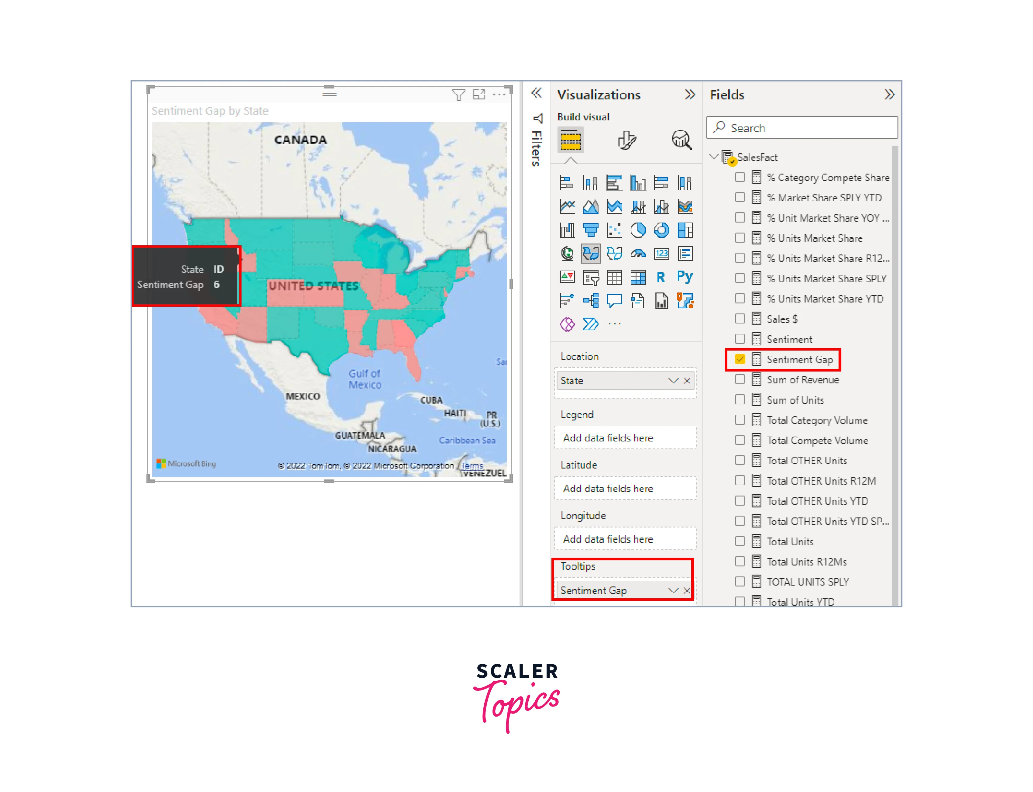
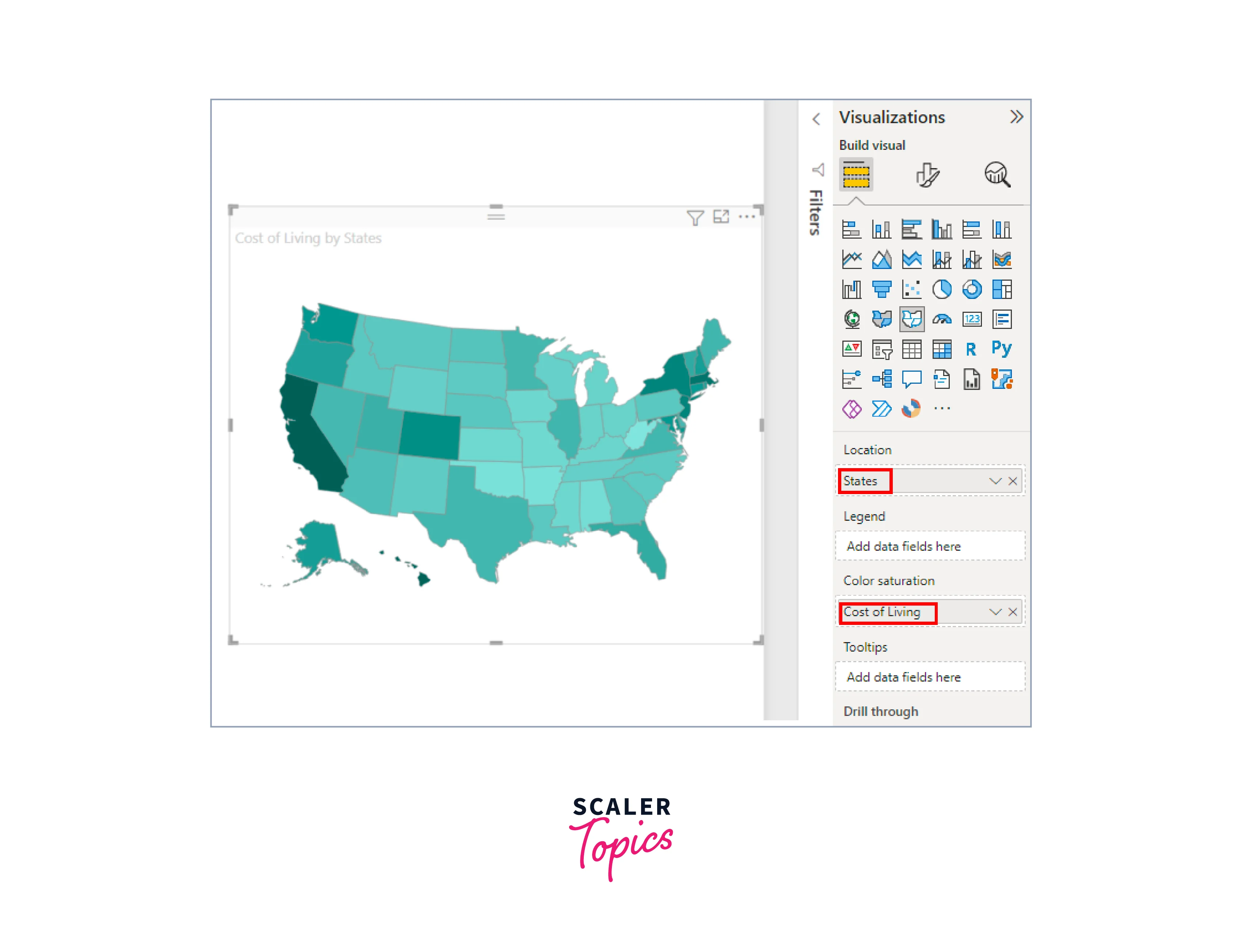
Maps
Maps visualization is a graphical representation that displays data on a geographical map, providing spatial context for better understanding and analysis. Let’s explore various types of Power BI visualizations for maps below:
-
Basic Map:
A simple map visualization that displays location-based data on a geographical map, enabling users to explore data in a spatial context.
-
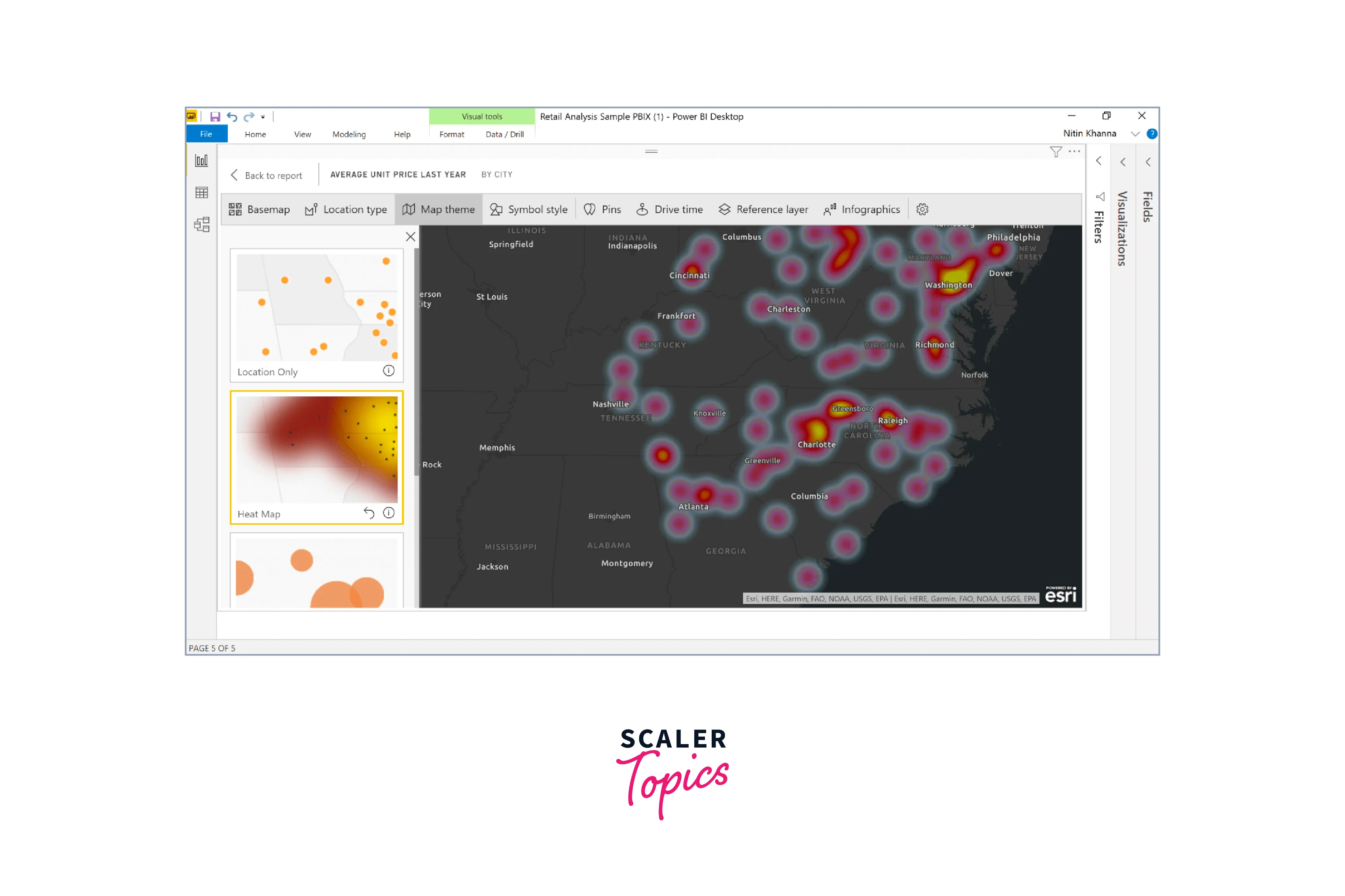
ArcGIS Map:
The integration of ArcGIS maps with Power BI elevates mapping to a higher level by offering a wide array of options for base maps, location types, themes, symbol styles, and reference layers, resulting in visually appealing and informative map visuals. Combining authoritative data layers, like census data, with spatial analysis enhances the visualization, providing a deeper understanding of the data presented on the map.
-
Azure Map:
A mapping service offered by Microsoft Azure provides developers with tools to create maps, and geocode addresses, and integrate location-based services into their applications.
-
Filled Map (Choropleth):
A map visualization that uses color shading or patterns to represent data values for specific geographic areas, providing an intuitive way to compare data across regions.
-
Shape Map:
Shape maps utilize color to compare regions on a map and do not display precise geographical locations of data points. Their primary function is to illustrate relative comparisons between regions on a map through different color shading.
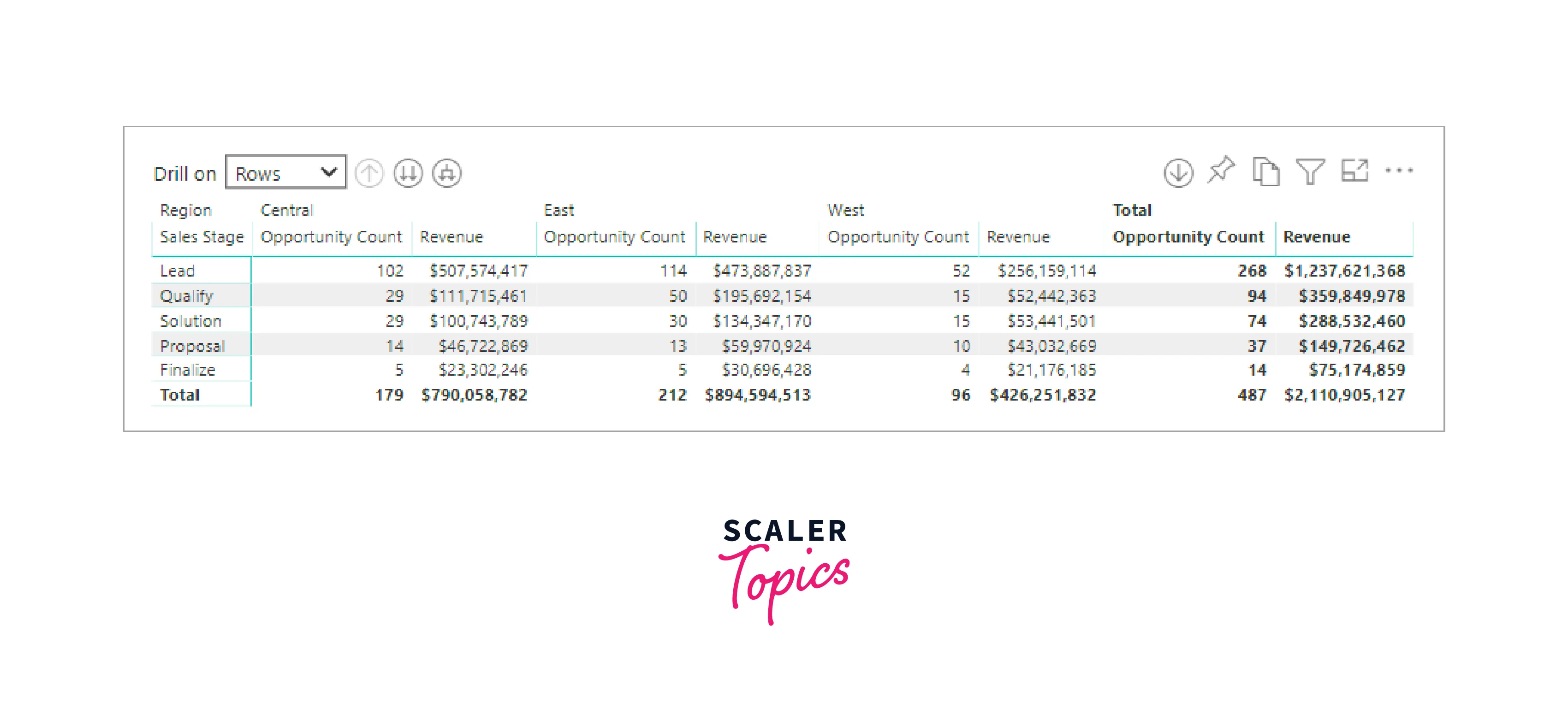
Matrix
The matrix visual in Power BI is a table-like visualization that supports a stepped layout, making it easier to display data across multiple dimensions. Unlike a regular table, a matrix can represent data more effectively with expanded row and column options. It's often used in reports and dashboards, allowing users to select elements like rows, columns, or cells to cross-highlight other visuals on the same report page, enhancing data exploration and analysis.
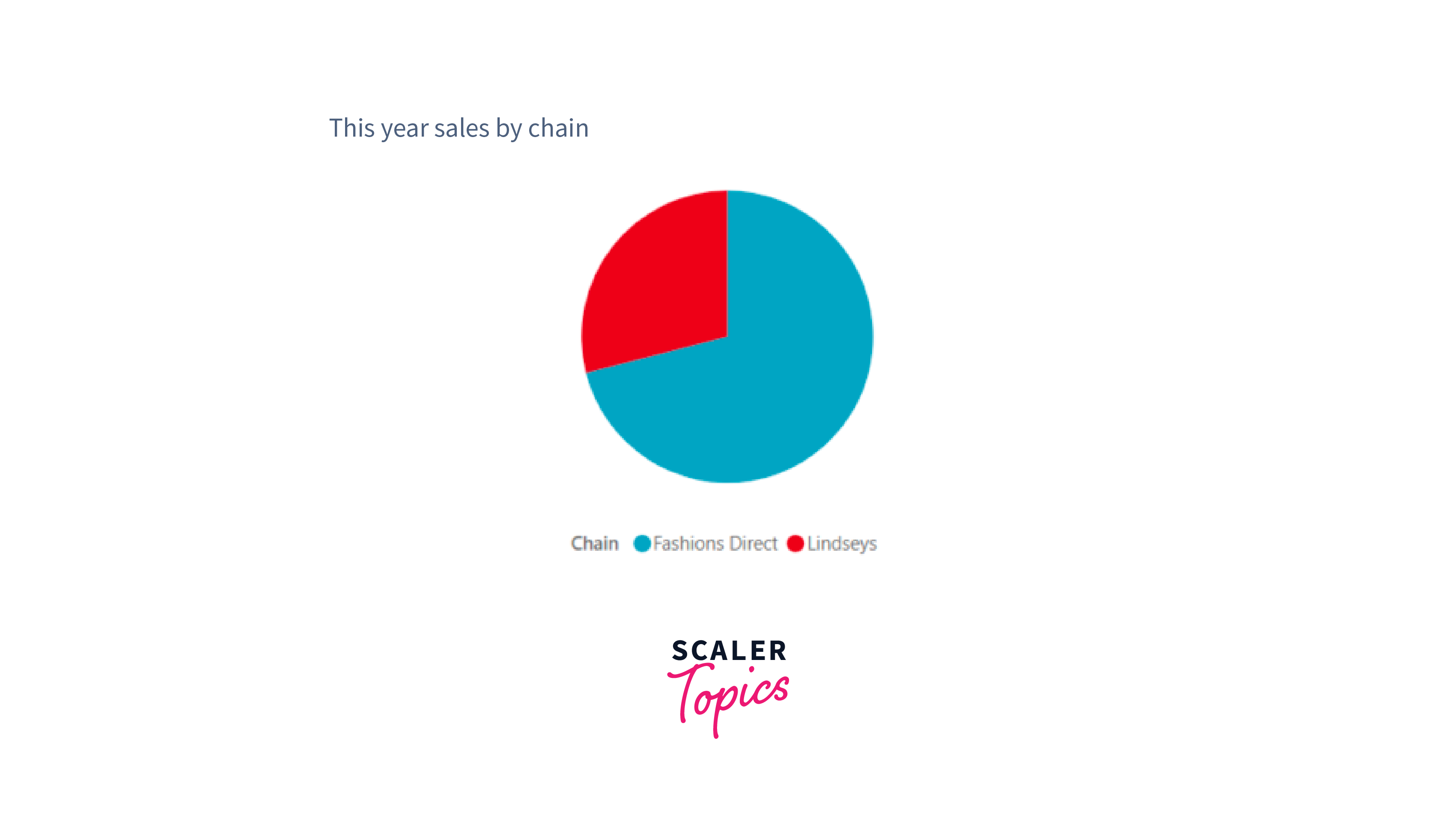
Pie Charts
Pie charts are circular visualizations that represent data as slices of a whole. Each slice represents a proportion or percentage of the total, with the size of the slice indicating its relative magnitude compared to other slices. Pie charts are useful for displaying data in a visually engaging way and making it easy to understand the distribution or composition of different categories in a dataset. However, they are most effective when displaying a small number of categories or when the differences between categories are substantial.
Power Apps Visual
Power Apps Visual is an interactive data visualization tool in Power BI. It allows users to embed and interact with custom Power Apps applications directly within their reports and dashboards. It enables users to extend their analytics with dynamic and user-friendly apps, providing a seamless experience for data exploration and decision-making.
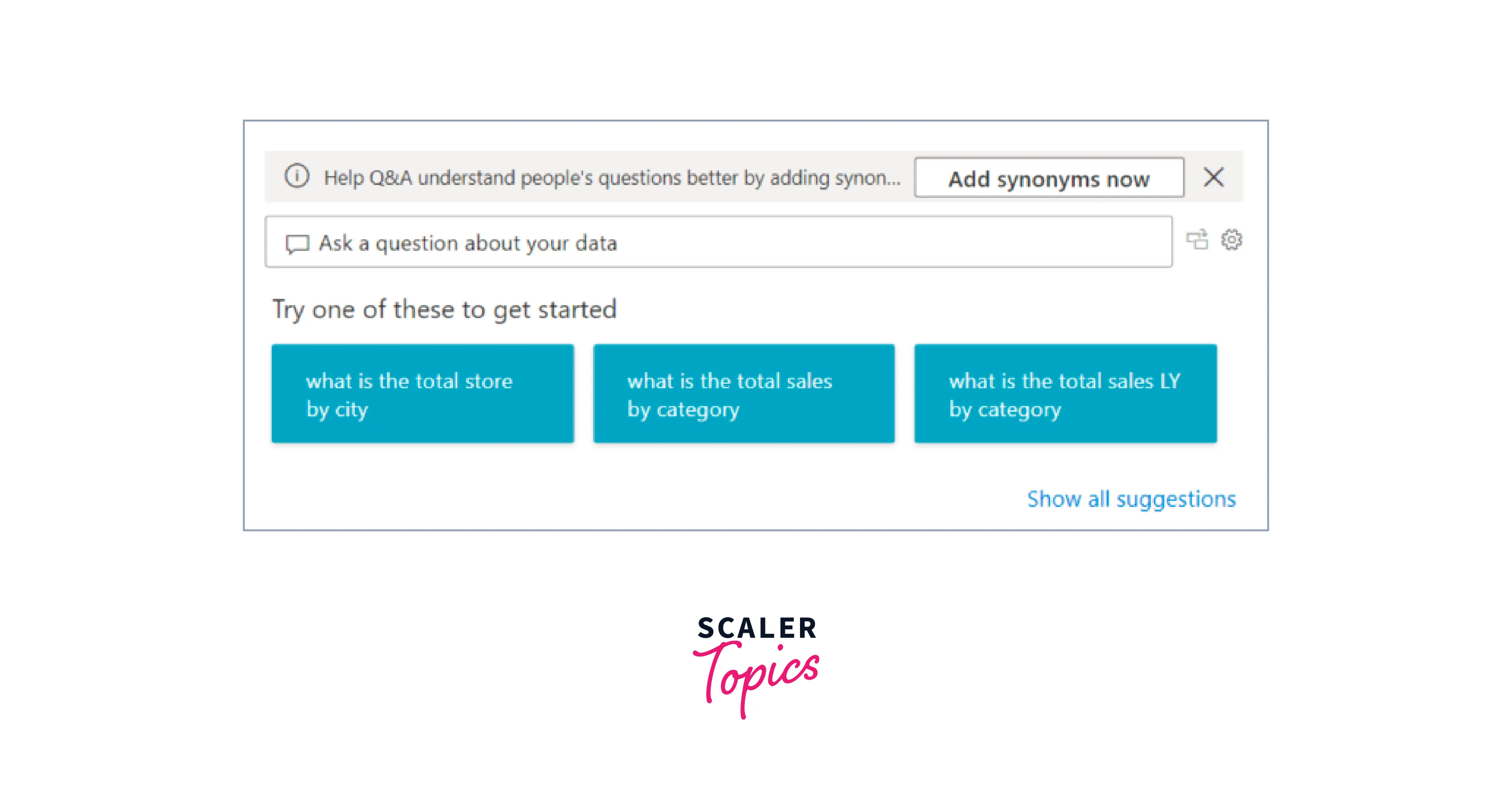
Q&A Visual
The Q&A visual in Power BI allows users to explore and analyze their data using natural language queries interactively. By simply typing questions in plain human language, users can receive instant visual responses, making it easy to get quick insights and explore data without the need for complex queries or data modeling. The Q&A visual leverages AI and natural language processing to interpret the user's questions and dynamically generate appropriate Power BI visualizations, enhancing the data exploration experience.
R Script Visuals
R Script Visuals in Power BI allow users to directly integrate R programming language capabilities into their reports and dashboards. By leveraging R scripts, users can create custom data visualizations and perform advanced data analysis, statistical modeling, and machine learning directly within Power BI, enhancing the platform's analytical capabilities and enabling more sophisticated data insights.

Ribbon Chart
A ribbon chart in Power BI is a data visualization that displays a series of data points along a horizontal ribbon, with each data point represented as a colored segment within the ribbon. It is often used to show the distribution and relationship of categorical data over a continuous axis, making it useful for visualizing data patterns and hierarchies. Ribbon charts can be customized to display various metrics and categories, providing insights into data trends and comparisons.
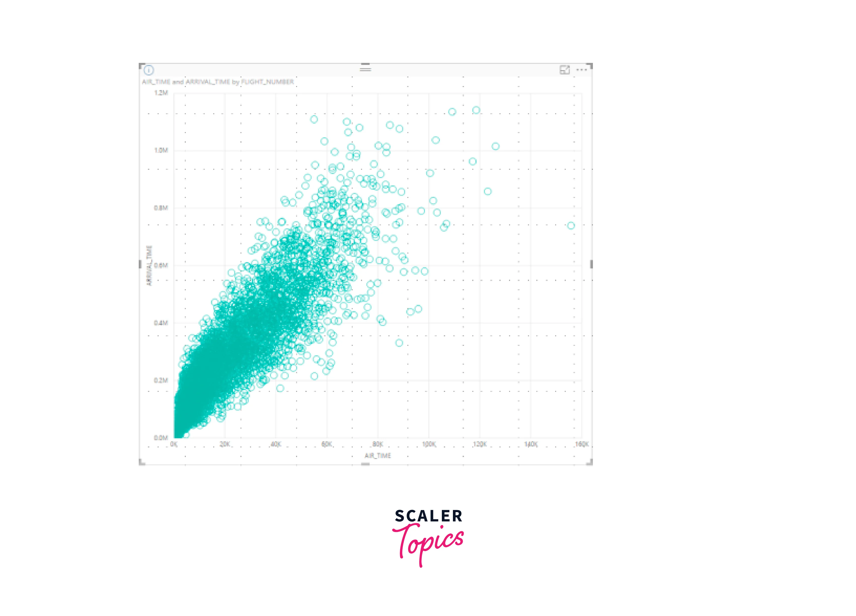
Scatter, Bubble, and Dot Plot Chart
A scatter plot is a data visualization that displays individual data points as dots on a Cartesian coordinate system, representing the relationship between two numerical variables. It helps identify patterns, trends, or correlations between the variables.

A bubble chart is a variation of a scatter plot that adds a third dimension by varying the size of the dots (bubbles) to represent a third numerical variable. It visually showcases the relationship between three variables simultaneously, making it useful for visualizing complex data with multiple dimensions.
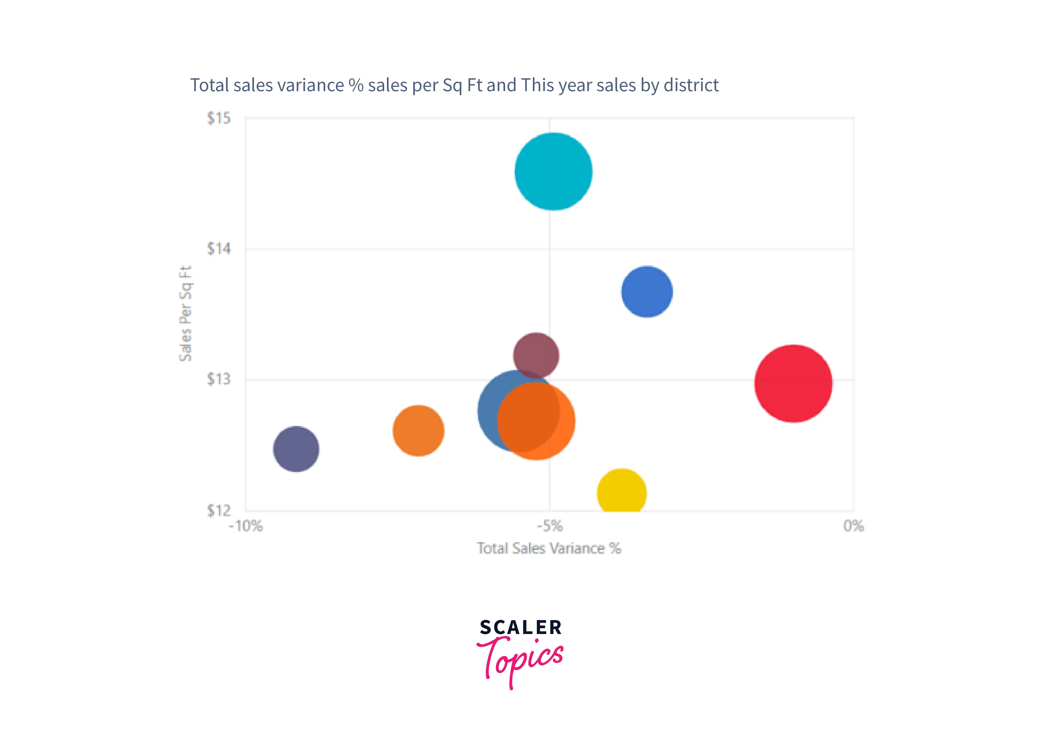
A dot plot chart is a versatile visualization similar to a bubble and scatter chart, but it is used to present categorical data along the X-axis. In this example, sales data is represented along the X-axis using squares instead of circles, effectively showcasing the distribution and patterns of sales data.

Scatter-High-Density Chart
In a scatter-high-density visual, data is sampled efficiently to create responsive and fast visuals while representing all data points in the dataset. An algorithm is used to eliminate overlapping points, ensuring that crucial data points are preserved, resulting in the best combination of responsiveness, representation, and clarity in the overall data visualization. This approach guarantees an effective and informative scatter plot for large datasets.
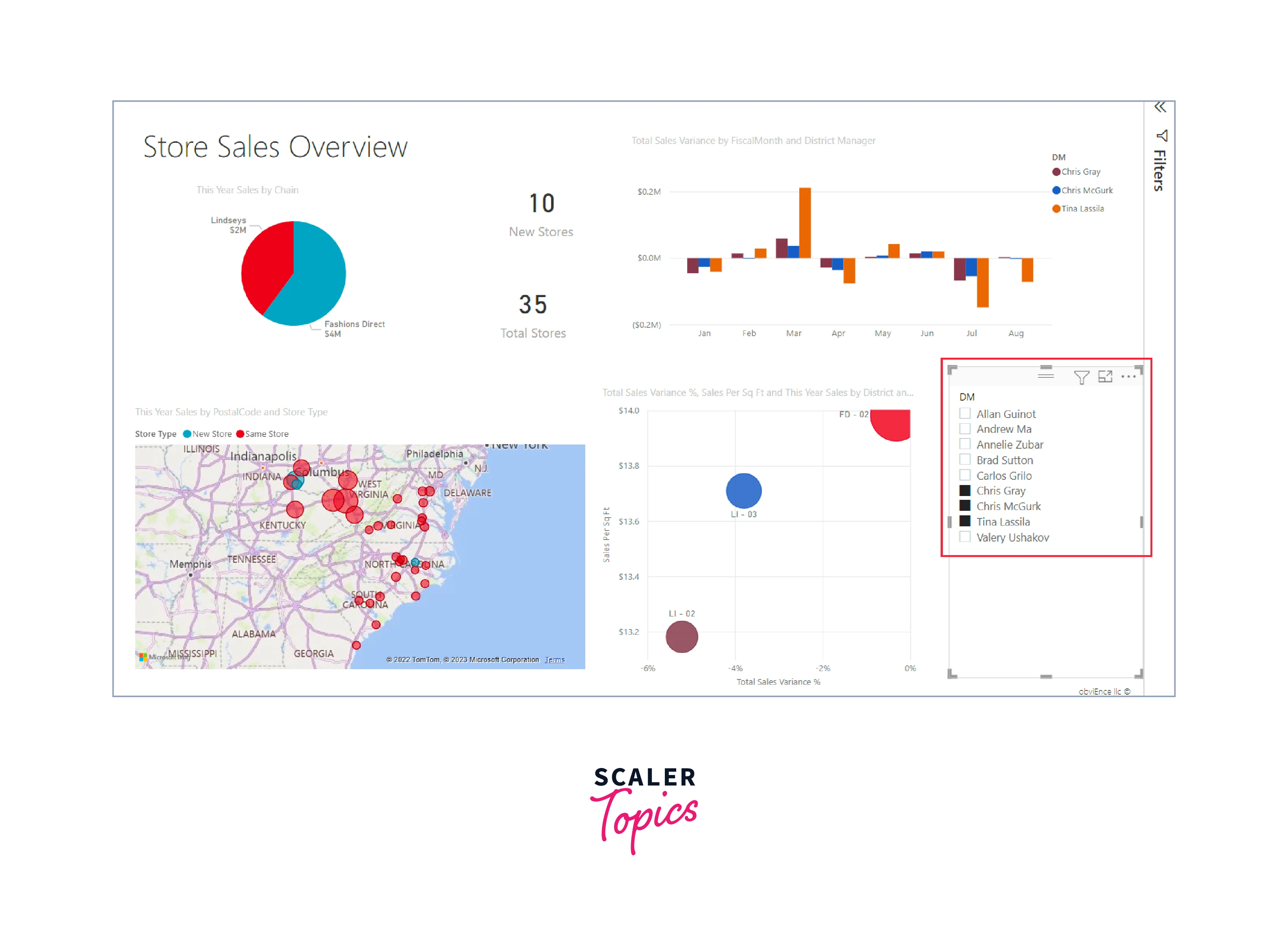
Slicers
Slicers visualization in Power BI allows users to filter interactively and segment data in their reports and dashboards. They act as interactive controls, enabling users to select specific data subsets, categories, or periods, dynamically updating all other visuals on the report page to display the relevant data, facilitating efficient data exploration and analysis.
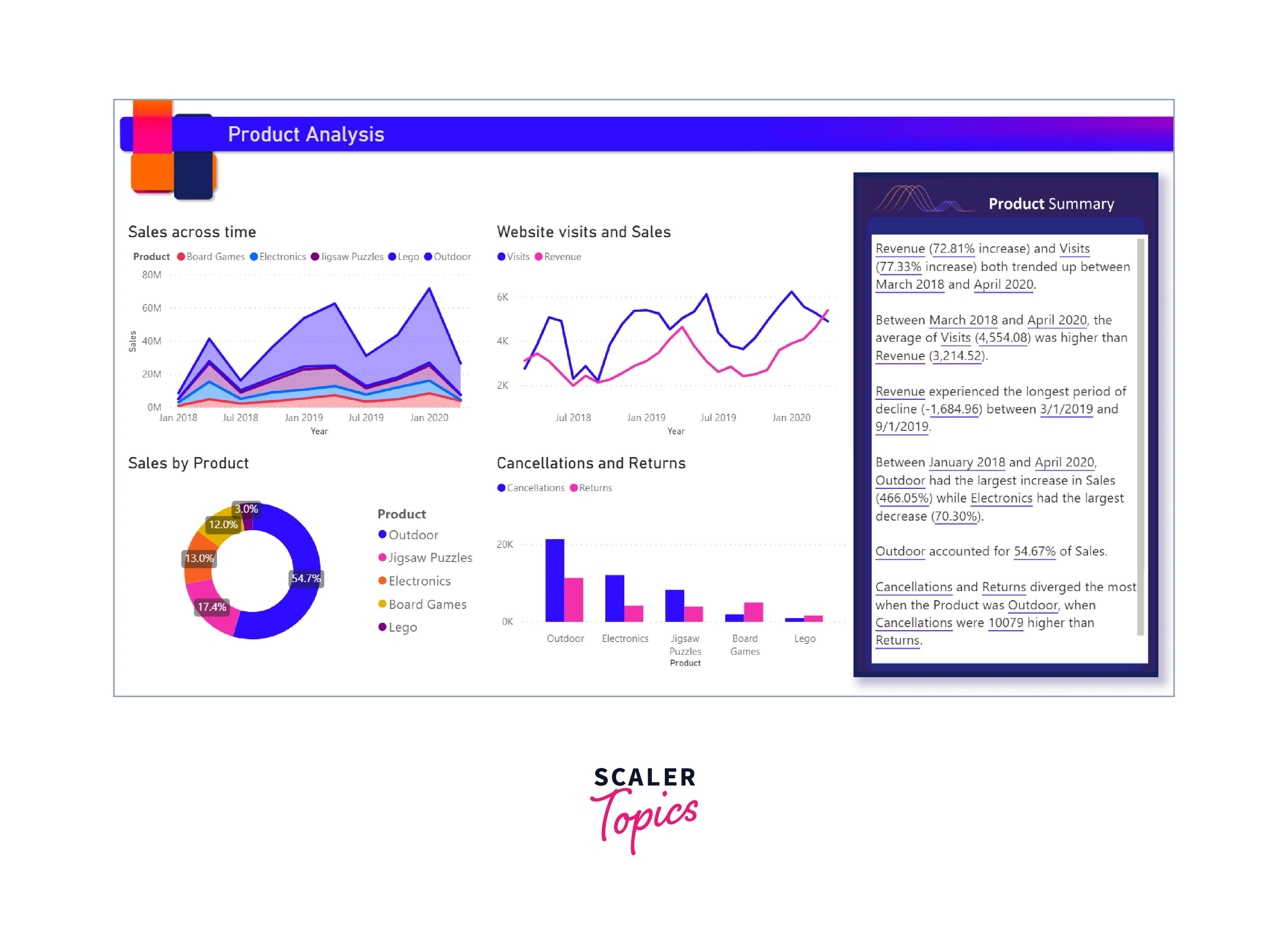
Smart Narrative
Smart Narrative in Power BI is an AI-driven feature that automatically generates written explanations and insights from visual data. It analyzes the data, identifies trends, patterns, and outliers, and then generates natural language narratives to describe the key findings in a human-readable format. Smart Narrative enhances data storytelling, saves time in report creation, and enables users to gain a deeper understanding of their data without the need for manual analysis and interpretation.
Standalone Images
Standalone images in Power BI allow users to insert and display static images, such as logos, icons, or infographics, directly into their reports and dashboards. These images are not linked to any data and provide additional context or visual enhancements to the overall data presentation.
Tables
Tables in Power BI are grids that organize related data in rows and columns, often including headers and a row for totals. They are well-suited for quantitative comparisons, displaying many values for a single category in a structured format. Tables offer the advantage of showing exact values and detailed data, making them ideal for precise data analysis and numerical comparisons by categories.

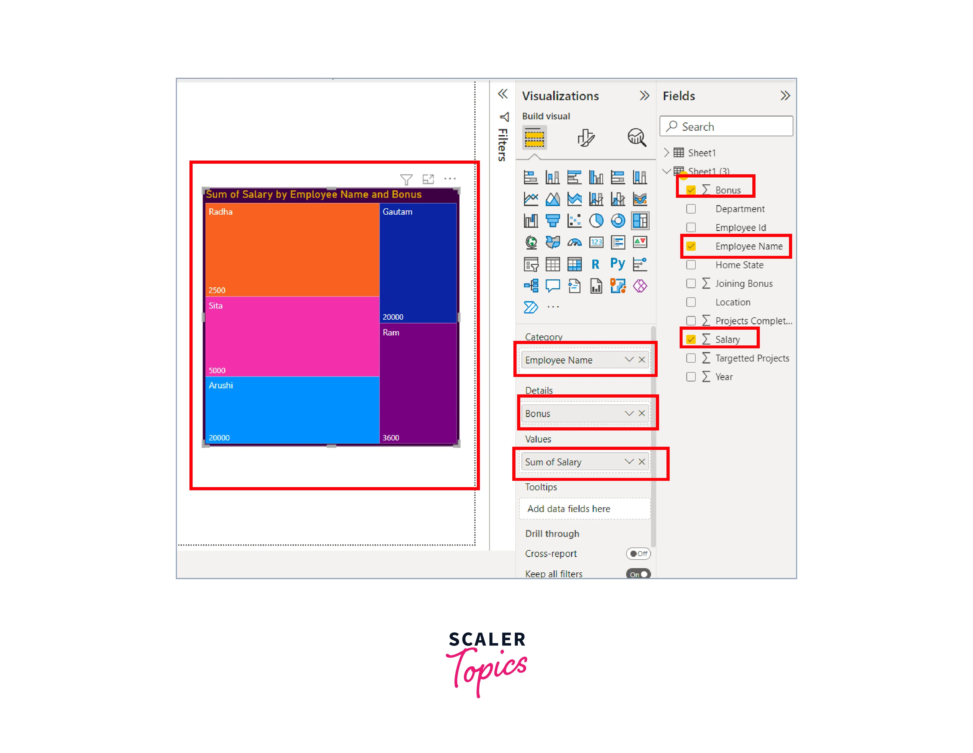
Treemaps
Treemaps are Power BI visualizations comprised of colored rectangles, where the size of each rectangle represents the corresponding value. They can be hierarchical, with nested rectangles, and arranged in descending size order. Treemaps are a powerful choice for - displaying large hierarchical data sets effectively, handling a substantial number of values when a bar chart may not be suitable, demonstrating the proportions between individual parts and the whole dataset, and identifying patterns, outliers, significant contributors, and exceptions in the data visualization.
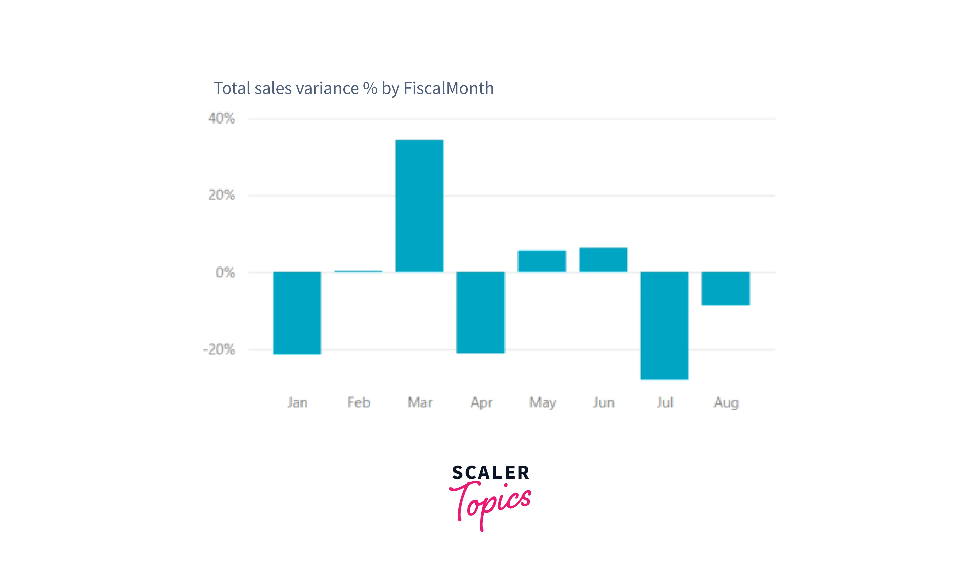
Waterfall Charts
Waterfall charts in Power BI displays a running total as values are added or subtracted, providing insights into how initial values (e.g., net income) are affected by positive and negative changes. The columns are color-coded for easy identification of increases and decrease, often starting at the horizontal axis for initial and final values, while intermediate values float as columns, earning them the name "bridge charts".
Waterfall charts are an excellent choice for:
- Analyzing changes in measures over time or across different categories.
- Auditing significant changes contributing to the total value.
- Visualizing annual profit by showcasing various revenue sources and arriving at the total profit (or loss).
- Illustrating headcount changes for a company over a year.
- Visualizing monthly earnings, expenditures, and the running balance of an account. They effectively reveal the flow of money throughout time.

Conclusion
- Power BI visualizations offer a wide range of versatile options, catering to various needs and preferences.
- Power BI visualizations types such as bar, column, area, and pie charts are effective for displaying different types of data relationships and compositions.
- Multi-row cards and single number cards are valuable tools for presenting multiple or single data points concisely.
- Combo charts, with their ability to combine multiple chart types, enhance data representation and analysis.
- Maps and key influencers charts provide geospatial insights and reveal crucial factors influencing data trends.
- Other Power BI visualizations like matrix, smart narrative, and slicers contribute to interactive and immersive data exploration, empowering users to gain deeper insights and make data-driven decisions.