Marketing Dashboard with Power BI
Overview
In today’s world, businesses need to process large volumes of data and extract valuable insights to make informed decisions and stay ahead of the competition. Businesses spend a huge amount of money and resources to run a wide range of advertising and marketing campaigns, and they must understand which campaigns are working better and why. Understanding marketing campaigns better will help businesses answer various questions, such as which types of campaigns have higher conversion rates, which products are working well, what the ROI for each campaign is, where to put more money, etc. This article will use a sample marketing campaign dataset to show how to build a Power BI marketing dashboard. Whether you are a beginner in this space or an experienced professional, this guide will help you leverage the power of data visualization and analysis to design and develop a Power BI marketing dashboard.
What are we Building?
In this article, we will design and develop a dynamic Power BI marketing dashboard. This Power BI marketing dashboard will provide at-a-glance insights into budget and revenue trends from marketing campaigns, average revenue contributions from each type of campaign, and revenue/budget distribution for various campaign types.
Pre-requisites
Here's a list of prerequisites to create a Sales Dashboard Using Power BI:
- Power BI Desktop:
Ensure you have Power BI Desktop downloaded and installed on your computer. You can also download it from the official Microsoft Power BI website. - Familiarity with Data Analysis:
A foundational understanding of data analysis concepts, such as data types, aggregation, and trends, will be helpful. - Basic Excel Skills:
A basic knowledge of Excel is beneficial for data pre-processing and transformation before importing into Power BI. - Visualization Concepts:
Basic comprehension of data visualization principles and chart types, like bar charts, line graphs, and pie charts.
How are we Going to Build This?
We'll begin by importing our sample marketing dataset into Power BI and ensuring data consistency and structure. This involves cleaning, transforming, and shaping data for further analysis and reporting. We'll also perform data preprocessing on our dataset by creating calculated columns, such as total duration of campaigns, revenue to budget ratio, etc. Next, we'll utilize Power BI's rich library of visualizations to create charts, graphs, and tables highlighting budget and revenue trends, revenue/budget distribution for various campaign types, etc. Lastly, slicers will be added to introduce interactivity to the report, allowing users to filter data by target customer types (B2B and B2C) for a more customized view.
Building Marketing Dashboard with Power BI
Let’s explore the various steps involved in creating a Power BI marketing dashboard using the sample dataset:
Data Connection
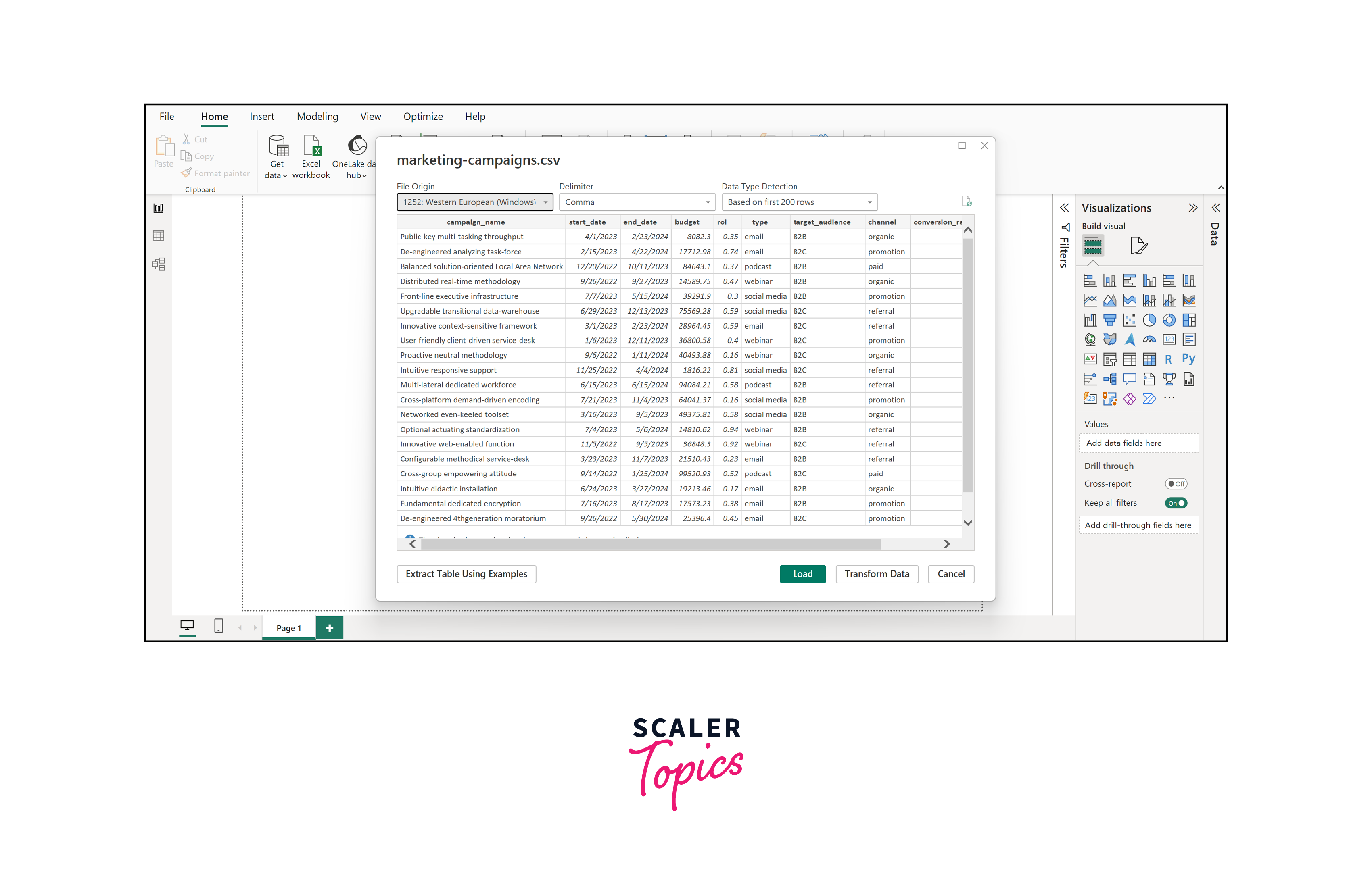
The first crucial step is establishing a data connection by collecting the sample dataset to kickstart our journey in building the Power BI marketing dashboard. You can download the sample dataset for our marketing dashboard project from here. This dataset has been curated to include essential features instrumental in our analysis and reporting.
Key Features in the Sample Marketing Dataset:
- Campaign Name:
This field contains the unique names of marketing campaigns, allowing us to identify and analyze individual campaigns. - Start and End Date:
These date ranges signify the duration of each campaign, aiding us in assessing campaign performance over specific periods. - Budget:
The budget allocation for each campaign, providing insights into the financial resources invested. - ROI (Return on Investment):
This metric reveals the effectiveness of campaigns by measuring the return generated relative to the budget spent. - Type:
The type categorizes campaigns into different segments or categories, helping us understand which strategies yield the best results. - Target Audience:
Identifies the intended audience for each campaign, whether it's Business-to-Business (B2B) or Business-to-Consumer (B2C). - Conversion Rate:
This crucial metric tells us how effectively campaigns convert potential customers into buyers. - Revenue:
The revenue generated by each campaign gives us a clear picture of its financial impact.
To connect to a data store using Power BI:
- Open Power BI Desktop.
- Click "Home" > "Get Data" > select your data source (e.g., Excel, CSV, database).
- Browse and select your dataset, then follow the prompts to configure the connection and load data into Power BI.
Data Transformation
In the data transformation phase of our Power BI marketing dashboard project, we're tasked with preparing our dataset for comprehensive analysis. This process involves several crucial steps to ensure data accuracy, consistency, and readiness for further insights.
In this step, we will begin by examining the data types of each column in our dataset. Ensure that dates are formatted correctly, numeric values are in the appropriate numerical data type, and text fields are of the right data type. Further, we will identify and address any missing data points in our dataset. Depending on the nature of the missing values, consider techniques like imputation (replacing missing values with reasonable estimates) or removal if the missing data cannot be reliably imputed.
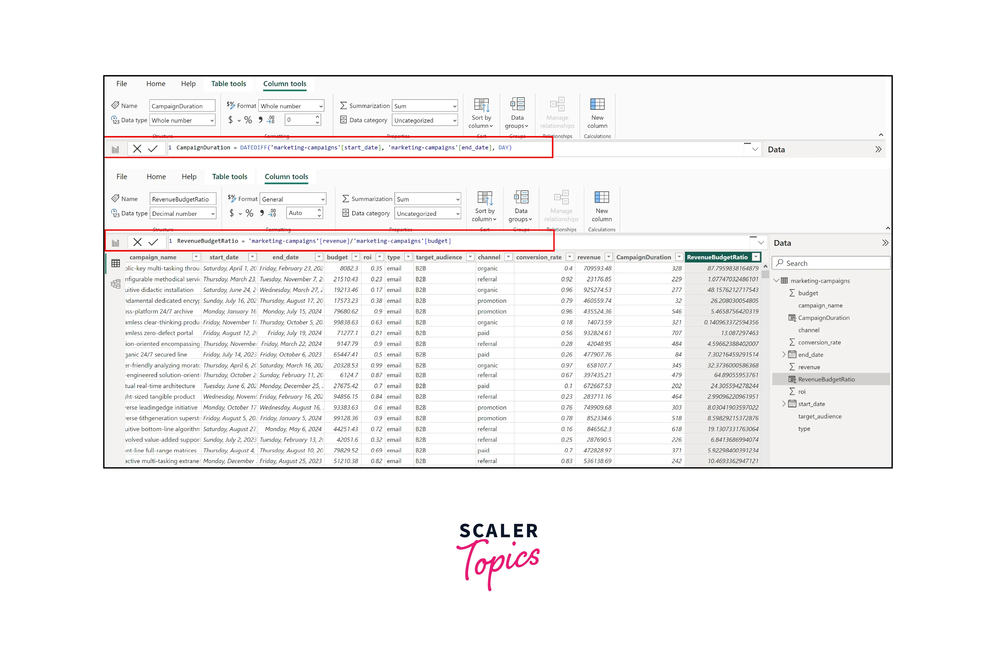
Next, we will enrich our dataset by adding two important features: campaign duration and revenue-to-budget ratio. Using DAX, we will calculate the campaign duration by subtracting the start date from the end date for each campaign. This new feature will provide insights into the length of each marketing effort. We will also compute the revenue-to-budget ratio for each campaign by dividing the revenue generated by the budget allocated. This metric will help us assess the effectiveness of budget utilization in generating revenue.
Here are the steps on how to add a calculated column using Data Analysis Expressions (DAX) in Power BI:
- Launch Power BI Desktop and open your report or data model where you want to add the calculated column.
- Select the table to add the calculated column in the Fields pane on the right. This is the table where your new column will reside.
- Go to the "Modeling" tab in the Power BI Desktop ribbon and click "New Column". This will open a formula bar where you can enter your DAX expression.
- In the formula bar, write your DAX expression to calculate the values for the new column. Press Enter to apply the expression. Power BI will calculate and add the new column to your table.
Creating Visualizations
Now that our data is ready for further analysis, we can move on to the exciting part—creating visualizations that will transform raw data into actionable insights. To create these visualizations in Power BI:
- Drag and drop the required fields onto the visualization area.
- Choose the appropriate visualization type (bar, line, or pie chart).
- Customize the visualizations by configuring labels, colors, and other settings.
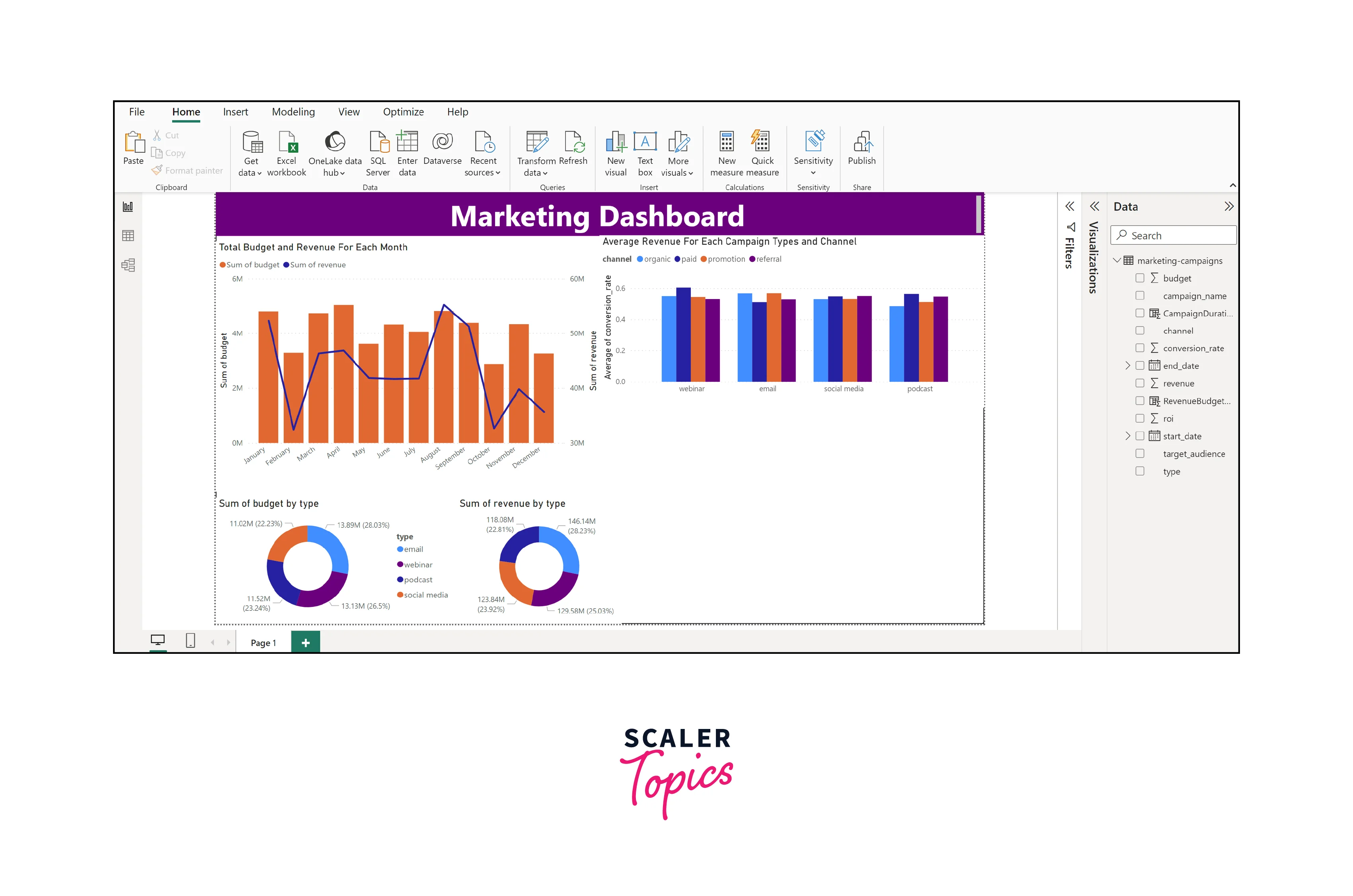
In this Power BI marketing dashboard, we will focus on the following visualizations:
- Total Budget and Revenue Trends Month-Wise (Bar and Line Chart):
This visualization is essential for tracking the overall financial performance of your marketing efforts over time. The bar chart will display the monthly budget, making it easy to identify trends and patterns. The line chart can show the trend lines for revenue, helping you assess whether your marketing activities are meeting their financial targets. - Budget and Revenue Distribution for Each Campaign Type (Pie Chart):
These pie charts are valuable for understanding how your budget is distributed across different campaign types. It provides a clear visual representation of the relative proportions of the budget allocated to email marketing, webinars, social media, podcasts, and other types. This insight helps you allocate resources effectively and prioritize high-performing campaign types. - Average Revenue Generated by Each Channel and Type (Clustered Bar Chart):
The clustered bar chart allows you to compare the average revenue generated by different marketing channels (organic, paid, referral, promo) and campaign types. It helps identify which channels and campaign types are most effective in terms of revenue generation. This information is crucial for optimizing your marketing strategy and resource allocation.
In this continuation of our visualization-building process, we'll expand our Power BI marketing dashboard with additional components:
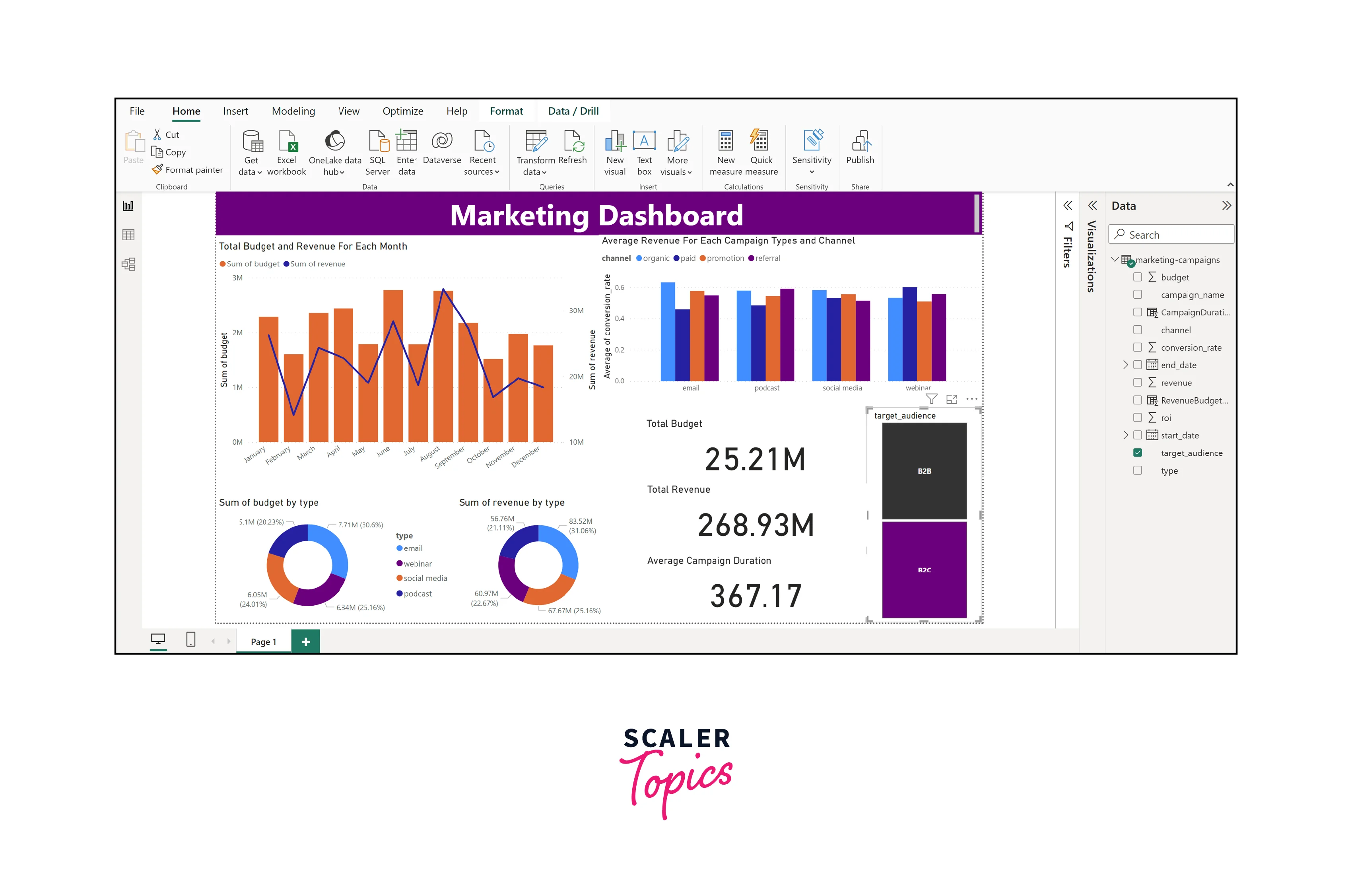
- Card Visualization for Total Budget, Revenue, and Average Number of Campaign Durations:
Card visualizations provide a quick and concise summary of key metrics. They allow users to grasp essential information at a glance. The cards for total budget and revenue provide immediate insights into the financial performance of your marketing efforts. The card displaying the average number of campaign durations is valuable for understanding the typical length of your campaigns. These cards act as high-level indicators, making it easy to assess your marketing initiatives' overall health and performance. - Slicer for Selecting or Filtering on Target Audience Type - B2B, B2C:
Slicers are interactive elements that empower users to filter and customize their data view. In this case, the slicer for selecting or filtering on target audience type (B2B, B2C) adds a layer of interactivity to your dashboard. Users can choose to focus on data specific to their target audience, allowing for more personalized and relevant insights. This feature enhances user engagement and ensures that your dashboard caters to different organizational stakeholders' specific needs and interests.
By incorporating these additional visualizations and interactivity elements, your marketing dashboard becomes a comprehensive and user-friendly tool for exploring and understanding your marketing data. It not only provides a holistic view of your marketing performance but also allows users to drill down into specific details and customize their analysis based on their preferences and objectives. For instance, the below figure shows the marketing dashboard for the B2B target audience.
Dashboard Reporting
Publishing and sharing the dashboard is important, allowing stakeholders to access insights and collaborate seamlessly. Here's how to do it:
- Click "Publish" in Power BI Desktop.
- Choose Power BI Service workspace for report publishing.
- In Power BI Service, open the report, click "Share," and specify the email addresses of recipients.
- Set desired permissions (view or edit).
- Recipients will receive an email invitation with an access link to the shared dashboard.
Conclusion
- By implementing this Power BI marketing dashboard, you've enabled data-driven decision-making within your organization. The ability to visualize and analyze key metrics such as budget allocation, revenue trends, and campaign performance empowers your team to make informed choices that maximize ROI.
- The insights from the dashboard's visualizations and interactive elements allow you to allocate marketing resources more effectively. You can identify high-performing campaign types, channels, and target audience segments, ensuring that resources are directed toward strategies that yield the best results.
- Including slicers and interactive elements in the dashboard enhances user experience by enabling customization. Team members can filter data by target audience type, allowing them to view and analyze data most relevant to their specific roles and responsibilities.