Page Layout and Formatting in Power BI
Overview
In the world of data visualization, Power BI, a business intelligence platform developed by Microsoft, stands as a formidable tool. Beyond data analysis and compelling visualizations, its prowess lies in its ability to present insights effectively. This article delves into the art of Power BI page layout and formatting, exploring the key elements that empower you to transform raw data into compelling, informative visuals. Power BI page layout involves arranging visuals strategically on your report canvas, while formatting encompasses fine-tuning fonts, colors, and other design elements. We'll guide you through the process of creating visually appealing and engaging reports in Power BI, enhancing your data storytelling capabilities.
Navigating the Power BI Desktop Interface
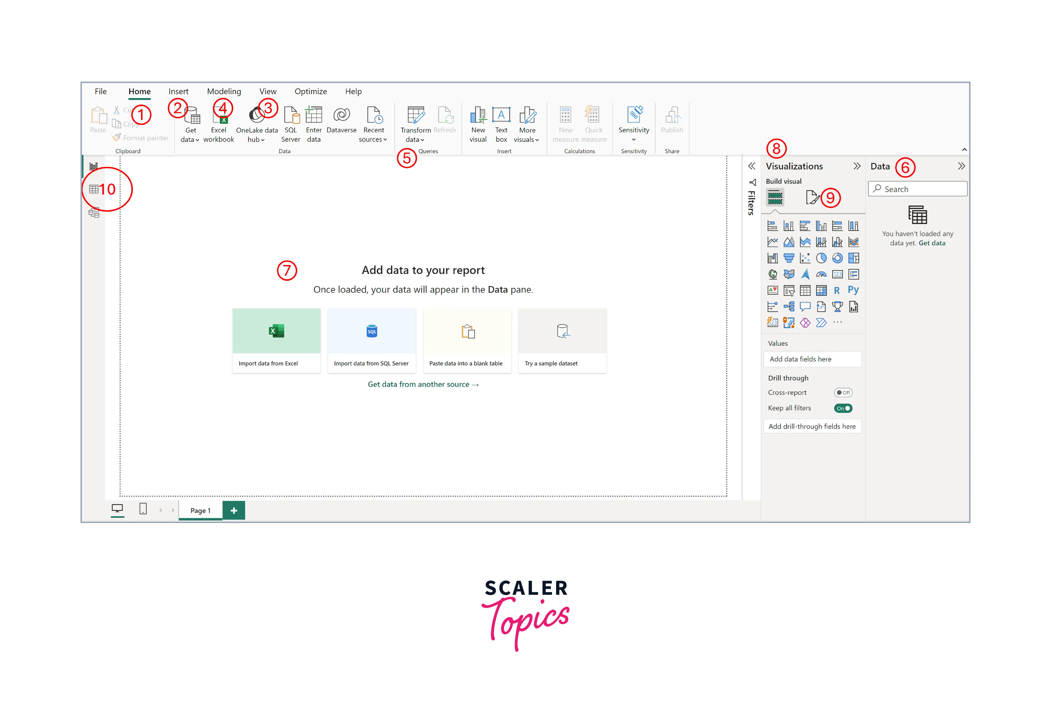
Before we delve into the intricacies of Power BI page layout and formatting, it's essential to familiarize ourselves with the tool's user-friendly interface. Power BI Desktop provides a robust environment for creating, designing, and fine-tuning your reports and dashboards.
- Home Tab:
The starting point for your Power BI journey. Here, you can create new reports, open existing ones, and access recent projects. It's also where you'll find options for publishing and sharing your reports. - Insert Tab:
This tab is your gateway to adding various report elements, such as visuals, text boxes, shapes, and images. It's where you begin building the structure of your report. - View Tab:
Here, you can control how your report appears while editing by applying various themes. Additionally, the View tab offers options for managing grids and guides, such as snap to grid, which are valuable aids for precise page layout. - Modeling Tab:
If you're working with complex data models, this tab becomes crucial. It allows you to define relationships between data tables, create new columns, measures, and tables, and manage relationships. - Transform Data:
This option opens Power Query Editor, where you can manipulate and clean your data before it enters your report. Data preparation is a foundational step in effective report creation. You can find this option under the Home tab. - Data Pane:
Located on the right side, this pane displays all the data fields available for your report. You can drag and drop fields onto the canvas to start building visuals. - Canvas:
The main workspace where you arrange visuals, tables, and other report elements. It's here that your page layout takes shape. - Visualizations Pane:
To the right of the canvas, you'll find this pane, which allows you to select and format visuals. You can also add data fields to specific visualizations from here. - Format Pane:
This is your go-to place for formatting. Whether it's adjusting font sizes and colors or applying themes, the Format Pane offers extensive customization options. - Report/Table/Model View:
It is located on the left side, and you can switch to different views using it.
Designing Effective Pages and Reports
Creating compelling and informative reports in Power BI hinges on thoughtful design. Here are a few of the key strategies and best practices for designing and developing effective pages and reports:
- Begin by establishing a clear hierarchy on your report pages. Prioritize the most critical information and visuals at the top, ensuring that viewers can grasp essential insights at a glance. Use grouping and layout options to organize visuals logically.
- Maintain a consistent look and feel across your report pages. Use the same color schemes, fonts, and styling elements throughout to reinforce your brand identity and make the report visually cohesive.
- Embrace whitespace to enhance readability. Adequate spacing around visuals and text elements prevents clutter and allows your audience to focus on the data. Avoid cramming too much information onto a single page.
- Leverage interactive features like slicers, filters, and drill-through options to empower users to explore the data on their terms. Interactive elements enhance engagement and enable deeper analysis.
- Narrate a compelling data story by guiding viewers through your report. Use text boxes, titles, and annotations to provide context and insights. Explain trends, outliers, and key takeaways to ensure data comprehension.
- Consider the device on which your report will be viewed. Power BI offers responsive design options to optimize the report's layout for different screen sizes, ensuring a seamless user experience on desktop, tablet, and mobile devices.
Formatting Visualizations for Clarity
When it comes to data visualization, how you present information greatly influences how well it's understood. Power BI provides a range of formatting options to enhance the clarity of your visuals. Let's explore three key aspects, as mentioned below:
Adjusting Colors, Fonts, and Styles
- Choose a color palette that compliments your data and conveys meaning. Highlight important data points with distinct colors and use color legends to provide context.
- Consistency in font choices contributes to readability. Select fonts that align with your report's theme and maintain uniformity.
- Customize visual styles by adjusting backgrounds, borders, and shapes. This can help direct attention and make visuals more appealing.
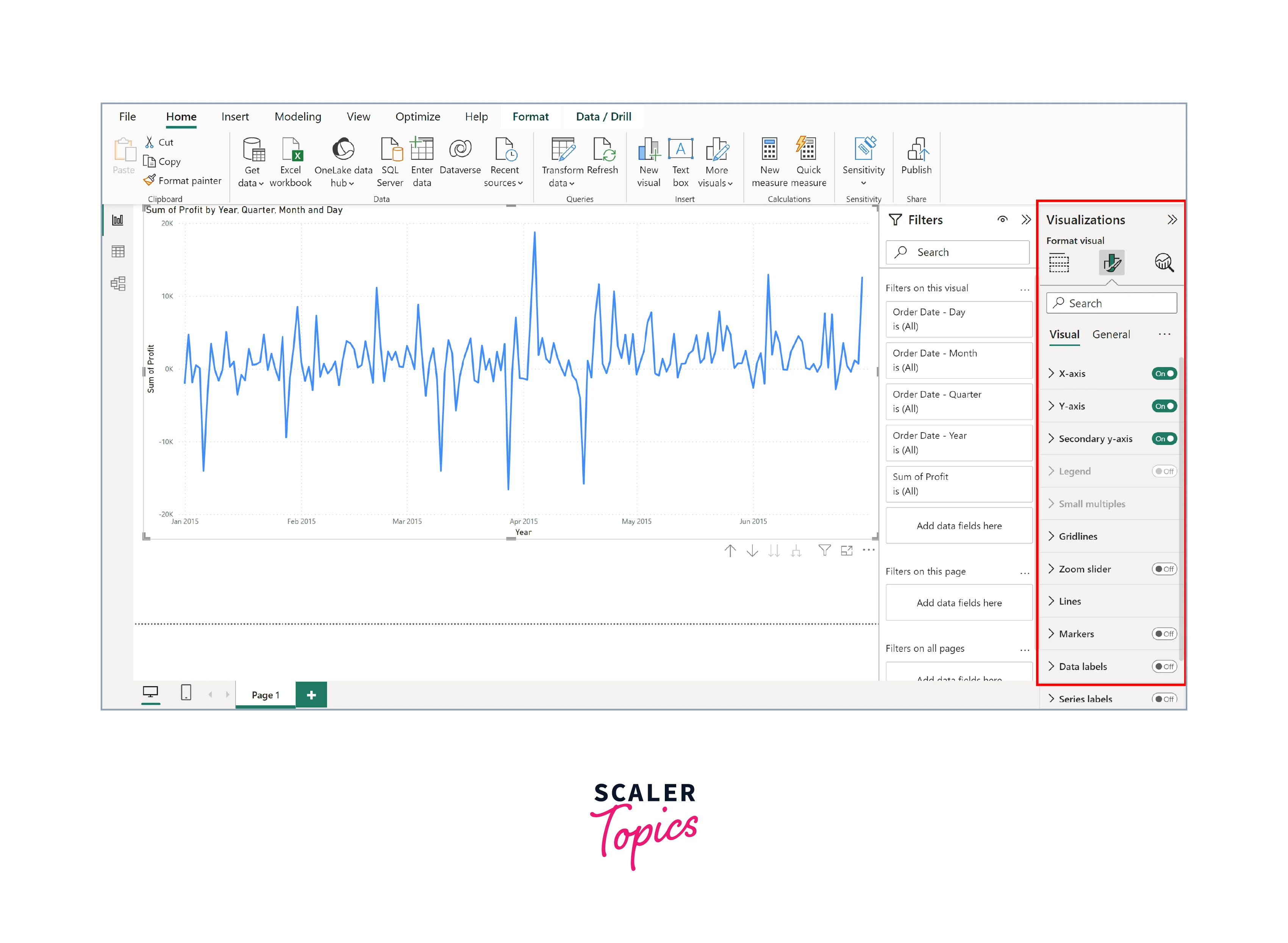
- You can adjust fonts, colors, and style by using these steps:
- Select the visual you wish to modify in terms of colors, fonts, or style.
- Access formatting options within the Format pane after selecting a visual. Customize colors, fonts, and styles under various sections like Axes, Title, and Effects.
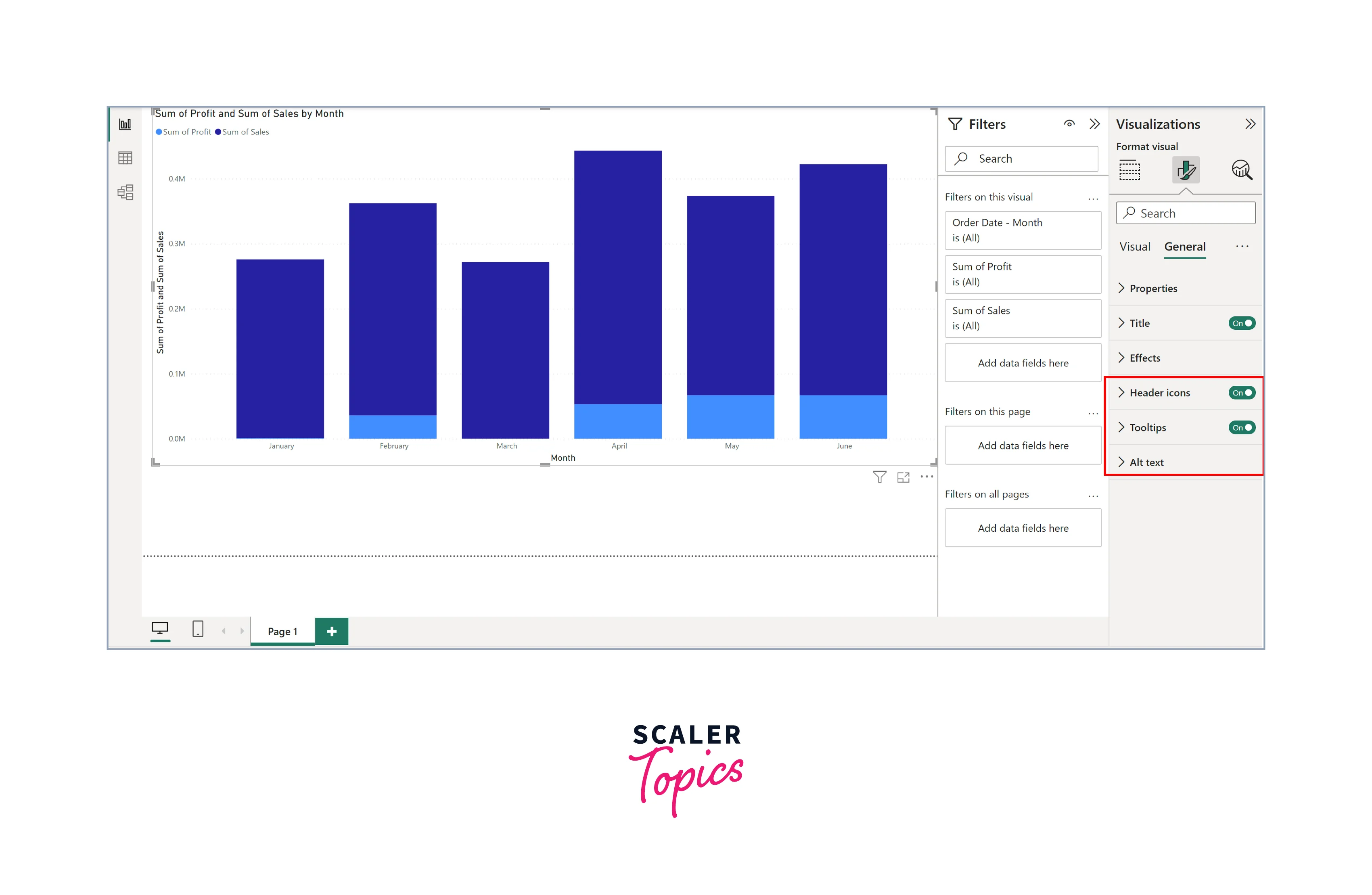
Enhancing Data Labels and Tooltips
- Add data labels to your visuals to display specific values directly on the charts. This makes it easier for viewers to interpret data, especially in bar charts or scatter plots.
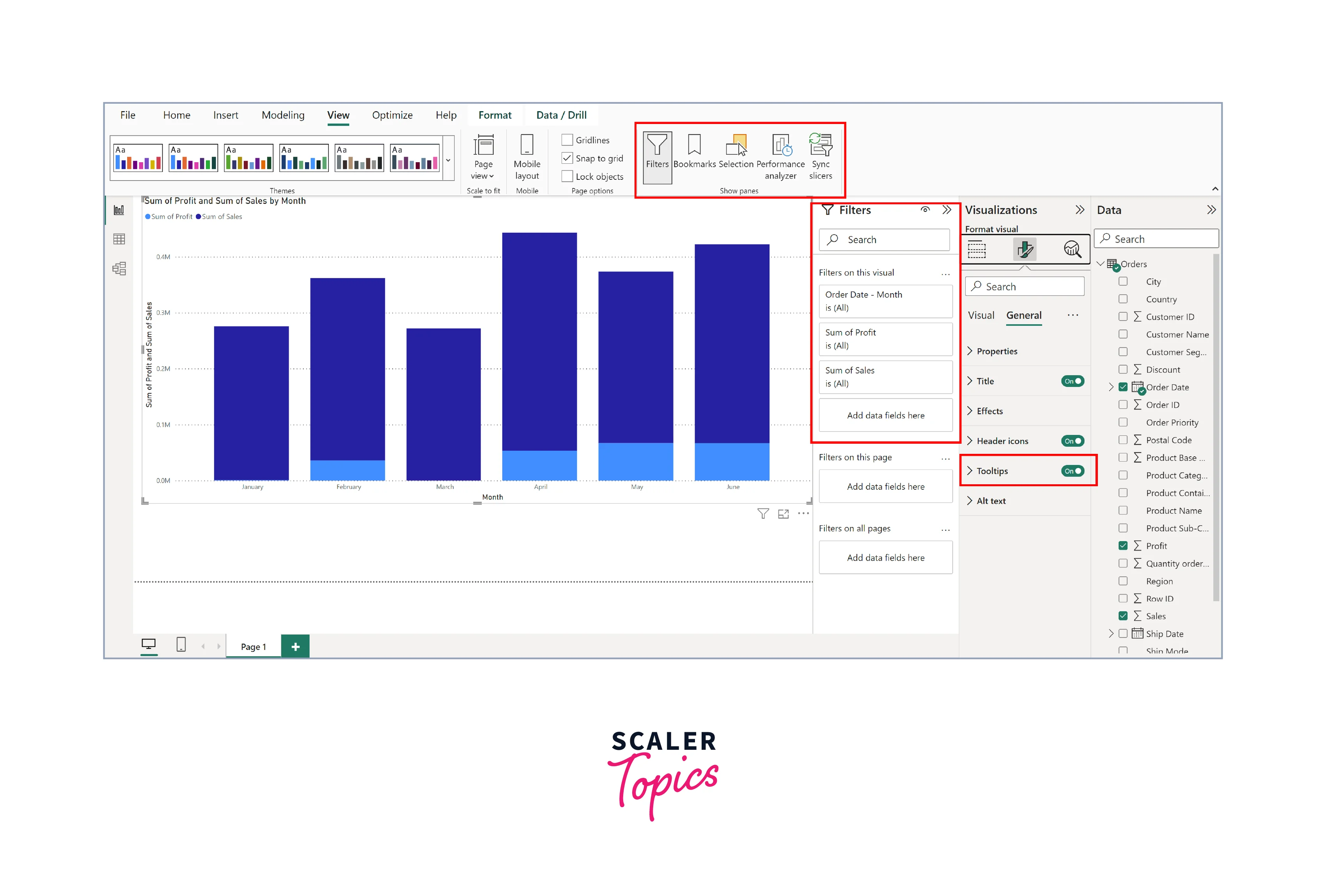
- Tooltips provide additional context when users hover over data points. Customize tooltips to show relevant information, such as category names or percentages.
- To adjust/modify data labels and tooltips, you can go to the Format pane, expand the data labels or tooltips section, and toggle the relevant options. You can control what information is displayed and how it appears.
Utilizing Themes and Report Templates
- Power BI offers pre-designed themes and the option to create custom ones. Themes encompass colors, fonts, and other visual elements. Consistent theme application across your report ensures a polished and professional appearance. To apply themes of your choice, in the Power BI Desktop, go to the "View" tab, select "Themes", and apply or customize existing themes. You can also import custom themes created externally.
- Save time and maintain consistency by using report templates. You can create templates with predefined layouts, visuals, and formatting, allowing you to replicate the same style across multiple reports. For creating report templates, design a report template by arranging visuals and formatting settings. Save this as a Power BI template (.pbit) for reuse.
Utilizing Grids, Alignment, and Snapping
In the realm of effective Power BI page layout and formatting, the precise placement of visuals plays a pivotal role. Grids, alignment tools, and snapping features are your allies in achieving a visually appealing and organized report. Incorporating these grid, alignment, and snapping features into your Power BI report design process allows you to create visually appealing and well-organized pages that enhance the overall user experience. Here's how to harness their power:
-
Gridlines:
Power BI provides gridlines and guides to assist with precise alignment. These aids help you maintain consistent spacing between visuals, ensuring a neat and orderly appearance. Activate gridlines through the "View" tab to align elements effortlessly.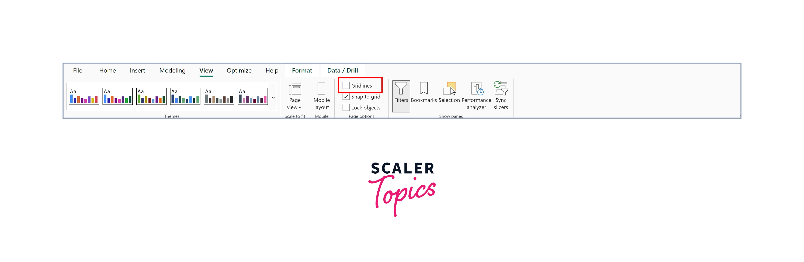
-
Alignment Options:
Take advantage of alignment options in Power BI to achieve pixel-perfect placement. You can align visuals horizontally or vertically, distribute them evenly, or match the size of selected items for a harmonious layout. -
Snapping to Grid:
Enable snapping to grid for automatic alignment. This feature ensures that when you move or resize visuals, they "snap" to the nearest grid point. It simplifies the task of arranging visuals precisely without manual adjustments.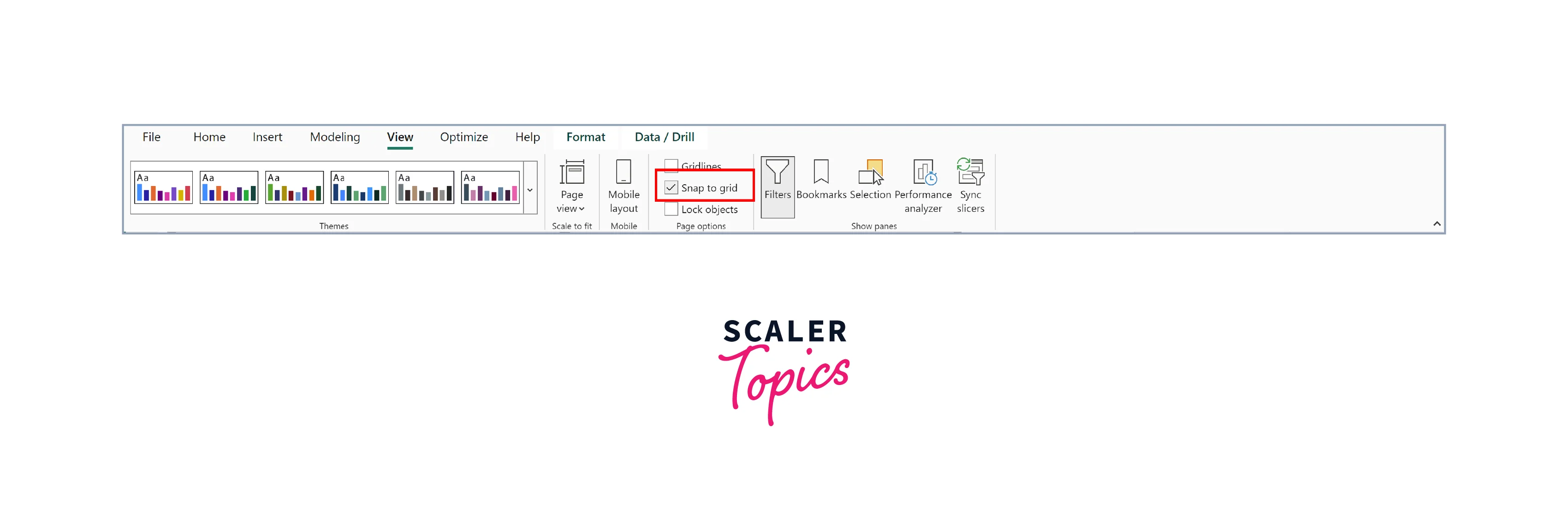
Page Interactivity and Navigation
Creating interactive and user-friendly reports in Power BI goes beyond aesthetics; it's about engaging your audience and facilitating data exploration. By incorporating these interactive features and navigation aids, your Power BI report becomes a dynamic tool that not only presents data but also invites users to explore and gain insights actively. It's about transforming static reports into interactive data experiences, making your data storytelling more compelling and impactful. To make your reports interactive and engaging, you can follow the below tips:
- Bookmarks and Buttons:
Start by using bookmarks to capture the current state of a report page, including filters, slicer selections, and visuals. You can then create buttons and actions linking to these bookmarks, allowing users to navigate the report effortlessly. This enables a guided storytelling experience and lets viewers focus on specific insights. - Drill-Through:
Implement drill-through actions to enable users to explore detailed information. Define drill-through fields that users can click on to access additional pages or insights related to a specific data point. It empowers users to dive deeper into the data. - Filters and Slicers:
Leverage filters and slicers to grant users control over the displayed data. Interactive filters enable users to refine their view, while slicers provide a more granular way to filter data by specific criteria. Both tools enhance user engagement and data exploration. - ToolTips for Interactivity:
Utilize tooltips creatively to provide additional context or insights when users hover over visuals or data points. This enhances the interactivity and explanatory power of your report.
Conclusion
- Power BI page layout and formatting are not just about aesthetics; they are the tools that transform raw data into powerful insights. A well-structured report with visually appealing elements can captivate your audience and convey the story hidden within the numbers.
- Page interactivity and navigation allows you to engage your audience and empower them to explore data on their terms. Features like bookmarks, drill-throughs, and interactive filters turn passive viewers into active participants in the data analysis process.
- Whether you're a beginner or a business professional, mastering the art of page layout, formatting, and interactivity in Power BI can elevate your reporting game.