Retail Dashboard with Power BI
Overview
In today's fast-paced retail landscape, data is the key to making informed decisions and gaining a competitive edge. Retailers collect vast amounts of information daily, from sales transactions to customer behavior, inventory levels, and market trends. But how can this data be transformed into actionable insights? The answer lies in the world of data visualization and business intelligence tools. In this article, we embark on a journey to harness the power of data analysis by building a comprehensive retail dashboard using a Power BI retail analysis sample dataset. Whether you are a seasoned data analyst or a retail manager looking to make data-driven decisions, this guide will walk you through the process of creating an intuitive and insightful retail dashboard that can provide real-time visibility into your retail operations.
What are we Building?
In this article, we will design and build a dynamic retail dashboard using Power BI. This dashboard will provide at-a-glance insights into sales trends, top-selling products, and country-wise insights for retail businesses.
Pre-requisites
Here's a list of prerequisites to create a Sales Dashboard Using Power BI -
- Power BI Desktop - Ensure you have Power BI Desktop installed on your computer. You can download it from the official Microsoft Power BI website.
- Familiarity with Data Analysis - A basic understanding of data analysis concepts, such as data types, aggregation, and trends, will be helpful.
- Basic Excel Skills - A foundational knowledge of Excel is beneficial for data preprocessing and manipulation before importing into Power BI.
- Visualization Concepts - Basic comprehension of data visualization principles and chart types, like bar charts, line graphs, and pie charts.
How are we going to build this?
We'll begin by importing our retail dataset into Power BI, ensuring data cleanliness and structure. This involves cleaning, transforming, and shaping data for analysis. We'll enrich our dataset by creating calculated columns, such as total sales amount, price, etc. We'll leverage Power BI's rich library of visualizations to create charts, graphs, and tables highlighting sales trends, top-selling products, etc. Slicers will be added to enhance interactivity, allowing users to filter data by time periods and regions for a more customized view.
Building Retail Dashboard with Power BI
Let’s explore the various steps involved in creating a retail dashboard using the Power BI retail analysis sample dataset -
Data Connection
The first crucial step in building our retail dashboard with Power BI is establishing a connection to our retail dataset. For this project, we will utilize a Power BI retail analysis sample dataset consisting of sales data from 2009-2011. You can also download this dataset from here. This dataset contains comprehensive information about product details, quantities, prices, countries, invoice dates, etc. Establishing this data connection is the foundation upon which we will build insightful visualizations and metrics to build the retail dataset.
To connect to a data store using Power BI -
- Open Power BI Desktop.
- Click "Home" > "Get Data" > select your data source (e.g., Excel, CSV, database).
- Browse and select your dataset, then follow the prompts to configure the connection and load data into Power BI.
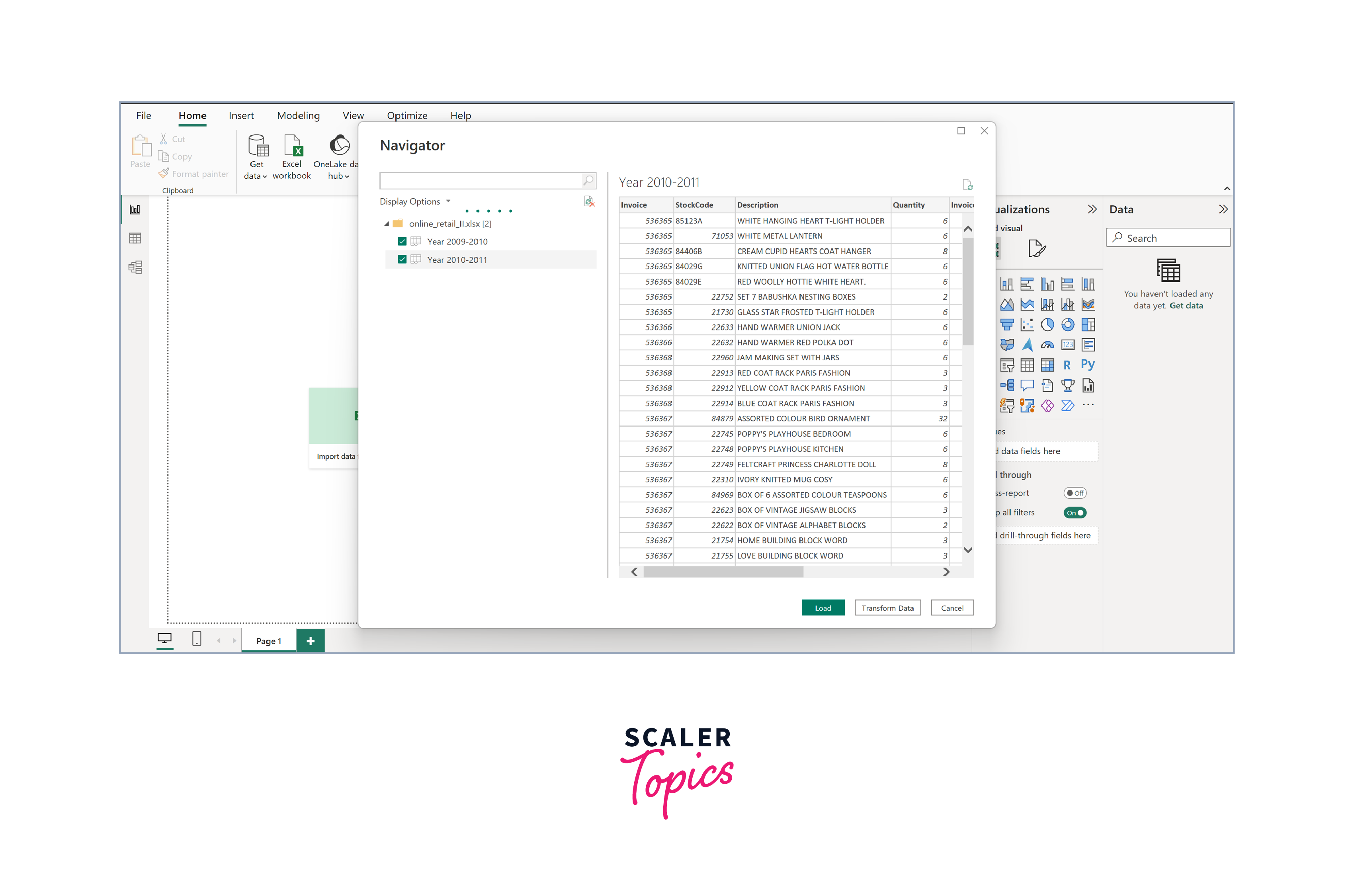
As evident from the image above, the dataset comprises two distinct sheets or tables - one dedicated to sales data for the period 2009-2010 and the other specific to 2010-2011.
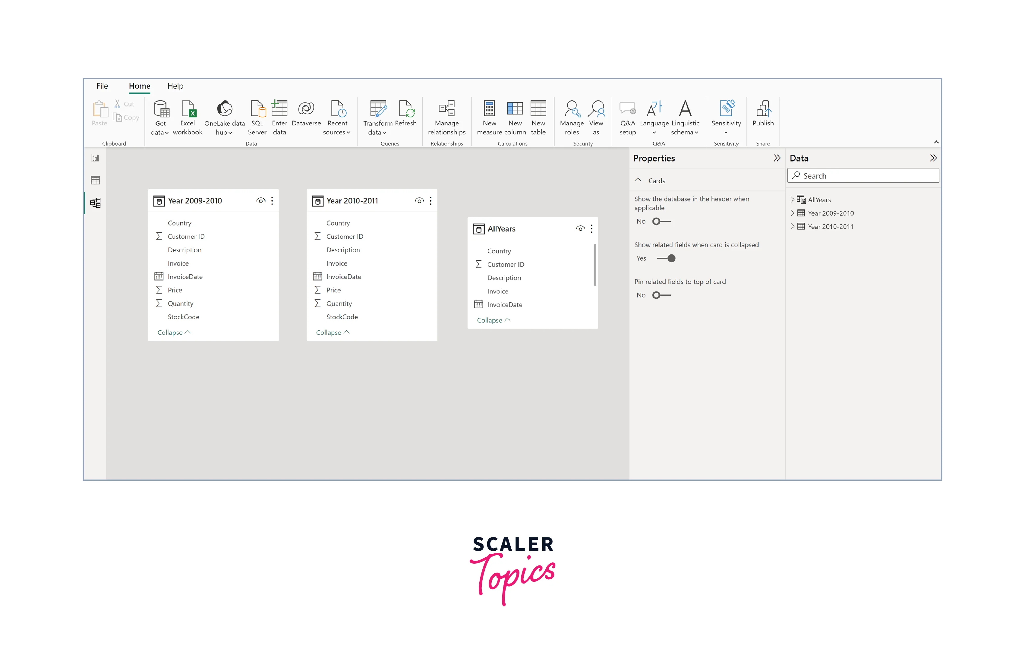
Data Model Creation
In this step, we'll construct our data model in Power BI, combining the two separate sales data tables (one for 2009-2010 and the other for 2010-2011) into a unified, cohesive dataset. Additionally, we'll check relationships between all relevant tables for seamless data analysis.
To merge the two sales tables into one, you'll employ Data Analysis Expressions (DAX) to create a new calculated table or use the "Append Queries" feature to stack them on top of each other. Furthermore, we will introduce a new feature within our data model, specifically designed to represent the total sales price for each transaction. This newly derived feature will be calculated by multiplying the quantity of a product sold by its respective unit price.
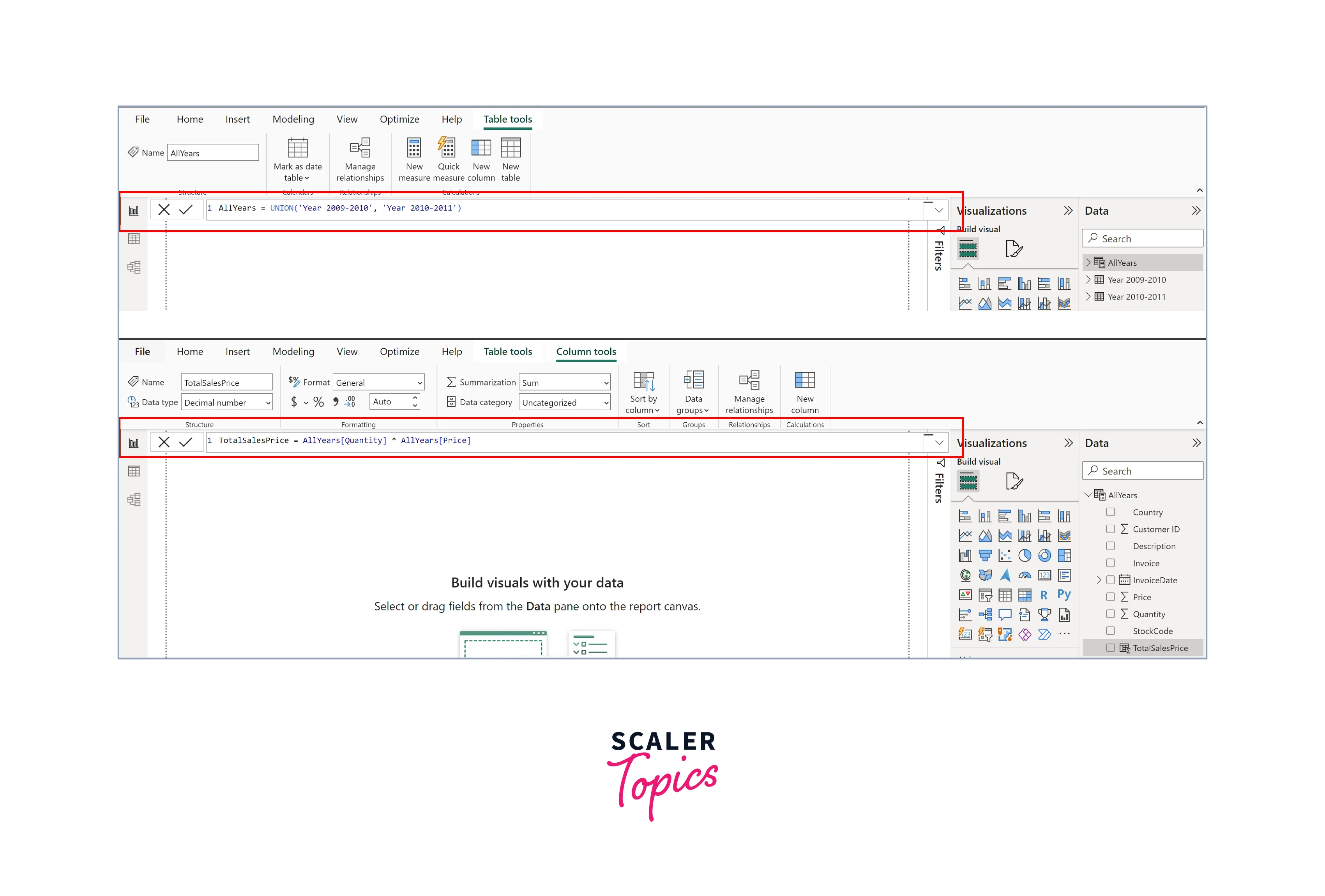
Power BI is excellent at automatically detecting relationships between tables based on common fields. In our case, where we are dealing with data from different time periods, no automatic relationships will be established. This step will give you a well-structured data model that combines historical sales data. This foundation is crucial for creating our retail dashboard, providing a unified dataset ready for powerful insights and visualizations.
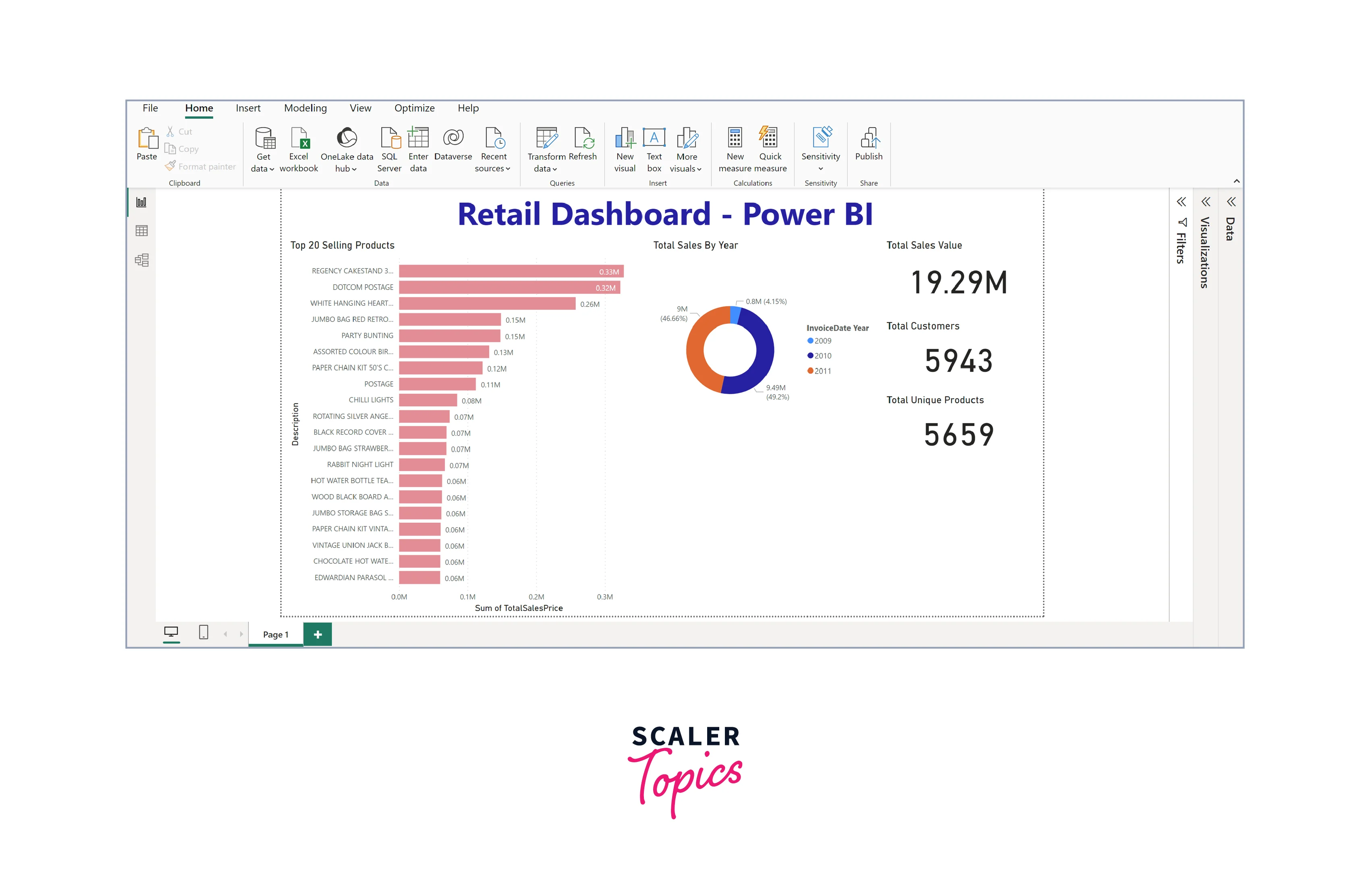
Creating Visualizations
Now that our data model is set, we can move on to the exciting part—creating visualizations that will transform raw data into actionable insights. To create these visualizations in Power BI -
- Drag and drop the required fields onto the visualization area.
- Choose the appropriate visualization type (bar, line, or pie chart).
- Customize the visualizations by configuring labels, colors, and other settings.
In this project, we will focus on the following visualizations -
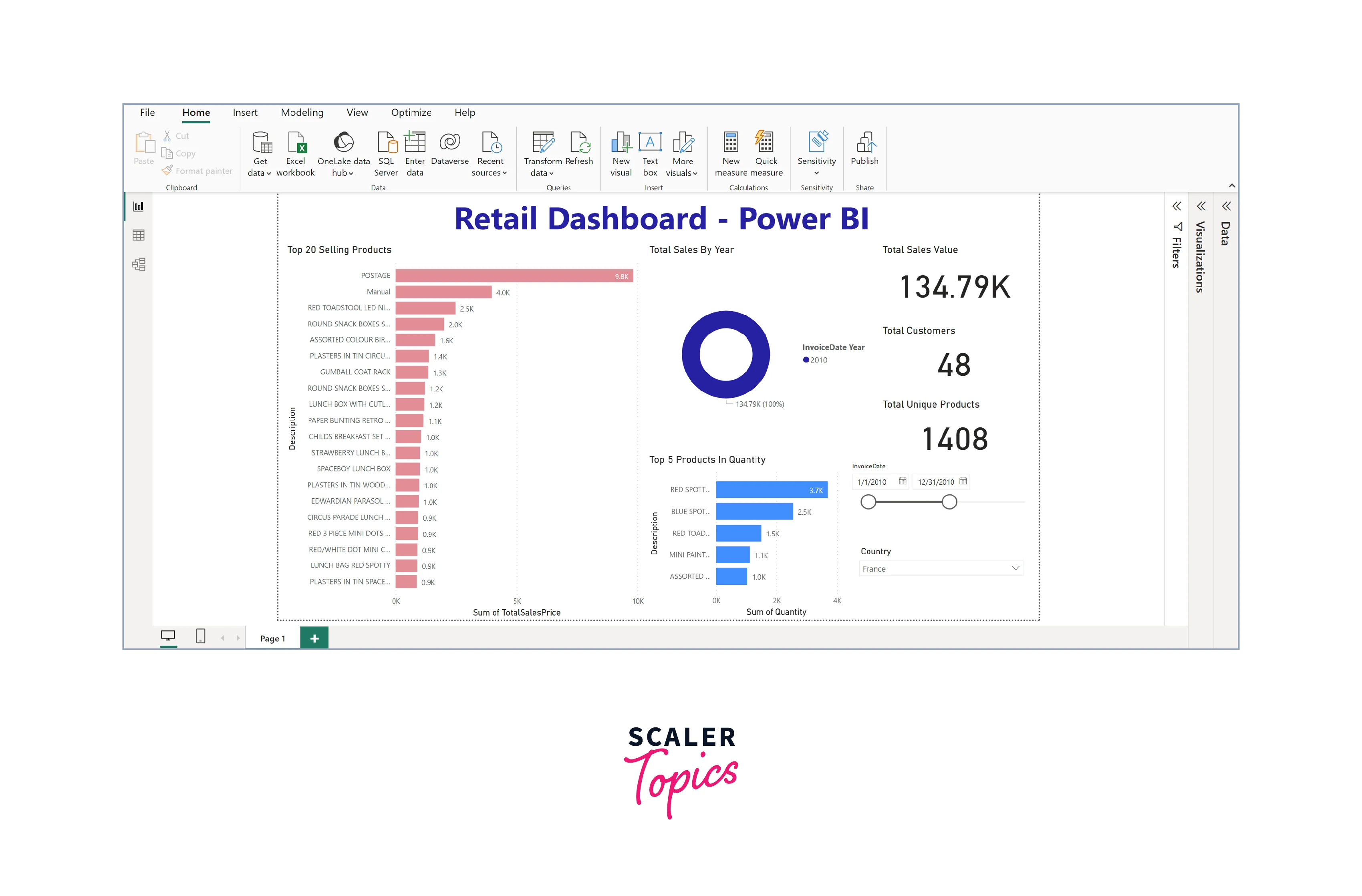
- Top 20 Selling Products by Sales (Horizontal Bar Chart) - This horizontal bar chart serves as a powerful tool to identify the top-performing products in terms of sales revenue. It allows us to quickly pinpoint which products drive most of our revenue, aiding inventory management and marketing strategies. Understanding the top sellers is crucial for optimizing product offerings and marketing campaigns.
- Sales Trends by Year (Pie Chart) - The pie chart showcasing sales trends by year provides an overview of how your retail business has performed over time. This insight is essential for planning inventory levels, staffing, and marketing efforts to align with historical sales trends.
- Total Sales, Customers, and Products (Card Visualization) - The card visualization displays key performance indicators (KPIs) such as total sales, customers, and products. These cards act as a quick reference, offering a snapshot of the overall health of your retail business. They are invaluable for monitoring progress toward business goals and identifying areas that require attention.
In this continuation of our visualization-building process, we'll expand our retail dashboard with additional components -
- Top 5 Products by Quantities (Horizontal Bar Chart) - This horizontal bar chart showcases the top 5 products by quantities sold. It provides essential insights into which products are in high demand, helping you adjust inventory levels, procurement strategies, and marketing efforts accordingly. Identifying the best-selling products by quantity ensures you can efficiently meet customer demands.
- Slicers for Date and Country Filtering - Slicers offer interactivity and customization to your dashboard. By incorporating date and country slicers, you empower users to filter data according to specific timeframes or geographical regions. This feature is invaluable for gaining localized insights, analyzing regional sales trends, and making date-specific comparisons. Users can tailor the dashboard to their needs, allowing for a more focused and insightful analysis.
You enhance your versatility and user-friendliness by including these elements in your retail dashboard. Users can explore data in greater detail, making it easier to identify trends, patterns, and correlations within specific contexts, ultimately leading to more informed decision-making in the dynamic retail landscape. For instance, the below figure shows sales and other trends for the France country and for 2010.
Dashboard Reporting
Publishing and sharing the dashboard is crucial, allowing stakeholders to access insights and collaborate seamlessly. Here's how to do it -
- Click "Publish" in Power BI Desktop.
- Choose Power BI Service workspace to publish to.
- In Power BI Service, open the report, click "Share," and specify recipients' email addresses.
- Set permissions (view or edit).
- Recipients receive an email invitation with a link to the shared dashboard.
Conclusion
- The retail dashboard built with Power BI empowers businesses to make data-driven decisions. It provides valuable insights into top-selling products, sales trends, and key performance metrics, enabling smarter inventory management, targeted marketing, and strategic planning.
- Including slicers for date and country, filtering allows users to tailor their analysis, providing localized and time-specific insights. This adaptability enhances the dashboard's relevance to different departments and regions within the retail organization.
- The dashboard streamlines the process of extracting critical information by visualizing data through charts, graphs, and cards. This efficiency helps identify growth opportunities, optimize resources, and promptly address challenges.