Introduction to Visualization with Power BI
Overview
In the rapidly evolving landscape of data analysis and business intelligence, Power BI has emerged as a powerful business intelligence tool for transforming raw data into insightful visualizations. This article serves as an introduction to the realm of data visualization using Power BI. This article explores why data visualization is important and briefly introduces various Power BI visualizations and steps to create visualizations in Power BI.
What is Data Visualization?
Data visualization involves transforming complex datasets into visual representations that are easily understandable, revealing patterns, trends, and insights that might otherwise remain hidden in rows and columns of numbers. Visualizations serve as a bridge between raw data and human comprehension, allowing us to absorb information quickly, make comparisons, and draw conclusions. From basic bar charts to heat maps and interactive dashboards, Data visualization enables us to communicate complex information effectively, making it accessible to a wide range of audiences, regardless of their technical expertise.
Visual representations of data leverage our innate ability to process visual information quickly. Our brains are wired to recognize patterns, spot anomalies, and draw connections between elements within visuals. This cognitive advantage makes data visualization a powerful tool for analysis and decision-making.
In the context of Power BI visualizations, it takes on a new dimension. Power BI provides a user-friendly interface and many tools that allow you to create interactive and dynamic visualizations from your data sources. Power BI empowers you to tell compelling stories with your data, from basic charts and graphs to intricate dashboards, fostering a deeper understanding of trends, correlations, and insights.

Importance of Data Visualization
Data visualization plays a pivotal role in modern data-driven decision-making processes. Here are several key reasons why data visualization is of paramount importance -
- Enhanced Understanding - Visualizing data transforms abstract numbers into meaningful insights, allowing stakeholders to grasp complex relationships, trends, and patterns at a glance.
- Quick Identification of Trends - Visual representations expedite the identification of trends, outliers, and anomalies, enabling timely responses to changing conditions or opportunities.
- Effective Communication - Visuals transcend language barriers, making it easier to communicate insights to diverse audiences, from technical experts to non-technical stakeholders.
- Informed Decision-Making - Well-crafted visualizations empower decision-makers with a clear, data-backed understanding of situations, resulting in more informed and confident choices.
- Storytelling - Visualizations have a narrative power that textual data lacks. They enable the creation of compelling stories that engage audiences and drive impactful discussions.
- Data Exploration - Interactive visualizations, such as those offered by Power BI, allow users to explore data from multiple angles, encouraging deeper analysis and discovery of hidden insights.
What is Power BI Desktop Visualization?
Power BI Desktop is a robust and feature-rich business intelligence tool that serves as the foundation for creating, designing, and refining visualizations before they are published to the dashboards/reports. It offers a comprehensive suite of tools and features, enabling users to transform raw data into meaningful and interactive visual narratives.
At its core, Power BI empowers users to connect to various data sources, whether they reside in local files, databases, cloud services, or online platforms. Once connected, users can shape and model the data using a user-friendly interface, ensuring the information is structured and organized for effective visualization. One of the standout features of Power BI is its diverse array of Power BI visualizations options. Users can select from a wide range of chart types, such as column charts, pie charts, scatter plots, and more, to best represent the data's underlying patterns and relationships. Additionally, Power BI Desktop allows for customizing colors, fonts, labels, and other visual attributes to align with branding guidelines or specific presentation requirements.
The interactivity and dynamic nature of Power BI visualizations enhance the overall user experience. Users can create interactive reports and dashboards by adding filters, slicers, and drill-through actions, allowing consumers of the visualizations to explore the data from different angles and levels of detail. This level of interactivity transforms static data into a dynamic and engaging analytical experience.
Types of Power BI Charts
Power BI offers a diverse range of chart types, each tailored to represent specific data types and patterns. Here's an overview of some of the key Power BI visualizations chart available -
- Column Chart - Compares data values using vertical columns, making it easy to discern relative magnitudes.
- Bar Chart - Similar to the column chart but with horizontal bars, suitable for categorical comparisons.
- Line Chart - Displays trends over time, making it ideal for illustrating changes and patterns in data.
- Area Chart - Depicts cumulative data trends, revealing proportions and variations.
- Pie Chart - Represents parts of a whole, useful for displaying percentages and proportions.
- Donut Chart - Similar to a pie chart, with a hole in the center, allowing for additional data display.
- Scatter Plot - Shows relationships between two variables, indicating correlations and outliers.
- Bubble Chart - Extends the scatter plot by adding a third data dimension, displayed as varying bubble sizes.
- Map - Visualizes geographical data, offering insights based on location.
- Treemap - Displays hierarchical data structures with nested rectangles, revealing proportions and patterns.
- Gauge Chart - This represents a single value within a specified range, akin to a speedometer.
- KPI Visual - Key Performance Indicators (KPIs) presented with icons or shapes, quickly conveying performance status.
- Card Visual - Displays single data values as cards, useful for presenting summary information.
- Matrix Visual - Arranges data in a grid format, facilitating comparisons and detailed analysis.
- Table Visual - Presents data in tabular format, offering a straightforward view of raw information.
How to Create a Power BI Visualization?
Creating Power BI visualizations is a straightforward process that involves a series of steps, allowing you to transform your raw data into a compelling and informative visual representation. Here's a step-by-step guide to help you get started -
Step 1. Connect to Data
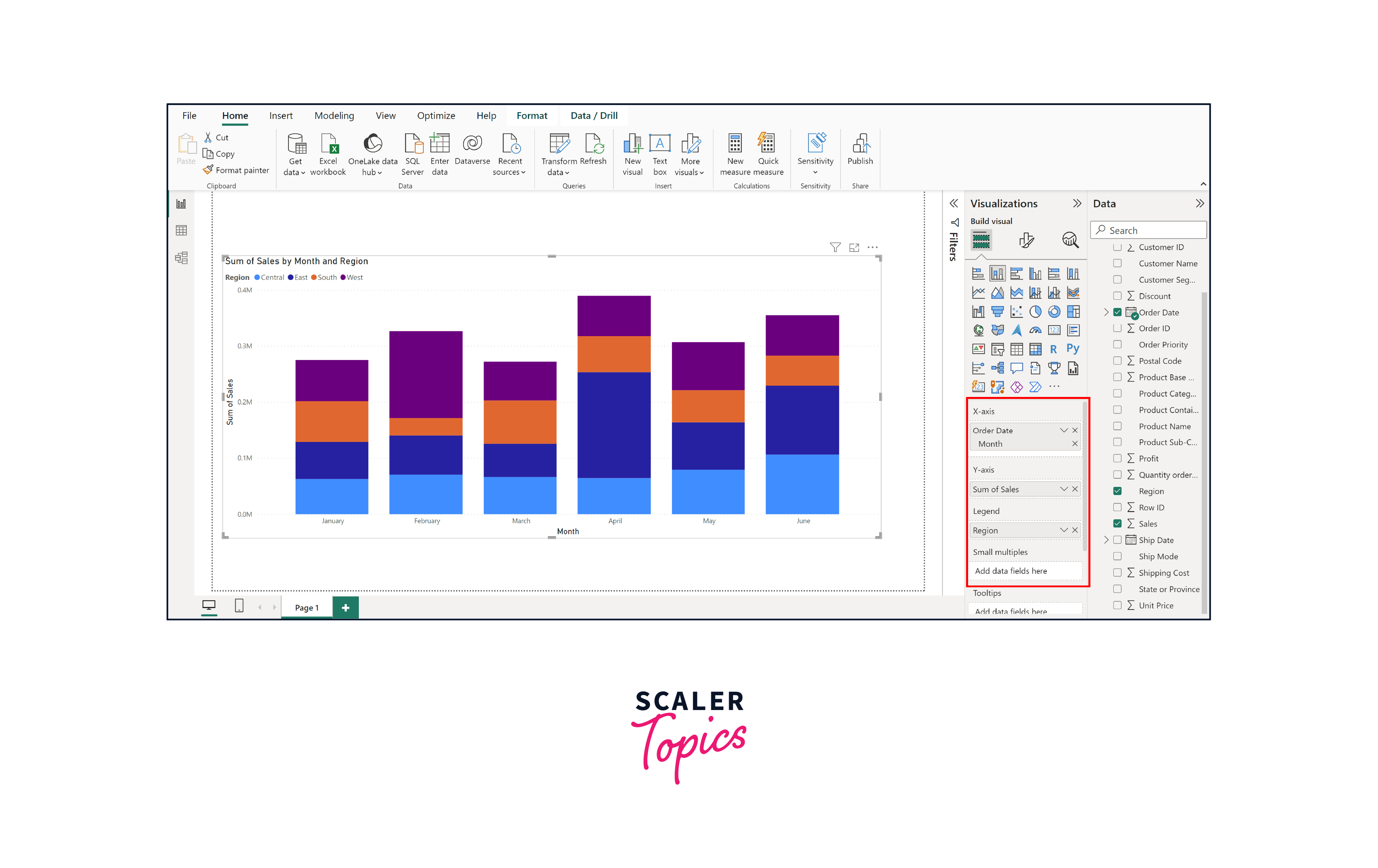
Open Power BI Desktop and click on the "Home" tab. Choose your data source by clicking "Get Data" and selecting the appropriate connection method (e.g., Excel, SQL Server, Online Services). Follow the prompts to establish the data connection. Once data is loaded, you can also clean, transform, and shape your data using a range of tools available in Power BI. For the purpose of this example, we will import the Sales Orders Dataset pertaining to US Super Stores using an Excel spreadsheet.

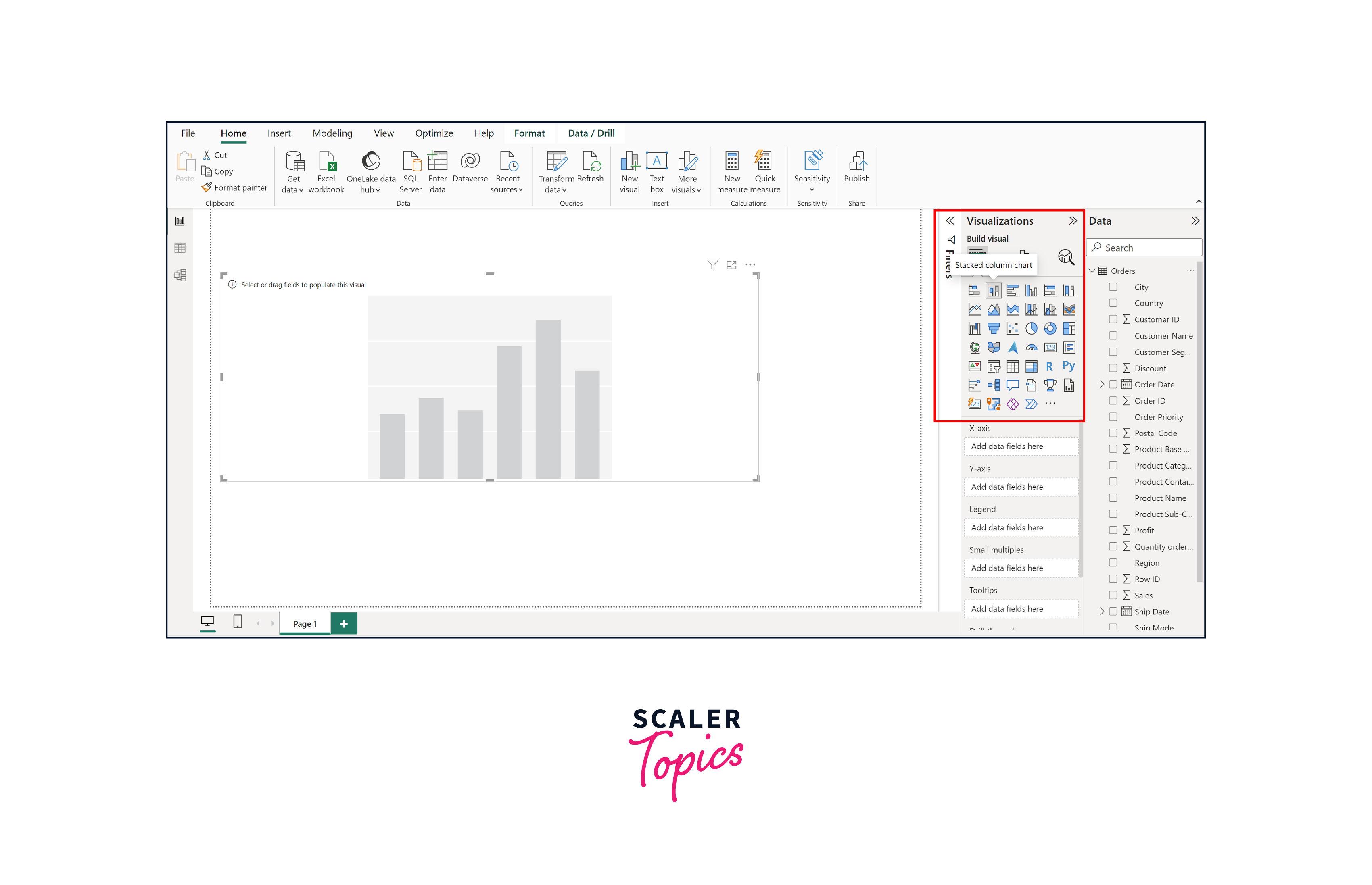
Step 2. Choose a Visualization
Once your data is prepared and transformed, navigate to the "Visualizations" pane on the right. Select the type of visualization you want to create (e.g., bar chart, line chart, pie chart) by clicking on the corresponding icon.
Step 3. Configure Fields
In the "Fields" pane, drag and drop the appropriate data fields into the visualizations' placeholders. Assign fields to categories such as Axis, Values, Legend, and Tooltips based on the type of chart you're creating. In this instance, we will generate a bar chart that showcases sales on a monthly basis across all stores for each region.
Step 4. Customize Visualization
Use the "Format" panes to customize the appearance of your visualization. Adjust colors, axis, legends, labels, titles, and other visual attributes to align with your intended message and aesthetics, as shown in the figure below.

Step 5. Add Interactivity
Enhance your visualization's interactivity by adding slicers, filters, and drill-through actions. These features allow users to interact with the data and explore different aspects of the visualization.
Advantages And Disadvantages Of Using Power BI For Visualization
Advantages of Power BI Visualizations
Here are some of the advantages of using Power BI visualizations -
- User-Friendly Interface - Power BI boasts an intuitive interface that caters to both beginners and experienced users. Its drag-and-drop functionality and pre-built templates facilitate the quick and effortless creation of visualizations.
- Data Integration - Power BI seamlessly integrates with various data sources, whether they are local files, cloud-based databases, or online services. This versatility ensures easy access to a wide array of data.
- Interactive Visuals - The interactive nature of Power BI visualizations empowers users to explore data dynamically. Filters, slicers, and drill-through capabilities enable deeper insights and better data comprehension.
- Rich Collection of Visual Elements - Power BI provides an extensive library of visualization types, allowing users to choose the most suitable format for their data. From basic charts to advanced visuals, the options are diverse and customizable.
- Real-Time Updates - Power BI can connect to live data sources, ensuring that visualizations display the latest information. This real-time aspect enhances decision-making by providing up-to-date insights.
- Collaboration and Sharing - The Power BI service allows for seamless sharing of visualizations with colleagues and stakeholders. Reports and dashboards can be shared via secure links or embedded in other applications.
Disadvantages of Power BI Visualizations
Here are some of the disadvantages of using Power BI visualizations -
- Learning Curve - While user-friendly, Power BI's extensive capabilities may have a learning curve for beginners. Advanced features, such as DAX formulas, might require additional time and effort to master.
- Data Volume Limitations - The free version of Power BI has limitations on data refresh frequency and storage capacity. Heavy users or organizations dealing with massive datasets may need to invest in premium versions.
- Licensing Costs - While Power BI offers free access, more advanced features and higher data capacities come with premium licensing costs. This could impact budget considerations for organizations.
- Customization Constraints - While Power BI provides a significant degree of customization, highly specialized visualizations might require additional coding or integration with external tools.
Conclusion
- Power BI offers an accessible and versatile platform for data visualization, enabling users to transform raw data into meaningful insights through its user-friendly interface and extensive visualization options.
- Power BI provides a diverse range of visualizations, including line charts, bar charts, maps, and pie charts, enabling effective data representation. Moreover, it allows the customization of these visual elements, enhancing their adaptability to specific requirements.
- While Power BI presents a learning curve and potential licensing costs, its collaborative features, seamless data integration, and diverse visualizations make it a valuable tool for individuals and organizations seeking to harness the power of data.
- By leveraging Power BI's strengths and addressing its limitations, users can effectively translate complex data into impactful visual narratives, driving a culture of data-driven insights and innovation.