Visualization Enhancers in Power BI
Overview
In the world of data analysis and business intelligence, Power BI, a tool developed by Microsoft, stands as a formidable tool. But what truly transforms data into actionable insights are the visualization enhancers it offers for Power BI visuals, such as slicers, filters, drill-down capabilities, and more. In this blog, we'll delve into the art of enhancing your Power BI visuals and reports by harnessing these features, making your data come alive, and empowering better decision-making.
Visualization Extraction
Visualization Extraction refers to the process of downloading Power BI visuals and exporting the data they represent. It provides users with the means to access the underlying data, allowing for further analysis or sharing with colleagues and stakeholders. This capability opens up new avenues for data exploration and collaboration, making Power BI an even more versatile tool. Visualization Extraction is a powerful feature in Power BI that extends the utility of this popular data visualization tool. It empowers users to dig deeper into their data, share insights more effectively, and integrate Power BI into their broader data workflows.
Power BI offers several methods to extract visualizations, each tailored to different needs and scenarios. Here are some common techniques -
-
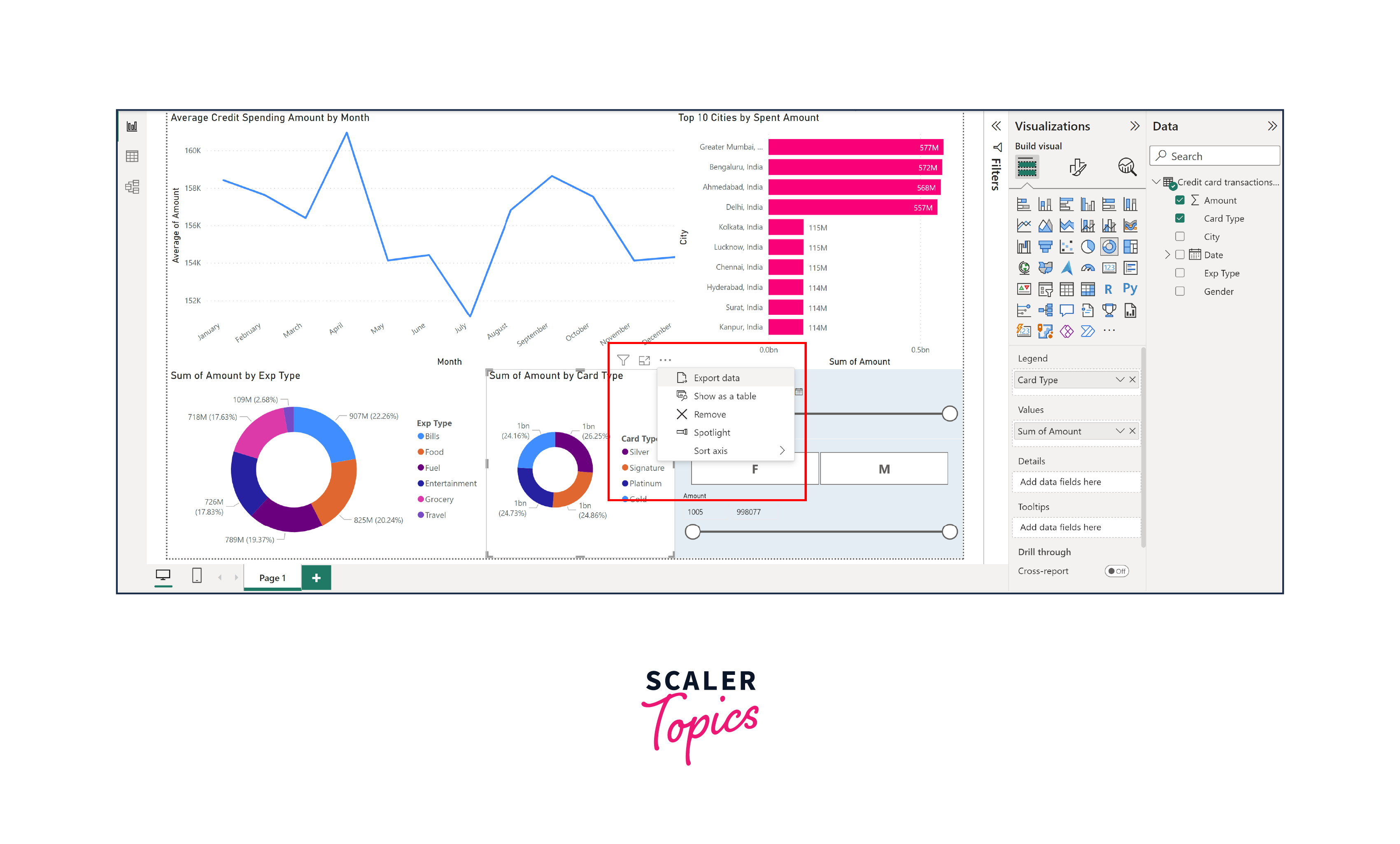
Export to CSV/Excel -
Power BI allows users to export the data behind Power BI visuals to common formats such as CSV or Excel. To do this, simply click on the visualization, click on the three dots in the right top corner of the Power BI visuals, and choose the "Export data" option. This is particularly useful when you need to work with the raw data for more in-depth analysis.
-
Export to PDF/PowerPoint -
If you want to share your entire report, including Power BI visuals and underlying data, you can export it as a PDF or PowerPoint presentation. This is useful for creating reports to share with stakeholders who may not have access to Power BI.
-
Leveraging Power BI APIs -
For advanced users and developers, Power BI offers APIs that allow programmatic access to Power BI visuals and data. This can be particularly valuable when you need to automate data extraction processes or integrate Power BI with other systems.
Power BI Extensions
Power BI extensions are additional components, tools, and visuals that can be added to your Power BI reports to extend their functionality. These extensions are developed by both Microsoft and third-party developers, and they offer a wide range of features to enhance your data visualization and reporting experience.
Let's explore some of the key Power BI extensions that can take your data visualization to the next level -
Custom Visuals
-
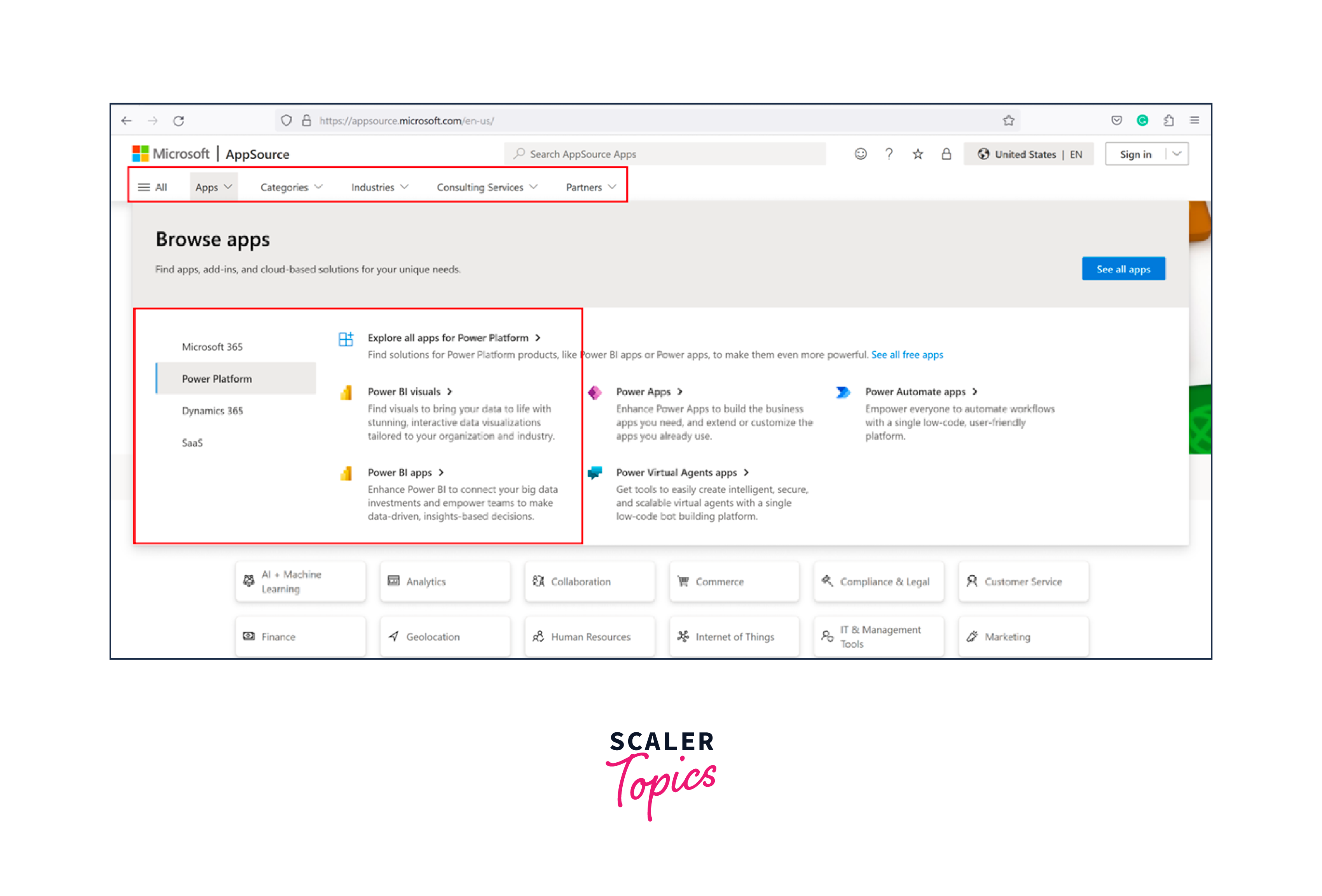
Microsoft AppSource -
Power BI provides a marketplace called Microsoft AppSource where you can discover and download custom Power BI visuals, such as Word Clouds, etc., created by both Microsoft and the Power BI community. These Power BI visuals cover a broad spectrum of data representation, from advanced charts and maps to creative infographics.
-
Custom Visual Development -
For those with specific visualization requirements, Power BI also allows you to develop your custom Power BI visuals using TypeScript and the Power BI Custom Visuals SDK. This opens up endless possibilities for creating tailored visuals that suit your unique data storytelling needs.
-
R and Python Integration -
Power BI enables you to integrate R and Python scripts into your reports, giving you the power to perform advanced statistical analysis, create custom machine learning models, and generate more complex visualizations.
Themes and Templates
-
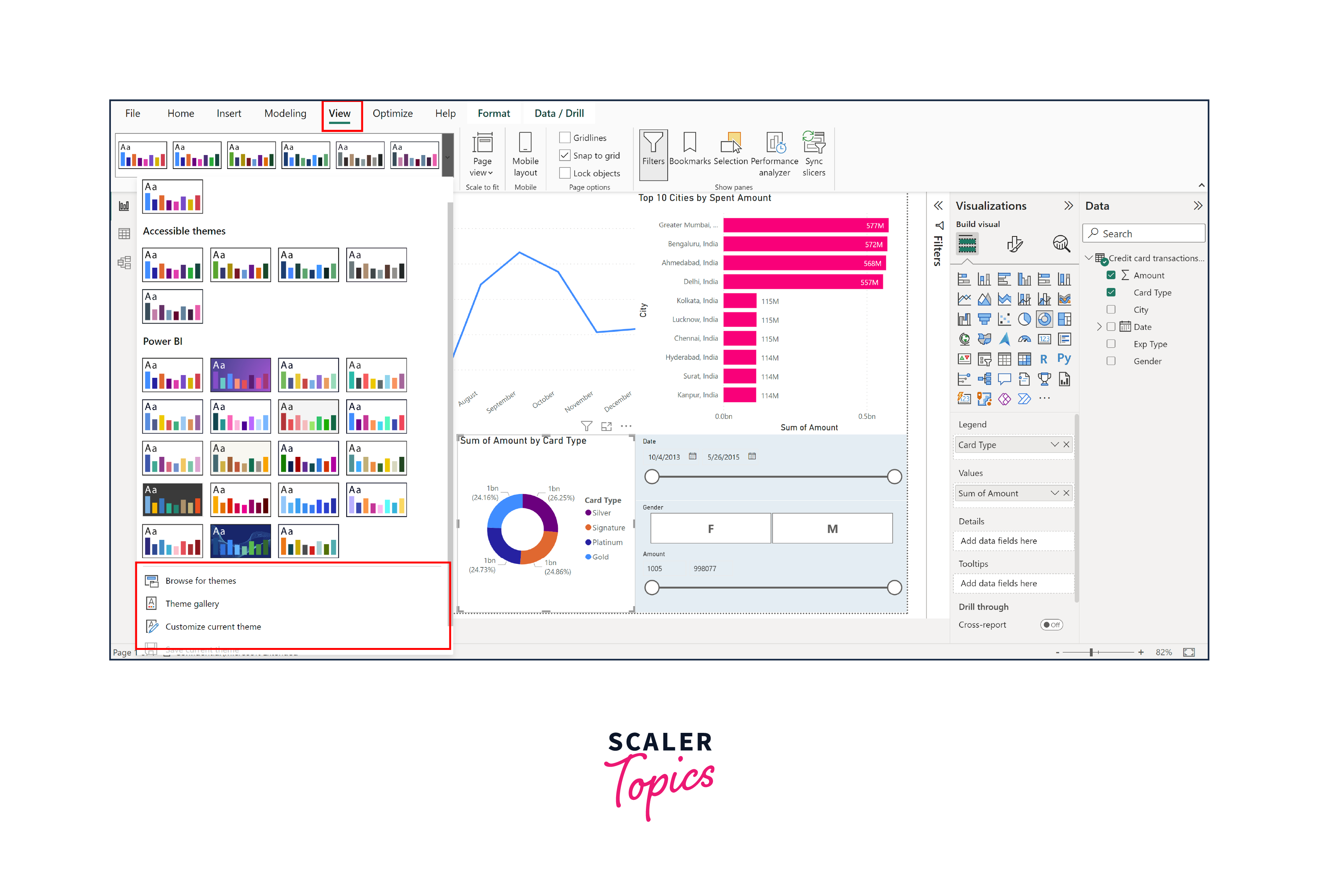
Custom Themes -
Power BI allows you to apply custom themes to your reports, altering the colors, fonts, and overall look and feel of your Power BI visuals. Several online resources and tools can help you create or find custom themes that align with your brand or preferences.
-
Report Templates -
You can save report templates for reuse, streamlining the report creation process. These templates can include custom themes, visuals, and layouts, making it easier to maintain a consistent style across your reports.
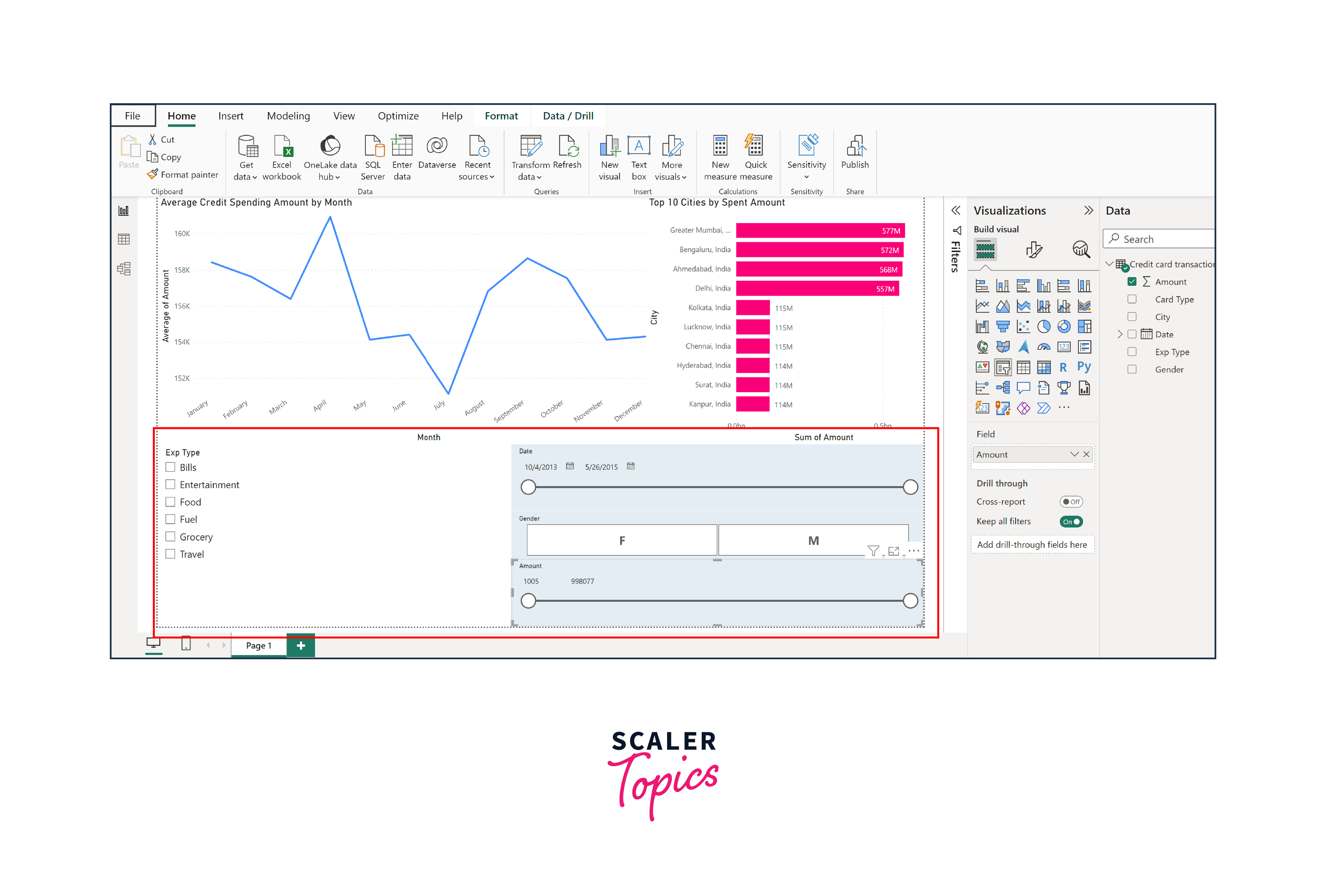
Filters
Filters are a fundamental component of data analysis and visualization, and Power BI offers a wide array of filter options that can significantly enhance your data representation. Whether you're aiming to focus on specific data subsets, drill down into details, or create interactive reports for your audience, understanding and effectively using filters in Power BI visuals is key to improving the clarity and impact of your visualizations.
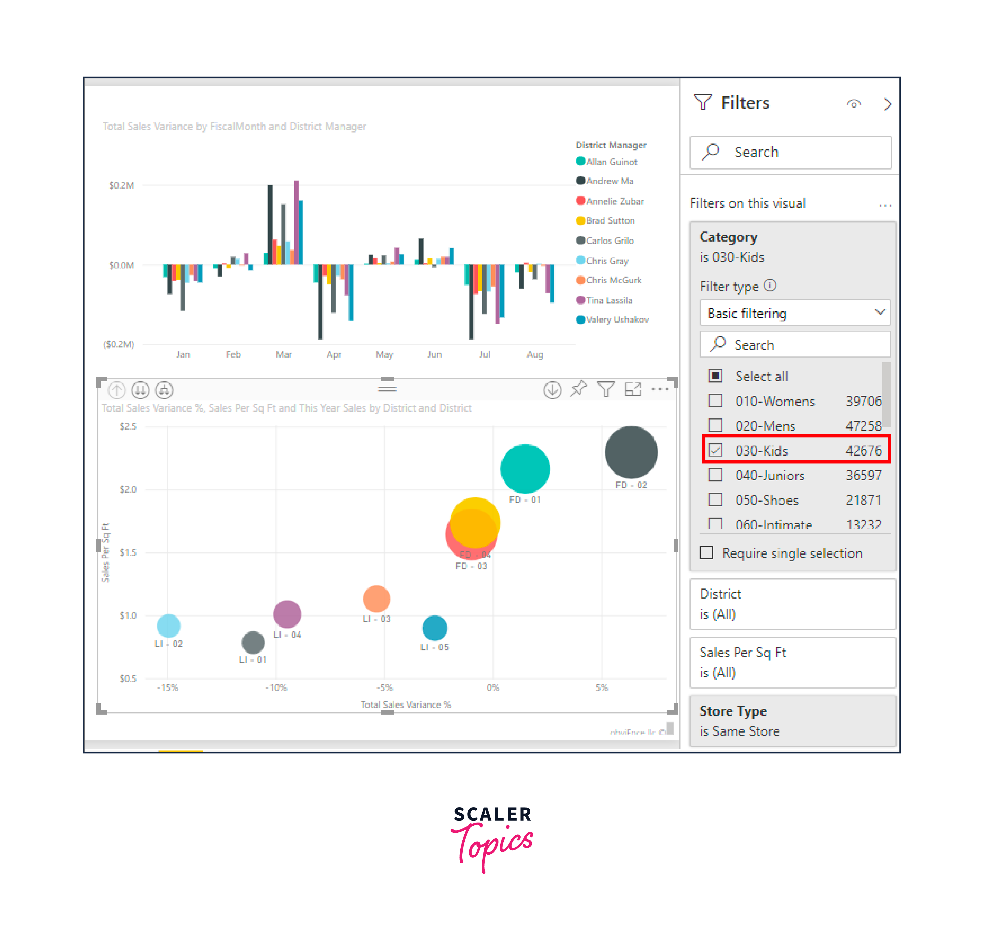
Filters in Power BI allow you to control which data points are displayed in your Power BI visuals, making it easier to extract meaningful insights. Here are some key benefits of using filters -
- Filters enable you to select specific subsets of data based on criteria that matter most to your analysis. This can help you zoom in on relevant information and exclude noise.
- Filters can make your reports interactive, allowing users to dynamically explore data by selecting different filter criteria, increasing user engagement.
- Power BI provides the ability to cross-filter visuals, meaning that selecting a data point in one visual can automatically filter related visuals on the same report page. This feature creates a coherent and interconnected view of your data.
Types of Filters in Power BI
Power BI offers various types of filters to suit different needs -
-
Visual-Level Filters -
These filters are specific to individual Power BI visuals on a report page. You can use visual-level filters to tailor the data displayed in a particular chart, table, or graph. This is particularly useful for isolating specific data points within a visual.
-
Page-Level Filters -
Page-level filters affect all Power BI visuals on a single report page. They are handy when you want to maintain consistent filter criteria across multiple visuals for a cohesive story.
-
Report-Level Filters -
Report-level filters apply to all report pages. They are ideal for global filtering, allowing you to set broad criteria that impact the entire report.
Filter Context in Power BI
In Power BI, Filter Context and Row Context are two essential concepts that play a crucial role in data modeling, calculations, and visualization. These contexts determine how data is filtered, calculated, and displayed within your reports and Power BI visuals.
Filter Context
- Filter Context refers to the set of filters applied to the data model that affects the calculations and visuals in your Power BI report. These filters can come from various sources, such as slicers, page-level filters, visual-level filters, and report-level filters. Filter Context defines which rows of data are included in calculations and determines the scope of the data displayed in visuals.
- For instance, imagine you have a dataset containing sales data for a retail store with columns like Date, Product Category, Sales Amount, and Region. You apply a slicer to filter the Date to show only data for the year 2023. In this case, the filter context includes the filter on the Date column, limiting the data calculations and Power BI visuals to only the year 2023.
Row Context
- Row Context, on the other hand, is the context established within individual rows of a table during calculations. It's created when iterating through rows during a calculation, such as when using DAX (Data Analysis Expressions) formulas. Row Context allows you to perform calculations row by row and can be influenced by the current row's values, regardless of the filters in the Filter Context.
- For instance, let's say you're creating a calculated column to calculate the profit margin for each product based on the Sales Amount and Cost Price columns. While calculating the profit margin for a specific product, Row Context considers only the values in the current row, regardless of any filters applied in the Filter Context.
Slicers
Slicers are visual controls that enable users to filter and interact with data within Power BI reports. They are typically displayed as a list of values or a range of values that users can select from. Slicers provide an easy and intuitive way for users to filter data without the need for complex queries or technical knowledge.
Let's say a user opens your Power BI report and sees the slicer with a list of product categories: "Electronics," "Clothing," "Home Appliances," and "Toys." They decide to select "Electronics" from the slicer. Instantly, the bar chart displaying sales data updates to show sales for the "Electronics" category only, and other visuals on the report page adapt accordingly. They can also choose a range of dates to see the trends and Power BI visuals for that duration only. This interactivity allows users to explore and analyze data based on their preferences and questions.
Slicers offer several key benefits for interactive data exploration in Power BI -
- Slicers provide an intuitive way for users to filter and explore data, making the report more user-friendly and accessible.
- Users can dynamically change the view of the data, allowing for on-the-fly analysis and discovery of insights.
- Slicers enable users to view the same data from different angles by selecting different slicer values, facilitating more comprehensive analysis.
- When combined with cross-filtering, slicers enable interactivity between visuals, creating a dynamic and interconnected user experience.
- Slicers are commonly used in Power BI dashboards to provide navigation and filtering options for different report pages.
Drill Down and Drill Up
Drill Down
- Drill Down is the process of moving from a higher level of aggregation or summary to a more detailed level within a visual or chart. It enables users to explore data hierarchies by clicking on elements of a visualization to reveal underlying details. Drill Down is typically used when users want to delve deeper into specific data points to understand the contributing factors.
- For instance, imagine you have a bar chart showing annual sales by region. By clicking on a specific bar representing a region (e.g., "North America"), you can drill down to reveal monthly sales data for that region, providing a more detailed view of the information.
Drill Up
- Drill Up, on the other hand, is the reverse of Drill Down. It allows users to move from a more detailed view back to a higher-level summary. Drill Up is valuable when users want to return to an overview after exploring data at a granular level, simplifying the visualization and refocusing the analysis.
- For instance, continuing from the previous example, after drilling down to view monthly sales data for "North America," users may want to drill up to the original annual sales view, aggregating all regions. This allows them to see the broader context and make comparisons between regions
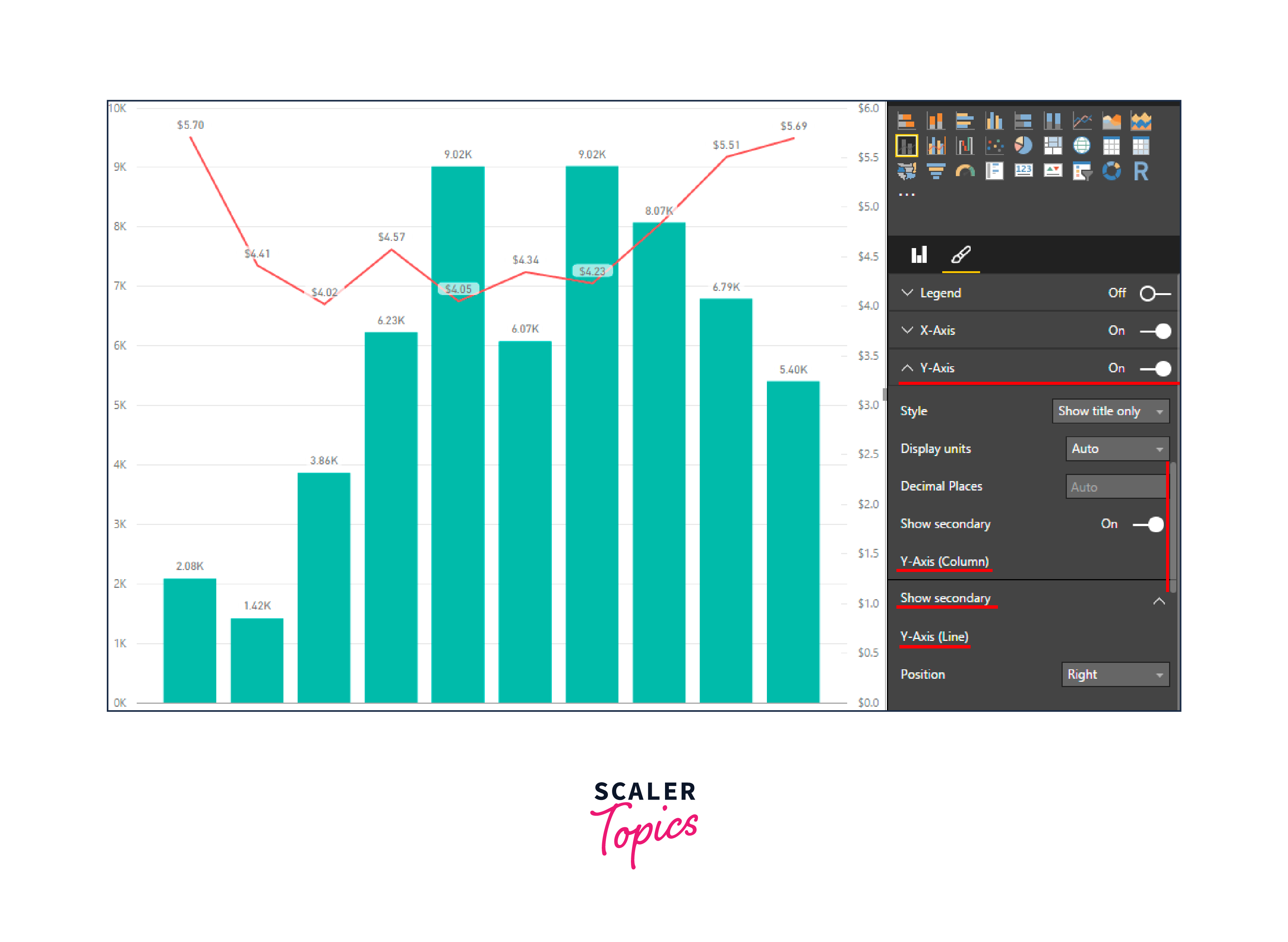
Dual Axis in Power BI
Dual Axis is a feature in Power BI that allows you to combine two different types of charts or visuals, each with its own Y-axis, within the same visualization. This feature is particularly useful when you want to compare two measures that have different scales or units of measurement in a single visual representation, providing a more comprehensive view of your data.
Power BI Reporting
Power BI reporting is the process of creating, designing, and sharing data-driven visualizations, dashboards, and reports using Microsoft Power BI. It empowers organizations and individuals to turn raw data into meaningful, actionable insights that inform decision-making, drive business strategies, and improve overall performance.
To enhance Power BI visuals in Power BI reports, you should start by selecting the right visuals for your data by utilizing a combination of charts, graphs, and tables to convey information effectively. Make sure to organize your report with a clear structure, using well-defined sections and page navigation. You must implement filters, slicers, and drill-through actions for interactivity. Apply consistent color schemes and formatting to maintain visual coherence.
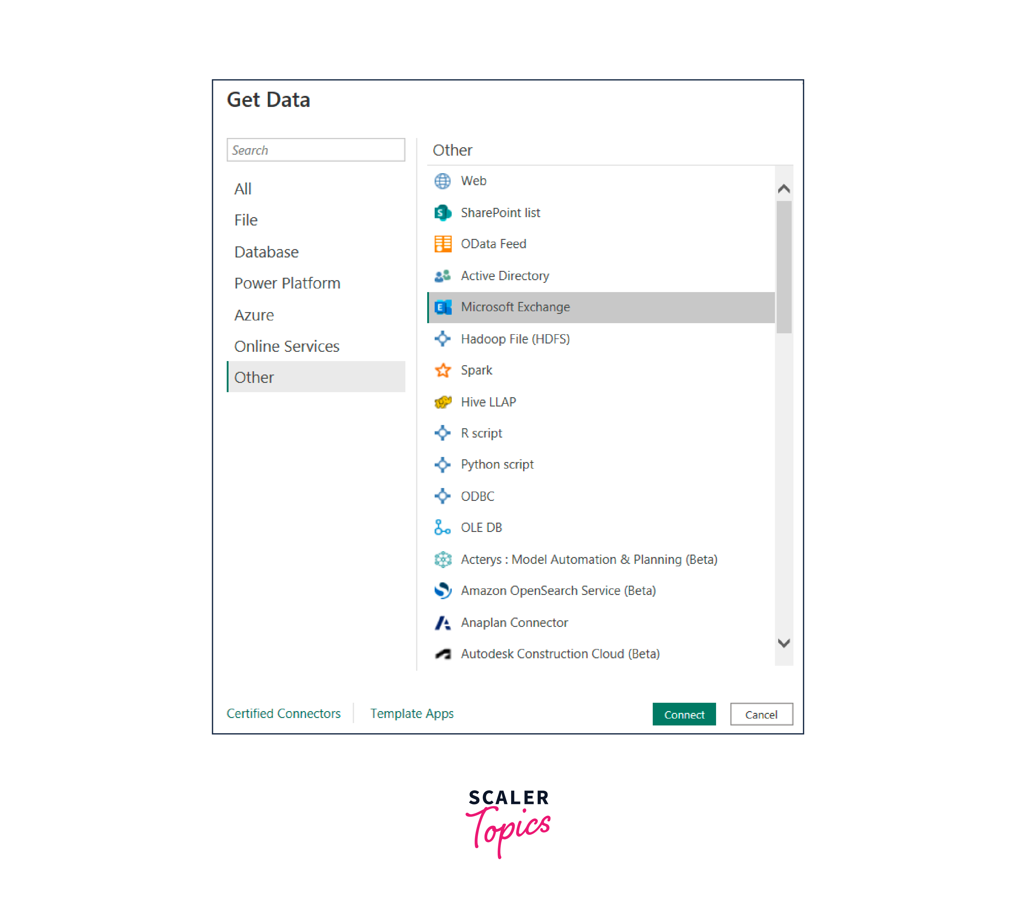
Power BI Exchange
Power BI Exchange is a feature that allows users to connect and integrate data from Microsoft Exchange into Power BI for reporting and visualization. This integration provides the ability to extract valuable insights from Exchange data, such as email activity, calendar events, and communication trends. By publishing Microsoft Exchange data to Power BI, users can create customized reports and dashboards to monitor and analyze email usage, productivity metrics, and collaboration patterns within their organization and they can gain valuable insights into their communication and scheduling patterns, leading to informed decision-making and improved productivity.
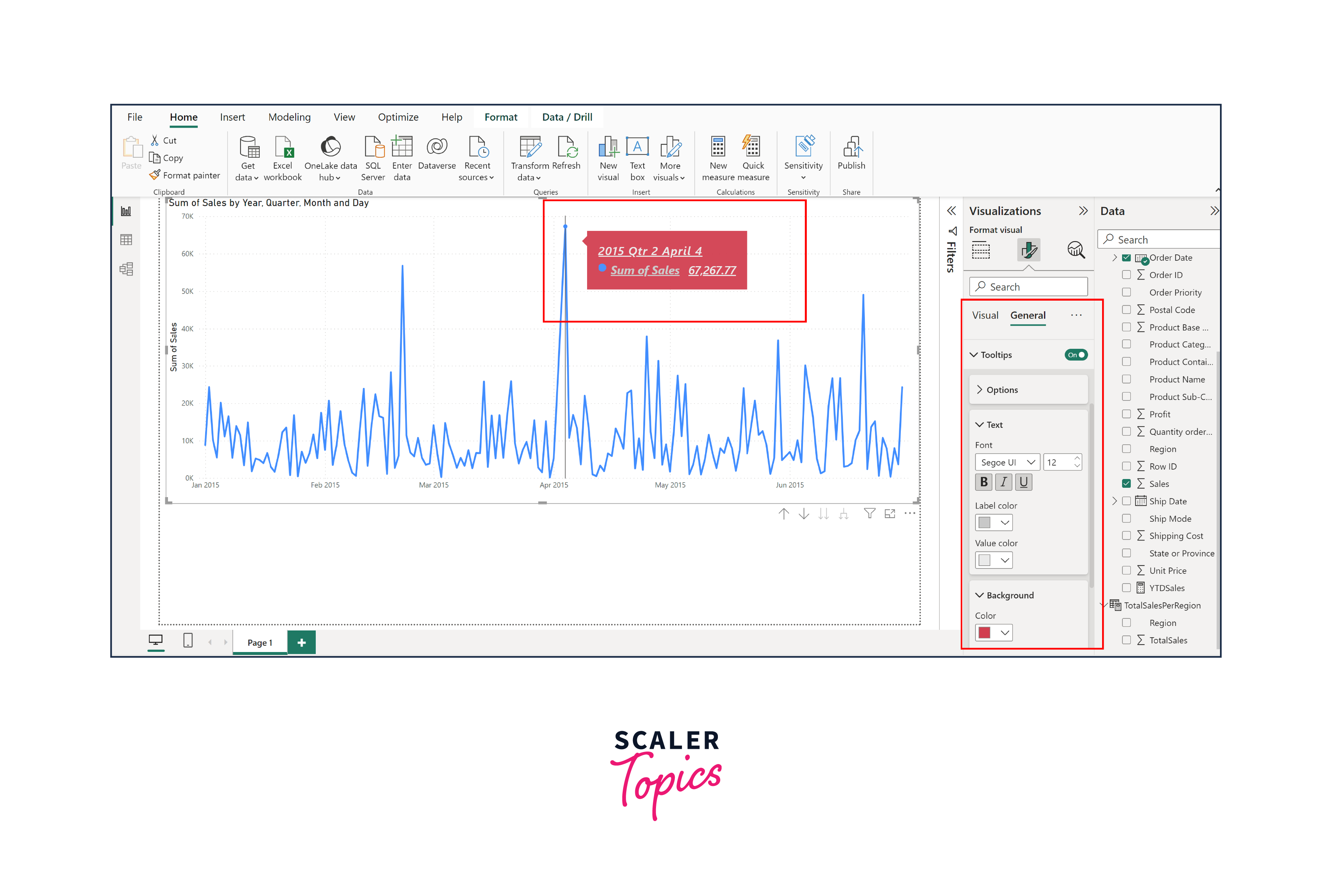
Power BI Tooltip
Power BI tooltips are a valuable feature that allows you to provide additional context, explanations, or insights to your report visuals when users hover over or interact with data points. Tooltips are a powerful tool for improving the clarity and interactivity of your reports, enabling you to convey information more effectively.
For instance, in a sales report, when a user hovers over a bar chart representing sales by product category, a tooltip can display details such as the category name, total sales amount, and the percentage of total sales it represents. This additional information helps users quickly understand the data point's significance without cluttering the visual itself.
Conclusion
- Power BI offers a robust platform for creating powerful data visualizations, allowing users to transform raw data into meaningful insights that drive informed decision-making.
- Features like slicers, filters, drill-downs, dual axes, and tooltips enable users to interact with data and Power BI visuals dynamically, explore details, and customize their analytical experience.
- Power BI provides customization options, extensions, and seamless integration with various data sources, enabling organizations to tailor reports to their unique needs and leverage a wide range of Power BI visuals enhancements.
- By combining these tools and techniques, organizations can effectively tell compelling data stories, improve data-driven communication, and ultimately achieve better business outcomes through informed decision-making.