Connecting to Web Page Data in Power BI
Overview
This Power BI web article explores how to connect and import web page data into Power BI, enabling users to harness the power of web-based information and integrate it into their data analysis and visualizations seamlessly. In this article, we will discover the diverse range of Power BI web data connectors available and master essential data extraction techniques to integrate web-based information into your analyses and visualizations seamlessly.
Examining the Source Data
Before importing data from web pages into Power BI, it is essential to examine the source data and ensure its relevance and integrity. Let's consider an example of Excel data to illustrate this process. In Excel, you can review the data structure, check for any inconsistencies or missing values, and validate column headers to match your analysis needs. Additionally, evaluating data types and formatting ensures a smooth import into Power BI, guaranteeing accurate visualizations and insights from the Power BI web data.
Connecting to the Excel Data
To connect to Excel data using Power BI, you can follow the steps mentioned below -
- Open Power BI and click "Get Data" on the Home tab.
- Choose "File" and select "Excel" as the data source.
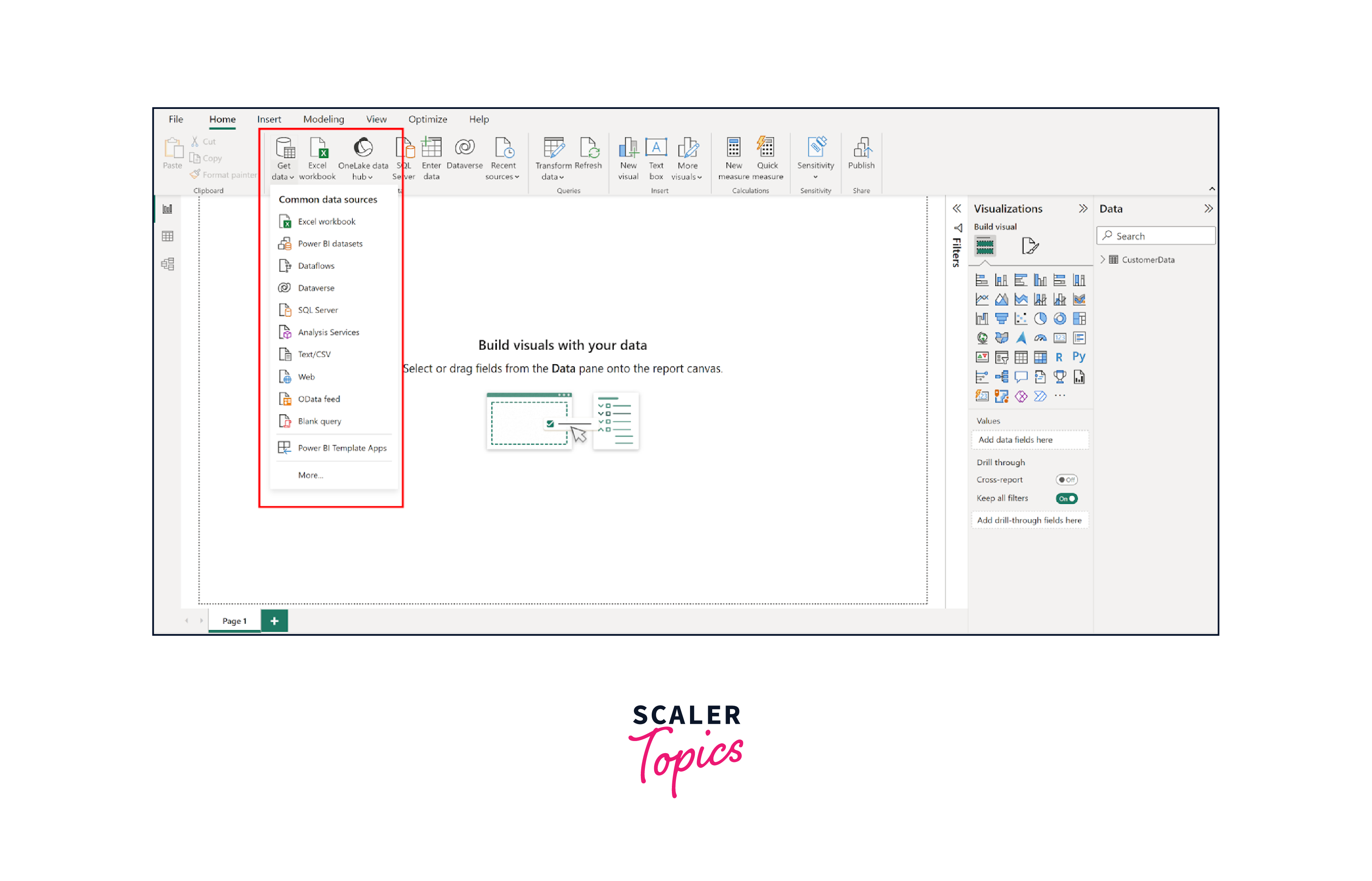
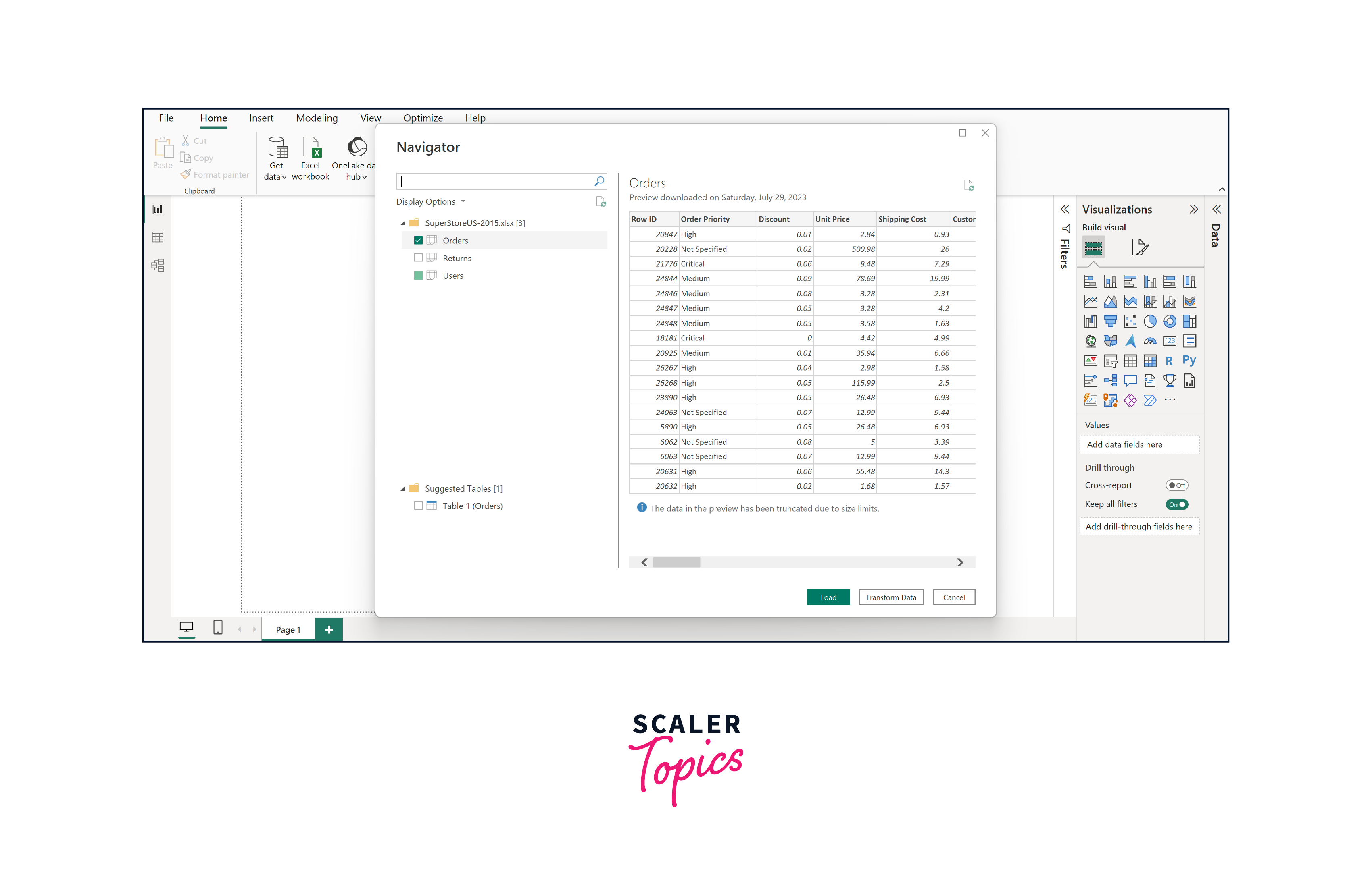
- Browse and select the Excel file you want to connect to.
- Select the desired sheets or tables from the Navigator window.
- Click "Load" to import the data into Power BI.
Connecting to the Currency Exchange Rate Data
To connect to web-based data in Power BI, a user can follow the steps mentioned below -
- Open Power BI and click "Get Data" on the Home tab.
- Choose "Web" as the data source.
- Paste the URL "http://www.currency-converter.org.uk/currency-exchange-rates.html" into the dialog box. This
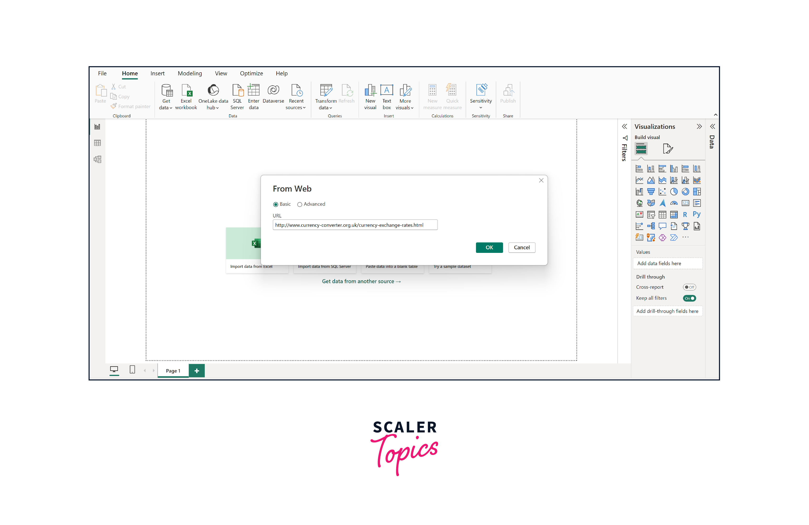 4. Click "OK" to load the data into Power BI.
5. Apply necessary data transformations and visualizations to analyze the currency exchange rate data with Power BI web tools.
4. Click "OK" to load the data into Power BI.
5. Apply necessary data transformations and visualizations to analyze the currency exchange rate data with Power BI web tools.
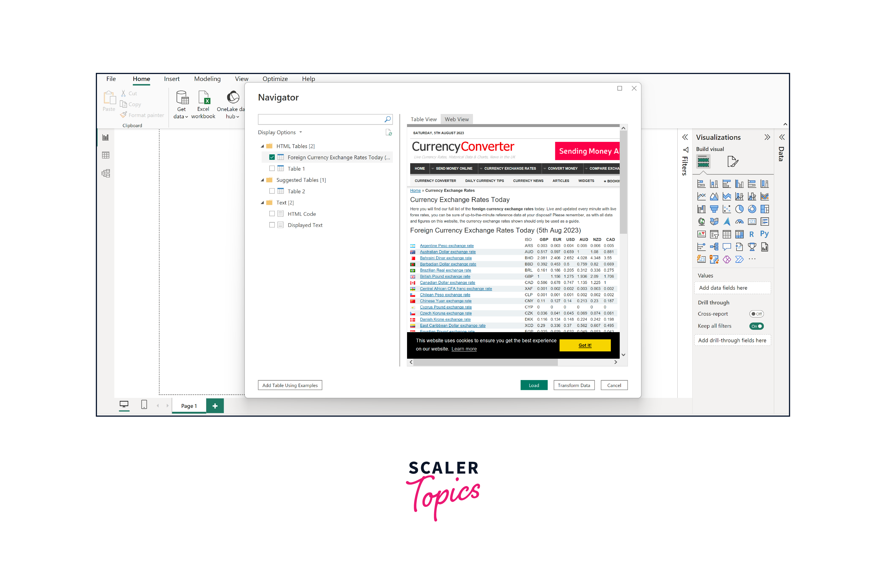
When connecting to web-based data in Power BI, it will primarily focus on tabular data, particularly HTML tables, displaying all retrieved tables. By selecting the checkboxes next to each table, you can preview the data within.
We are interested in the table containing exchange rate information for our case. Thankfully, Power BI offers a helpful feature when connecting to web pages - switching to web view. This feature displays a table preview as it appears on the webpage, making it easier to locate the correct table. In our example, we will select the table labeled "Foreign Currency Exchange Rates Today ( .. )" to import and analyze the currency exchange rate data with Power BI web tools, as shown in the below figure.
Query Editor: Remove Columns
To remove columns from the input table in Power BI -
- In Power BI, click "Transform Data" to open the Query Editor.
- Highlight the columns you want to remove by clicking them.
- Right-click on any selected column header and choose "Remove" from the context menu.
- The selected columns will be removed from the table. Save the changes and proceed with Power BI web data analysis.
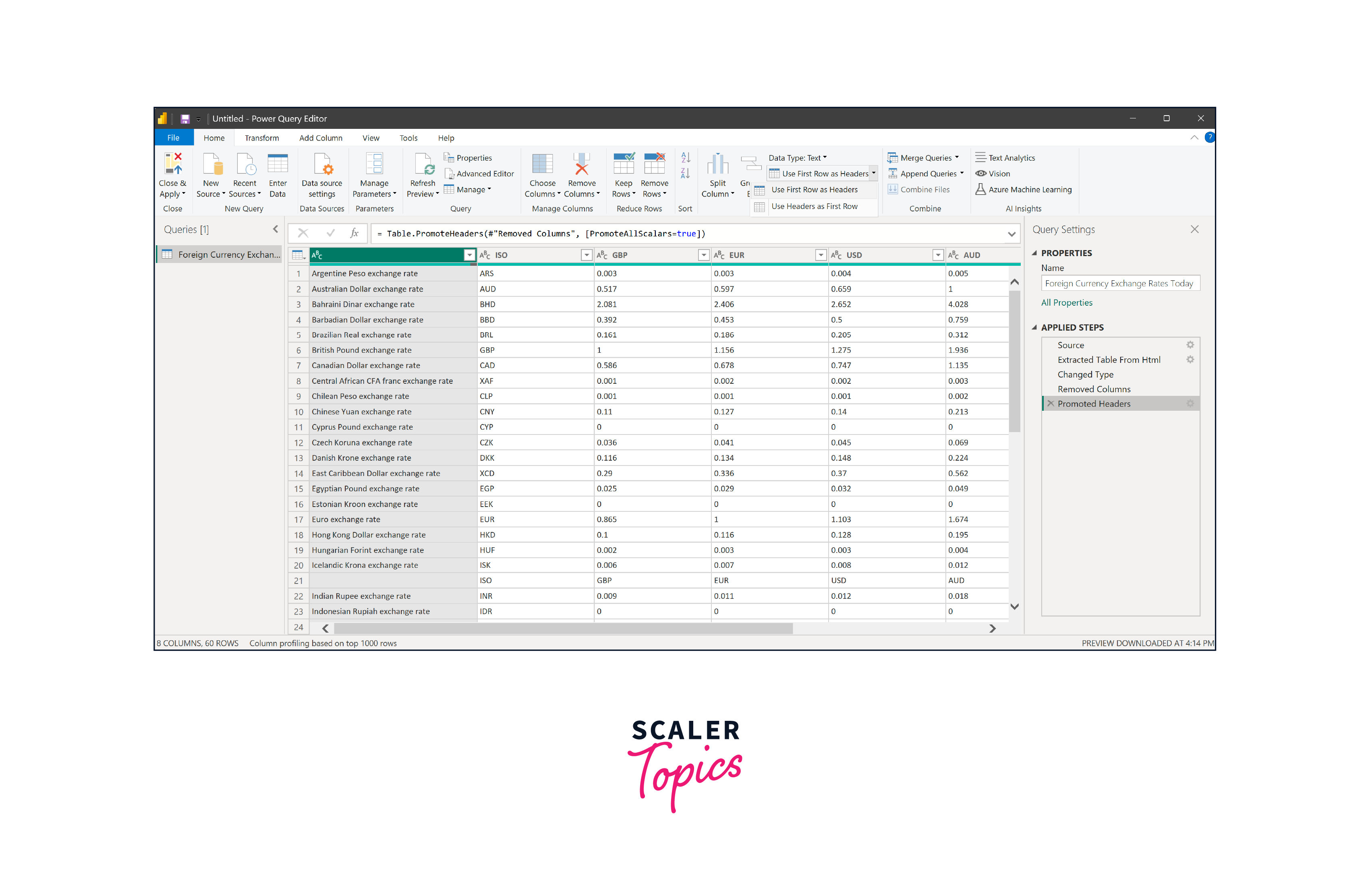
Query Editor: Use First Row as Headers
Upon importing the table, you'll notice that the column names appear as column1, column2, and so on. However, the actual column names are being used as the first row in the table. To use the first row as headers in Power BI, you can follow the steps mentioned below -
- In the Query Editor, select the table.
- Click "Use First Row as Headers" on the Home tab.
- Power BI will automatically set the first row as column headers.
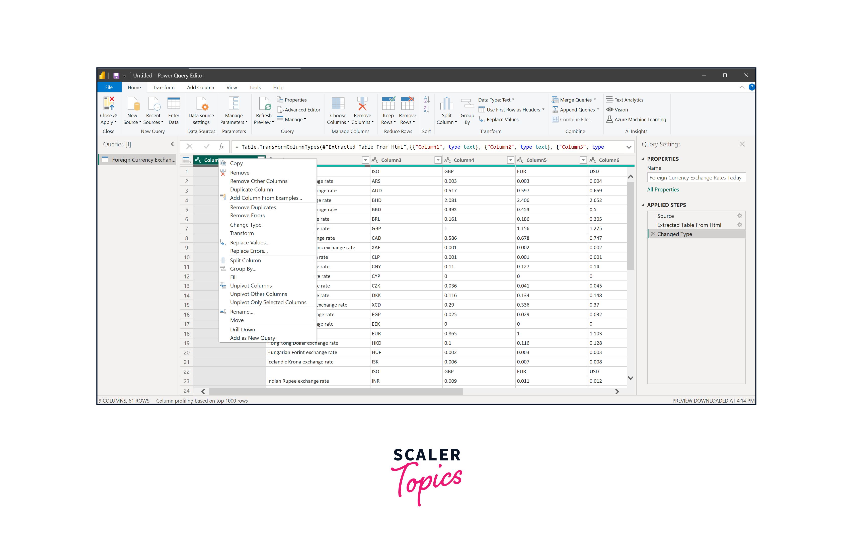
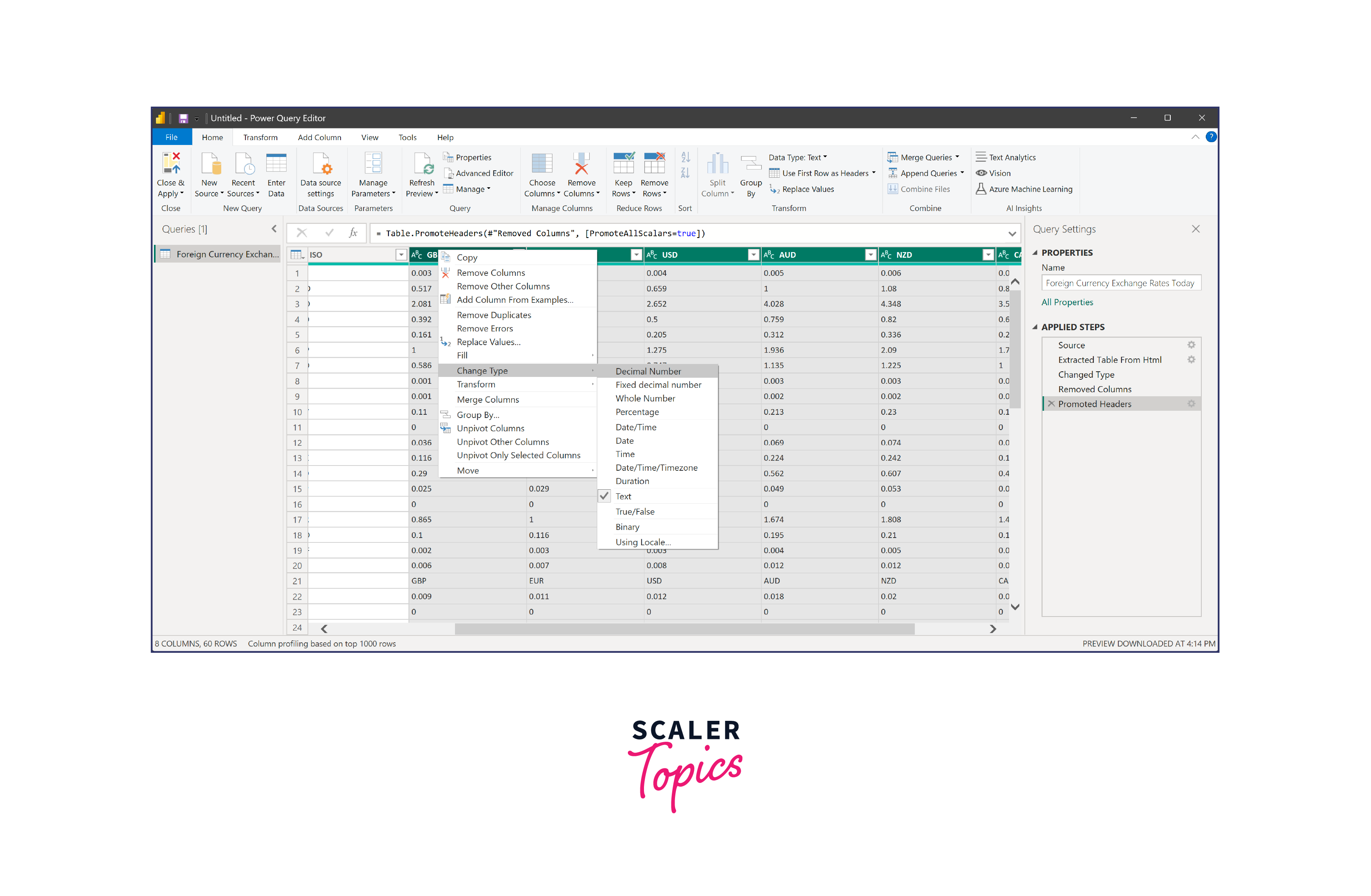
Query Editor: Change Type
We need to ensure the conversion rate columns have numeric values, as they are currently in text format. To change the data type of a column in Power BI, you can follow the below steps -
- Select all the numeric columns by clicking on the first numeric column and shift-clicking on the last numeric column.
- Right-click and choose "Change Type > Decimal Number."
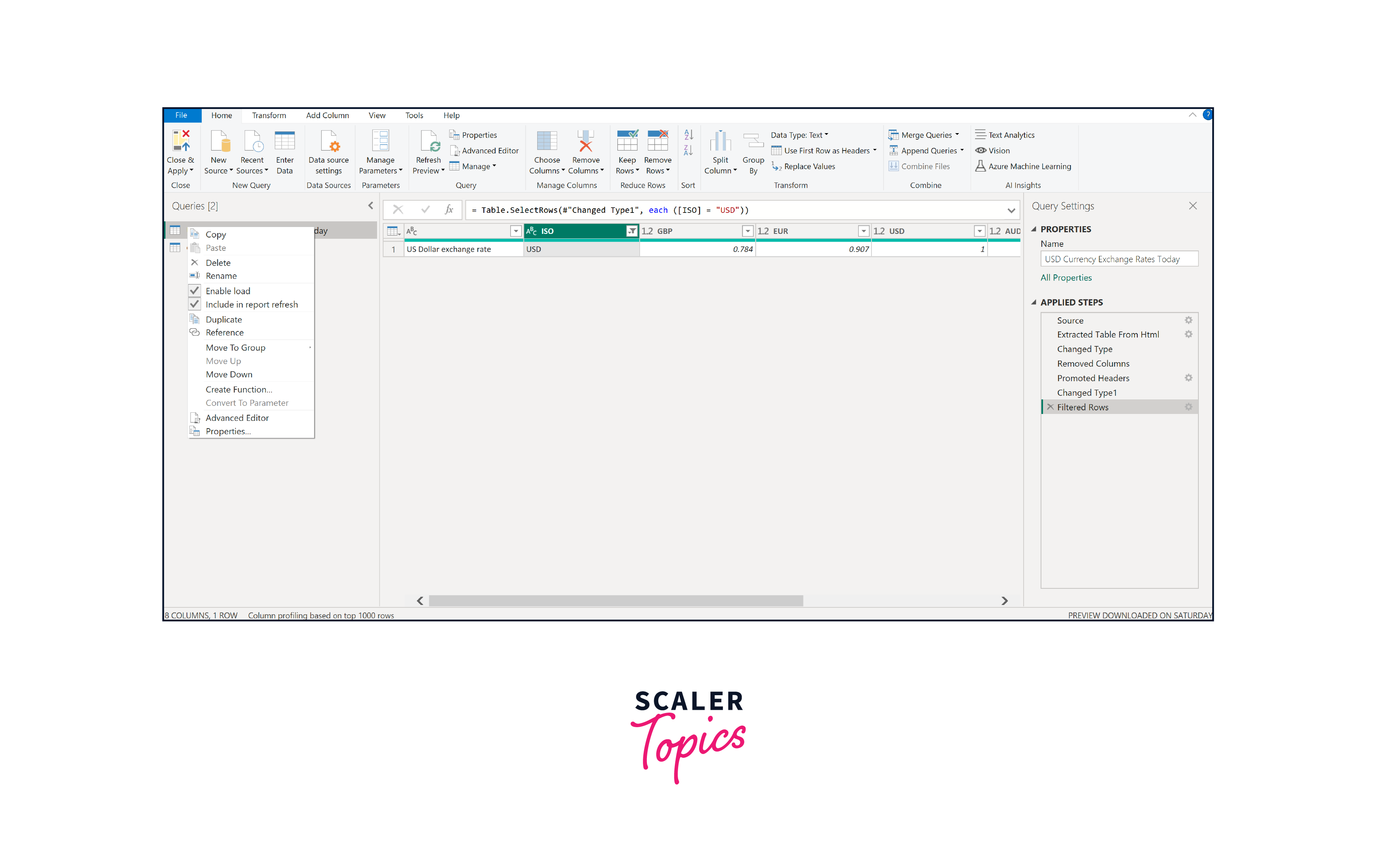
Query Editor: Filtering out Unwanted Rows
Suppose we wish to retain only the USD currency data in our example. Here's how you can achieve it. To filter out unwanted rows from the table in Power BI, a user can follow the below steps -
- Locate the filter arrow next to the ISO column heading in the Query Editor.
- Click the filter arrow and use the "Select All" toggle to deselect all currencies.
- Activate only the currency you require, such as USD.
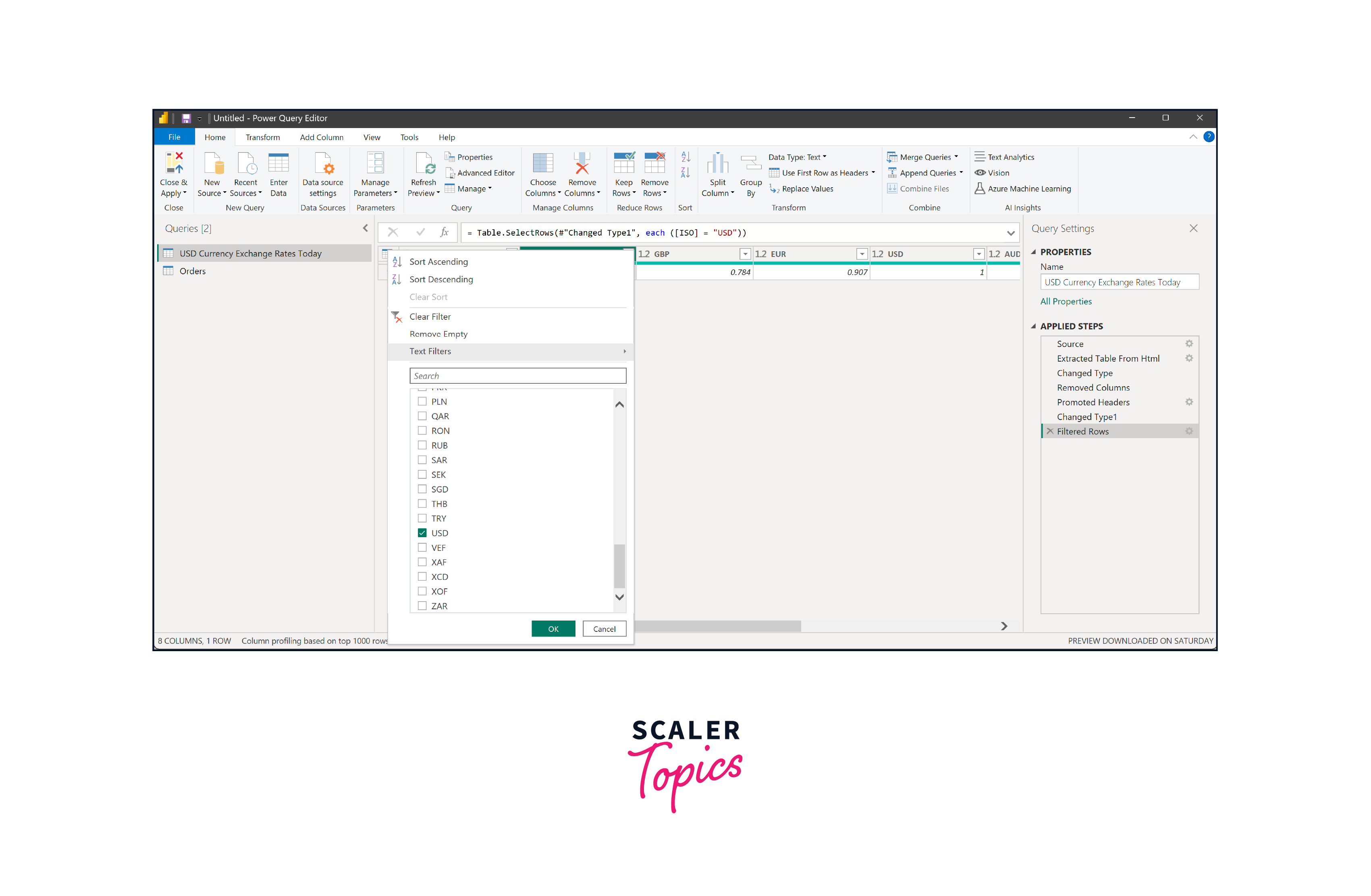
Query Editor: Renaming a Query
Queries are typically named automatically based on the underlying data source, but it's advisable to rename them for clarity. To do this, double-click on the current name, right-click on the current name and select rename, or select the query and press F2 on the keyboard. Let's rename the query as "USD Currency Exchange Rates Today" for better organization and identification.
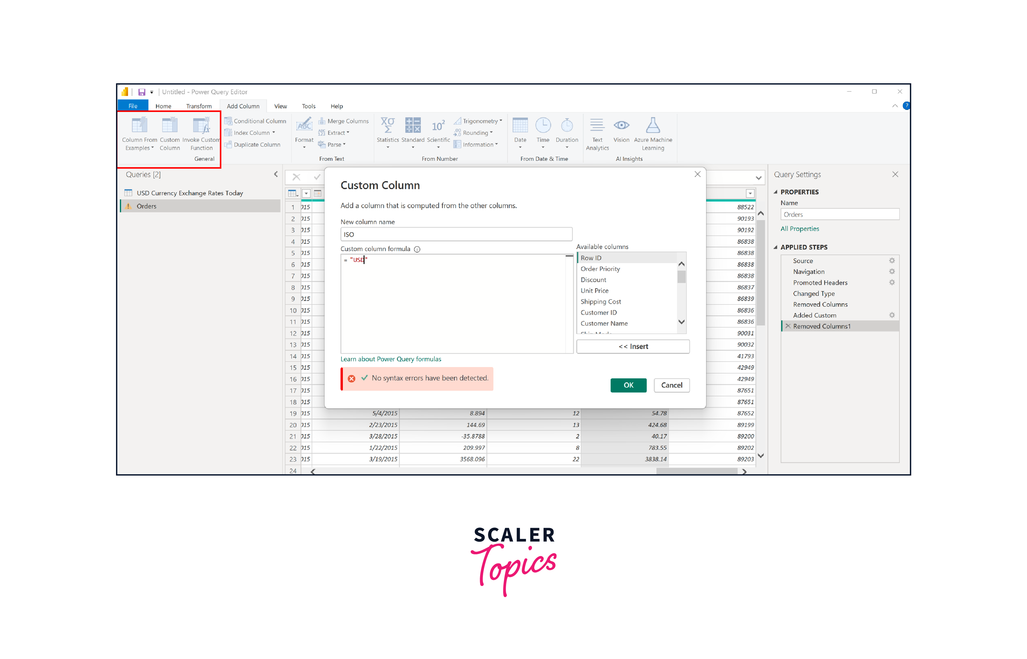
Query Editor: Creating a Custom Column
To establish a currency exchange table connection with another table, we need to create a new column in the "Orders" table that matches the "ISO" column in the "USD Currency Exchange Rates Today" table. To achieve this, a user can follow these steps -
- Click on "Add Column" > "General" > "Custom Column."
- Name the new column as "ISO" to match the column in the other table.
- Create a formula with the literal value "USD" enclosed in double quotes to ensure "USD" appears in every row of the new column.
- Click "OK" to generate the "ISO" column, which will now contain "USD" in each row.
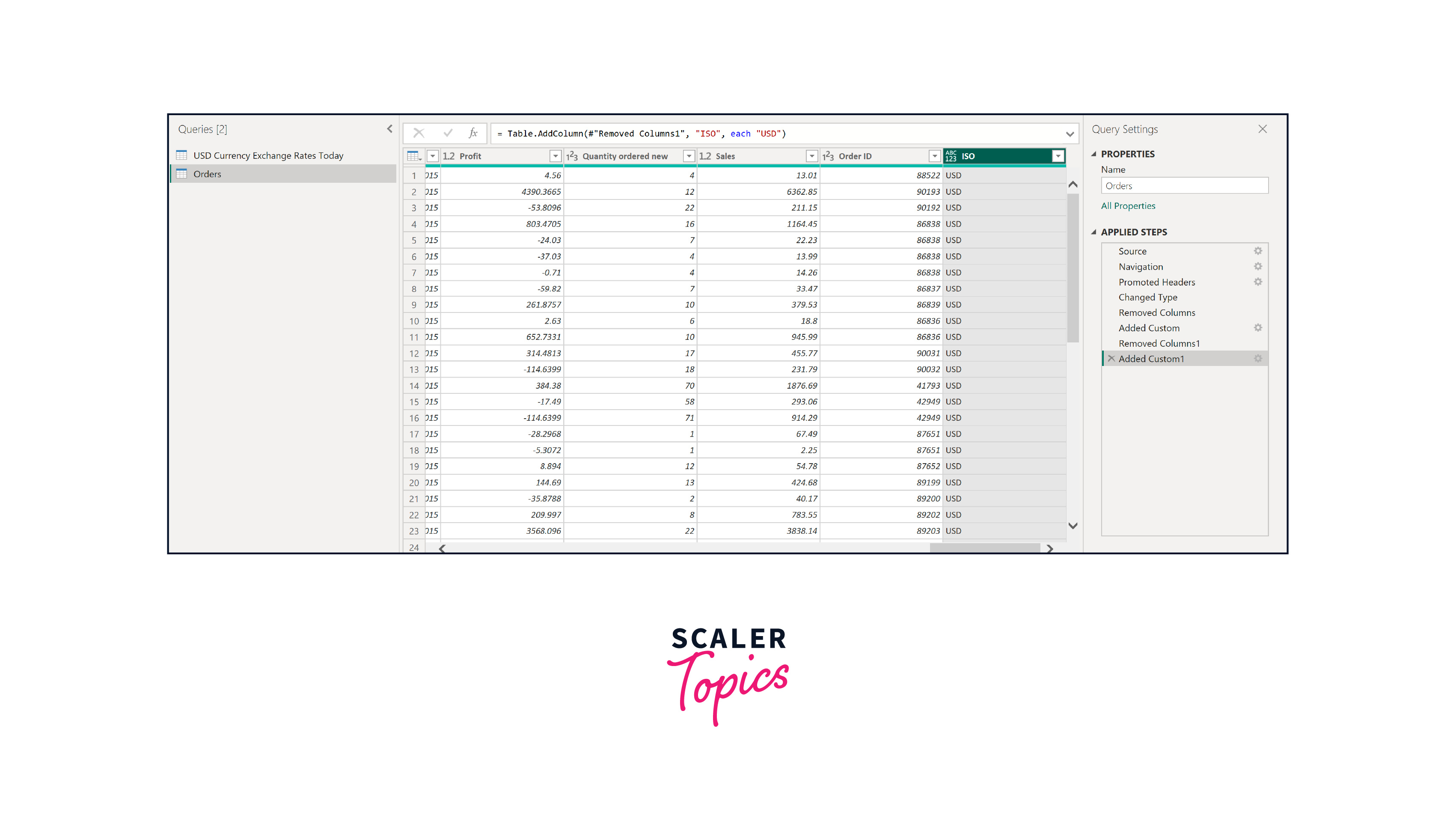
This connection allows each row in the "Orders" table to match the single "USD" row in the "USD Currency Exchange Rates Today" table, enabling easy currency conversion for each required currency value.
Query Editor: Close and Apply
With the Query Editor changes complete, we can save and exit by clicking on "File" > "Close & Apply."
Adding a Report Background
A background image in a dashboard is important as it can enhance the overall user experience and aesthetics. To add a background image while creating a report in Power BI, you can follow these steps -
- In the Power BI report view, go to the "Format page" in the Visualizations pane.
- Under the "Canvas background" section, click on "Image" and select the image you want to use as the report background from your local files.
- Adjust the image fit, color, and transparency.
The selected image will now serve as the background for your Power BI report, adding a personalized touch to your visualization.

Automatic Detection of Relationships
Next, we need to validate whether these two tables are connected to each other or not. To verify if these two tables are connected in Power BI, you can follow these steps -
- Click on the "Model View" icon on the left side of the screen.
- Since we used the same name, "ISO", when creating the extra column in the "Orders" table, Power BI automatically detects and creates the relationship between the two tables.
- The fact that the common column was engineered in the Query Editor means the "Orders" and "USD Currency Exchange Rates Today" tables are already linked, as illustrated in the below figure.

By leveraging the automatically detected relationship, Power BI ensures seamless data integration between the two tables, enabling you to perform accurate analysis and visualizations easily.
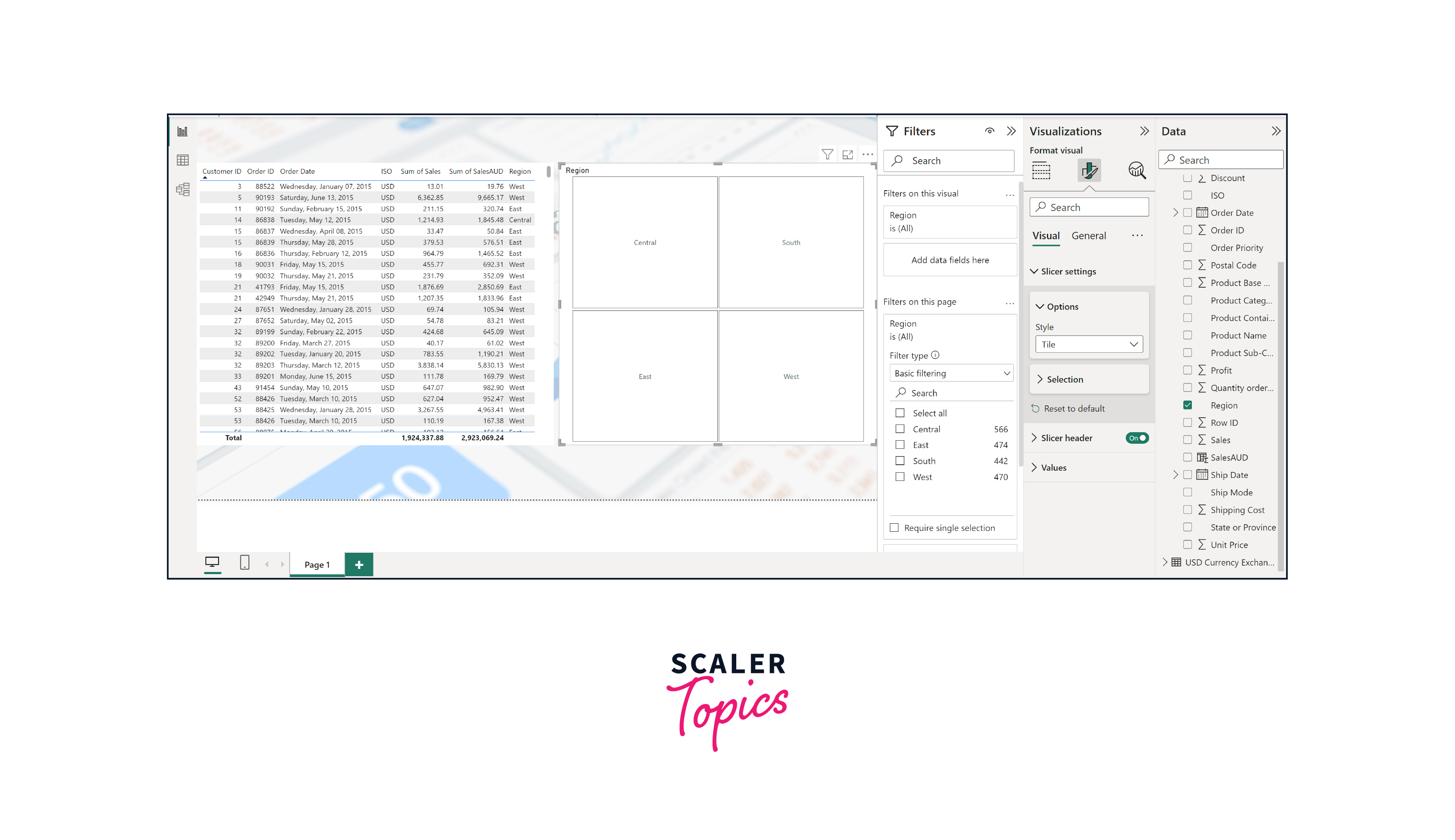
Using the Table Visual
The Table visual is a fundamental element of Power BI reports. Its ability to present data in a clear, organized, and detailed format makes it a valuable tool for data analysis, reporting, and decision-making. When used alongside other visuals, it enhances the overall effectiveness of a Power BI report and empowers users to gain deeper insights into their data. The Table visual is a powerful tool in Power BI that allows users to present data in a structured tabular format. To utilize the Table visual, you can follow below steps -
- Select the Table icon from the "Visualizations" pane to add a table visual to your report.
- Drag and drop the desired fields into the "Values" field to populate the table with relevant data.

Creating Calculated Columns
Creating calculated columns involves using Data Analysis Expressions (DAX) formulas to generate new columns in a Power BI table. These formulas can perform calculations, manipulate data, or derive insights from existing columns. Calculated columns are dynamically generated, automatically updating whenever the underlying data changes, providing valuable additional information for analysis and visualization.
Simply put, calculated columns are new columns that users can add to a table in Power BI. These columns are defined using DAX formulas and are computed row by row, resulting in a static value for each row in the table. Calculated columns extend the data model by incorporating custom calculations based on existing column values. For instance, a calculated column to convert the sales number of an order to AUD could be defined as SalesAUD = Orders[Sales] * RELATED('USD Currency Exchange Rates Today'[AUD]).
Similarly, we can convert Sales figures in other currencies as well by using below mentioned DAX formulas -
- SalesCAD = Orders[Sales] * RELATED('USD Currency Exchange Rates Today'[CAD]).
- SalesGBP = Orders[Sales] * RELATED('USD Currency Exchange Rates Today'[GBP]).
- SalesNZD = Orders[Sales] * RELATED('USD Currency Exchange Rates Today'[NZD]).

Using the Slicer Visual
A slicer is a visual element in Power BI that allows users to filter and interactively control data displayed in other visuals. It acts as a filter on the data, enabling users to slice and dice the information to focus on specific subsets of data easily. Slicers are typically displayed as a list of values that users can select to filter the data accordingly.
Slicers are a valuable feature in Power BI that enhances the visualization capabilities and user experience. Slicers empower users to make data-driven decisions more efficiently and effectively by providing a user-friendly way to filter and explore data.
Conclusion
- Power BI web data connectivity offers a powerful way to access and integrate real-time information from web pages directly into reports and visualizations.
- By leveraging the Query Editor, users can perform essential data transformations, such as removing unwanted columns, using the first row as headers, and filtering out irrelevant data, ensuring data accuracy and relevance.
- Creating calculated columns using DAX formulas allows for dynamic calculations and enriches data with new insights, enabling users to perform complex calculations and data manipulations.
- Visual elements like background images, slicers, and table visuals enhance the aesthetics and interactivity of the dashboard, providing users with a compelling and engaging data exploration experience.
- Through automatic relationship detection, Power BI simplifies data linking, improving data analysis and enabling users to derive meaningful insights from connected tables.