Features of Power BI
Overview
In this article, we delve into the world of Power BI and explore its remarkable features that empower users to visualize data, gain actionable insights, and make informed business decisions. Power BI features offer a comprehensive suite of solutions to unlock the true potential of data-driven decision-making, from data connectivity and transformation to interactive visualizations and AI-driven analytics.
Features of Power BI
Power BI sets itself apart from other business intelligence and data visualization tools with its exceptional and diverse range of cutting-edge features. Let's delve into the key and distinguishing Power BI features for harnessing the full potential of data analytics and driving data-based decision-making -
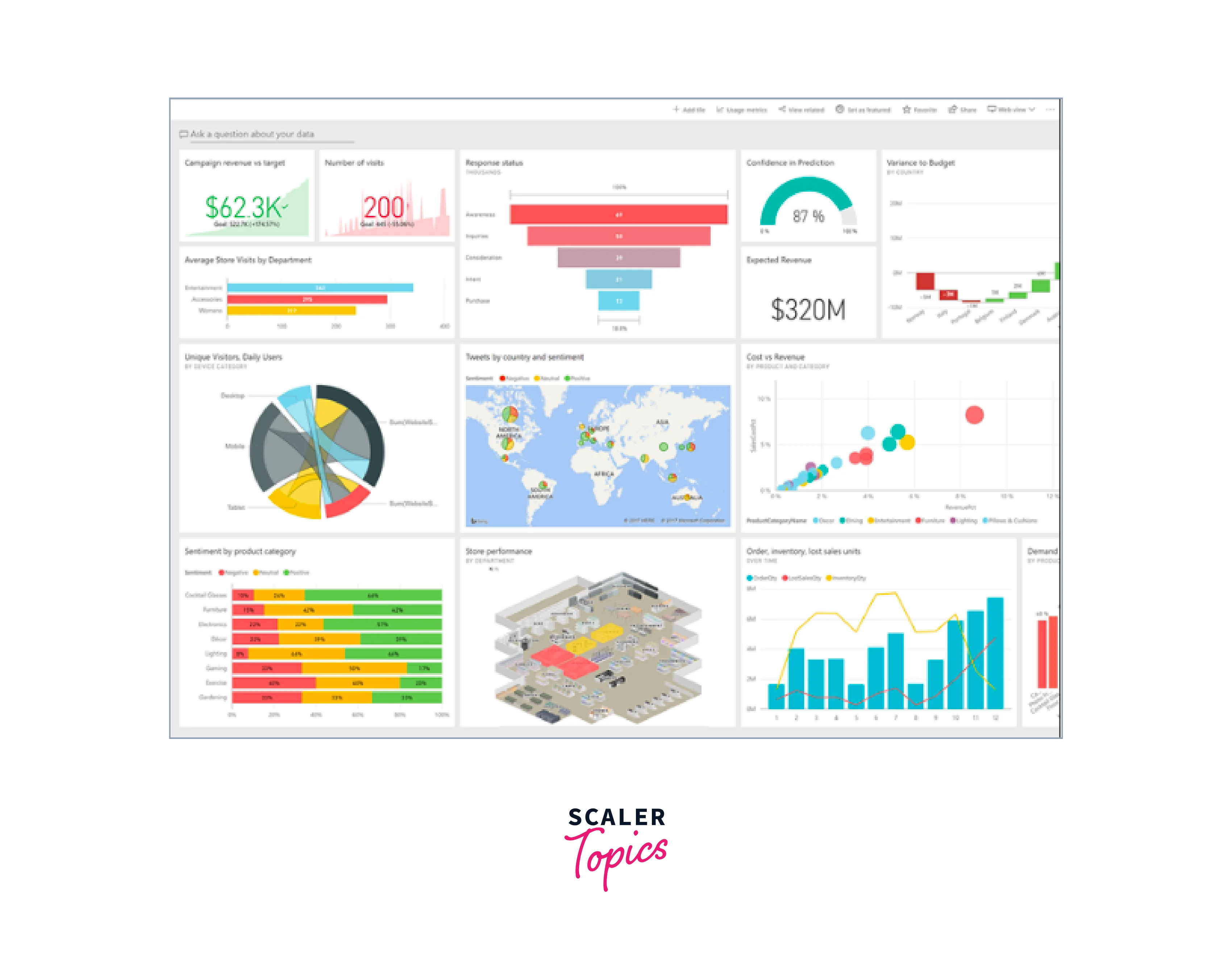
Range of Attractive Visualizations
Power BI offers an extensive range of visualizations that empower users to transform raw data into meaningful and engaging insights. Each visualization can be customized and configured to suit specific data analysis needs, allowing users to create captivating and insightful reports and dashboards tailored to their unique requirements. Here are some of the cool ways you can display your data in Power BI -
- Column Chart - A basic chart representing data as vertical bars, suitable for comparing categorical data or displaying trends over time.
- Bar Chart - Similar to a column chart, but the bars are horizontal, making it ideal for comparing data in categories.
- Line Chart - Useful for showing trends and changes over time, the line chart connects data points with straight lines.
- Pie Chart - A circular chart representing data as pie slices, suitable for displaying proportions or percentages.
- Donut Chart - A variation of the pie chart with a hole in the center, providing more space for data labels or additional information.
- Area Chart - Similar to a line chart, but the area between the line and the axis is shaded, making it suitable for displaying cumulative data.
- Scatter Plot - Used to visualize the relationship between two numerical variables, plotting data points on a two-dimensional graph.
- Map Visualizations - Power BI offers various map visualizations, including filled, bubble, and heat maps, to display geographical data and spatial trends.
- Funnel Chart - Depicts data in stages, showing the gradual reduction of values from one stage to another, commonly used for sales or marketing data.
- Tree Map - A hierarchical chart that displays data in nested rectangles, with the size of each rectangle representing a numerical value.
- Gauge Chart - This shows a single value on a circular scale, resembling a speedometer, and is often used to represent progress toward a goal.
- KPI (Key Performance Indicator) Visual - Presents key metrics with clear visual indicators like arrows or colors, enabling quick performance assessment.
- Card Visual - A simple visual that displays a single value or metric, useful for presenting key figures prominently.
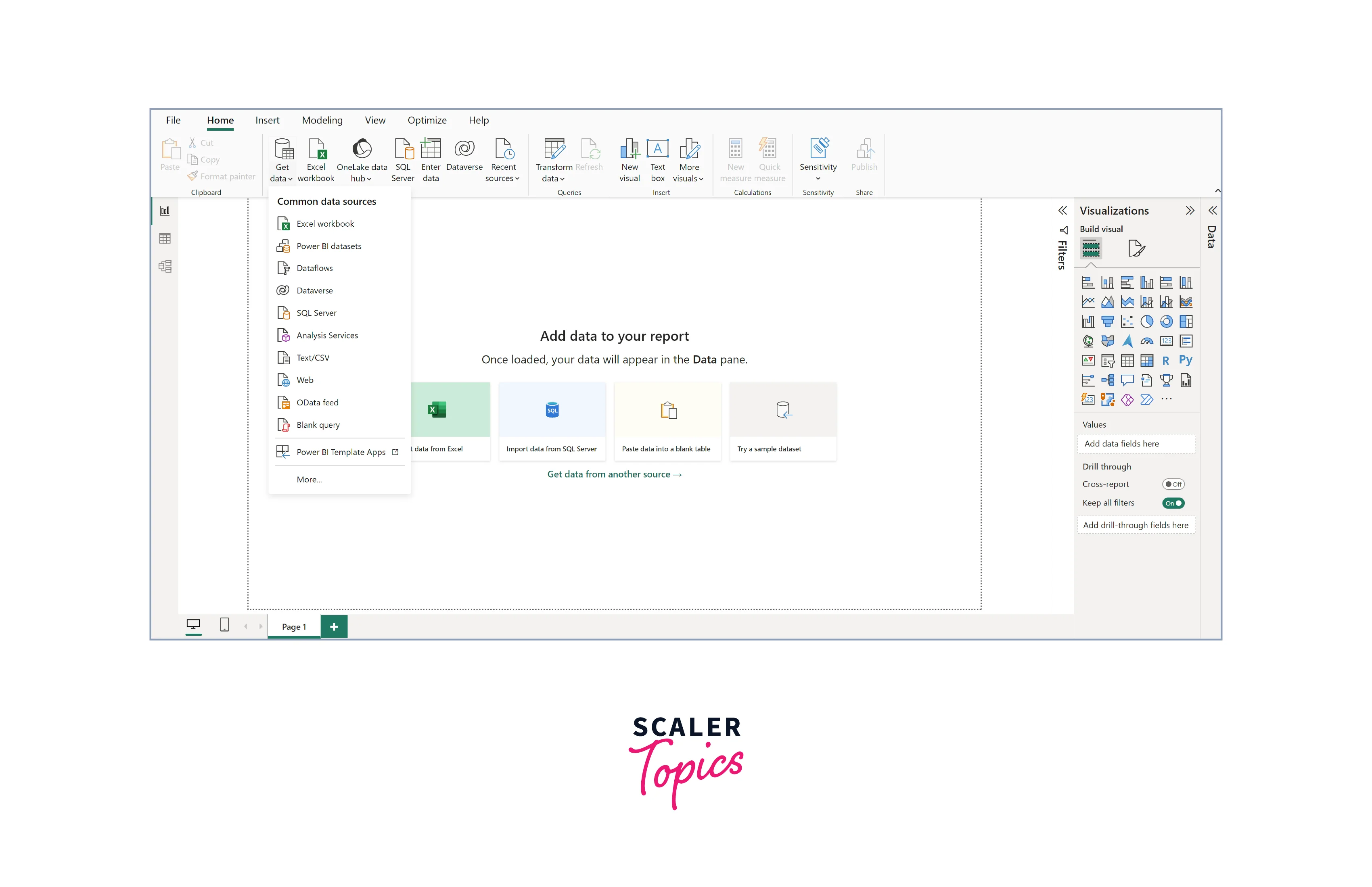
Get Data (Data Source)
Power BI makes it effortless to connect to a wide range of data sources, empowering users to fetch data from different places and use it for analysis and visualization. This extensive data source compatibility makes Power BI an indispensable tool for accessing and analyzing data from various applications and databases, enabling users to explore insights from different angles and sources. Power BI supports a wide range of data types/sources, including -
- Excel/CSV Workbook
- SQL Server Database
- Azure SQL Database
- Azure Data Lake Storage
- SharePoint Online
- Salesforce
- Google Analytics
- Dynamics 365
- Common Data Service (CDS)
- Web
- JSON
- XML
- Hadoop File (HDFS)
- Folder
- MySQL Database
- PostgreSQL Database
- Teradata Database
- SAP HANA Database
- Amazon Redshift
- Oracle Database
- Google BigQuery
Dataset Filtration
Power BI offers robust datasets filtration capabilities, allowing users to refine and focus their data to extract specific insights. With dataset filtration, users can create custom filters to narrow down the data displayed in reports and dashboards, ensuring a clear and concise representation of the most relevant information. This Power BI feature empowers users to perform in-depth analysis, compare data subsets, and answer specific questions without complex data manipulation. In Power BI, you have the ability to filter datasets, creating smaller subsets that contain only the most relevant and essential data. The tool offers diverse built-in data connectors, including Excel, SQL databases, Oracle, Azure, Facebook, Salesforce, and more. This enables users to effortlessly connect to these data sources and import data from one or multiple sources to build datasets for analysis and visualization.
Customizable Dashboards
One of the key Power BI features is its ability to create fully customizable dashboards. These dashboards act as visual canvases, allowing users to arrange and organize reports, charts, and other visualizations based on their preferences and requirements. Users can effortlessly drag and drop elements, resize visuals, and add custom visuals to design insightful and visually appealing dashboards that suit their specific data analysis needs. With the ability to personalize colors, themes, and branding elements, users can create dashboards that align with their organization's aesthetics and branding guidelines. This level of customization empowers users to build powerful data stories and present complex information in an easy-to-understand and engaging manner, making data-driven decision-making more accessible and impactful.
Flexible Tiles
Power BI offers flexible tiles that provide users with dynamic and interactive visualizations. These tiles automatically adjust their size and layout to fit different screen resolutions and aspect ratios, ensuring a consistent and optimized viewing experience across various devices. With flexible tiles, users can seamlessly interact with their data and dashboards on desktops, tablets, and smartphones, enabling on-the-go access to critical insights and fostering a truly responsive and user-friendly data analytics environment.
Navigation Pane
The navigation pane in Power BI is a user-friendly tool that provides easy access to datasets, dashboards, and reports. This intuitive feature allows users to seamlessly switch between different project components, enabling a smooth and efficient workflow. Whether it's managing datasets, working on interactive dashboards, or creating insightful reports, the navigation pane simplifies the user experience and ensures convenient navigation within Power BI's rich and versatile environment.
Informative Reports
Power BI empowers users to create highly informative reports that present data insights in a clear and concise manner. With a wide range of visualizations, interactive features, and advanced analytics, users can craft comprehensive reports that provide valuable business intelligence. These reports enable data-driven decision-making, fostering a deeper understanding of trends, patterns, and key metrics and driving organizational success. Moreover, these reports can be easily shared with colleagues and stakeholders for greater collaboration, ensuring seamless knowledge exchange and fostering a data-driven organizational culture.
Natural Language Q&A Question Box
Power BI's Natural Language Q&A Question Box feature allows users to interact with their data using simple, everyday language queries (e.g., "Show sales by region," "What are the top products by revenue?"). This is one of the standout Power BI features, making it easily accessible for non-technical readers. With this intuitive capability, users can ask questions in a natural language format, and Power BI will respond with relevant and accurate visualizations and insights, making data analysis accessible to a broader audience and encouraging a data-driven decision-making culture within the organization.
DAX Data Analysis Function
Power BI offers a powerful Data Analysis Expressions (DAX) function, which allows users to create advanced calculations and measures for data analysis. With DAX, users can perform complex calculations, create custom metrics, and derive meaningful insights from their data, enhancing the depth and sophistication of their data analysis in Power BI.
Help & Feedback Buttons
Power BI provides convenient Help and Feedback buttons within the application, offering users quick access to resources, documentation, and community support. These buttons enable users to seek assistance, find answers to their questions, and provide valuable feedback to improve the Power BI experience, ensuring a user-centric and continuously evolving data analytics platform.
Office 365 App Launcher
Power BI integrates seamlessly with Office 365 App Launchers, providing users a unified experience across Microsoft applications. With this integration, users can access Power BI directly from their Office 365 environment, streamlining their workflow and enabling effortless navigation between tools for enhanced productivity and data-driven decision-making.
Great Collection in Content Packs
Power BI offers content packs that bundle dashboards, data models, datasets, and embedded queries, streamlining the data analysis process. With content packs, users can directly access a comprehensive collection of elements, eliminating the need to search for individual components separately and enabling them to leverage pre-built resources for insightful data visualization and analysis quickly.
Conclusion
- Power BI is a powerful and versatile business intelligence and data visualization tool that empowers users to transform raw data into actionable insights.
- With Power BI features like customizable dashboards, flexible tiles, and natural language Q&A, Power BI offers a user-friendly and intuitive interface for data exploration and analysis.
- The integration with Office 365, a wide range of data connectors, and the availability of content packs further enhance the Power BI experience, making it a go-to solution for organizations seeking data-driven decision-making capabilities.