House Price Analysis in Excel
Overview
Traditional methods of evaluating real estate may skew qualitative and rely more on instincts than good reasoning. However, linear regression analysis can find a robust model for using previous transactions in a location to guide property ratings and price analyses better.
What are We Building?
Three methods have historically been used to value property: comparable sales, income, and cost. Regression models offer a more flexible and objective substitute. Additionally, once a model is created, the process is autonomous, enabling real estate business owners to concentrate on their strongest suit. Variables like square footage and the number of bedrooms can be included in a model to assess their effects on a property's value. Regressions do not work like a magic trick. There is always a chance that a variable will exhibit autocorrelation or multicollinearity or that a correlation between two variables will be artificial.
Pre-requisites
Data Analytics using Excel along with basics of Excel.
How are We Going to Build This?
- Make an Excel report with all the important data, including pivot tables, pertinent charts, etc.
- Make a few hypotheses centered on the crucial factors and test them with the data.
- Mention all the highly connected variables.
Final Output
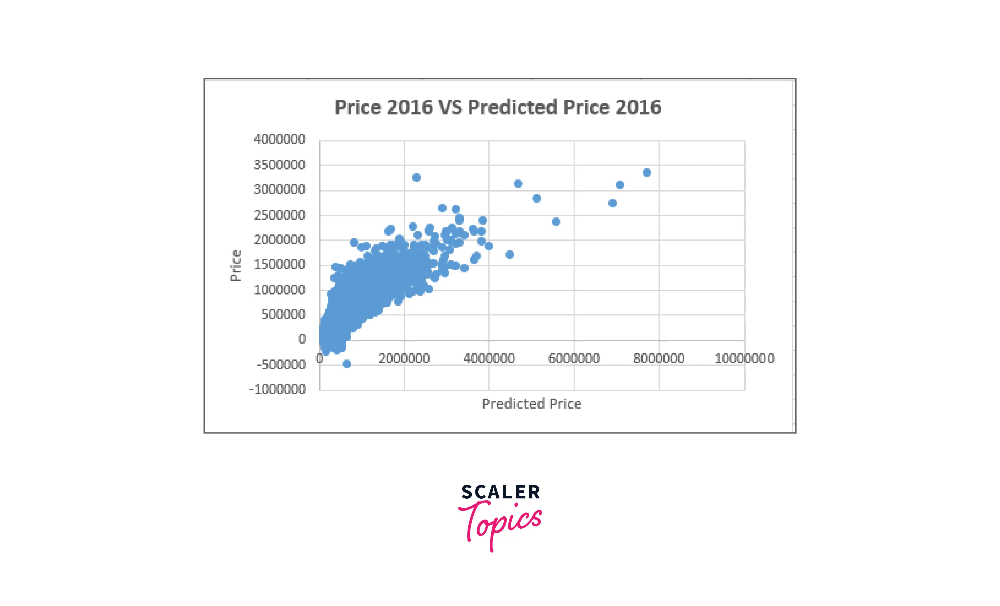
Requirements
The Analysis ToolPak can help you develop detailed statistical or engineering studies faster and with fewer steps. The program uses the required statistical or engineering macro functions to calculate and present the results in an output table once you supply the necessary data and parameters for each analysis—some tools include output tables and charts.
One worksheet at a time is the only one on which the data analysis features can be used. When you run a data analysis on grouped worksheets, the first worksheet will display the results, while the remaining worksheets will display empty prepared tables. Recalculate the analysis tool for each worksheet to do data analysis on the remaining worksheets.
For Windows, Do The Following:
Select the Add-Ins category from the File tab, Options, and Add-Ins.
If you're using Excel 2007, select Excel Options by clicking the Microsoft Office Button picture.
Select Excel Add-ins in the Manage box, then click Go.
Select Tools > Excel Add-ins from the file menu if you use Excel for Mac.
Check the Analysis ToolPak checkbox in the Add-Ins box and click OK.
Click Browse to find Analysis ToolPak if it isn't listed in the Add-Ins available box.
When requested to install the Analysis ToolPak, choose Yes if it isn't already on your machine.
For Mac, Do The Following:
Then, click Excel Add-ins from the Tools menu.
Select the Analysis ToolPak check box in the Add-Ins available box, then click OK.
Click Browse to find Analysis ToolPak if it isn't listed in the Add-Ins available box.
If you are prompted to install the Analysis ToolPak even though it isn't already on your machine, select Yes.
Restart Excel after quitting.
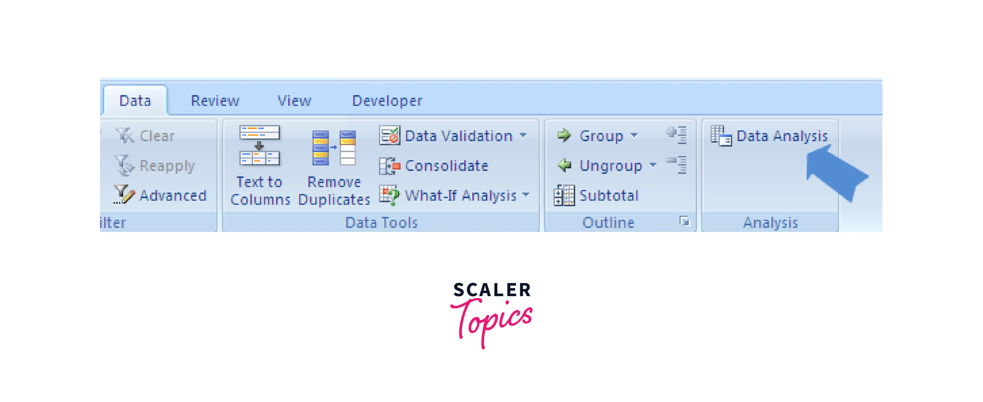
On the Data tab, the Data Analysis command is now accessible.
Building the Monthly Sales Report in Excel
Data Collection and Preparation
In this task, we'll examine many homes that an established real estate firm sold in a hypothetical state in 2016 and 2017. The agency employs qualified auditors who measure and map all the pertinent attributes of the properties as well as nearby geographic data. In addition, the agency is interested in knowing how the metrics they gather relate to the cost of the house. Therefore, they have engaged you to develop a model that uses the data to forecast the house's market value.
It would be best to build a regression model using the price as the dependent variable, using data from 2016 as your starting point. First, determine the elements that influence the growth of the housing market. Then, you are required to forecast the selling prices of the homes sold in 2017 using the model.
Data Cleaning and Transformation
In this step, we will get the highly co-related price variables.
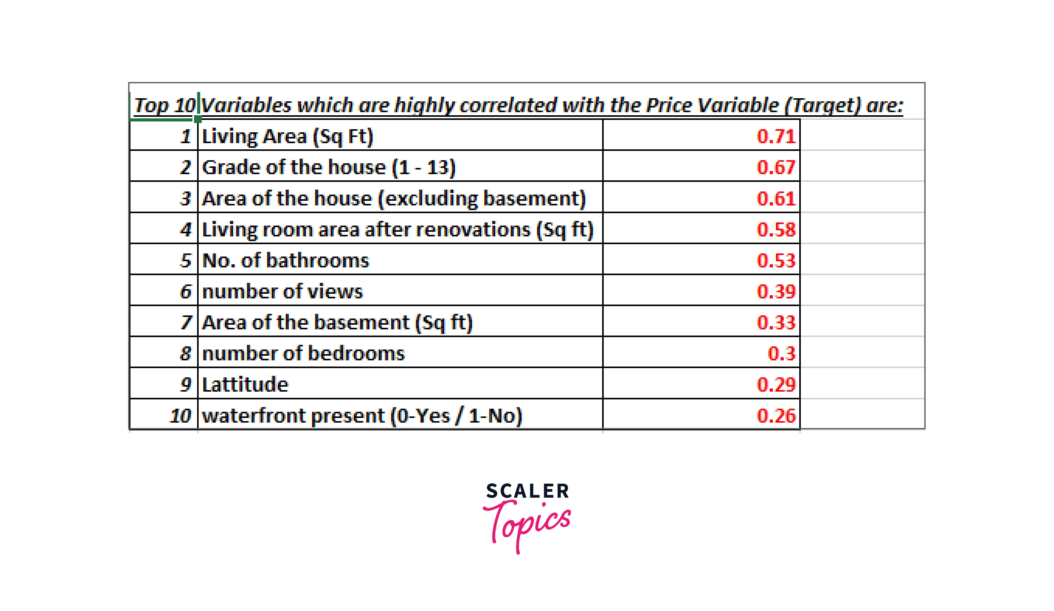
Click the Microsoft Office icon, choose Excel Options, choose Add-Ins, click Go, and then check the Analysis ToolPak box if you still need to install it. Choose the Descriptive Statistics option under the Data Analysis section, then click OK. Data Analysis >> Descriptive Statistics is found in the Data tab.
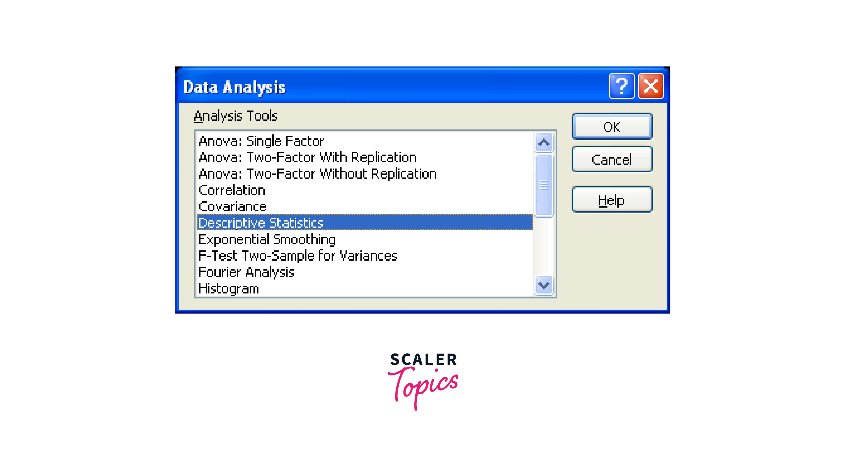
We choose the data in the input range, then the output range, where we want the output to be saved. The output will be thrown into the new worksheet if the output range is not specified. For options involving means, check summary statistics and confidence levels. The level of confidence is 95% by default. You can adjust the level to the study's hypothesis standard. The outcome will be displayed in the output range you choose when you click "Ok."
When performing a regression analysis, you may use Excel to do your regression analysis by following the procedures listed below:
Enter your data into Excel.
Entering your data sets into the Excel program is the initial step in doing your regression analysis in Excel. First, open the Excel program and input your data into the columns you can label according to your variables. In the following stages of the procedure, you can use this data as a reference when performing your regression analysis calculation.
Plugin Data Analysis ToolPak installation
The following action is to confirm that the free Data Analysis ToolPak program is set up on your PC. This program offers essential resources for doing regression analysis, one of several statistical calculations. First, open the Excel program, go to the "Data" tab in the top bar, and see whether the "Data Analysis" tab appears to determine if you already have the Data Analysis ToolPak. Click "Analysis tools" and "Data Analysis ToolPak" to install if it doesn't.
"Data Analysis" can be opened to see the dialogue box.
Calculations can start as soon as the Data Analysis ToolPak plugin has been downloaded successfully. To accomplish this, launch the Excel program, select the "Data" tab from the top bar, then click the "Data Analysis" button to display the dialogue box. Select "Regression" when the box appears, then click "OK" to input your variable data.
Type in the variable data
Click the "Input Y Range" box and type the range you want to calculate to start your regression analysis.
Choose your output choices.
The next step is to choose your output settings to specify how you want Excel to present the calculations' findings: Check the "Labels" box and move to the "Output options" section after entering your input data. Enter the column and row where you wish the summary displayed after selecting the "Output Range" bubble. Run your computation after selecting "OK" and checking the "Residuals" box.
Examine the results
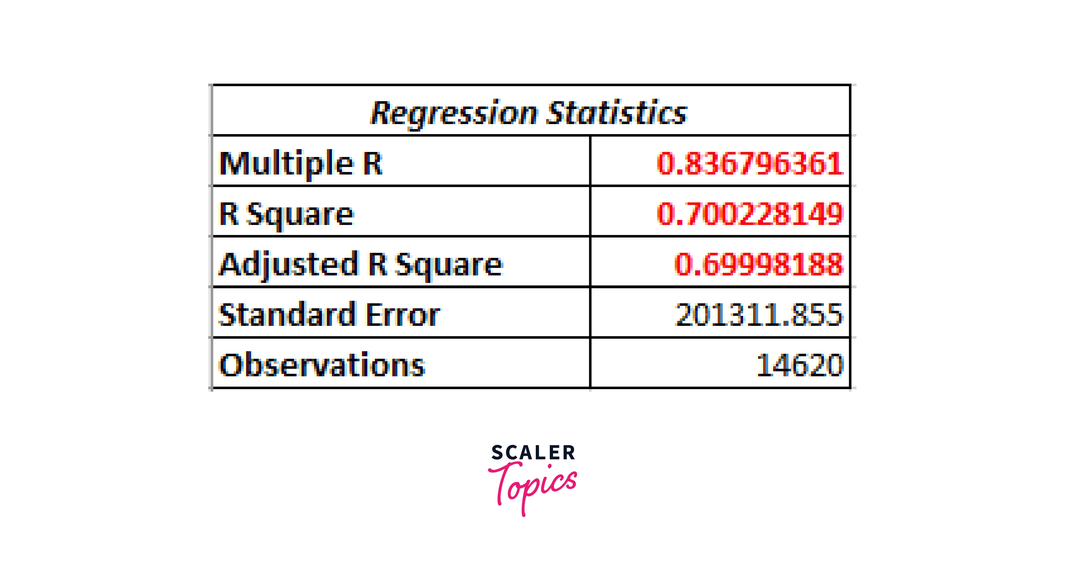
After conducting your regression analysis, interpreting your computations' outcomes is the next step. The summary output will produce several numbers, the R2 value being particularly insightful because it may gauge the variation between the dependent and independent variables and determine whether the regression model you selected is a good fit for your data. The range of R2 values is 0 to 1, with a greater value indicating a better fit for the model. A lower p-value indicates a correlation between the independent and dependent variables, which can be used to determine their relationship.
Create a scatter plot.
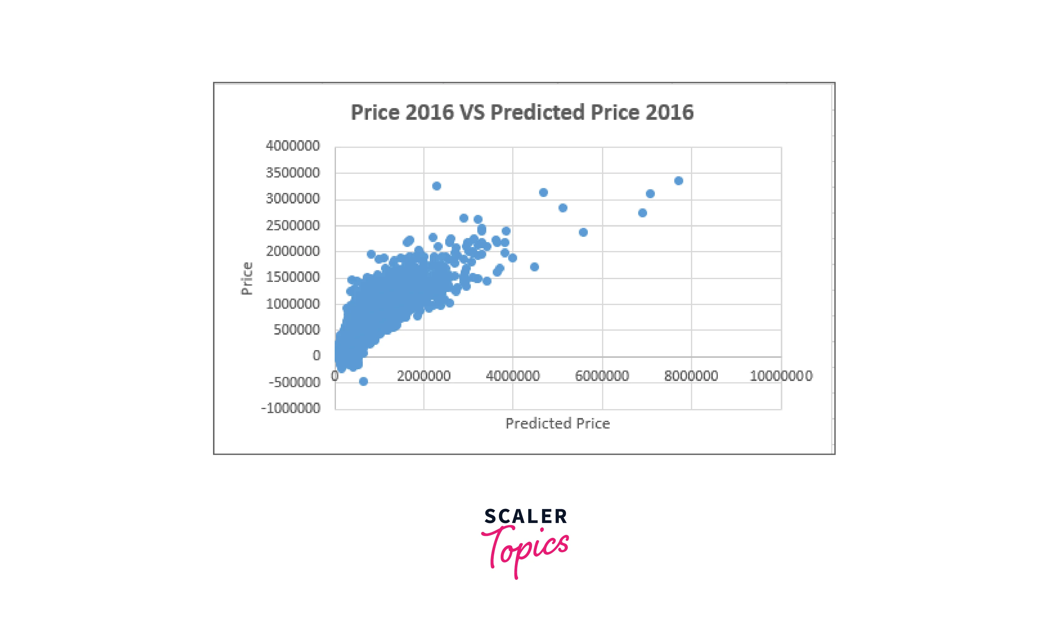
Start by selecting the data columns, including their headings, and clicking "Insert" on the top bar to display your regression results as a chart. Next, select the scatter plot by clicking "Recommended Charts" and clicking there. If you select the scatter option, Excel will create a scatter plot of your data on your worksheet.
Regression trendline insertion
Right-click any point on your scatter plot to bring up a menu, then select "Add Trendline" from there to add your trendline. The right pane of the screen will automatically populate with a "Format Trendline" box where you may choose the "Linear" option from the "Trendline Options" drop-down. Next, scroll down and choose the "Display Equation on Chart" checkbox to display the regression equation in the chart.
House Price Analysis in Excel
Descriptive Analysis
Descriptive analysis is a sort of data analysis that aids in accurately describing, displaying, or summarising data points so that patterns may appear that satisfy all of the data's requirements.
It is one of the most crucial processes in examining statistical data. It provides you with an analysis of the distribution of your data and aids in detecting errors and outliers. In addition, it lets you spot patterns between variables, preparing you for future statistical analysis.
Examples of descriptive approaches are building tables of quantiles and means, calculating methods of dispersion like variance or standard deviation, and creating cross-tabulations or "crosstabs" that can be used to test various hypotheses. These hypotheses frequently draw attention to variations among subgroups.
When significant variations between subgroups are displayed using a table of means, inferences, and conclusions are typically drawn. We naturally tend to extrapolate explanations for those patterns when we see, for instance, a discrepancy in incomes.
But this also falls under impact measurement, which requires various methods. Most of the time, random variation results in mean differences, and statistical inference are necessary to establish if the observed differences could result from pure chance.
A crosstab or two-way tabulation is designed to display the cell proportions of components with distinct values for each of the two available variables. A crosstab of education versus receipt of aid is to be made, for example, to determine what percentage of the population has a high school diploma and receives food or cash assistance.
The percentages of those who get food or financial assistance in each educational category should also be examined since aid levels dramatically decline as education levels rise.
The fraction of the population with varying education degrees can also be analyzed using column proportions. However, this is the inverse of any causal effects. For example, we might see a surprisingly high percentage of grantees with a college degree, but this could be due to a higher proportion of college graduates than those with only a high school diploma.
Descriptive analysis can be classified into four forms: frequency, central tendency, dispersion or variation, and position. These techniques work well when only one variable is present.
-
Measures of Frequency Understanding how frequently a specific event or response is likely to occur is crucial for descriptive analysis. The main goal of frequency measurements is to create something akin to a count or a percentage. Think about a study where 500 people are questioned about their favorite IPL team. A list of 500 responses would be challenging to read and organize, but counting the number of times a specific IPL team was chosen may make the data much more understandable.
-
Measures of Central Tendency Identifying the Central (or average) Tendency or Response is crucial while doing a descriptive study. The mean, median, and mode averages are used to calculate central tendency. Think about a survey where 1,000 people's weights are recorded as an example. The mean average would be a great descriptive statistic to use in this situation to measure mid-values.
-
Measures of Dispersion At times, understanding how data is distributed across a range is crucial. Consider the average weight of a sample of two persons to explain this further. The average weight will be 60 kilograms if both people weigh 60 kilograms. The average weight is still 60 kg even if one person weighs 50 kg and the other 70 kg. This type of distribution can be measured using dispersion metrics like range or standard deviation.
-
Measures of Position Identifying the position of a single value or its response regarding others is another aspect of descriptive analysis. In this field of knowledge, metrics like percentiles and quartiles are extremely helpful. Additionally, if you have data on numerous variables, you can examine any associations using bivariate or multivariate descriptive statistics. The bivariate analysis examines the frequency and variability of two distinct variables simultaneously to determine whether they appear to follow a pattern and vary in tandem. The central tendency of the two variables can also be tested and compared before performing other kinds of statistical analysis.
Similar to bivariate analysis, multivariate analysis examines more than two variables.
For instance, researchers might characterize a phenomenon using both correlation analysis and a case study, a qualitative analysis. The researcher can fully comprehend the behavior and pattern of the concerned set by using case studies to describe individuals, events, and institutions.
In contrast to experimental investigations, which typically require smaller samples, the researcher tends to collect data points from a relatively high number of samples while conducting surveys, one of the primary types of descriptive analysis.
The survey approach has a certain benefit over other descriptive methods, making it simple for researchers to examine larger populations. In addition, if the surveys are effectively conducted, they provide a more thorough and organized description of the research unit.
Regression Analysis
Regression analysis' objectives are to forecast the dependent variable's value based on the independent variable's value and characterize the connection between two variables based on observed data. Although we can make these predictions, it does not follow that we can infer a causal connection between the independent and dependent variables.
Definition 1: The linear regression model predicts y from x of the following form if y is a dependent variable and x is an independent variable.

Where the random error is, and the deterministic element of the model is + x. We further assume that the random error is normally and independently distributed with a mean zero for each given value of x.
Geospatial Analysis
When applied to geographic models, geospatial analysis is the collection, visualization, and manipulation of imagery, GPS, satellite photography, and historical data that is either explicitly described in terms of geographic coordinates or implicitly in terms of a street address, postal code, or forest stand identifier.
Crisis management, climate change modeling, weather monitoring, sales analysis, human population forecasts, and animal population management are just a few of the many uses for geospatial analysis.
Geospatial analysts separate useful information from irrelevant information and use that information to conceptualize and visualize the order that lies beneath the surface of the data that has been spatially sorted. By doing this, they can offer precise trend analysis, modeling, and projections. Analysts must diligently avoid spatial fallacies, biases, or misinterpreted effects and causal links. Some people believe that geospatial analysis includes just as much intuition as it does science.
Around the world, one billion users are using Excel. Eighty percent of the data kept in Excel has a spatial component. As a result, excel users have many datasets that can be represented or understood as maps. Unfortunately, excel has extremely few tools and functions for geographic data processing. It would be best if you frequently employed additional third-party applications when transferring these data in readable form (such as CSV files).
The GIS (Geographic Information System) family of spatial data analysis tools is arguably the most prestigious. A GIS application is also the GIS.XL add-in. Just much simpler to use, with well-chosen features and strong Excel connectivity.
Analysis Visualization and Insights
More Monthly Sales Report Templates
Any business that wants to boost sales and stay ahead of the competition in any industry must conduct market research. In quest of a better value, most consumers compare several brands' offerings. Using a tool like this Competitor Price Comparison Excel Template is one of the most practical ways to analyze competitive pricing and determine where their goods and services stand in the market.
These factors make price comparison essential for achieving the proper price position in the market in which you compete. Additionally, maintaining a competitive edge requires offering the appropriate pricing for the appropriate good or service.
-
An overview of significant end-of-month key performance indicators (KPIs) is provided by this dashboard sales template. View outbound calls, meetings, client conversions, and new lead analytics for each sales representative and team member. See how your end-of-month revenue compares to previous months and get a visual representation of the lead-to-opportunity ratio, opportunity-to-win ratio, and sales volume per channel. By copying and pasting the dashboard template into new tabs for every month, you may create an ongoing monthly sales report.
-
View monthly hotel sales information, such as total revenue from lodging, the number of rooms sold, the typical room rate, and the occupancy rate for each month. The design includes a visual chart showing monthly room sales and a list of monthly statistics. Use this template as a monthly and annual sales report to show data for individual months and annual totals.
-
Get a summary Report of your monthly retail sales using this template, which will be presented in tables and charts. Three sections comprise the template: The Sales Summary displays monthly total sales, customer orders, and sold goods, and a graph illustrating how sales have changed over time. The Product Summary contains a pie chart to compare product performance and units sold and sale amounts for various products. The template also includes comparing sales for the current and previous months. For template variants, you can swap out products with the names of sales reps or store addresses.
-
With the help of this simple forecast report template, small enterprises can calculate monthly sales over 12 months. Although intended for a particular product, this template can display an overall sales forecast. The template will automatically calculate total sales and percentage totals for each month and display the projected annual sales total once you enter your data into the non-shaded cells, including the number of units sold and the price per unit.
Conclusion
If we had to explain our model, the size of the lot influences a house's worth, how big the house is, how well it was built, how well it is now maintained, and whether or not it has air conditioning. This makes perfect sense. When we compare our model to conventional valuation techniques, we find that it closely resembles the cost approach, which also includes the cost of purchasing land and building a new structure and adjusting it for current levels of obsolescence. To use a regression phrase, this similarity could be an incorrect correlation.
