R Line Graphs/line Plot
Overview
R is a language and environment used for statistical computing and graphics. It is an open-source software supported by The R Foundation for Statistical Computing. R serves as a powerful tool for data analysis and visualization, widely used by statistics professionals, data scientists, and other data-related experts.
One of the most common and popular plots in R is a line graphs. Line graphs in R, commonly created using ggplot2, are ideal for visualizing trends and patterns in time-series or continuous data. With simple code, R users can generate informative and appealing line graphs.
Introduction
As discussed in the overview, R is a widely used programming language and software environment for statistical computing and graphics. Statisticians rely on its extensive capabilities, including graphical methods, statistical tests, modeling, time-series analysis, clustering, and visualization techniques.
Line graphs in R, without points, are essential for visually representing trends and patterns in continuous data. They offer a clear and smooth representation of data over time or an ordered dimension, allowing users to observe changes and variations easily. Line graphs help identify trends, seasonal patterns, or fluctuations, making them valuable tools for data analysis and communication in various fields, such as finance, economics, climate science, and social sciences.
Syntax and Examples
To create a line plot in R, you can use the plot() function or the more powerful ggplot2 package. Here are examples of both methods:
-
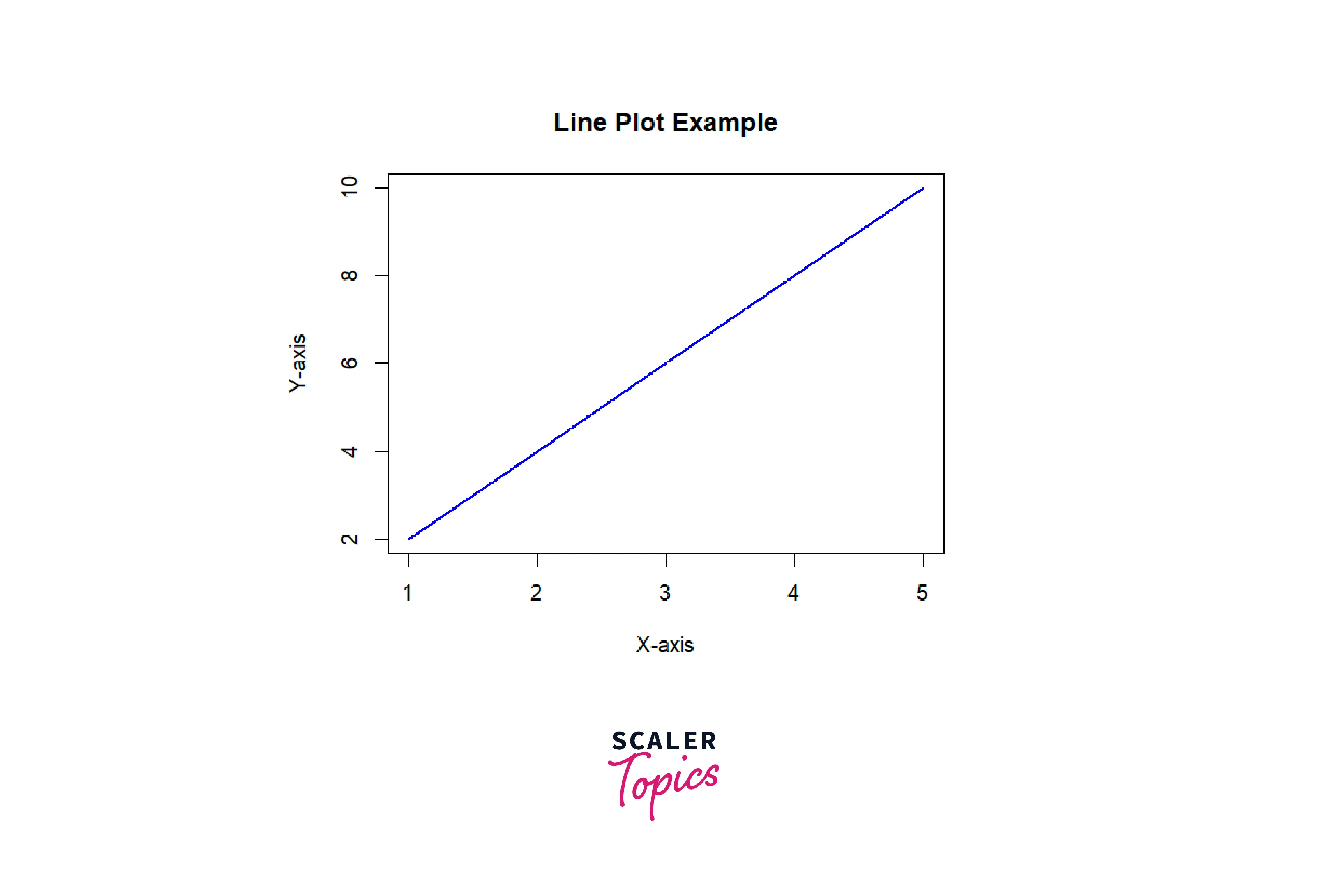
Using base R's plot() function:
Output
-
Using ggplot2 package:
Output
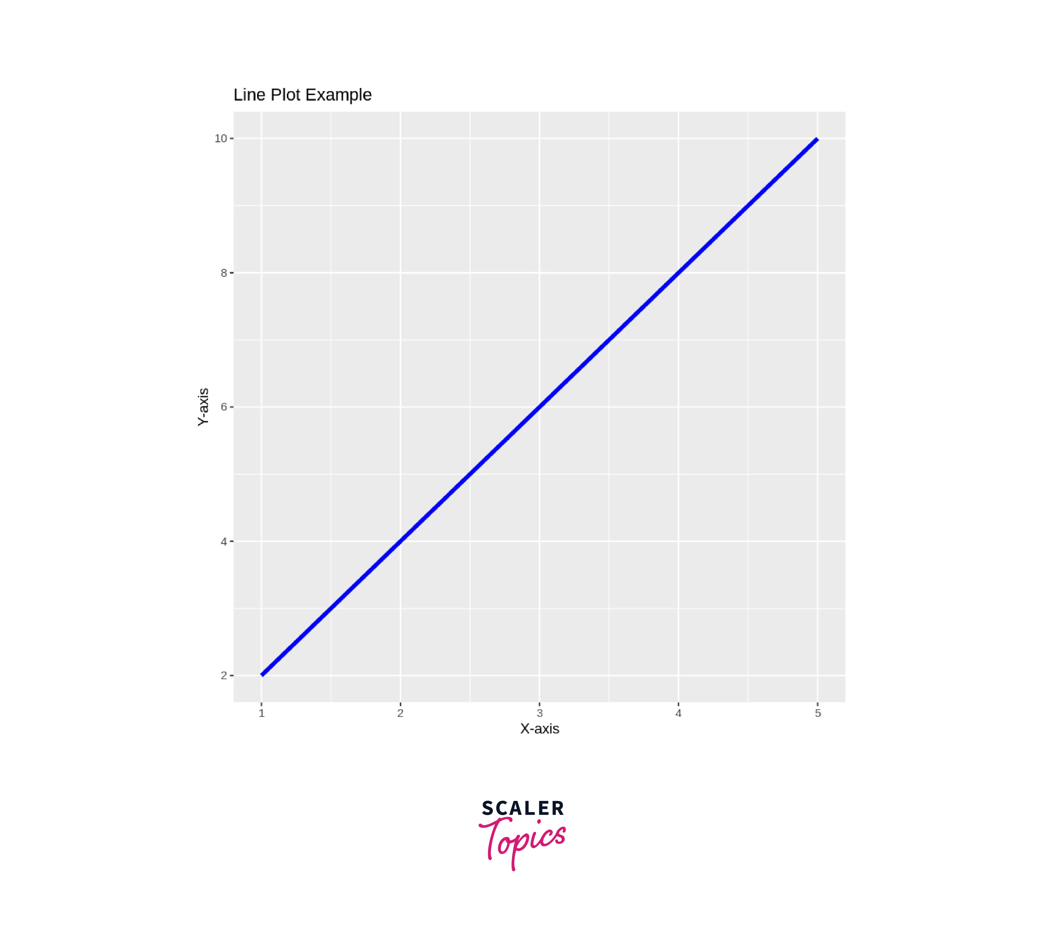
In both examples, we have a simple dataset with X and Y values. The plot() function generates a basic line plot using base R, where type = "l" specifies a line plot, lwd = 2 sets the line width to 2, and col = "blue" sets the line color to blue. The ggplot2 example uses ggplot() to initiate the plot, geom_line() to create the line plot, and labs() to set axis labels and the plot title.
You can customize these plots further by adding more data points, changing colors, adjusting line styles, and using additional features provided by ggplot2 to create more sophisticated and informative line plots.
Line Chart Title, Color and Labels
To add a title, color, and labels to a line chart in R using the ggplot2 package, you can follow the example below:
Output
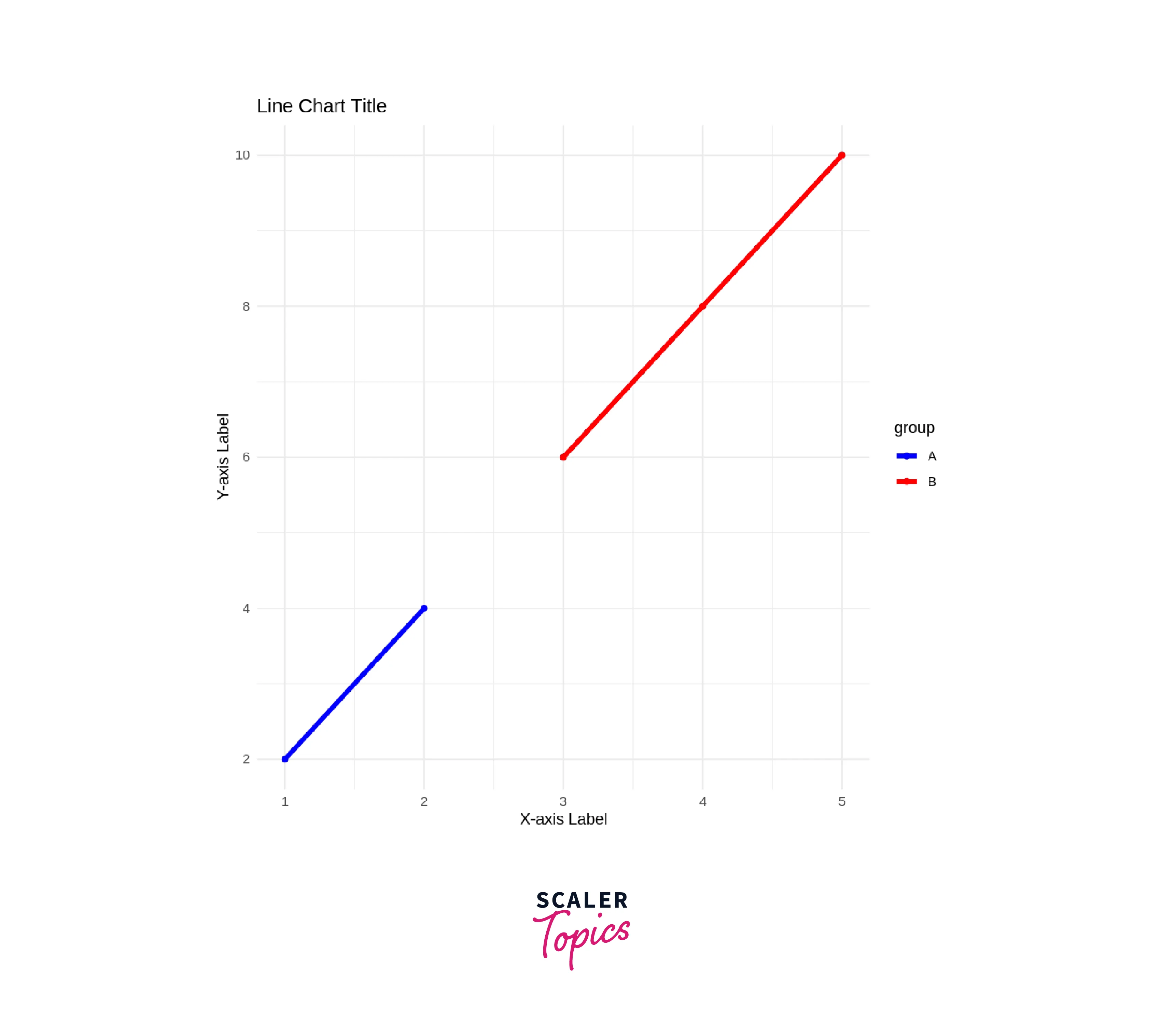
In this example, we have a data frame data with X and Y values and a grouping variable called group. We use aes() to map x, y, and color aesthetics to the respective columns in the data frame.
geom_line() is used to create the line chart, and size = 1.5 sets the line width to 1.5.
labs() is used to set the axis labels and the chart title. Replace "X-axis Label", "Y-axis Label", and "Line Chart Title" with your desired labels and title.
theme_minimal() is used to apply a minimalistic theme to the chart. You can explore other themes available in ggplot2 for different appearances.
scale_color_manual() allows you to set custom colors for the lines. In this example, we use "blue" for group "A" and "red" for group "B".
ggplot2 has advantages over base R, including:
- Layered grammar of graphics approach.
- Ease of customization.
- Widely adopted in the R community.
By customizing these elements, you can create visually appealing and informative line charts to represent your data effectively.
Plotting Multiple Lines in A Line Chart
To plot multiple lines in a line chart in R using the ggplot2 package, you need to have data with multiple lines in the same data frame. Each line's data should be associated with a common variable that will be mapped to the color aesthetic. Here's an example of how to do it:
Output
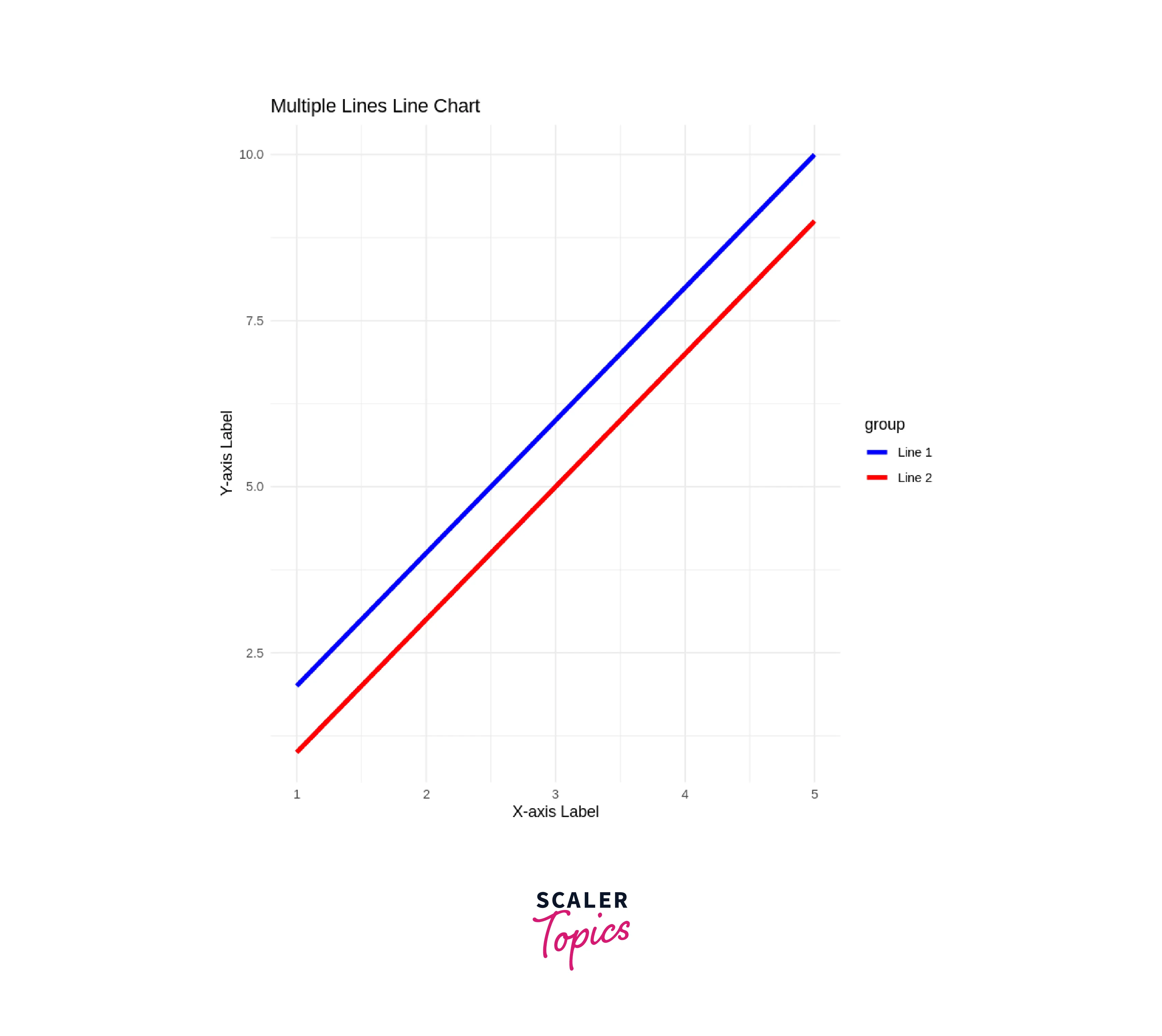
In this example, the data frame data contains two lines' data: "Line 1" and "Line 2." The x column represents the common X-axis values for both lines, while the y column contains the corresponding Y-axis values. The group column is used to differentiate the lines, and it is mapped to the color aesthetic.
- geom_line() creates the line chart with multiple lines. The size = 1.5 argument sets the line width.
- labs() is used to set the axis labels and the chart title.
- theme_minimal() applies a minimalistic theme to the chart. You can explore other themes available in ggplot2 for different appearances.
- scale_color_manual() allows you to set custom colors for the lines. In this example, we use "blue" for "Line 1" and "red" for "Line 2."
By organizing your data in this manner and customizing the chart options, you can easily create a line chart with multiple lines to visualize and compare various datasets effectively.
Conclusion
- R is a powerful language and environment for statistical computing and graphics, widely used by professionals in data analysis and visualization.
- Line graphs, especially those created using ggplot2 are effective tools for visualizing trends and patterns in time-series or continuous data.
- Customizing line charts in R is straightforward, allowing users to add titles, labels, and colors for better presentation and interpretation.
- With the ability to plot multiple lines in a single chart, R empowers data analysts to compare and contrast datasets efficiently, making it a versatile tool for various data-driven applications.