React Bootstrap Carousel
Overview
Carousel's are a versatile tool for creating visually appealing and interactive slide shows or cycling displays. Modern carousels are responsive and generate specific calls to action. React-bootstrap provides a very simple way to integrate custom carousels into our website.
Carousel Props
Props are used to modify the default behavior of the carousel. Here are some of the ways we can customize the bootstrap carousel:
- activeIndex: Each slide is assigned an index and the index of the currently active slide is known as activeIndex.
- as: It is used to store a custom version private to the page or application of the element and is not associated with the built-in browser behaviors.
- controls: This can be set to true or false, by default it is true. When set to true it shows the previous and next buttons in the carousel.
- indicators: These can also be set to true or false, by default they are set to true. These show the navigation of the slides at the bottom of the current slide.
- interval: It is the period for which the current slide is active. We can modify this by giving time in milliseconds.
- keyboard: It is used to set whether the carousel should listen and respond to keyboard events or not.
- nextIcon: It is used to change the default next icon to a new icon.
- prevIcon: It is used to modify the default previous slide.
- nextLabel: We can associate a label in the current slide to show the next element coming up in the carousel, it is only shown to the screen readers.
- prevLabel: Similarly we can also set a prevLabel to provide information about the previous slide.
- onSelect: It is a callback function that is triggered only when the active item changes.
- pause: It pauses the transition of slides based on various mouse events.
- slide: It takes a boolean value and when true enables animation on the Carousel as the slide changes.
- touch: When set to true enables the touch screen users to change the slide to previous or next with the support of left/right swipe interactions.
- wrap: It is again a boolean value that represents whether the slides should cycle continuously or have hard stops.
- bsPrefix: It is a prefix used for data attributes(props) data-bs-<some attribute> associated with Bootstrap components, carousel in this case.
Carousel.Item Props
The carousel is composed of individual carousel items and these items also have properties that can be modified:
- as: We can store a custom item type for the carousel component.
- interval: It is used to delay the time interval between the transition of two slides.
- bsPrefix: It is a prefix that is written with props to strongly customize the bootstrap CSS.
Examples
Basic example: How to Create a Carousel in React using Bootstrap?
To create a simple bootstrap carousel in React we will first create a React project and inside the project, we will install the bootstrap-react module with the command -
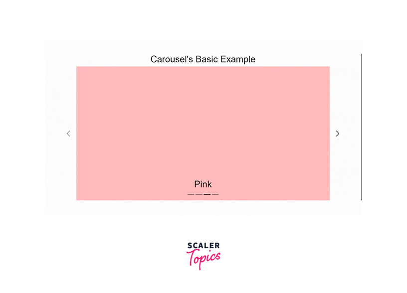
We are going to create a simple carousel as shown above. We are using background color but images can also be used to create carousels. It automatically cycles from one item to another. It has prev and next controls as well as indicators.
Add a file to the project Carousel.jsx with the folder structure being:

Now, add the carousel's code: Carousel.jsx0
- Carousel.Item refers to each slide of the carousel. Here, slides are given a unique ID based on the color of their background.
- Carouse.Caption is used to show some caption(text) with each slide at the bottom.
Here's the CSS used to set the background color for each slide and define the size of the carousel:
Lastly, we will add Carousel to the main App.js page as follows:
Variations
In this section, we will see how we can change the properties of carousels as per our requirements with the help of props.
Let us create a react project having various types of carousels. Create a folder in the src folder as Carusels. Also, add a folder named Images inside the public folder and add a few images of your choice to it that can be used in carousels. The public folder makes access to the images easier.
Install or add a react-bootstrap dependency in this new project. The following can be used to install the latest version.
The folder structure for this example is as follows:
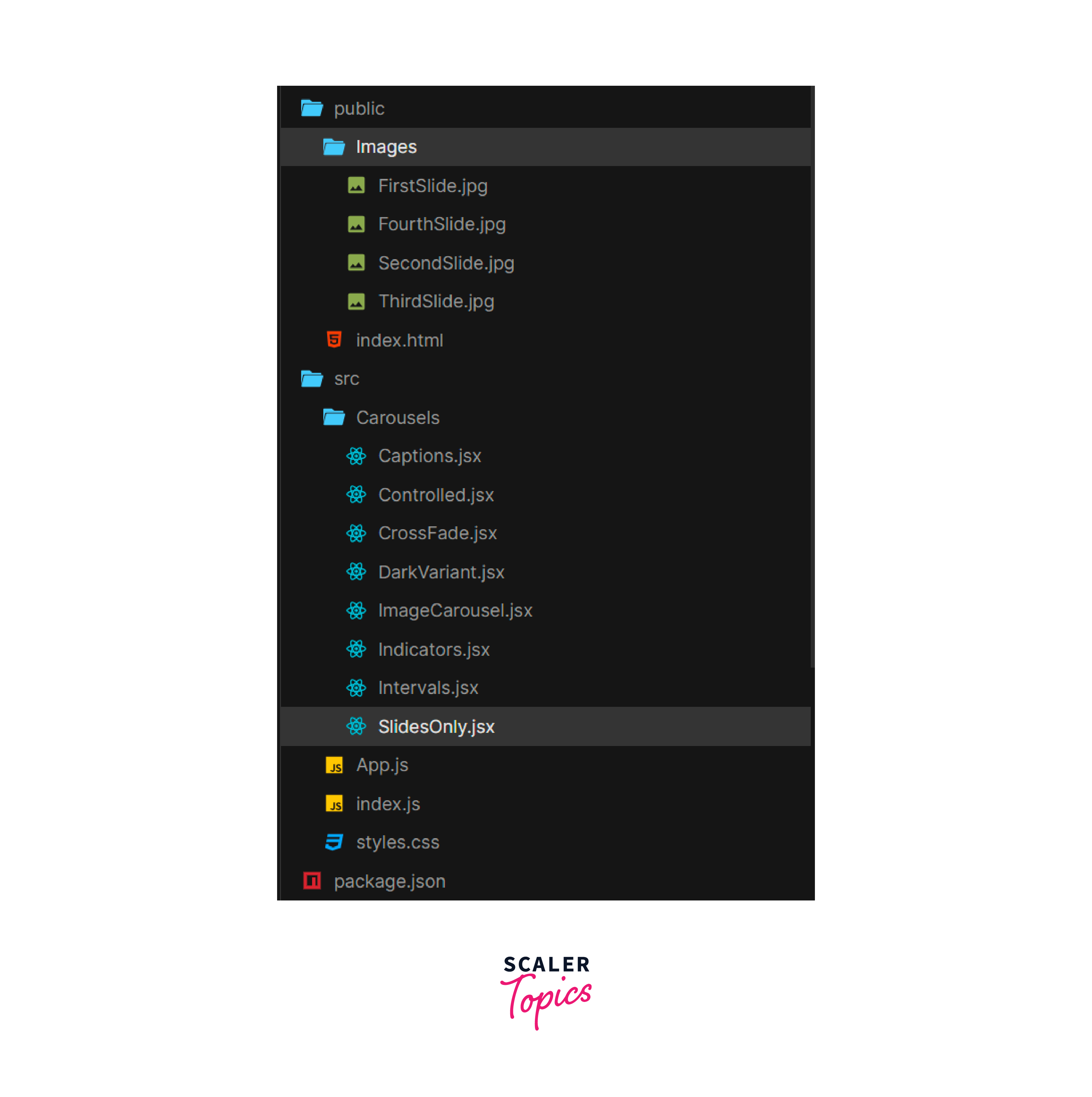
Add the jsx files inside the folder Carousels for different variations.
The styles.css file is as follows:
The width of the image is set to 100%, this will make the image size appropriate to the size of the window. Also, the caption text may not be visible if the image's color aligning with it is of the same color. So we are adding a background to it with 30% opacity. This way image will also be visible and the readability of the text will be high.
We are going to use an ImageCarousel to call images dynamically as follows:
Let us now see how we can code different variations of the carousels.
Slides Only The Slides only variant has only slides and these automatically change after a certain interval. By default controls and indicators are set to true, so we will change these to false as we only want slides.
SlidesOnly.jsx
App.jsx
In App.js we are importing and calling the SlidesOnly. Output:

With controls In the previous example, the user had no control over the carousel and it was only cycling through slides. By enabling controls we can let the user move to the previous or next slide with the help of two buttons added at the sides.
controls are by default set to true only but we can also manually set them using the prop controls={true} inside the Carousel element.
Controlled.jsx
App.jsx
Output:

With indicators Indicators add the little buttons at the bottom to make navigation to random slides possible. Again indicators are by default true only and manually can be set to true or false with the help of indicators={true | false}.
Indicators.jsx
App.jsx
Output:
 With captions
The caption is the text to be presented at the bottom of the slides above the indicators to tell the user more about the current slide.
With captions
The caption is the text to be presented at the bottom of the slides above the indicators to tell the user more about the current slide.
We can add all types of text links, etc. in the caption. In our example, we will insert a <h3></h3> heading and a <p> paragraph to describe the image.
The <Caousel.Caption> tag is inserted inside the <Carousel.Item> tag after the image. Captions.jsx
App.jsx
Output:

Crossfade To change the carousel's transition to cross-face, add the prop fade={true} to the <Carousel> element. This changes the transition from one slide to another.
Crossfade.jsx
App.jsx
Output:

MDBCarousel Interval By default, the interval for each transition is 3 seconds or 3000 milliseconds. In other words, a particular item of stays active for 3000 milliseconds. We can reduce or increase this interval using the prop interval={<time in miliseconds>}.
Note: It takes time interval in milliseconds so multiply the seconds with 1000.
Intervals.jsx
App.jsx
Output:

Dark variant The controls, intervals, and captions are white. Many times to match with the dark theme or make these visible when images are also of white background, we can change its theme to dark.
In older versions variant="dark" was supported but now we can use the bsPrefix with theme to change the variant to dark.
DarkVariant.jsx
App.jsx
We will change the CSS property background color of the caption to white to make it look attractive. Add the following to the class .carousel-caption:
Output:

Conclusion
- Carousel's in Bootstrap React provides a way for slideshows to cycle through a sequence of content. Carousel consists of Carousel Items, and Carousel Captions which are used to add slides and text content with the slides respectively.
- Carousels have various props to modify and customize the carousel for the specific website. Indicators, Controls, Intervals, Touch, Wrap, bsPrefix, etc. are the commonly used props.
- Carousel items can also be customized as per user requirements with the props as, interval, and bsPrefix.
- The controls, indicators, and fade props can be set to true to enable them and set to false to disable them. By default controls and indicators are enabled and fade is disabled.
- We can add caption with the tags <Carousel.Caption> tag inside the <Carousel.Item> tag below the image. It can have headings, paragraphs, etc.
- Interval is the period between two slides. This can be modified with the interval prop by specifying time intervals in milliseconds. By default, it is 3000 milliseconds.
- To change the theme of the to dark use the theme bsPrefix bs-data-theme="dark". This changes the color of controls and indicators to black.