React Bootstrap Tables
What is React Bootstrap Table?
React Bootstrap Table library is an excellent tool for developers seeking an elegant solution to create tables within React applications. It's built on the foundation of Bootstrap, a widely used front-end framework known for its responsive design and sleek aesthetics. React Bootstrap Table combines the power of React with the elegance of Bootstrap to make table creation a breeze.
Tables are indispensable when it comes to presenting data in a structured and organized manner. Whether you're working on a dashboard, an e-commerce site, or a data analytics tool, React Bootstrap Table empowers you to craft tables that not only deliver information effectively but also look stunning.
Table Props
To wield React Bootstrap Table effectively, you need to acquaint yourself with its extensive list of props and components. Let's explore some of the essential table props that will be your trusty companions on your table-building journey:
- bordered: This prop, when applied, adds borders around all sides of the table and its cells, providing a well-defined visual structure.
- borderless: In contrast to bordered, the borderless prop removes borders entirely, including those around the table header, resulting in a border-free appearance.
- variant: The variant prop allows you to switch the color scheme of the table, inverting it from dark to light or vice versa, providing flexibility in the table's visual style.
- size: By setting the size prop, you can control the overall size of the table. When using 'sm' as the size, it reduces cell padding by half, making it suitable for compact layouts.
- bsPrefix: The bsPrefix prop serves as an escape hatch for dealing with heavily customized Bootstrap CSS. It allows you to work with Bootstrap styles that have been strongly tailored to your project's needs.
How to Use the React Table Component?
Now that we've introduced you to the world of React Bootstrap Table and its myriad features, it's time to roll up your sleeves and learn how to use the React Table component effectively. In this section, we'll guide you through the process step by step.
Most Basic Table Markup
Let's start with the basics. Creating a simple table using React Bootstrap Table is a breeze. Here's a step-by-step guide:
-
Import React Bootstrap Table: Begin by importing the React Bootstrap Table library into your React component.
-
Create Data: Define your data as an array of objects. Each object represents a row in your table, with key-value pairs representing the columns.
-
Define Columns: Next, specify the columns for your table. Each column is an object with a detailed property that corresponds to the key in your data and a text property for the column header.
-
Render the Table: Finally, render the table component, passing in your data and columns as props.
That's it! You now have a basic table displaying your data.
Table with Images, Badges, Buttons, and Secondary Texts
Sometimes, you need more than just plain text in your table cells. You may want to include images, badges, buttons, or secondary text to provide additional context. React Bootstrap Table makes this easy.
To include these dynamic elements, you can use custom formatter functions. Here's an example of how to include an image in a table cell:
In this example, we've defined a column named 'Avatar' and used the formatter property to specify a custom function that renders an image based on the avatar property in each row of your data.
You can apply a similar approach to include badges, buttons, or secondary text within your table cells. The key is to define custom formatter functions that return the desired JSX elements based on your data.
With these steps, you can create tables that go beyond mere text and provide a richer and more informative user experience.
Contextual Classes to Color Tables, Table Rows, or Individual Cells
Styling your table is essential for visual appeal and usability. React Bootstrap Table offers contextual classes that allow you to add color to tables, rows, or even individual cells.
To color your table, you can add Bootstrap's contextual classes directly to the table component. For instance, to create a table with a light blue background, you can use the table-primary class:
Similarly, you can apply contextual classes to rows and cells using the rowClasses and cellClasses props:
In this example, rows will have a green background (table-success), and cells will have a yellow background (table-warning).
By leveraging contextual classes, you can customize the appearance of your table to align with your project's design and branding guidelines.
Prop Striped to Add Zebra-Striping
Adding zebra-striping to your table rows is a straightforward way to improve readability. React Bootstrap Table provides the striped prop for this purpose.
To enable zebra-striping, simply add the striped prop to your table component:
With this prop, every other row in your table will have a slightly different background color, making it easier for users to distinguish between rows.
Hoverable Tables
To create tables that respond to user interactions, you can enable the hover effect using the hover prop. When a user hovers over a row, you can define specific behaviors, such as changing the background color or displaying additional information.
To enable the hover effect, add the hover prop to your table:
Now, when a user hovers over a row, you can use CSS or JavaScript to add interactive elements, enhancing the user experience.
Active Tables
Active tables are useful when you want to indicate that certain rows or cells are currently selected or have a particular status. React Bootstrap Table allows you to mark these elements as "active" for better user comprehension.
To enable active tables, you can use the selectRow prop and specify the mode as "checkbox" or "radio":
In this example, users can select rows using checkboxes or radio buttons, and the selected rows will be visually indicated as "active."
Bordered Tables
Adding borders to your table or individual cells is a common design choice. React Bootstrap Table provides the bordered prop to achieve this effect.
To create a bordered table, simply add the bordered prop to your table component:
This will apply borders around the entire table and its cells, enhancing the visual structure.
Small Tables
In situations where screen space is limited or you're working with compact datasets, you can reduce the table size using the small prop. This prop reduces the font size and padding, making the table more compact while preserving data integrity.
To create a small table, add the small prop to your table component:
This is especially useful for responsive designs where you need to ensure tables remain usable on smaller screens.
Vertical Alignment
Controlling the vertical alignment of your table's content is essential for maintaining a polished presentation. React Bootstrap Table provides options for aligning content at the top, middle, or bottom of cells.
You can use the rowStyle prop to apply custom styles to rows. For instance, to vertically align text in the middle of each cell, you can define a custom style like this:
By specifying verticalAlign: 'middle' in the row style, you ensure that text and content within each cell are vertically centered.
Customizing React Table Component with CSS Classes
While React Bootstrap Table offers excellent default styles, you may want to add your custom CSS classes to achieve a unique look that aligns with your project's branding and design guidelines.
To apply custom CSS classes, simply add them to the appropriate elements. For example, to style the table with a custom class, you can do the following:
In this example, the custom-table class is applied to the table, allowing you to define custom styling rules in your project's CSS.
Remember that you can apply custom classes not only to the entire table but also to specific rows, cells, or columns as needed. This flexibility ensures that your table's appearance aligns precisely with your project's requirements.
How to Add Sorting and Filtering to the Table Component
Sorting and filtering are critical functionalities for tables, especially when dealing with large datasets. React Bootstrap Table simplifies the process by providing built-in support for adding these features to your tables.
To enable sorting, you can use the defaultSorted prop and specify the column by which you want to initially sort the table. For example, to sort the table by the 'Name' column in ascending order:
This will display the table with the 'Name' column sorted in ascending order by default. Users can click on column headers to change the sorting order interactively.
For filtering, you can use the filter prop. This prop allows you to specify a custom filter function for each column. For instance, to filter the 'Age' column based on a custom filter function:
In this example, we've applied a text filter to the 'Age' column, allowing users to enter text to filter the table based on age values.
By enabling sorting and filtering, you provide users with powerful tools to navigate and explore data efficiently within your tables.
Additional Examples
To deepen our understanding and skills, we'll explore additional example:
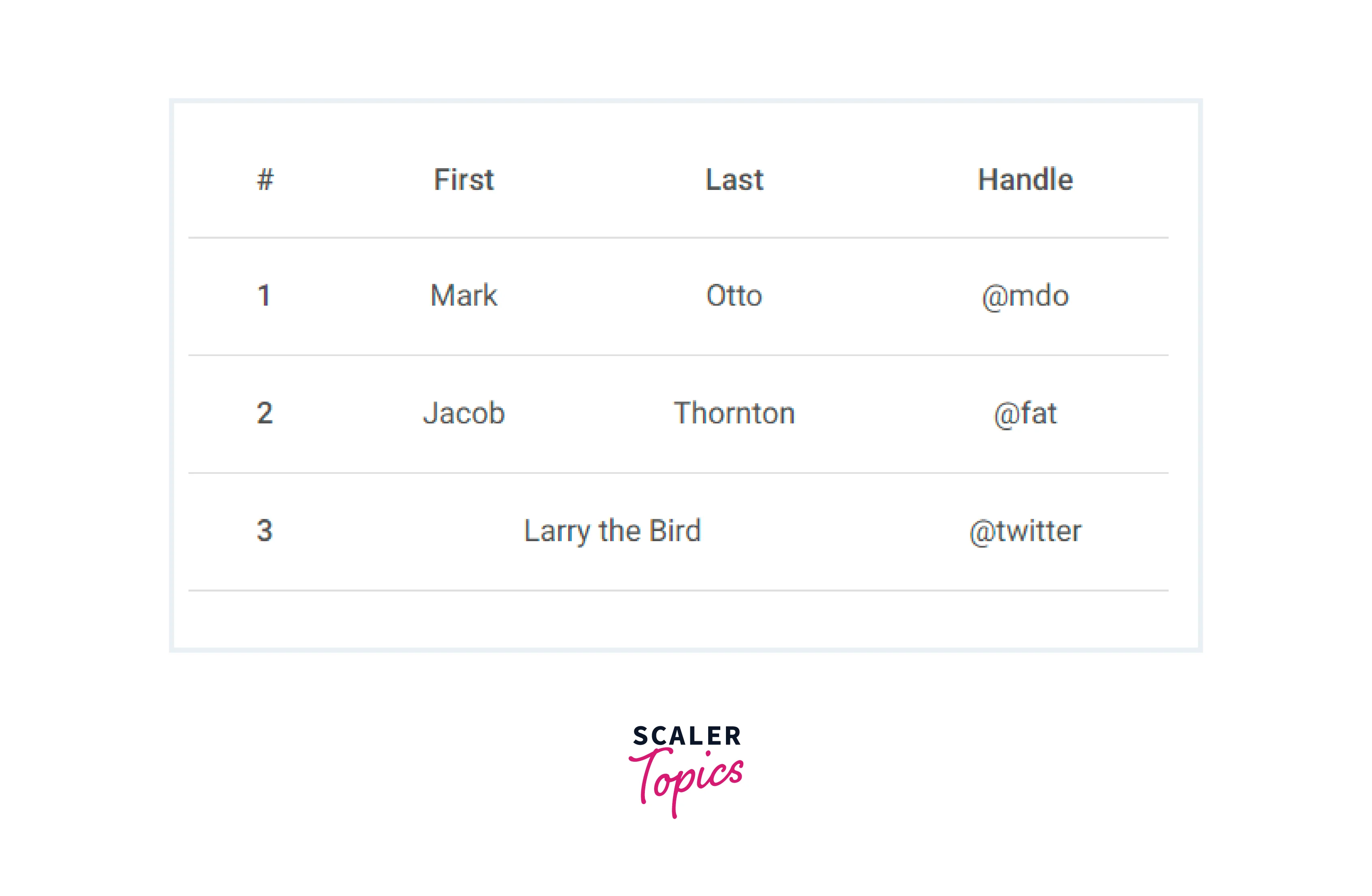
Basic Example
Using the most basic table markup, here’s how .table-based tables look in MDB.
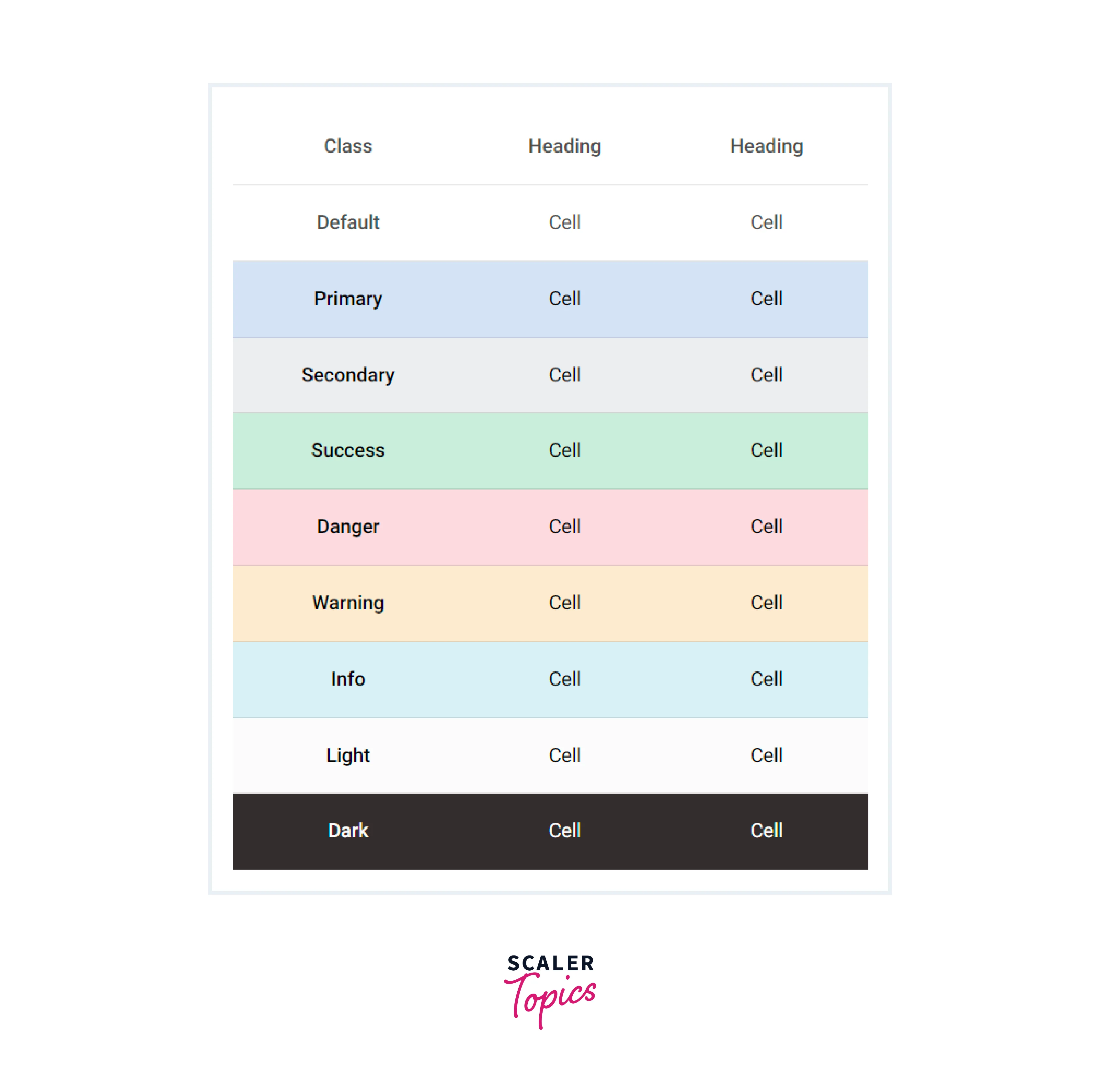
Variants
Use contextual classes to color tables, table rows or individual cells.
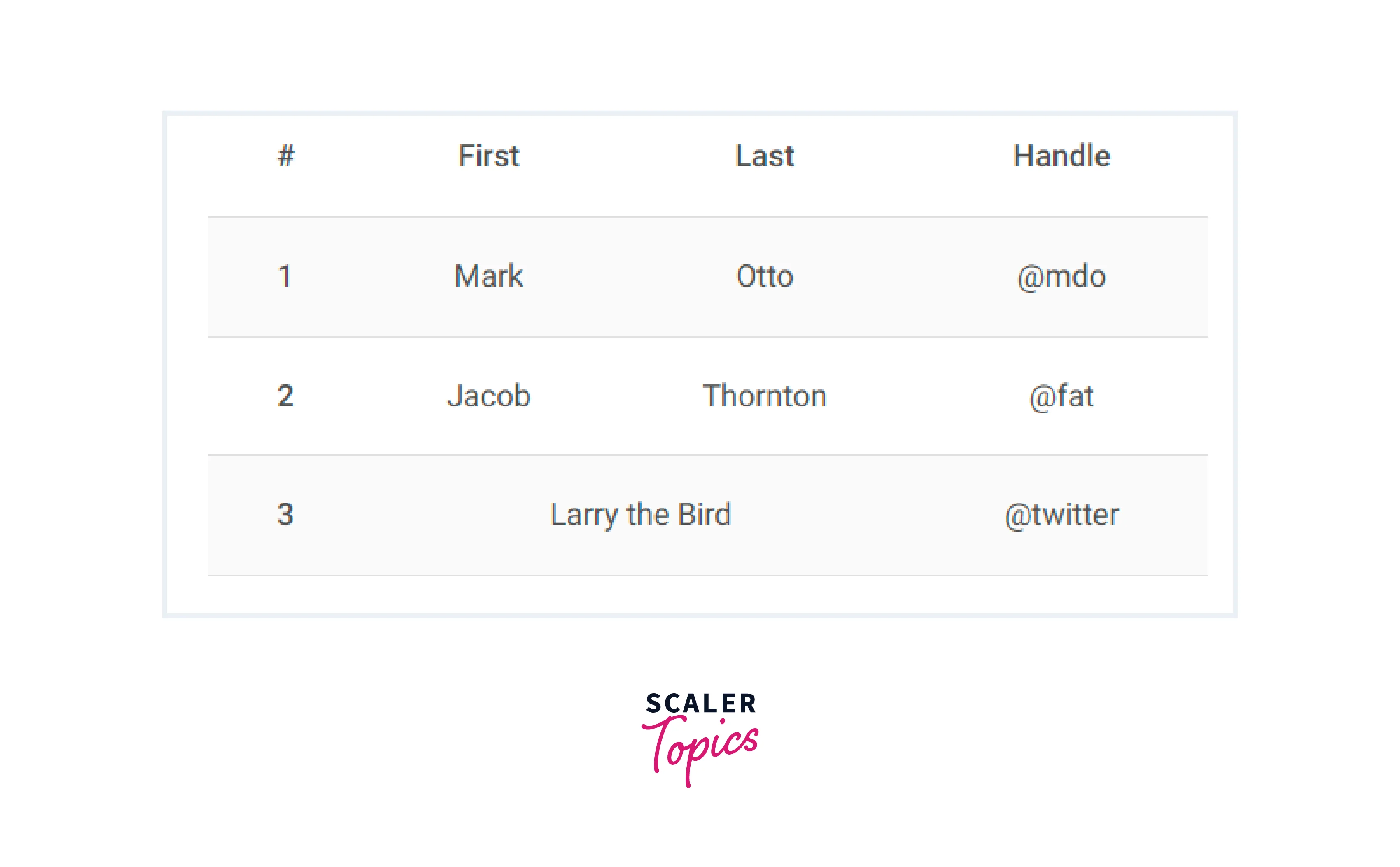
Striped
Use prop striped to add zebra-striping to any table row within the <tbody/>.
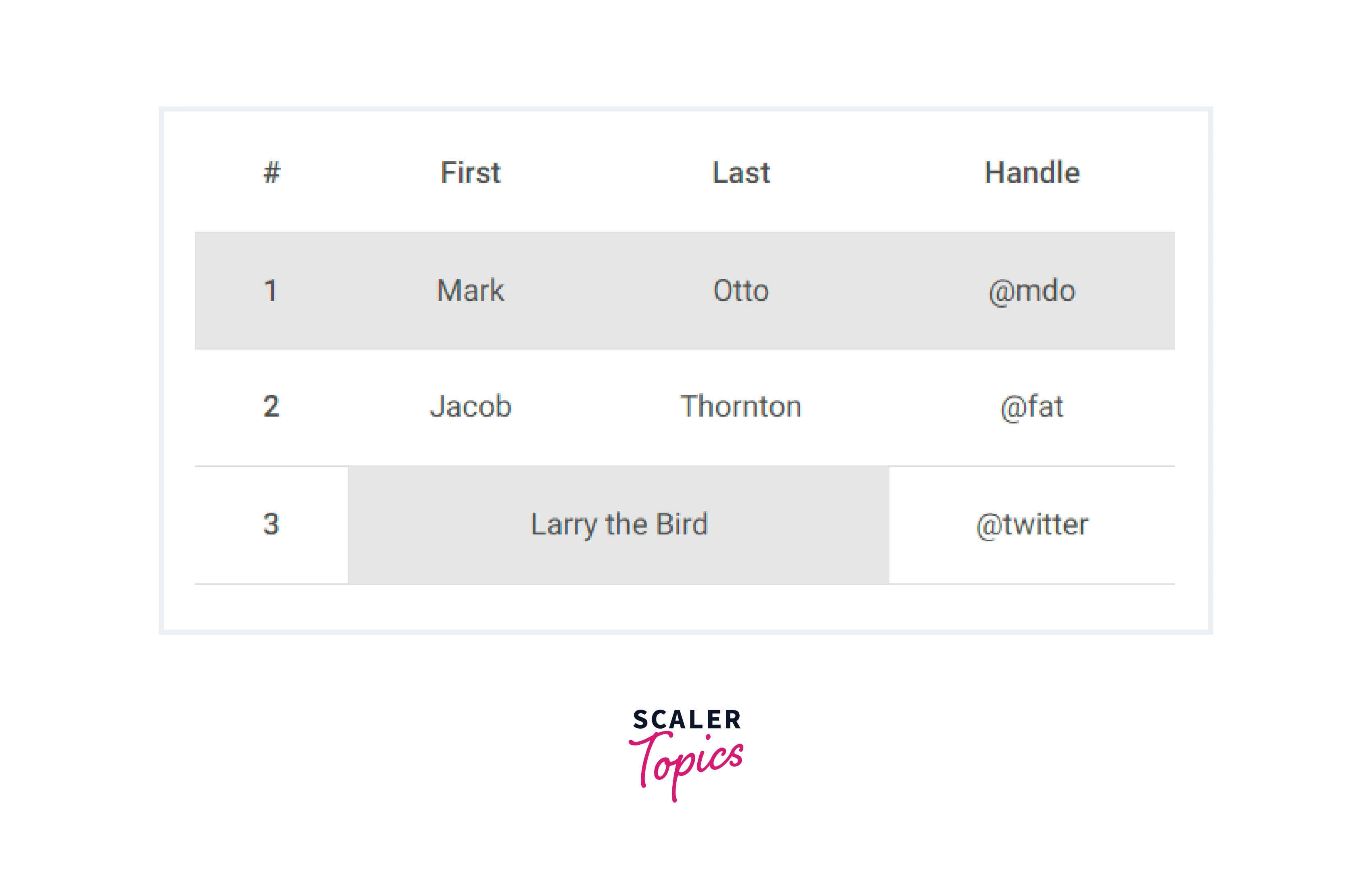
Active Tables
Highlight a table row or cell by adding a .table-active class.
Conclusion
- React Bootstrap Table stands out as a game-changer for developers aiming to create tables in React applications. It offers a perfect blend of aesthetics and functionality.
- With an extensive collection of props and components, React Bootstrap Table equips developers with the tools needed to craft visually appealing, responsive, and interactive tables.
- The library's features empower developers to not only present data effectively but also elevate the overall user experience. Users can interact with tables seamlessly.
- By mastering the concepts covered in this article, developers gain the skills to integrate tables seamlessly into their projects. Whether it's a simple data presentation or a complex data management system, React Bootstrap Table fits the bill.
- React Bootstrap Table emerges as a trusty ally in the quest for creating beautiful and functional tables. It simplifies the table-building process, ensuring developers can focus on delivering high-quality user experiences.
- To unlock the full potential of React Bootstrap Table, it's time to embark on your exploration. Dive into the library, experiment with its features, and embark on a journey to table mastery within the realm of React development. Your projects will undoubtedly benefit from the power and versatility this library offers.