React Native App Intro Slider
Overview
In today's competitive app market, creating a captivating onboarding experience is crucial to engage users and make a lasting impression. React Native, a popular framework for building cross-platform mobile apps offers a range of components and libraries to implement app intro sliders seamlessly. In this comprehensive guide, we will explore the React Native App Intro Slider.
Introduction
The App Intro Slider is a powerful component in React Native that allows developers to create visually appealing and interactive onboarding screens for their mobile apps. These screens typically introduce users to the app's features, guide them through the app's functionalities, and entice them to explore further. With the App Intro Slider, you can customize the content, layout, and behaviour of each slide to create a compelling onboarding experience for your users.
Usage
To use the React Native App Intro Slider, follow these steps:
- Step 1: Install the required dependencies by running the appropriate package manager command (e.g., npm install or yarn add).
- Step 2: Import the necessary components and functions from the React Native App Intro Slider library into your project.
- Step 3: Set up the data structure for your intro slides, including the content, images, and any associated actions or callbacks.
- Step 4: Render the AppIntroSlider component in your app's entry point or the desired screen, passing the necessary props and configuring the desired behaviour.
- Step 5: Customize the appearance and behaviour of the intro slides using the available props and methods.
Configuring Buttons
One of the essential aspects of creating a seamless onboarding experience with the React Native App Intro Slider is configuring the buttons. These buttons allow users to navigate through the intro slides and perform specific actions, such as skipping the onboarding process or proceeding to the next slide.
- Skip Button: The skip button provides an option for users to bypass the onboarding process and proceed directly to the main content of the app. To configure the skip button:
- Use the onSkip prop to specify a callback function that will be triggered when the user clicks the skip button.
- Inside the callback function, you can define the desired behaviour, such as navigating to the home screen or displaying a login/signup screen.
- Next Button: The next button allows users to advance to the next slide in the intro sequence. To configure the next button:
- You can customize the appearance and behaviour of the next button by using the renderNextButton prop.
- Pass a custom component or function that renders the desired button UI, such as a styled TouchableOpacity or a custom SVG icon.
- Inside the custom component or function, define the onPress event handler to act as moving to the next slide using the appropriate method.
- Previous Button: The previous button enables users to navigate back to the previous slide if they want to review or change their previous selection. To configure the previous button:
- Use the renderPrevButton prop to specify a custom component or function that renders the previous button UI.
- Inside the component or function, define the onPress event handler to trigger the action of moving to the previous slide using the appropriate method.
- Done Button: The done button indicates the completion of the intro slides and allows users to finish the onboarding process. To configure the done button:
- Use the renderDoneButton prop to provide a custom component or function that renders the done button UI.
- Inside the component or function, define the onPress event handler to perform the desired action when the user clicks the done button, such as navigating to the main screen or displaying a welcome message.
Props and Methods
Props
| Prop | Type | Description |
|---|---|---|
| slides | array | An array of objects representing each intro slide. |
| onSkip | function | A callback function triggered when the user skips the intro slides. |
| onDone | function | A callback function is triggered when the user reaches the last slide and finishes the intro. |
| renderItem | function | A function to render the content of each slide. |
| renderNextButton | function | A function to render a custom Next button. |
| renderPrevButton | function | A function to render a custom Previous button. |
| renderDoneButton | function | A function to render a custom Done button. |
| activeDotStyle | object | Custom styles for the active dot in the pagination indicator. |
| dotStyle | object | Custom styles for the dots in the pagination indicator. |
| bottomButton | boolean | Determines whether to position the buttons at the bottom of the slide. |
Methods :
| Method | Description |
|---|---|
| goToSlide | Programmatically navigate to a specific slide by index. |
| skipToNext | Skip to the next slide. |
| renderNextButton | Render the Next button. |
| renderPrevButton | Render the Previous button. |
| renderDoneButton | Render the Done button. |
Types of Intro Slider
We will dive into different types of intro sliders that you can implement using React Native, ranging from simple sliders to those with custom buttons, pagination, full-size background images, and RTL (right-to-left) support.
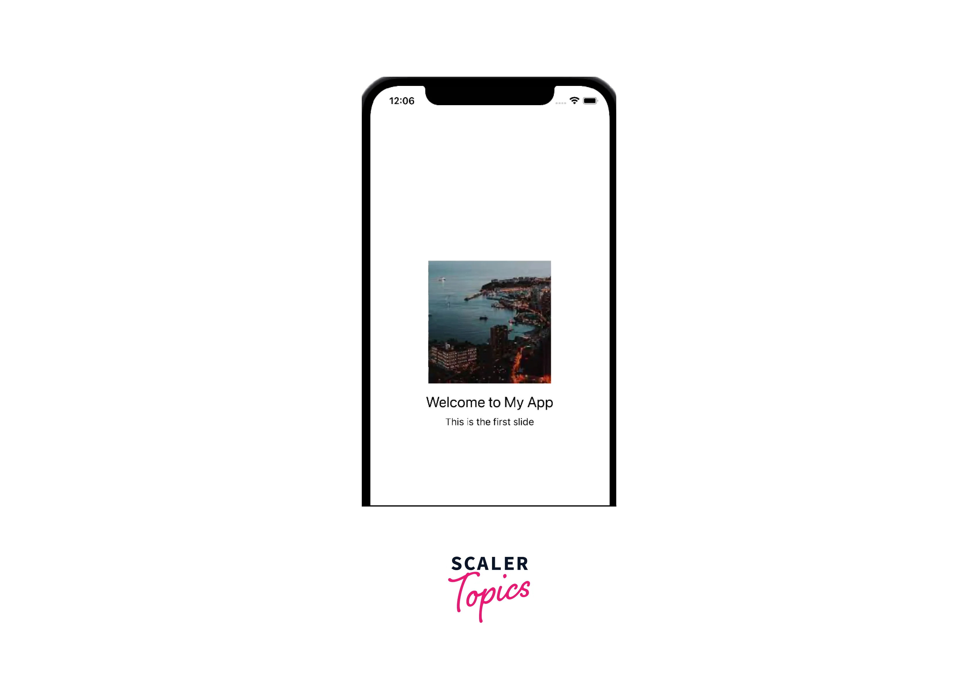
Simple Intro Slider
The simple intro slider provides a straightforward navigation flow, allowing users to swipe through and typically includes navigation buttons such as "Skip" and "Next" to control the user's progression through the slides.
Intro Slider with Button in Centre
In this type of intro slider, the Next button is positioned in the center of the screen, creating a prominent call-to-action for users to proceed to the next slide. This design choice can help draw attention to the button and encourage users to continue exploring the app's features.
Intro Slider with Custom Buttons
With the App Intro Slider component, you have the flexibility to customize the buttons' appearance and behaviour according to your app's branding and design language. You can replace the default buttons with custom ones.
Custom Pagination with Log In / Sign Up Buttons
To provide a seamless user journey from the intro slides to the login or sign-up process, you can incorporate custom pagination with login or sign-up buttons. This integration allows users to access these essential actions directly from the onboarding screens.
Full-Size Background Images
In some cases, using full-size background images in the intro slides can create a visually immersive onboarding experience. These images can set the tone, showcase key features, or represent the app's overall theme, capturing users' attention and generating excitement.
RTL (Right-to-Left) Support
React Native App Intro Slider also offers support for right-to-left languages and layouts. This is particularly useful for apps targeting audiences in regions where RTL languages such as Arabic, Hebrew, or Persian are predominantly used. By enabling RTL support, you ensure that the intro slides and navigation elements align correctly with the cultural preferences and reading direction of the target users.
Conclusion
- The React Native App Intro Slider component offers a powerful solution for creating engaging onboarding experiences in mobile applications.
- By using the App Intro Slider, developers can guide users through the app's features, highlight key functionalities, and make a positive first impression.
- Configuring the buttons in the App Intro Slider allows for seamless navigation and interaction within the onboarding process.
- The skip button provides users with the option to bypass the onboarding screens and proceed directly to the app's content.
- The next and previous buttons enable users to navigate through the intro slides, allowing for review and adjustment of previous selections.
- The done button signals the completion of the onboarding process and allows users to move forward into the main app experience.
- With the flexibility of customizing button appearance and behaviour, developers can align the button designs with the app's branding and design language.
- By leveraging the provided props and methods, developers can programmatically control the intro slider's flow, enabling dynamic rendering of buttons and customization based on user interactions.
- Creating a seamless and intuitive onboarding experience with well-configured buttons enhances user engagement and satisfaction.