React Native Calendar
Overview
The article will focus on React Native calendars, which are complex GUI elements that mobile app developers sometimes need to add to their apps. While React Native provides built-in components for primary GUI elements, creating more advanced components like calendars can be challenging. That's where the React Native Calendars library comes in, offering customizable pre-implemented components for adding calendars to your React Native app. The article will cover how to use these components to create a customizable, shareable calendar, as well as alternative packages for building calendars in React Native.
What is react-native-calendars Library?
React Native Calendars is a third-party library for React Native developers, which provides pre-implemented, customizable components for adding calendars to React Native applications. This library includes various calendar components, such as month view, week view, agenda view, and others, which can be used to display date-based data and capture date values from users.
Installations
Install react-native-calendars in your project using the below commands: For Yarn Users:-
For NPM Users:-
No need to link native modules as RN Calendars is coded in JavaScript.
Features to Highlight the react-native-calendars Library
The React Native Calendar component is a popular third-party library that allows developers to easily implement a calendar UI in their React Native applications. Some of its key features are:
Pure JS: No Native code required -
The React Native Calendar component is written entirely in JavaScript, which means that it does not require any native code to be added to the application. This makes it easier for developers to implement and maintain the component.
Date marking -
The calendar component allows developers to mark dates with different symbols such as a dot, multi-dot, period, multi-period, and custom marking. This feature is useful for indicating events, holidays, or other important dates to the user.
Customization of style, content, and dates
The component provides flexibility for developers to customize the calendar's style, content, and dates. This includes the ability to customize the colors, fonts, and sizes of the text, as well as the layout of the calendar.
Swipeable calendar with flexible custom rendering -
This means that developers can customize the appearance of the calendar based on their specific requirements.
Allowing or blocking certain dates -
The component allows developers to specify which dates should be allowed or blocked in the calendar. This feature is useful for restricting the user from selecting certain dates based on specific requirements.
Accessibility support -
The React Native Calendar component has built-in accessibility support, which means that it can be used by users with disabilities. This feature helps to make the application more inclusive and accessible to a wider range of users.
Automatic date formatting for different locales -
The component provides automatic date formatting for different locales, which means that developers do not have to worry about formatting dates based on the user's locale. This feature helps to improve the usage of the application across different regions.
React Native Calendar Components
React Native Calendars provides different components to create dynamic calendars, agendas, and timelines.
Calendar component: Displays a built-in calendar with support for monthly navigation.
CalendarList component:
This trendy and elegant component provides a semi-infinite, scrollable calendar list. Users can scroll through past and future months seamlessly, making it ideal for applications that require an extended date range. Agenda component:
The Agenda component is a comprehensive calendar solution that helps developers to create timetables, appointment tables, and date schedulers. It offers a rich set of features for managing and displaying events in a user-friendly manner.
Creating a Basic React Native Calendar
You can utilize the Calendar component to generate a classic calendar element that provides a month navigation feature. It is not compulsory to provide any props for this component. To create a calendar with the default configuration, paste the below code in App.js. File-name: App.js
Output
 It is important to note that when a date is chosen, a default highlight background style is not rendered as expected. Therefore, we must write our code to achieve this feature later.
Touch Event CallBacks
React Native Calendars provides various props that enable the attachment of callbacks for significant user interactions. Users can perform various actions on the Calendar component by interacting with it. They can press the month navigation arrows and day elements to navigate through the calendar and perform the desired actions. Below is an example demonstrating callback implementations: onDayPress The event onDayPress occurs when a particular day element is tapped by the user.
onDayLongPress The event "onDayLongPress" is triggered when the user performs a long press action on a day element.
onPressArrowLeft When the user clicks on the left navigation arrow for the month, it triggers the onPressArrowLeft event.
onPressArrowRight The event onPressArrowRight is triggered when the user clicks on the arrow icon located on the right side of the calendar component, which is used to navigate to the next month.
Initial, Min , and Max Dates
There are instances where the application developer wants to restrict the user to minimum and maximum end dates. To address this need, the Calendar component provides various props that can be utilized to set initial, minimum, and maximum dates. For example, suppose a calendar component is needed that displays October 2002 initially and allows selecting a day only between the 12th of October 2002 and the 29th of October 2002. By utilizing the Boolean prop disableAllTouchEventsForDisabledDays, we can effectively prevent touch feedback for disabled date elements. You can execute the code snippet provided earlier and evaluate it against the mentioned specifications. We can implement this scenario using the below code.
File-name: App.js
Output

As you can see in the above output, the users are restricted from selecting dates other than those falling within the range of 01-Oct-2002 to 29-Oct-2002.
Reusable Calendar Components
Creating a reusable component is considered a best practice when you need to use the calendar in multiple locations. The MyCalendar component has custom initial, minimum, and maximum dates, and it accepts all supported Calendar props for additional customization. In a subsequent section of the article, we will explain how to create a reusable date picker component, which will provide you with additional information on creating shareable calendars.
File-name: App.js
Calendar UI Customizations under Support
The View, TouchableOpacity, and Text are some of the framework components that are included in the Calendar component. Unlike the native date picker component available in Android and iOS, the Calendar component provides a wide range of props that can be used to customize the user interface extensively. For instance, by using the disableLeftArrow and disableRightArrow boolean props, you can disable the left and right arrows in the MyCalendar implementation mentioned earlier.
Output

Date Range Marking
One option to achieve a date range marking style in React Native is to use custom styles, however, React Native Calendars provides a convenient built-in date range marking feature that can increase productivity. For instance, marking the first ten days of December 2022 can be easily accomplished using this feature.
File-name: App.js
To generate 15 days, we utilize the getMarked function. The styling of the period's start and end edges will be altered based on the values of the startingDay and endingDay variables. Upon executing the above code snippet, the resulting output can be observed as follows:
Output

It is possible to utilize the period marking feature to construct a date range selector component. The React Native Calendars library provides an in-built functionality for marking multiple periods.
Individual Days marking
To indicate special days or national holidays in a physical paper calendar, you may notice colored or symbolized boxes on specific dates. Similarly, in the Calendar component, you can make use of the marked dates prop to designate day elements.
To begin with, the first step is to understand how to highlight specific days. The code provided below can be utilized for MyCalendar:
File-name: App.js
When the boolean prop labeled as "marked" is enabled, the component will show a dot on a particular day. On the other hand, when the boolean prop named "selected" is turned on, the component will display a filled circle surrounding the corresponding day element.
Output

One can modify the above-mentioned indicators and shapes in the following ways:
File-name: App.js
Output
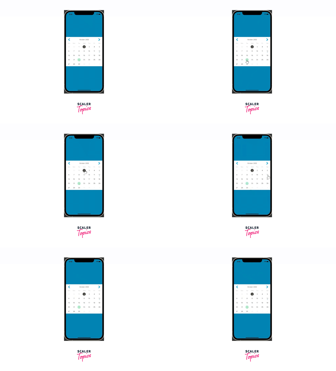
By utilizing the markedDates prop, we can effortlessly highlight the presently selected day component. To accomplish this, we can retain the current date in the component's state and adjust the markedDates object correspondingly. This process is illustrated in the following code snippet:
File-name: App.js
In the above code, we used the useMemo Hook to memoize the marked object, ensuring that it is only recomputed in case of changes in the selected parameter. This approach aims to enhance performance optimization. The following example showcases the practical application of the aforementioned code by implementing selectable day elements.
Output

React Native Calendars provides a marked boolean element that displays a circle shape with predefined styles. However, the library also offers flexibility through the customStyles prop, which allows users to define their shape styles. Upon pressing a day element, a code snippet is triggered that displays a green rectangle.
File-name: App.js
Output

The code snippet mentioned above demonstrates the activation of the custom markers functionality through the use of markingType="custom". By utilizing the multi-dot marking type, we can include several dot indicators within day elements to signify events occurring on a specific day, as illustrated in the subsequent code example:
File-name: App.js
Output

Calendar Theme Customizations
Suppose there is a need to modify the color and font of the day element, header, and weekday name. React Native Calendars provides the facility to alter the appearance by using a custom theme object. However, if the custom theme object appears to be restrictive, you can directly overwrite the stylesheets of the Calendar component. Besides, customization of the Calendar component's container styles is also possible. For instance, the calendar's appearance can be personalized using the theme prop, and the style prop can be utilized to modify the container's styles, as demonstrated in the following example:
File-name: App.js
The provided code snippet utilizes the theme prop to implement a dark color scheme for the calendar and further applies style enhancements to the calendar container using the style prop.
Output

Advanced Use Cases With React Native Calendar Agenda Component
There are situations where it becomes necessary to integrate agenda views in React Native applications. While the markedDates prop of the Calendar and CalendarList components can be used to add multi-period markers, the calendar component does not offer enough room to incorporate a title and a description for each marker line. Therefore, creating an agenda view using the Calendar or CalendarList component may not be the optimal choice.
You can use the Agenda component to generate agenda views that showcase records for every day in a separate view that appears when you click on a day element. Execute the below code to see a sample agenda view:
File-name: App.js
Output
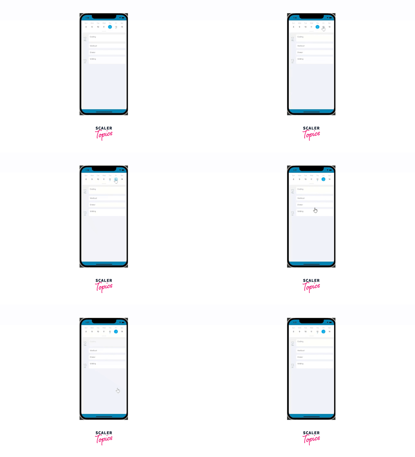
By utilizing the items prop, we incorporated the Agenda component and furnished it with the necessary day items. With the help of the renderItem callback, we created a user interface for each day item. For more information on the various callbacks and supported props available in the official documentation of the Agenda component.
React-native-calendars Alternatives
Just like any widely-used package, there exist options for the React Native Calendars library. These options are not as competitive as the React Native Calendars package, for several reasons. Most of these alternative packages focus on creating date pickers instead of calendar views. Some of these packages are no longer supported or have been deprecated, such as react-native-calendar. The alternatives are relatively new and are still gaining recognition within the React Native community. However, it's still worthwhile to consider the alternatives because they may become prominent in the future and may provide unique features that meet your specific requirements. Here are some alternative libraries to check out: react-native-calendario: Minimal, modern, scrollable calendar component with built-in range selection, date marking, and style customization react-native-calendar-strip: a modern and customizable calendar component that displays days in one row. It provides a simple and customizable calendar strip that allows users to navigate through dates and select specific dates. It is a popular choice for implementing a compact and horizontally scrollable calendar strip component in React Native applications. react-native-calendar-picker: a date picker component with extensive style customization. It allows users to select single dates or date ranges with ease. The library provides customization options for appearance, allowing you to match the calendar picker with your application's design. It offers callbacks to handle date selection events and retrieve the selected dates programmatically. React Native Date Picker: This library with the platform-specific date and time picker components is implemented in Java and Objective-C for better performance. The component offers three distinct modes: date, time, and datetime, providing flexibility for various use cases. It allows customization to match the desired visual style and supports multiple languages, enhancing its versatility for international applications.
FAQs
Q: How can I add React Native Calendar to my project?
A: To add React Native Calendar to your project, you can use a package manager like npm or yarn to install the library and then import the components into your project.
Q: Is React Native Calendar suitable for all types of React Native apps?
A: React Native Calendar is suitable for most types of React Native apps that require a calendar component, such as scheduling apps, task management apps, and event-based apps.
Q: Can I customize the appearance of the calendar in my app?
A: Yes, React Native Calendar provides developers with a variety of customization options for the appearance of the calendar, including the ability to change colors, fonts, and styles.
Conclusion
In conclusion, the react-native-calendars library provides developers with a highly customizable and user-friendly solution for integrating calendars into their React Native applications. With straightforward installation steps and a wealth of features, including touch event callbacks, date range and individual day marking, and customizable UI options, this library makes it easy to create beautiful and functional calendars.
In addition, the library offers reusable components and advanced use cases with the React Native Calendar Agenda Component, which makes it a great choice for developers looking for a flexible and powerful calendar solution.
While there are alternatives to react-native calendars, these options may not offer the same level of customization and functionality. Developers looking for a comprehensive and easy-to-use calendar library for their React Native projects should definitely consider using react-native-calendars.
