React Native Chart Kit
Overview
It's crucial that we give the user a pleasant experience while interacting with apps where the data has the power. Charting libraries can be useful in this situation. They enable you to give the consumer an appealing data presentation, which encourages them to utilize your app more frequently. In this article, we'll examine React Native Chart Kit, a framework for creating charts in React Native. To provide you with a usable example to work with, we're going to construct an application that makes use of it.
What is react-native-chart-kit and How to Use it?
Importing Components
The command for importing components are :
Import components using ES6 syntax.
Example
Let us take a quick look at a basic example :
React Native Chart Style Object
Define a chart-style object as having the properties shown below.
Properties:
- backgroundGradientFrom : explains the color that comes first in the backdrop of a chart's linear gradient.
- backgroundGradientFromOpacity : establishes the initial color opacity in the backdrop of a chart's linear gradient.
- backgroundGradientTo : defines the second color of a backdrop chart's linear gradient.
- backgroundGradientToOpacity : specifies the second color's opacity in the backdrop of a chart's linear gradient.
- fillShadowGradientFrom : Defines the initial color of the region beneath the data's linear-gradient (also known as fillShadowGradient).
- fillShadowGradientFromOpacity : Establishes the initial color's opacity in the area's linear-gradient (also known as fillShadowGradientOpacity).
- fillShadowGradientFromOffset: Specifies the initial color offset (0-1) in the region beneath the data's linear gradient.
- fillShadowGradientTo: defines the second color in the area beneath the data's linear gradient.
- fillShadowGradientToOpacity: defines the second color's opacity in the region beneath the data's linear gradient.
- fillShadowGradientToOffset: Specifies the second color offset (0-1) in the area under the data's linear gradient.
- useShadowColorFromDataset: Sets forth the choice to apply color from each dataset to the graphic data. False by default.
- color: explains the base color function, which is used to determine the hues of the labels and sectors that are used in charts.
- strokeWidth: determines a chart's basic stroke width
- barPercentage: provides a definition for the percent (0–1) of the available width for each bar in a chart.
- barRadius : specifies the diameter of each bar.
- propsForBackgroundLines:Refer to the Line documentation for react-native-svg to change the background lines' styles.
- propsForLabels: Consult the Text documentation for react-native-svg to change the labels' styles.
- propsForVerticalLabels: Refer to the Text documentation for react-native-svg to change the vertical label styles.
- propsForHorizontalLabels: Consult the Text documentation for react-native-svg to change the styles of horizontal labels.
Responsive Charts in React Native
Use the Dimensions react-native library to obtain the width of your device's screen to create a responsive chart.
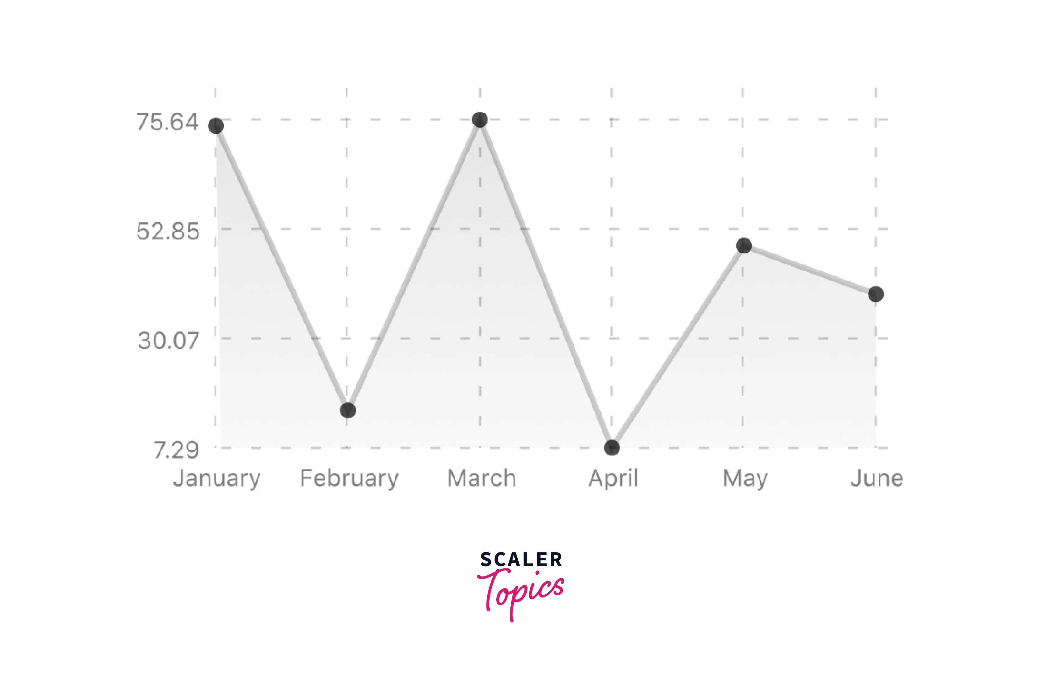
Line Charts in React Native
Properties:
- data: Data for the graph - see the preceding example
- width: Use the Dimensions library to determine the width of your screen for responsive charts
- height: The chart's height
- withDots: Draw dots on the line
- withShadow: To show a line's shadow
- withInnerLines: display the inner dashed lines
- withOuterLines: show dashed outer lines
- withVerticalLines: Put vertical lines there.
- withHorizontalLines: Display horizontal outlines
- withVerticalLabels: Manifest vertical labels
- withHorizontalLabels: displaying horizontal labels
- withVerticalLabels: Display vertical labels
- withHorizontalLabels: Displaying horizontal labels
- fromZero: Create charts starting at 0 instead of the minimal value.
- yAxisLabel: text before horizontal labels
- yAxisSuffix: Text should be added to horizontal labels.
- xAxisLabel: Add text before vertical labels
- yAxisInterval: Every x input causes the y-axis to be shown.
- chartConfig: the chart's configuration item,
- decorator: This method may render additional items, such as data point information or supplementary markup, from a large amount of input.
- hidePointsAtIndex: indicators for the data items you don't wish to show
- formatYLabel: This function modifies the Y label's display value's format. Returns the desired string after accepting Y as an input.
- formatXLabel: This function modifies the X label's display value's format. returns the desired string after accepting the parameter X.
- getDotProps: The props in chartConfig can be replaced with this.ForDots segments number The default number of horizontal lines is 4.
- horizontalLabelRotation: Angle of rotation for the horizontal labels
- verticalLabelRotation: Angle of rotation for the vertical labels
- getDotColor: Describes the dot color function, which accepts (dataPoint, dataPointIndex) and is used to determine the colors of the dots in a line graph.
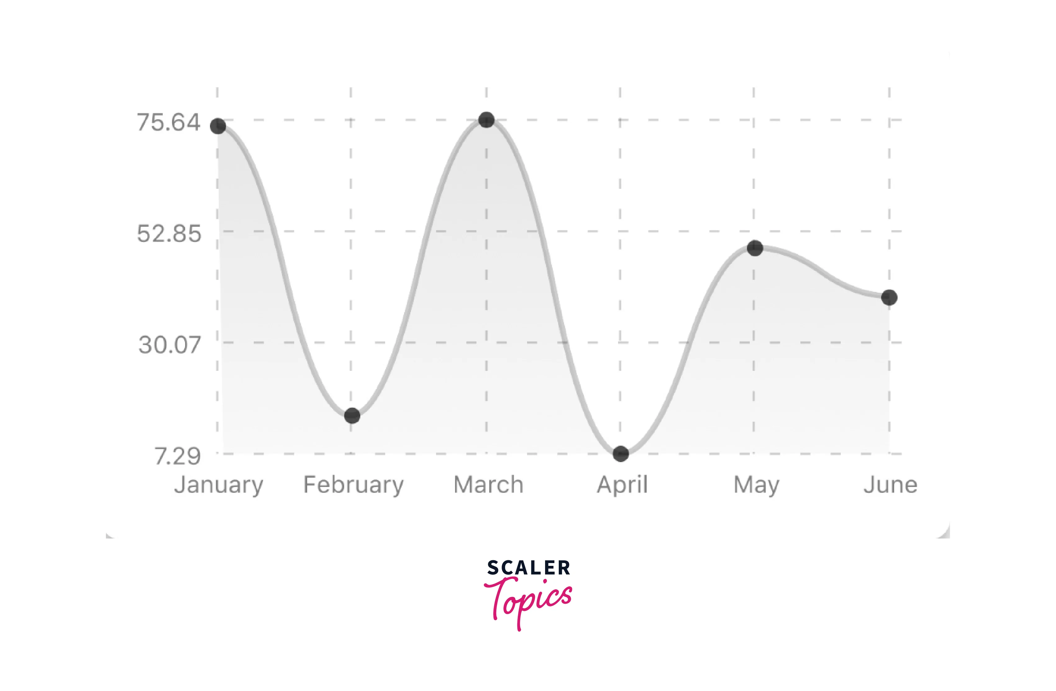
Bezier Line Chart in React Native
Properties:
- bezier: To make the line chart curved and smooth, add this prop.
Progress Ring React Native

Properties:
- data: Data for the chart graph - see the preceding example
- width: Use the Dimensions library to determine the width of your screen for responsive charts.
- height: The chart's height
- strokeWidth: Size of the chart's stroke
- radius: chart's inner circle
- chartConfig: Chart configuration object; for an example of configuration, check the file's header.
- hideLegend: Default setting for the hide chart legend switch is false.
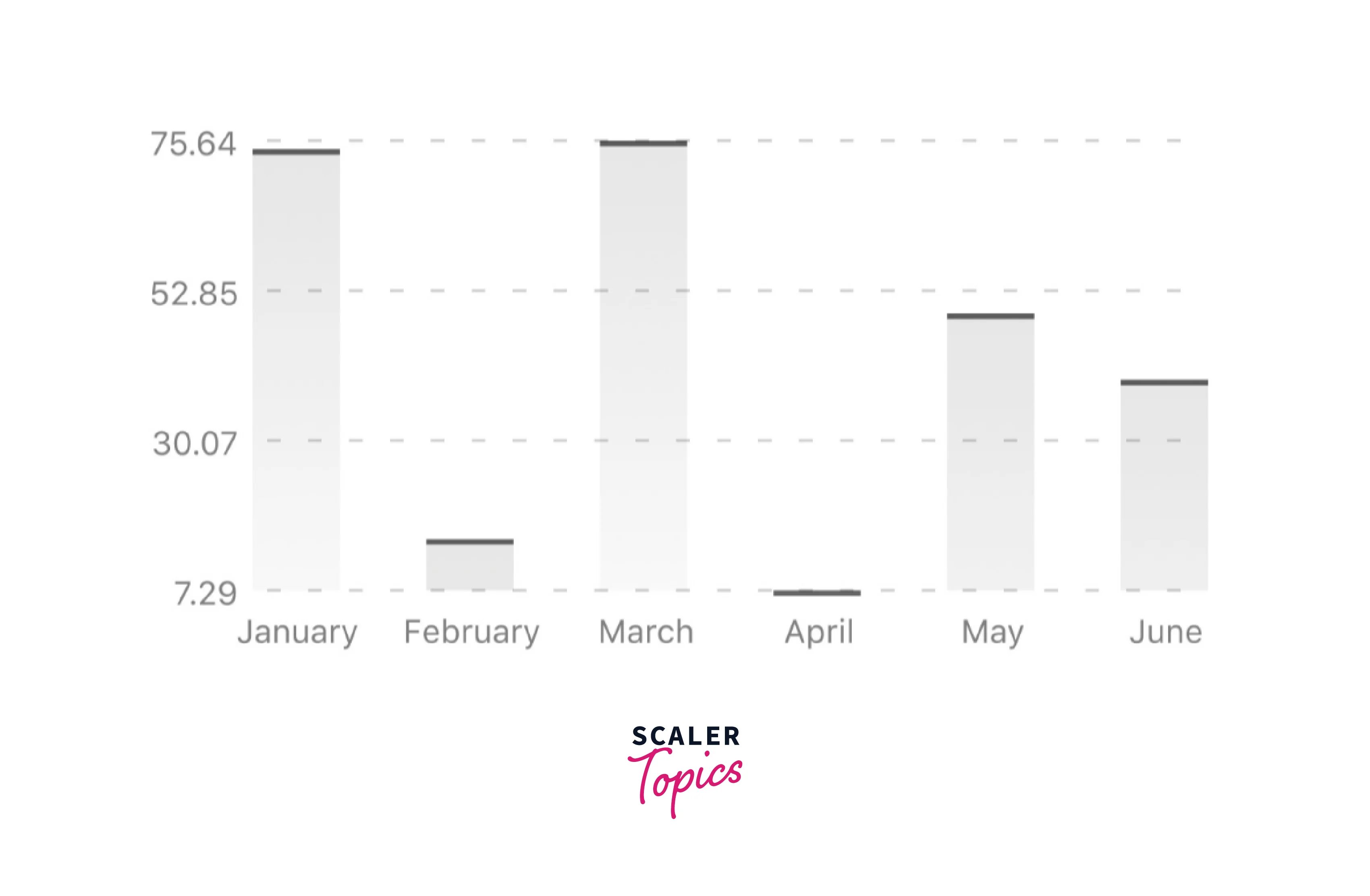
React Native Bar Chart
Properties:
- data: Data for the graph - see the preceding example
- width: Use the Dimensions library to determine the width of your screen for responsive charts.
- height: The chart's height
- withVerticalLabels: Manifest vertical labels
- withHorizontalLabels: displaying horizontal labels
- fromZero: Create charts starting at 0 instead of the minimal value.
- withInnerLines: display the inner dashed lines
- yAxisLabel: text before horizontal labels
- yAxisSuffix: Text should be added to horizontal labels.
- chartConfig: Chart configuration object; for an example of configuration, check the file's header.
- horizontalLabelRotation: Angle of rotation for the horizontal labels
- verticalLabelRotation: Angle of rotation for the vertical labels
- showBarTops: Display bar tops
- showValuesOnTopOfBars: Display value over bars
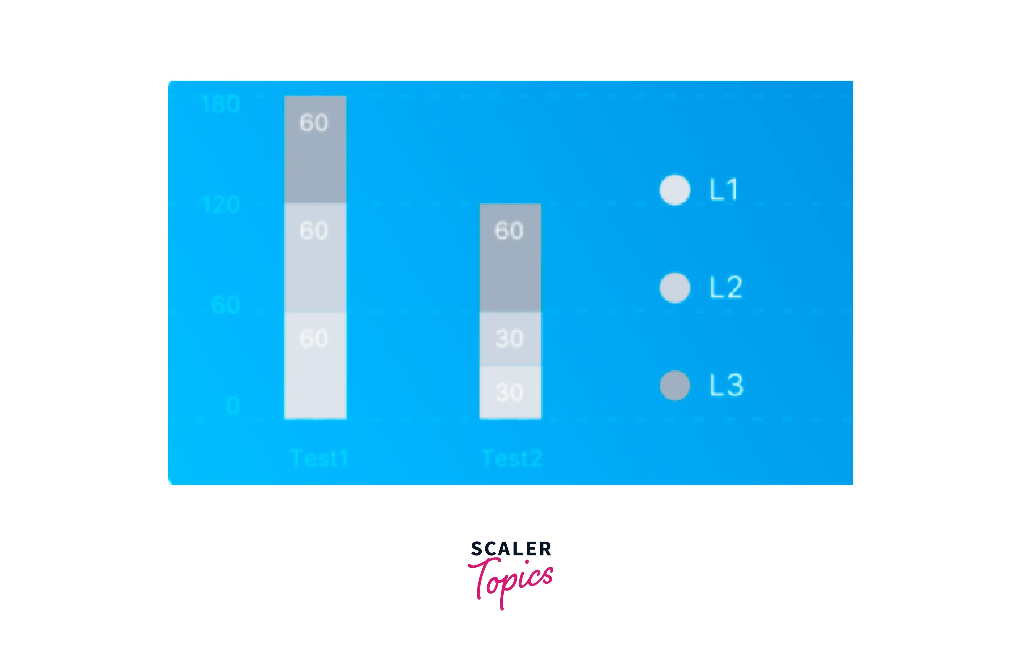
Stacked Bar in React Native
Properties:
- data: Data for the graph - see the preceding example
- width: Use the Dimensions library to determine the width of your screen for responsive charts.
- height: The chart's height
- withVerticalLabels: Manifest vertical labels
- withHorizontalLabels: displaying horizontal labels
- chartConfig: Chart configuration object; for an example of configuration, check the file's header.
- barPercentage: establishes the percentage (0–1) of the available width for each bar in a chart.
- Legend: Display legend
React Native Pie Chart
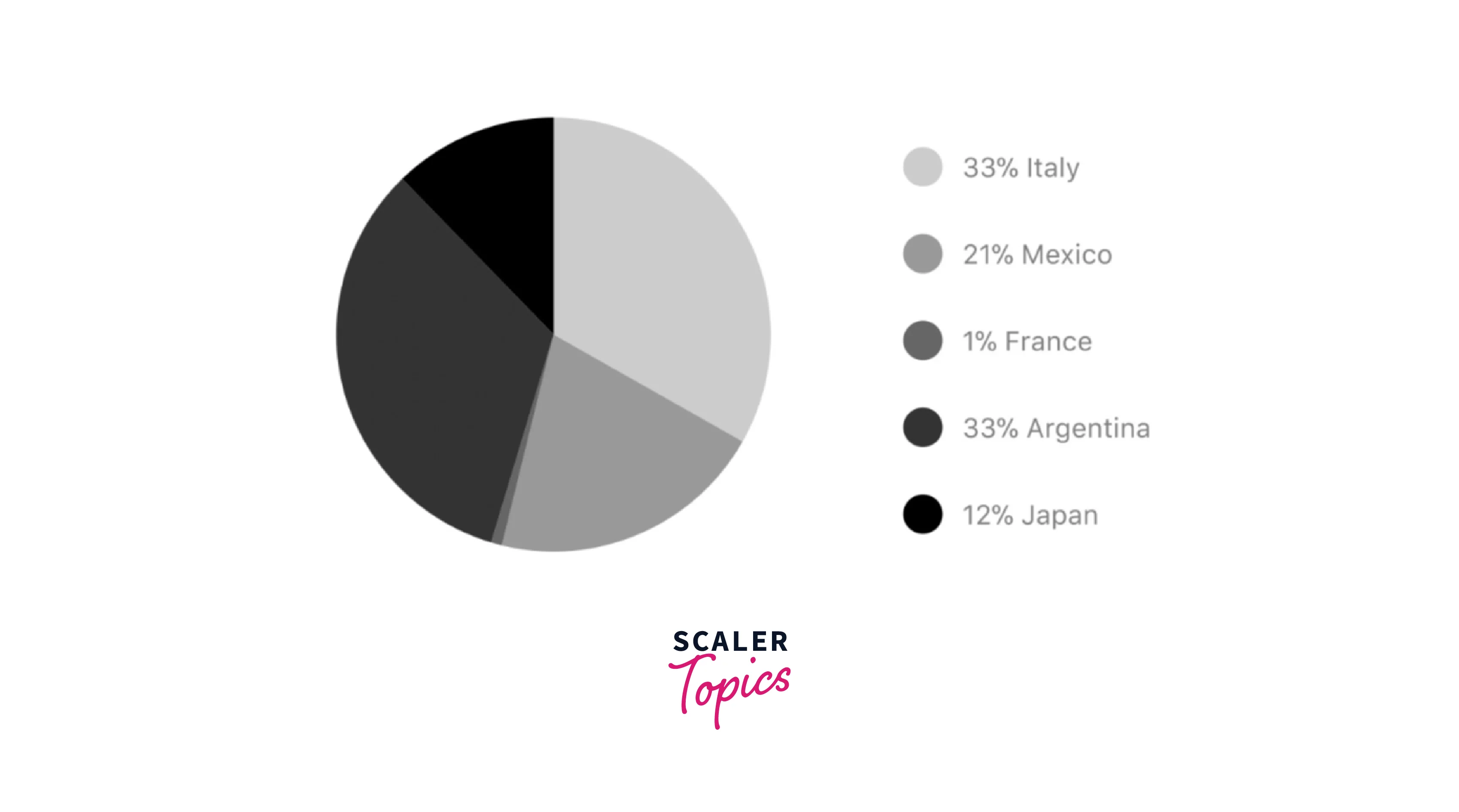
Properties :
- data: Data for the chartgraph - see the preceding example
- width: Use the Dimensions library to determine the width of your screen for responsive charts.
- height: The chart's height
- chartConfig: Chart configuration object; for an example of configuration, check the file's header.
- accessor: The data object's property where the number values are derived
- bgColor: If you wish to set a translucent background color, enter transparently or none.
- paddingLeft: pie chart padding on the left
- center: Offset the chart's x and y coordinates.
- absolute: values are displayed as absolute numbers.
- hasLegend: Set it to false to make the legend disappear. It defaults to true.
- avoidFalseZero: Set it to true to display a "1%" rather than a rounded figure equal to "0%," which is the default setting.
Heatmap in React Native
Such a graph is frequently used to show developer contribution activities. This graph may also be utilized in many other situations when you need to see how frequently a specific event occurs over time.
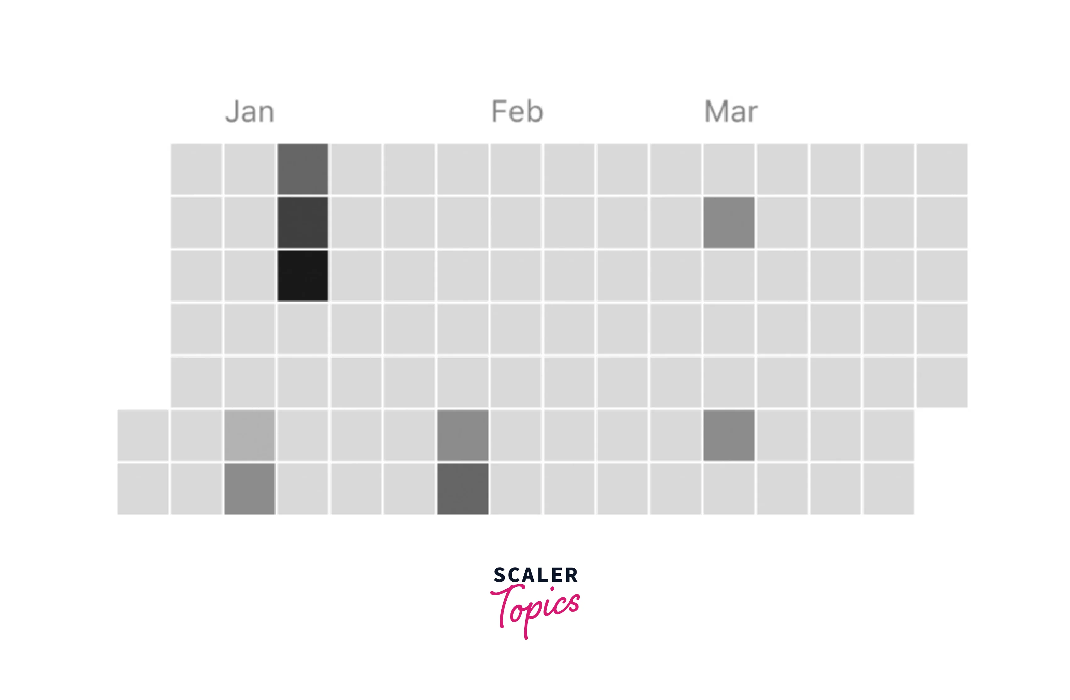
Properties :
- data: Data for the graph - see the preceding example
- width: Use the Dimensions library to determine the width of your screen for responsive charts.
- height: The chart's height
- gutterSize: Size of the chart's gutters between the squares
- squareSize: Size of the chart's squares
- horizontal: Should a graph be horizontally formatted? By default, true
- showMonthLabels: Should month labels be included in the graph? by default, true
- showOutOfRangeDays: Should the graph include all squares, including those representing days outside the range?
- chartConfig: Chart configuration object; for an example of configuration, check the file's header.
- accessor: the data object's property from which the number values are derived; counts by default
- getMonthLabel: Function that takes as an input the month index (0–11) and returns the label for each month.
- onDayPress: When a user clicks a day square on the chart, a callback is triggered that receives a value-item object.
Abstract Charts in React Native
You may make your charts by using the extensible class rc/abstract-chart.js!
There are several available approaches :
renderHorizontalLines(config): creates horizontal backdrop lines similar to those found in line and bar charts. a config object with the following properties is required.
renderVerticalLabels(config): render vertical lines in the backdrop. a config object with the following properties is required.
renderDefs(config): Definitions for background and shadow gradients in rendering.
FAQs
Q: What is Compilation
A: The package is immediately built for use in production following installation, making it simple to install with npm and use right away. Use npm run dev to start compilation in watch mode, which will recompile the files on modification, or execute npm run build to compile TypeScript into JavaScript once for development purposes.
Q: What is Heatmap in React Native?
A: Such a graph is frequently used to show developer contribution activities. This graph may also be utilized in many other situations when you need to see how frequently a specific event occurs over time.
Conclusion
- Chart libraries enable you to give the consumer an appealing data presentation, which encourages them to utilize your app more frequently.
- Properties of react native chart kit are backgroundGradientFrom, backgroundGradientFromOpacity, backgroundGradientTo, fillShadowGradientFrom, and much more.
- Responsive Charts in React Native are Line Charts in React Native, Bezier Line Chart in React Native, Progress Ring React Native, React Native Bar Chart, Stacked Bar in React Native, React Native Pie Charts, and Heatmaps in React Native.
- Heatmap is a graph that is frequently used to show developer contribution activities.