Creating Checkbox Component in React Native App
Overview
We can use a variety of built-in components that React Native offers us to design a stunning UI for mobile applications. But a few of the components are not present as built-in components. One of them is React native checkbox. In this article, we will build a unique React native checkbox component. Although checkbox components are offered by third-party libraries like React-Native-elements, we can have more control over their customization and functionality by building our own.
React-native-check-box
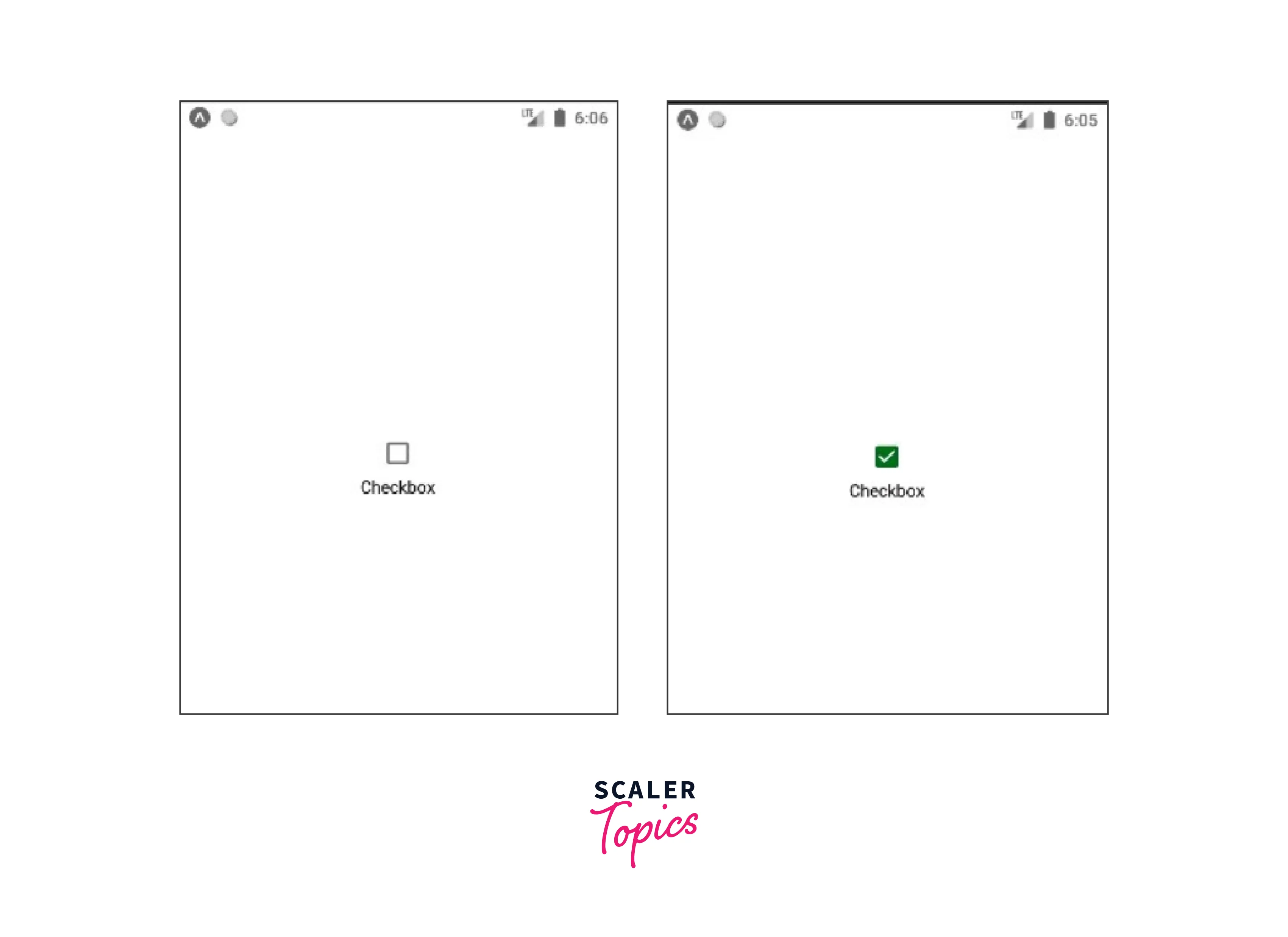
It is a component for react native that can be used to create checkboxes in both iOS and Android. When CheckBox was separated from React Native's core, this module was developed. There isn't a built-in component in React Native that can be used as a checkbox. A React native checkbox is a visual widget that offers the user a variety of options. Users may simultaneously tick many checkboxes from the available choices.
BEMCheckBox was used in the IOS version's implementation. An open-source package called BEMCheckBox makes it simple to design stunning, incredibly customizable, animated checkboxes for iOS.
Getting Started
Start your React Native project by using the command below:
A fresh React Native project with a simple template will be created in this way.
If you wish to execute the project on iOS or Android, use one of the instructions listed below:
yarn run ios or npm run ios
Installation
Now after setting up the react native project install the React native checkbox component:
Run:
npm i react-native-check-box --save
Or
yarn add react-native-check-box --save
API
- style:
It describes the custom style of the React native checkbox. It is of the type ViewPropTypes.style and is optional. - leftText:
It is the custom text displayed on the left. It is of the type PropTypes.string and is optional. - leftTextStyle:
It describes the style of the leftText. It is of the type Text.propTypes.style and is optional. - rightText:
It is the custom text displayed on the right. It is of the type PropTypes.string and is optional. - rightTextView:
It is the View of the rightText. It is of the type PropTypes.element and is optional. - rightTextStyle:
It describes the style of the rightText. It is of the type Text.propTypes.style and is optional. - checkedImage:
Custom checked image can be specified here. It is of the type PropTypes.element and is optional. - unCheckedImage:
Custom unchecked image can be specified here. It is of the type PropTypes.element and is optional. - isChecked:
It is of the type PropTypes.bool and is a required value. If true the React native checkbox will be marked checked. By default it is false. - onClick:
The callback function that executes when clicking the React native checkbox is specified here. It is of the type PropTypes.func.isRequired and is a required value. - disabled:
It is used when the React native checkbox has to be disabled. It is of the type PropTypes.bool and is optional. By default it is false. - checkBoxColor:
The React native checkbox image's tint color (this prop works for both checked and unchecked states). It is of the type PropTypes.string and is optional. - checkedCheckBoxColor:
This prop will override the value of checkBoxColor for the checked state and tint the React native checkbox image's checked state color. It is of the type PropTypes.string and is optional. - uncheckedCheckBoxColor:
Tint color for the React native checkbox image in the unchecked state (this parameter will override checkBoxColor's unchecked state value). It is of the type PropTypes.string and is optional.
Common Properties of React Native Checkbox
Here are some of the common properties of React Native Checkbox:
- onChange is a callback function. It is used to initiate the native input event.
- value is a Bool that is used to check or uncheck the checkbox. Boolean properties include value. The checkbox is given a value using it. If the value of the checkbox changes, the checkbox is updated. The checkbox's default value is false.
- disabled is a Bool that decides whether the checkbox is enabled. It is employed to check whether the checkbox is selected. This property's default value is false.
- The onValueChange is a callback method that modifies the value property to match user activities.
For iOS apps, the following React Native checkbox characteristics are listed:
- The box's hidden status can be determined using the Boolean property hideBox. This property's default value is false.
- lineWidth is a numerical value that is utilized to determine the box and checkmark lines' width. This property's default value is 2.0 px.
- boxType can be either a circle or a square. It is employed to designate the kind of box to utilize. Its default value is a circle.
- When the checkbox is not selected, the color of the box is added using the Boolean property tintColor. The default setting is #aaaaa.
- The tick mark color is verified using onCheckColor. Its default value is #007aff.
- The inside color of the checkbox is examined using onFillColor. Its default value is transparent.
- The type of animation to be utilized when the checkbox is selected is specified using the onAnimationType property. Its default value is stroke.
- The duration of any animation is added using the animationDuration function. This setting defaults to 0.5 seconds.
- The type of animation to be utilized when the checkbox is unchecked is specified using the offAnimationType variable.
Example:
Here is an Android checkbox property for React Native:
The tintColors is a boolean property. When the checkbox is selected, it has a color value that indicates true, and when it is deselected, it has a color value that indicates false.
How to Build a React Native App with Checkbox?
After going through React Native checkbox properties, let's add checkboxes to a demo React Native app. In our example, a user will choose from a list of fruits and click on the save button to add them. Initially, in the state all the fruits are false.
The React Native checkbox example's source code is provided here:
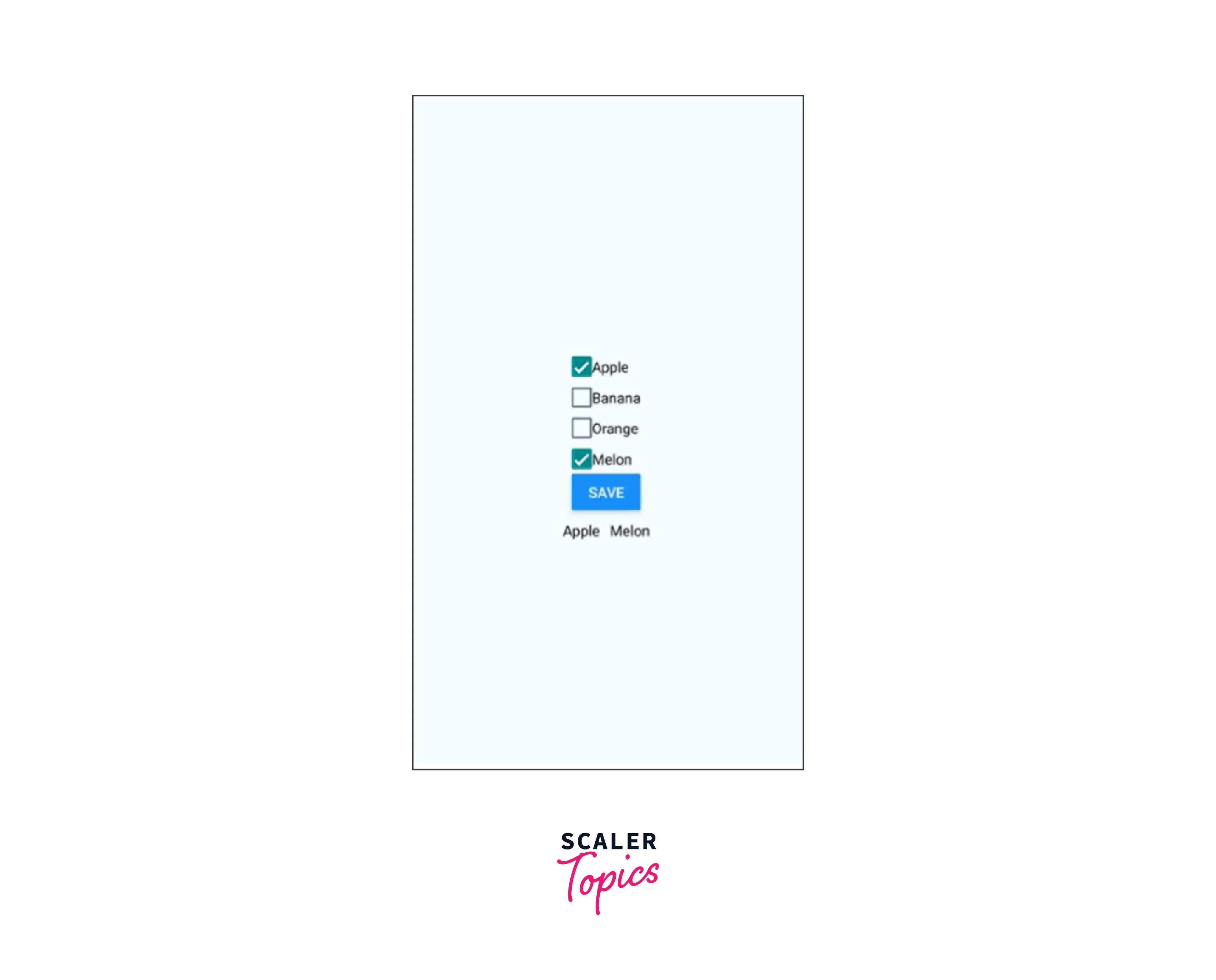
In the above code the onValueChange function will alter the value of the state and the checkbox will be checked and unchecked based on state value.
FAQs
Q: How to create a React native checkbox in an expo-managed project?
A: The expo-checkbox offers a fundamental boolean input element for all systems. For Expo-based projects, you should use the expo-checkbox package. It can be installed as follows:
Example:
Q: What version of React Native is supported by react-native-checkbox?
A:
| RN version | Checkbox version |
|---|---|
| > 0.60 & < 0.62 | >= 0.3 (Support IOS from 0.4) |
| < 0.60 | 0.2 (only Android) |
| >= 0.62 to run on Windows | 0.5 |
Q: Can I create custom React native checkbox styles?
A: Yes, you can create custom styles for Checkbox components by using React Native's StyleSheet API. You can define custom colors, sizes, borders, and other visual properties to match your app's design requirements.
Q: How can I handle the Checkbox's checked and unchecked states?
A: React native checkbox components typically have an onValueChange prop that allows you to define a callback function to handle the change in the checked state. You can update the state variable and perform any necessary actions based on the Checkbox's checked or unchecked state.
Q: Is it possible to render multiple Checkbox components dynamically?
A: Yes, you can render multiple Checkbox components dynamically by using an array of data or mapping through a data source. You can iterate over the data and generate Checkbox components dynamically based on the data items.
Conclusion
- A React native checkbox is a visual widget that offers the user a variety of options. Users may simultaneously tick many checkboxes from the available choices.
- React-native-check-box is a component for React native that can be used to create checkboxes in both iOS and Android. When CheckBox was separated from React Native's core, this module was developed.
- An open-source package called BEMCheckBox makes it simple to design stunning, incredibly customizable, animated checkboxes for iOS.
- The React native checkbox can be customized with the use of several props like style, leftText, leftTextStyle, etc. It can also be disabled using the disabled prop.
- Bool values isChecked and onClick listeners are required props.