React Native Date Picker
Overview
Nowadays, many applications use a date or time picker to allow the user to select a date and time. They help us remember things, mark important dates on a calendar, set alarms, and much more. In this article, we will examine the React Native date picker options available and go over how to pick the best one for your app.
What is Date Picker in React Native?
The react native date picker is a cross-platform component for iOS and Android. Date, time, and "datetime" are among the three available modes. The date picker is flexible and supports various languages. To attain the best look, feel, and function feasible, it is written in native code.
React Native Date Picker's DatePicker Component from react-native-datepicker is a single component that works with DatePickerAndroid, TimePickerAndroid, and DatePickerIOS for both Android and IOS. You can maintain a consistent appearance between Android and iOS by using this library.
It can be used both as a Modal or inline.
Installation
-
Download package with any package manager :
-
Install pods :
-
Now you need to rebuild the project :
Automatic linking is supported by this package. Installing the package and its dependencies (cocoapods) is typically all that is required (as described above). Run react-native run-ios, react-native run-android, or begin the build from within Xcode or Android Studio to rebuild the project. Run npx react-native link react-native-date-picker and rebuild if you're using React Native 0.60 or higher or if your setup is having trouble automatically linking. You might need to manually link the package on occasion.
Requirements
- The Xcode version must be greater than equal to 11.6
- The React Native version must be greater than or equal to 0.57.
- Version 0.64.2 or later must be used if React Native 0.64 is being used.
- A SDK version 42 or greater must be used if you are using Expo. Use 44.0.4 or later if using Expo SDK 44.
Expo
- This library is compatible with development builds. No configuration plugin is needed.
- Your app's Debug build, which includes the expo-dev-client package, is a development build.
- A development build enables developers to iterate as quickly as possible, unlike a production build, which is intended for the general public, and a preview build, which allows your team to test your upcoming release.
- It includes scalable development tools that you can use to create and test your project.
- The Expo Go app cannot use this library because it needs custom native code.
React Native Date Picker Libraries
Consider the following four factors when deciding whether to use a third-party library in an app you're developing :
- GitHub stars: If a package has only a few stars, we cannot be certain that it is dependable, nor can we anticipate that it will be updated and stable for our project.
- Activity: The package might not be appropriate if it has enough GitHub stars but isn't being actively maintained. We want the package that will function the best with the most recent version of React Native because the framework is evolving quickly (be sure to check the last commit date)
- Main maintainer: Finding out who is the library's primary maintainer is also crucial. For instance, we can have more faith in the package if it is maintained by the React Native community (a group of talented and reliable developers involved in developing and expanding the framework) rather than if it was created by an unidentified individual.
- README: A strong library can be strengthened even further by a strong README. This is especially important given how quickly React Native is being developed. Look here for details on support for the most recent React Native releases.
Here are some libraries that you can consider if you want to render a date time Picker :
-
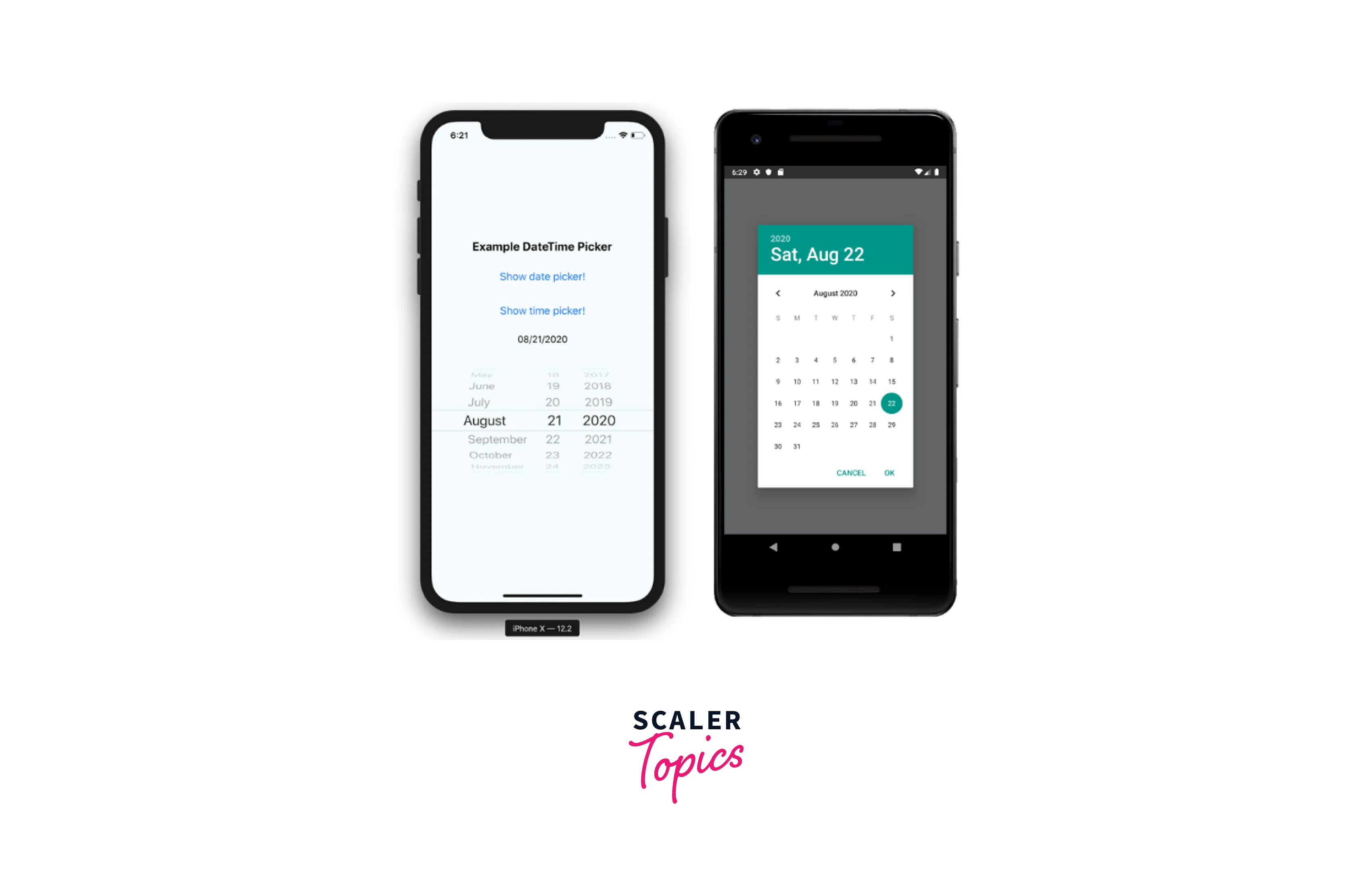
React Native DateTimePicker: The implementation of React Native DateTimePicker complies with iOS and Android development standards and makes use of the system's native components.
The React Native community, which is in charge of creating the best open-source libraries for React Native, also actively maintains this package. The last commit was made in Feb 2023, as of the time of writing. This package has a thorough README and is compatible with one of the most recent React Native releases. As a result, it stands out as one of your best options if you want a date and time picker that feels native in your app.
The date picker looks like this :
And the time picker :
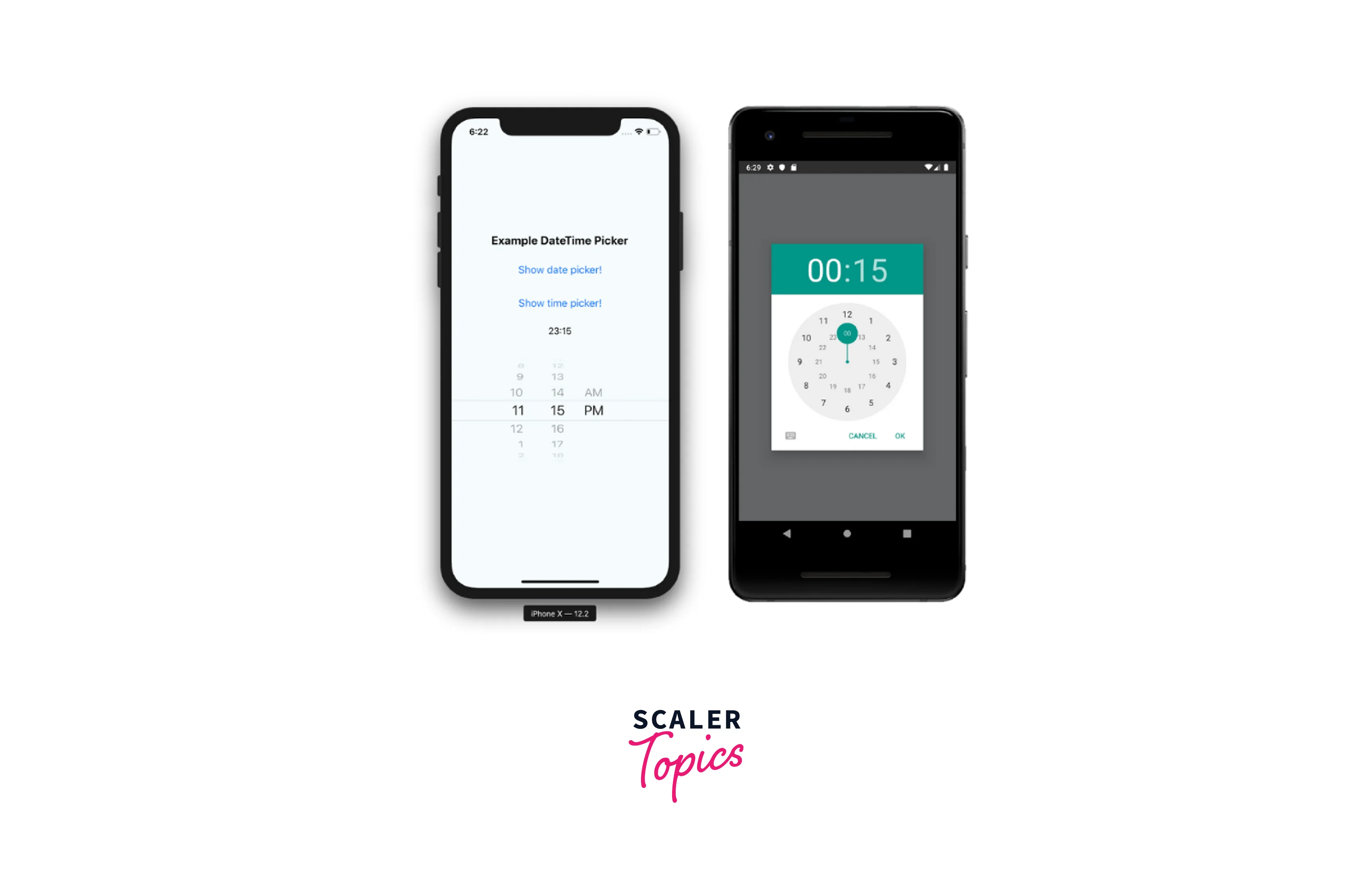
There are several features in this library, and the README lists the available props. It comes with an easy installation guide and a useful section with usage examples.
-
React Native Date Picker: This date picker library's 1.0.0 version was committed on April 8, 2018, and its most recent commit was made in February 2023, indicating that it is still under active maintenance. It is a strong candidate for testing because of this. With the help of this library, you can maintain a similar appearance on iOS and Android. Henning Hall made a custom component for Android that resembled the native iOS picker, even though it isn't a very common solution.
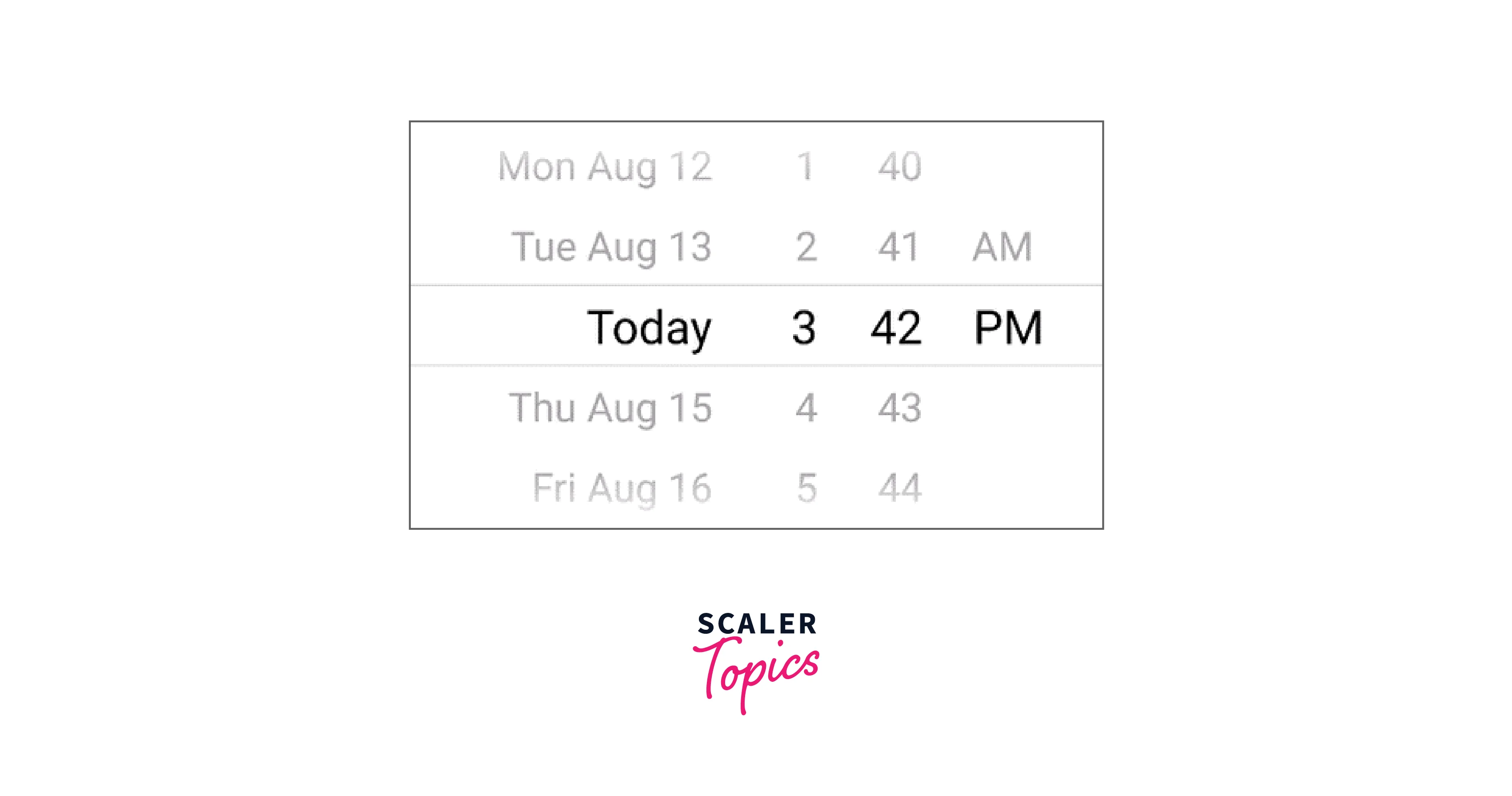
Some clients prioritize iOS before creating an Android version of their cross-platform React Native app. As a result, using this package to create an iOS-like design for the entire app often makes sense. The README is also very helpful.
-
React-native-paper-dates: React-native-paper-dates is a useful cross-platform Material Design date picker that is worth looking into if you use React Native Paper.
Along with a text input option, React Native Paper Dates includes picker options for a single date, a range of dates, and multiple dates for their modal.
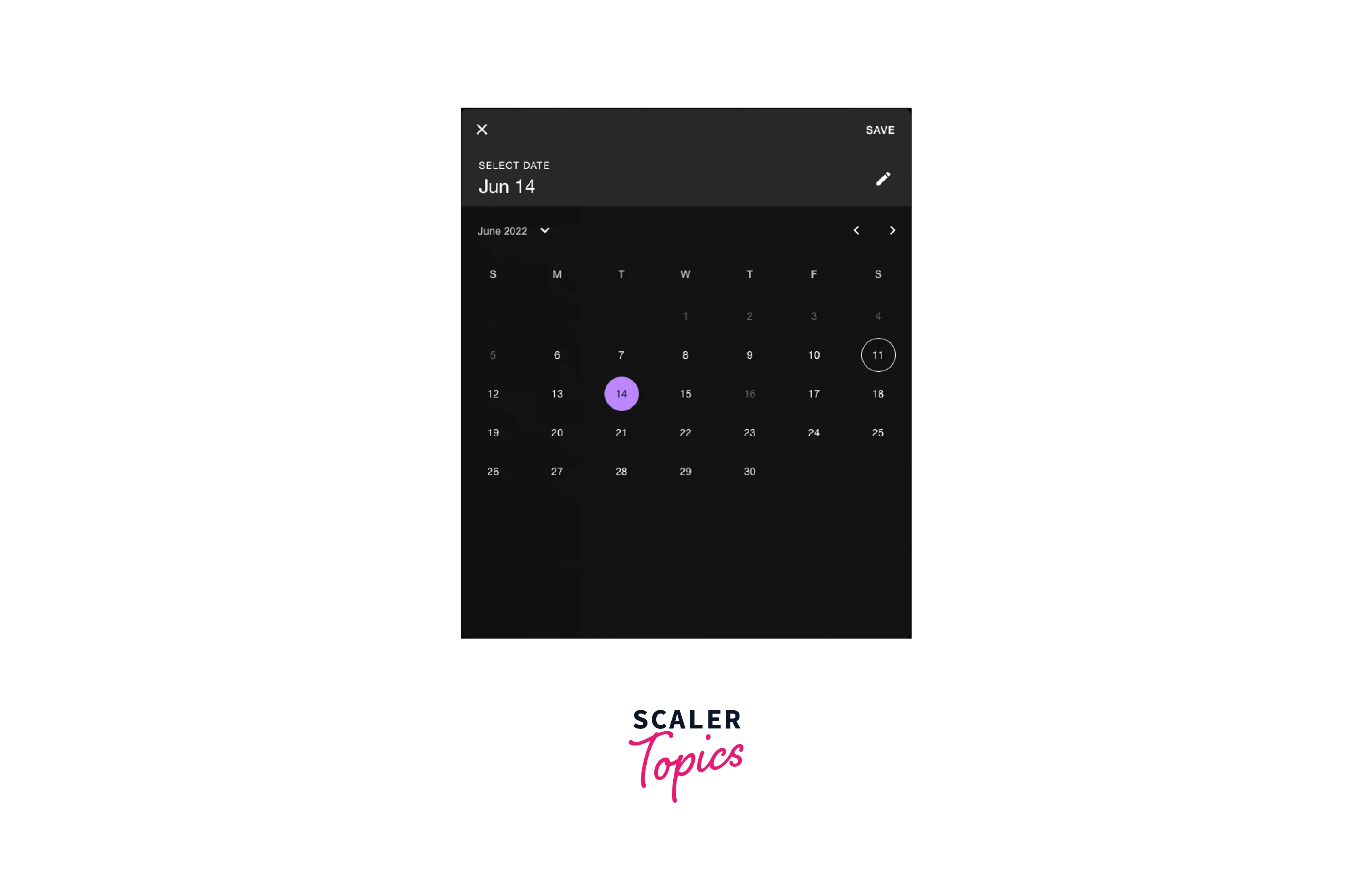
React Native Paper must be installed to use this library, so if you don't already have it in your project but still want to use the date picker, you can use their Babel plugin. Excluding the modules you don't use, will shrink the bundle size. All you have to do is change your babel.config.js or babelrc configuration file to appear like this :
-
React-native-modal-datetime-picker: Last but not least, react-native-modal-datetime-picker has over 150k weekly downloads and 2.5K GitHub stars.
It supports all of its props and offers a better developer experience thanks to its active maintenance and use of React Native DateTimePicker.
Creating a Date Picker for Your React Native App
To create a Date Picker first set up your project and run the below command to install the dependencies :
Using React Native v60+ should make Android automatically link.
Displaying a Date Picker is pretty straightforward:
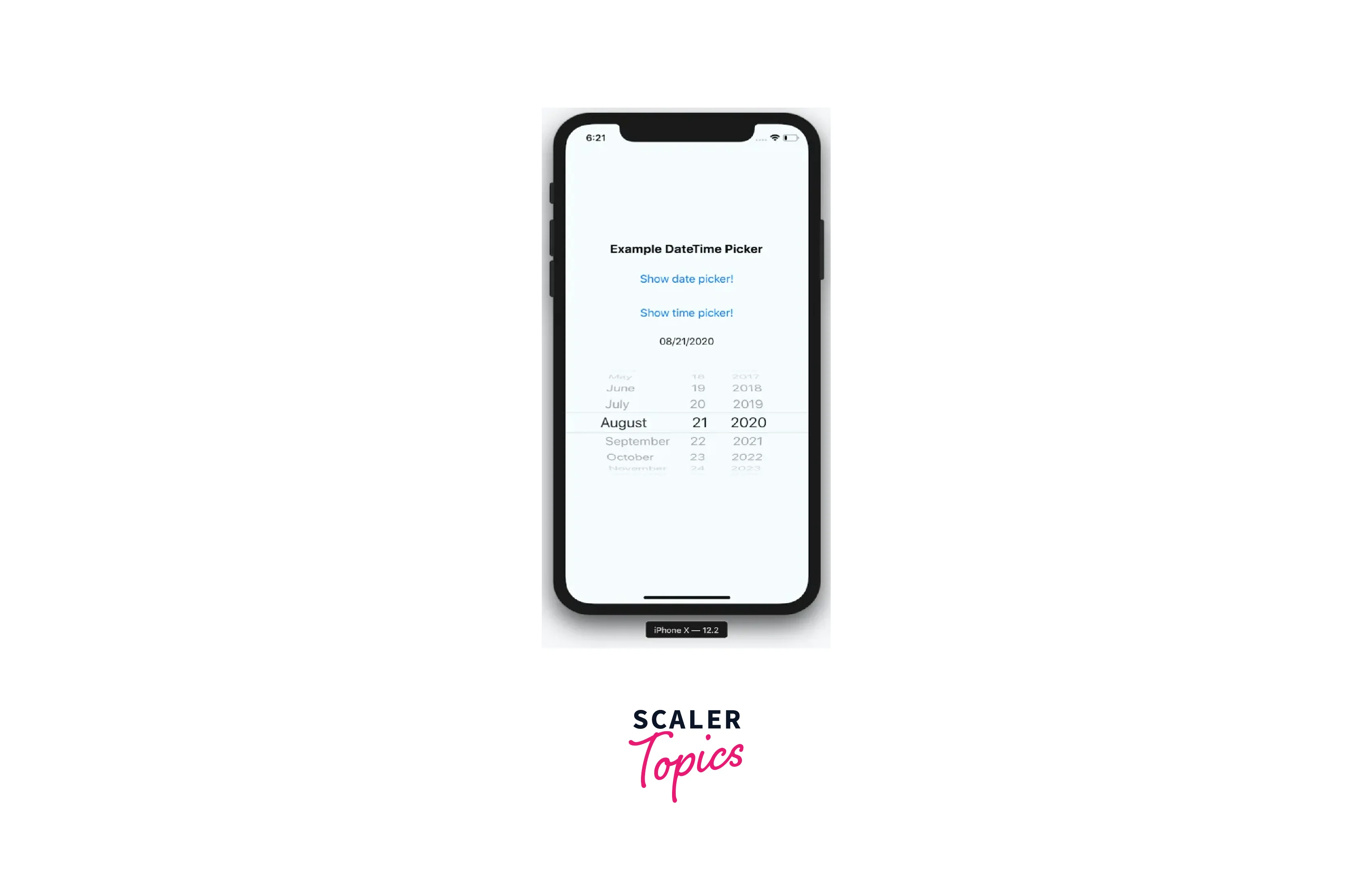
This DatePicker's primary issue is that Android launches a modal while iOS shows a sizable scroll wheel (as shown above). This significant UI difference needs to be taken into account. A customized Date Picker can be created to address this.
Here styled components has been used to customize the Date Picker.
Let us understand the above code :
A header bar is shown above the iOS DatePicker in this block. It provides a clear way for the user to close the modal. Android does not require it.
Three props are accepted by this component :
- date: This is the day that the picker will initially show.
- onChange: While not necessary, this enables you to adapt to date changes. Only iOS is affected by this since DateTimePicker for Android only fires an onChange event when the user selects done or cancel.
- onClose: When the modal is closed with the selected date or undefined if canceled, this method is called.
This element can be used on a screen as follows :
The showDatePicker state should be set to true when the user selects your date component, which uses the date state to display the selected date.
React Native Date Picker Props
| Props | Description |
|---|---|
| date | Currently selected date. |
| onDateChange | Date change handler function (inline only) |
| fadeToColor | Android picker is fading toward this background color. {color, 'none'} |
| maximumDate | Maximum date that can be chosen. Example: new Date("2021-12-31") |
| minimumDate | Minimum selectable date. Example: new Date("2021-01-01") |
| androidVariant | Two variations in android style are available. "nativeAndroid," and "iosClone" |
| minuteInterval | interval at which minutes can be selected. |
| mode | The pick-a-date mode. Date, Time, and Datetime |
| locale | The locale for the date picker. Changes language, date order, and am/pm preferences. Value needs to be a Locale ID. |
| textColor | Changes the text color. Colors other than black (#000000) or white (#ffffff) will replace the "Today" string with a date on iOS 13 or higher. |
| timeZoneOffsetInMinutes | Timezone offset in minutes (default: device's timezone) |
| dividerHeight | Change the divider height (only supported for iosClone) |
| is24hourSource | Change how the 24h mode (am/pm) should be determined, by device settings or by locale. {'locale', 'device'} (android only, default: 'device') |
| modal | Boolean indicating if modal should be used. Default: "false". When enabled, the other modal props need to be used. See example. |
| open | Modal only: Boolean indicating if the modal should be open. |
| onConfirm | Modal only: Date callback when the user presses confirm button |
| onCancel | Modal only: Callback for when the user presses the cancel button or closes the modal by pressing outside it. |
| title | Modal only: Title text. Can be set to null to remove text. |
| confirmText | Modal only: Confirm button text. |
| cancelText | Modal only: Cancel button text. |
| theme | Modal only, iOS 13+: The theme of the modal. "light", "dark", "auto". Defaults to "auto". |
Examples
Modal
In the above code, useState has been used to create two state variables, date and open. If open is true, then the modal will be shown. onCancel calls the setOpen to make the value of open false. onConfirm calls setDate to set the value of date and setOpen to make the value of open as false. The button is used to open the modal.
Inlined
In the above code, useState has been used to create the state variable date, and onDateChange calls setDate to modify the value of date.
FAQs
Q. How to change the date order format, for example, YYYY-MM-DD, etc.?
A. The locale prop determines the order. For example, to get the French preference set locale='fr'.
Q. How do I modify the AM/PM or 12/24h format?
A. The locale prop on iOS determines the 12/24h preference. For example, to get the French preference set locale='fr'. On Android, the device setting controls the 12/24h format by default. To allow the locale to also determine the device setting on Android, add is24hourSource="locale". The AM/PM section of the selector will be visible when using 12h mode. It is NOT advisable to enforce any particular 12/24h format, but this can be done by selecting a locale that prefers 24 hours and adding is24hourSource="locale".
Q. Is it possible to show only the month and year?
A. Unfortunately, due to a DatePickerIOS limitation, this is not possible. Your month-year picker should be possible, for example, using React native wheel pick.
Q. Why does the Android application fail while running the picker?
A. To get the picker to function properly in Android production or release mode, you might need to ignore some classes if Proguard for Android has been enabled. Go to your proguard file (often called proguard-rules.pro), and add the following lines to maintain the public class net.time4j.android.ApplicationStarter maintain the public class net.time4j.PrettyTime
Q. What is necessary to upgrade to version 4 (4.0.0)?
A. Simply increase the version number in your package json since there are no breaking changes in v4.
Conclusion
- The react native date picker is a cross-platform component for iOS and Android.
- Some libraries that you can consider if you want to render a date time Picker are React Native DateTimePicker, React Native Date Picker, React-native-paper-dates, and React-native-modal-datetime-picker.
- React Native Date Picker's DatePicker Component from react-native-date picker is a single component that works with DatePickerAndroid, TimePickerAndroid, and DatePickerIOS for both Android and IOS.
- Run npx react-native link react-native-date-picker and rebuild if you're using React Native 0.60 or higher, or if your setup is having trouble automatically linking.
