React Native Maps
Overview
The user experience can be improved by having correct location data for your users. You may utilise this information, for instance, to show people what is nearby, provide special discounts for goods and services nearby, and much more. In this article, we are going to talk about React Native Maps and how they can improve user experience.
What is React-Native-Maps?
A component system for maps called React Native Maps comes with platform-native code that must be generated with React Native. We'll show you how to include Google Maps in your React Native application and show you the basic elements like <MapView /> and <Marker> in this article.
React Native Maps Installation
To integrate Google Maps functionality into our app, we must first obtain an API key before presenting our MapView component. To achieve this, follow these instructions to obtain your API secrets.
Next, in the file android/app/src/main/AndroidManifest.xml, add the code which is given below:
This will link the React Native project with our SDK key.
The next step is to install react-native-maps in your project by running the following command.
A separate version of this package is needed for Expo. Use this instead, if you are using Expo :
Component APIs
MapView / Component API :
- provider: It defines the map framework to use. Alternatively, use null or undefined to use the native map framework or "Google" for Google Maps.
- Region: The region which will be displayed on the map. The centre coordinates and the range of coordinates show the determined area.
- initialRegion: the first area that the map will show. Only use this prop in place of the region if you don't wish to have any more control over the map's viewport than the original region. A region change won't occur if this prop is changed after the component has been installed. This is comparable to the text input's initialValue prop.
- Camera: The map should show the camera's perspective. The region attribute is ignored if you use this.
- initialCamera: Use this prop in place of the camera only if you don't want to change anything except the default camera setting, same as how you would initialRegion. A region change won't occur if this prop is changed after the component has been installed. This is comparable to the text input's initialValue prop.
- mapPadding: adds unique padding to the map's edges. Useful when map markers or pieces are hidden.
- paddingAdjustmentBehavior: Only for GoogleMaps on iOS, specifies how and when to adjust padding with safe area insets.
- customMapStyle: enhances the map component with a unique style.
- userInterfaceStyle: adapts the map to the chosen style. Whatever the system settings are by default.
- showsUserLocation: If true, the map will display the user's position. NOTE: Before changing this to true, you must have runtime location rights; otherwise, it will fail silently.
- zoomControlEnabled: If false, the zoom control won't be accessible at the bottom right of the map (available only on Android).
- minZoomLevel: The map's minimum zoom level must be between 0 and 20.
- maxZoomLevel: The map's maximum zoom value must be between 0 and 20.
Marker / Component API:
- Title: The marker's heading. The default callout behaviour, which displays the title and description, if supplied, will be used if the component has no children that are a <Callout />. This is only utilised in the absence of any children that are a <Callout />.
- Description: the marker's explanation. The default callout behaviour, which displays the title and description, if supplied, will be used if the component has no children that are a <Callout />: This is only utilised in the absence of any children that are a <Callout />.
- Image: a distinctive picture to serve as the marker's symbol. The use of only local picture resources is permitted.
- icon: Marker icon to render (comparable to the GMSMarker Class's icon attribute). The use of only local picture resources is permitted.
- pinColor: The platform default pin, which may be customised by this colour, will be used if no custom marker view or custom image is specified. if a custom marker is being used, ignored.
- Coordinate: The marker's coordinates.
- centerOffset: The position in points at which the view should be skewed.
- Anchor: sets the marker's anchor point. The anchor identifies the area of the icon picture that is fixed to the location of the marker on the surface of the Earth.
- calloutAnchor: Set the location inside the marker picture on which the callout will be shown when it is displayed. The same coordinate system as the anchor is used to specify this. For further information, see the anchor prop. The centre of the top of the picture is the default.
- Flat: determines whether this marker should be a billboard facing the camera or flat against the map.
- Identifier: A code that will be used later to refer to this marker.
- Rotation: a float value that represents the rotation angle in degrees of the marker.
- Draggable: This property is not value-based. By including this, the marker may be moved about or dragged.
- Tappable: establishes whether a marker should be tappable. The marker won't have onPress events if false is set.
Callout / Component API:
- Tooltip: If false, this callout's children will be surrounded by a standard "tooltip" bubble window. If this is the case, child views will have complete control over their appearance, including any bubble like styles.
- alphaHitTest: If true, clicks on callout's transparent regions are relayed to the map. Just for iOS.
Polygon / Component API:
- Coordinates: The polygon's coordinates are listed in an array.
- Holes: a 2D array of coordinates with at least three points in each hole to characterise the polygon's holes.
- strokeWidth: The size of the path's stroke.
- strokeColor: The colour of the path's stroke.
- fillColor: The path's fill colour should be.
- lineCap: The style of line caps to use on the path's open ends.
- lineJoin: The kind of line joining that should be used for path corners.
- miterLimit: The limiting value that prevents spikes at the intersections of linked line segments. In pathways that employ the mitre lineJoin style, the mitre limit helps you prevent spikes.
- Tappable: A polygon can be tappable and employ the onPress method if the tappable Boolean value is true.
Polyline / Component API:
- Coordinates: A set of coordinates that serve as the polyline's description.
- strokeWidth: The size of the path's stroke.
- strokeColor: The colour of the path's stroke.
- strokeColors: The path's stroke colours (available on iOS only). The length of the coordinates must match.
- lineCap: The style of line caps to use on the path's open ends. Square, round, and butt are all potential values.
- lineJoin: The kind of line joining that should be used for path corners. Bevel, round, and mitre are all potential values.
- miterLimit: The limiting value that prevents spikes at the intersections of linked line segments. In pathways that employ the mitre lineJoin style, the mitre limit helps you prevent spikes.
- Tappable: A polygon can be tappable and employ the onPress method if the tappable Boolean value is true.
Circle / Component API:
- Center: The circle's geographic centre's coordinates.
- Radius: The circle's intended radius, expressed in metres.
- strokeWidth: The size of the path's stroke.
- strokeColor: The colour of the path's stroke.
- fillColor: The path's fill colour should be.
- lineCap: The style of line caps to use on the path's open ends. Square, round, and butt are all potential values.
- lineJoin: The kind of line joining that should be used for path corners. Bevel, round, and mitre are all potential values.
- zIndex: The placement of this tile overlay about other overlays. Overlays with lesser z-indices are covered by an overlay with a bigger z-index.
- miterLimit: The limiting value that prevents spikes at the intersections of linked line segments. In pathways that employ the mitre lineJoin style, the mitre limit helps you prevent spikes.
Overlay / Component API:
- Bounds: The image's bottom-left and top-right corners' coordinates. For example, [[lat, long], [lat, long]].
- Breading: Using simply the Google Maps API the direction, is measured in clockwise degrees, from the north. Values that are outside of the [0, 360] range will be normalised.
- Tappable: Allows an overlay to be tappable and use the onPress function solely for Android devices. * Opacity: Only Google Maps the overlay's transparency.
Heatmap / Component API:
- Points: Heatmap elements are listed in an array and applied to density.
- Radius: The ranges between 10 and 50 pixels represent the heatmap spots' radius.
- Opacity: the heatmap's transparency.
- Gradient: configuration gradient heatmap.
Geojson / Component API:
- GeoJSON: The colour of the polygonal and polylineal strokes
- fillColor: The colour of the polygonal fill.
- lineCap: The style of line caps to use on the path's open ends. Square, round, and butt are all potential values.
- lineJoin : the kind of line joining that should be used for path corners. Bevel, round, and mitre are all potential values.
- zIndex : the placement of this tile overlay in relation to other overlays. Overlays with lesser z-indices are covered by an overlay with a bigger z-index.
How to Set Up Default MapView?
Create a new file and import the react-native-maps component instead. Render the component from within it.
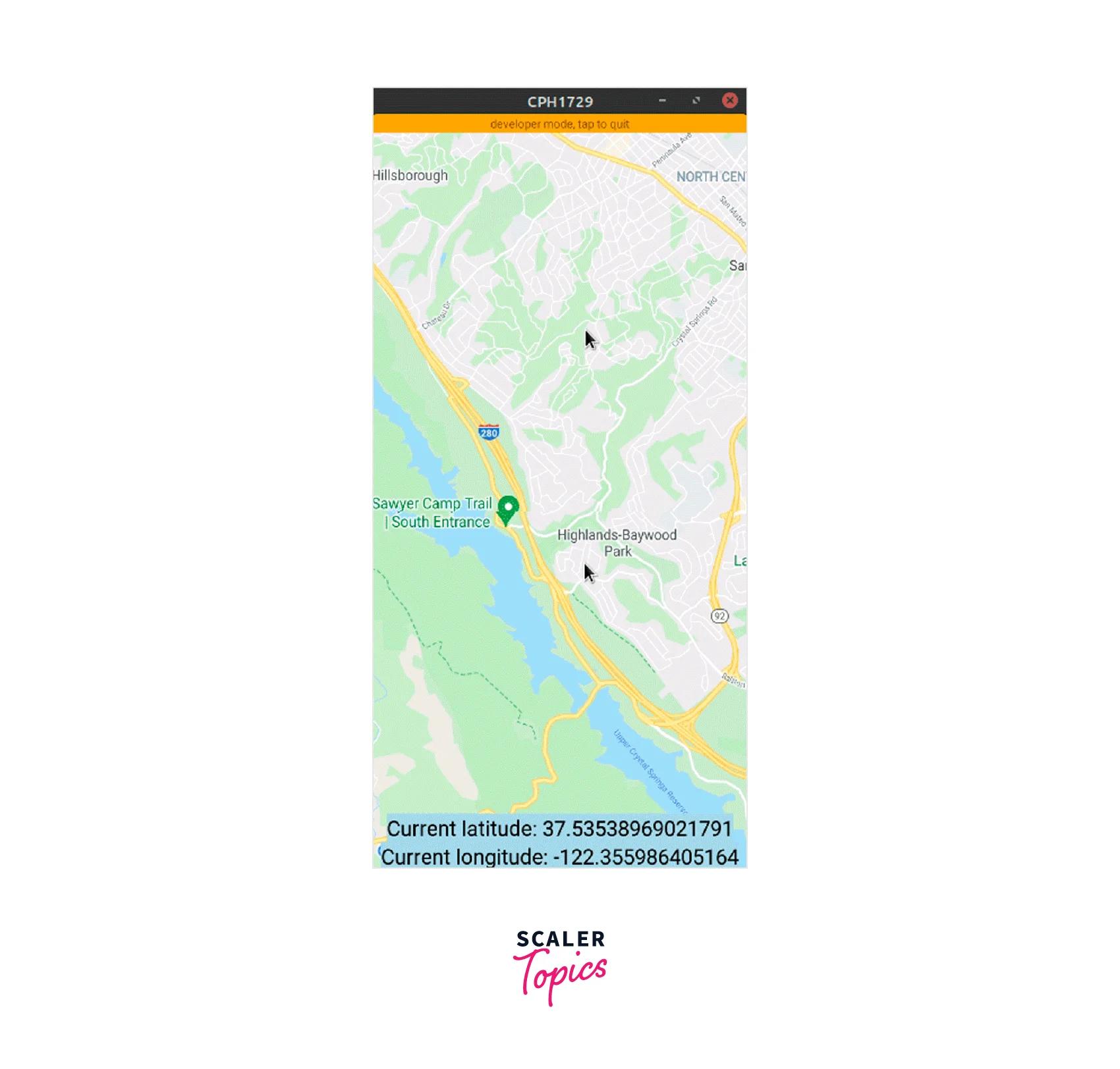
When the component mounts, the initialRegion prop displays the region that will be shown on the map. Once initialised, the initialRegion value cannot be altered.
To set the proportions, don't forget to include the style parameter; otherwise, the screen will be white. As long as the value is set to 1, the will fill the full screen.
The initialRegion prop requires an object containing the longitude, latitude, and delta values of a region. How much the region on the map needs to be zoomed is specified by the latitudeDelta and longitudeDelta parameters. Use the region prop to alter the region.
How to use UseState Hook with React Native Maps?
Using Prop: onRegionChangeComplete to set the new region into the state when changing the region using the useState Hook. When the user stops panning the map, the callback prop onRegionChangeComplete is activated.
Output:

How to Add Marker in React Native Maps?
Import Marker first from react-native-maps.
Render the Marker component as a child of the MapView component next. Send the marker's coordinate to the coordinate prop.
You should now be able to see the marking, as seen below.

The map can have n markers added to it, and you can send the map directly as a child to the MapView component.
Here is an illustration of a MapView with numerous Marker components:
Customizing the Map Marker:
Changing of Colour: Use the pinColor prop to alter the marker's colour.
We're making the pin green in this instance:

Changing the marker image:
By providing the image argument to the <Marker /> component, you may additionally provide a unique marker picture.

Changing the marker view:
Additionally, developers can use unique marker views with react-native-maps. This might be useful when you wish to use a symbol to denote a location. An illustration would be to illustrate an automobile component to represent the location of a car dealer.
To achieve this, first write some code to create a custom component like follows:
Next, we will insert the CustomMarker into your project.

React Native Maps Styling
Create a JSON object from the Google style generator to be used in the map design. The produced style object should then be sent to the customMapStyle attribute of the MapView component.
Since the map style is generated by the generator, you don't need to worry about the mapStyle variable; all you need to do is copy and paste the generated JSON object into the code and send it to the <MapView /> component. The above code will change the theme of the map from light to dark.

Getting Specific Coordinates or Current Location
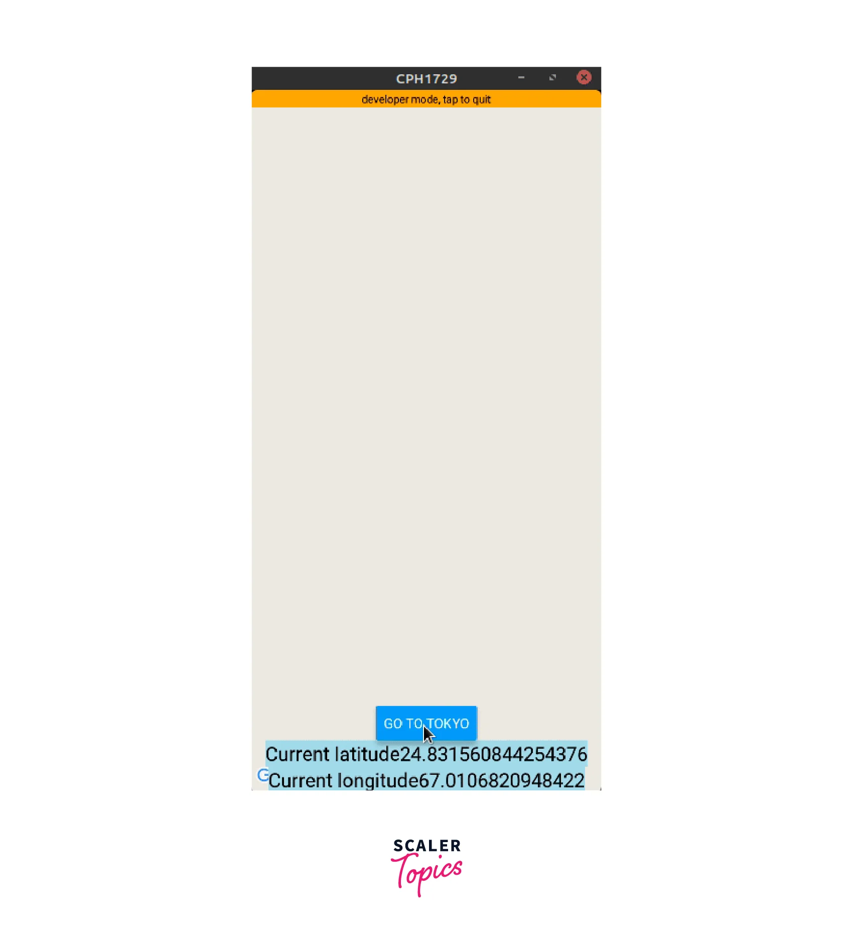
What would happen if you wanted to animate to a specific coordinate?
First, use the useRef() Hook to create a reference to <MapView />:
As a result, we are now able to use methods to manage our MapView component.
Add the following code next:
The breakdown of this above code is as follows:
A mutable ref object with the provided argument's value as its current property is what the useRef() Hook returns. The component is not yet mounted if the value of the current property is undefined. Now, using mapRef.current, you may access any of the <MapView /> functions.
The two arguments that may be sent to the animateToRegion() function are the destination coordinates (in this example, tokyoRegion), and the length of the animation in milliseconds.

In the end, your file's code should resemble this:
Using <polyline /> in React Native Maps:
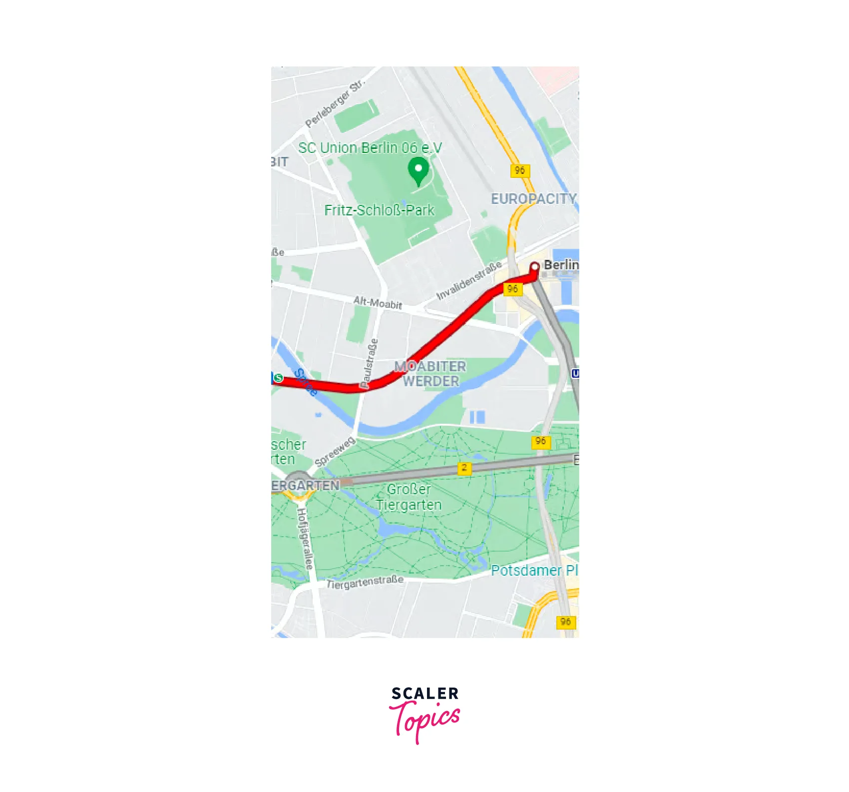
To draw a line between many locations, use the Polyline component from the react-native-maps package. Its coordinates prop accepts an array of coordinates. For style purposes, you may additionally supply other props like strokeWidth, strokeColor, etc.
Let's build a route:
Keep the location coordinates in their appropriate variables and send an array of them to the coordinates prop of the Polyline component.
The line is ultimately constructed straight between these points, disregarding the real physical routes and highways. The Google Maps Direction API, which provides all feasible routes between two locations, must be used to construct numerous coordinates between the source and destination locations in order to do that.
Directions Using Google Maps
You must first activate the Direction API for your project in order to utilise it. Keep in mind that the Directions function of Google Cloud won't operate unless you have a valid billing address.
Make a helper function named "getDirections" first. Write the following code here:
The overview_polyline.points property's encoded polyline points are converted by the decode() function into an array that contains the coordinates' latitude and longitude.
As a consequence, the PolyLine component will be able to read the position coordinates with ease. React-native-maps will raise an error without it.

FAQs
Q: How to render a Marker with a custom image?
A: To render a Marker with a custom image you need to take following steps:
- You must create a png picture with different resolutions (let's name them custom_pins);
- Place all images in the iOS and Android drawables directories.
- You may now use the code that reads:
Q: How to render a Marker with a custom view?
A: You can use the following code block :
Conclusion
- React Native Maps is a popular library that allows developers to integrate maps into their React Native applications.
- It provides a seamless interface for displaying interactive maps and adding markers, overlays, and other map-related components.
- React Native Maps is designed to work on both iOS and Android platforms, providing a consistent experience for users across different devices.
- React Native Maps provides extensive options for customization. Developers can customize the appearance of maps, markers, polylines, and other map elements to match the design and branding of their application.
- React Native Maps includes APIs for retrieving the user's current location and performing reverse geocoding to convert coordinates into human-readable addresses.
- React Native Maps seamlessly integrates with native map functionalities, enabling developers to leverage native capabilities and access additional features provided by the underlying map providers.
- In order to integrate Google Maps functionality into our app, we must first obtain an API key before presenting our MapView component.
- react native maps support following Component APIs, <MapView />, <Marker />, <Callout />, <Polygon />, <Polyline />, <Circle />, <Overlay />, <Heatmap /> and <Geojson />.
- You can customize the marker by changing its color, image and view.
