React Native Paper
Overview
For a programmer without design expertise, it would be ideal to create a workable MVP as soon as feasible. Utilizing a component library is the most effective approach to accomplish this. The cross-platform UI kit library React Native Paper offers a selection of editable, market-ready components that by default adhere to and respect Google's Material Design principles.
Introduction to React Native Paper
The react-native UI library React Native Paper has approximately 10,000 ratings on GitHub. created by Callstack, a business that specializes in react native development in Europe. Nearly all of the necessary UI elements are provided by React Native Paper with built-in theme support. The theme comes with pre-installed react-native-vector-icons to make working with icons in react-native simple to install and customize.
Implementing widely used design principles created by Google with the aid of react-native-paper greatly aids in creating a very attractive user interface. We can quickly create an MVP by offering a collection of excellent customizable components with strong theming support.
Features
- Platform Adaptation :
The iOS and Android ecosystems' high expectations are met by React-native-Paper. Using react-native-paper will benefit you as your users will get better experience. - Full Theming Support :
Themes are first-class citizens in React-native-paper since every app is unique. One can easily alternate between dark and bright settings, change the standard colours, or add their own. - Accessibility and RTL support :
React-native-paper is fully compatible with screen readers, readability tools and right-to-left languages. Make your app inclusive by default.
Setup and Important Installations
Open a Terminal in the folder containing your project, then enter the following commands to install the react-native-paper package :
For npm
For yarn
If you are using v5+ of react-native-paper then you will have to install react-native-safe-area-context.
For npm
For yarn
Additionally, the native library components must be linked for the iOS platform :
Installing and linking react-native-vector-icons is also necessary if you're working on a pure React Native project.
The MaterialCommunityIcons icon pack in particular has to be included in the project because several components (like AppBar) use it internally.(Android BackAction).
For npm,
For yarn,
Each platform's specific steps are listed in the library. The appropriate use of icon fonts requires that you adhere to their installation manual. By using babel-plugin-optional-require, you can choose not to install vector icons.
You don't need to install vector icons if you use Expo. Be sure to add babel-preset-expo in any babel.config.js or .babelrc files you may have, though. Use our optional babel plugin to get a smaller bundle size by omitting modules you don't use. The import statements are automatically rewritten by the plugin so that only the modules you use are imported rather than the entire library. For a production environment, add react-native-paper/babel to the plugins section of your babel.config.js file. It should seem as follows:
The plugin only functions if you use ES2015 import statements rather than require to import the library.
The following must be added to your .flowconfig's [options] section if you're using Flow to typecheck your code :
Use Cases of React Native Paper
We need to perform some preliminary setup before we can use the package. In the App.js file:
To make setup easier, we'll use context rather than redux for state management within this app. within a store.I render the app using the consumer component's context value.
The boolean value of isDarkModeOn indicates if the theme is active at the moment. If you want to later dynamically alter the colour theme, you must first complete this setup. Redux can also be used with it; the configuration is fairly similar.
After that, I return a PaperProvider wrapper for the entire application, whose child is the AppNavigator component, inside the renderProps.
Although a navigation library like react-navigation uses its own theme by default rather than the paper theme, the AppNavigator component theme is also dynamically altered by the same context variable. Because of this, we'll need to do a little more preparation in the future in order to use the colors from the DefaultTheme and DarkTheme inside our navigation components.
Depending on the context value, the PaperProvider wrapper is given one of two theme props: DefaultTheme or DarkTheme. In this lesson, I use the pre-installed DefaultTheme and DarkTheme to help you get things set up more quickly. Themes can be entirely overridden or modified. Once everything is set up, we can begin developing our app and utilize all of react-native-paper's features.
Examples
Let us try to implement the components of the library. First, we must enclose our app in the react-native-paper component named "Provider." The theme is added to each component in our application using the <Provider/>. Additionally, it serves as a gateway to elements that must be presented at the top level, such as modals.
All the colours and fonts that our components will utilize collectively constitute the "theme". To change the default colours and add some new ones, I made the theme.js file. We must supply our theme as a prop to the "Provider" component in order to use it.
Since we simply put up the theme for future use, you won't notice any changes in the app just yet. Let's put some components to the test and see how they perform.
<Button/> will be our first component to discuss. We import <Button/> into our app by exporting it from react-native-paper. As we can see, it is not yet anything spectacular. To make our button stand out in the UI, we may add the prop mode="contained" attribute.
Let us add some more styles to the "Button" component by creating a small abstraction over it. It will enlarge our button and better fit our screen.

One thing to note is that our button's colour truly originates from the theme we offer. For instance, if the application's primary colour is changed to red, all of the buttons will also turn red. The same holds true for background and text colours.
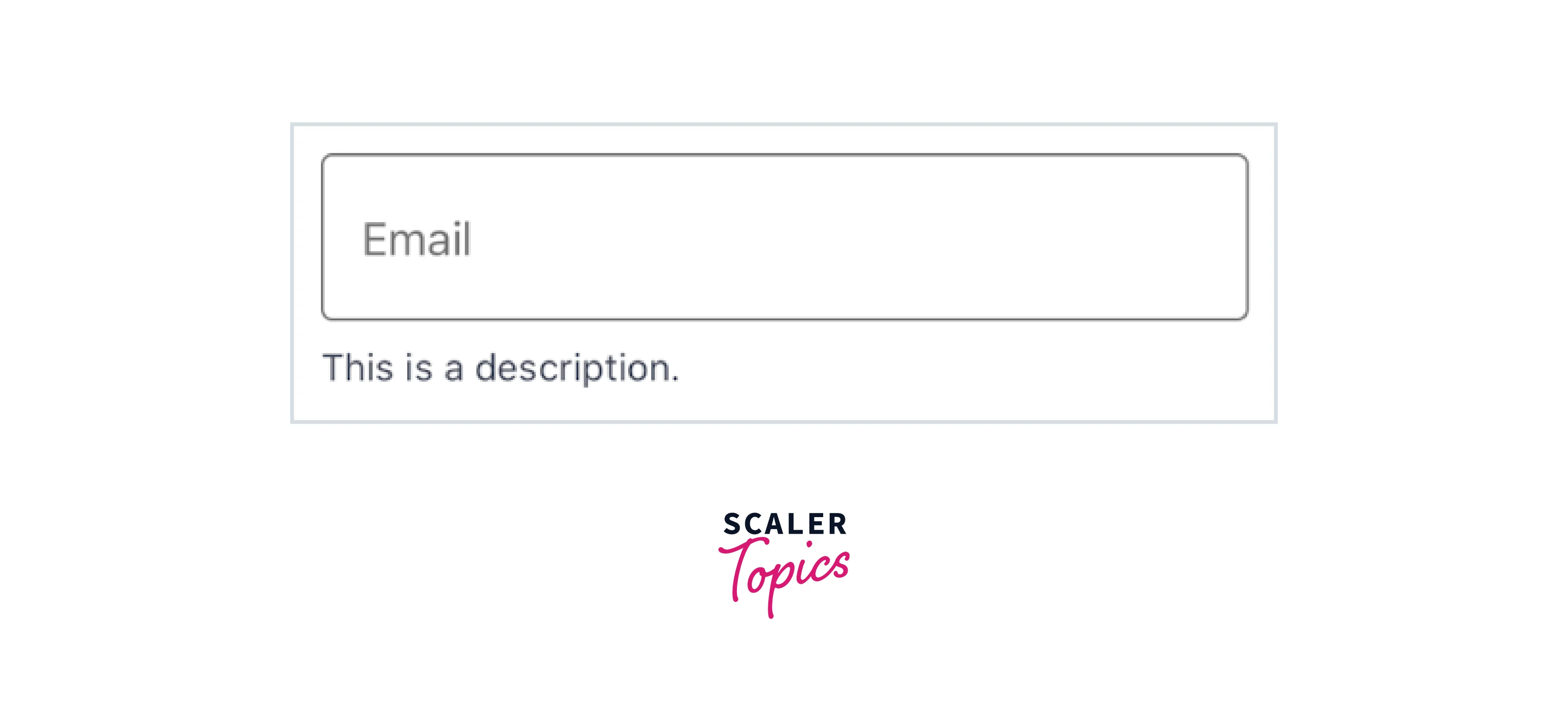
TextInputs are the second-most crucial elements in our application. The component "TextInput" from react-native-paper is beautiful and handles all animations. It will be heavily utilised in any signup page or form.
You can always abstract components and add styles to them as shown:
We have added the extra properties description and errorText so we could choose what was shown beneath the field.
Including some fundamental typography in our project is always a fantastic idea. In this instance, we'll add Header and Paragraph components. On the screen, they will be used to present crucial information.
As you can see, we are replacing the <Text/> component from react-native with the <Text/> component exported from react-native-paper. This is done in order to guarantee that the colours specified in our theme.js file will be used for our text.
All of the above components can be used along with other components provided in the react-native-paper to create better designs.
FAQs
Q. How Can We Provide a Custom Theme?
A. After being wrapped in the withTheme higher-order component function from the library, custom components can get the theme props. With the Provider component, you can supply a custom theme to change the colours, typescales, etc.
Example:
Q. How Can Font Configuration Be Done?
A. To configure custom fonts you have to prepare a fontConfig object where fonts are separated by platforms in order to generate a bespoke font. Following that, you must:
- pass the fontConfig in configureFonts as the value of config parameter
- set the isV3 object property of the params to false.
The fontConfig object supports native for iOS, Android, Mac OS X, Windows, and Web. Use these to replace the fonts on specific systems.
Conclusion
- Nearly all of the necessary UI elements are provided by React Native Paper with built-in theme support.
- React Native Paper is a popular UI component library specifically designed for React Native applications.
- It provides a wide range of pre-built, customizable, and ready-to-use components such as buttons, text inputs, cards, dialogs, lists, and more.
- The theme comes with pre-installed react-native-vector-icons to make working with icons in react-native simple to install and customize.
- Implementing widely used design principles created by Google with the aid of react-native-paper greatly aids in creating a very attractive user interface.
- Features of react native paper are Platform adaptation, Full theming support, Accessibility and RTL support.
- React Native Paper is actively maintained and frequently updated, ensuring compatibility with the latest versions of React Native and providing bug fixes and new features.
- The react-native UI library React Native Paper has approximately 10,000 ratings on GitHub.