React Native Popup Menu
Overview
Explore React Native Popup Menus in this article, discovering their purpose, benefits, implementation in projects, and inspiring use cases. Join us to see how Popup Menus can transform your app's interface, enhancing user interactions seamlessly.
Features
The React Native Popup Menu is a user-friendly and versatile component that offers a range of features and customization options. Here's an elaboration of each point:
Simple to use popup/context menu: The React Native Popup Menu provides a straightforward and intuitive way to implement popup or context menus in your application. Developers can easily incorporate these menus without complex coding or configuration.
Multiple modes: animated, not animated, slide in from bottom or popover: With the React Native Popup Menu, developers have the flexibility to choose from various modes for menu presentation. Options include animated menus, non-animated menus, menus that slide in from the bottom, or popover-style menus.
Default opening and closing animations: The Popup Menu component includes built-in opening and closing animations, providing smooth and visually appealing transitions for a polished user experience. These default animations add an extra touch of professionalism to your app.
Customizable on various levels - menu options, positioning, animations: The Popup Menu component offers a high level of customization. Developers can tailor the menu options, positioning, and animations to suit their specific requirements. This flexibility ensures that the menu aligns with the app's unique design and behavior.
Different lifecycle hooks: The Popup Menu component includes various lifecycle hooks that developers can utilize to perform actions or handle events at different stages of the menu's lifecycle. These hooks allow for fine-grained control and customization.
RTL layout support: The React Native Popup Menu provides built-in support for right-to-left (RTL) layouts. This ensures compatibility and proper alignment for apps that utilize RTL languages or have RTL-specific design requirements.
Community driven features
The React Native Popup Menu offers extensive support for multiple platforms, including UWP (Universal Windows Platform), react-native-web, and react-native-desktop. In addition, the React Native Popup Menu provides comprehensive TypeScript definitions. This feature enables developers to leverage the benefits of static typing and enhance the development process.
Installation
Use below command to install react-native-popup-menu in your react native project:
Basic Usage
To utilize React Native Popup Menu, start by enclosing your application within the MenuProvider. Then, incorporate the Menu component wherever you require it. Here's a straightforward illustration to help you understand the implementation:
Creating custom pop-up menu dividers and options in React Native
To implement a simple pop-up menu that activates upon a button click, we'll generate a file named SimpleMenu.js within the component folder. Later, we'll render this component within the App.js file. File Name: SimpleMenu.js
File Name: App.js
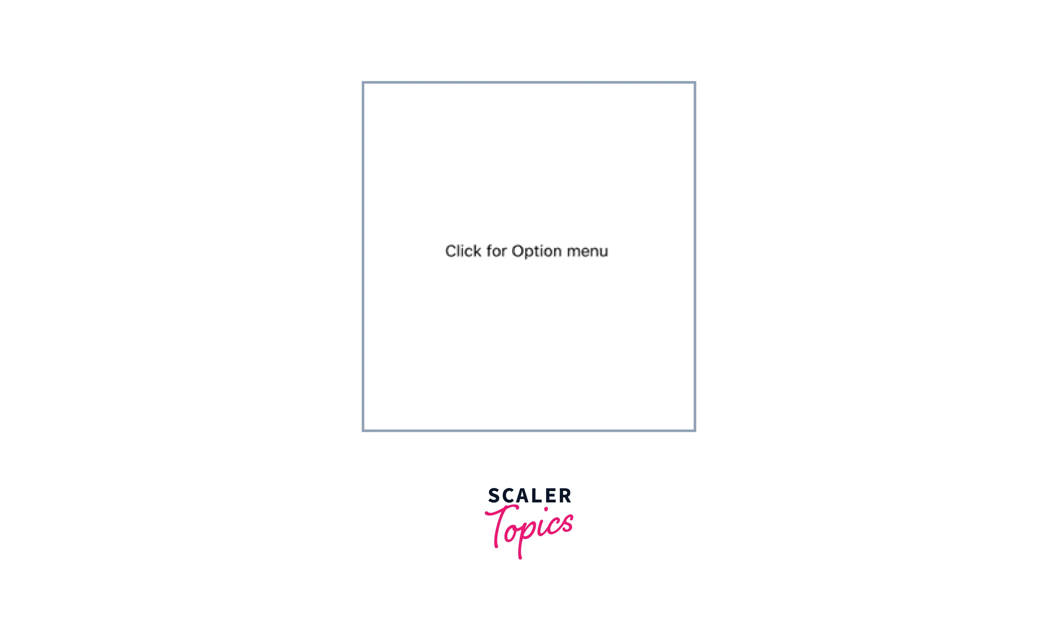
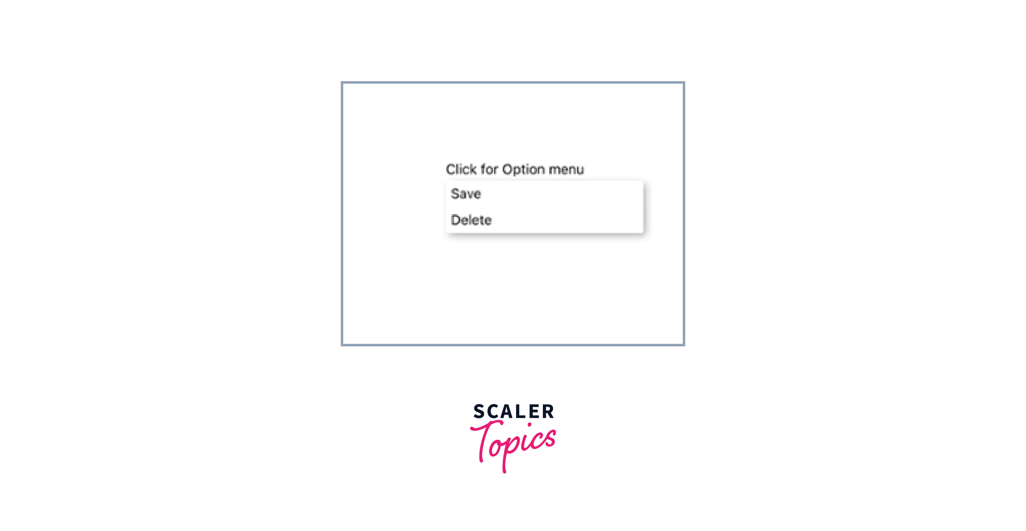
Output
To get started with implementing the pop-up menu, let's explore the built-in APIs provided by the library:
- MenuProvider: This API offers imperative methods for handling the pop-up menus.
- Menu: The root menu component is used to define menu names and handle necessary events.
- MenuTrigger: With this component, we can specify the position where the pop-up menu will be displayed.
- MenuOptions: This component encapsulates all the menu options.
- MenuOption: It acts as a wrapper component for individual menu options.
By utilizing these APIs, we can effectively create and control pop-up menus within our React Native application. Now, we will make use of these APIs to create a SimpleMenu.js file:
In this example, we are demonstrating the creation of a basic pop-up menu using the provided APIs. To begin, we wrap all the menu content within a MenuProvider component. Inside the MenuTrigger component, we specify the desired text that will be displayed as Click for Option menu.
To add a personal touch, we apply custom styles to define the appearance of the MenuTrigger content. The MenuOptions component contains two MenuOption children, which will appear when the MenuTrigger is clicked.
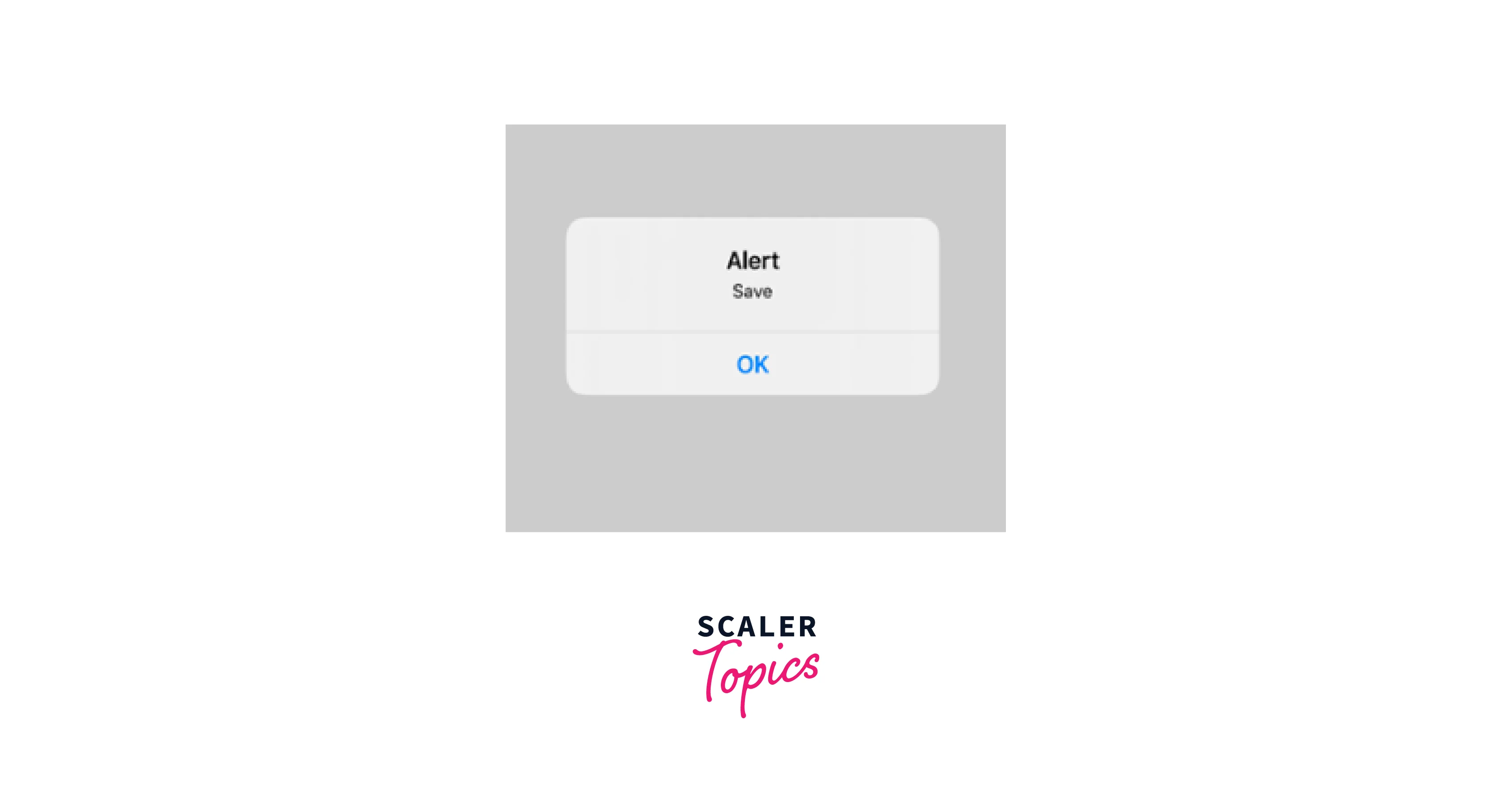
Finally, we handle the selection of menu options through the onSelect event. When a menu option is chosen, an alert message is displayed to provide feedback on the selection.
We want to show a popup alert when the user clicks on the option menu and then select save, below are the screenshots that demonstrates what we are trying to achieve.
MenuTrigger and MenuOption components offer the flexibility to customize their children according to our preferences. This means we have the freedom to define the structure and style of the child elements. For example, instead of using plain text (such as Click for Option menu) as the child of MenuTrigger, we can use an icon to represent it. File Name: SimpleMenu.js
Output

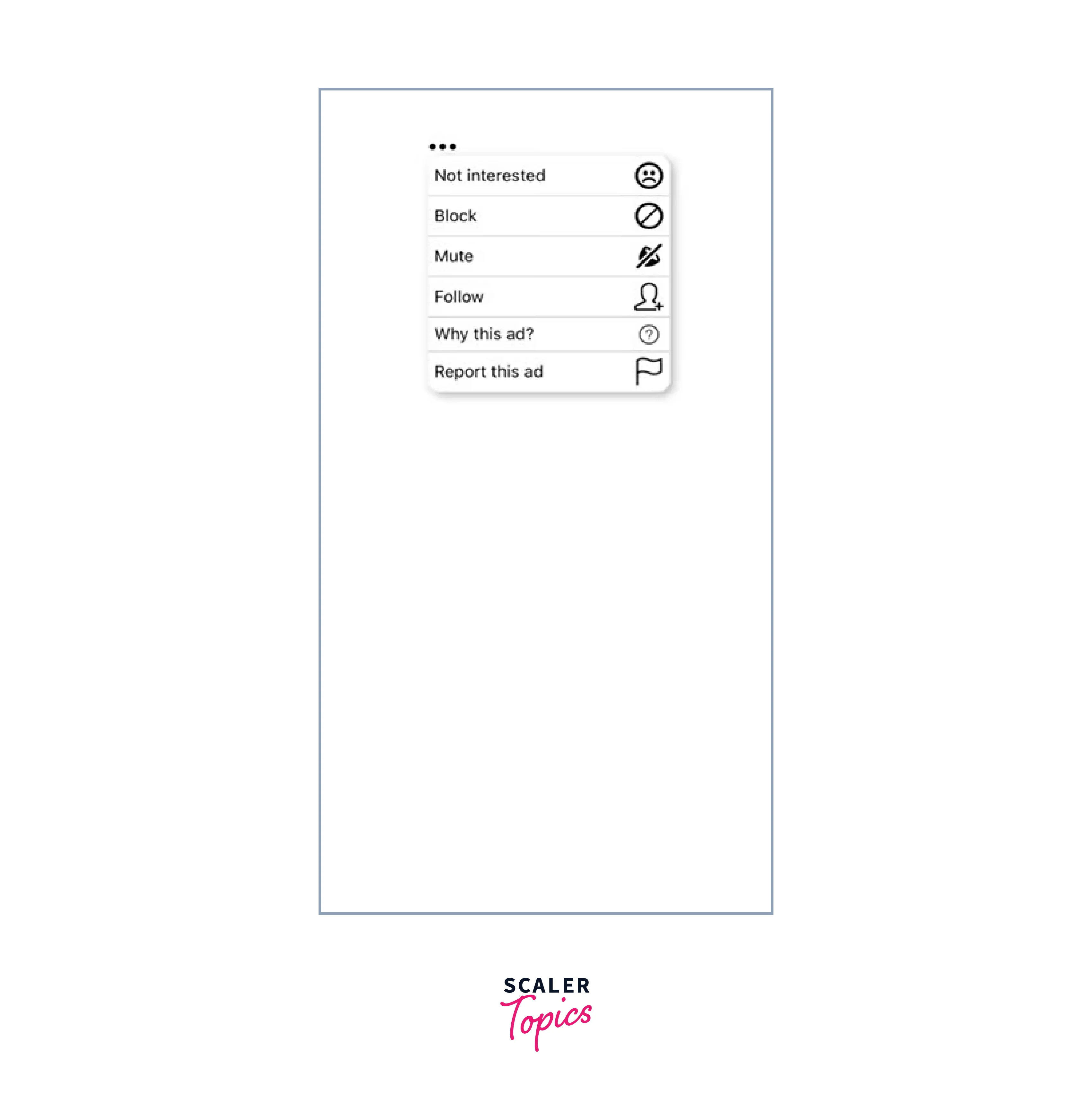
Let's explore how we can enhance the pop-up menu we created earlier in the article. Similar to the initial example menu we presented, we will customize the MenuTrigger and MenuOption components by adding a text divider and an icon.
To achieve this, we will create two new files named CustomMenu.js and CustomContents.js. In CustomMenu.js, we will import the necessary APIs, create a custom icon for the MenuTrigger, and apply custom styles to it.
Within the MenuOptions component, we will display a total of six options. Each option will be defined as a separate component, which we will create in the CustomContents.js file.
File Name: CustomContents.js
In CustomMenu.js, we extract three properties from each component we receive: text, iconName, and value. These properties are used to display text and icons in the menu. Additionally, we utilize the onSelect function to trigger an event when an option is clicked.
Within the CustomMenu.js file, we import various components such as Block, Mute, Follow, Why, Question, and NotInterested. These components are then utilized as children within the MenuOptions component. Additionally, the values for the three props we previously extracted are passed into the respective components.
Furthermore, we have implemented a divider component and assigned it a specific style to distinguish it visually from other menu elements.
Output
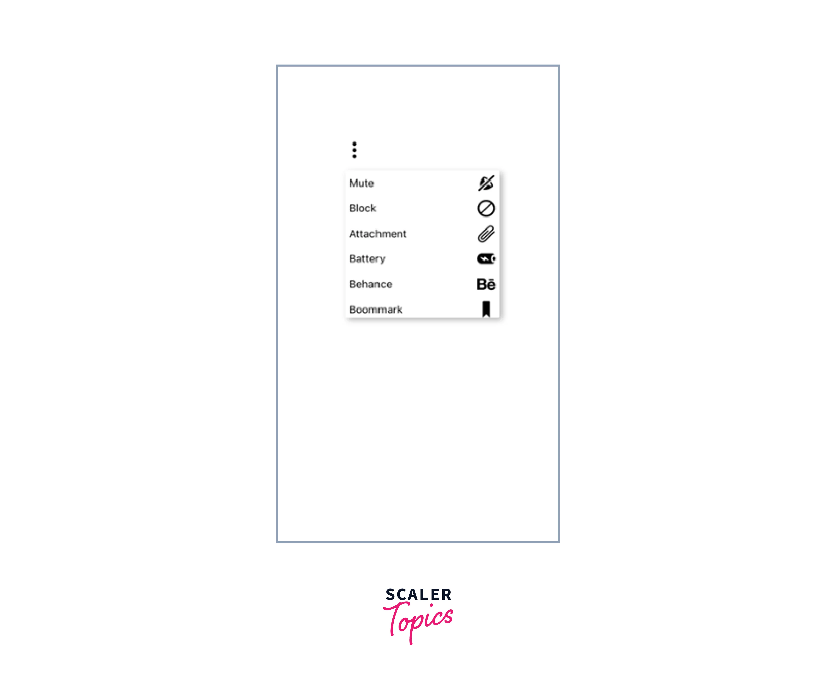
Pop-up menus with a scroll view
To display a pop-up menu with scrolling functionality, we have two options: FlatList and ScrollView.
Similar to the usual process, we'll create a file called ScrollViewMenu.js. Additionally, we'll create a data.js file that will provide the data required for the scroll view. Within this file, we'll implement the scroll view using both FlatList and ScrollView components.
The data necessary for creating the scroll view will be generated in the data.js file:
To utilize the FlatList component, we import data from a newly created data.js file, along with the menu pop-up APIs. The data array is then passed to the FlatList API component, enabling us to map over each item and render them within the scroll view. File Name: ScrollViewMenu.js
Output
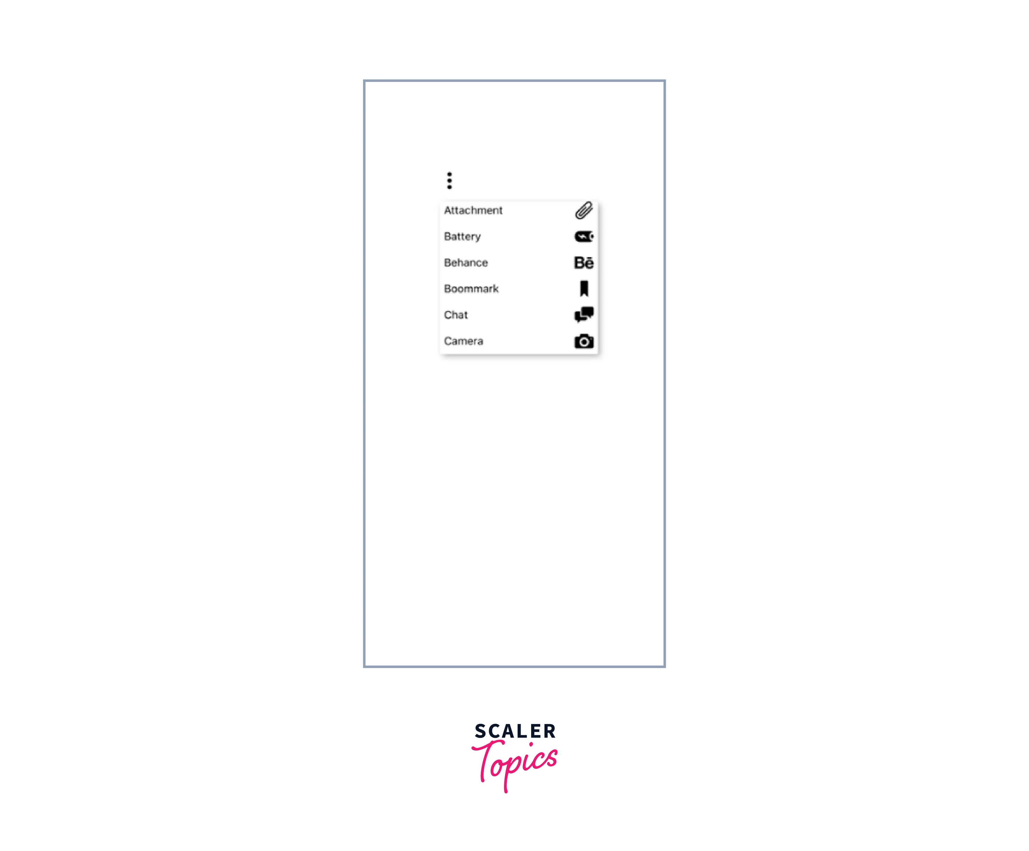
To implement the same functionality with a ScrollView, we will follow a similar process, but this time we will utilize the ScrollView API component.
Output
Documentation
React Native Compatibility
| Popup Menu Version | Minimum React Native Version |
|---|---|
| 0.13 | 0.55 (16.3.1) |
| 0.9 | 0.40 |
| 0.8 | 0.38 |
| 0.7 | 0.18 |
Conclusion
- React Native Popup Menu provides a user-friendly and versatile component for implementing popup or context menus in React Native applications.
- The component offers multiple modes, including animated and non-animated menus, slide-in menus, and popover-style menus.
- The Popup Menu component offers a high level of customization, allowing developers to use menu options, positioning, and animations.
- It can function as both a controlled and uncontrolled component, providing flexibility in managing the menu's state and behavior.
- Basic usage involves enclosing the application within the MenuProvider and using the Menu component where the menu is required.
- Custom pop-up menus can be created by defining custom components for menu dividers and options using the provided APIs.
- Customization options include adding icons, applying custom styles, and handling events when menu options are selected.