React Native Slider
Overview
A component called React Native Slider allows users to choose one value from a variety of options. Most frequently, we encounter sliders while changing the phone's brightness or volume. In this article, we will look at a similar component provided by react native community.
What is Slider in React Native?
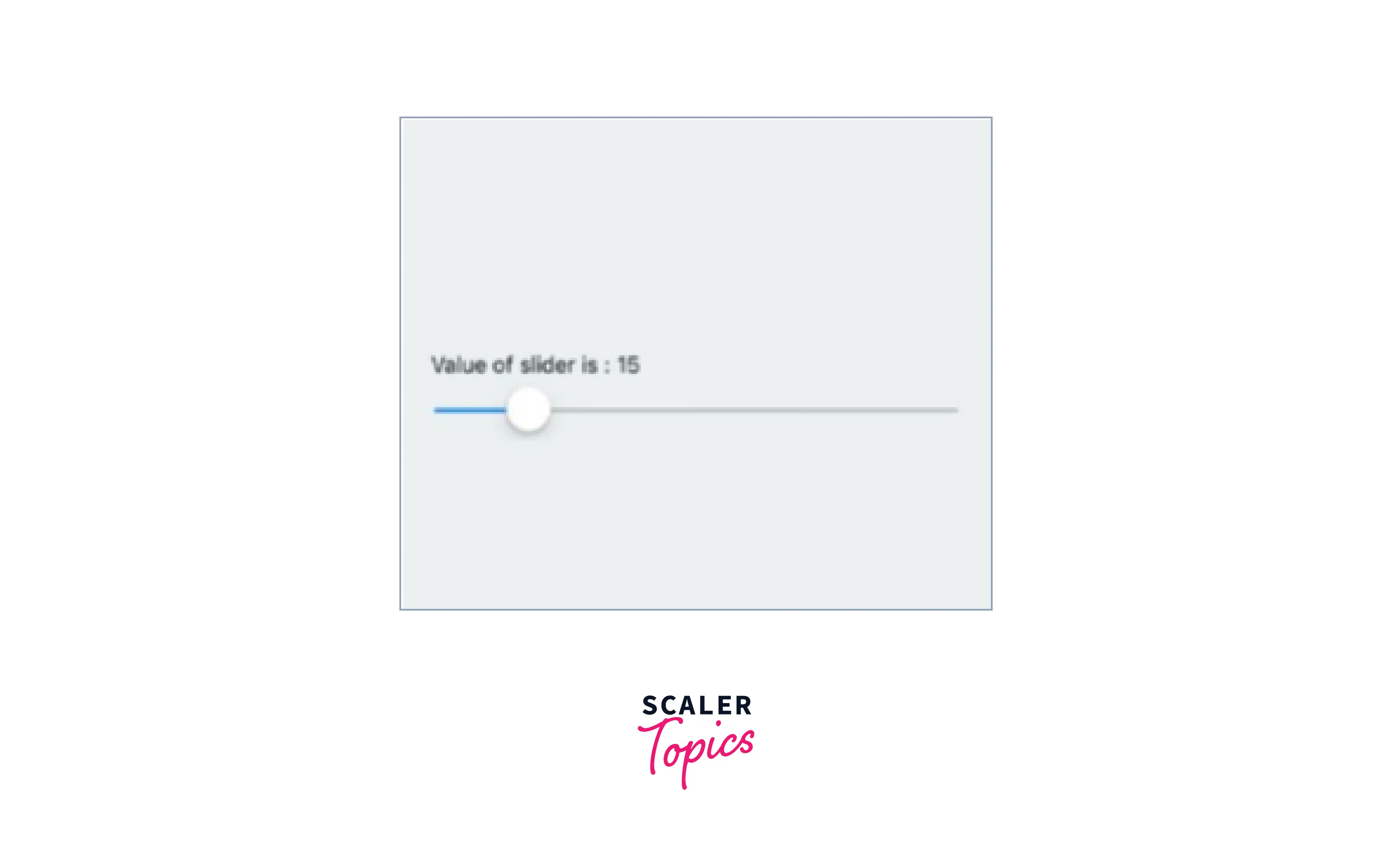
React Native slider is a component used in iOS and Android devices that allows users to select a value (basically slide between a range of values) from a given range. This can be observed when you change the volumes in your devices.
Installations
Type the following command to install the slider in your app :
Although the developers have made an effort to keep this component compatible with earlier releases of React Native, you may need to use a particular version of this component to support the precise version of React Native you are using due to the platform's nature and the existence of breaking changes between releases. See the table below :
| React Native version(s) | Supporting react-native-slider version(s) |
|---|---|
| <0.25.0 | <0.7.0 |
| v0.25.x | v0.7.x |
| v0.26.0+ | v0.8.x |
| v0.43.0+ | v0.10.x |
| v0.44.0+ | v0.11.x |
Usage and Application
Provide Visual Feedback The use of visual feedback in user interface design is crucial. People expect things to function the way they do in the real world when buttons and controls react to our touch. The slider immediately displays visual confirmation after an input event.
Show The Range and Histogram You should display the real range of values in a whole collection if you use sliders for filtering. This is particularly beneficial for e-commerce sites that let users sort goods by price. You should offer an accurate range, the minimum price, and the maximum price for an item that consumers may search inside rather than utilizing the range $0 and Max.
React Native Slider Props
- value: The slider's starting point
- disabled bool: If true, the slider can't be moved by the user.
- minimum value: The slider's starting minimum value
- maximum value: The slider's starting maximum value
- step: The slider's step value. The range for the value should be 0 to the maximum.Minimum Value = Value -
- minimumTrackTintColor: The shade applied to the track to the button's left.
- maximumTrackTintColor: The hue of the track to the button's right.
- thumbTintColor : The hue applied to the thumb.
- thumbTouchSize: The dimensions of the touch area that permits thumb movement. The visible thumb's center is shared with the touch area. This makes it possible to have a visibly tiny thumb that can yet be moved easily by the user.
- onValueChange: While the user is sliding the slider, the callback is continually invoked.
- onSlidingStart: When the user begins adjusting the value (for example, when the slider is pressed), the callback function is called.
- onSlidingComplete: When the user is finished altering the value (for example, when the slider is released), the callback function is called.
- style: The aesthetic of the slider container
- trackStyle: It refers to the style used for the track.
- thumbStyle: The design used for the thumb
- thumbImage: Chooses an image for the thumb.
- debugTouchArea: To visibly observe the thumb touch rect in green, set it to true.
- animateTransitions: If you wish to utilize the standard "spring" animation, set it to true.
- animationType: To utilize one of the two types of animations with the default animation settings, set animationType to "spring" or "timing."
- animationConfig: Used to set the settings for the animation. The Animated library uses the same parameters.
Importing Slider in Code
first, import the slider :
Render the slider using the following command :
Example

FAQs
Q. What is Slider in React Native?
A. React Native slider is a component used in iOS and Android devices that allows users to select a value (basically slide between a range of values) from a given range.
Conclusion
- A component called React Native Slider allows users to choose one value from a variety of options.
- Slider provides visual feedback to the users.
- Slider allows the user to select the values from a given range.
- Slider supports props like value, disabled bool, minimumValue, maximumValue, and step.