How to Use react-native-snap-carousel?
Overview
As React Native grows day by day. One of the key challenges is building a new UI component from scratch, which is quite difficult for any developer. So using some React Native plugins will make our development faster and easier.
In this article, you will discuss the react-native carousel package, known as react-native-snap-carousel.We might see a carousel that is used for storytelling, onboarding, promotion, and advertising. In most cases, it is designed to capture user attention for engagement. Carousels allow developers to present a larger number of items or content pieces within a smaller area.
What is React-native-snap-carousel?
In React Native, react-native-snap-carousel is considered a package for developing a beautiful aesthetic representation of any information that adds visual appeal.
Build a flatlist, make animations for the flatlist, and add pagination functions. That sounds like a very long process. Who wanted to be involved? That's why react-native-snap-carousel comes into the picture for easy development within a short period.
It is an open-source React native library for carousels. Also, it supports lazy loading and different customizations by using props.
How does it Work?
Under the hood, react-native-snap-carousel uses different react native concepts and mechanisms, and the Gesture Handler is the main gesture responder system. Scroll animation is also a great feature in React Native Snap Carousel, which enables different animations with different animation styles, transitions, and momentum.
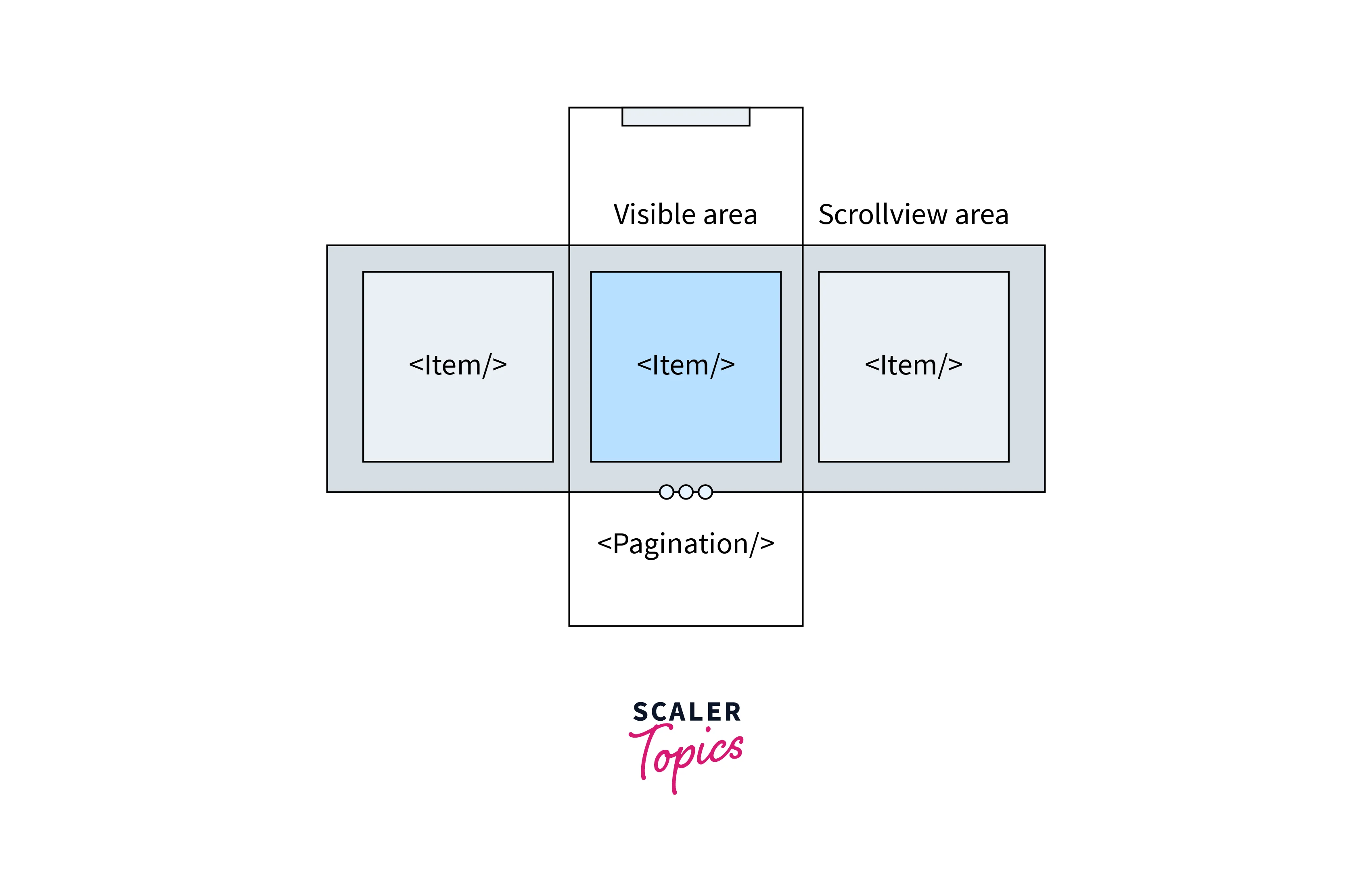
It uses an in-built Pagination component where different hooks are used in the background. It's important to note that React Native Snap Carousel abstracts away the complexities of handling touch events, animation, layout calculations, and snapping behavior, providing a simplified and easy-to-use interface for creating carousels in React Native applications.
Integrating Carousel
react-native-snap-carousel provides a few components that we can use to create and customize carousels in our Snap carousel react native project. Here are the main components available in react-native-snap-carousel:
-
<Carousel/>:
The main component that wraps the carousel functionality. It handles the rendering of carousel items, swipe gestures, and navigation. -
<Pagination/>:
A built-in component that displays pagination indicators, typically in the form of dots, to indicate the current position in the carousel. -
<ParallaxImage/>:
A specialized component that allows you to create parallax effects with background images in carousel items. -
<SliderEntry/>:
A helper component often used in examples and demos to define the content and structure of carousel items. -
<SliderBox/>:
A simple wrapper component that provides a pre-configured carousel with images. It is useful for quickly creating image carousels.
With the above Props accepted to implement a carousel using the Carousel component from the react-native-snap-carousel package, you can utilize the following:
- data:
An array of items to be rendered in the carousel. - renderItem:
A function that defines how each item in the carousel should be rendered It takes an item from the data array as input and returns the corresponding React element. - sliderWidth:
The width of the carousel container determines the overall width of the carousel and affects the visible area of each item. - itemWidth:
The width of each item in the carousel. It determines the size of individual items displayed within the carousel container. - autoplay:
Specifies whether the carousel should automatically scroll through the items. Accepts a boolean value. - autoplayInterval:
The time interval (in milliseconds) between automatic slide transitions when autoplay is enabled. - loop:
Determines whether the carousel should loop back to the beginning after reaching the last item. Accepts a boolean value. - onSnapToItem:
A callback function is triggered when the carousel snaps to a new item. It receives the index of the new item as an argument. - onScroll:
A callback function is called when the carousel is scrolled. It provides scroll event details as arguments, such as the current scroll offset and the scroll direction. - scrollEnabled:
Specifies whether scrolling is enabled for the carousel. Accepts a boolean value. - layout:
Defines the layout type for the carousel. It can be either 'default', 'stack', or 'tinder'.
Important Installations (for Both "react native cli" and "expo cli")
We all need the following prerequisites:
- Node.js and NPM or Yarn
- Android Studio (to develop Android apps) and Xcode (to develop iOS apps)
- VScode (code editor)
- JDK (JAVA Development Kit)
Installation in React Native
Installation in Expo
Then the following installation is the same for Expo as well as the react-native CLI.
Now, it's good to go with the React Native Snap Carousel. Great, We have successfully created our React Native app. We are ready for coding! 💪
Creating an Image Carousel (With Code Example)
Before doing anything, we first need to import the react-native-snap-carousel library to our react native project. If we wanted to use pagination, we could add it later in the development of the pagination component.
Example - 1: Create a Default Carousel
The Snap Carousel component in React Native allows you to display various types of content, including images, text, or any other custom components.
Here's a general approach to creating data in a React Native Snap Carousel:
viewdata.js:
The above data was created to be used in future examples. view1 item in the data array contains an image and a title property. And view2 item in the data array contains an image and a boolean value property.
Now we are going to develop our first carousel using React Native.
App.js:
This is a function component named renderItem1, which takes an object ({item}) as a parameter. It returns a JSX that represents the visual layout of a single item in the carousel.
Example - 2: Tinder-Like Image Carousel
To create a Tinder-like layout in a React Native Snap Carousel, you can modify the existing code to achieve the desired effect.
The difference is that we just need to change the value of layout to tinder over the default value.
How to Add Pagination?(With Code Example)
Pagination refers to a visual indicator in the carousel that allows one to navigate between every slide of the carousel by understanding the current position of the carousel.
Usually, a carousel has multiple forms of pagination, like dot indicators, arrow navigations, thumbnails, and progress bars. But in react-native-snap-carousel, the default pagination is dot style.
In React Native Snap Carousel, pagination can be implemented using the built-in pagination feature provided by the library. Here's an overview of how pagination works in the React Native Snap Carousel:
To use pagination in the React Native Snap Carousel, you need to import the necessary components from the library:
- renderCarouselItem: is a function that defines how each item should be rendered.
- To display pagination dots, you can use the Pagination component provided by react-native-snap-carousel. It automatically syncs with the carousel to display the appropriate number of dots and highlight the active dot.
Example - 1: Adding Pagination Carousel
The props accepted by the Pagination component include:
- activeDotIndex:
(required) The index of the currently active or selected item. - dotsLength:
(required) The total number of items or slides in the carousel. - activeOpacity:
Opacity of the dot when tapped The prop has no effect if tappableDots isn't set to true. - carouselRef:
Reference to the carousel component to which pagination is linked. Needed only when setting tappableDots to true. - containerStyle:
is the style to be applied to the pagination container. - dotColor:
The color of the active pagination dot. - dotContainerStyle:
Style of each dot's container. Use this if you need to specify styles that wouldn't have any effect when defined with dotStyle (such as flex). - dotElement:
Optional custom active dot element that will replace the default one. The element will receive a prop active set to true as well as a prop index. - dotStyle:
The style to be applied to the pagination dots. - inactiveDotColor:
Background colour of the inactive dots - inactiveDotElement:
Optional custom inactive dot element that will replace the default one. The element will receive a prop active set to false as well as a prop index - inactiveDotOpacity:
is the value of the opacity effect applied to inactive dots. Example: 0.5 - inactiveDotScale:
The scale factor applied to the inactive pagination dots. The type will be number - inactiveDotStyle:
Dots' style that will be applied to inactive elements - renderDots:
Function that gives you complete control over pagination's rendering. It will receive three parameters : (activeIndex, total, context). This can be especially useful to replace dots with numbers. - tappableDots:
Make the default dots tappable, e.g., your carousel will slide to the corresponding item. Note that carouselRef must be specified for this to work. The value will be Boolean - vertical:
Whether to layout dots vertically or horizontally. Example: True and False. - animatedDuration:
Length of dot animation (milliseconds). The value type is Number - animatedFriction:
Controls "bounciness" or overshoot on dot animation. supports Number Type - animatedTension:
Controls speed dot animation. supports Number Type. - delayPressInDot:
Delay in ms, from the start of the touch, before onPressIn is called on the dot. also supports Number Type.
Example - 2
This Final Code is a Combination of Default Carousel, Tinder Carousel, Pagination Carousel, and Parallax Carousel.
Output:

Conclusion
- In this article, we learned how to implement a carousel using the react-native-snap-carousel library. However, there are many libraries available except for this React Native Snap Carousel.
- We can use react-native-deck-swiper and react-native-swiper, react-native-image-slider-box, react-native-flatlist-slider and react-native-parallax-swiper.
- React Native Snap Carousel offers a user-friendly solution for implementing carousels in React Native applications.
- With its ease of integration, smooth animations, gesture support, customization options, performance optimization, and strong community support, it empowers developers to create engaging and interactive carousels that enhance the user experience.
FAQ
Q: Can I replace Dot Pagination with Custom pagination in react-native-snap-carousel?
A: Yes, We can replace the default dot pagination with custom pagination in React Native Snap Carousel.
Example: