React Native SVG
Overview
SVG is an image format that displays the image you see using vector graphics. Due to their ability to scale to any resolution, they are now very common among developers. Any editor can be used to create and edit SVG files. CSS can also be used to change its properties. The nature of SVGs means that file sizes are unaffected by resolution, allowing them to be much smaller than their pixel-based counterparts.
What is an SVG File?
Vector images are rendered in SVG, an XML-based format. As opposed to other image formats like .png and .jpeg, which are driven by pixels, vector images are controlled by mathematical equations and can scale to any desired size without pixelating.SVG files are smaller in size than other image types in comparison.
If you open an SVG file in your text editor, a large XML code filled with numbers and different nodes will be visible. The SVG itself won't be the main focus of this tutorial. Instead, we'll show you how to render SVGs on a screen for a mobile application.
Are SVGs Supported in React Native?
It is more difficult to render SVGs in mobile apps than it is to do so online, where you can paste the SVG code into your HTML file or use SVG directly as an image source. This is due to the absence of a native React Native component that can directly render SVGs.
We'll need to install a few libraries from the npm registry because React Native doesn't come with default support for React Native SVG. Fortunately, there is a well-liked npm package called react-native-svg that functions perfectly for the majority of use cases.
To begin, let's create a React Native project. Run the command line :
Run the upcoming command after entering the project location to install the react-native-svg and react-native-svg-transformer packages :
Your React Native project will have SVG support on both the Android and iOS platforms thanks to react-native-svg. You can import local SVG files into your React Native project using react-native-svg-transformer, just as you would with a Create React App project on the web.
The following commands can be used to get started if you're using Expo CLI rather than React Native CLI.
Introduction to React Native SVG
React Native SVG support on iOS, Android, macOS, Windows, and a compatibility layer for the web is provided by react-native-svg.
Features
- Most SVG properties and elements are supported (Rect, Circle, Line, Polyline, Polygon, etc).
- The SVG code to react-native-svg conversion is simple.
Installation
-
With expo-cli The native code is already present in the Expo client app. Install the library using the below command :
-
With react-native-cli To install the library, use the below commands :
Now to Link the native code,
Supported Versions of React Native
| react-native-svg | react-native |
|---|---|
| 3.2.0 | 0.29 |
| 4.2.0 | 0.32 |
| 4.3.0 | 0.33 |
| 4.4.0 | 0.38 |
| 4.5.0 | 0.40 |
| 5.1.8 | 0.44 |
| 5.2.0 | 0.45 |
| 5.3.0 | 0.46 |
| 5.4.1 | 0.47 |
| 5.5.1 | >=0.50 |
| >=6 | >=0.50 |
| >=7 | >=0.57.4 |
| >=8 | >=0.57.4 |
| >=9 | >=0.57.4 |
| >=12.3.0 | >=0.64.0 |
react-native-svg Props
| Name | Description |
|---|---|
| fill | The color inside the shape is referred to by the fill prop. It has a default value '#000'. |
| fillOpacity | The opacity of the color or content that the current object is filled with is specified by this prop. It has default value 1. |
| fillRule | The fillRule prop, which can be nonzero or evenodd, determines which side of a path is inside a shape, which determines how to fill will paint the shape. It is nonzero by default. |
| stroke | The stroke prop determines how a shape's outline will look. It is 'none' by default. |
| strokeWidth | The current object's outline's width is specified by the strokeWidth prop. By default, it is 1. |
| strokeOpacity | The current object's outline's opacity is specified by the strokeOpacity prop. By default, it is 1. |
| strokeLinecap | When an open subpath is stroked, the stroke Linecap prop specifies the shape to be applied to the end of the path. 'butt','square', or 'round' are all possible values for the current object. 'square' is the default value. |
| strokeLinejoin | The shape to be used at the corners of paths or fundamental shapes when they are stroked is specified by the'strokeLinejoin' prop. Can either be "round," "bevel," or "mitre". 'miter' is default. |
| strokeDasharray | The pattern of dashes and gaps used to stroke paths is controlled by the 'strokeDasharray' prop. |
| strokeDashoffset | The dash pattern's starting point is determined by the 'strokeDashoffset' prop. It is null by default. |
| x | X-axis distance translation. It is 0 by default. |
| y | Y-axis distance translation. It is 0 by default. |
| rotation | Degree of rotation for the current object. It is 0 by default. |
| scale | Scale value on the current object. It is 1 by default. |
| origin | Coordinates for the current object's transform origin. It is 0,0 by default. |
| originX | For the current object, transform the originX coordinates. It is 0 by default. |
| originY | For the current object, transform the originY coordinates. It is 0 by default. |
Fabric's Support
React Native's new rendering system is called Fabric. As of this project's version 13.0.0, only react-native 0.69.0+ is supported for Fabric. Due to configuration changes that broke compatibility, support for earlier versions is not possible.
| react-native-svg | react-native |
|---|---|
| >=13.0.0 | 0.69.0+ |
| >=13.6.0 | 0.70.0+ |
Troubleshooting
Unexpected behaviour
Please create a fresh project using the most recent versions of react-native and react-native-svg if you experience unexpected behavior.
Create the replica of the issue in App.js.
Adding Windows support
- npx react-native-windows-init --overwrite
- cd windows\<AppName>
- Open <AppName>.vcxproj
RN 0.68+
Scroll down to the bottom until you can find :
- To that, add the following <ItemGroup>
- <PackageReference Include="Win2D.uwp" Version="1.26.0" />
Pre RN 0.68
-
Scroll down to the bottom until you can find :
-
To that, add the following <ImportGroup>
How to Render SVG Shapes in React Project in Your Preferred Editor?
Let's examine how you can render React Native SVG in your app using the react-native-svg library.
Import the "Svg" and "Circle" components from "react-native-svg" to get started after opening the project in your preferred editor, as shown below.
To display any SVG shape, a parent component called <Svg> is required. A container component for all of your SVG objects, if you will. Use this as a wrapper component around your SVG component if you're rendering any SVG form, such as a circle or polygon.
Height, width, and viewBox are the three props required by the <Svg> component. The viewBox prop specifies the spatial location of your React Native SVG. The width and height props specify the dimensions. Render the <Circle> component as follows inside the <Svg> component :
The x and y coordinates are used as the <Circle> component's cx and cy props, respectively. These coordinates specify the orientation and location of your React Native SVG component within the container. The same would be represented via the y and x props, respectively, if you were to render another SVG shape, like a rectangle.
You can pass an integer as a string to the r prop to describe the circle's radius. This value can be changed to alter the size of the rendered React Native SVG circle.
The border surrounding the React Native SVG element can have its color modified using the stroke prop and its thickness using the strokeWidth property. In the end, the rendered SVG element's color is shown by the fill prop. These props, which are present in the majority of SVG components, are comparable to the attributes on the native HTML <svg> element.
View the complete code that creates a React Native SVG circle on the screen here :
You should see a blue React Native SVG circle as the output on the screen.
Note : You will see that the <Svg> component is enclosed inside a <View> component. Any general-purpose container component, such as <View> or any other unique wrapper component, can be used to contain your SVG components. This enables you to position your SVG components wherever you want on the screen using Flexbox layouts, as shown in the example above.
You can similarly render other SVG shapes, including rectangles, polygons, lines, ellipses, etc.
Rendering SVG Images and Icons in React Native
Let's look at how you can render React Native SVG icons and images in your app now that you know how to render any SVG using the react-native-svg library.
Let's import SvgUri from the library since you need to use it in this situation :
The width, height, and uri props are provided to the <SvgUri> component. The uri prop, which points to the URL of the SVG, can be specified. For instance, if you want to render this SVG, you can do so by adding the following URL to the uri prop of your <SvgUri> component :
This is very similar to how images are rendered in React, where you would give the image URL in the src attribute of your img> tag.
The SVG should appear on the screen as shown below using the code above :
The height and width props of the <SvgUri> component allow you to change the SVG's width and height. You don't need a container component in this case, in contrast to rendering SVG shapes.
You might need to use a local SVG icon or an image from within your project as a reference. You must have installed the react-native-svg-transformer library when you set up the example project. In your project, you can use this to render a local SVG icon or image.
You must first modify a few project configuration settings. Navigate to the metro.config.js file for your project. If this file is missing from your project, you must create it.
Add the subsequent code after that :
Then, like how you would download an image for your project, download an SVG and save it there. Say your SVG file is called image.svg. This SVG file can now be imported like any other component :
Furthermore, render it inside any component :
The SVG should display on the screen using the mentioned code. You can use this method to render various SVG icons in your app if your project requires you to render SVG icons locally.
XML Strings to Render SVGs
In exceptional cases, if you are unable to use the 'SvgUri' component to access local SVGs, you can render SVGs in a React Native app by using XML strings.
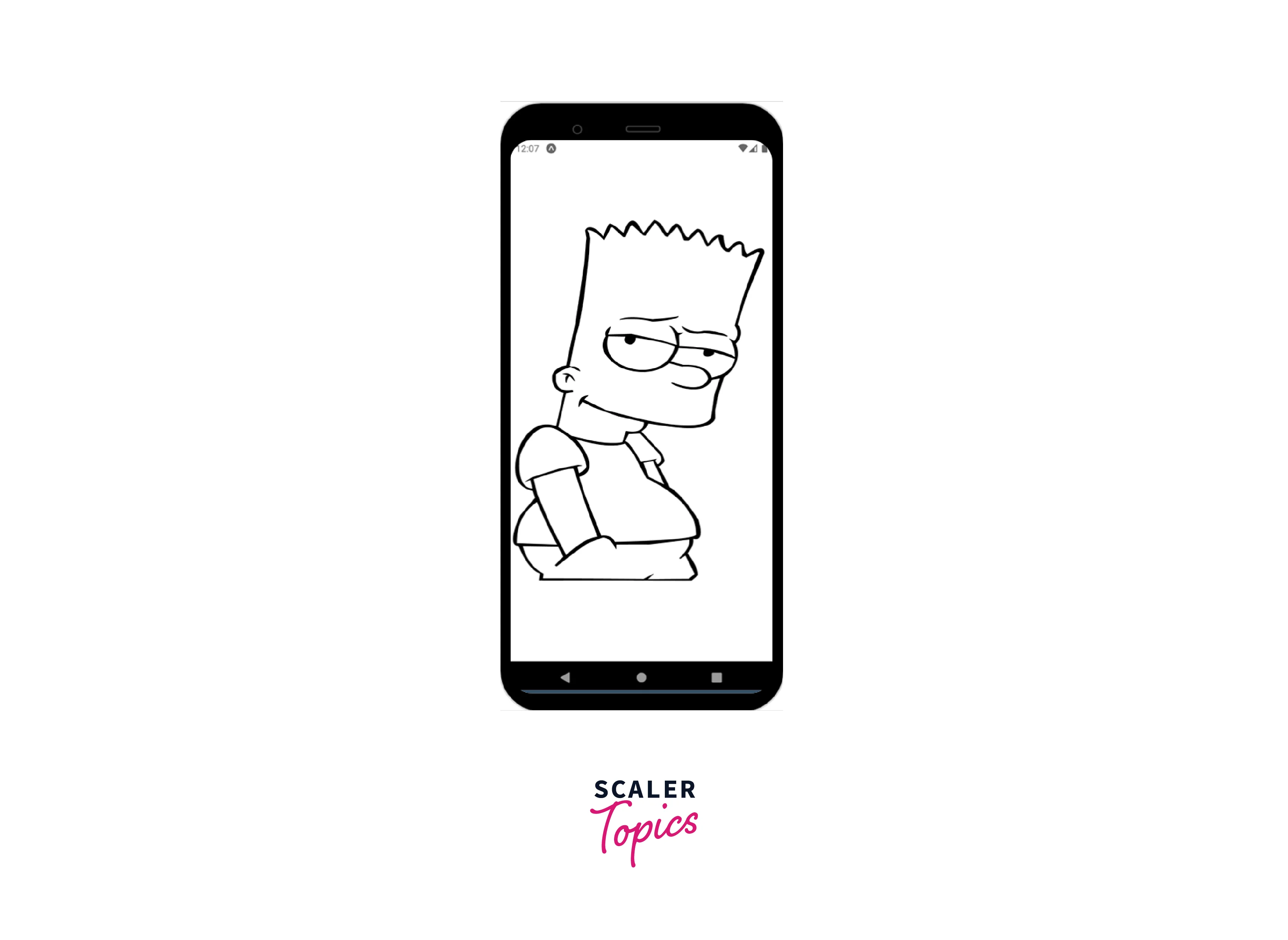
Consider the case where you downloaded any SVG file for your project. You'll find a tonne of XML code inside this SVG file, along with an HTML element named <svg>. Using the <SvgXml> component, you can directly render an SVG from its XML code:
Take the entire <svg> element from the XML code of the SVG file and paste it inside a variable.
Then, as shown below, pass the mentioned above variable to the xml prop inside your <SvgXml> component :
The above React Native SVG should now appear on the screen.
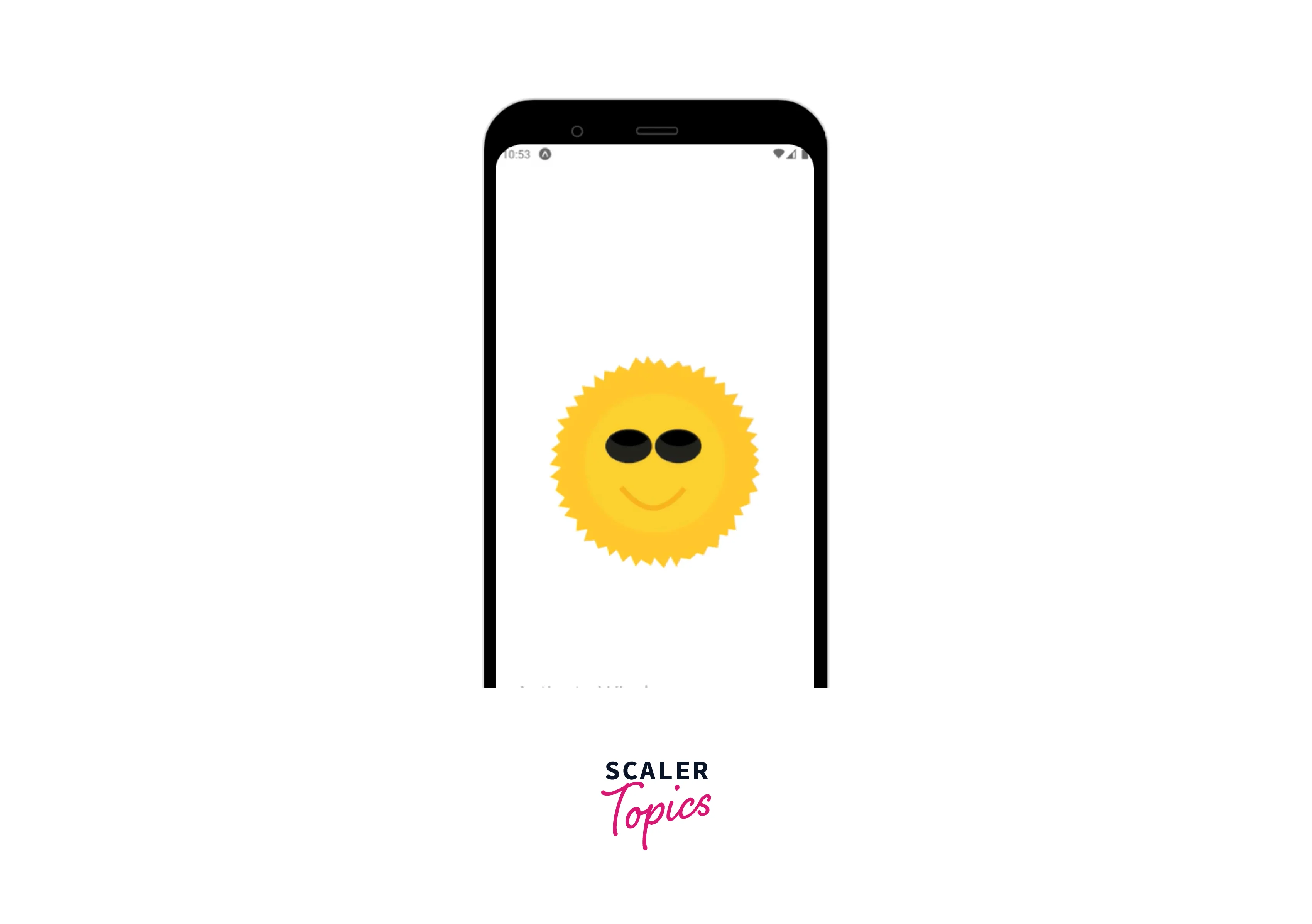
React Native Animated SVGs
We have thus far examined various Svg integration methods for react-native. We will examine SVG animation in react-native in this section. The goal is to get a flashing circle.
The SVG component's stroke color should be changed every few milliseconds, which is what we want to achieve. Create a file called AnimatedLoader.js and paste the following code into it to get going. The animations will be made using the React Native Animated API.
Making the Path component animable, which enables us to apply animations to the Path component, is the first thing we've done here.
const AnimatedPath = Animated.createAnimatedComponent(Path);
Making an Animated.Value that we can attach to an animated component is the next step. To avoid being able to directly mutate the Animated.Value, we used a useRef hook to store it. In the useEffect hook, we've created a loop that produces a fade-in and fade-out effect.
Connecting the animation to the component that needs it is the final step. The AnimatedPath in this situation. We have the color Animated attached. To interpolate the color animated value and produce a color mapping between the inputRange and outputRange, add a value to the stroke prop of the AnimatedPath. To see the changes, save your emulator and restart it.
Examples for Understanding
Let us take some examples of other shapes :
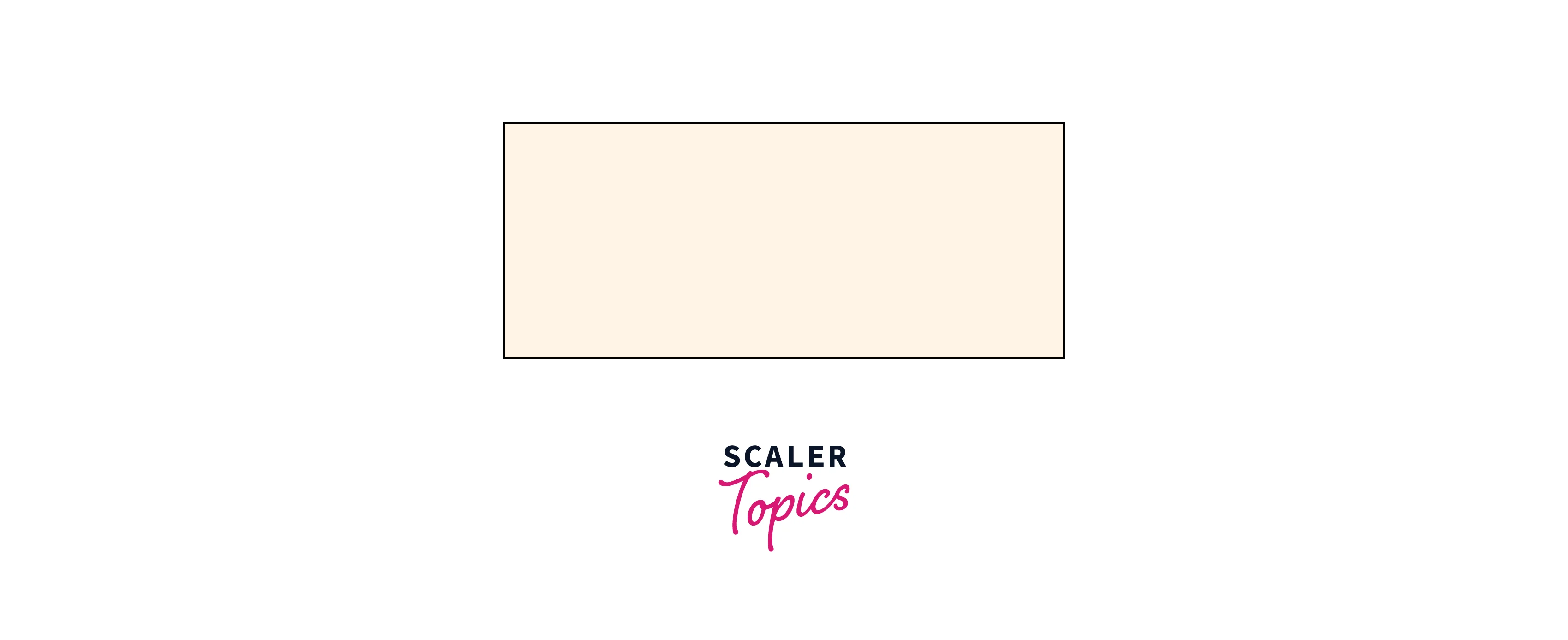
Rectangle
The shape of a rectangle and its variations are made using this element:
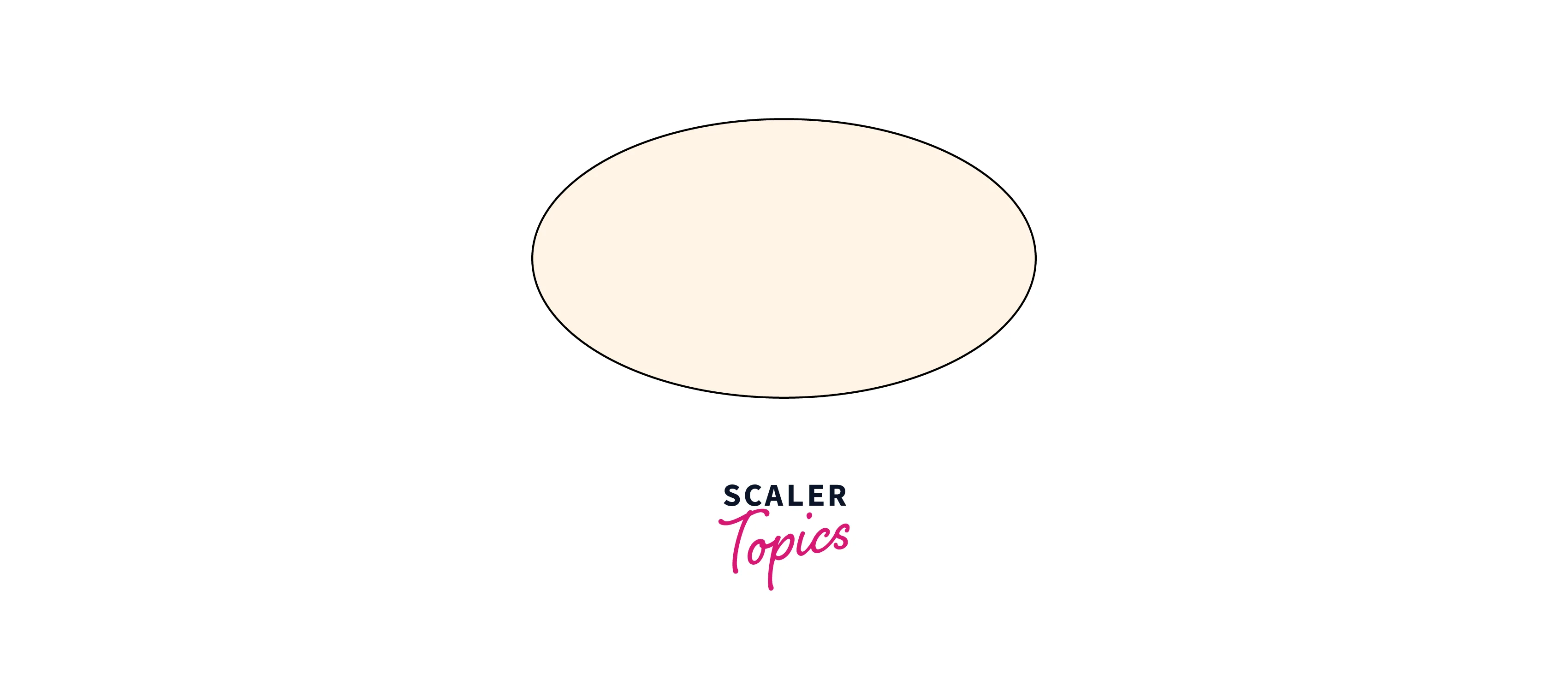
Ellipse
An ellipse is made using this element. A circle and an ellipse have many similarities. The distinction is that a circle has an equal x and y radius, whereas an ellipse has a different x and y radius.
Line
This element is a basic SVG shape that is used to draw a line between two points.
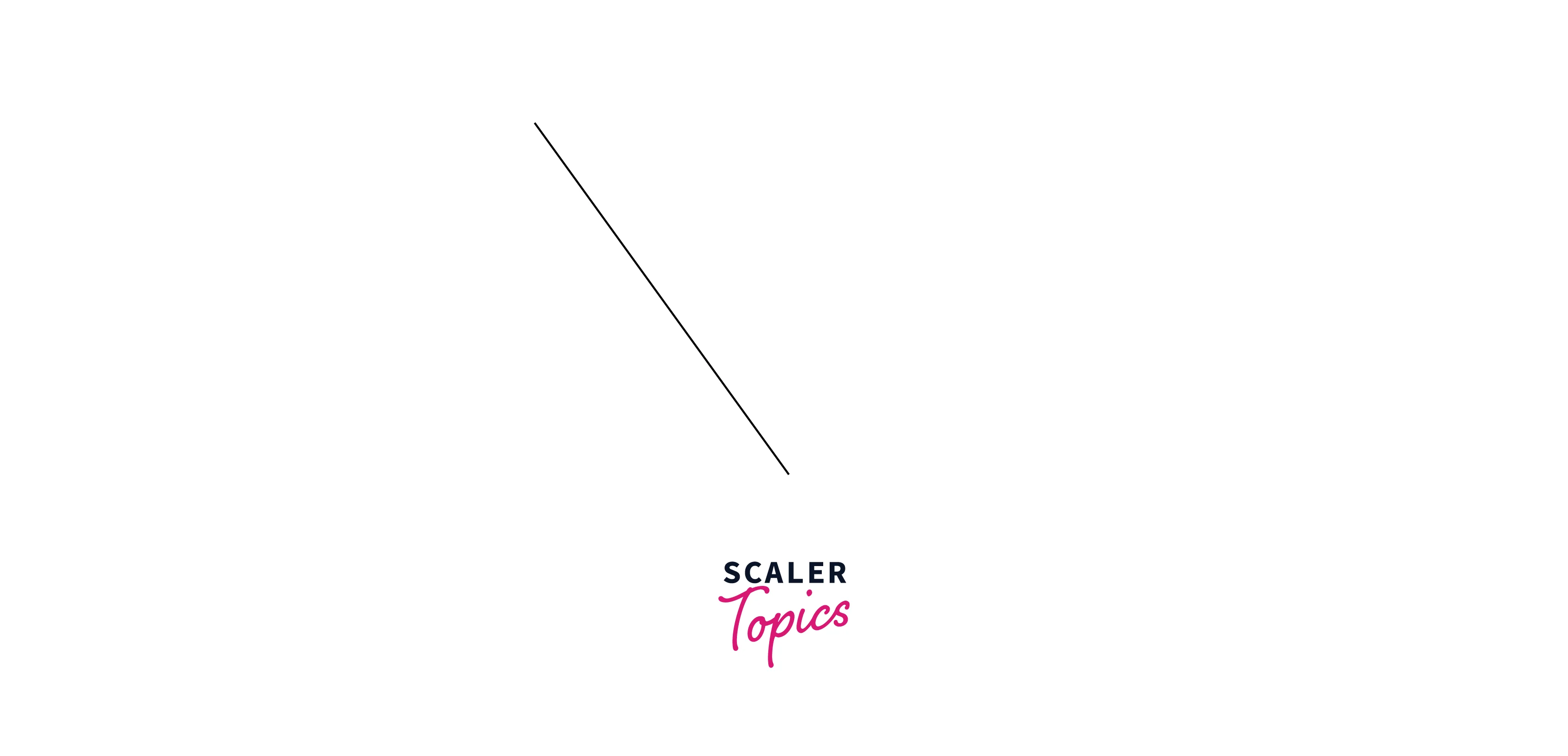
- The x1 and y1 props define the start of the line on the x-axis and y-axis, respectively.
- The x2 and y2 props define the end of the line on the x-axis and y-axis, respectively.
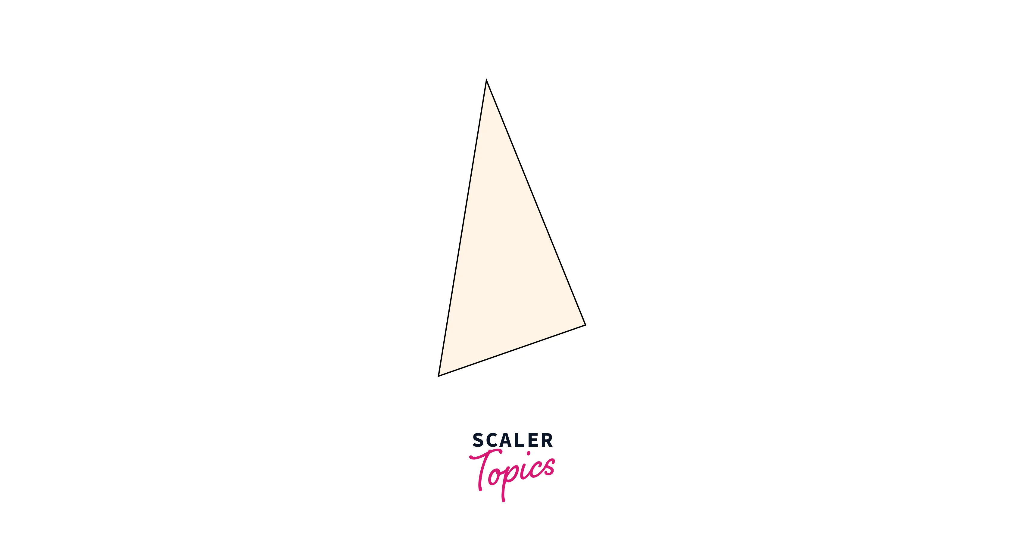
Polygon
Using the element, a graphic with at least three sides can be produced. Polygons are closed shapes made of straight lines (all the lines connect up). The x and y coordinates for each polygonal corner are specified by the points prop.
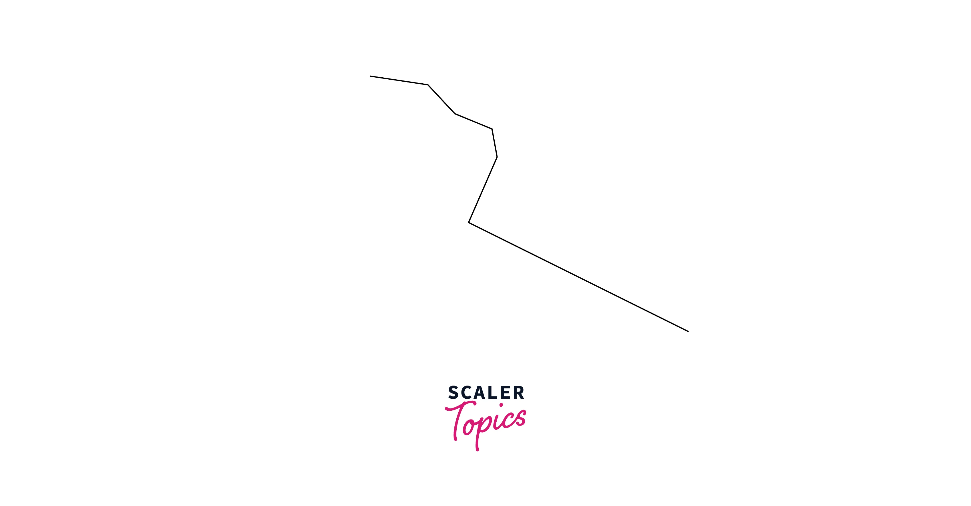
Polyline
Any shape with only straight lines can be made using the element. Each polyline point's x and y coordinates are specified by the points prop.
Conclusion
- SVG is a type of image format that displays the image you see using vector graphics. The image is independent of resolution because SVG files are vector-based.
- There is no native React Native component that can directly render React Native SVG.
- To display any SVG shape, a parent component called <Svg> is required.
- Using the <SvgXml> component, you can directly render an SVG from its XML code
- <SvgUri> component can load React Native SVG from a URI.
- Rectangle, Circle, Line, Polygon, etc, are various shapes that can be rendered from react-native-svg.
- React Native SVG files are vector-based, so the picture is independent of resolution.
- React Native SVG can be animated and are also search engine friendly.