React Native ActivityIndicator
Overview
A spinning wheel that shows a task is currently being processed is known as an activity indicator in react native. You should show an activity indication to reassure the user that your application is not blocked or frozen if an action takes a noticeable and unspecified period to process, like performing a CPU-intensive job or connecting to a network.
ActivityIndicator in React Native
React Native provides ActivityIndicator to display a circular loading indicator. You can use it for longer action-response durations. The React Native Activity Indicator can be used whenever you need to signal a delayed response since it plays the platform-specific, infinite circular loading animation.
React Native Activity Indicators can be modified in several ways to suit any app. You can also modify it according to your application design and use it in a variety of ways. In this tutorial, you will also get to know some alternate techniques for displaying personalized cross-platform activity indicators using a variety of external libraries and built-in APIs.
Basic Example
Let's start by creating a simple loading indicator. We will first try to render the React Native Activity Indicator continuously. Now let us set up a new React Native project by the following commands :
Now to run the project, use the below command :
Now in the App.js` file write the following code:
A circular indicator is rendered continuously by the code above. Try to view the output on both the Android and iOS operating systems, if it is possible. A circular indication element that is tailored to your current operating system will be shown. On Android, it will appear as follows :
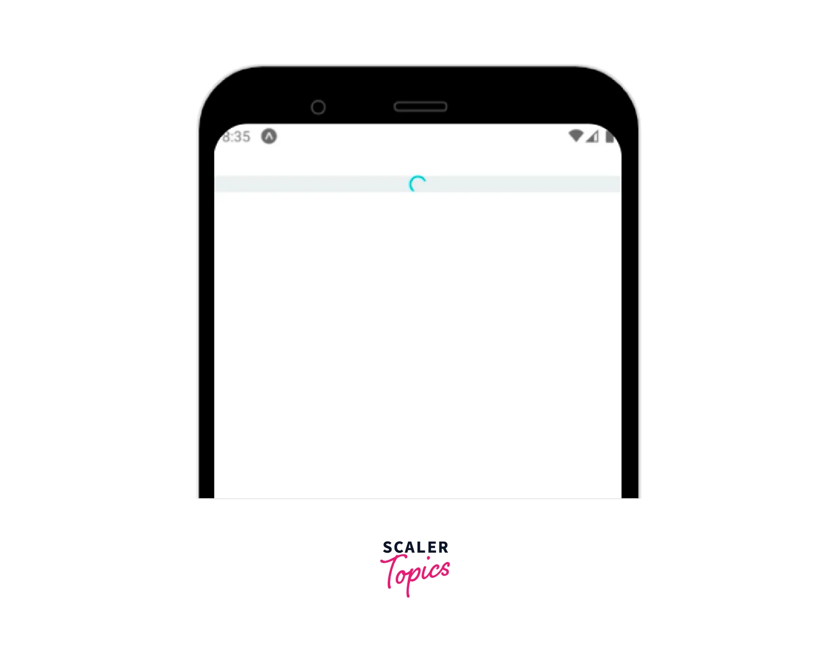
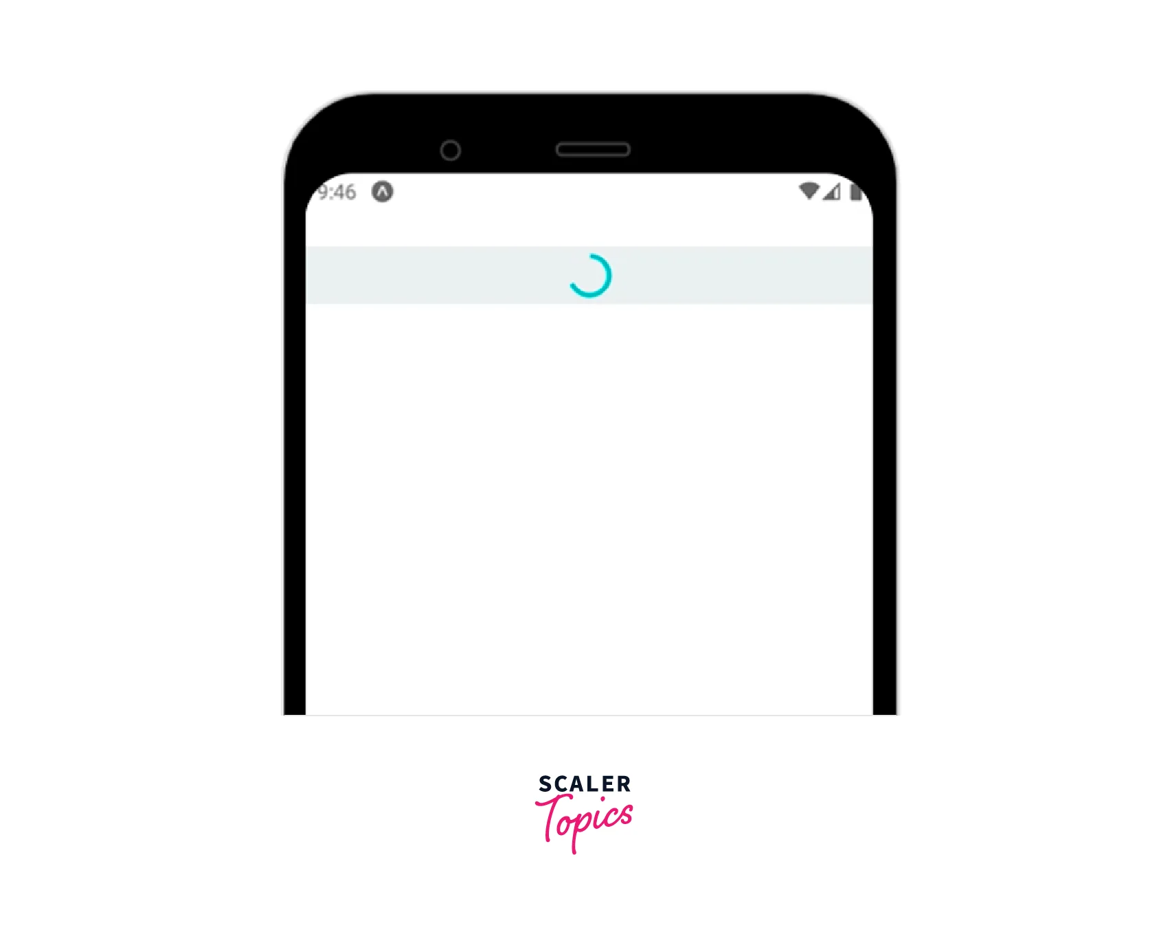
By default, the React Native Activity Indicator will appear quite small. To increase its size, provide the value of the size prop as follows :
<ActivityIndicator size="large"/>
You will now notice the following indicator animation, slightly enlarged :
ActivityIndicator Props
The activity indicator is a child of the view class and hence inherits all of the view's properties, which are listed on the official react-native website. Moreover, it has the following explicit properties :
| Props | Description |
|---|---|
| animating | Whether to show the indicator (which is true by default) or hide it (false). |
| size | The indicator's size can be changed to small, large, or specified by a number. Small is the default size. Only Android supports the number format. |
| color | Set the spinner's foreground color (default is gray). |
| hidesWhenStopped | When there is no animation, it provides an option to display or conceal the indicator (true by default). |
ActivityIndicator Customization
With the size prop, we already know how to alter the size of the indicator element. But, since React Native Activity Indicator takes View styles, you can alter its background colour, opacity, border, margin, padding, and other features.
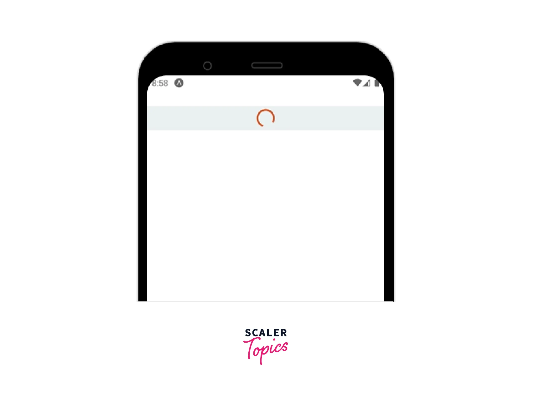
You may also modify the colour of the activity indicator element in React Native. You can alter the theme colour of the loading indicator by doing the following, for instance :
<ActivityIndicator color="#bb5533" size="large" style={styles.indicator}/>
You can now see the indicator element's custom colour :
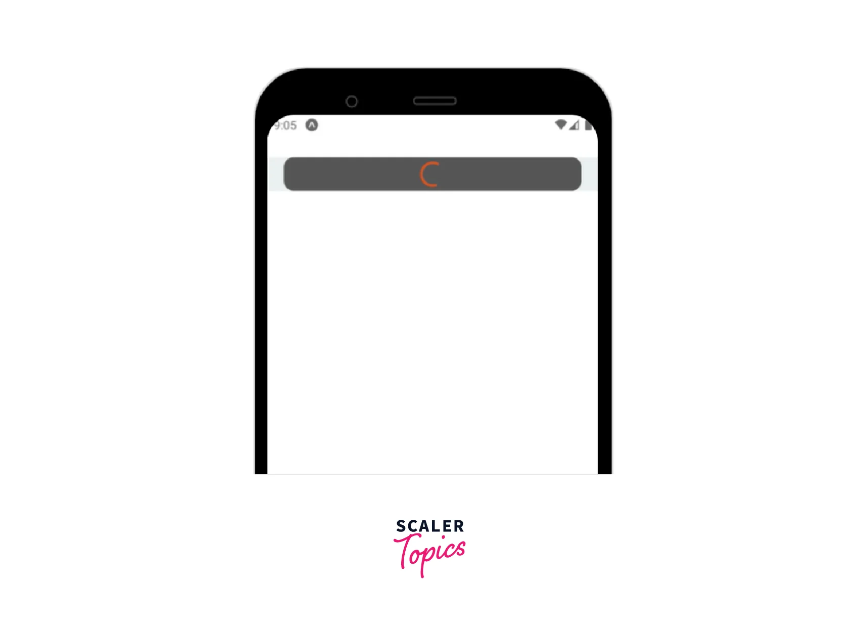
Let's now modify the padding, border, and background colour. In the current CSS, use the indicator setup as follows :
Apply the style to the indicator :
Check the app. You will now notice an indicator with the following background layer :
Add additional View styles and experiment with developing several unique activity indicators.
Using theme colors for activity indicators
Dark and light system themes are commonly supported by React Native apps. Some programmers create applications that support many themes. Currently, the majority of React Native developers manage dark and light style themes using the built-in Appearance module's useColorScheme Hook.
Take a look at the following code :
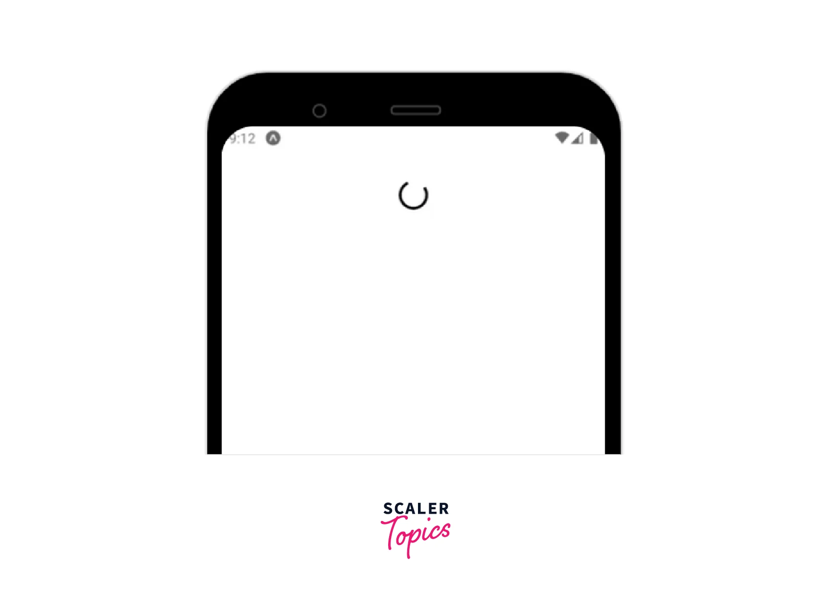
When `activity indicator you start the app, you will notice an inverted color for the activity indicator based on the current theme because we changed the colour of the activity indicator based on the current theme here. As an illustration, if you test the application in dark mode, a white activity indicator will appear, and vice versa.
Using Activity Indicator Libraries
Because built-in framework components can have restrictions, the developer community frequently develops libraries for particular use cases. On Android, the built-in React Native Activity Indicator component makes use of an Intermediate Progress GUI element. It utilizes an Apple SDK element called UIActivityIndicatorView for iOS. According to the UI/UX definitions of the operating system, these platform-specific GUI elements display circular loading indicators, and they won't allow program developers to make flexible adjustments.
For instance, the built-in activity indicator cannot be used to generate a three-dot loading indicator. You must therefore utilize a third-party library or create your custom activity indicator if you don't like the platform-specific activity indicator.
Creating SVG-based Activity Indicators with react-native-modern-styled
Modern styled, cross-platform progress indicators like circular and bar loaders are available through the react-native-progress package. Each progress indicator provides a variety of customization props, and the library uses the react-native-svg library to generate customized activity indicator elements on the app screen.
Make a new React Native project to test out the libraries for our chosen progress indicators :
Next, install the library :
To implement a basic circular activity indicator, add the following code to your App.js file :
Start the app. As opposed to the built-in platform-specific React Native Activity Indicator, you will see a distinct circular loading indicator :
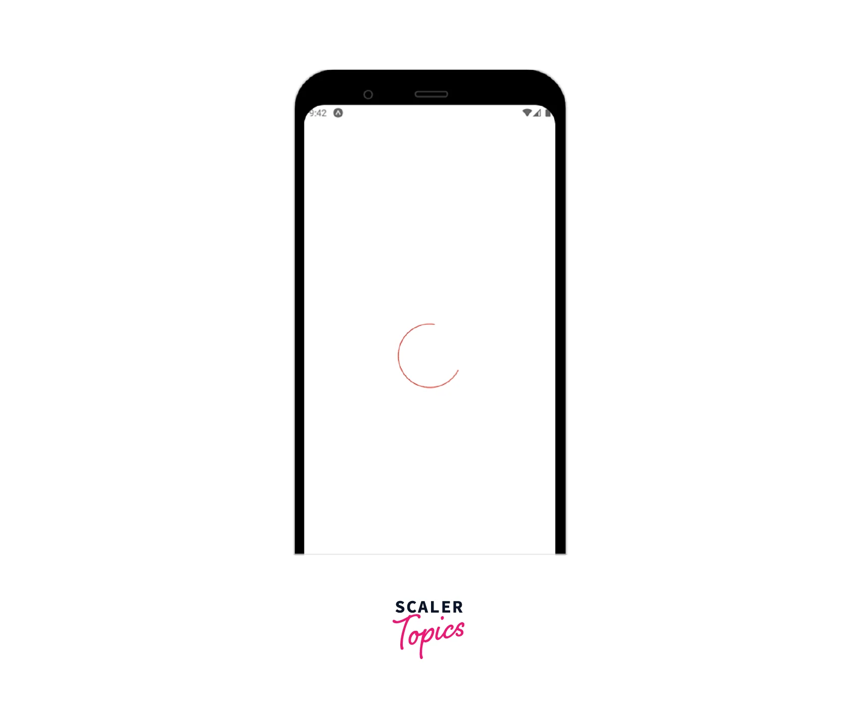
You can get a shorter circle circumference segment if you try setting the endAngle prop to a lower value.
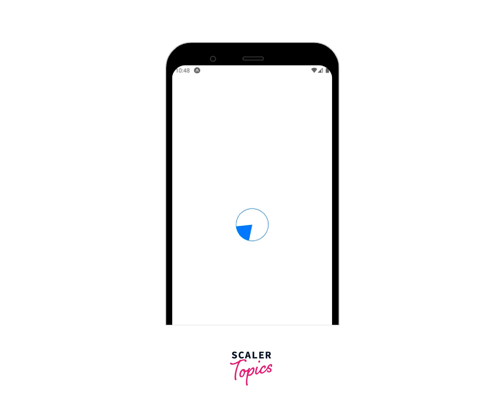
This module provides us with three progress indicator types: CircleSnail, Bar, and Pie. For example, you can use the Pie component to create a futuristic activity indicator. Look at the following code snippet:
The following outcome will be visible once you combine the aforementioned code snippet with the preceding project source :
Creating Indicator Overlays with react-native-loading-spinner-Overlay
The react-native-loading-spinner-overlay library allows you to use a Modal-based overlay.
First, install the library to get started :
Let us use the library with a list of fruits.
As with the previous implementation, the above code will display a Modal-based indicator element.
Your Own ActivityIndicator
In addition to looking at two third-party activity indicator libraries, we spoke about how to change the built-in React Native Activity `Indicator component to create custom activity indicators. Due to their limitations, these approaches could sporadically fall short of your UI/UX needs. With the React Native Animated API, you can then design your activity indication to your rigid UI/UX guidelines.
Write the following code in the App.js file
Install the dependencies :
Start the app. As illustrated in the following preview, the activity indicator will now appear as an animated circle :

Examine the following key details by opening the App.js file :
- The CustomActivityIndicator component uses the Animated API to render an animation using Animated.View.
- The source code creates a frame sequence with Animated.sequence, two animations with Animated.timing and an animation loop with Animated.loop.
- With the styling specification scaleX: scaleAnim, scaleY: scaleAnim, we continually expand and contract the circle.
- The built-in Easing module is used by animation definitions to create fluid, contemporary animations.
FAQs
Q. What other libraries can be used to create custom React Native Activity Indicator?
A. react-native-progress and react-native-loading-spinner-overlay, two well-liked libraries for making custom activity indicators, are additional substitute libraries for custom indicator creation. We can also locate some alternative libraries for this situation, just like we can with any other npm package. Take a look at these different libraries:
- react-native-indicators
- react-native-circular-progress
- react-native-indicator
- react-native-circular-progress-indicator
Q. Can an inbuilt activity indicator be used with expo-managed projects?
A. Yes, React Native Activity Indicator can be used with expo-managed projects as well. It can be imported as follows : import {ActivityIndicator} from 'react-native'; The usage also remains the same.
Q. How can I draw more custom animated shapes in React Native Activity Indicator?
A. Use the react-native-svg library if you need to create more complex animated shapes, and View styles aren't sufficient for your needs.
Conclusion
- React Native provides ActivityIndicator to display a circular loading indicator used for longer action-response durations.
- The activity indicator is a child of the view class and hence inherits all of the view's properties.
- The activity indicator also has props like size, hidesWhenStopped, color, and animating.
- The built-in activity indicator cannot be used to generate a three-dot loading indicator etc. Hence you must therefore utilize a third party or create your custom activity indicator.
- Modern-styled, cross-platform progress indicators like circular and bar loaders are available through the react-native-progress package.
