Drawer Navigator React Native
Overview
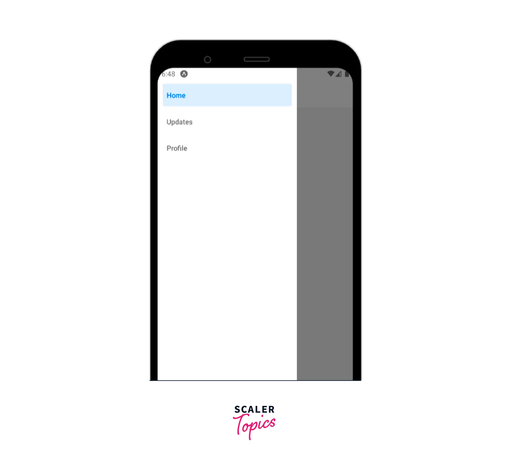
Drawer Navigator React Native is a UI panel that shows the app's navigation menu. A panel of choices on the left side of the screen is called the Navigation Drawer, which is normally concealed but can be seen by swiping to the right with the help of gestures. In this tutorial, we'll look at how to implement React Native's Drawer Navigation feature.
What is Drawer Navigator?
The navigation menu is essentially displayed via the UI panel called Drawer Navigator React Native. By default, it is concealed, but if the user swipes a finger from the screen's edge, it will become visible. Today's mobile apps consist of just one screen. Therefore, we use React Native to build different navigational elements. The best advantage of using React Native Drawer Navigation is that the UI of the screen becomes very clear.
Syntax
Installation is as follows :
Syntax of Drawer Navigator React Native is as follows :
Different Methods to Close and Open Drawer
There are three different methods to open and close the Drawer Navigator React Native :
- navigation.openDrawer(): The drawer is opened with this method.
- navigation.closeDrawer(): The drawer is closed with this method.
- navigation.toggleDrawer(): The drawer is toggled with this method.
React Native Drawer Navigator Props
The following props are accepted by the Drawer Navigator React Native component :
- id: It is an optional prop for the navigator. To refer to this navigator in a child navigator, use navigation.getParent.
- initialRouteName: The name of the route that will be rendered on the navigator's initial load.
- screenOptions: The default parameters for the navigator's displays.
- backBehavior: This determines what occurs when the navigator calls goBack. This includes hitting the device's back button or, on Android, the back gesture.
It supports the following values :
- firstRoute - Return to the navigator's first screen (default).
- initialRoute - returns to the initial screen specified by the initialRouteName parameter; if not specified, returns to the first screen.
- order - return to the screen that was selected before the main screen.
- history - returns to the navigator's most recently viewed screen; if the same screen is visited many times, earlier entries are removed from the history.
- none - do not deal with the back button.
- defaultStatus: The default condition of the drawer - whether the drawer should stay open or closed by default. The drawer will be open when this is set to open from the first render. It may be shut routinely with motions or automatically using code. The drawer will, however, reopen if it was closed when returning. The back button shuts an open drawer, which is the reverse of how the drawer operates by default, as it always starts closed.
- detachInactiveScreens: To conserve memory, a boolean value is used to specify whether inactive screens should be separated from the view hierarchy. Integration with react-native screens is made possible by this. Its default status is ssetto true.
- useLegacyImplementation : Whether to utilize the historical implementation based on Reanimated 1. The new approach, which is based on Reanimated 2, will work more effectively, but it requires more configuration and requires Hermes and Flipper for debugging.
- drawerContent: drawerContent is a function that returns a React element to be rendered as the drawer's content, such as navigation elements.
Providing a custom drawerContent: There are just links to the routes in the RouteConfig in the scrollable default component for the drawer. It's simple to override the default component to give the drawer a header, footer, or additional content.
Options
The displays of the Drawer Navigator React Native may be set up using the following settings. These may be supplied in the options prop of Drawer. Screen or under screenOptions prop of Drawer. navigator.
- title: a title that is more general and can be used instead of headerTitle and drawer label.
- lazy : Whether or not this screen should display on first-time access. Its default state is set to true. If you wish to render the screen during the first render, set it to false.
- drawerLabel: Strings or a provided function that returns a React.Node for display in the drawer sidebar.
- drawerActiveTintColor: Colour for the drawer's active item's icon and label.
- drawerActiveBackgroundColor: The drawer's active item's background color.
- drawerInactiveTintColor: The drawer's inactive items' symbol and label are colored.
- drawerInactiveBackgroundColor: The drawer's inactive items' background color.
- drawerItemStyle: The single item's style object, which may include a label and/or an icon.
- drawerLabelStyle: Apply a style object to the Text style within the content section so that it produces a label.
- drawerContentContainerStyle: Style object for the ScrollView's content area.
- drawerContentStyle: The wrapper view's style object.
- drawerStyle: The drawer component's style object. Here, you may pass a custom width or background color for a drawer.
- drawerPosition: Options for drawerPosition are left or right. defaults to the right for languages using RTL and left for languages using LTR.
- drawerType: It controls the drawer's appearance and animation.
- Front: A conventional drawer with an overlay covering the screen.
- Back: Swiping reveals the drawer hidden behind the screen.
- slide: Swipe to uncover the drawer, and the screen will slide as well.
- permanent: A sidebar is displayed as a permanent drawer. Useful for having a drawer that is constantly displayed on.
- drawerHideStatusBarOnOpen: When true, the Drawer hides the OS status bar anytime the drawer is pulled or in an "open" state.
- drawerStatusBarAnimation: Animation while concealing the status bar. Used together with hideStatusBar.
- overlayColor: When the drawer opens, a colored overlay will be shown on top of the content view. The animation of the opacity from 0 to 1 occurs as the drawer opens.
- sceneContainerStyle: For the component enclosing the content on the screen, a style object.
- gestureHandlerProps: Passing along props to the pan gesture handler below. On the Web, this is not supported.
- swipeEnabled: if the drawer may be opened or closed using swipe movements. Its default state is set to true. The web does not support the swipe gesture.
- swipeEdgeWidth: allows users to specify the distance at which the swipe gesture should be activated. On the Web, this is not supported.
- swipeMinDistance: Minimum swipe distance required to trigger the drawer's opening.
- keyboardDismissMode: Whether to dismiss the keyboard when the swiping gesture starts. 'on-drag' is the default. To turn off keyboard handling, set it to 'none'.
- unmountOnBlur: Whether this screen has to be unmounted while navigating to another. Any local state in a screen, as well as the state of any nested navigators in the screen, are reset upon unmounting. false is the default. We often advise against using this feature since consumers don't anticipate their navigation history being lost when switching screens. Please think about whether enabling this prop would genuinely improve the user's experience before doing so.
- freezeOnBlur: Whether or not to stop inactive displays from rendering again. false is the default. when enabled, defaults to trueThe react-native-screens package's freeze() function is called at the beginning of the programme.
Implementation of React Native Drawer Component
Let us now implement the Drawer Navigator React Native component step by step :
-
Step 1 : Open your terminal and run the following command to install expo-cli.
-
Step 2 : Now you should create a new project using the following command.
-
Step 3 : Now move into your project directory using the following command.
-
Step 4 : Install react-navigation in your project now. React Navigation is used to browse from one page to the next. Use the following command to install it.
-
Step 5 : Now, use the following command to install important dependencies that will be required into your react-native project.
-
Step 6: Now install the drawer by using the following command.

-
Step 7: Now edit the App.js file as follows :
Use the command npm run android to fire up the app.
Nested drawer Navigator
Nesting navigators entails displaying one navigator within the screen of another navigator.
For example, suppose the nesting is as follows :
- Stack.Navigator
- Home (Tab.Navigator)
- Feed (Screen)
- Messages (Screen)
- Profile (Screen)
- Settings (Screen)
- Home (Tab.Navigator)
Example
Another example of a Drawer Navigator React Native component is as follows :

FAQs
Q. What is drawer navigation?
A. A common navigation strategy is to use a drawer from the left (or occasionally right) side to navigate between displays. The best advantage of using React Native Drawer Navigation is that the UI of the screen becomes very clear.
Conclusion
- React Native Drawer Navigation is a UI panel that shows the app's navigation menu.
- There are three different methods to open and close the drawer namely navigation.openDrawer(), navigation.closeDrawer() and navigation.toggleDrawer().
- Some of the important react native drawer navigation props are id, initialRouteName, screenOptions, backBehavior, and defaultStatus etc.
- The displays of the navigator may be set up using the following settings title, lazy, drawerLabel, drawerActiveTintColor, drawerActiveBackgroundColor, drawerInactiveTintColor etc
