Layouts in React Native Using Flexbox
Overview
Flexbox reacts native is a powerful layout system that allows developers to create dynamic and responsive user interfaces with ease. React Native, being a popular framework for building mobile applications, utilizes Flexbox to simplify the process of designing and aligning UI components. Using Flexbox React Native allows developers to create complex layouts with ease.
Dimensions in React Native
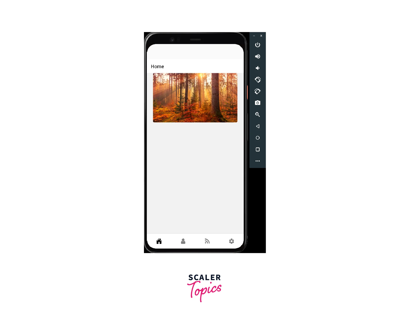
In React Native, dimensions refer to the size of the elements that are displayed on the screen. These elements can be anything, such as text, an image, or a container.
To access the dimensions of a screen or an element, we can use the Dimensions module provided by React Native. The Dimensions module gives us access to the dimensions of the screen as well as the dimensions of any element we want to measure.
The Dimensions module has three methods: get(), set() & addEventListner().
The get() method returns an object that contains the dimensions of the screen. This object has two properties: width and height. We can use these properties to determine the size of the screen and adjust our elements accordingly.
The set() method, on the other hand, allows us to set the dimensions of an element dynamically. We can use this method to adjust the size of an element based on different factors, such as the size of the screen or the content of the element.
The addEventListner() method in the Dimensions module allows you to listen for changes in the device's screen dimensions. This can be useful if you need to update your UI in response to changes in the screen size, such as when the device is rotated.
Here’s an example:

It's important to note that using fixed dimensions for elements in your app may cause issues with different screen sizes and resolutions. To create responsive designs, it's recommended to use relative units like percentages or flexbox. With Flexbox React Native, you can easily adjust the alignment and spacing of elements on the screen.
Functional components in React Native can utilize the useWindowDimensions hook to get the dimensions of the current window.
useWindowDimensions is a hook provided by React Native that allows you to retrieve the dimensions of the window or screen on which your app is running. It returns an object with two properties: width and height.
Here's an example of how to use useWindowDimensions in a functional component:
useWindowDimensions is particularly useful when you want to create a component that is responsive to changes in the dimensions of the window or screen. For example, you can use it to create a layout that adjusts to different screen sizes or to implement a responsive font size.
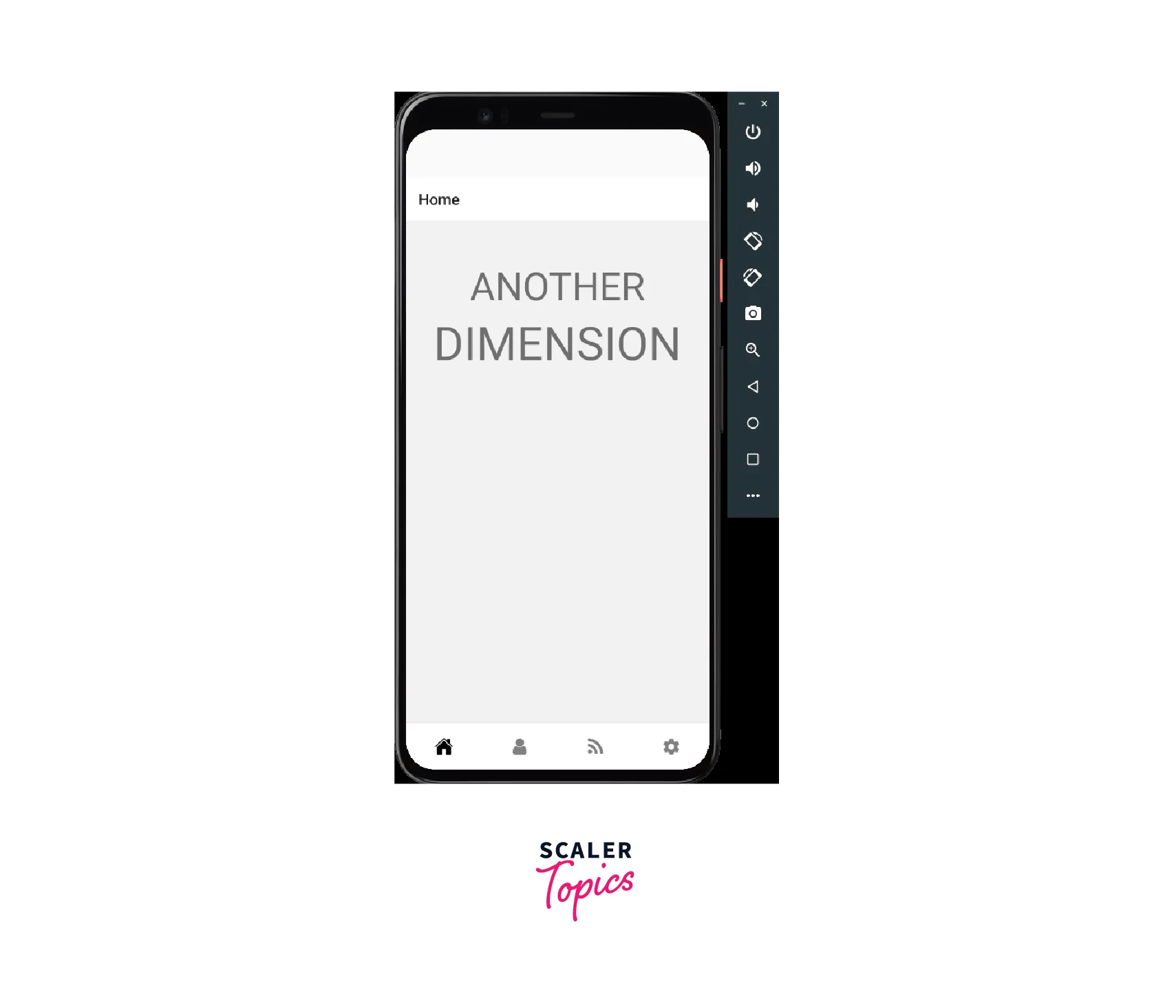
Here's an example of how to use useWindowDimensions to create a responsive font size:

Detecting Orientation in React Native
Detecting orientation in React Native can be useful when you want to adjust your UI based on the orientation of the device. For example, you might want to change the layout of your app when the user rotates their device from portrait to landscape mode. Flexbox React Native is particularly useful in React Native for creating layouts that adapt to different screen sizes and orientations.
React Native provides a built-in Dimensions module that allows you to detect changes in device orientation. You can use this module to retrieve the dimensions of the screen or window and determine whether the device is in portrait or landscape mode.
Here's an example of how to use the Dimensions module to detect orientation:
In this example, we define a component that displays the current orientation of the device. We use the useState hook to create a state variable called orientation, which we initialize to portrait.
We then define a function called handleOrientationChange, which gets the dimensions of the window using the Dimensions module and sets the orientation state variable to landscape if the width is greater than the height, or portrait otherwise.
We use the useEffect hook to add an event listener for changes in device orientation using Dimensions.addEventListener. We pass in the handleOrientationChange function as the event handler. We also use the useEffect hook to remove the event listener when the component unmounts using listener.remove.
Finally, we define a View component that displays the current orientation using the orientation state variable.
Flexbox in React Native
Flexbox is a layout system that allows you to easily create flexible and responsive layouts in React Native. It is similar to the CSS Flexbox layout system but has some differences due to the unique characteristics of React Native.
Flexbox react native is a combination of the Flexbox layout system and the React Native framework, which enables developers to create dynamic and responsive UI designs for mobile applications. One of the benefits of using Flexbox React Native is the ability to easily change the order of elements without modifying the markup.
In a Flexbox React native layout, you define a container element and its children. You then apply Flexbox properties to the container element to control the positioning and sizing of its children.
Flexbox in React Native is like playing with blocks. You have a big block (the container) and you put little blocks (the children) inside it. You can tell the big block how to position the little blocks by using special rules (Flexbox properties) like "line them up in a row" or "put space between them". You can also make some of the little blocks bigger or smaller than others by using another special rule (the flex property). This helps you make pretty designs with your blocks!
What is Flex?
In Flexbox React Native, the flex property is used to control the ability of a component to grow or shrink in size. When you apply the flex property to a component, you are essentially telling React Native how much space it should take up relative to its siblings.
The flex property is a number that represents the flex factor of the component. The higher the flex factor, the more space the component will take up compared to other components with a lower flex factor. For example, if you have two components with flex: 1 and one component with flex: 2, the component with flex: 2 will take up twice as much space as each of the other components.
By default, all components have a flex value of 0, which means they will not grow or shrink. However, if you set the flex property to a positive value, the component will become flexible and will grow or shrink to fill the available space. React Native Flexbox includes a wide range of properties for controlling the spacing, alignment, and distribution of elements on the screen.
The Flexbox React native layout system makes it easy to create UIs that adapt to different screen sizes and device orientations.
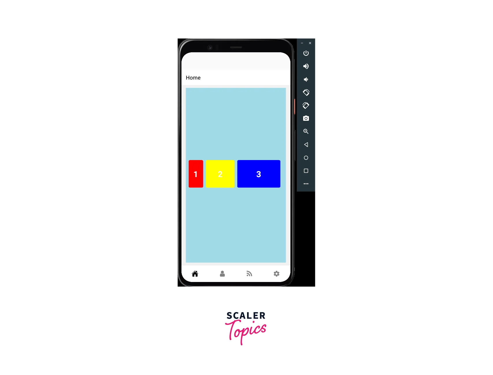
Here's an example:

In this example we have used flexbox react native to make the design responsive to screen sizes.
First, we define a component that displays three boxes in a Flexbox layout. We use the flex property to control the size of each box.
Box 1 have a flex value of 1. Box 2 has a flex value of 2, which means it will take up twice as much space as Box 1 and BOX 3 have a flex value of 3.
By using the flex property, we can create flexible layouts that adapt to different screen sizes and orientations. Flexbox React Native also provides the justifyContent property, which allows you to align content along the main axis.
Properties of Flexbox
The React Native Flexbox model is based on two main axis: the main axis and the cross axis, which are used to position and align elements on the screen. Flexbox react native is equipped with a plethora of properties, and the following are some of the fundamental ones:
| Property | Values | Description |
|---|---|---|
| flexDirection | row, row-reverse, column, column-reverse | Determines the primary axis of the layout. |
| justifyContent | flex-start, flex-end, center, space-between, space-around, space-evenly | Determines how items are distributed along the main axis of the layout. |
| alignItems | flex-start, flex-end, center, stretch, baseline | Determines how items are aligned along the cross axis of the layout. |
| layoutDirection | ltr, rtl | Determines the layout direction of the component. |
| alignSelf | auto, flex-start, flex-end, center, stretch, baseline | Allows individual items to override the alignItems property. |
| alignContent | flex-start, flex-end, center, stretch, space-between, space-around | Determines how lines are aligned along the cross axis of the layout when there is extra space. |
| flexWrap | wrap, nowrap, wrap-reverse | Determines whether items are forced onto a single line or can be wrapped onto multiple lines. |
| flexShrink, flexGrow, flexBasis | Numbers | Determines how a flex item should grow, shrink, and be sized. flexShrink specifies how much an item can shrink, flexGrow specifies how much it can grow, and flexBasis specifies its initial size. |
| gap, rowGap, columnGap | Numbers | Specifies the gap between the items in the layout. gap specifies the gap for both rows and columns, rowGap specifies the gap between rows, and columnGap specifies the gap between columns. |
| height, width | Numbers, auto | Specifies the height and width of the component. |
| position | absolute, relative | Determines the positioning method of the component. absolute positions the component relative to its nearest positioned ancestor, while relative positions the component relative to its normal position in the layout. |
React Native Flexbox supports a variety of layout modes, such as a row, column, wrap, and nowrap, allowing developers to build complex interfaces with ease. These properties can be used together to create a wide variety of flexible layouts in React Native.
FAQs
Q. What is Flexbox?
A: Flexbox is a layout system that allows you to create flexible and responsive layouts more efficiently. It is used to arrange items within a container and control how they are positioned and spaced. Flexbox in React Native system includes properties like flexDirection, justifyContent, and alignItems that allow developers to precisely control the layout and alignment of elements on the screen.
Q. What is the difference between flexDirection and justifyContent?
A: flexDirection determines the primary axis of the layout (either row or column), while justifyContent determines how items are distributed along that axis (such as flex-start, center, or space-between).
Q. Can I use Flexbox for both iOS and Android apps?
A: Yes, Flexbox in React Native is a part of the React Native's framework system and can be used for both iOS and Android apps.
Q. What is the difference between alignItems and alignContent?
A: alignItems determines how items are aligned along the cross-axis of the layout (such as center or stretch), while alignContent determines how lines are aligned along the cross-axis when there is extra space (such as space-between or space-around).
Q. How do I use Flexbox to create responsive layouts?
A: Flexbox is ideal for creating responsive layouts because it allows items to automatically adjust their size and position based on the available space. To create responsive layouts, you can use properties like flexWrap, flexShrink, and flexGrow to control how items are sized and arranged. Additionally, you can use media queries to adjust styles based on the screen size or orientation. The Flexbox React Native layout system is widely used in building mobile apps due to its flexibility and ease of use. Understanding the principles of Flexbox React Native is essential for creating well-designed and responsive mobile interfaces.
Conclusion
- Flexbox react native is a powerful layout system that allows developers to create flexible and responsive layouts with ease.
- With Flexbox, developers can control the size and position of components within a container, adjust the spacing between them, and create dynamic and responsive layouts.
- Flexbox uses properties like flexDirection, justifyContent, alignItems, and many others to achieve these results.
- Flexbox is a fundamental part of React Native development because it works on both iOS and Android platforms.
- Learning how to use Flexbox effectively can make your code more efficient, and easier to maintain, and help you to create visually appealing and user-friendly apps.
- Flexbox is essential for any React Native developer who wants to create high-quality, responsive layouts with ease.
- When used effectively, the React Native Flexbox layout system allows developers to create complex UI designs with ease, ensuring a consistent and visually appealing user experience across various mobile devices.
