React Native Modal
Overview
In its simplest form, a modal is a screen that pops up above another screen to guide users to important information or the following action in a process. The usage of models can significantly enhance user interfaces. An active modal forces the user to interact with the new screen by hiding the previous one, which is still visible. The built-in React Native Modal component makes working with modal pop-ups simple.
What is React Native Modal?
React Native Modal is a component that is used to display content over a view. Both Android and IOs support this. When the modal is opened, its view becomes visible. The three possible modal configurations (slide, fade, and none) determine how the modal will appear inside the React native app. An improved, animated React Native modal that is fully editable.
React-native-modal's objective is to increase the functionality of the original React Native Modal component while maintaining a straightforward API by incorporating animations, style customization options, and other capabilities. It improves the Modal component of React Native and offers lovely animations and a variety of styling options. The entire application area is covered by the modal shown above the screen. We must import the modal from the react-native library to use the Modal component in our application.
Prerequisites
The tools, frameworks, and packages listed below are necessary to begin this tutorial.
- Node.js
- NPM
- React-Native
- React-Native CLI
- Text Editor or IDE
- Xcode or Android Studio
Features of React Native Modal
- Smooth animations for entry/exit
- Simple and adaptable APIs
- Backdrop opacity, color, and timing adjustments
- Listeners for the completion of the modal animations
- Appropriately resize on device rotation
- Swipeable
- Scrollable
Supported Platforms
react-native-modal allows the creation of a cross-platform modal component for both Android and iOS.
Installation
Run the following line of code to install react-native-modal :
React Native Modal Props
| Props | Description |
|---|---|
| visible | Whether or not your modal is visible depends on this prop. |
| supportedOritentions | It permits turning the modal in any of the predetermined directions (portrait, portrait-upside-down, landscape, landscape-left, landscape-right). |
| onRequestClose | When the user touches the hardware back button on an Android device or the menu button on an Apple TV, this callback prop is activated. |
| onShow | This enables passing a function that will execute once the modal is active. |
| transparent | It decides if the modal will completely enclose the view. When set to true, the modal appears over the transparent backdrop. |
| animationType | It manages the modal's animation. There are three categories of animated accessories: slide: The modal slides in from the bottom. fade: It disappears from view. none: The model appears without any animation. |
| hardwareAccelerated | The underlying window's ability to force hardware acceleration is controlled by this prop. |
| onDismiss | A function that will be called after the modal has been closed is passed by this prop. |
| onOrientationChange | When the orientation changes while the modal is displayed, this prop is called. The orientation can be either portrait or landscape. |
| presentationStyle | It regulates how a model (fullScreen, pageSheet, fromSheet, and overFullScreen) generally appears on large devices. |
| animated | The use of this prop is deprecated. Use the animatedType prop, which was covered above, instead. |
Use Cases of Modal in React Native
react-native-modal functions similar to the original React Native modal.
-
Import the react-native-modal:
-
Create a <Modal> component that will hold the modal content in it:
-
The isVisible prop should then be set to true to display the modal:
The only prop required to make the modal function is isVisible. Its value must be managed by saving it in the state of your wrapper component and changing it to true or false as required.
How to Create a Basic Modal in React Native
A prior action, such as traveling to/from a screen or clicking a button, causes a modal to appear. Open App.js and write the below code in it:
Let's try to understand the code.
useState
const [isModalVisible, setIsModalVisible] = React.useState(false);
The isModalVisible state variable and setIsModalVisible function are returned by the React useState Hook. We can only view the modal once we modify the state because the starting state is false. Here, we'll employ a button.
handleModal
const handleModal = () => setIsModalVisible(() => !isModalVisible);
When the button is pressed, handleModal is called, which returns the reverse state. False becomes true, and vice versa.
<Modal />
<Modal isVisible={isModalVisible}>
Modal has an isVisible attribute that takes a Boolean value. The modal knows when to appear since we pass isModalVisible to isVisible.
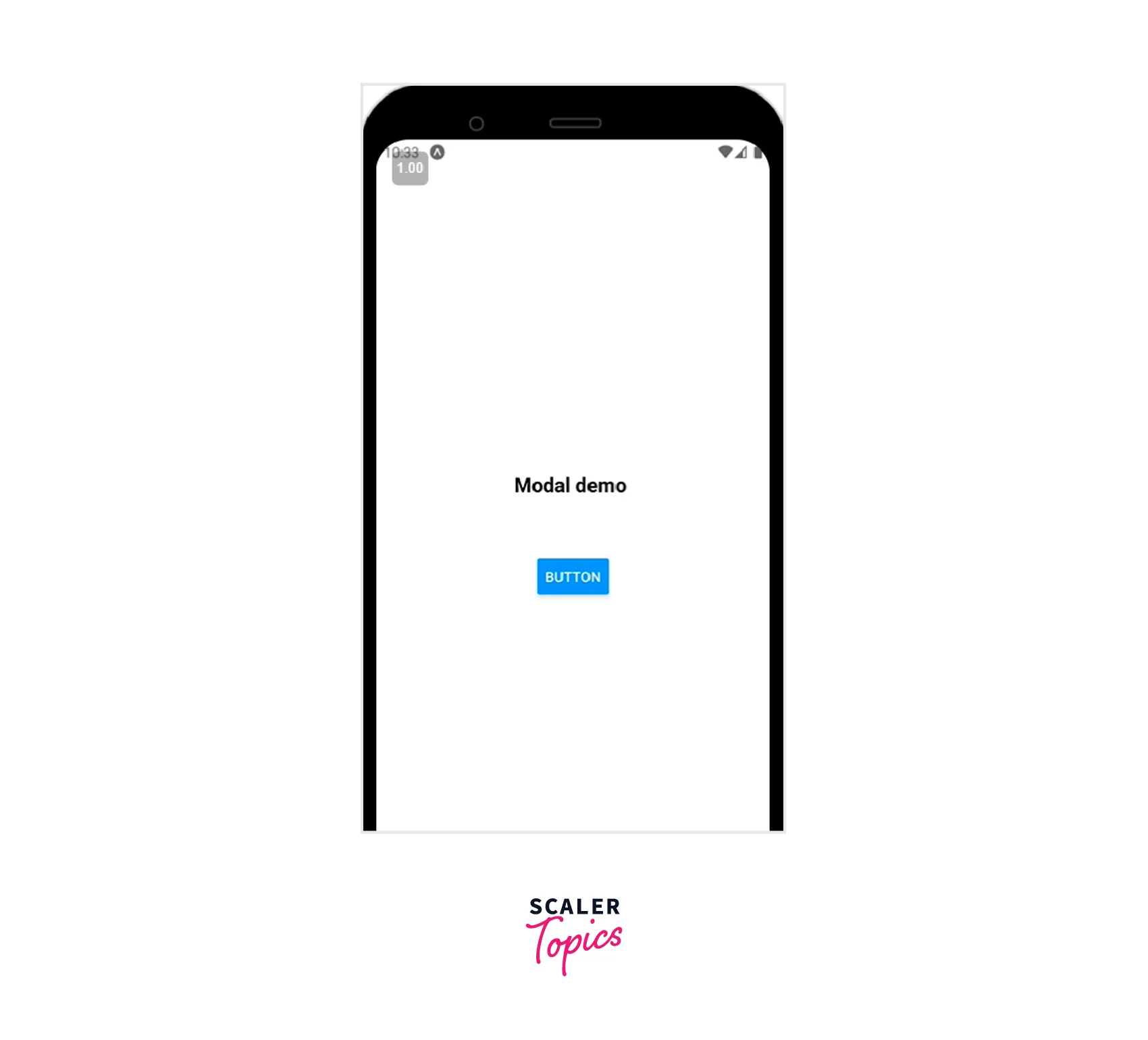
Your completed modal will resemble the illustration below:
How to Create a Reusable Modal in React Native
The earlier illustration produced a modal with buttons to open and close it. Now that we are aware of these procedures let's construct a unique modal and a button for starting it.
Start by using a straightforward button to open and close our modal. Make a new file called Button.js in the components folder, and then add the following code:
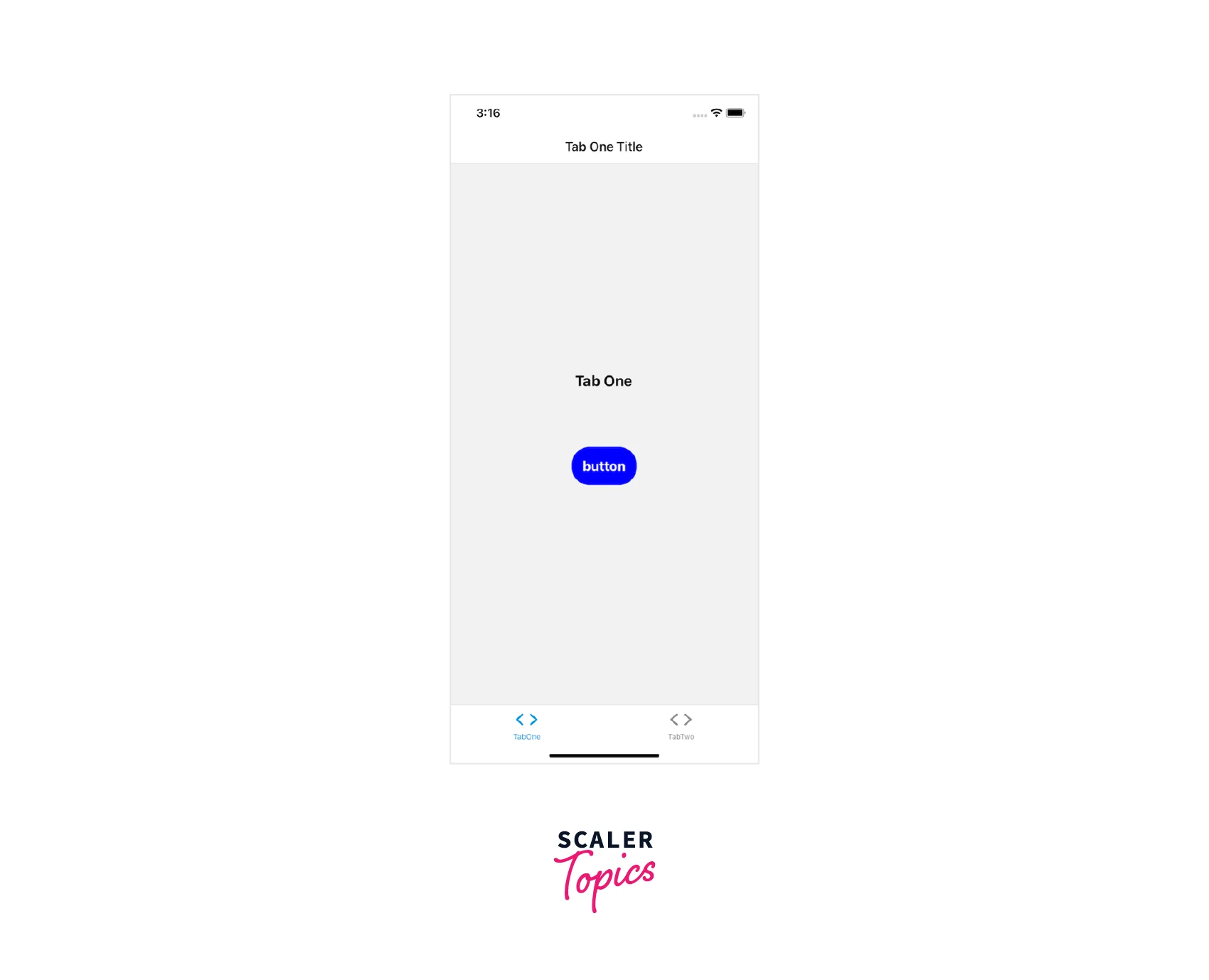
Your output should look like the image below:
We'll build our modal after we've created a button. Make a file named Modal.js in your components folder and add the following code to it:
Creating a Pop-Up Modal in React Native
We currently have a modal that only shows up when we tell it to. Let's add pop-ups that show up when we want to ask the user to notice something or take action. We'll start by coming up with a call-to-action scenario.
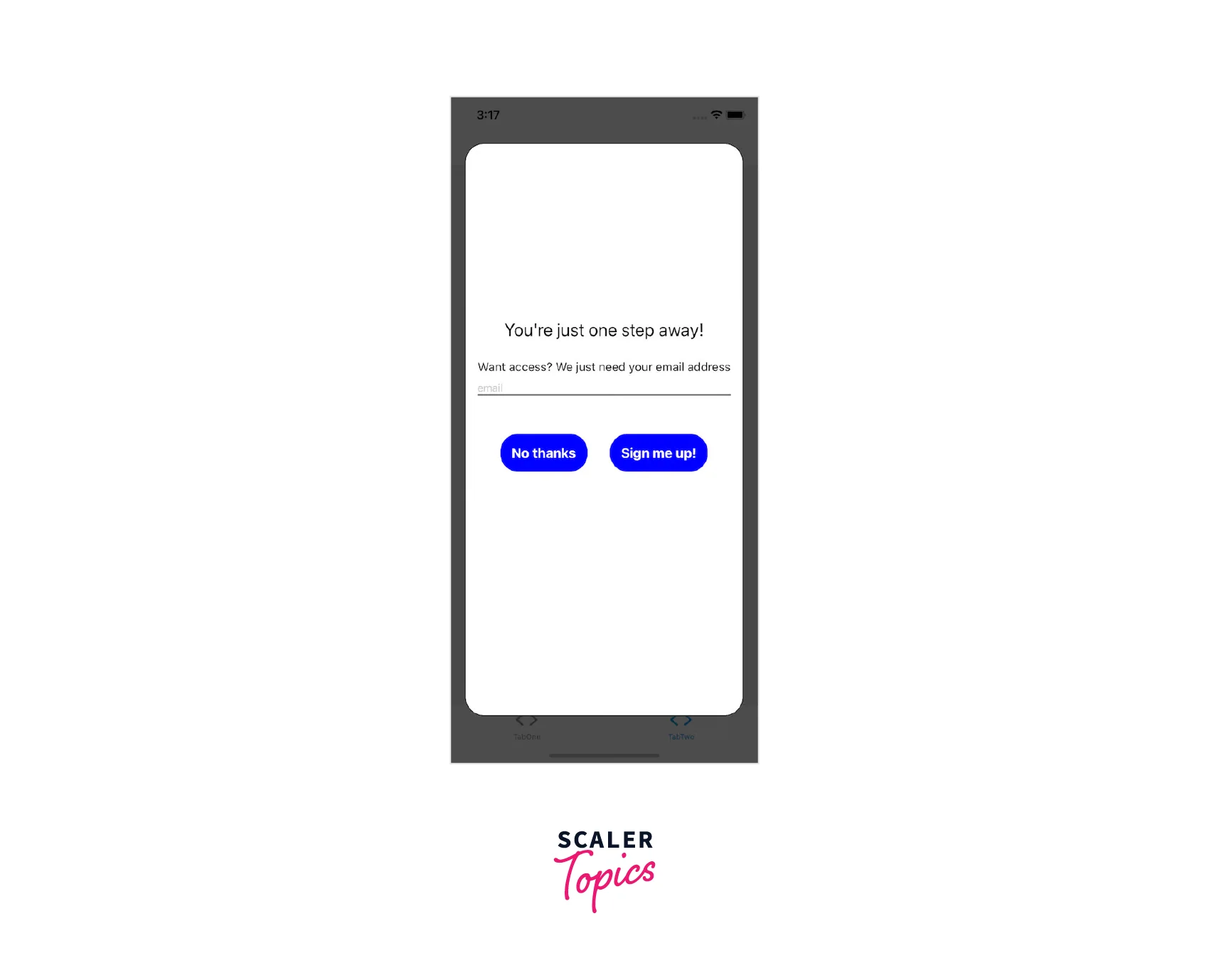
Let's imagine that a user needs to sign up in order to view a specific screen. If the user arrives at the screen without being subscribed, we want to make a call to action.
Change the current code in screens/TabTwoScreen to the following code:
When an item in the dependency array changes, as denoted by [], useEffect rerenders the page. Navigating to the screen activates useEffect, which brings up the Modal component.
No dependencies have been supplied, therefore useEffect will only render once. When simulating whether a user is subscribed, use setTimeout:
Your modal should resemble the illustration below :
Child Component and Dot Notation
Dot notation is used to export Modal as a module with related components. If you want to add a heading, you can use a modal to access the header component. A string can be used as the title prop for ModalHeader. Modal.Body, Modal.Container, and Modal.Footer accepts children. A child component can be anything you want it to be, such as text, pictures, buttons, or a ScrollView.
Now that we have a modal and an icon, we can return to screens/TabOneScreen. Everything will be put together in just two simple stages.
Change the import statements from the code block above to the code block below, accordingly, to import our new button and modal:
The return statement's modal component should be treated similarly.
Complete Example
The component (ModalTester) in the example below has a button and a modal. The isModalVisible state variable determines whether the modal is visible, and when it has a value of false, it is initially hidden. The modal becomes visible when the button is clicked since isModalVisible is set to true.
Another button inside the modal hides the modal when it is activated by setting isModalVisible to false.
FAQs
Q: Why react native component is not working as expected?
A: React-native-modal utilizes the react-native original Modal component internally. Before filing a bug complaint, try replacing the react-native-modal component with the original Modal component from the react-native framework. If the problem still exists, see if it has already been filed as a react-native issue.
Q: Why does the react native modal blinks oddly when animating?
A: UseNativeDriver=true causes this problem, which is a documented problem that needs to be fixed. As a short-term fix, you can change the prop hideModalContentWhileAnimating to true, which appears to fix the problem. Additionally, avoid explicitly assigning the Modal's backgroundColor property. Set it on the infant container if possible.
Q: Why am I unable to sequentially show multiple models?
A: Sadly, numerous models cannot currently be displayed simultaneously in react-native. As a result, you must use the onModalHide prop to check that the modal you are closing has finished its hiding animation before using the react-native-modal to display a new modal right away after closing the previous one.
Q: Why does the modal enter/exit animation flicker?
A: Verify that your animation and animationOut settings are accurate. We discovered that, for instance, using fadeIn as an exit animation causes the modal to flicker (fadeOut is the proper departure animation!). Additionally, some users have discovered that by changing backdropTransitionOutTiming=0, the flicker can be eliminated without impairing the motion.
Q: Why can't I have multiple modals open at once?
A: Consider the query above. A react-native bug prevents the display of multiple modals (or even alerts/dialogs) at once. Having said that, I strongly advise against using multiple modals at once because doing so frequently results in a poor user experience, particularly on mobile.
Conclusion
- In its simplest form, a modal is a screen that pops up above another screen to guide users to important information or the next action in a process.
- React Native Modal is a component that is used to display content over a view. Both Android and iOS support this.
- React-native-modal's objective is to increase the functionality of the original React Native Modal component while maintaining a straightforward API by incorporating animations etc.
- Features of React Native Modal are smooth animations for entry/exit, simple and adaptable APIs, backdrop opacity, colour and timing adjustments, and listeners for the completion of the modal animations.