React Native Styling with Examples
Overview
React Native Styling is essential for creating engaging and visually stunning mobile applications. In this article, we will dive into the world of React native styling, exploring the use of StyleSheet, screen wrapping, margins and padding, and platform-specific styling. We will also cover the best practices for building and styling React Native apps and component styling, as well as provide examples of breaking down and modifying existing styles. By the end of this article, you'll have a solid understanding of how to leverage the power of React Native styling to create beautiful and functional mobile applications. So, let's get started!
How Styling Works in React Native?
React Native Styling is done by using StyleSheets.There are two ways to style the component of React-Native App that are listed below:-
-
Using style prop :- Using style props is similar to using inline CSS, except they are written in camel case. In this styling, we make an object of key-value pair, where the key is the property, and then pass it to the style prop.
General Syntax for using the style prop:-
Let's take an example:-
OUTPUT:
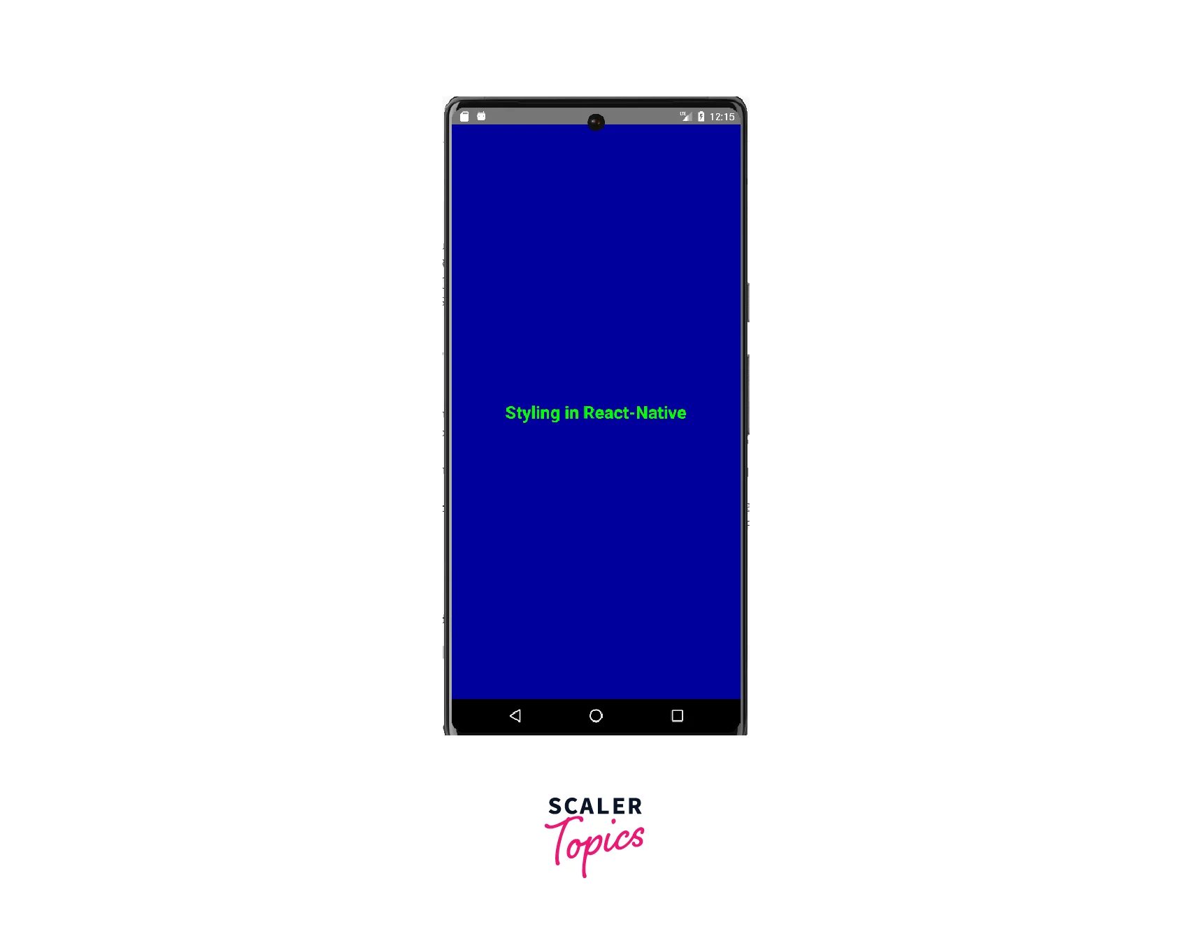
Explanation:
We have created a container having backgroundcolor 'blue' and aligned the text having the color 'neon green' inside it vertically 'center' using the justifyContent property.
-
Using StyleSheet :- In this styling, we will be creating the stylesheet to give the styling to the components by defining key-value pairs in a stylesheet object. This object can then be assigned to the style prop of a component, which applies the styles to that component. This styling is recommended to use if your code is getting more complex, both to break the styling into smaller pieces and to use the same set of styling again and again in the different components to implement React Native Styling.
Let's have a look at the general syntax to create a styleSheet:-
Let's take an example to make it clear that is given below:-
OUTPUT:
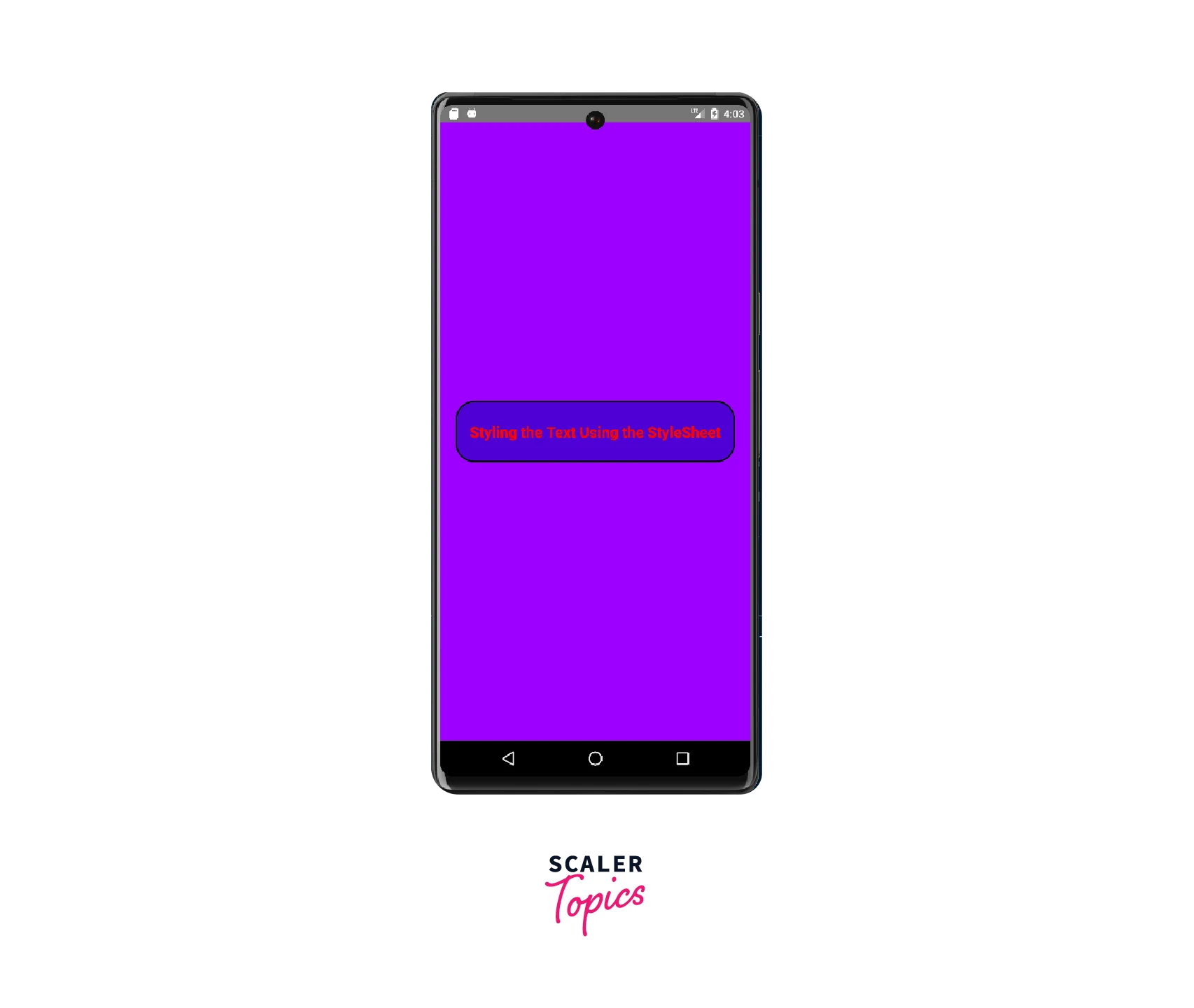
Explanation:
In React Native Styling the container style contains various properties such as flex, justifyContent, alignItems, and backgroundColor that define the layout and background color of the main container. The textContainer style contains properties such as width, height, justifyContent, borderWidth, backgroundColor, and borderRadius that define the layout and background color of the text container. The styleText style contains properties such as fontSize, color, fontWeight, and textAlign that define the font style of the text.
Pixel Handling
In React Native Styling, handling pixels is similar to how it's done in web development. React Native uses a styling system that is similar to CSS, where pixels are used to specify the size and position of components on the screen.
When specifying the size of a component, you can use a fixed number of pixels or a percentage of the screen size. For example, you can set the height of a component to 100 pixels or 50% of the screen height. The property that we use to handle pixels is 'width' and 'height'.
Let's take an example to make it more clear.
OUTPUT:
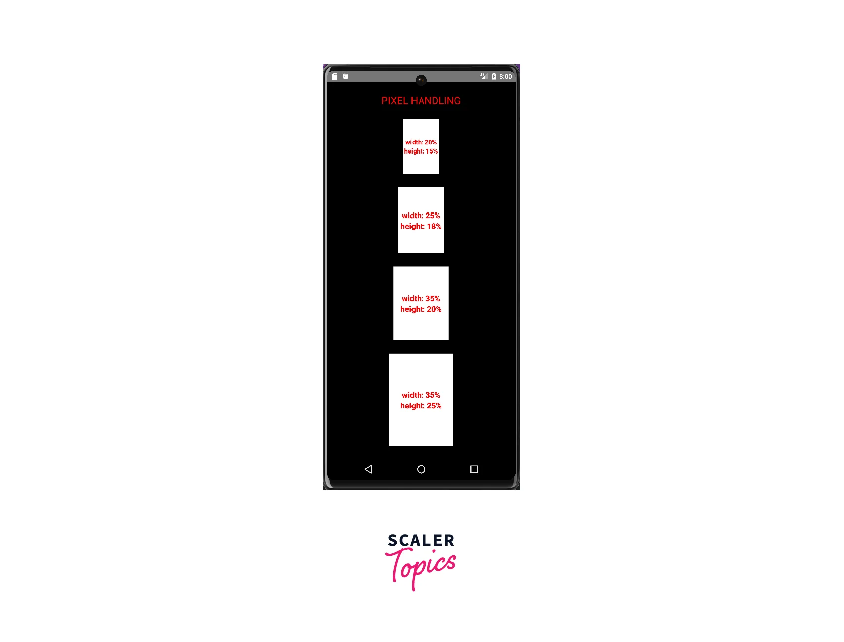
Explanation:
The styles are created using the StyleSheet.create() method, and they have a flex of 1, meaning they take up the entire available space. It has a black background, and its content is vertically and evenly distributed using the "justifyContent" property. The children of the main container are horizontally centred using the "alignItems" property. The four containers inside the main container have different width and height properties, with their dimensions specified in percentages. They are also given a border of width 2, with the background colour set to white. The text inside these containers is styled with some additional properties, such as font size, color, font weight, and text alignment.
Screen Wrapping
In React Native Styling, screen wrapping is defined to fit all the content into the available screen size (or different screen sizes) without scrolling it.
Some various properties and components are used to wrap the content of the screen, which are listed below:
-
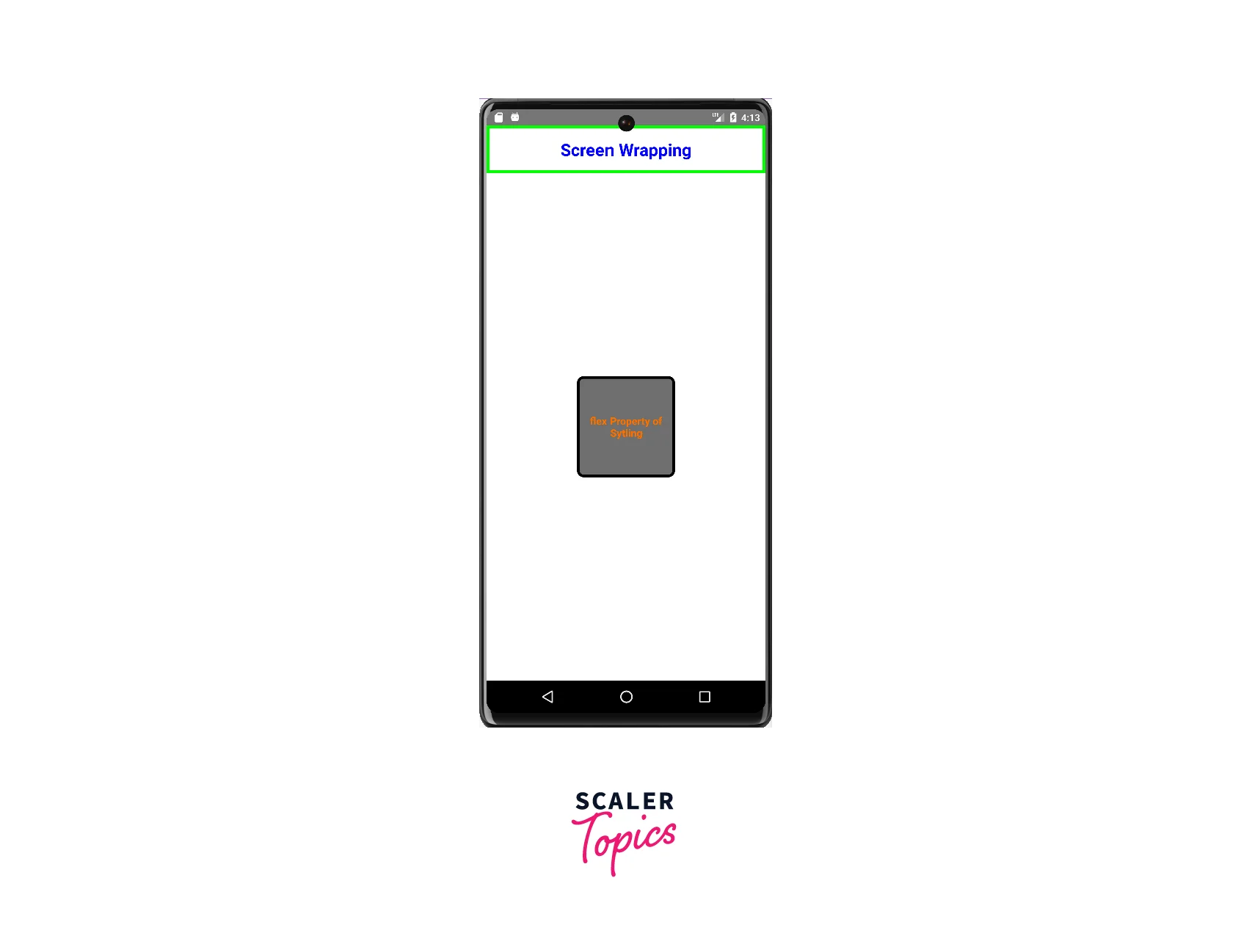
flex property:- In React Native Styling, the flex property is used to control how a component will grow or shrink to fill the available space within its container.
Let's take an example to make it clear that is given below:-
OUTPUT:
-
SafeAreView Component:- In React Native Styling, SafeAreaView is a component that helps us to ensure that app's content is displayed within a safe area that is not obstructed by the device's notches, status bars, or other similar elements as well as it also adjust its size and position automatically based on the device's physical characteristics and the platform-specific guidelines for safe areas.
Let's take an example to make it clear that is given below:-
OUTPUT:

Margin and Padding
Margin and Padding are used to control the spacing between elements in a user interface in React native styling.
Margin:- Margin refers to the space outside of an element's border. It is the distance between the border of an element and the adjacent elements. Margin can be set using the margin property in the style object of a component. For example, margin: 10 would add a 10-pixel margin around the element.
Padding:- Padding refers to the space inside an element's border. It is the distance between the border and the content within the element. Padding can be set using the padding property in the style object of a component in React native styling. For example, padding: 10 would add 10-pixel padding within the element.
Let's take an example to make it clear that is given below:-
OUTPUT:
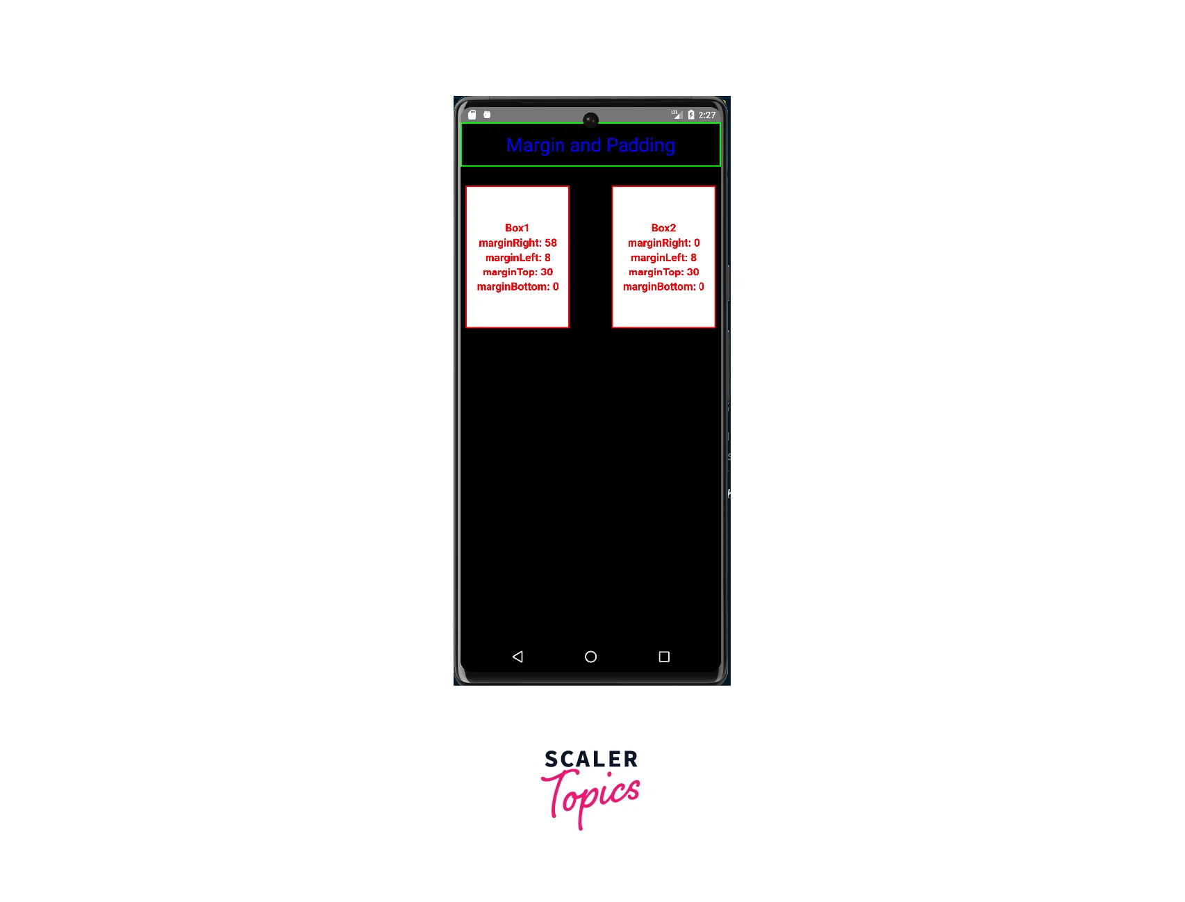
Explanation:
There are two main container views. The first container View contains a title, and the second container View contains two boxes. Each box is a nested View component that has some styling applied to it using the StyleSheet.create() method. In react native styling the style properties of each box include width, height, borderWidth, borderColor, justifyContent, alignItems, background color, marginRight, marginTop, marginLeft, and padding. These properties are used to control the layout and appearance of each box. Additionally, there are several text components nested within each box that displays the margin and padding values used on that particular box.
Shadows and Borders
Shadows and Borders are styling properties that are used to give a visual distinction to components in a user interface.
Shadows:- Shadows are used to create the illusion of depth and separation between UI elements. In React Native Styling, shadows can be added to a component using the elevation style property. The elevation property is a numerical value that represents the elevation of the component in the layout hierarchy, with higher values indicating a greater degree of separation from the background. The shadowColor, shadowOffset, shadowOpacity, and shadowRadius properties can also be used to customize the appearance of the shadow.
Borders:- Borders are used to visually separate and distinguish between different components or parts of a component. In React Native Styling, borders can be added to a component using the borderWidth, borderColor, and borderRadius style properties. The borderWidth property defines the thickness of the border, borderColor defines the color of the border, and border-radius defines the degree of rounding of the border's corners.
Let's take an example to make it clear that is given below:-
OUTPUT:
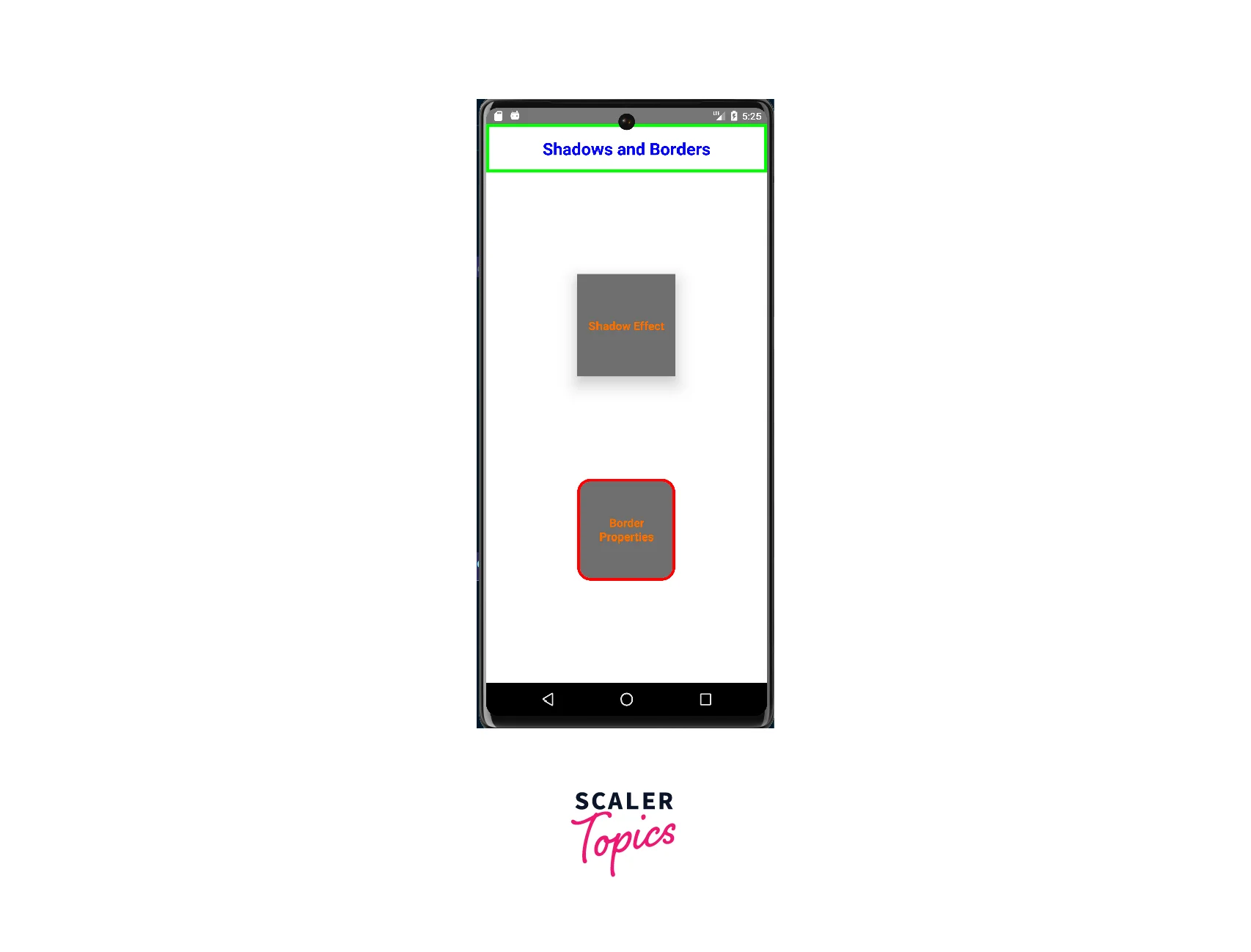
Explanation:
The first container has a shadow effect and a border, while the second container has a borderWidth, borderColor, and borderRadius properties. The "styles" object defines the styling for the various components. The "StyleSheet.create()" method is used to create a style object that contains the various styles for the components. Each of the styles defined in the "styles" object is applied to the respective components using the "style" property.
Platform-Specific Styling
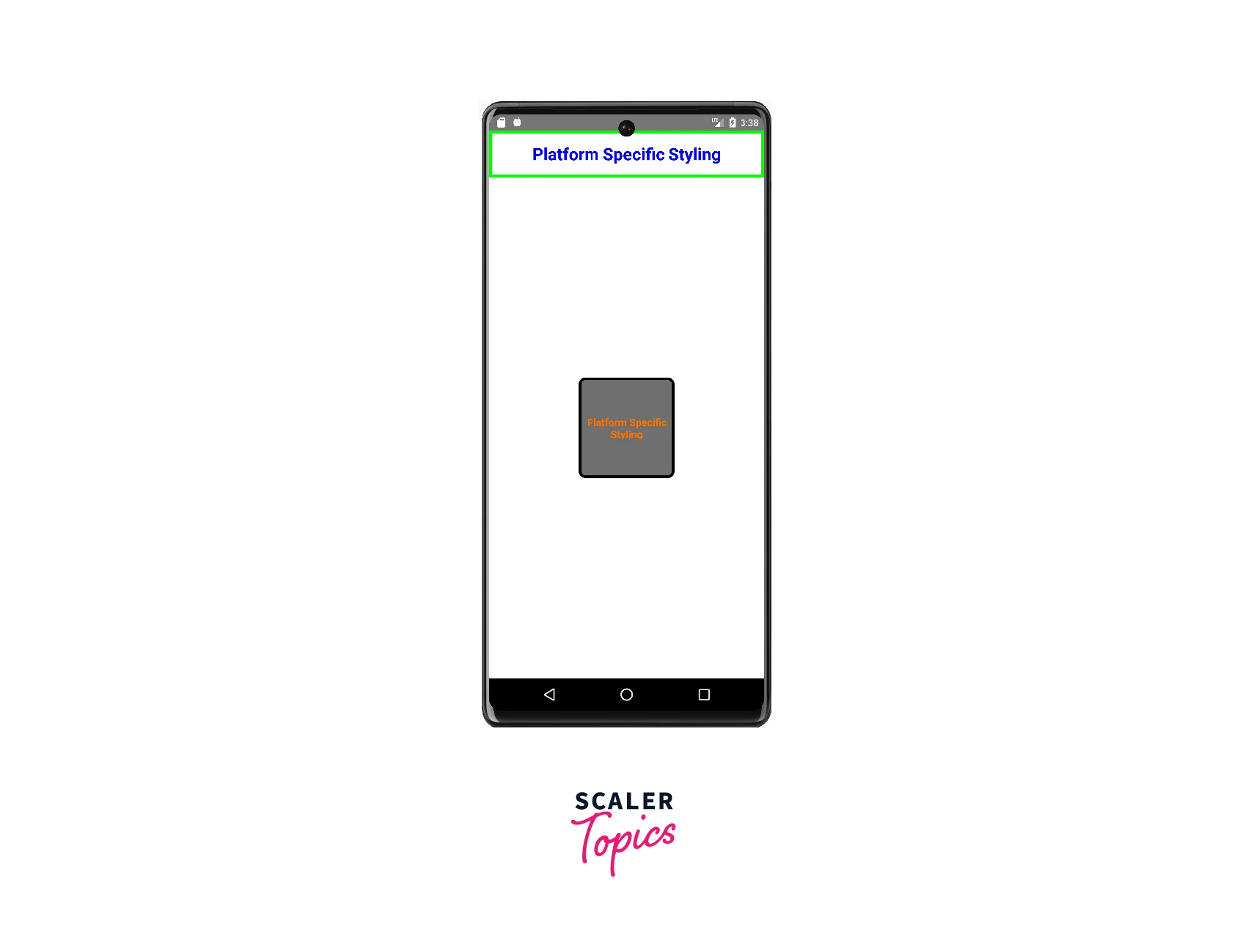
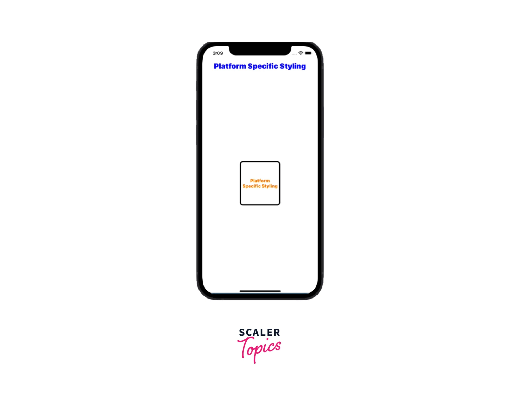
React native styling provides Platform specific styling that allows you to apply different styles to a component based on the platform it's being run on (i.e. iOS or Android). This is useful when you want to customize the look and feel of your app to match the design conventions of the platform.
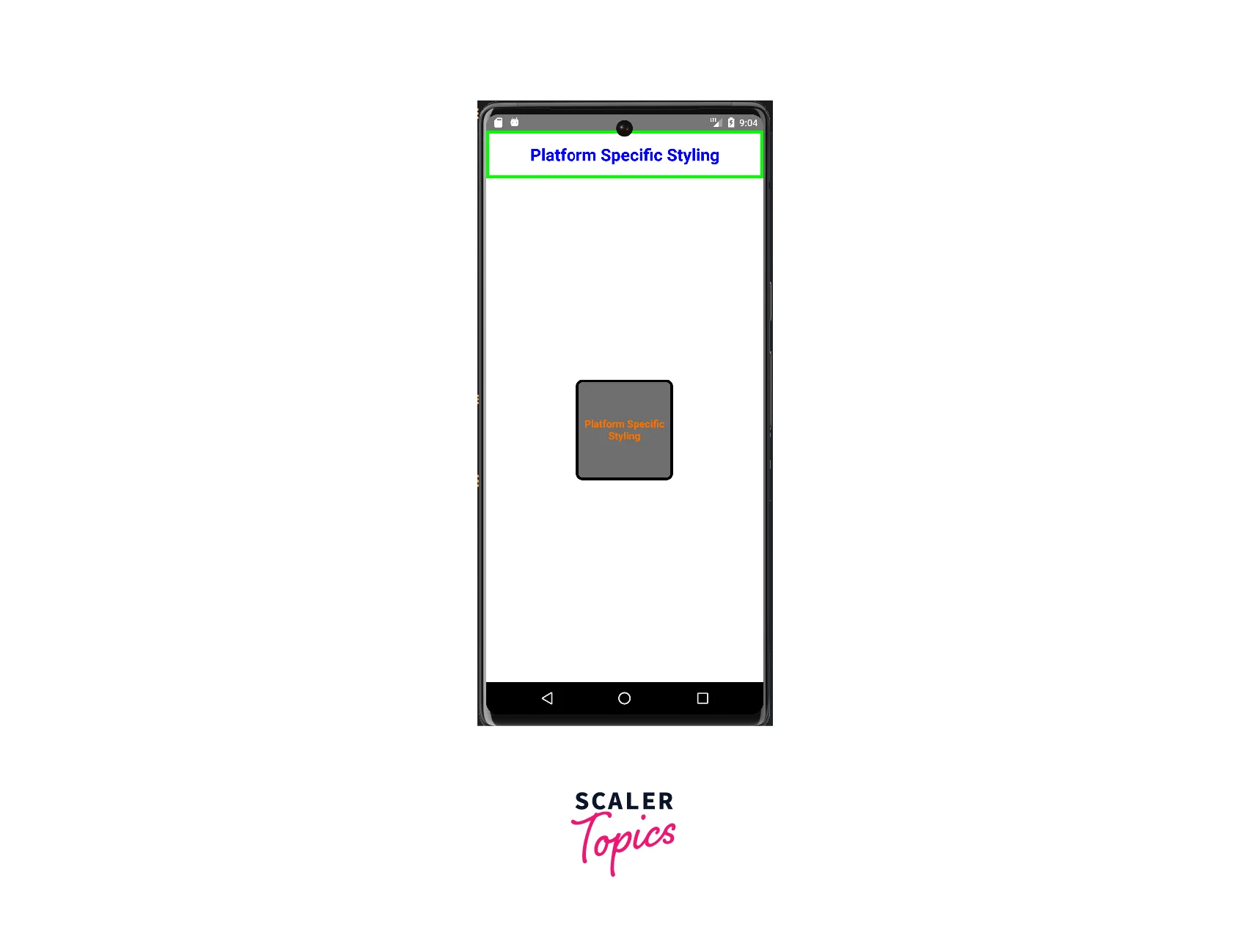
Let's take an example to make it more clear:-
ANDROID OUTPUT:
iOS OUTPUT:

Explanation:
The "titleContainer" contains a "SafeAreaView" with a blue-colored Text component that displays the title "Platform Specific Styling". The mainContainer contains two View components - container1 and container2.
The 'container1' and 'container2' have different background colors, border colors, and sizes, and their styles are defined using the "StyleSheet.create()" method. The Platform component is used to select different styles based on the 'platform' being used (iOS or Android).
In "container1", the background color and border color are different for Android and iOS. In container2, the width, height, background color, border color, and other styles are different for iOS and Android.
Building and Styling the React-Native App
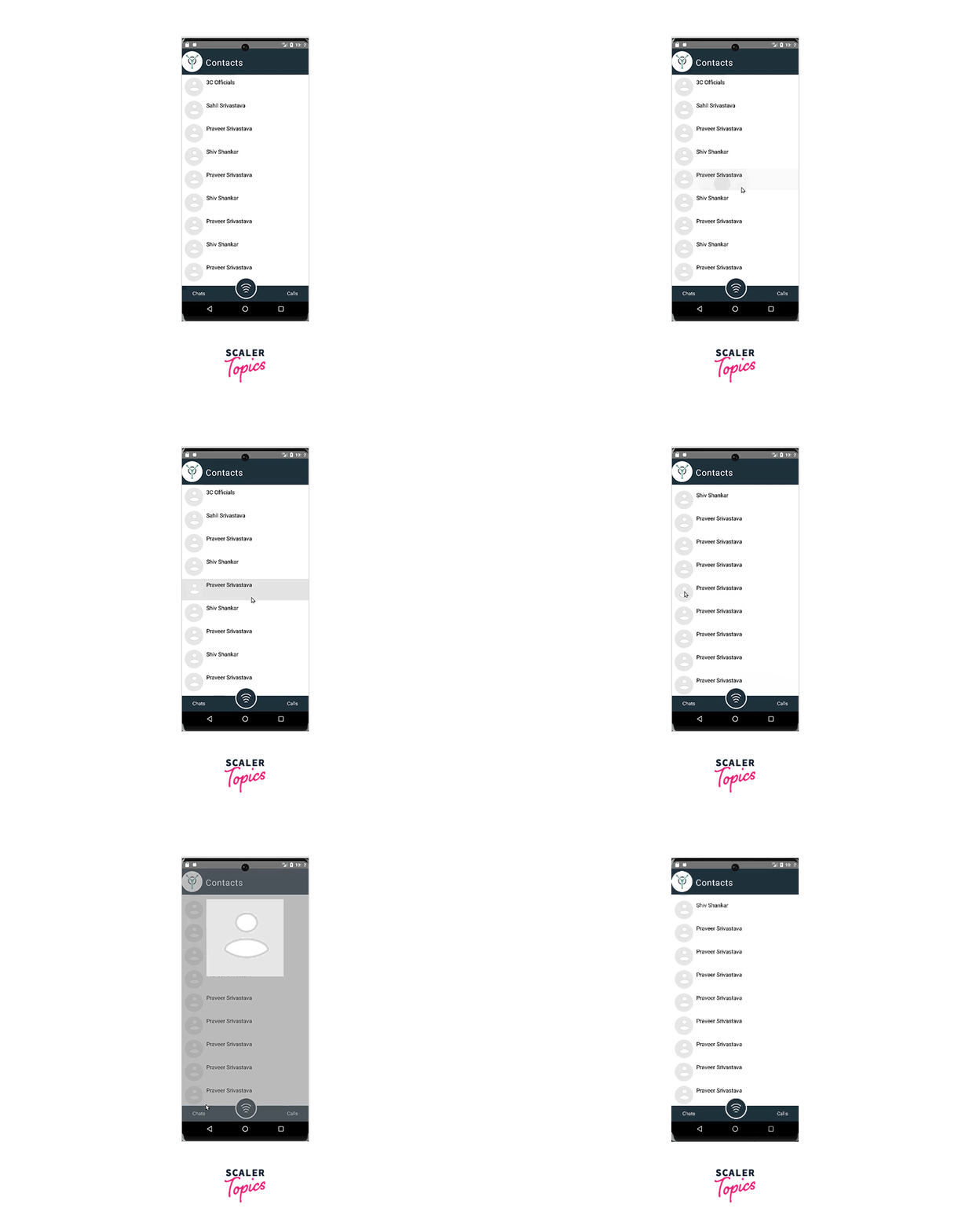
Now, we are going to create a React-Native App by combining all the above components that we have covered till now to demonstrate the use of react native styling in a real-world scenario.
OUTPUT:
React-Native Component Styling
In React Native styling, component styling refers to defining the appearance and layout of the user interface.
There are four ways to style the component in React native styling that has been explained below:-
-
Inline Styling Using style props:- In this styling, we make an object of key: value pair where the key is the property and then, pass it to the style prop.
Let's take an example to make it clear that is given below:-
OUTPUT:

-
Using StyleSheet:- StyleSheet provides reusability through which the same style can be reused in the different components.
Let's take an example to make it clear that is given below:-
OUTPUT:

-
Cascading Styling:- In React Native Styling, cascading styling refers to the addition of two or more styling in the same component.
Let's take an example to make it clear that is given below:-
OUTPUT:

-
Platform Specific Styling:- Platform-specific styling is necessary to handle the styling in Android or ios individually.
Let's take an example to make it clear that is given below:-
ANDROID OUTPUT:
iOS OUTPUT:
Breaking the Code
-
Shadows Addition
Add the code below to the styleSheet.create to get the shadow effect on clicking the profile photo of the contact list.
Explanation :-
This is a style definition for a container component with 100% width and height, white background, black shadow color, and 20 elevation.
-
Modal Styling
Add the code below to the styleSheet.create to get the shadow effect on clicking the profile photo of the contact list.
FAQs
Q: What is the difference between inline styling using style props and using the StyleSheet API in React Native?
A: Inline styling using style props is when you apply styles to a component directly in its props, while the StyleSheet API is used to define reusable styles that can be applied to multiple components.
Q: How do I apply styles to child components in React Native?
A: You can apply styles to child components by passing the style object or stylesheet reference as a prop to the child component.
Q: How do I create platform-specific styles in React Native?
A: You can create platform-specific styles by creating separate style files with the same name, but with different extensions
