Stack Navigator React Native
Overview
A `mobile app's ability to switch between several displays, each of which serves a different function for the user, is one of its most crucial features. This article will discuss stack navigation in React Native applications.
What is Stack Navigator
Stack navigator react native is a type of navigation that maintains a stack of displays (screens). Your app may switch between screens using Stack Navigator, where each new screen is stacked on top of the previous one. A screen is added to a stack each time we visit it, and hitting back will remove it from the stack and display the previous screen. Web pages that allow us to travel between the many pages of a site and press back to return to the previous page are a fantastic illustration of this form of navigation. We must first add the library required for Stack navigation before continuing.
The Stack navigator react native is set up by default to have the recognizable iOS and Android look and feel: additional screens slide in from the right on iOS, while Android uses the OS default animation. However, you may modify the animations to suit your needs.
Despite being very customizable, @react-navigation/stack is built in JavaScript, so bear that in mind. Although it uses native animations and gestures, the performance might not be as quick as a native implementation. For many apps, this might not be a problem, but if navigation performance is a problem for you, you might want to utilize @react-navigation/native-stack, which makes use of native navigation primitives.
How to Install Stack Navigator in React Native?
Minimum requirements:
- react-native >= 0.63.0
- expo >= 41 (if you use Expo)
- typescript >= 4.1.0 (if you use TypeScript)
To use this navigator, make sure you have @react-navigation/native and its dependencies installed, then install @react-navigation/stack :
for yarn :
Then you must install and setup the Stack navigator react native essential libraries :
-
Step 1 : Install react-native-gesture-handler first. If you have an Expo managed project, run the following command in the project directory :
Run the following command in your `project directory if you have a basic React Native project:
-
Step 2: At complete the installation of react-native-gesture-handler, add the following at the top of your entry file (make sure there's nothing else before it), such as index.js or App.js :
Note: Don't ignore this step if you are creating for Android or iOS; otherwise, even if your app functions OK in development, it may crash in production. Other platforms are not covered by this.
-
Step 3 : Installing @react-native-masked-view/masked-view is an alternative. This is required if you wish to use HeaderStyleInterpolators.forUIKit to animate the header in UIKit-style. If you have an Expo managed project, run the following command in the project directory :
Run the following command in your project directory if you have a basic React Native project:
-
Step 4: For the connection to be complete (Mac), the pods must also be installed (through Cocoapods) if you are working on an iOS project on a Mac.
Stack Navigator Props
These are the props that the Stack. Navigator Stack navigator react native component accepts :
- id: It is an optional individual ID for the Stack navigator react native. To refer to this navigator in a child navigator, use this together with navigation.getParent.
- initialRouteName: The name of the route that will be rendered when the navigator initially loads.
- initialouteName
- screenOptions: The default parameters for the navigator's displays.
- detachInactiveScreens : To conserve memory, a Boolean value is used to indicate whether idle screens should be separated from the view hierarchy. This provides compatibility with react-native screens. True is the default value. If you wish to deactivate this optimization for certain screens (for example, if you want a screen to stay in the display even when not focused), detachPreviousScreen prop is used.
- keyboardHandlingEnabled: If false, the keyboard will not be dismissed immediately when going to a new screen from the current one. True is the default value.
Stack Navigator Options
The displays in the navigator may be configured using the following options. These may be supplied via the options prop of Stack. Screen or screenOptions prop of Stack.navigator :
- title : It is a string that serves as headerTitle's fallback.
- cardShadowEnabled : Use this option to create shadows that are visible during transitions. It has a default value of true.
- cardOverlayEnabled : During transitions, use this prop to make a dark, semi-transparent overlay visible underneath the card. On iOS it has a default value of false and on Android it has a default value of true.
- cardOverlay : a function that returns a React Element to be used as the card's overlay. When utilizing this, be careful to set cardOverlayEnabled to true.
- cardStyle: The style object for the card in the stack. Here, you may choose a different background color to use in place of the built-in one. For transparent models, you may optionally set {backgroundColor: 'transparent'} to make the previous screen visible below. Using this, you may build features like modal dialogues. To prevent prior screens from being disconnected and visible below while using a transparent backdrop, you should additionally set presentation:'modal' in the options. On the web, the screen height is not constrained by the viewport's height. The address bar of the browser may now be hidden while scrolling, as intended. If this is not the desired behavior, you may force the screen to fit the viewport by setting cardStyle to {flex: 1}.
- presentation: This shortcut option sets up several settings to customize the rendering and transition styles :
- card: For iOS and Android screen transitions, make use of the default OS animations.
- modal: When you use modal animation there are a few changes.
- Unless otherwise provided, sets the screen's headerMode.
- adjusts the screen animation for models such that it corresponds to platform behavior.
- transparentModal: It is similar to modal and has the following changes :
- Unless otherwise provided, sets the screen's headerMode.
- sets the screen's background color to transparent so that the preceding screen is viewable.
- Detach the previous screen by changing the detachPreviousScreen setting.
- stops the preceding screen from revolving into its former place.
- transforms the motion on the screen into a vertical slide animation.
- animationEnabled : Whether the screen should be set to display transition animation. The screen won't animate while pushing or popping if you set it to false. Defaults to false on the web and to true on iOS and Android.
- animationTypeForReplace : how the animation will look when this screen takes the place of another. It defaults to push. The following values can be entered :
- push : An animation depicting the pushing of a new screen will be utilised.
- pop : An animation of a screen popping will be utilised.
- gestureEnabled : Whether you can dismiss this screen using gestures. Defaults to false on Android and true on iOS. On the web, gestures are not supported.
- gestureResponseDistance : Number to override the touch start distance from the screen's edge for gesture recognition. Depending on the gestureDirection value, it will construct either the horizontal distance or the vertical distance. This is not supported for the web. The default values are :
- 50 - when gestureDirection is horizontal or horizontal-inverted
- 135 - when gestureDirection is vertical or vertical-inverted
- gestureVelocityImpact : Number, which assesses the applicability of gesture velocity. 0.3 is the default. On the Web, this is not supported.
- gestureDirection : Direction of the gestures. On the Web, this is not supported.
- transitionSpec : Screen transition configuration object. For further information, see the Animations section of the article.
- cardStyleInterpolator : styles that were interpolated for different card elements. For further information, see the Animations section of the article.
- headerStyleInterpolator : styles that were interpolated for various header elements. For further information, see the Animations section of the article.`
- detachPreviousScreen : Detach the previous screen from the view hierarchy to conserve memory by using the detachPreviousScreen Boolean. If you want to be able to see the previous screen through the active screen, set it to false. DetachInactiveScreens must not be set to false in order for this to apply. When utilizing a transparentModal or modal presentation, this is automatically modified to keep the necessary screens visible. in all other situations, defaults to true.
- freezeOnBlur: It is a Boolean value that indicates whether inactive screens should be stopped from re-rendering. false is the default. When the application starts, the enableFreeze() function from the react-native-screens package sets the default value to true. React-native-screens version >= 3.16.0 is necessary. Only Android and iOS are supported.
Animations in Stact Navigator
When a screen is added or deleted, Stack navigator react native offers several options to customize the transition animation. By indicating the choices in the options parameter for each screen, these transition animations may be modified on a per-screen basis.
Animation-Related Options
Stack navigator react native-related options are as follows :
- gestureDirection : The direction of swipe gestures :
- vertical - The screen-closing gesture will begin at the top. The screen will slide from the bottom for animations.
- vertical-inverted - The screen-closing gesture will begin at the bottom. The screen will slide from the top for animations.
- horizontal - In RTL, the gesture to close the screen will begin on the left, and the right. With SlideFromRightIOS, the screen will slide from the right for animations, and the left for RTL.
- horizontal-inverted - In RTL, the gesture to close the screen will begin on the right, and the left. As the orientation is reversed, the screen will slide from the left with SlideFromRightIOS and from the right with RTL for animations.
- transitionSpec: An object that provides the animation type (timing or spring) and its settings (for example, timing duration). It requires two properties :
- open - The transition configuration when adding a screen.
- close - The transition that occurs when a screen is removed. Each object should have two properties :
- animation - The animation function to be used (timing and spring).
- config - The timing function's configuration object. Duration and easing can be used for timing. It might be stiffness, damping, mass, and so on for spring. spring animation example :
- cardStyleInterpolator: This is a function that defines interpolated styles for different regions of the card. This allows you to change how the transitions between screens look. It should return at least an empty object, potentially with interpolated styles for the container, the card itself, the overlay, and the shadow. The following properties are supported :
- containerStyle - The style of the container view that wraps the card.
- cardStyle - The style of the view that represents the card.
- overlayStyle - The style of the view that represents the semi-transparent overlay seen below.
- shadowStyle - The style of the view that represents the card shadow.
- headerStyleInterpolator: This is a function that defines interpolated styles for different areas of the header. It should return at least an empty object, potentially with interpolated styles for the left label and button, right button, title, and backdrop. The following properties are supported :
- leftLabelStyle - The style of the left button label (back button label).
- leftButtonStyle - The style of the left (typically the back) button.
- rightButtonStyle - The right button's style.
- titleStyle - The header title text style.
- backgroundStyle - The background style for the header.
Pre Made Configurations
Custom transition animations for screens may be created using these settings. We also export from the library numerous configurations with ready-made animations that you may use :
-
TransitionSpecs :
- TransitionIOSSpec - Exact values from the animation configuration of UINavigationController.
- FadeInFromBottomAndroidSpec - Android Nougat activity open animation configuration.
- FadeOutToBottomAndroidSpec - Android Nougat configuration for activity closure animation.
- RevealFromBottomAndroidSpec - Approximate configuration for Android Pie's activity open animation. Example :
-
CardStyleInterpolators :
- forHorizontalIOS - Standard iOS-style right-side in.
- forVerticalIOS - Standard iOS-style bottom-sliding slide-in (used for modals).
- forModalPresentationIOS - iOS 13's standard modal animation.
- forFadeFromBottomAndroid - For Android Oreo, a standard Android-style fade-in from the bottom.
- forRevealFromBottomAndroid - Android Pie's standard reveal from the bottom. Example configuration for vertical screen fade animation in Android Oreo style :
-
HeaderStyleInterpolators :
- forUIKit - A standard UIKit header animation in which the title fades into the back button label.
- forFade - A straightforward fade animation for the header parts.
- forStatic - A simple translate animation that translates the header as well as the sliding screen. Example iOS animation configuration for header components where the title fades into the back button :
-
TransitionPresets : We export numerous transition presets that combine a variety of these settings to match certain native animations. A transition preset is an object that exports a few animation-related screen parameters under TransitionPresets. The following presets are currently available :
- SlideFromRightIOS - iOS navigation transition.
- ModalSlideFromBottomIOS - The standard iOS modal navigation transition.
- ModalPresentationIOS - The iOS 13 modal presentation style.
- FadeFromBottomAndroid - Android 9 (Oreo) standard navigation transition when launching or quitting an Activity.
- RevealFromBottomAndroid - Android 9 (Pie) standard navigation transition when launching or exiting an Activity.
- ScaleFromCenterAndroid - When launching or dismissing an Activity on Android >= 10, this is the standard Android navigation transition.
- DefaultTransition - The current platform's default navigation transition.
- ModalTransition - The current platform's default modal transition.
Transparent models
A transparent modal is a modal dialogue that appears on top of the screen. The previous screen is still visible beneath. You may achieve a translucent modal screen by using presentation:'transparentModal' in the screen's settings.
Example :
When you travel to the Modal screen, the backdrop will be translucent, and the Home screen will be visible beneath. In addition to the presentation, you may wish to define a few other factors to achieve modal dialog-like behavior:
- Disable the header using, headerShown: false
- Enable the overlay by setting cardOverlayEnabled: true (you can't close the screen this way)
You may use the useCardAnimation hook to customize items inside your screen if you want to further customize how the dialogue animates, or if you want to shut the screen when tapping the overlay, for example :
Stack Navigator Header Related options
The list of header-related settings may be found here. These parameters may be supplied using the Stack.navigator's screenOptions prop or the Stack.Screen's options prop. You do not need to utilize @react-navigation/elements to access these options; they are just listed on that page.
List of supported options :
- header: This method receives a function that returns a React Element to be shown as a header. As an argument, the function expects an object with the following properties :
- navigation - The current screen's navigation item.
- route - The current screen's route object.
- options - The current screen's choices
- layout - The screen's dimensions, including height and width.
- progress - Animated nodes that reflect the animation's progress.
- back - Back button options, containing an object with a title attribute to use as the back button label.
- styleInterpolator - A function that returns interpolated styles for various header components. When utilizing a custom header, be sure to set headerMode to screen as well. Example :
- headerMode: This property specifies how the header should be rendered :
- float - Create a single header that stays at the top of the screen and animates when the screens are updated. On iOS, this is the default setting.
- screen - Each screen is accompanied by a header, which fades in and out with the screen. On other systems, this is the default setting.
- headerShown: Whether the screen's header should be shown or hidden. The header is displayed by default. When set to false, the header is hidden.
- headerBackAllowFontScaling: Whether or not the back button title type should resize to accommodate Text Size accessibility options. The default value is false.
- headerBackAccessibilityLabel: The back button in the header has an accessibility label.
- headerBackImage: Function provides a React Element to show a custom image in the back button in the header. When a function is called, the tintColor is sent to it as an argument object. Defaults to the Image component with the back image source, which is the platform's default back icon image (a chevron on iOS and an arrow on Android).
- headerBackTitle : Title string used by the iOS back button. The preceding scene's headerTitle is used by default.
- headerBackTitleVisible : A suitable default is provided for whether or not the back button title should be shown, but if you wish to override that, use true or false in this option.
- headerTruncatedBackTitle : When headerBackTitle does not fit on the screen, the back button uses a title string. By default, "Back" is selected.
- headerBackTitleStyle : The back title's style object.
Helpers :
The Stack navigator react native extends the navigation prop with the following methods :
- replace : The current screen is replaced by a new screen in the stack. The following arguments are accepted by the method :
- name - string - The name of the route to be added to the stack.
- object - Screen parameters to pass to the target route. Example :
- push : Navigates to a new screen by pushing it to the top of the stack. The following arguments are accepted by the method :
- name - string - The name of the route to be added to the stack.
- object - Screen parameters to pass to the target route. Example :
- pop : Removes the current screen from the stack and returns to the previous screen. It accepts one optional input (count), which specifies how many screens to return to.
Example :
- popToTop : removes all screens from the stack except the first and navigates to it.
Example :
Events
The navigator can send out events in response to specific activities. The following events are supported :
- transitionStart : This event is triggered when the transition animation for the current screen begins.
Event data:
e.data.closing - A Boolean value that indicates whether the screen is open or closed.
Example:
- transitionEnd : When the transition animation for the current screen ends, this event is triggered.
Event data:
e.data.closing - A Boolean value that indicates whether or not the screen was opened or closed.
Example: - gestureStart : This event is triggered when the swipe gesture for the current screen begins.
- gestureEnd : This event is triggered when the swipe gesture for the current screen is completed. For example, a screen was effectively dismissed.
- gestureCancel : This event is triggered when the swipe gesture for the current screen is cancelled. For example, the gesture did not dismiss a screen.
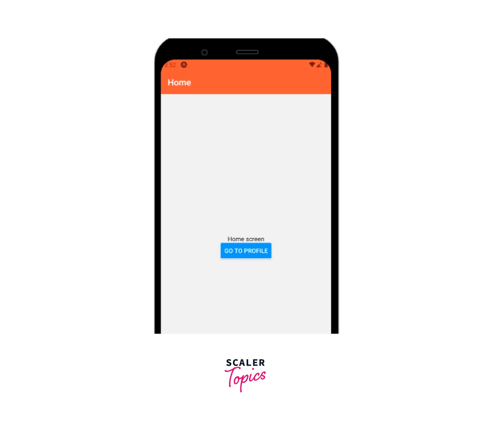
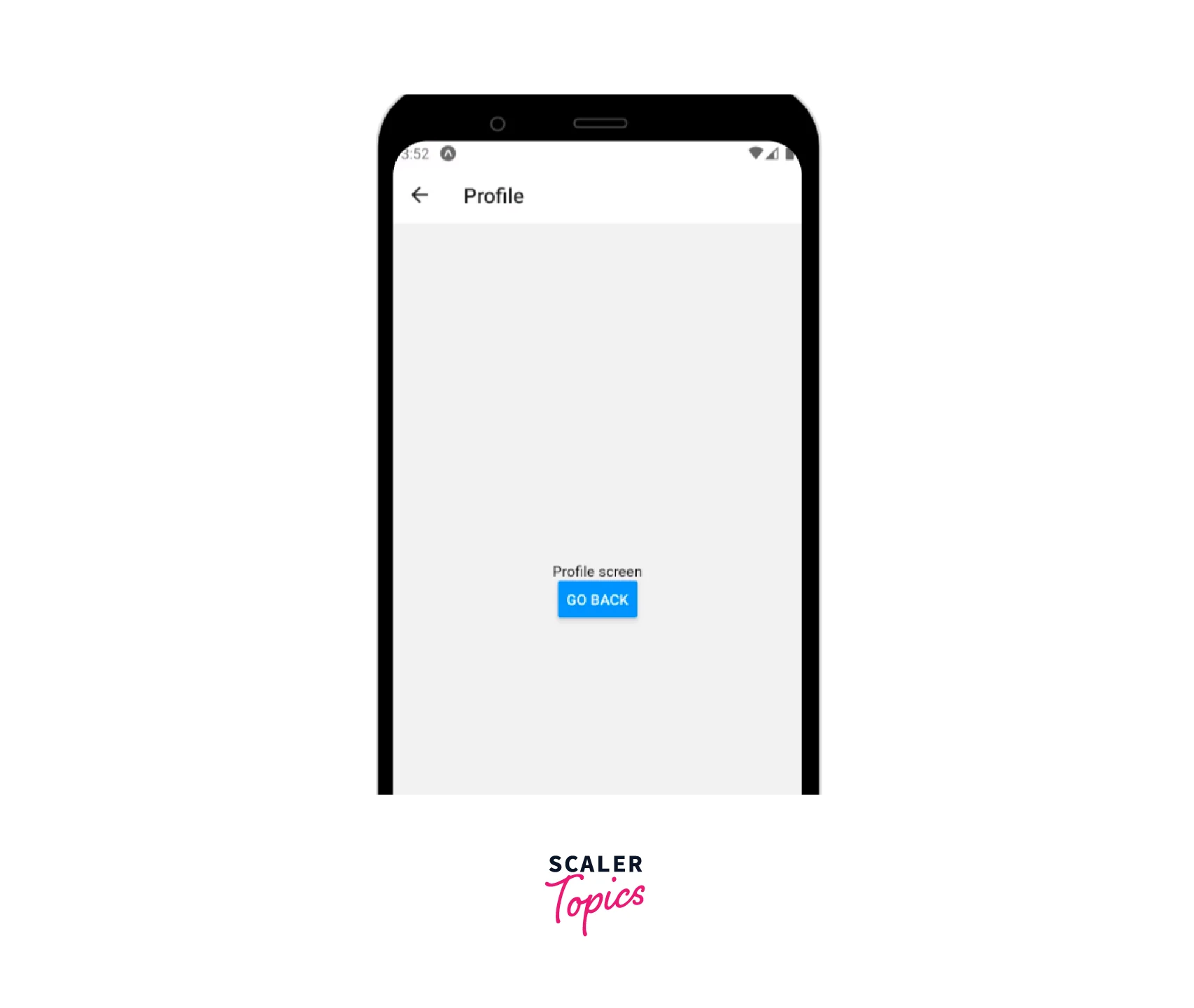
Stack Navigator Example
Let us now implement a Stack navigator react native using all the above props and options :
App.js file :
FAQs
Q. What are transparent modals in stack navigator?
A. A transparent modal is a modal dialogue that appears on top of the screen. The previous screen is still visible beneath. You may achieve a translucent modal screen by using presentation:'transparentModal' in the screen's settings.
Conclusion
- Stack navigator react native is a type of navigation that maintains a stack of displays (screens).
- The Stack navigator React native is set up by default to have the recognizable iOS and Android look and feel.
- Few important props accepted by Stack navigator react native are id, initialRouteName, screenOptions, keyboardHandlingEnabled, and detachInactiveScreens.
- Few important options accepted by Stack navigator react native title, cardShadowEnabled, cardOverlayEnabled, cardOverlay, and cardStyle, etc.
- Although Stack navigator react native (built in JS) uses native animations and gestures, the performance might not be as quick as a native implementation.