Font Awesome in React
Overview
Font Awesome is a popular icon library that provides scalable vector icons that can be customized and used in a variety of ways. The Font Awesome React library is a React wrapper for Font Awesome that allows developers to easily use Font Awesome icons in their React applications.
Introduction
The Font Awesome React library is a wrapper for the Font Awesome icon library that allows developers to easily use Font Awesome icons in their React applications. The library provides a simple and powerful way to add icons to React projects, customize them, and use them in a variety of ways.

Prerequisites
To use the Font Awesome React library, developers must have a basic understanding of React and the Font Awesome icon library. Additionally, developers should have a development environment set up with Node.js and npm or yarn.
Get Started
To get started with Font Awesome, you will first need to install the library in your project. You can do this by using either npm or yarn.
For example, if you are using npm, you can install Font Awesome by running the following command in your project's root directory:
If you are using yarn, you can install Font Awesome by running the following command in your project's root directory:
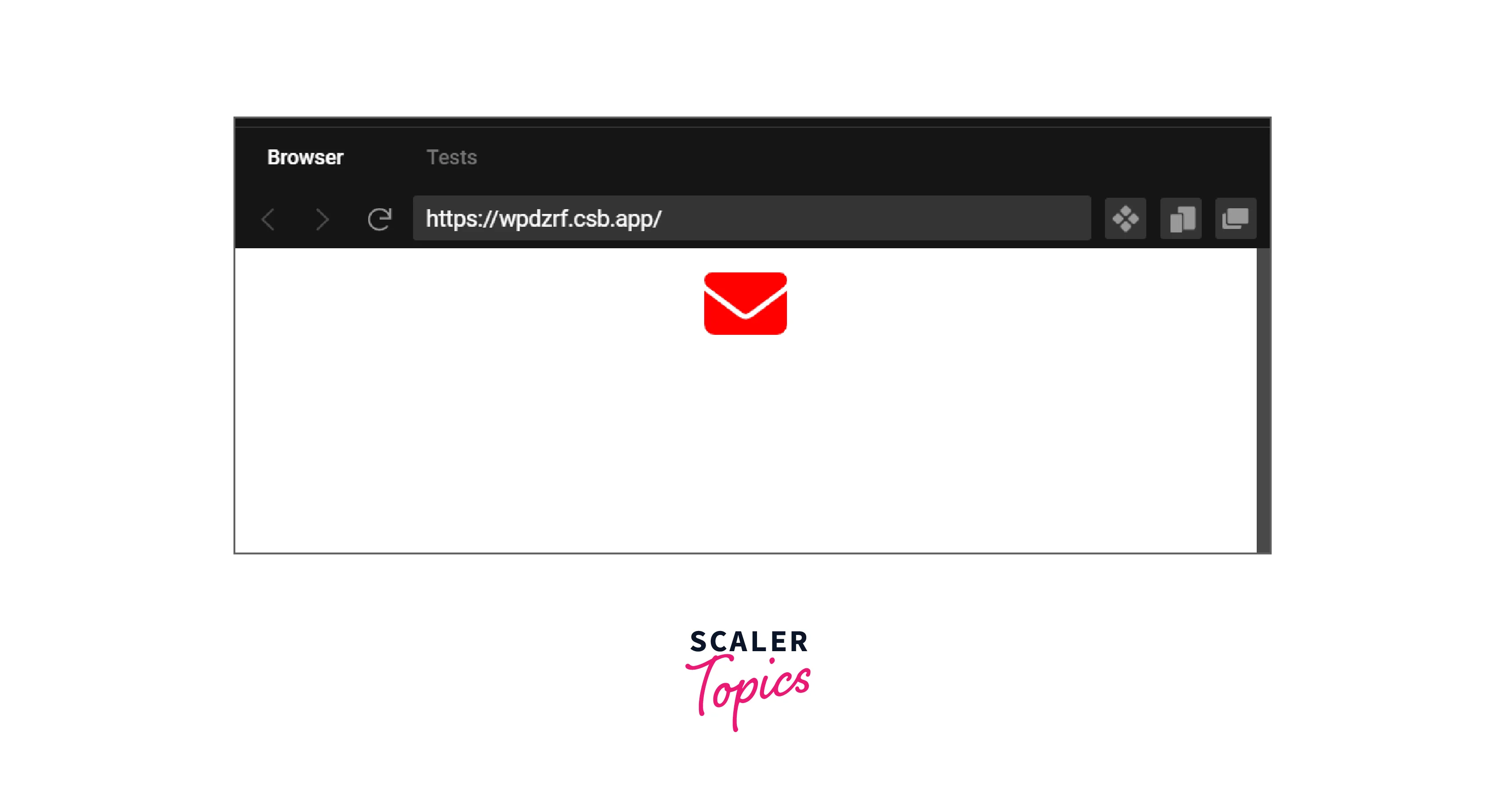
Once the library is installed, you can import the icons you want to use in your project. For example, to import the "envelope" icon, you can add the following line of code to the top of your JavaScript file:
Then, you can use the imported icon in your React components. For example, you can use the <FontAwesomeIcon> component provided by the Font Awesome React library to render the "envelope" icon:
You can also customize the icon by passing in additional props such as size and color. You can also import other icons package or with different styles like regular, light, or brands.
It is a good practice to import icons as per usage rather than importing all icons at once, as it can increase the bundle size of the app.
Using Icons
Once you've imported the icons you want to use in your project, you can use them in your React components.
For example, you can use the
Here's an example of a component that renders the "envelope" icon:
Output
You can also customize the icon by passing in additional props. For example, you can change the size of the icon by passing in a "size" prop. You can also change the color of the icon by passing in a "color" prop.
Output
In this example, the envelope icon will be rendered in a size of 3x and with red color. You can also use the classname prop to add a custom class to the icon and style it accordingly. Additionally, you can use other props like animation, transform, mask, etc.
It is important to note that, the icon will only be rendered if it is imported and passed in the icon prop of the FontAwesomeIcon component.
Icon Syntax
The Font Awesome React library uses a simple syntax to display icons. The main component provided by the library to display icons is the
Here's an example of how to display an icon using the
Explanation:
In this example, the "user" icon is imported and passed as a prop to the
In addition to the "icon" prop, the
- size: Allows you to set the size of the icon, which can be in pixel or string values like 'lg', '2x', '3x' etc.
- color: Allows you to set the color of the icon, which can be in any valid css color format.
- className: Allows you to add a custom class to the icon, useful for styling the icon.
- prefix: Allows you to specify the icon prefix, such as 'fas' for solid icons or 'far' for regular icons.
- animation: Allows you to add animation to the icon, such as spin, pulse, etc.
- transform: Allows you to add the transformation to the icon, such as rotate, flip, etc.
- mask: Allows you to add a mask to the icon, such as a square or circle
Here's an example of how to use some of these props to customize an icon:
In this example, the envelope icon is being rendered in a size of 3x, with a red color, className of my-custom-class, it is also animated with a spin animation, rotated by 45 degrees, and has a square and circle mask applied to it.
It is important to note that all the props are optional, you can use only the props that are required for your use case. Additionally, you can use the
Features
The Font Awesome React library provides a variety of features for developers to use. Some of the key features include:
-
Support for all Font Awesome icons: The library provides access to all the icons available in the Font Awesome library, which includes over 1500 icons in various styles like solid, regular, light, and brands.
-
Customization options for icons: The library allows developers to customize icons by changing the size, color, and various other attributes of the icons. This allows developers to easily match the icons to the look and feel of their application.
-
Easy integration with React: The library is designed to be easily integrated with React, which makes it simple for developers to use Font Awesome icons in their React applications.
-
Simple syntax for displaying icons: The library uses a simple syntax for displaying icons, which makes it easy for developers to understand and use.
-
Animation Support: The library allows developers to add animation to the icons, such as spin, pulse, etc. This can be useful for creating interactive and engaging user interfaces.
-
Transform Support: The library allows developers to add the transformation to the icons, such as rotate, flip, etc. This can be useful for creating unique and creative designs.
-
Mask Support: The library allows developers to add a mask to the icons, such as squares or circles. This can be useful for creating distinctive and attention-grabbing designs.
-
TypeScript Support: The library can also be used with TypeScript. Developers can use the @fortawesome/react-fontawesome package and import the icons they want to use. Additionally, developers can also use the @fortawesome/fontawesome-svg-core package to customize the icons.
-
Next.js Support: The library can also be used with Next.js. Developers can import the library and use it in their Next.js components. Additionally, developers can also use the dynamic imports feature of Next.js to only load the icons that are needed for a specific component.
Overall, the Font Awesome React library provides a wide range of features that allow developers to easily add and customize icons in their React applications, making it a valuable tool for any developer looking to enhance the visual appeal of their projects.
Unit Testing
Unit testing is a way to test individual units or components of your application to ensure that they are working as expected. The Font Awesome React library can be easily unit tested by testing the icons and their customization options.
Here is an example of how to unit test an icon component that uses the Font Awesome React library:
In this example, we are using Jest and testing-library to test the
You can also test other props like animation, transform and mask. For example, you can test if the icon is animated by checking the animation property of the icon.
It's important to note that testing library and jest can be replaced with another library of your choice. The main idea is to test that the component is rendered correctly.
Processing Elements into SVG Using Font Awesome
The Font Awesome React library provides a way to process <i> elements into SVG using the library's built-in <FontAwesomeIcon> component.
The <i> element is a common HTML element that is used to add icons to a web page. However, the <i> element is not semantic and does not provide the best accessibility or performance. By processing <i> elements into SVG using Font Awesome, developers can improve the accessibility and performance of their web pages.
Here is an example of how to process <i> elements into SVG using the Font Awesome React library:
This code imports the Font Awesome library and adds solid, regular, and brand icons to the library. The dom. watch() function is then called to start watching for <i> elements on the page.
When the library detects an <i> element on the page, it will automatically replace the element with an SVG version of the icon. The <i> element should have the appropriate classes added to it to identify which icon should be used.
For example, if you want to use the "envelope" icon, you can add the following HTML to your page:
The fas class indicates that the icon is a solid style icon and the fa-envelope class indicates that the "envelope" icon should be used.
When the dom.watch() function runs, it will replace the <i> element with the following SVG:
The SVG element is more semantic, and accessible, and has better performance than the <i> element. Additionally, you can use the <FontAwesomeIcon> component to customize the SVG as per your need.
It's important to note that this process should be done only once on the application's initialization, and also it can be done only on client-side, if you are doing server-side rendering, you should use the <FontAwesomeIcon> component to achieve the same results.
Using with TypeScript
Using Font Awesome React with TypeScript is relatively straightforward and can be done by installing the @fortawesome/react-fontawesome package and importing the icons that you want to use.
First, you'll need to install the @fortawesome/react-fontawesome package by running the following command:
You will also need to install the @fortawesome/free-solid-svg-icons, @fortawesome/free-regular-svg-icons, or @fortawesome/free-brands-svg-icons package depending on the icons you want to use.
Next, you can import the FontAwesomeIcon component and the icons that you want to use in your TypeScript file.
Here's an example of how to import the "envelope" icon and the FontAwesomeIcon component:
Once you've imported the icons and the component, you can use them in your TypeScript code like you would in a JavaScript file.
Here's an example of how to use the "envelope" icon in a TypeScript component
Explanation In this example, we are using the interface Props to define the types of the props of size and color which are optional.
You can also use the other props like animation, transform, mask, etc. with the FontAwesomeIcon component in a similar way as in JavaScript.
It is important to note that, you should define the type of props passed to the component, to avoid errors at compile time.
Additionally, you can use the @fortawesome/fontawesome-svg-core package to customize the icons. This package provides a way to add a prefix to the icons, watch for <i> elements, and also add the library to your application.
Using with Next.js
Using Font Awesome React with Next.js is relatively straightforward and can be done by installing the necessary packages and importing the icons that you want to use in your Next.js components.
First, you'll need to install the @fortawesome/react-fontawesome package by running the following command:
You will also need to install the @fortawesome/free-solid-svg-icons, @fortawesome/free-regular-svg-icons, or @fortawesome/free-brands-svg-icons package depending on the icons you want to use.
Once you've installed the packages, you can import the FontAwesomeIcon component and the icons that you want to use in your Next.js component.
Here's an example of how to import the "envelope" icon and the FontAwesomeIcon component in a Next.js component:
Explanation In this example, we are importing the "envelope" icon and the FontAwesomeIcon component, and using them to render the icon in the MyComponent.
You can also use other props like animation, transform, mask, etc. with the FontAwesomeIcon component in a similar way as in a regular React application.
One of the benefits of using Font Awesome React with Next.js is that you can take advantage of the dynamic imports feature of Next.js to only load the icons that are needed for a specific component. This can help improve the performance of your application by reducing the amount of code that needs to be downloaded by the client.
Here's an example of how to use the dynamic imports feature to load the "envelope" icon only when it is needed:
Explanation In this example, the dynamic function is used to load the FontAwesomeIcon component and the "envelope" icon only when they are needed, and the ssr option is set to false to prevent the icons from being loaded during server-side rendering.
It's important to note that you will need to configure your next.js application to support dynamic imports if you want to use this feature.
Conclusions
- Font Awesome React is a powerful library that allows developers to easily add and customize icons in their React applications.
- The library provides access to all the icons available in the Font Awesome library, which includes over 1500 icons in various styles like solid, regular, light, and brands.
- The library allows developers to customize icons by changing the size, color, and various other attributes of the icons.
- The library is designed to be easily integrated with React, which makes it simple for developers to use Font Awesome icons in their React applications.
- The library uses a simple syntax for displaying icons, which makes it easy for developers to understand and use.
- The library also allows developers to add animation, transformation, and masks to the icons which can be useful for creating interactive and engaging user interfaces.
- The library can also be used with TypeScript and Next.js which allows developers to use the library in a type-safe manner and also take advantage of the dynamic imports feature of Next.js to improve the performance of the application.
- Unit testing can be easily done with the library by testing the icons and their customization options.
- The library also provides a way to process <i> elements into SVG which improve the accessibility and performance of the application.