Material Table React
Overview
Material table react is a tool for efficiently constructing data tables in React applications that were created with the popular Material UI framework. All of the significant features are supported by Material table react, which is essentially the only table library.
What is Material Table in React?
Material table react, a tool for quickly creating data tables in React applications, was developed using the well-known Material UI framework. In this article, you will develop a basic table with some information to demonstrate how to get began with Material-table.
One of the best and most feature-rich component libraries is Material-table, which supports custom table layout, styling as desired, sorting, searching by default, performative pagination, filtering columns, addition, deletion, and updating row data in the table, exporting or uploading data, along with other features.
Material table react can utilize Material UI's icons, layouts, and components because it was created using the Material UI library. React material table is the ideal option for showing information if you already use Material UI in the React application.
Prerequisites
Since the release of material-table v1.36.1, the oldest React version that is supported is ^16.8.5. This is because you need to utilize react-beautiful-dnd for drag-and-drop functionality which is implemented via hooks.
Use material table React 1.36.0 or upgrade your dependencies if you're using an older version of React.
Why do We Need a Table Component
A simple HTML table is quite effective and can be utilized to quickly present data. You can even personalize it with your design. A simple HTML table should suffice if you're only interested in displaying simple data to the end users.
But there are several drawbacks to using simple HTML tables, such as:
- In terms of styling, HTML tables are rather simple. For an HTML table to appear professional, several styles must be added.
- HTML tables do not offer any extra features like searching or sorting.
- Due to the lack of default pagination or lazy loading capability, HTML tables are also not optimized for performance.
Table components are intended to help you in resolving these and other associated complications with simple HTML tables. A decent table component should include the following features:
- Data searching
- Data sorting
- Column filtering
- Options for downloading
- Customization of style
- Row operations
- Data grouping
Installation of Required Packages
First, start a new project with Create React App.
Go to the project's root folder after it has been created:
To use material table react, add the dependencies as well:
Alternatively, if you wish to use yarn:
To begin using a react material table, that is all you require.
Features of Material Table in React
The features of React material table are:
- Selection
- Styling
- Search
- Sorting
- Actions
- Detail Panel
- Component overriding
- Editable
- Custom column rendering
- Filtering
- Export
- Localization
- Tree Data
- Grouping
- Remote Data and many more
Usage of React Material Table
Here is a simple example of a react application that makes use of a material-table.
Creating a Material Table in React
To render a table using a material table, you must provide the data (an array of objects) as well as the names of the columns to be able to map with the data. The columns will determine which data will be placed in which column.
The following code should be added to a new file called Table.jsx:
The above code renders:
But hold on, something is wrong. You'll see some unusual text if this code is rendered. This occurs as a result of material table internally attempting to use material icons, which we must disable explicitly.
Adding Material Icons
Installing the dependency inside of our project is necessary before we can add Material Icons to our table.
Or, use yarn:
Let's say we only want to import one icon. Should we have to include every icon in the set? That would make the application too large.
We'll show you how to import material icons for use in the material-table in the incorrect and correct ways in the sections below.
Wrong approach: Doing this will import all of the icons:
Correct method: Instead, let's focus on getting just that icon:
Let's develop another component to include all the necessary icons in the application and reuse it throughout, adhering to this best practice.
Add the following code to a new file called TableIcons.js:
If you don't like the icons in the material-icons library, you can modify the design by switching to another icon library.
Using Icons in the Table
Now, let's add the icons to the table component.
Next, place the icons on the table. Update your code to include the extra icons prop:
Adding Actions
Two additional types of actions can be added to our material-table:
Actions for every row (such as deleting or updating a row) Actions for the entire table (such as adding new data to the table) By adding an actions array prop to the table, we can simply add actions.
If the action is specific to the row, no more explanation is necessary. If the action applies to the entire table, we must pass the table, the value isFreeAAction = true.
As an example, consider the following:
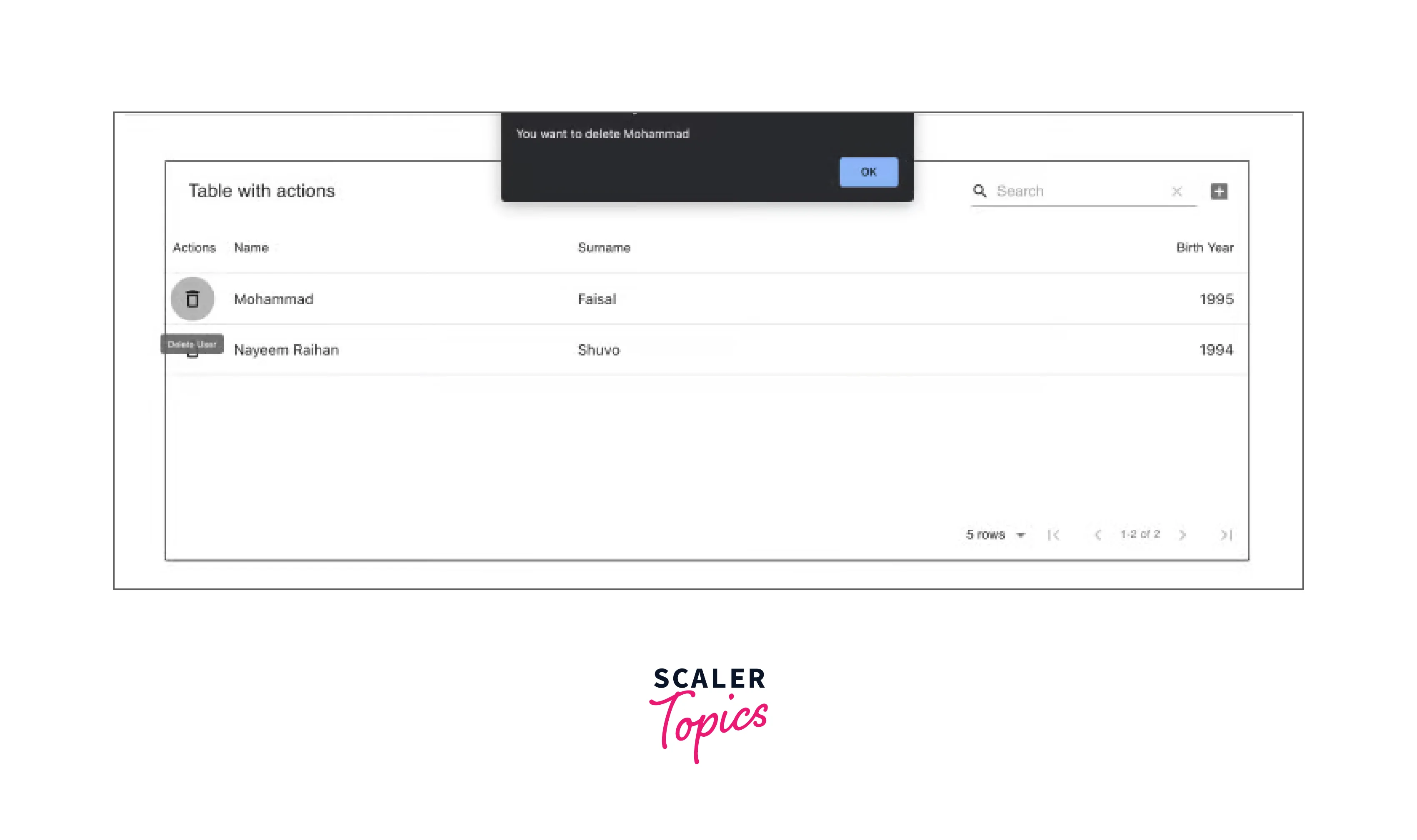
To eliminate duplicates, we are eliminating the data and column props. Now, there will be two extra buttons on our table: an Add button in the upper right corner and then a Delete button one per row. This gives you the option to define the actions for the table. You can choose whether or not you wish to enable action by using the disabled property.
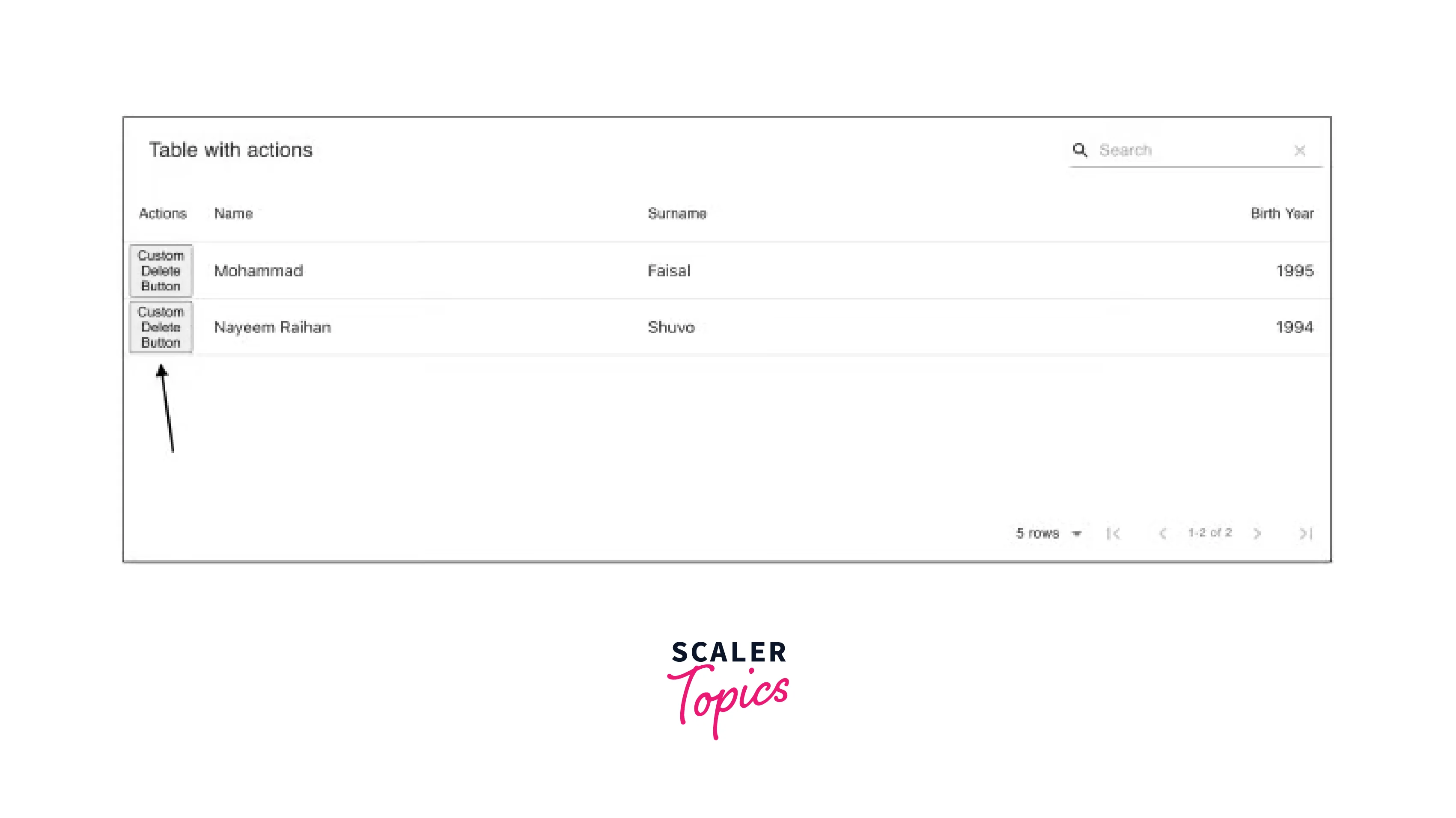
Override Table Components
Now suppose you would like to render a customized action button because you don't like the way the action buttons look. Or perhaps you dislike the way the table cells appear. You may alter the appearance and experience of any component with a material-table.
To accomplish this, the MaterialTable component accepts an extra argument named components, which allows you to override nearly every element of the table.
We'll alter our previous example's Delete button to demonstrate how this works. Assume we don't want a Delete icon, but rather a text button.
All that remains is to place the following prop on the table:
Now the table looks like this:
Custom Rendering
It's convenient to be able to override the components offered by the material table. What about developing our columns, though? As we've seen, the material-table handles the rendering after receiving the columns and data props from the user.
Assume we have a remote picture URL. The URL should not be shown (it would be silly to do so).
In this case, we are free to render anything we want, like an image component.
We must change the columns that are passed onto the table to accomplish that.
Let's add imageUrl to our prior example and render that by making the following changes:
.csv to .pdf
The material-table library's export function is by far the best feature. You might need to provide users with the option to export data to Excel or PDF when creating applications with a lot of data. Traditionally, you would need to employ a unique Excel library to accomplish that.
With material-table, all you need to do is pass an option that reads exportButton: true, and you're good to go.
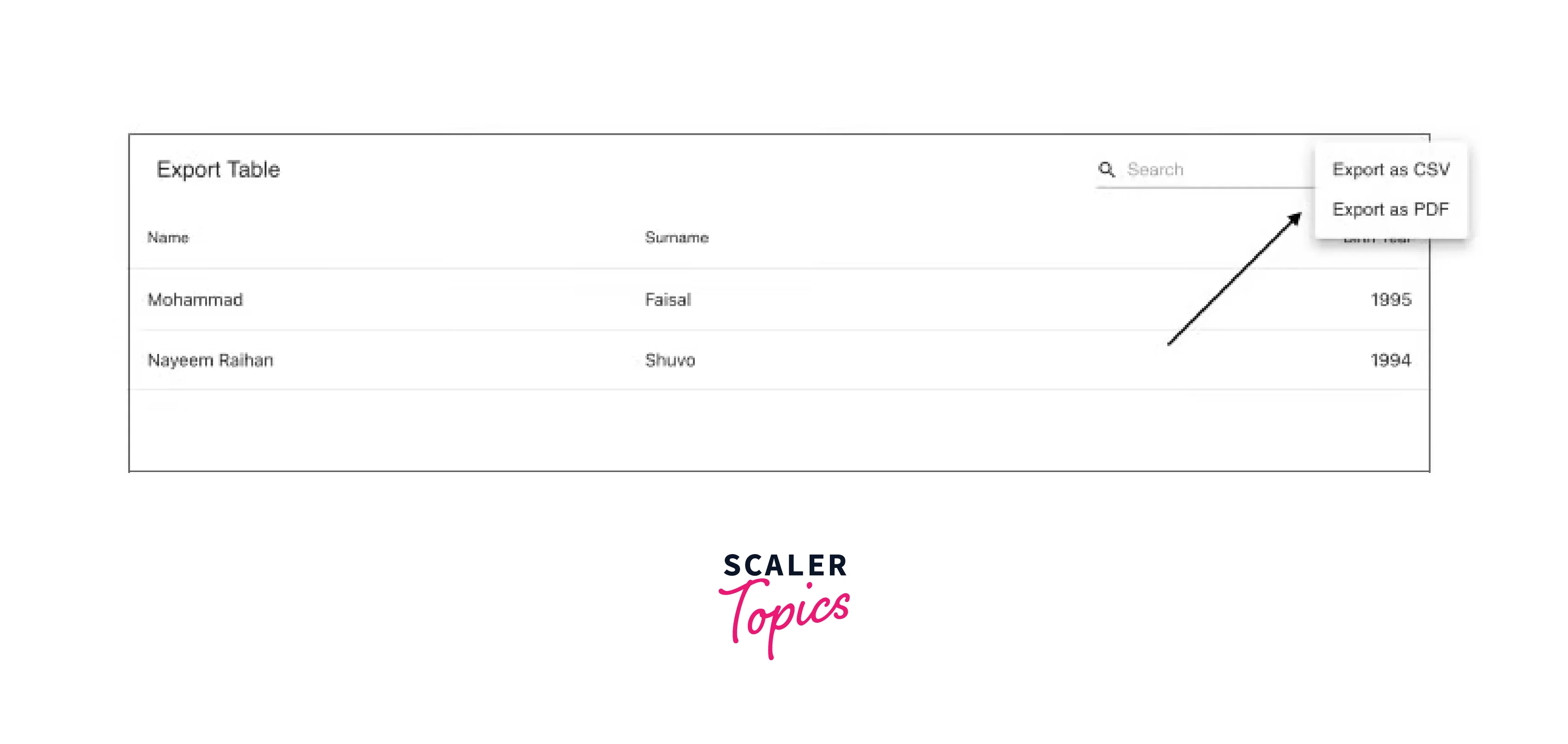
There will now be an extra icon above the table allowing individuals to download data in both .csv and .pdf formats.
Grouping Data
Imagine you own a list of individuals, each of them has a name, age, etc. How do you display individuals who are the same age on your table if you wish to?
You can easily group data with material-table. This would be very challenging to accomplish dynamically in any other kind of table. To accomplish this, the material table internally makes advantage of the amazing React DnD library.
You only need to pass the grouping
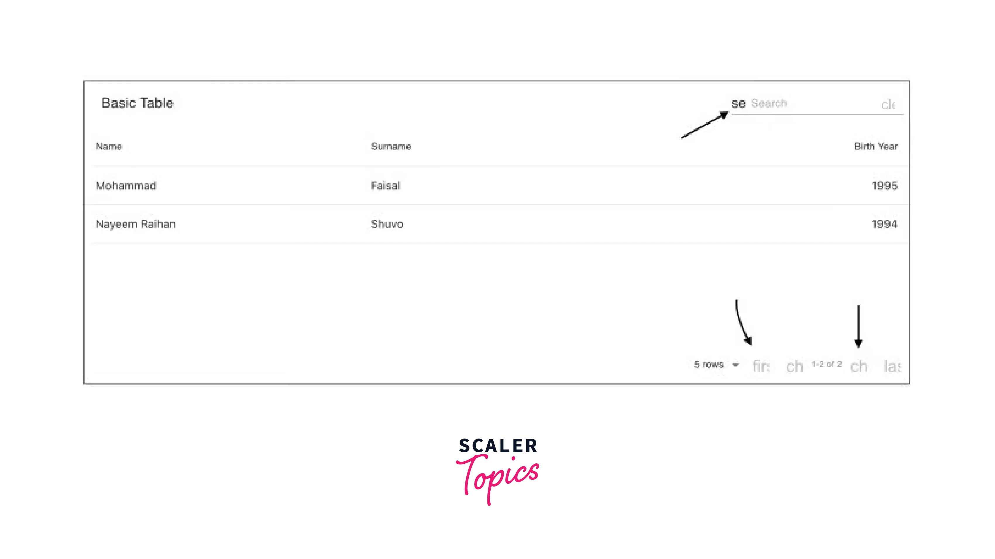
Searching and Sorting
Searching
As we've already seen, material-table gives us the option to perform a search operation on the data by default. By including styles in the settings, you can alter how the search bar looks and feels using options. searchFieldStyle.
If you don't want the search bar to appear for whatever reason, use search: false, as in:
Sorting
You can very easily sort your data with material table. You only need to pass sorting: true as an additional option.
You may quickly sort your data using material-table as well. Simply pass the sorting: true option as a second option.
Keep in mind that material-table will attempt to lexicographically order your data by default. If you want to sort using a different mechanism, you can do so by overriding the columns property, as seen below:
Alternatives to Material Table React
Although we concentrated on material-table in this article, you can utilize different table components in your React app. Let us look at a few interesting alternatives to material-table.
Rsuite-Table
rsuite-table offers many capabilities and is excellent for producing professional-looking tables. It supports practically all of the functionality stated above, however, there is no option to download data.
Additionally, data grouping is also not available.
React Table
React Table is a set of hooks that lets you add functionalities to any table component; unlike the other component libraries described here, it isn't a component library. As per the official website, it is stated that React Table is a table utility, not a table component.
React Table can be used for sorting, filtering, grouping, and other table-related features to any table component.
Conclusion
- Tables are an essential component of nearly any web application, particularly those that rely significantly on data.
- Material table react is developed on top of Material UI, a very popular React UI toolkit. A material table is a tool for efficiently constructing data tables in React applications.
- You must use react material-table 1.36.0 or upgrade your dependencies if you're using an older version of React.
- You can also add icons to your table components in react material table.
- Two additional types of actions can be added to our react material table:
- Actions for every row (such as deleting or updating a row)
- Actions for the entire table (such as adding new data to the table)
- Material table react can be used for searching, sorting, filtering, grouping, and other table-related features to any table component.