React Alerts
Overview
A built-in feature of the web, alert messages are frequently used in online applications to display status messages such as cautions, errors, success messages, information, and consent confirmations. We can see the alert message on most of the websites, they provide us with important pieces of information while filling out a form they tell us if we have entered the correct credentials or not, and many other things. React alerts allow us to implement this feature inside a React application.
Introduction to React Alert
react-alert is a lightweight react library that provides us with the functionality to add react alerts to our react application with ease. This library also has many customizations that can be directly applied to the alerts that react-alert creates.
react-alert even allows us to use a custom template that we can use for our alerts in our application.
Installation
Installation of react-alert is the same and simple as all other npm packages out there.
With npm
With yarn
react-alert allows the use of templates, we can use our custom template or we can use the templates provided by react-alert. These templates are
- Basic - npm install react-alert-template-basic
- Dark - npm install react-alert-template-oldschool-dark
- Material UI - npm install react-alert-template-mui
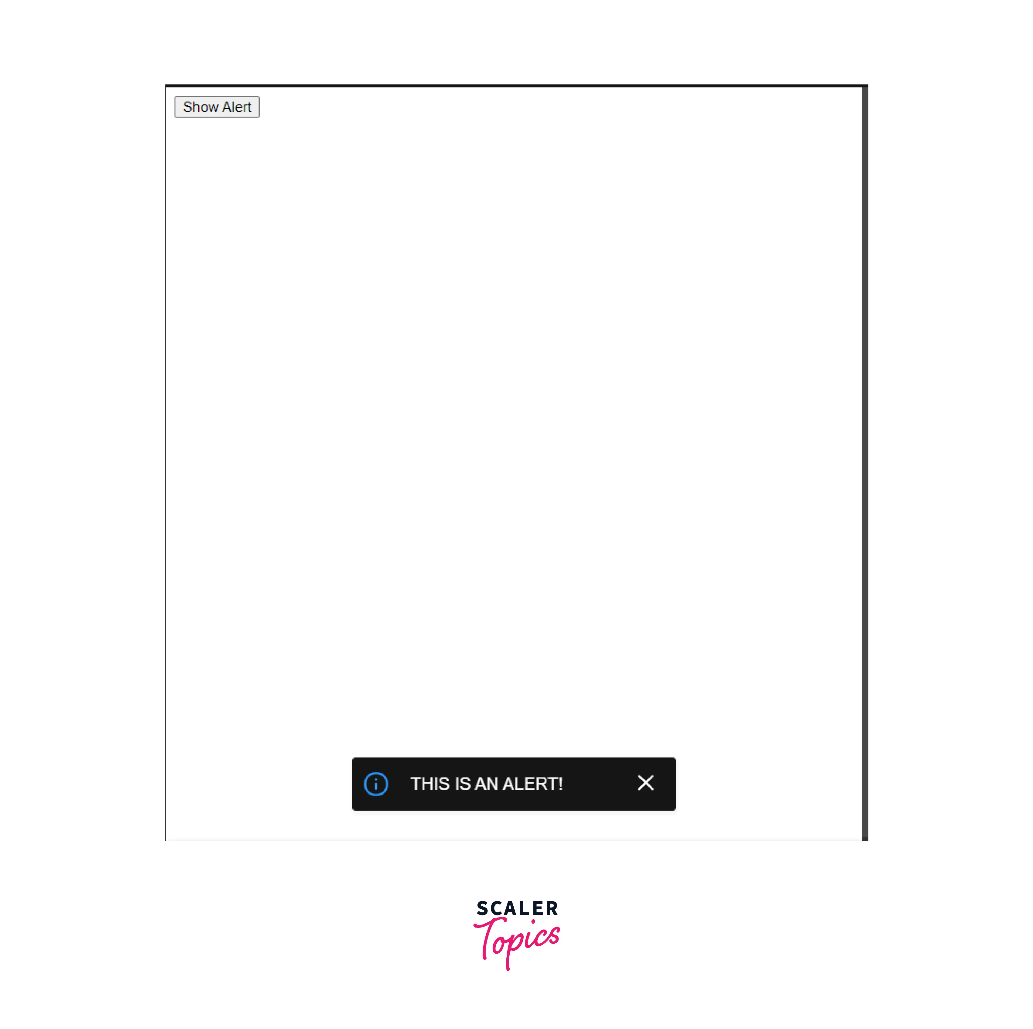
Let's see how we can use react-alert. react-alert provides a Wrapper Component that we use to wrap our <App/> component. This wrapper component accepts a template and some options.
In the index.js
Now in the child files of App.js we can import the useAlert hook
Output:
Now, let's look at the options object. This object contains a key-value pair which is used to customize the Alerts. The following properties can be added to the options object to show react alerts: offset : STRING position: Any one of the following options ['top left', 'top right', 'top centre', 'middle left', 'middle', 'middle right', 'bottom left', 'bottom right', 'bottom centre'] timeout : NUMBER, after this time the alert is removed type: one of ['info', 'success', 'error'] transition: one of ['fade', 'scale'] containerStyle : OBJECT, this is the style that you can apply to the container template: alert template to be used.
Now that we are using the useAlert hook, we can write the react alerts as
Remember we discussed that we can use either the provided templates or we can make our custom Alert Template.
Let's see how we can make our custom Alert Template.
Using a Component as a Message
react-alert also allows us to pass a component as a message. To do this you can simply pass a react component instead of the string.
Showing Alerts in Different Positions at the Same Time
It is possible to use many AlertProviders in a single project and layer them throughout the DOM tree if we need to split the logic of showing alerts in various spots simultaneously. Additionally, you can retrieve references to each alert separately by using various contexts.
Here is an example
Index.js
Output:
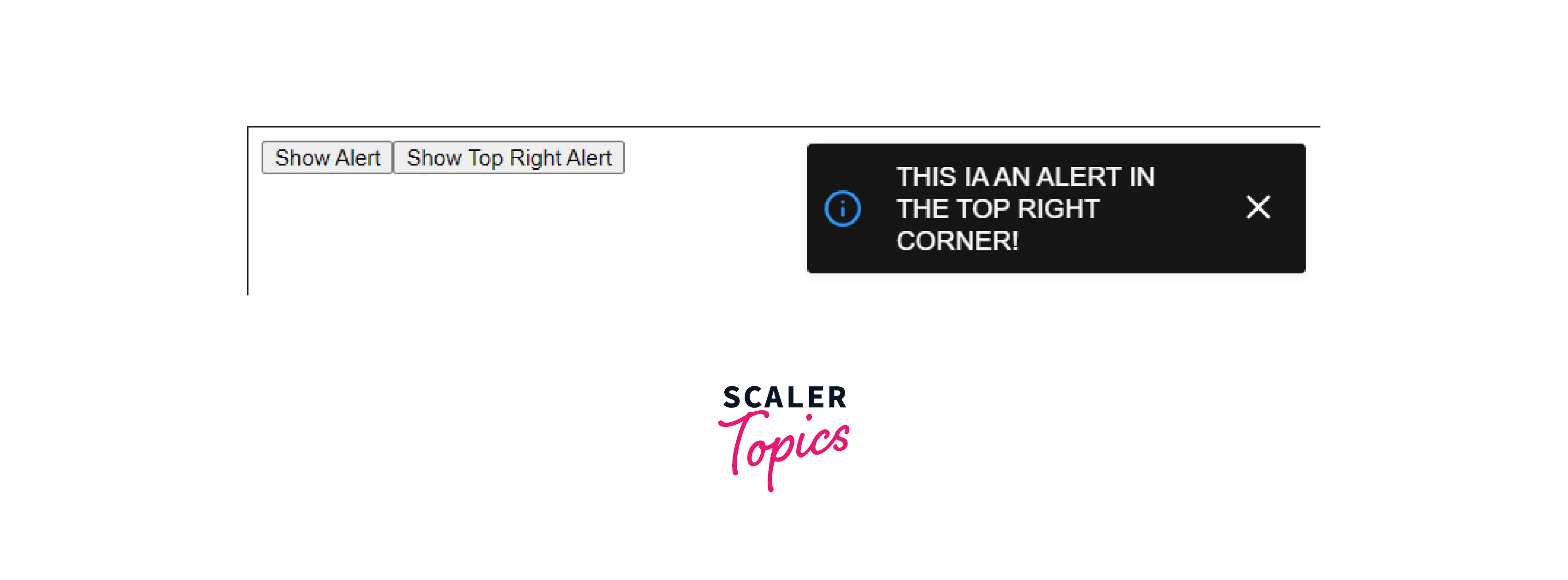
Explanation:
We generally don't nest a couple of AlertProviders for react alerts because it will complicate the management of alerts as you can see in the output of the above code. In such a case we can pass the position directly to the alert. The alerts without individual position property will take it from the Provider. The alerts which don't have an individual position property will take the position from the Provider. If we pass position to methods show, success, info, and error then it will overlap Provider's position.
Output:

Different React Alert Message Frameworks
Other than react-alert there are many different alert frameworks that are available to use. Let's take a look at some of them.
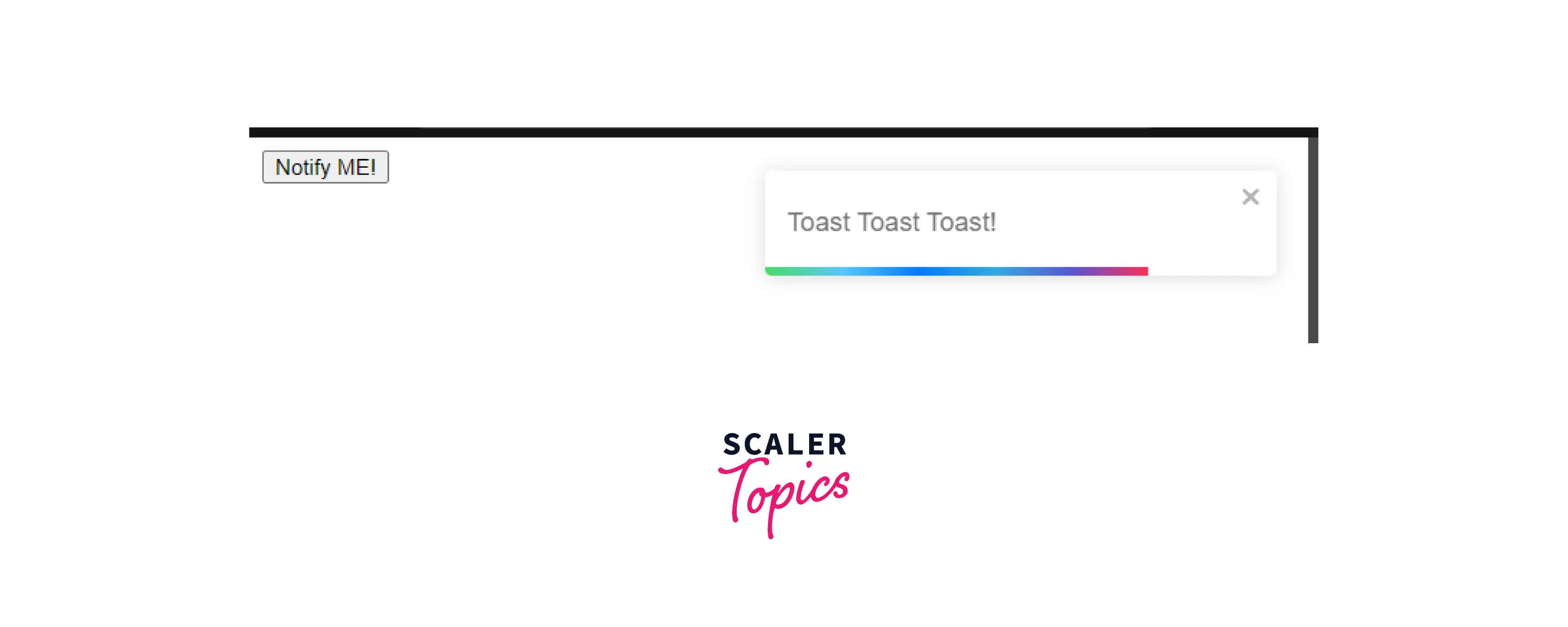
React-Toastify
react-toastify is a lightweight package that uses Toastify behind the scenes and enables us to add personalized react alerts in our React Application.
react-toastify is very simple to use
First, install the library: npm I react-toastify
Here is a working example:
Output:
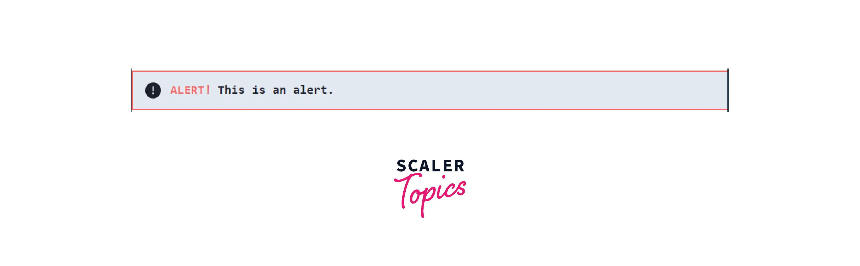
Rc-Notification
rc-notification is another React Component Library that allows us to add react alerts to our React Project.
First, install the library npm I rc-notification
Here is a working example
Chakra-Ui/Alert
Chakra UI is a popular react UI library that has an Alert component that provides simple, modular, accessible, reusable React components that make it super easy to create and customize alert messages in our React application.
Using Chakra Alerts is very simple
Output:
Conclusion
In this article, we have covered about
- Alert messages are used on websites to provide useful information such as errors, cautions, information, etc.
- react-alert is a React library that allows us to add react alerts in our react application by providing us with many customizations that we can apply to the alerts that we create.
- We can also add our custom Alert Templates in react-alert.
- With react-alert we are not limited to a single alert, but we can place multiple alerts.
- We have also seen other popular alert libraries like
- React Toastify
- Rc Notification
- Chakra-ui/alert