React Animation
Overview
Animations are created by the manipulation of images and could be used to make any website more attractive. The main reason for adding animation to a website is to convey information effectively and we can make use of react animation libraries to add stunning animations to our website. You can refer to Samsung and Apple websites for the role played by animation in marketing their products.
React Animation could be achieved by image manipulation using javascript, CSS, or any styling libraries.
Top React Animation Libraries
Multiple react libraries could be used to create smooth and amazing animations. Let us explore a few of these libraries,
Framer Motion
Framer motion is one of the best libraries to create production-ready stunning animations. We could implement robust and complex user interaction animation in react using this library.
Features:
- The Frame motion react animation library provides multiple customizations props to modify our animations.
- The library focuses on accessibility constraints by providing reduced motion configuration for animated components.
- The library includes components like m and LazyMotion that could be used to reduce the bundle size of the application leading to faster loading of websites.
- Provides a wide range of examples and documentation for the implementation of animations.
- There is also support for server-side rendering frameworks like next.js, and gatsby.
- We can also create 3d animations using the framer-motion-3d library.
Installation:
The following commands could be used to install the package using the npm or yarn package managers respectively,
This react animation library also provides full support for typescript.
Usage:
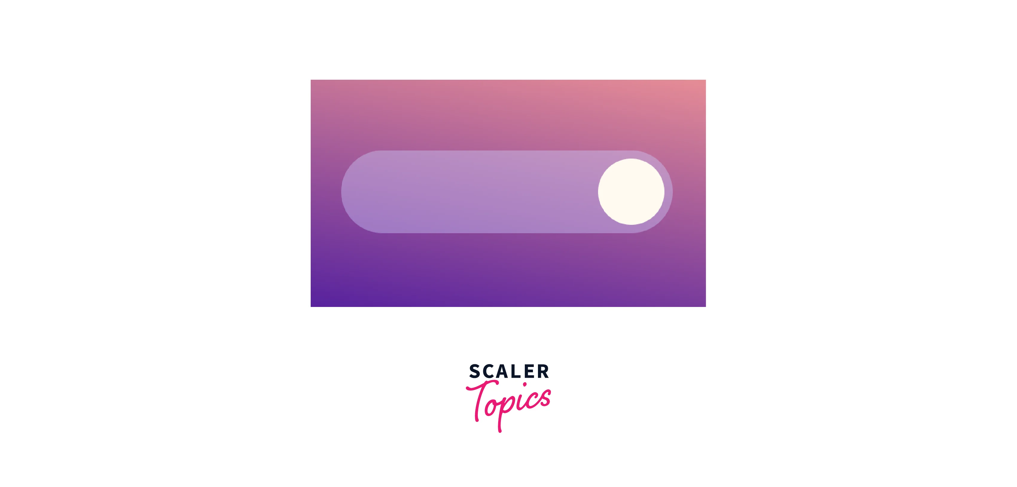
The react animation by the framer is created by using the motion component which is the basic component is DOM that is optimized for 60 fps animations. Let us create a simple toggle button animation using the framer motion library,
The above animation is called layout animation as the animation is invoked by changing the flex layout of the button.
- The layout option is used to animate the button whenever the layout changes.
- The transition prop receives an object which determines the properties of the animation. We can specify the animation duration, damping(speed of motion), stiffness(force against the motion), and much more.
- The data- property is used to add custom data to the div component and in our case, it is used to send the current status of the toggle button to the switch class styles to change the layout.
- The value of the data-Option is maintained by the toggledOn state.
React-spring
The react spring library provides animation in react based on the physics of spring and fluid interactivity. This library supports five platforms including react native animations.
Features:
- Provides the features to run animations without the need to update the states.
- Supports server-side rendering and typescript.
- Provides @react-spring/three package to work with react three fiber library to create 3D designs and work with webGL.
- The library has support for testing with the jest library.
- Multiple hooks are provided to control and customize the animations.
- Easy to create and configure animations.
Installation:
The following commands could be used to install the package using the npm and yarn package managers respectively,
We can also install the smaller version of the package, @react-spring/web that has the components used specifically for web applications.
Usage:
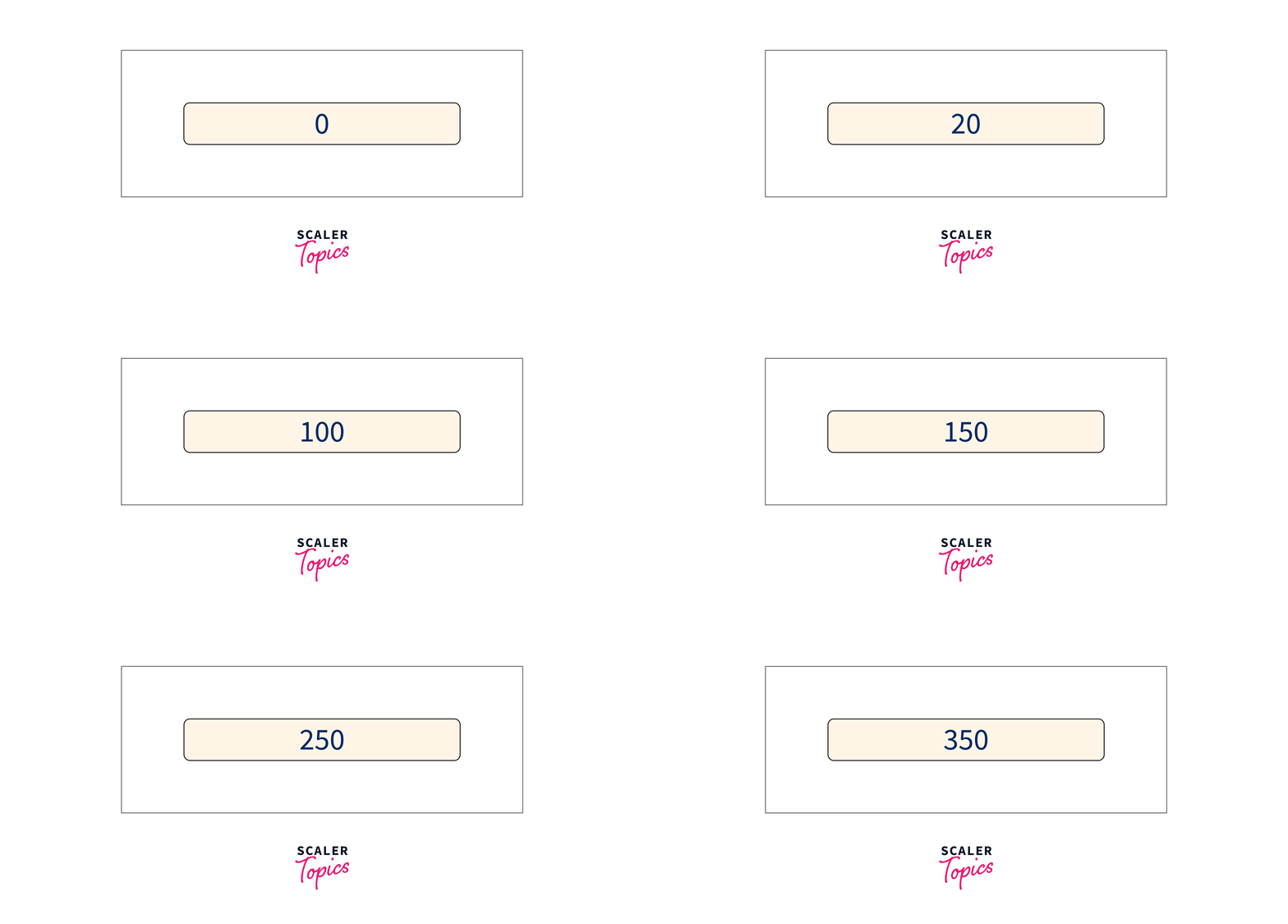
In react spring animations we can use the animated component to animate an element. The animated component is a react higher-order component with logic for running animations. Let us create a toggle button, which fills up when clicked,
The useSpring() hook is used to create an animation configuration object which is passed into an animated component.
- In our example, we are animating a button that fills when clicked. The important part is that the button only gets filled up to the available screen width.
- The useMeasure() hook gets the reference to an element and stores the width of the element.
- The width is maintained by the useSpring() hook based on the toggle state of the button.
- If the button is toggled on, the available width returned by useMeasure() is filled with properties from the fill class.
- The toFixed(0) method is used to represent the width in decimal.
- The style prop is used to pass the animation configuration from useSpring(). We can see that there is no specific animation configuration, as react springs handles it for us.
Remotion
Remotion is a react framework for creating videos and animations using react components and web programming.
Features:
- Remotion provides a player on the web which could be used to pause and play the video.
- We can use algorithms, API, and much more functions to create new effects.
- Provides support for server-side rendering.
- This library also supports features of react like quick reload and compositions.
- This library gives the power to create dynamic videos based on inputs.
Installation:
We can create a remotion project by any of the following commands,
After running the command, the required packages are installed. We can preview the created video or animations by running the application using,
We can also render our video into a .mp4 file using the following command,
Usage:
Let us understand the initial setup required to create a video or react animation using the remotion library.
- The AbsoluteFill is a component with a flex column design for arranging the components.
- A remotion app has a width, height, number of frames in an application, and duration of frames per second.
- We can get such information using the useVideoConfig() hook.
- The Composition component could be used to render a video directly into the application with defined frames and fps.
React Motion
React motion is a simple react animations package that is used to build realistic spring-based animations.
Features:
- Provides physics-based configurations that work for any animations.
- This library provides better alternatives for TransitionGroup components.
- Has robust support for typescript.
- Provides spring, Motion, staggered motion, TransitionMotion, and preset APIs to develop smooth animations.
Installation:
The react move animation package can be installed using any of the following commands based on the package manager,
We can also use the bower package manager to install the react motion package using the following command,
Usage:
The animations are used inside the Motion component and the style prop that receives a number or OpaqueConfig object returned from the spring function.
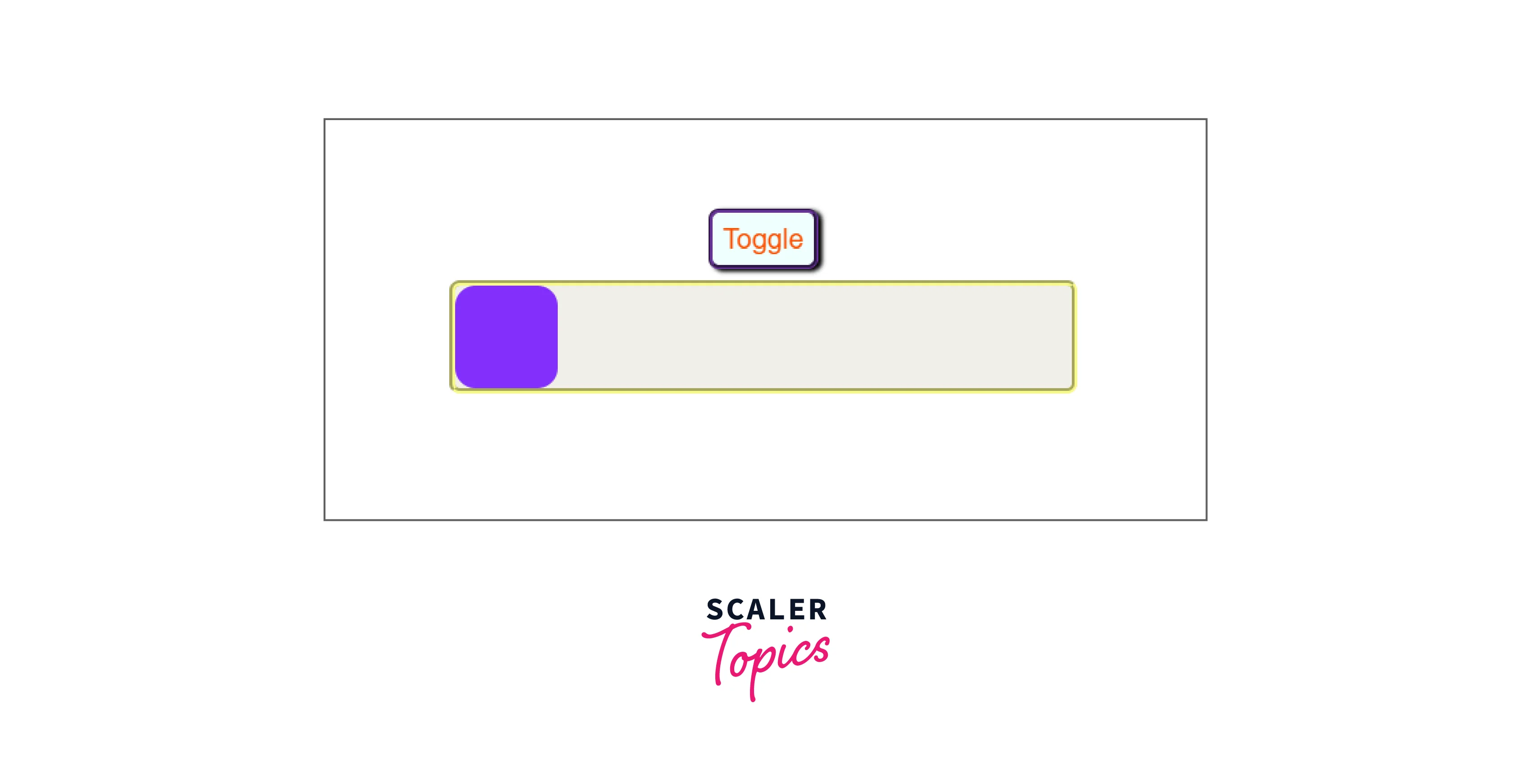
- In our example, we specify the distance the violet bar has to move in the spring function based on the toggle state. This provides no interpolation.
- The WebkitTransform and transform are CSS properties that make the animation move by an x distance.
- The smoothness and easiness of the react animation are maintained by the Motion component.
React Move
React move is the package used to create data-driven and smooth animations in reactjs. It could also be used for animation in React Native and react VR.
Features:
- Availability of start, interrupt, and end animation lifecycle events.
- Provides support for typescript.
- The package provides custom tweening functions and customizations over the delay, duration, and easing of animations.
- Provides a lot of examples with good documentation.
Installation:
The following commands could be used to install the package using the npm and yarn package managers respectively,
Usage:
Let us create a simple toggle component similar to the previous examples using the react move library,
The Animate component is used to control the animation. The start function is used to set the initial value of x at the start of the animation and the update function is used to set the updated value of x to move the animation. The movement of the animation is performed by the transform property of CSS. The easeExpOut effect provides a smooth outwards animation to the component. We can also add tasks when the animation ends using the leave() method.
React-anime
React-anime is a react animations library that is developed based on the anime.js javascript library that could be used to create smooth and complex animations.
Features:
- Nested animations could be produced simply by using <Anime> component inside another <Anime> component.
- The delay prop could be used to create cascading animations.
- Provides typescript support and also has features to create dynamic react animations.
- Could be used to animate CSS, SVG, and DOM attributes easily.
Installation:
The following commands could be used to install the package using the npm and yarn package managers respectively,
Usage:
The Anime component has support for multiple customization props and is used to create animations. The following examples show the usage of react anime library,
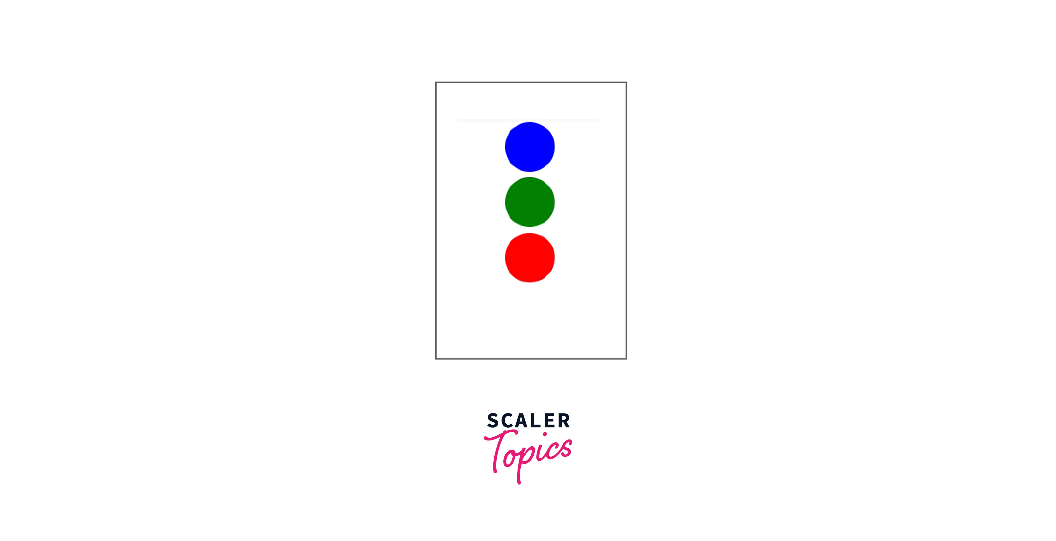
The above example produces an animation that moves three colored balls from right to left using the translateX property with a total animation duration of 1 second. The scale is used to change the dimensions of the image during animations.
- We can also set the loop prop to true to repeat the animation.
- We can achieve a front and back effect by setting the direction prop as alternate.
- The delay prop defines the time between each animation in a loop environment.
React Awsome Reveal
The react awesomely reveal anime utilizes the intersection observer API to find the appearance of an element on the screen and provide reveal animations to the element. The library uses the emotion styling engine to provide animations.
Features:
- Includes features to create custom animations.
- A lightweight package with typescript and server-side rendering support.
- Availability of native asynchronous API and hardware acceleration.
- This library has support for tree shaking.
Tree Shaking refers to the removal of unused imports to reduce the size of the bundle for better performance.
Installation:
The following commands could be used to install the package using the npm and yarn package managers respectively,
The emotions styling engine should also be installed together.
Usage:
This library provides a different component to create reveal animations. The
The Slide component provides a slide In animation and the Fade component makes the text appear through a fade effect.
- The damping prop is used to slow down an animation effect.
- The delay prop determines the time to wait before the appearance of the animation.
- The cascade prop is used to chain multiple animations.
Animating React App with 1 Line Code
We can utilize the autoAnimate method from the @formkit/auto-animate package to add animation to our website with a single line of code. The autoAnimate property can be used to apply simple animations to any components and will animate whenever a child is added, removed, or moved around.
The animateRef object stores the reference to the div variable and when a child is added or modified to the reference variable, the autoAnimate function is invoked using the useEffect hook, and a smooth transition is shown in the modification of the child component.
React Transition Group Components for Animation
React transition groups can be used to implement entering and exiting transitions of a component in a website. The library achieves animation by grouping elements and modifying the DOM.
Installations
The following commands could be used to install the react transition react animation package using the npm and yarn package managers respectively,
Transitions
The transition component is used to animate the mounting and unmounting of a component, but can also be used for in-place transitions. We can apply animations in entering, entering, exiting, and exiting states.
CSS Transitions
The CSS transitions method implements animations by using CSS. The states in this transition are appeared, enter and exit. These animations should be applied to two classes at a time where the second class has the .active pseudo selector.
The active pseudo selector indicates an element that is being interacted with the user.
Transition Group
This component manages all the components as a list and controls the mounting and unmounting of the component.
Examples:
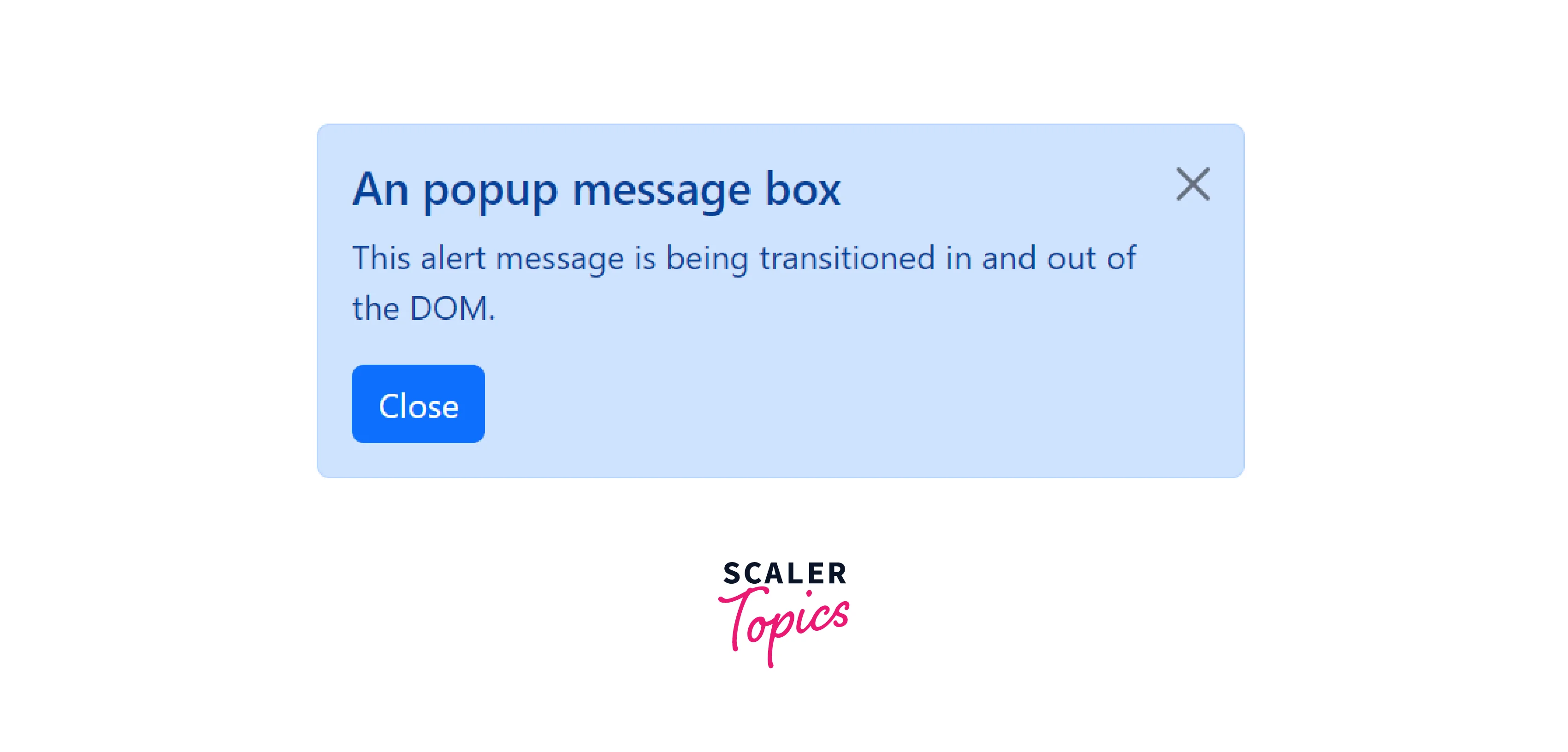
The below example shows the creation of an animated popup box,
The popup box is mounted to the Alert component using the nodeRef prop. The onEnter and onExit functions are used to invoke the animations for opening and closing the popup box.
What is React Animation?
The react animations library can be used with any inline style library which supports defining keyframe animations like Radium or Aphrodite.
We can install the react animations library using the following command,
Usage
Radium is an inline styling library and we can combine it with react animations to produce animations,
The StyleRoot component allows the usage of multiple inline styling features like media queries, keyframes, etc... The radium keyframes are used to add the bounce animation from react-animations to the div component.
List of All the Animations
There are different types of animation available and here are some major classifications of animations,
- Bounce
- Fade
- Flash and Flip
- Roll and Rotate
- Shake, slide, and swing.
- Zoom and scale animations.
Conclusion
- React animations are used to create a user-friendly and interactive website.
- There are multiple react animation libraries that provide physics-based animations.
- We can also use the autoAnimate property to implement animations easily.
- The react transition Group provides component-level transition control for implementing animations.
- The react animation library is used along with react inline styling library to provide awesome animations.
