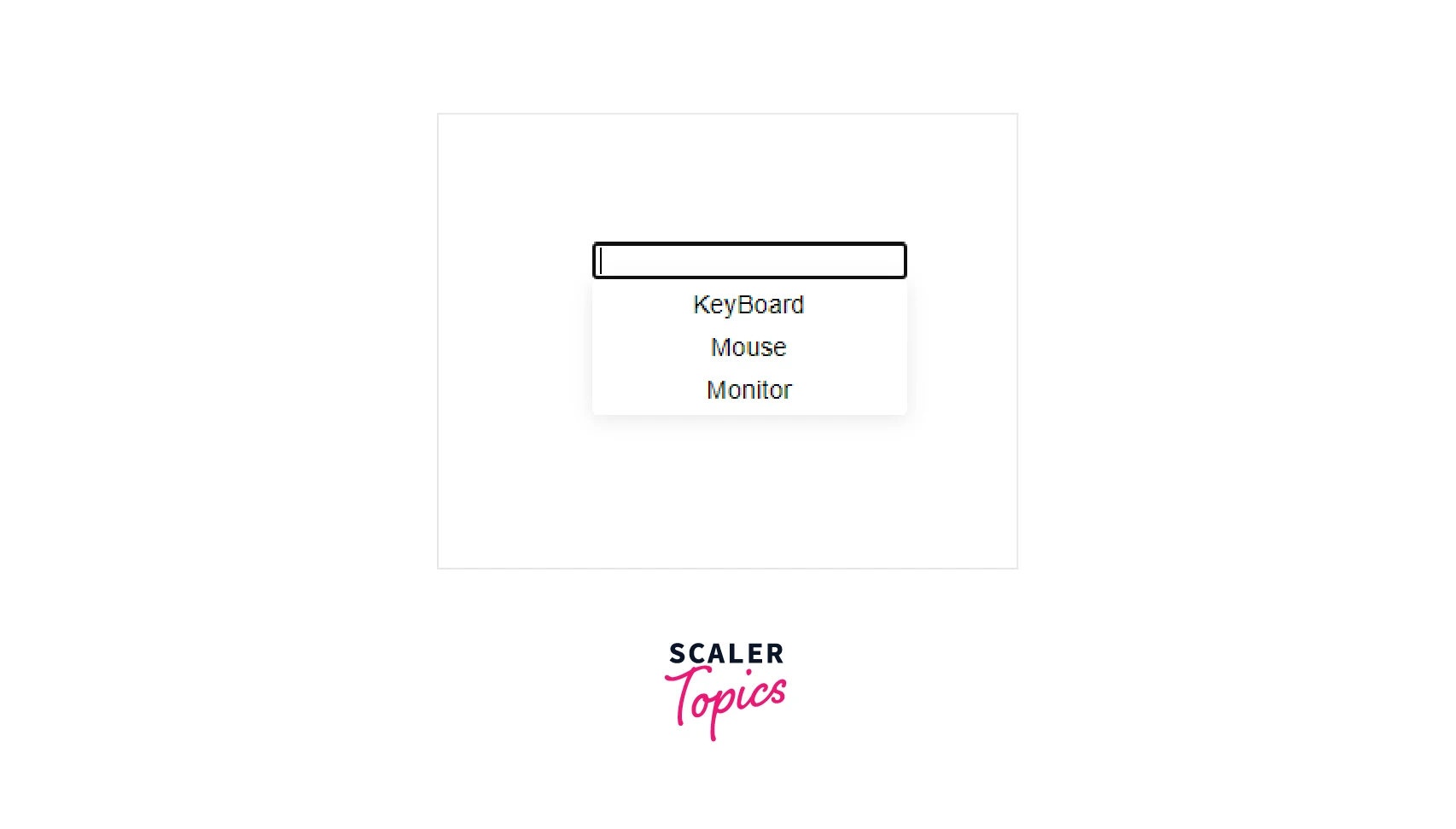
React Autocomplete
Overview
Have you ever wondered how data is automatically suggested to you while entering some data into a field? React autocomplete makes life easy and avoids mistakes by giving suggestions to a user. Autocomplete is a feature that suggests possible completions for a search or input field, based on the characters that have been typed. This can save users time and effort, and make search and input fields more user-friendly. React-autocomplete is a popular library for implementing autocomplete functionality in React applications.
React Autocomplete
React autocomplete is a module provided by react, which helps us to provide autocomplete feature in our application. Autocomplete is a feature in which an input field suggests a word based on user input. This helps improve the user experience in your application, such as in cases where a search is necessary.
1. Installation
To install a react-autocomplete module in our react app, we can use the following commands :
npm - npm install --save react-autocomplete
yarn - yarn add react-autocomplete
2. API
React-autocomplete provides us with many props which can be used to implement different functionalities :
Props
- getItemValue: In react-autocomplete, Used to read the display value from each entry in items
- items: The items to display in the dropdown menu
- autoHighlight: Whether or not to automatically highlight the top match in the dropdown menu
- isItemSelectable: Invoked when attempting to select an item. The return value is used to determine whether the item should be selectable or not.
- menuStyle: Styles that are applied to the dropdown menu.
- onChange: Invoked every time the user changes the input's value.
- onMenuVisibilityChange: Invoked every time the dropdown menu's visibility changes (i.e. every time it is displayed/hidden).
- onSelect: Invoked when the user selects an item from the dropdown menu
- renderInput: Invoked to generate the input element.
- renderMenu: Invoked to generate the render tree for the dropdown menu.
- value: The value to display in the input field.
Imperative API
The react-autocomplete library provides an imperative API, which allows developers to programmatically control the behavior of the autocomplete component. This can be useful in a variety of situations, such as when you want to programmatically trigger the autocomplete suggestions, or when you want to change the autocomplete input value from outside the component.
3. Development
You can start a local development environment with npm start. This command starts a static file server on localhost:8080 which serves the examples in examples/. Hot-reload mechanisms are in place which means you don't have to refresh the page or restart the build for changes to take effect.
To develop applications using React Autocomplete, you will need a development environment that includes Node.js and npm. You can then use the npm command to install the library and its dependencies.
4. Tests
We have seen in previous articles about testing react components. We can create tests and check our components by running them using the command to test our react-autocomplete: npm test.
5. Scripts
This library also includes several scripts that can be used to build, lint, and test the code. These scripts can be run using the npm command, for example:
npm run build
In summary, React Autocomplete is a useful library for adding autocomplete functionality to your React applications. It provides a flexible API and a set of scripts for building, linting, and testing the code.
Different Scenarios in React Autocomplete
React Autocomplete provides two different scenarios for implementing an autocomplete component:
- combo box.
- free solo.
Combo box
In the combo box scenario, the user can either select a suggestion from the list or enter a custom value to autocomplete in react. The list of suggestions is typically provided as a static array of options, but it can also be generated dynamically based on user input. The selected value is then stored in the component's state.
Here is an example of using React Autocomplete to implement a combo box:
Explaination
In this example, the ComboAutocomplete component is a functional component that takes in two props: items and onChange. The items prop is an array of objects, each with a value and a label field. The onChange prop is a callback function that will be called whenever the selected item in the react-autocomplete changes.
The ComboAutocomplete component uses the Autocomplete component from the react-autocomplete library to render the autocomplete. The getItemValue prop specifies that the value of each item in the autocompletes should be taken from its value field. The items prop is set to the items prop passed to the ComboAutocomplete component. The renderItem prop specifies how each item in the autocompletes should be rendered.
Now let's use this ComboAutocomplete component.
Explaination
In this example, the Example component uses the useState hook to manage the state of the selected value in the react-autocomplete. It also defines an array of items that will be passed to the ComboAutocomplete component as the items prop. When the user selects an item in the autocomplete, the setSelectedValue function will be called, which will update the selected value in the component's state. The selected value is then displayed below the autocomplete in react.

Free Solo
The Free Solo scenario involves using an external data source or API as react autocomplete input to provide autocomplete suggestions. In this scenario, the React-autocomplete library integrates with the external data source and uses this data as react autocomplete input to generate suggestions as the user types. This is useful when the options for autocomplete are not known ahead of time and need to be dynamically generated based on user input.
Here is an example of using React Autocomplete to implement a Free solo:
This example shows how the React-Autocomplete component can be used in conjunction with an external API to provide react autocomplete input which provides autocomplete suggestions in the Free Solo scenario. It demonstrates how the Autocomplete component can be configured to fetch suggestions from the API and how the suggestions can be rendered for the user to select.
Building An Autocomplete Component In React
Prerequisites
To build an autocomplete component in React, you will need to have a basic understanding of React and its components, as well as knowledge of how to use JavaScript to manipulate data and interact with external APIs.
Steps to build Autocomplete Component in React
Here are the steps you can follow to build an autocomplete component in React:
- Choose a data source for your autocomplete in react suggestions. This can be a pre-populated list of options, or it can be an external API that you will use to generate suggestions dynamically.
- Set up your React project and create a new component for your autocomplete functionality. This component will contain the logic for fetching suggestions, rendering them, and handling user input.
- Use the useState hook to manage the state of your component, including the current value of the input field and the list of autocomplete suggestions.
- Implement a function for fetching suggestions from your data source. If you are using a pre-populated list of options, this function can simply return the list. If you are using an external API, you will need to use JavaScript's fetch function to make a request to the API and return the response as a list of suggestions.
- Use the render method of your component to render the input field and the list of autocomplete suggestions. You can use the map function to iterate over the list of suggestions and create a list of <li> elements for each suggestion.
- Use the onChange event of the input field to update the current value of the input field in the component's state. You can also use this event to trigger a new request to the API to fetch updated suggestions based on the current value of the input field.
- Use the onSelect event of the input field to update the current value of the input field when the user selects a suggestion from the list. You can also use this event to hide the list of suggestions once a selection has been made.
By following these steps, you can create a basic autocomplete component in React-autocomplete that allows users to input a value and select from a list of suggestions. You can then customize and improve the component to meet the specific requirements of your application.
Here is an example of how you could implement an autocomplete component in React following the steps outlined above:
Explaination
This example is similar to the previous one, but instead of using an external API to generate suggestions in react-autocomplete, it uses a pre-populated list of options. The fetchSuggestions function filters the list of options based on the current value of the input field and updates the suggestions state with the filtered list. The render method then uses the map function to iterate over the suggestions and create a list of <li> elements for each suggestion. The onChange and onSelect events of the input field are used to update the component's state and hide the list of suggestions once a selection has been made.

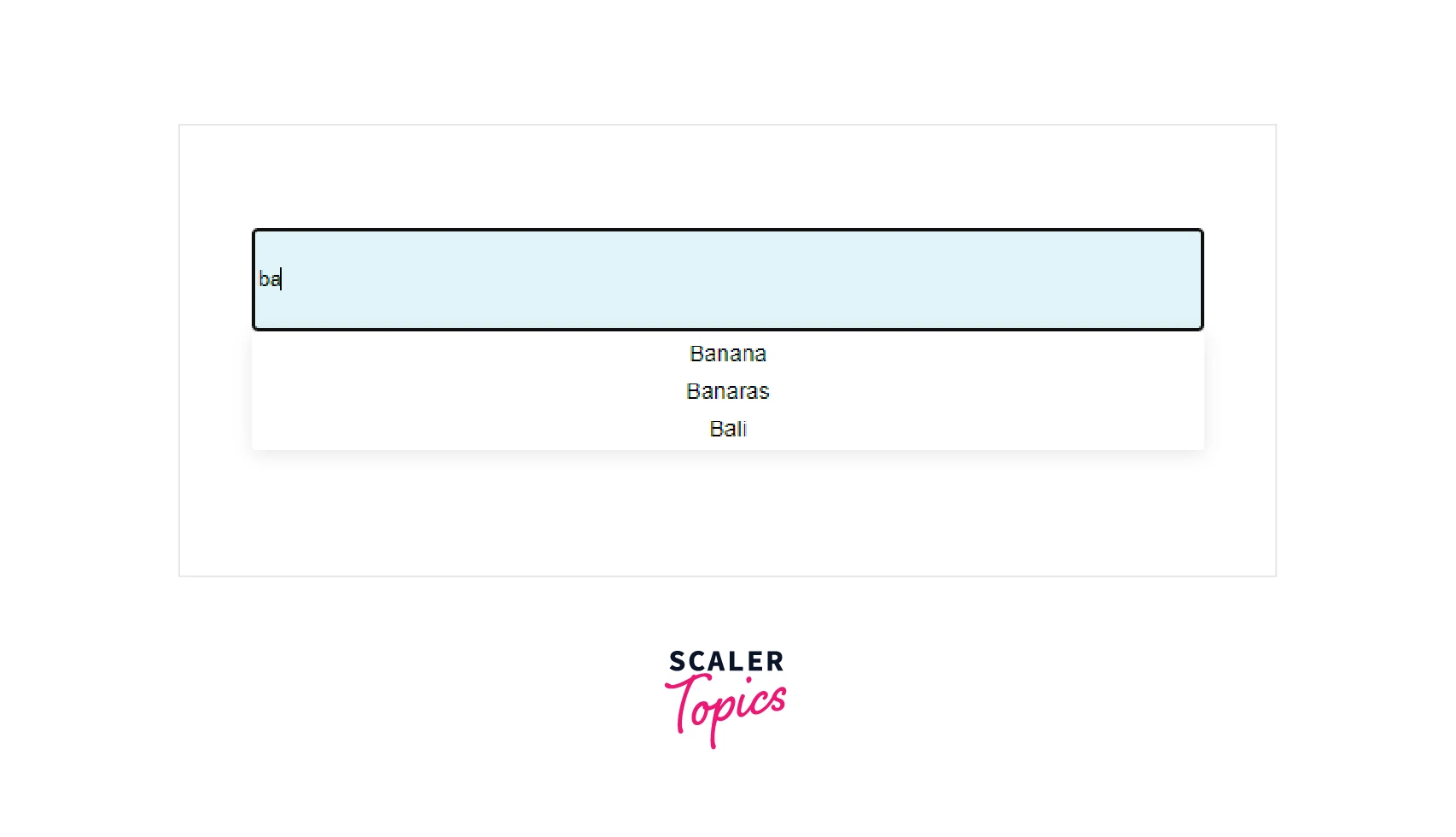
we can see there are multiple suggestions for the keyword ba.

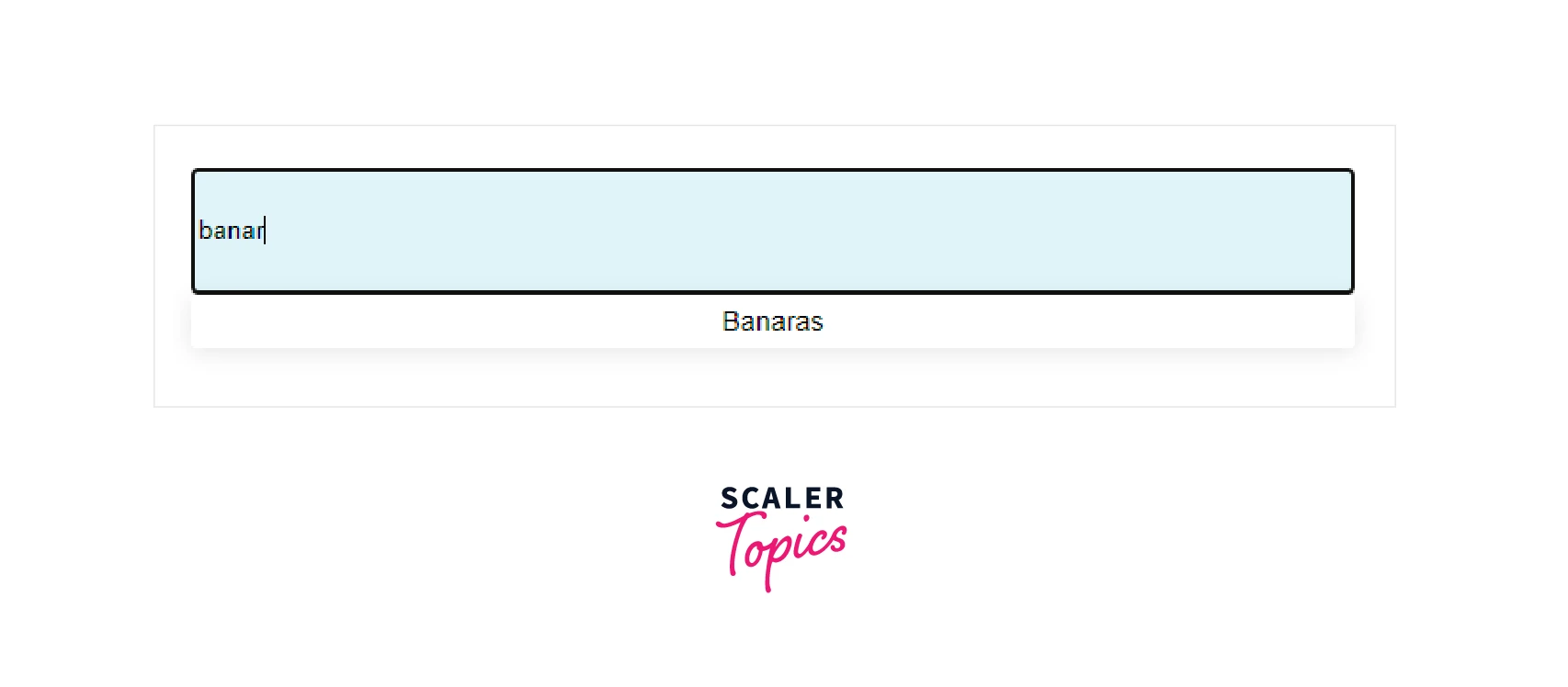
we can see there is only one suggestion for the keyword banar.

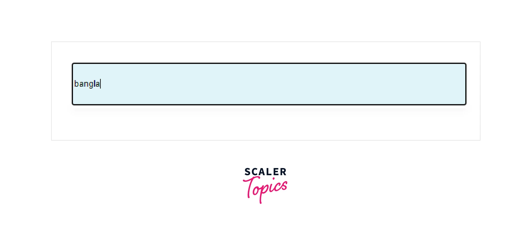
As we can see there is no suggestion for the keyword bangla.
Adding Styles To The React Autocomplete Component
To add styles to the React Autocomplete component, you can use the className and style props of the Autocomplete component. The className prop allows you to specify the CSS class(es) to be applied to the component, and the style prop allows you to specify inline styles to be applied to the component.
As we can see we have provided style using inputProps in Autocomplete . We can add more css according to our needs and UI.
FAQs
Here are some commonly asked questions about using react-autocomplete:
Q. What is react-autocomplete and what is it used for?
A. React-autocomplete is a package that provides a simple yet customizable input field for React applications. It is often used to enable users to quickly search for and select items from a list of options.
Q. How do I install react-autocomplete?
A. To install react-autocomplete, you can use the following command:
npm install react-autocomplete
Q. How do I use react-autocomplete?
A. To use react-autocomplete in your React application, you will first need to import the Autocomplete component from the react-autocomplete package. Then, you can use the Autocomplete component in your React JSX code.
Q. Can I customize the appearance of the react-autocomplete input field?
A. Yes, you can customize the appearance of the react-autocomplete input field by passing props to the Autocomplete component. For example, you can change the styles of the input field and the list of options by passing a style prop to the Autocomplete component, and you can change the placeholder text by passing a placeholder prop.
Q. Does react-autocomplete support asynchronous data fetching?
A. Yes, react-autocomplete supports asynchronous data fetching through the load options prop. You can provide a function that returns a promise to the load options prop, and react-autocomplete will call that function whenever the user types in the input field, passing the current value of the input field as an argument. The function should return a promise that resolves with an array of options to display in the list.
Conclusion
In conclusion,
- Autocomplete functionality is a useful and user-friendly tool for enhancing search and input fields in web applications.
- Autocomplete in react is easy to install and use, and it supports asynchronous data fetching through the loadOptions prop.
- You can customize the appearance of the input field and the list of options by passing props to the Autocomplete component in react-autocomplete.
- There can be two scenarios in react-autocomplete: combo box and free solo.
- In addition, the react-autocomplete library is lightweight and performance-optimized, ensuring that it won't slow down your application or impact its overall performance.
- Overall, react-autocomplete is a valuable tool for implementing search and selection functionality in React applications.
