Top React Charting Libraries
Overview
Data visualization has become part of many websites that are dealing with a large amount of data. Nobody likes to view statistical data in a table like an excel sheet on a website, but data can also be expressed efficiently using data visualization techniques such as charts and graphs. A chart can deliver important aspects such as status, progress, or range of the data easily and is perceived by many users more than a simple data table. There are many types of charts like bar charts, piechart, etc.. that can express data in different forms and can be used to learn the required information from data.
What is a React Chart Library?
- A charting library in react are third-party libraries that provide different components that are highly customizable and can be used to create charts based on data easily.
- Multiple libraries provided different types of graphs.
- We can create different types of charts such as LineChart, BarChart, AreaChart, Piechart, ScatterChart, CompositeChart, and RadarChart.
- React chart libraries provide different options to specify colors, design, and support different other customizations.
- Usually, data is provided as a prop to the components imported from the library. Details like the name of the axes, and the width, and height of the chart are also provided as props. It is important to note that the data must be in syntax specified by the library to be rendered in the application.
Top React Chart Libraries
Let us look into some of the best react chart libraries used by developers for creating visually stunning charts to express data easily. All the discussed libraries can be downloaded using the yarn or npm package manager.
Ant Design React Chart Library
The ant Design React Chart Library provides high-quality graphs with default configurations and it is also easily configurable according to our needs, responsive and lightweight. This library was developed based on the multiple javascript charting libraries with react and also supports typescript. This library provides different graph animations and also different graph events to interact with the charts. In addition to different charts, this library also provides a component to visualize data as relational graphs, flowcharts, and maps.
We can use the following command to install the ant design react chart library,
The basic configurations and a simple example to create a bar chart with the library are as follows,
Explanation
- The autofit option can be used to specify whether to use the specified height and width for the chart or to fit the chart according to its parent component.
- The name of the xField and yField must match the fields in the data object.
- The labels are used to show the sales data inside the graph. We can also specify the color, and opacity of the text shown inside the graph.
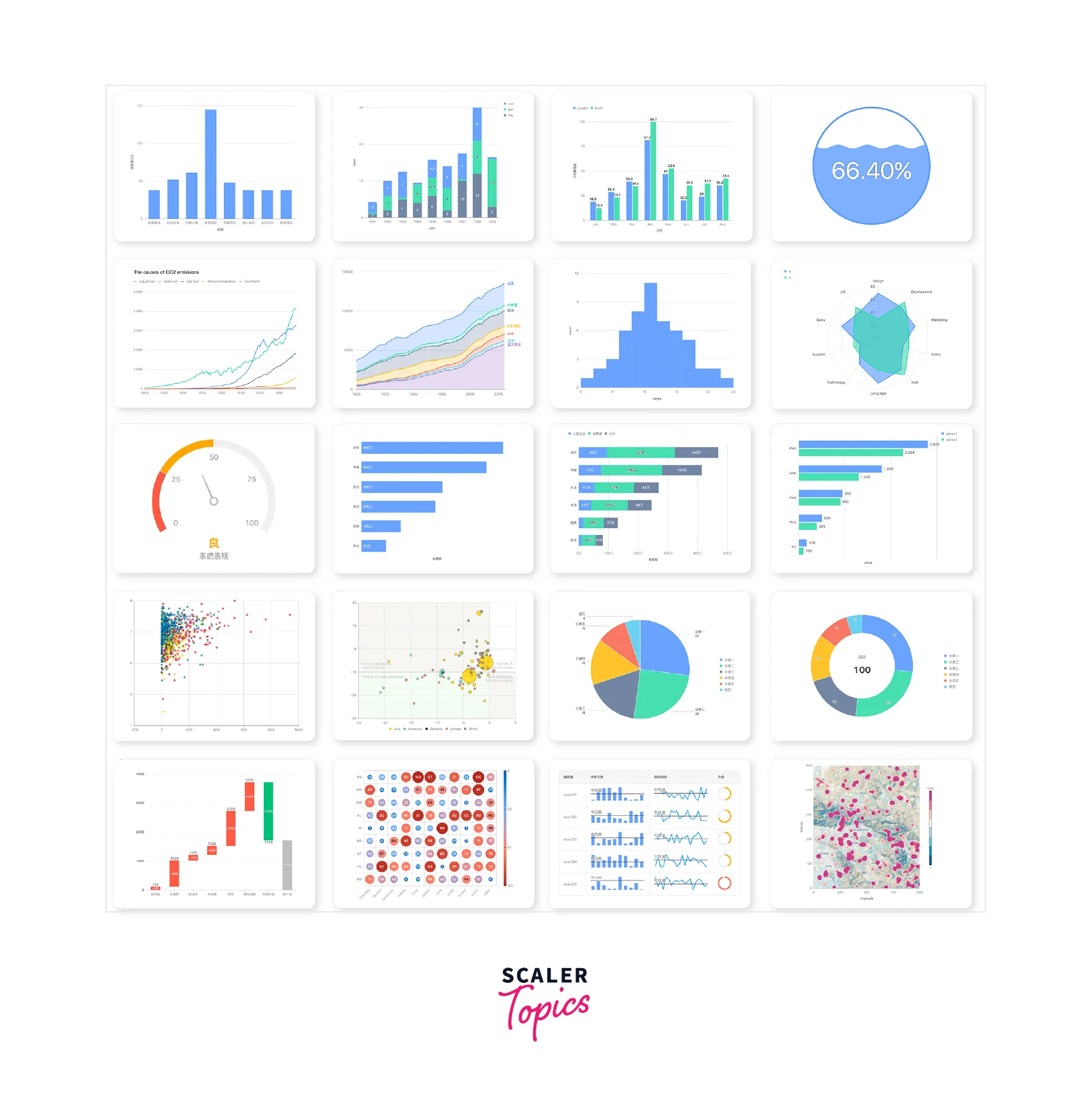
The above example can be used to create a bar chart like the first image of the image below.
BizCharts
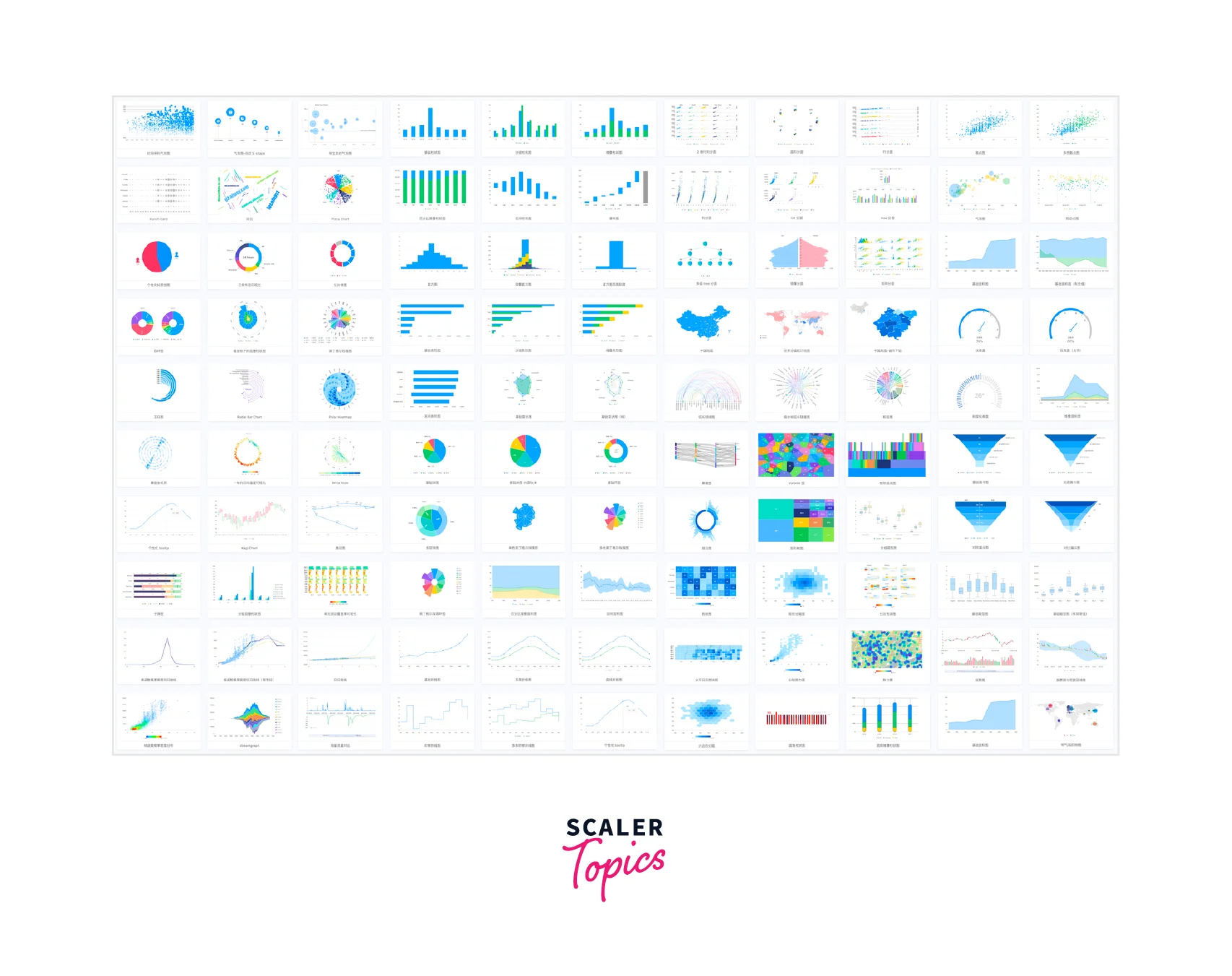
BizChart is another library that provides a large collection of charts for data visualization. Since the documentation of this library is present only in Chinese, it is hard to implement advanced customizations using this library, but simple user-friendly graphs can be easily created.
We can use the following command to install the bizchart library,
The simple configurations to create a graph using the library is as follows,
Explanation
- The Chart is the wrapper component in which data must be passed as a prop.
- The Interval is used for the axes of the graph. The position is of the format xcoordinates*ycoordinates. In our example, the year is used as X-coordinates, and sales is sued as Y-coordinates. The color shows the color of the graph.
- The Tooltip is used to show information about the graph and the shared option allows multiple tooltips to be shown.
eCharts For React
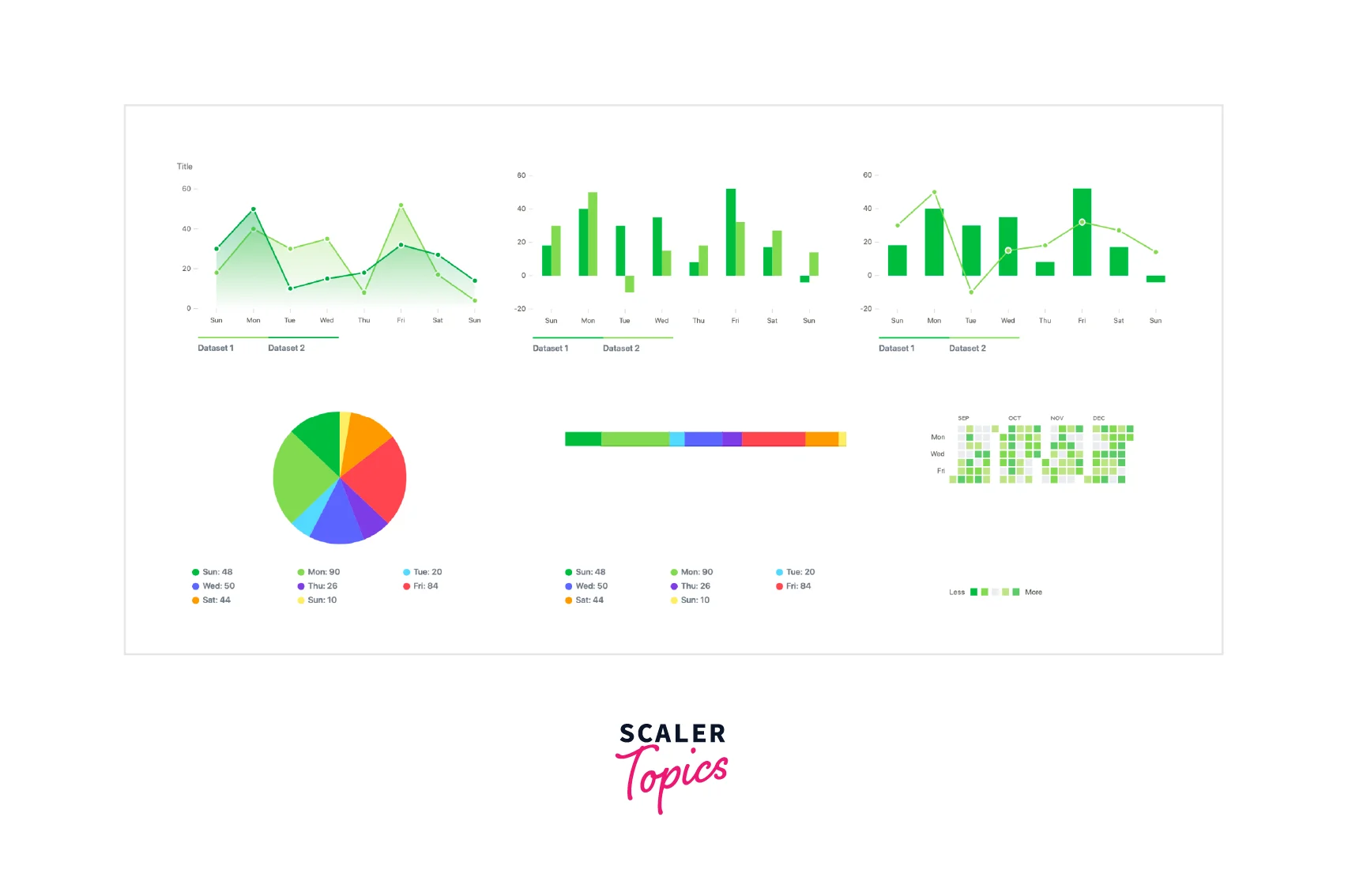
The eCharts react charting library provides multiple charts with different themes and animations. This library provides SVG support, mobile optimization, dynamic data visualization, 3D Visualization with WebGL, and much more features.
We can use the following command to install the eCharts For React library,
Let us see the basic configuration to create a bar chart using the eCharts library,
Explanation
- The type is the name of the axis and must be specified inside both the X and Y axis.
- The series has the data that is to be visualized and the type of chart that we want to display.
- The ReactEcharts is the base component and supports style like normal react elements. The height of the chart can be specified here or inside the config. The option must be passed as a prop.
Nivo
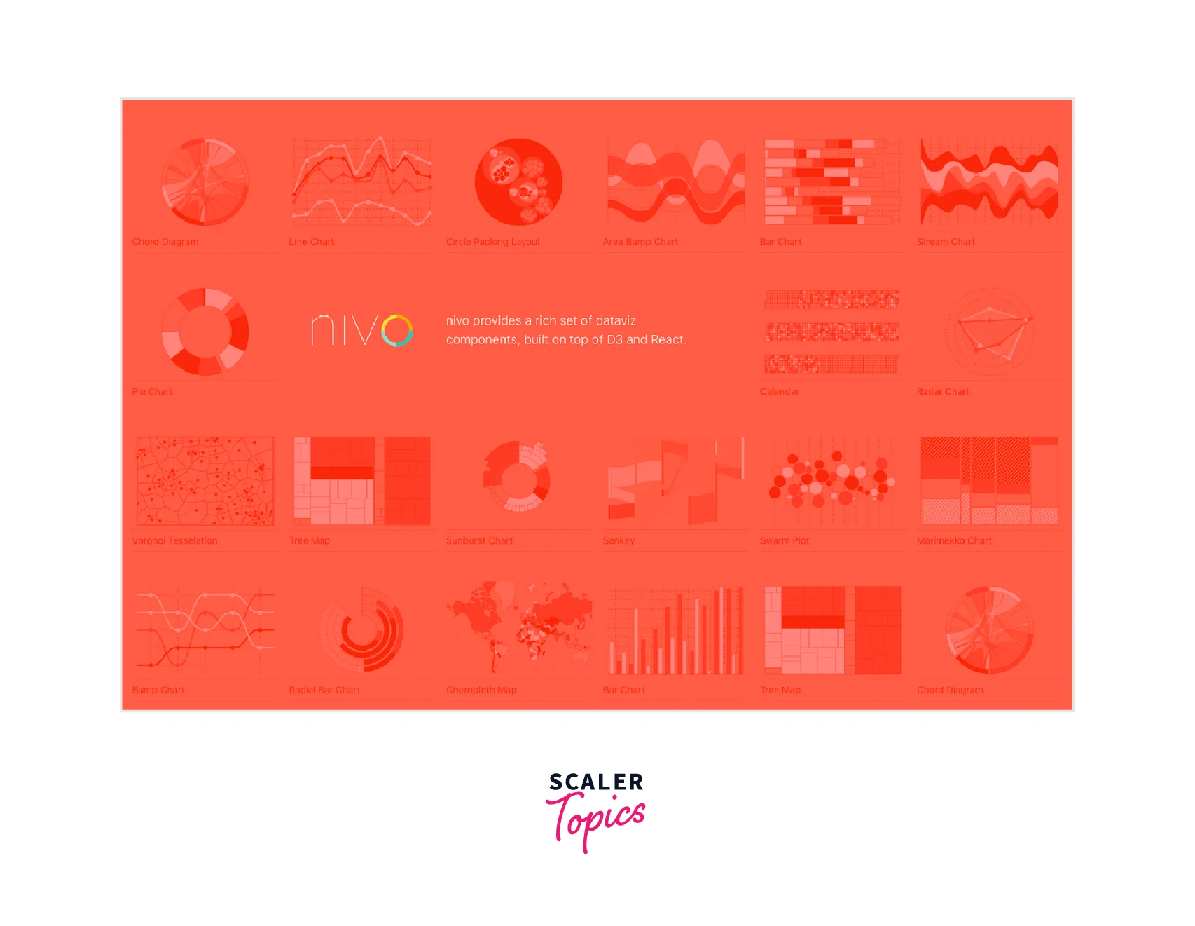
Nivo is another react charting library built using the javascript's D3 library. This package provides server-side rendering of charts, animations from the react swing library, multiple chart themes, and gradients. The charts are responsive and highly customizable.
The npm distribution of Nivo is different from other libraries and we need to install packages according to the graph we are going to use,
Let us explore the basic configurations for using the Nivo components to create graphs,
Explanation
- The keys are used to differentiate different types of data. The indexBy option is used to index data according to keys. In a bar chart, the key is set to the numeric data and the index is the name of the data.
- The valueScale option determines the size of the bar based on the value of the data. There are two options, linear and symbolic. Linear provides a constant representation and symbolic provides a larger graph for larger data.
- The animate option provides a transition effect on loading.
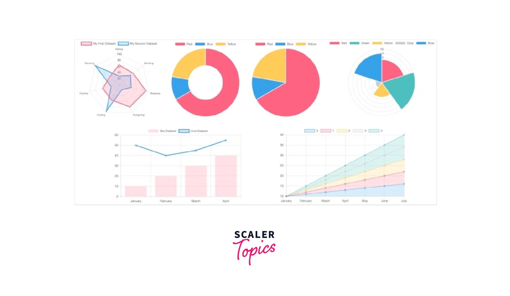
React Chart JS 2
React chart JS 2 charting library in react is one of the most popular libraries for data visualization. This library is a wrapper that runs the chartjs library that uses HTML canvas elements to create charts and is easy to use.
We can use the following command to install the React Chart JS 2 library. We must also install the chart.js library with this library.
Let us explore the configurations for the react chart js library,
Explanation
- The plugins option provides different elements to show inside the graph. A legend is used to show the colors used to represent different datasets and a title is shown at the top of the graph. We can specify the position of the legend.
- The data must have an array of labels that represent each column of data. The tooltip is enabled by default and label values are displayed inside the tooltip.
- The background color of each dataset can be specified along with the label of the dataset.
React Stockcharts
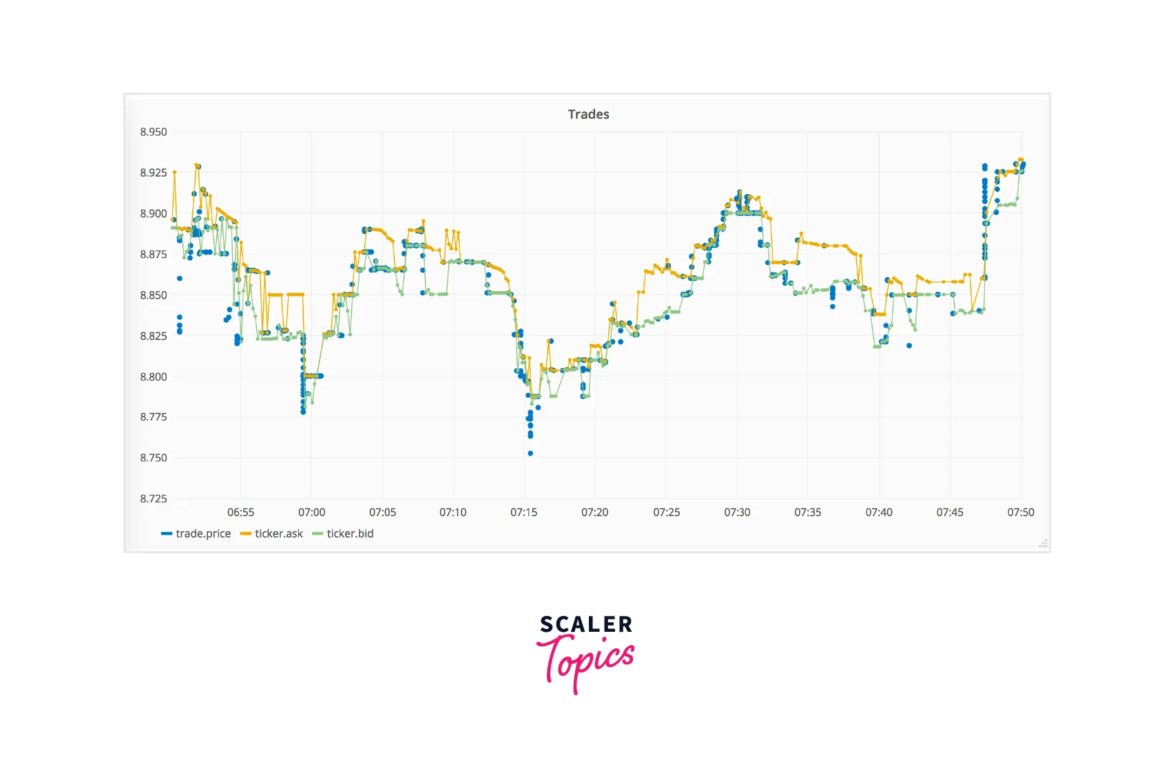
React stockcharts is another useful react charting library that can be used to visualize time series data. It provides a lot of indicators and components that can be added to the graph. The library provides fast performance and actions like zooming of graphs.
We can use the following command to install the React Stockcharts library.
Let us explore the configurations that must be made as props in the components of the library,
Explanation
- The Chart component must be present as a child to the ChartCanvas component.
- The graph type can be either SVG or hybrid. If hybrid is used, then the data series will be created on a canvas element and other elements will be created as an SVG.
- The XAxis and YAxis components are used to specify the position of the X and Y axis.
- The percentScale allow zooming interaction to our graph. It is not useful in a bar graph but can be used in an area graph.
- The xAxxessor is used to specify the data that will be used in the X axis and similarly for the yAxessor. The BarSeries is used to express data on a bar chart.
- The xExtents option can be used for uneven data and it specifies the start and end points to show during the rendering of the chart. We have specified the range as two dates in our example.
React Timeseries Charts
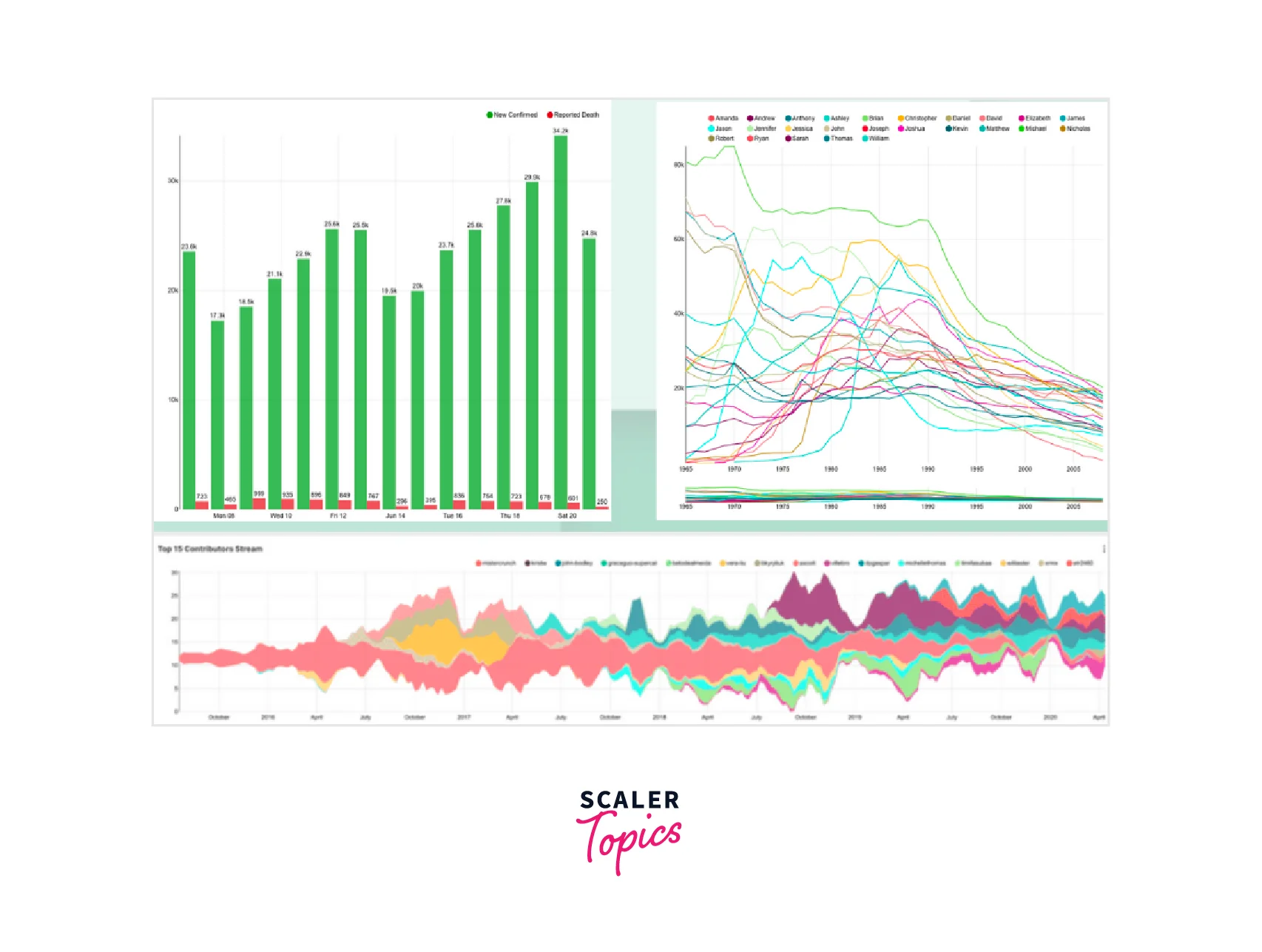
The react charting library, react timeseries charts are also created to visualize time series data. This library also provides interaction with graphs along with highlighting and indicators. We can also create chart overlays and multiple compositions on the X and Y axis.
We can use the following command to install the React Timeseries Charts library.
Let us look into the configurations used by the react time series charts library to visualize time data,
Explanation
- The ChartContainer is the parent component that has the timeRange prop which is used to specify the range of the Xaxis. All the charts inside this component will have the same X-axis.
- The ChartRow component can be used to create multiple charts that can be placed one above the other. The height prop must be specified in the ChartRow component. Each ChartRow component should have a Y-axis and central area to render graphs.
- The Charts component can have multiple charts that will be rendered as overlapping charts.
- The Yaxis can be described for each chart. The format is used to specify the representation of data in the axis. We can also specify the type of data such as linear or log in the type prop.
React Vis
React Vis is another react charting library that provides multiple common charts to visualize data. This library also is built based on the D3 JS library. The charts provide multiple interaction features, are customizable, and are easy to use.
We can use the following command to install the React Vis library.
The configurations of react vis library are easy to use and is as follows,
Explanation
- The XyPlot is the wrapper component in which dimensions can be specified and also accessors can be used to get the data.
- The Hint component provides a customizable tooltip. The data must be passed in the value prop.
- The HorizontalGridLines component is used to show horizontal lines inside a component. We can also specify the total number of lines in the tickTotal prop.
- The data must be an array of objects with X and Y fields. AreaSeries are usually highly stacked to show different data.
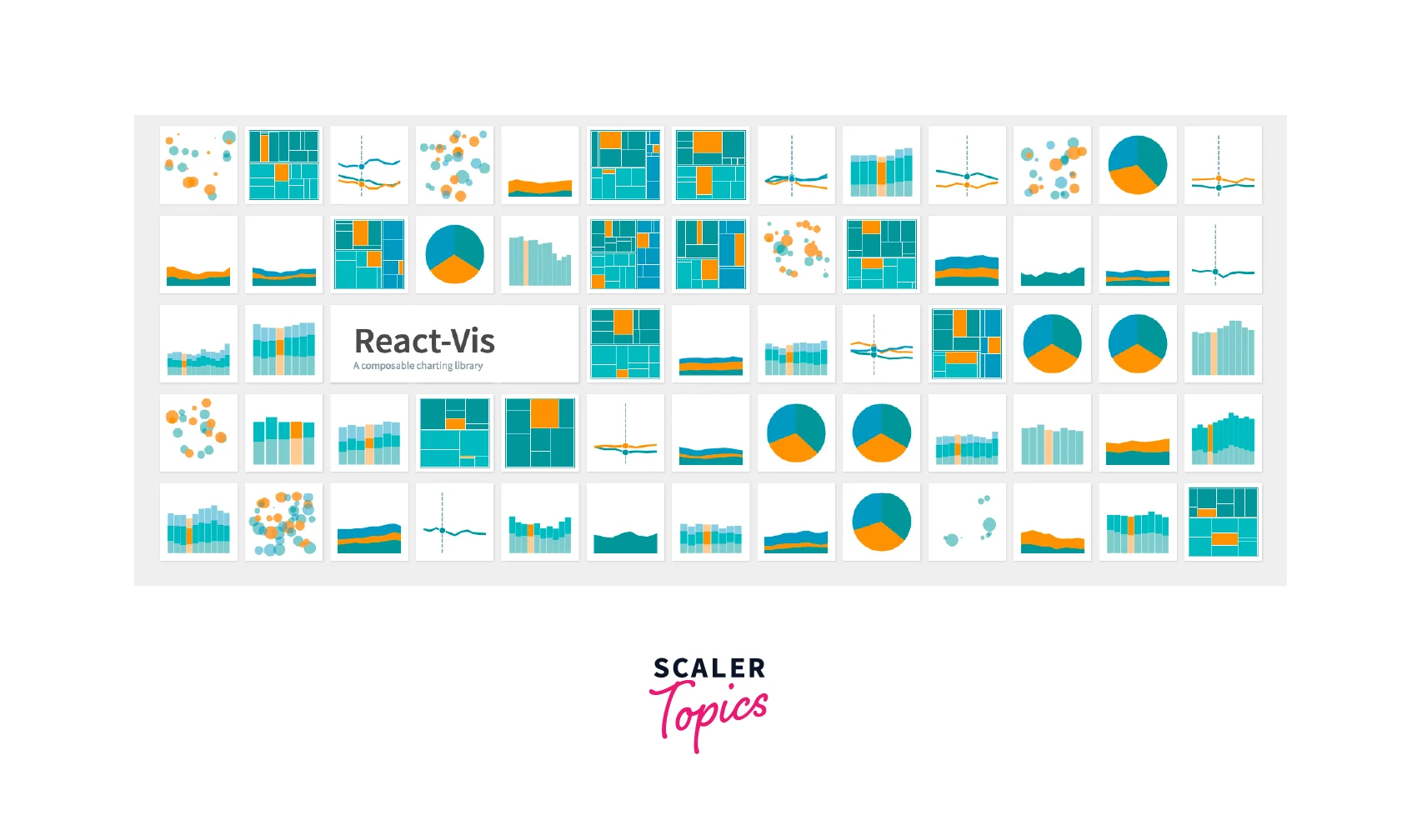
This library is deprecated and is not currently maintained. Therefore, there may be vulnerabilities in this library and it is not recommended to use this library for developing applications in production.
Recharts
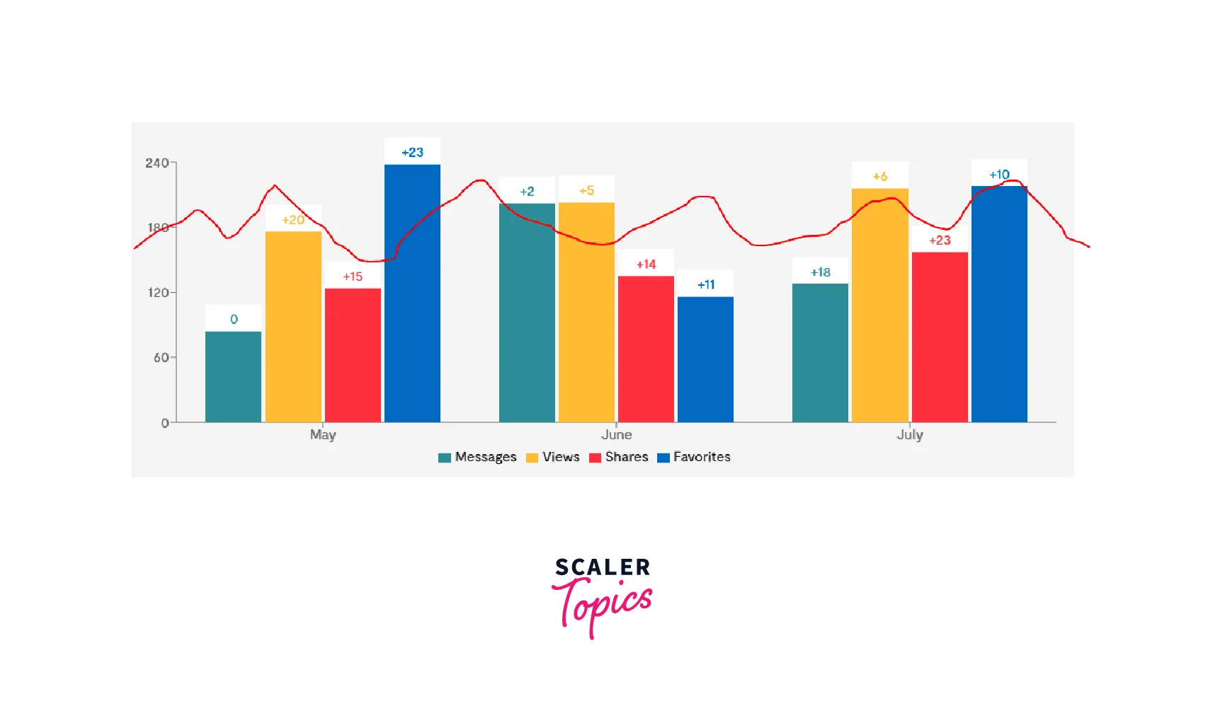
Reacharts is one of the oldest react charting libraries. The library is lightweight, provides native SVG support, and uses D3 modules to implement graphs. The library has an easy component-based syntax and provides multiple customizable components that can be modified according to the needs of the user.
We can use the following command to install the Recharts library.
Recharts uses a collection of reusable components to render the charts. Let us explore the syntax used for a stacked bar chart,
Explanation
- The parent ResponsiveContainer container modifies the size of the graph according to its parent component. We can also specify the minimum width and height of our graph in this component.
- The BarChart component is a wrapper for the charts.
- The XAxis and YAxis represents the axes. The value of the dataKey prop in XAxis must be present in the data and will be shown on the x-axis.
- The tooltip shows the data when hovering over the chart. The legend is used to show the details of the color used in the chart. The legend will be generated based on the name of the chart or the dataKey prop.
- The Bar component renders the chart. The datakey must be present as the key in the data with a numerical value. The bar graphs with the same stackId will be stacked together.
Rumble Charts
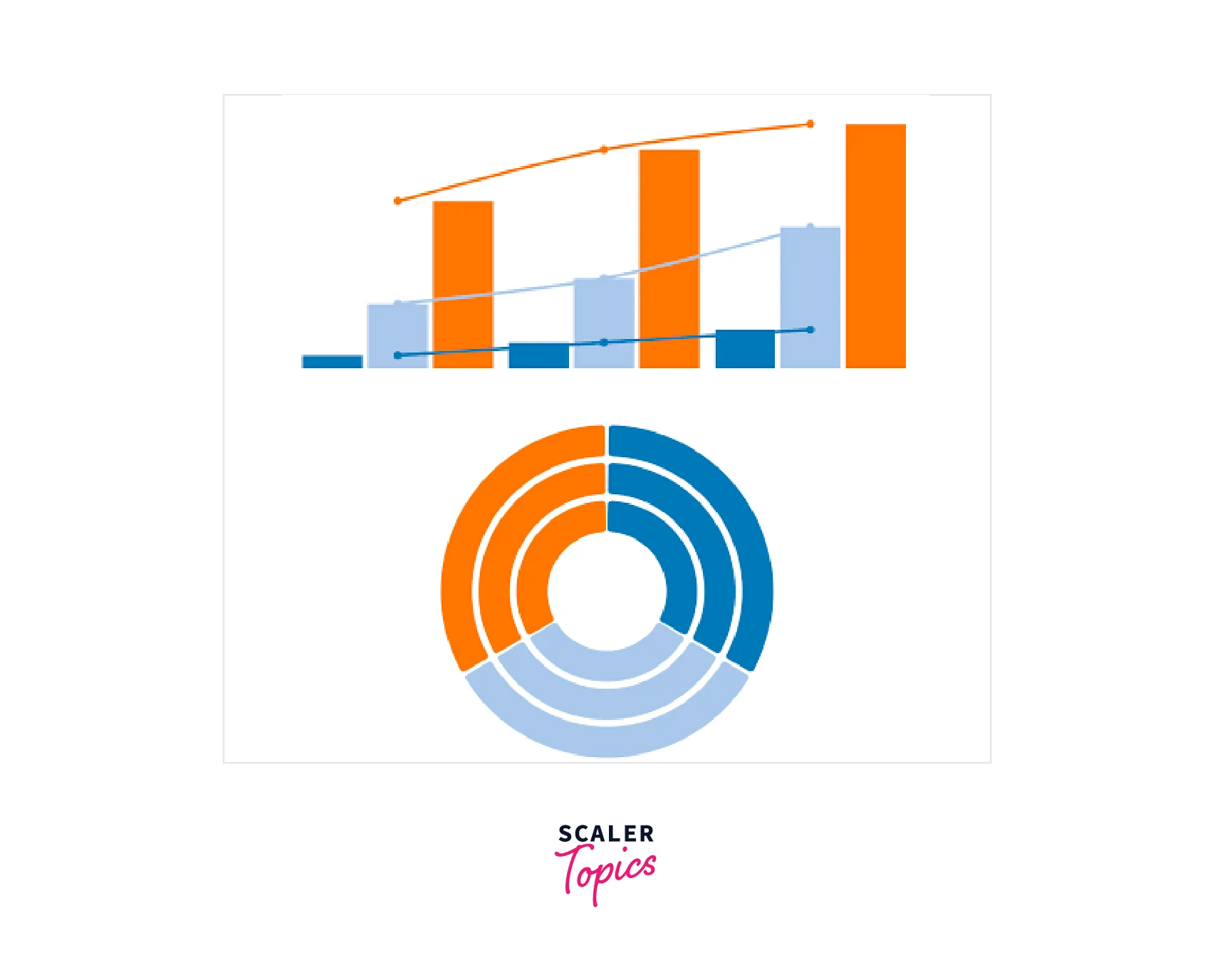
Rumble Chart is another react charting library that uses D3 Js for creating illustrative charts. This library also uses hierarchical react components to render charts and has a very easy syntax. This library also provides various events that can be combined into graphs.
We can use the following command to install the Rumble Charts library.
Let us explore the simple component-based syntax and data structure for creating a bar chart with a mouse event,
Explanation
- The Chart is the parent wrapper component which determines the height and width. The series data must be according to the specified syntax. The data value of the series should be an array of numeric numbers or two dimensional, [[0, 1]] where 0 is x and 1 is y or can be an object { x: 0, y: 1} that is mostly used for points.
- The barAttributes prop can be used to specify events on the graph. In our example, the graph will be highlighted when we hover over the bar graph. The barStyle can be used to style the bar graphs.
FusionCharts
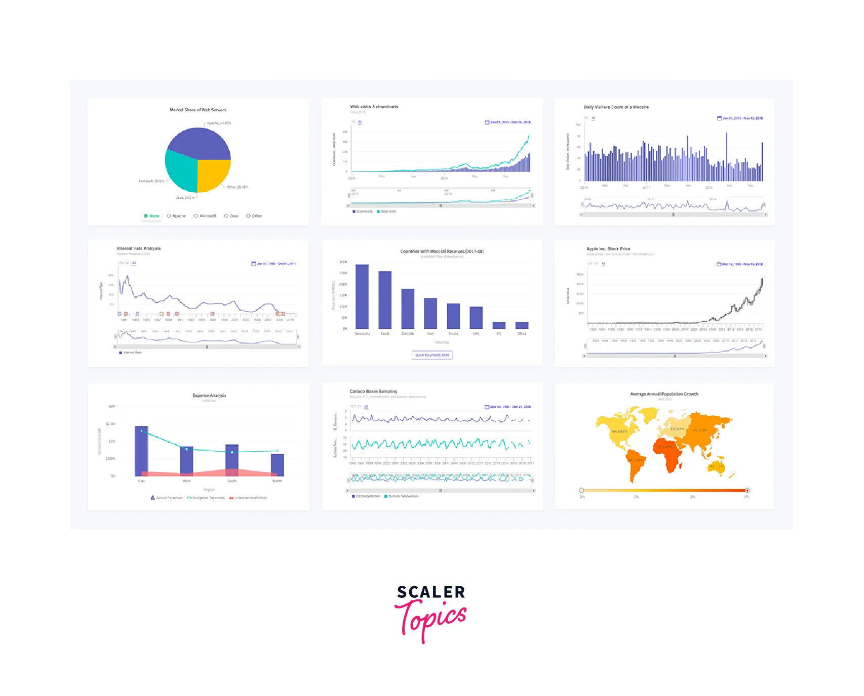
FusionCharts is yet another react charting library that has features to render a chart with just a single react component and proper configurations. This library provides various ways to add a chart and provides interactivity between charts.
We can use the following command to install the react fusion Charts library.
We need to create a configuration object to describe the properties of a chart and let us understand the structure of such a configuration object,
Explanation
- The design of the chart including the type of the chart and data should be specified in the configuration.
- The ReactFC component from the fusioncharts is used for all types of charts and the configuration must be passed prop. We use the ...(spread operator) to pass all details in the configuration as a prop.
- The data must have a label and a value. The tooltip is enabled by default and these details will be displayed by hovering over the chart. The label is displayed in the Xaxis.
- A numberSuffix will be shown next to each number on the Y-axis. Themes are color combinations and can be any of fusion, gammel, candy, ocean, zune, carbon, or umber.
Victory
Victory is a robust react charting library that has multiple responsive charts with features like interactive animations and drawing support for SVG. Victor also has a react native version and can also be used for creating mobile applications.
We can use the following command to install the Victory Charts library.
Victory charts use multiple components to configure the graphs. Let us look at the component structure for creating a stacked bar chart,
Explanation
- The VictoryChart is the parent component and also has a prop for the color theme of the chart.
- The VictoryAxis component is used to render an axis. The tickValues are displayed according to the tickFormat in the respective axes. The dependentAxis depicts a Y-axis and the tickFormat is used to normalize the sales values.
- The VictoryBar component renders the bar chart. The values of the x and y prop must match the fields in the data.
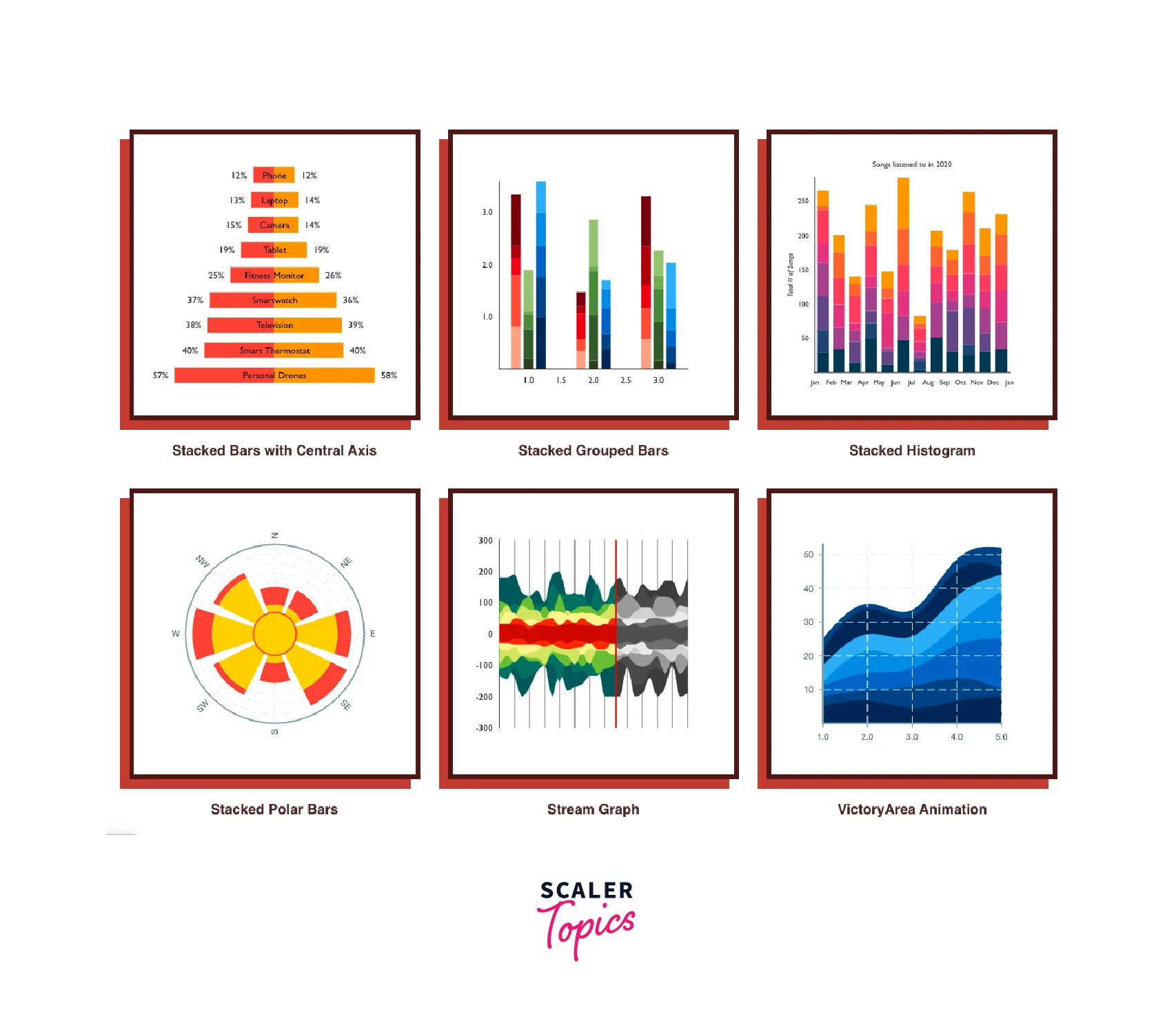
Visx
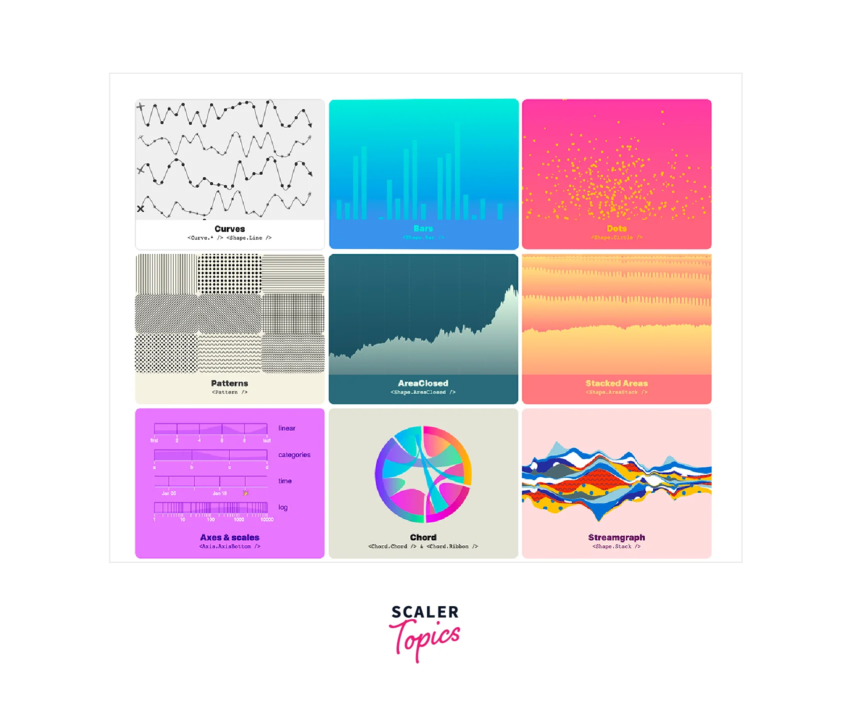
Visx is a react charting library built using the D3 library combined with features of the ReactDOM. This library is regarded as a collection of visualization primitives that are low-level and expressive. It is highly customizable and we can style our charts easily and also includes animations.
Visx is separated into multiple modules and we can install the required module. We can use the following command to install all the modules of the visx charts library.
Visx uses a single component to render the chart but renders a graph for every data which is different from other libraries. Let us look at a bar chart,
Explanation
- The complete graph will be rendered as an svg element because of the top-level SVG component.
- The x and y axis takes the value of the current data position and maps it to the axis position of the complete data. A useMemo hook is usually used for this task.
- The GradientTealBlue components id is referenced in the rectangle component to be implemented. We can also create a gradient by using the LinearGradient component from the @visx/gradient library.
vx
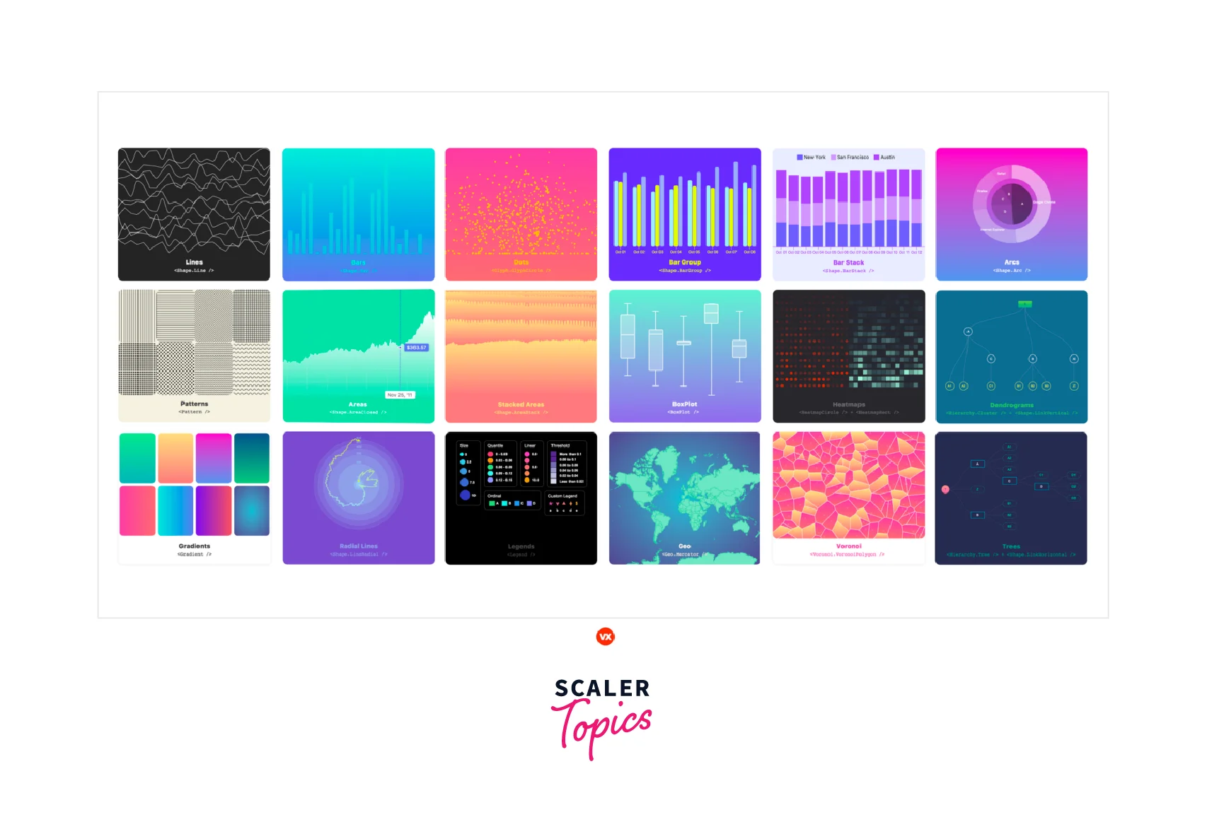
Vx charting library is very similar and is derived from visx. This library also provides low-level visualization components that are created using the D3 js library. This library supports animations and multiple charts.
Vx is also separated into multiple modules and we can install the required module. We can use the following command to install the vx libraries,
The syntax and usage are also similar to the visx library. Let us implement a simple bar chart,
Explanation
- The component will be rendered as an svg. A Group of charts can be rendered.
- The xScale.bandwidth() gives the bandwidth of the data. More functions are used to implement these values.
- The x values are scaled according to the data in the axes and several functions are used for this function.
Walkthrough of The Most Popular Library with Code Example
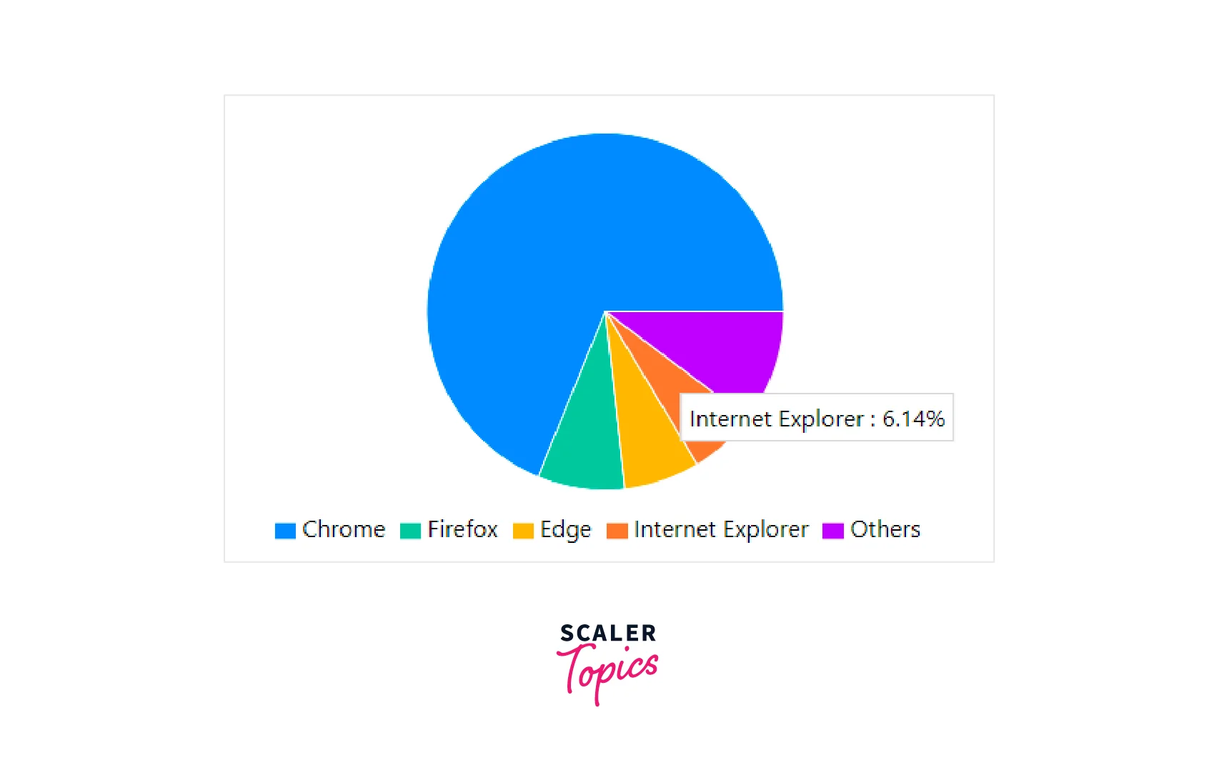
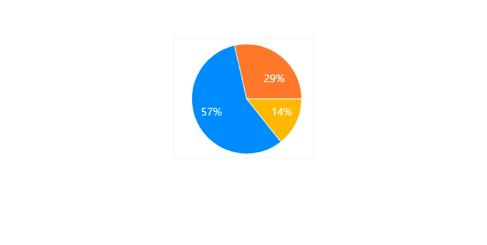
The most popular library currently used by multiple developers is, recharts and react chart 2. We can perform the following steps to create a pie chart using the recharts library,
- Import the components from the recharts library.
- Create the data and colors for the pie chart.
- Implement the function to create a customized percentage label that will be rendered inside each quadrant of the pie chart.
- The textAnchor of the Text component is used to specify the position of the text.
- Create a PieChart component and render the Pie chart along with the created label in the label prop.
- The Cell component represents the quadrants of the pie chart. Each quadrant is made of different colors based on the COLORS array.
The following pie chart is generated using the above code,
FAQs
Q. Which react charting library should I use?
A. There are multiple react charting libraries and we can select the library based on our requirements. For example, if we want to visualize time series data, then we can use libraries like Timeseries Charts, etc...
Q. How to resolve the error Component series.scatter3D not exists. Load it first while working with eCharts For React.
A. This error occurs when working with WebGL in echarts library and can be resolved by installing the echarts-gl package that provides globe visualization and WebGL acceleration. Then import the package into the react application.
Conclusion
- React charting libraries provide multiple components that can be used to create charts to visualize data.
- We can create charts like LineChart, BarChart, AreaChart, Piechart, ScatterChart, CompositeChart, and RadarChart for general data visualization.
- Some libraries help with timeseries data.
- Multiple libraries use hierarchical react components to create graphs and some libraries use configuration objects to create graphs.
- All libraries hold extensive documentation that can be used to highly customize our charts.
