React Colorful
Overview
React is one of the most favored languages when it comes to the development of User Interfaces, as it uses the "concept of reusable components". There is a constant flow of dynamic data through react components. Are you using React to create an application that allows users to sketch and choose colors? If so, the perfect library for that is React Color, a set of React color picker components that imitates the color pickers seen in widely used programs like Chrome, Photoshop, Sketch, and many more.
Introduction
Even while React Color is a fantastic option for the majority of applications, some developers believe that the numerous style options for a color picker component are an extraneous feature. If you're seeking a simple and quick replacement for React Color for your React project, you'll adore this package called React Colorful.
Here are some reasons why React Colorful is a superior choice over React Color:
- It doesn't rely on anything. Only 1.8 KB in size, compared to 140 KB for React Color. Built using hooks and functional components, which play better than ES6 classes.
- Only 1.8 KB in size, compared to 140 KB for React Color. Built using hooks and functional components, which play better than ES6 classes. Supports trees shake. Your React app bundle will only contain the components you use.
- Supports WAI-ARIA guidelines for accessibility for people using assistive technology.
- A straightforward and mobile-friendly color picker interface
- Integration of TypeScript or Preact is supported.
Naturally, there is a downside to each of these advantages. One is that React Colorful lacks React Color's 13 different color picker styles. The twelve color models supported by React Colorful, including Hex, RGB, HSL, and HSV pickers, make up for the absence of a color picker style.
Features
A simple color picker for React projects is called React colorful. With 13 color models, it is the most used React color picker. It is quick, tried and true, independent, accessible, and mobile-friendly. Let us look at some of React colorful features that make it better than all other color pickers:
- It is 2.8 KB in size after being gzipped, which is very less.
- Only the needed components will be imported into the app bundle, which is tree-shakeable.
- Only functioning parts and hooks are used in its construction, which makes the app work faster.
- It is 100% test-covered and strictly TypeScript written, making it bulletproof.
- Types are delivered with the package.
- The UI and the interface are uncomplicated and simple to use for the developers.
- It functions for the majority of browsers out of the box, irrespective of the version.
- It is a touch screen and mobile device compatible.
- It complies with the WAI-ARIA standards to benefit those who use assistive technology.
- It only depends on react and react-dom peer-to-peer and has a minimum version of 16.8.0. It has no requirements in package.json.
These features make React colorful and more useful than any other popular color picker for React.
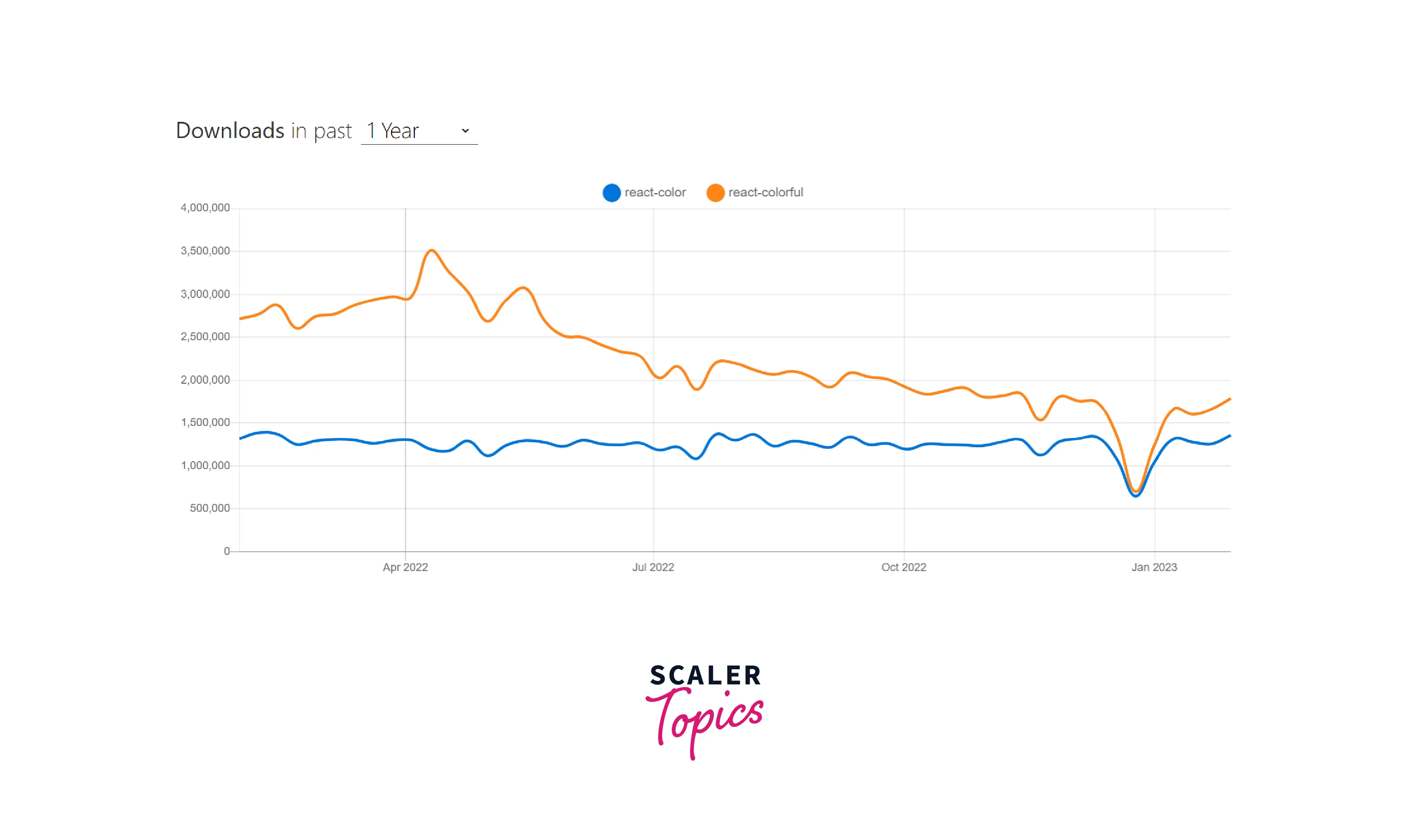
React-colorful has eclipsed react-color as the most widely used React color picker since the middle of 2021.
Getting Started
You only need to install the package react colorful using your preferred package manager (npm or yarn) to use React Colorful:
Now check if React-colorful is added to the package's requirements.json:
The component with the desired color model then needs to be imported, as well as the CSS for the color picker component.
Example:
Now make the following changes in your react App.js file:
Explanation:
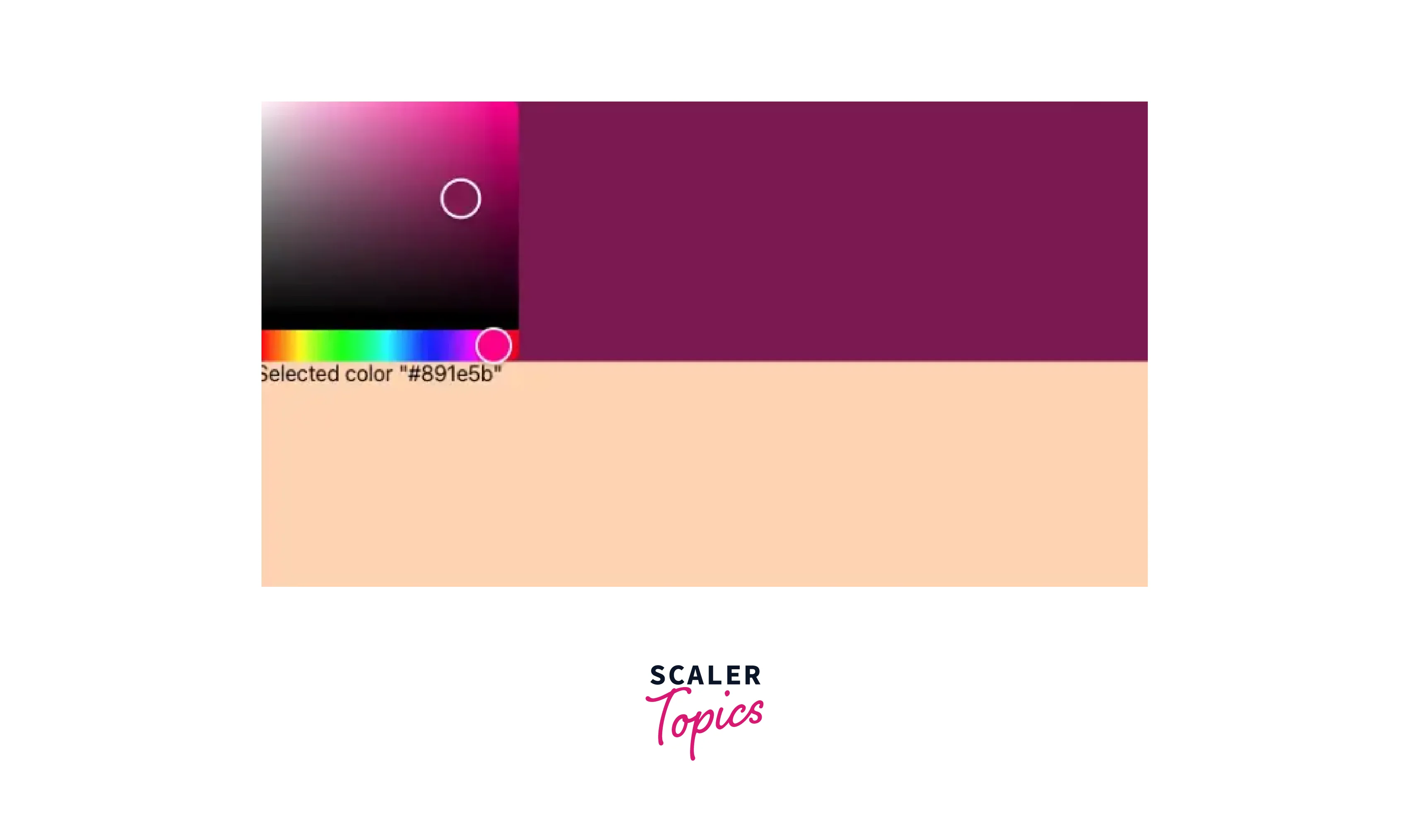
Line 9 of the code creates a user interface with a peachPuff backdrop that fills the entire viewport's height (line 10).
On the UI (user interface), there are two things:
- Lines 13 through 19 make up the color picker, which is situated on a div with the chosen color (line 15). The color picker is on line 18.
- The string equivalent of the chosen color is on the line 20.
Now let us run the program with npm start. Choose the background color for the top half, which is #891e5b.
Supported Color Models
Simply import the appropriate component to update the color model. There are 13 color models, as we've already discussed, that accommodate various color representations. The list of parts you could acquire from the React colorful library is as follows:
- HexColorPicker, such as #ffffff
- RgbStringColorPicker, such as rgb(255, 255, 255)
- RgbaStringColorPicker, such as rgba(255, 255, 255, 1)
- RgbColorPicker, such as { r: 255, g: 255, b: 255 }
- RgbaColorPicker, such as { r: 255, g: 255, b: 255, a: 1}
- HslColorPicker, such as { h: 0, s: 0, l: 100 }
- HslaColorPicker, such as { h: 0, s: 0, l: 100, a: 1 }
- HsvStringColorPicker, such as hsv(0, 0%, 100%)
- HsvaStringColorPicker, such as hsva(0, 0%, 100%, 1)
- HslStringColorPicker, such as hsl(0, 0%, 100%)
- HslaStringColorPicker, such as hsla(0, 0%, 100%, 1)
- HsvColorPicker, such as { h: 0, s: 0, v: 100 }
- HsvaColorPicker, such as { h: 0, s: 0, v: 100, a: 1 }
A color can be described in 4 different ways:
- RGB:
Red, green, and blue are the three keys that make up the object known as RGB. The color intensity for each value ranges from 0 to 255. Black is represented by the numbers r: 0, g: 0, and b: 0, whereas red, green, blue, and white are represented by the numbers r: 255, g: 255, and b: 255, respectively. - Hex:
#rgb, where r (red), g (green), and b (blue) are color intensities between 00 and ff, represents a hexadecimal color value. Black is #000000, Red is #ff0000, Green is #00ff00, Blue is #0000ff, and White is #ffffff. - HSL:
Hue, Saturation, and Lightness, or HSL. On the color wheel, the hue ranges from 0 to 360 degrees. Red is 0, green is 120, and blue is 240. Saturation is expressed as a percentage, where 0% represents a grayscale shade and, 100% represents a complete color. When describing brightness, lightness is used, where 0% is dark, 50% is "normal", and 100% is white. White is at h: 0, s: 0, and l: 100. - HSV:
Hue, saturation, and value are abbreviated as HSV. HSB is another name for it (hue, saturation, and brightness). A color with 100% lightness in HSL is pure white, whereas a color with 100% value in HSV just casts a white light on a colored object. It is dark (h: 0, s: 0, v: 100).
Tweak React-colorful
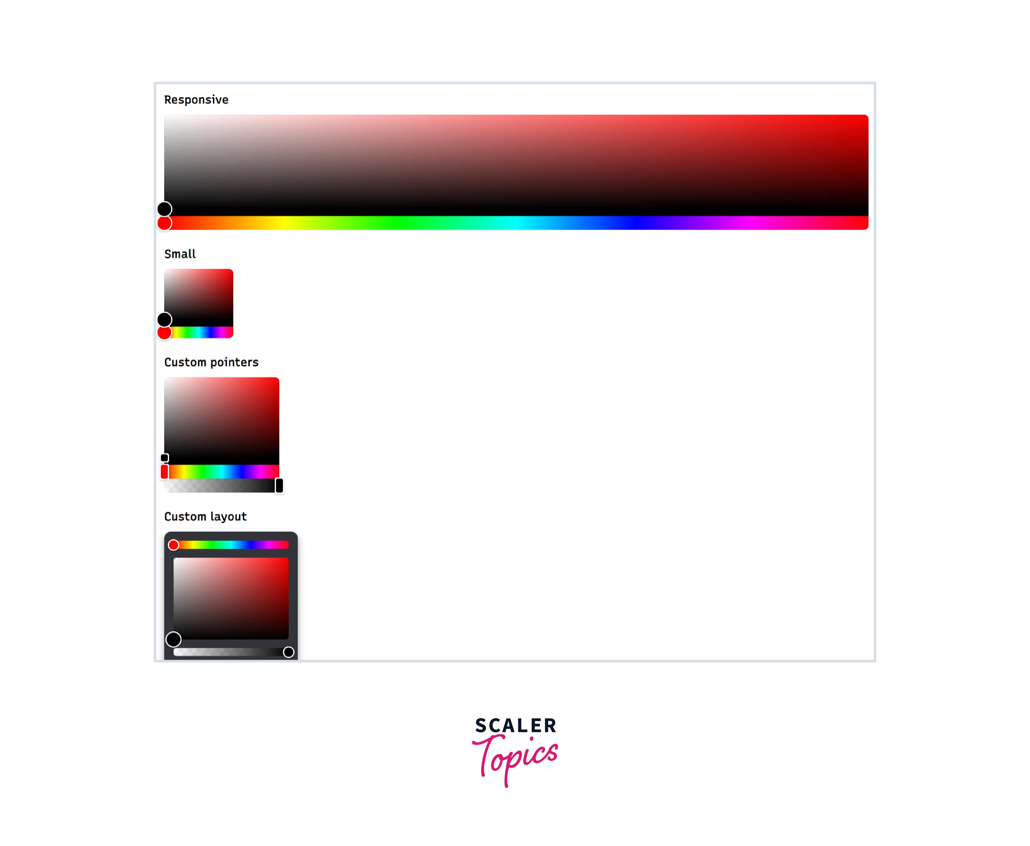
Making a new stylesheet to replace the default ones is the simplest approach to modify react-colorful.
Example:
Let us look at an example to tweak react colorfully.
make the following change in your App.js file:
Styles.css file:
Basic Examples of Using React-colorful
Value Debouncing
A debounce function in JavaScript ensures that your code is only activated once in response to user input. You can debounce any quickly changing value with the useDebounce() hook. When using a debounced value, it will only display the most recent value. Debounce hook has novt been called in the allotted amount of time.
App.js file:
styles.css file:
Popover Picker
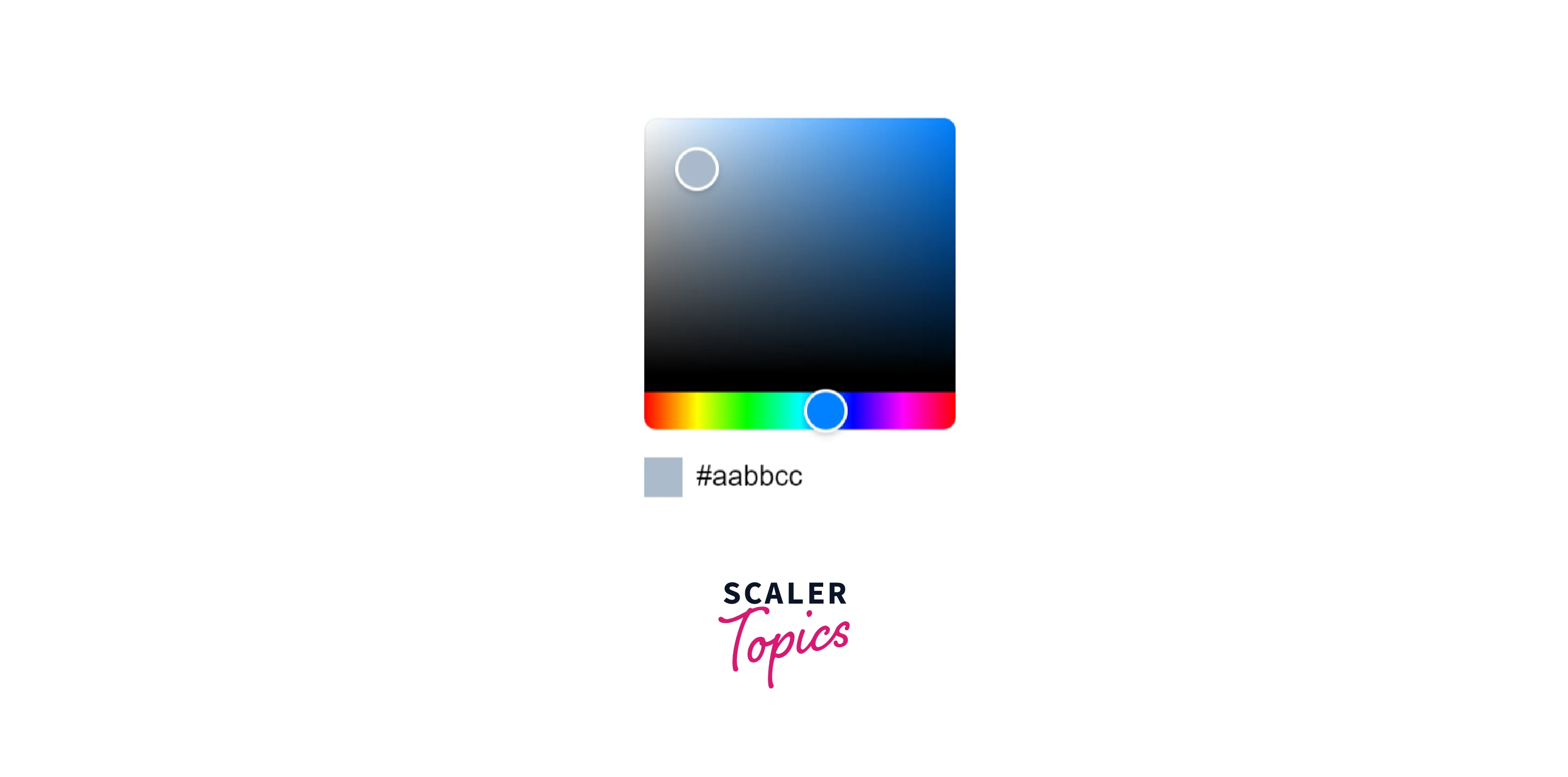
In this example, we will try to implement a popover that will display the color picker when pressed.
App.js file:
Popoverpicker.js file:
useClickOutside.js file:
styles.css file:

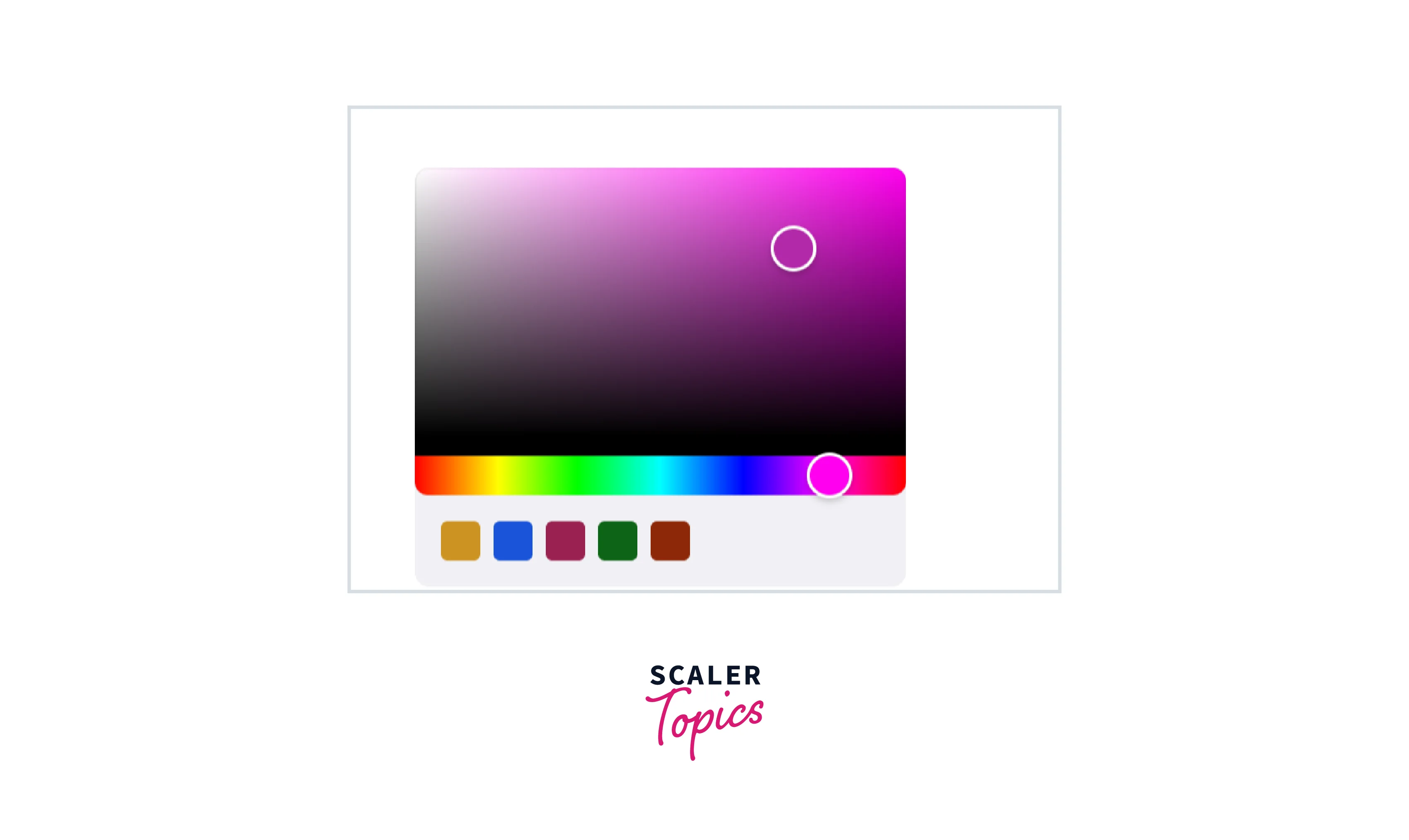
Preset Colors
App.js file:
SwatchesPicker.js file:
styles.css file:
Picker that Accepts any Color Input
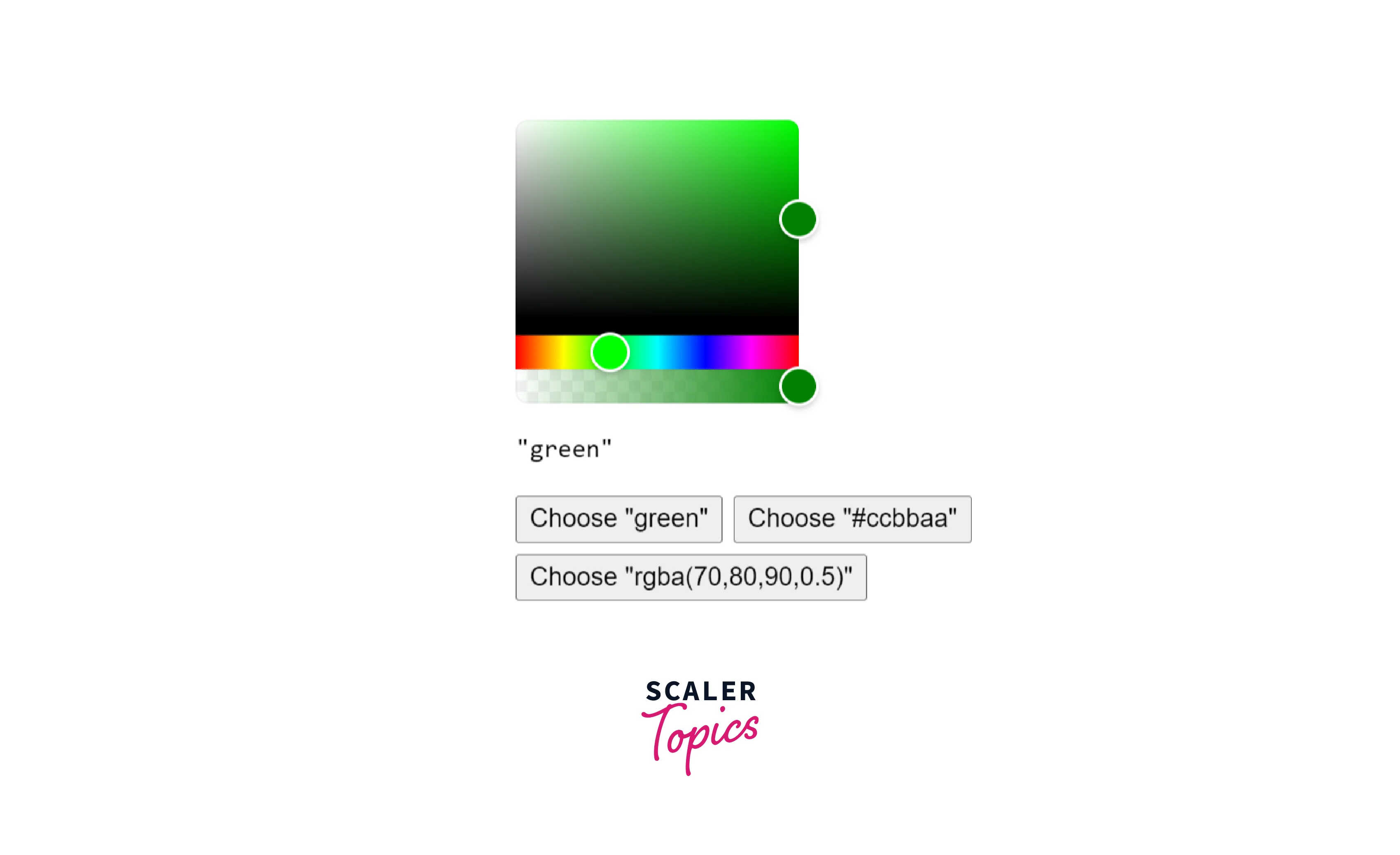
In this example, we are going to make a color picker that accepts any color input. Let us make the files with the following code.
App.js file:
CustomPicker.js file:
styles.css file:
Conclusion
- React colorful is a small and straightforward color picker component for React apps.
- There are 13 color models, hence it is the most used React color picker.
- It is quick, tried and true, mobile friendly, dependency-free, mobile-friendly, and accessible.
- React colorful is fast because of it is built using hooks and functional components, which play better than ES6 classes.
- React colorful only depends on react and react-dom peer-to-peer and has a minimum version of 16.8.0. It has no requirements in package.json.
- React uses very few manually enhanced color conversion techniques to produce its beautiful ships.
- Making a new stylesheet to replace the default ones is the simplest approach to modify react-colorful.
- React-colorful only needs an Object and generally works with most browsers out of the box. offer polyfill to fully support IE11.
