React Data Grids
Overview
A React data grid, also known as a React table, is a component that displays tabular data in a grid format. It is typically used for displaying large amounts of data and allows for sorting, filtering, and pagination of the data. React data grids are highly customizable and can be integrated with other libraries and frameworks. They often offer features such as column resizing, row selection, and inline editing. Some popular React data grid libraries include react-table, react-virtualized, and ag-grid.
Introduction to React Data Grid
React data grids, also known as tables, are powerful tools for displaying and manipulating large sets of data. They provide a way to sort, filter, and paginate data, making it easy for users to quickly find the information they need.
In this article, we will take a closer look at React data grids and explore some of the popular libraries and features available for creating them. We'll also discuss the benefits of using React data grids and how they can be integrated with other technologies to create dynamic and user-friendly applications.
Whether you're a developer looking to add data grid functionality to your next project, or just curious about the capabilities of React, this article will provide you with a comprehensive introduction to this powerful technology.
Features of React Data Grid
Those are some of the features that can be offered by a React data grid, some of the features include:
- React 18.0+ support: ensures compatibility with the latest version of React.
- Evergreen browsers and server-side rendering support: allows the grid to work seamlessly on modern browsers, and can be rendered on the server for improved performance.
- Tree-shaking support and minimal dependencies: helps keep bundle sizes small and allows for easy integration with other libraries.
- Virtualization: improves performance by only rendering columns and rows that are currently in the viewport.
- TypeScript support: provides type safety and improved code quality.
- Keyboard accessibility: allows for easy navigation and interaction using the keyboard.
- Light and dark mode support: provides visual options for different environments.
- Frozen columns: allows for certain columns to be locked in place while others can be scrolled.
- Column resizing: allows for the user to adjust the width of columns.
- Multi-column sorting: allows for sorting by multiple columns at once.
- Column spanning: allows for cells to span multiple columns.
- Row selection: allows for the selection of one or multiple rows.
- Row grouping: allows for grouping of rows based on certain criteria.
- Summary rows: allows for displaying summary information for a group of rows.
- Dynamic row heights: allows for rows to have different heights based on the content.
- No rows fallback: allows for displaying a message when there are no rows to display.
- Cell formatting: allows for custom formatting of cell data.
- Cell editing: allows for editing of cell data directly in the grid.
- Cell copy/pasting: allows for easy copying and pasting of cell data.
- Cell value dragging/filling: allows for dragging and filling of cell values.
- Customizable Components: allows for customizing the appearance and behavior of the grid.
- Right-to-left support: allows for displaying the grid in RTL languages.
React Data Grid Example
Here's an example of a basic React data grid using the popular library react-table:
Output:
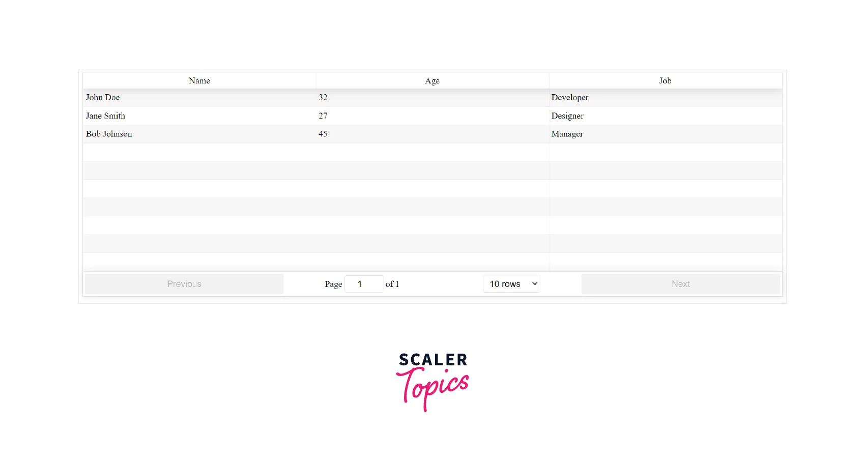
In this example, we first import the necessary libraries, including react-table and the CSS file for styling. We then create a React component called DataGrid, which sets up the initial state with an array of data to be displayed in the grid.
In the render method, we define the columns for the table using the columns prop and pass in the data from the state. We also set the default page size to 10 and apply some CSS classes for styling.
The ReactTable component takes care of the rest, including handling pagination, sorting, and filtering of the data.
Please note that this is a basic example and some features may be missing. It's recommended to use the library documentation and examples to fully understand how to implement a react data grid.
Getting Started
Getting started with a React data grid can be a straightforward process, but it does require some setup beforehand.
- Dependencies:
To use a React data grid, you will need to have React and a data grid library installed. Some popular libraries include react-table, react-virtualized, and ag-grid. You can install these libraries using npm or yarn. - Component Modules:
Once you have the necessary dependencies installed, you can import the data grid component(s) into your project. For example, if you're using react-table, you'll need to import the ReactTable component. - Optional Modules:
Some data grid libraries also offer additional modules that can be imported for additional functionality. For example, react-table offers a useTable hook that can be used for more advanced table configuration. - Sample Data Source:
Next, you'll need to set up a data source for the grid to display. This can be done by creating an array of data in your component's state or by fetching data from an external source. - Auto-Generate Columns:
To quickly set up the columns for your table, you can use the library's auto-generation feature. For example, if you're using react-table, you can pass in the data and it will automatically create columns based on the keys of the data objects. - Manually Define Columns:
Alternatively, you can manually define the columns for your table. This can be done by creating an array of objects, where each object represents a column and its properties. - Styling Columns:
To style the columns, you can use CSS classes or inline styles. Most libraries also offer built-in styling options. For example, react-table has options for styling rows, cells, and headers.
Conclusion
- React data grids, also known as tables, are a powerful tool for displaying and manipulating large sets of data.
- There are several popular libraries available for creating React data grids, including react-table, react-virtualized, and ag-grid.
- To get started with a React data grid, you will need to have React and a data grid library installed. You can then import the necessary component(s) and set up a data source.
- Some libraries also offer additional modules for additional functionality.
- You can choose to auto-generate the columns or manually define them. React data grids can be a great tool for creating dynamic and user-friendly applications.
- They offer a wide range of features that can be tailored to fit the needs of any project.
- With the right library and setup, React data grids can be a powerful and efficient way to display and manipulate large sets of data.