React Grid Layout
Overview
Creating a robust and responsive react project is very much favored as it provides one of the best user experience and the majority of internet users access the web using their mobile phones. Multiple layouts provide a responsive design and the grid is one such layout. There are many react libraries that provide components to implement grid layouts.
What is React Grid layout?
The grid layout allows us to design the website with grids based on rows and columns. A grid layout always has a parent component or a grid container with the CSS property of display as grid or inline-grid and children's components or grid items that will be arranged based on rows and columns.
The React Grid Layout library not only provides grid layout but also draggable and Resizable grid components that can be arranged easily. We can also implement a grid layout using the Grid component in the material UI library.
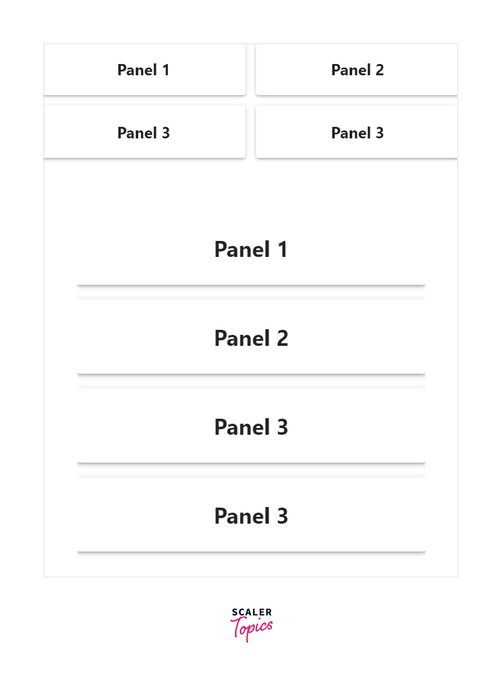
Anatomy
This section helps to understand the structure of a grid component in the react grid layout library. The following image shows the structure of the react grid component.
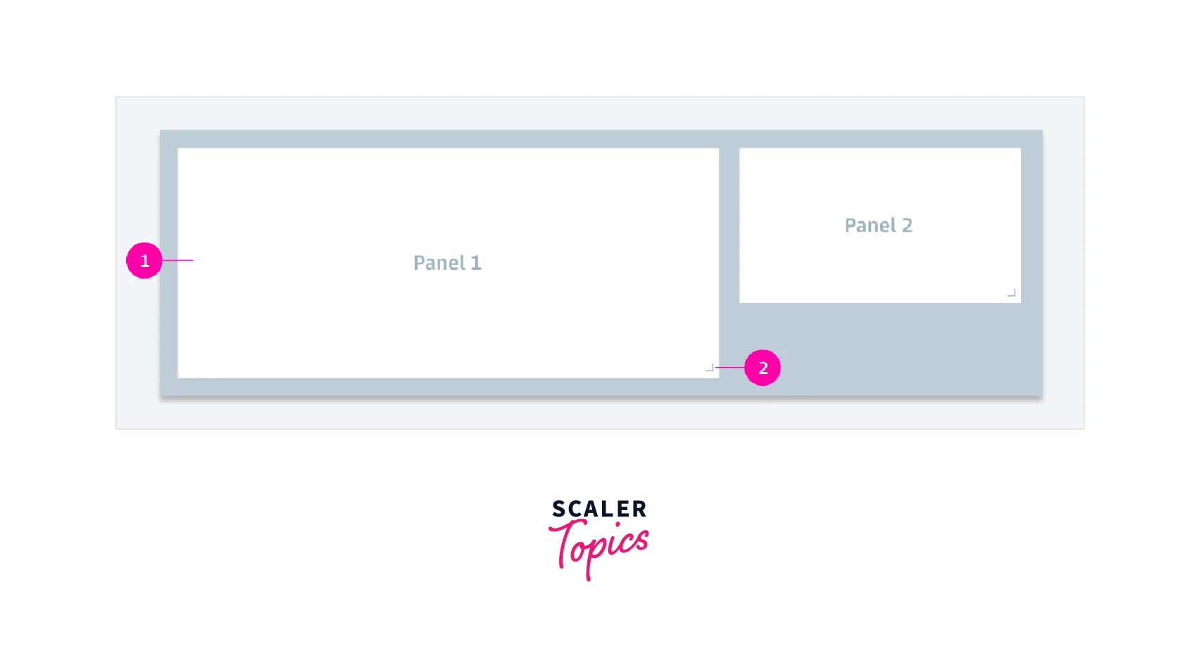
- The number 1 shows the Panel in which the content to be displayed is shown.
- The number 2 shows the Resize Dragger which is used to resize the component.
The following image shows the grid layout and grid component provided by the material UI library.
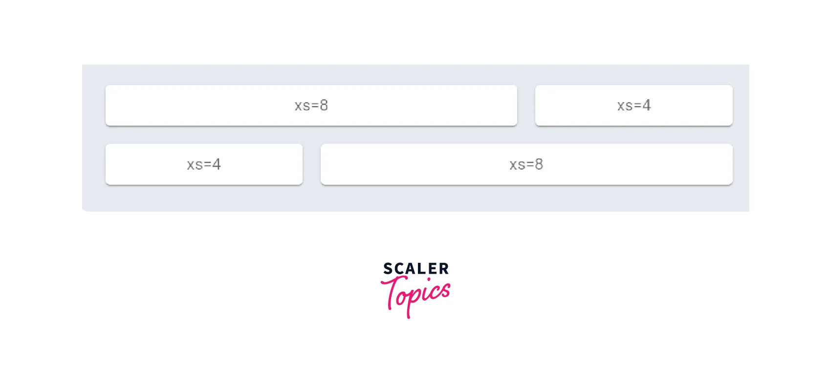
+, Unlike the react-grid-layout library, the grid component provided by material UI is static and can't be resized by dragging, but is resized automatically for different devices.
- The xs inside the grid component represent the size occupied by the component in an extra small device like a mobile phone.
Variations
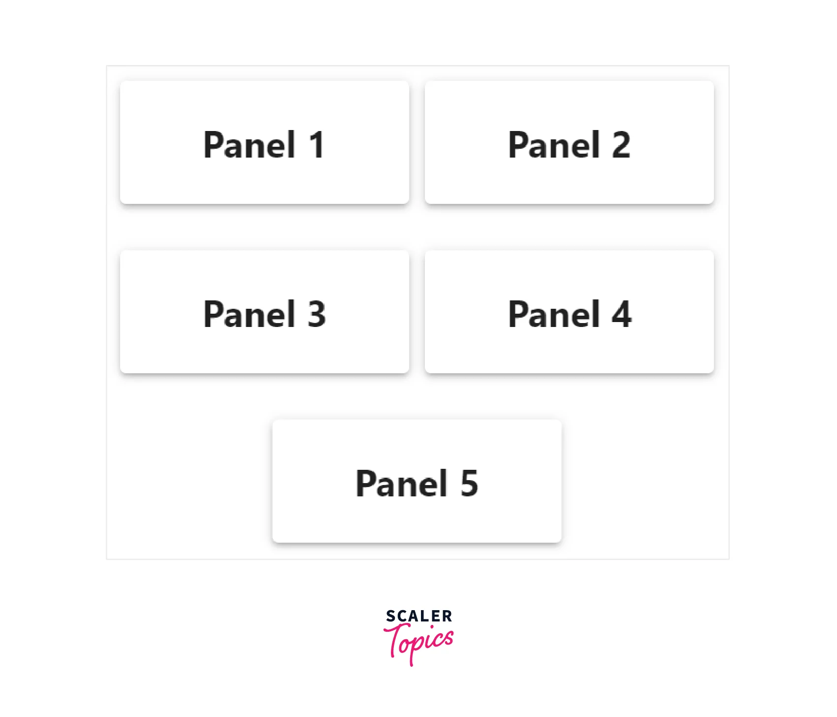
There are different variations for grid layout in the React Grid Layout library. The grids can be either React Grid Layout made resizable or non-resizable.
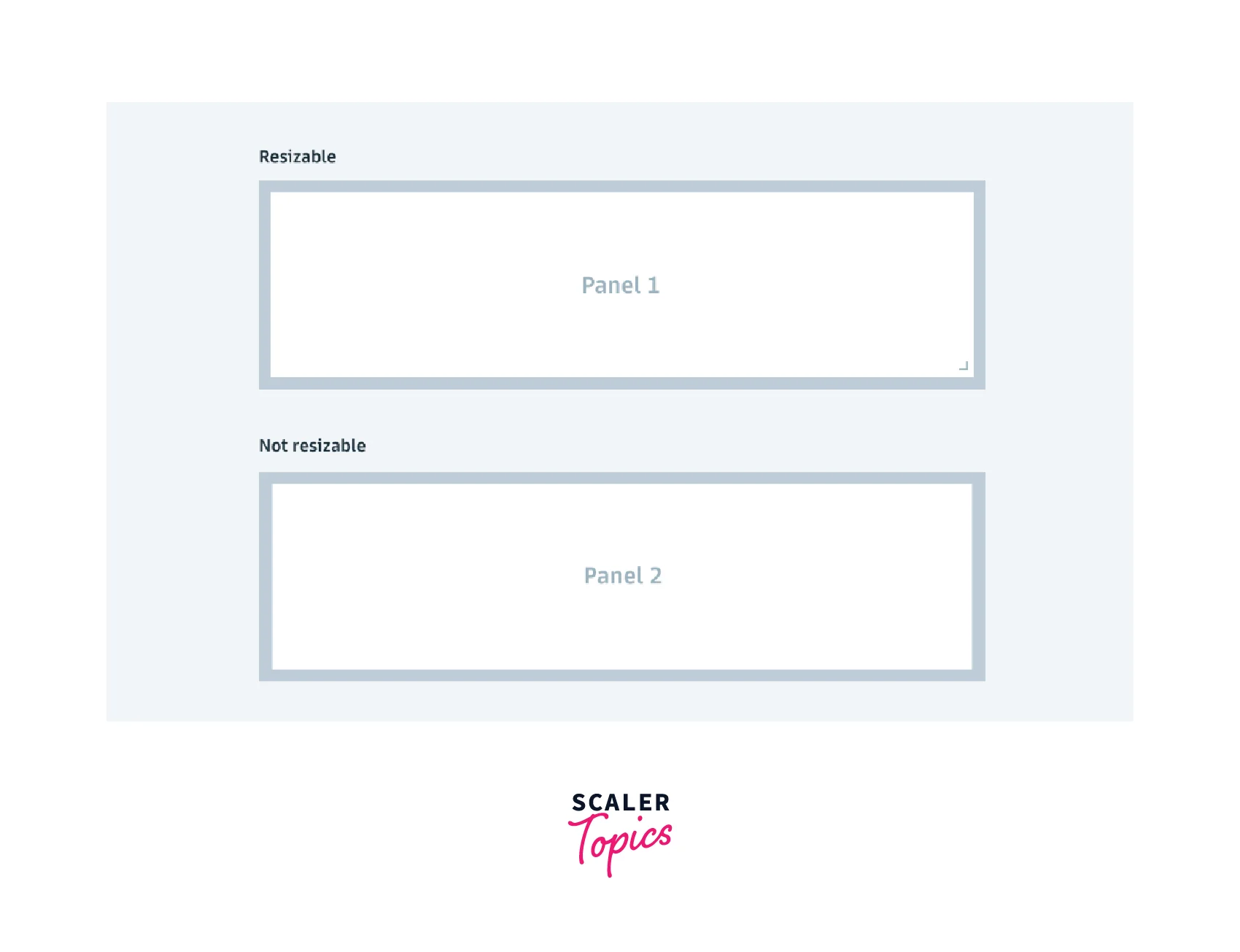
The first panel shows a resizable grid panel with a dragger and the second panel shows a static grid.
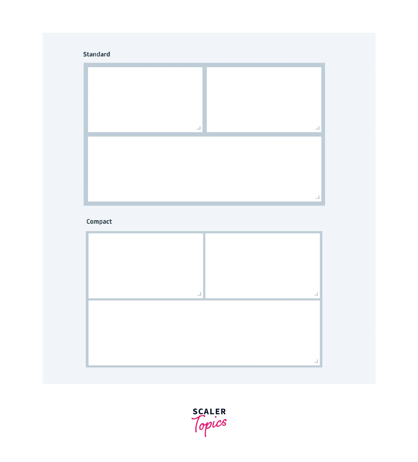
Two variants of density can be used in the react grid layout library. We can either use the standard density that is shown in the first panel or the compact density that is being used in the second panel.

Material UI also provides for customizing the grids such as nested grids, custom spacing between grids, and custom positioning of grids using offsets. The Grid component of material UI provides a property to get a full border or a half border.
Behaviors
React Grid Layout library provides Grids that behave differently based on the user actions and dimension of the device being used.
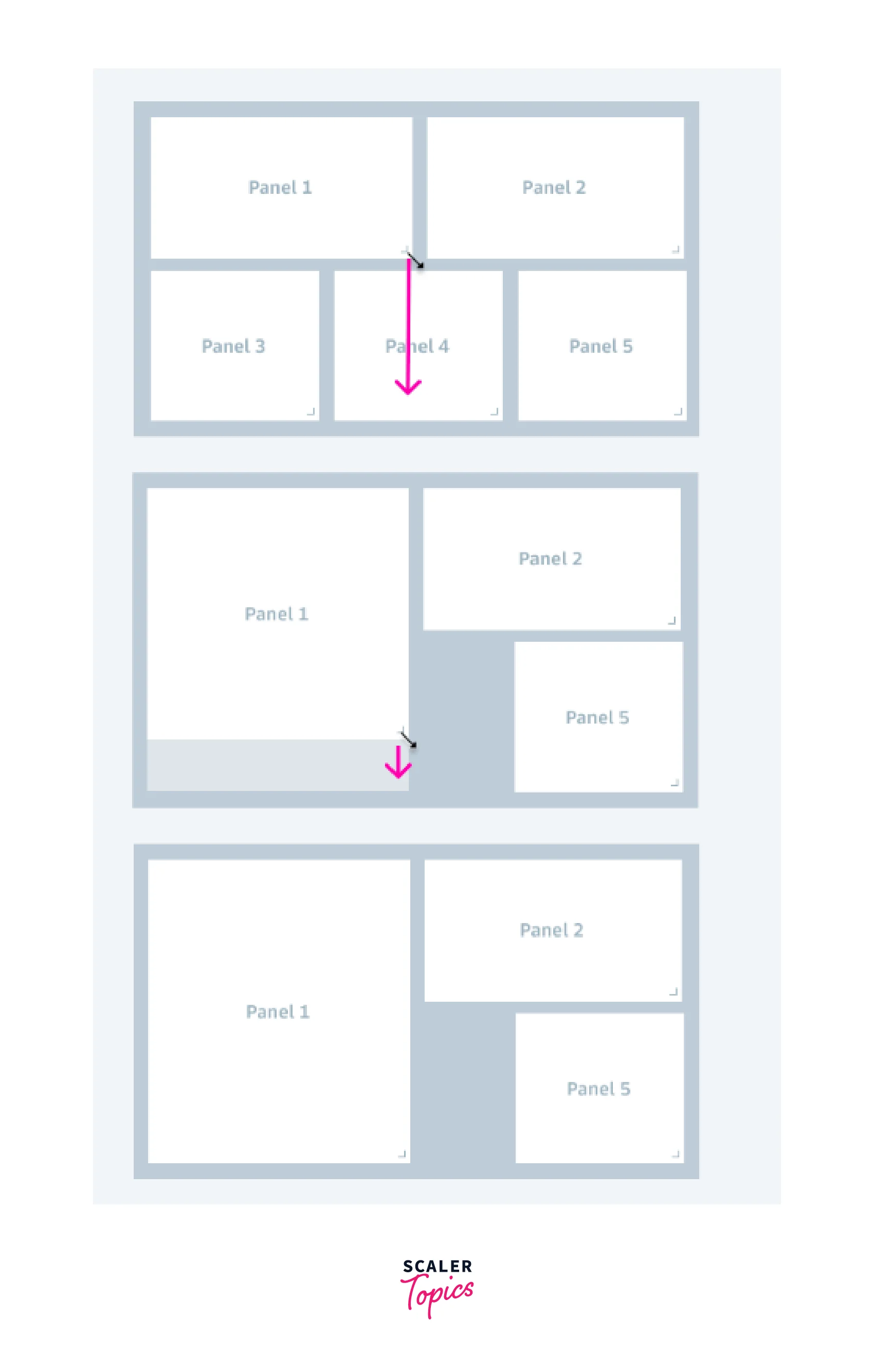
Within a grid layout, there may be multiple panels and each panel can be moved to a different location using the Panel Moving property. To move a panel, we can just click on a panel and drag that panel and position it anywhere inside the grid. There is also a shadow-based marker guide that shows the position that the grid will be placed once the dragged panel is released and even more the other panels will automatically adjust themselves within the grid based on the position changes of the adjusted panel.
- The first image shows the position to which panel 5 has to be moved.
- The second image shows the dragging and dropping of panel 5 at the top along with the shadow helper guide that shows the position where the panel will be placed.
- The final image shows the relocation of panels 1 and 2 according to the relocation of panel 5.
Note: The height and width of the panel are not altered when the panel is dragged and moved to another location within the grid.
The grid layout can also have panels with the fixed position property and such panels can't be moved.
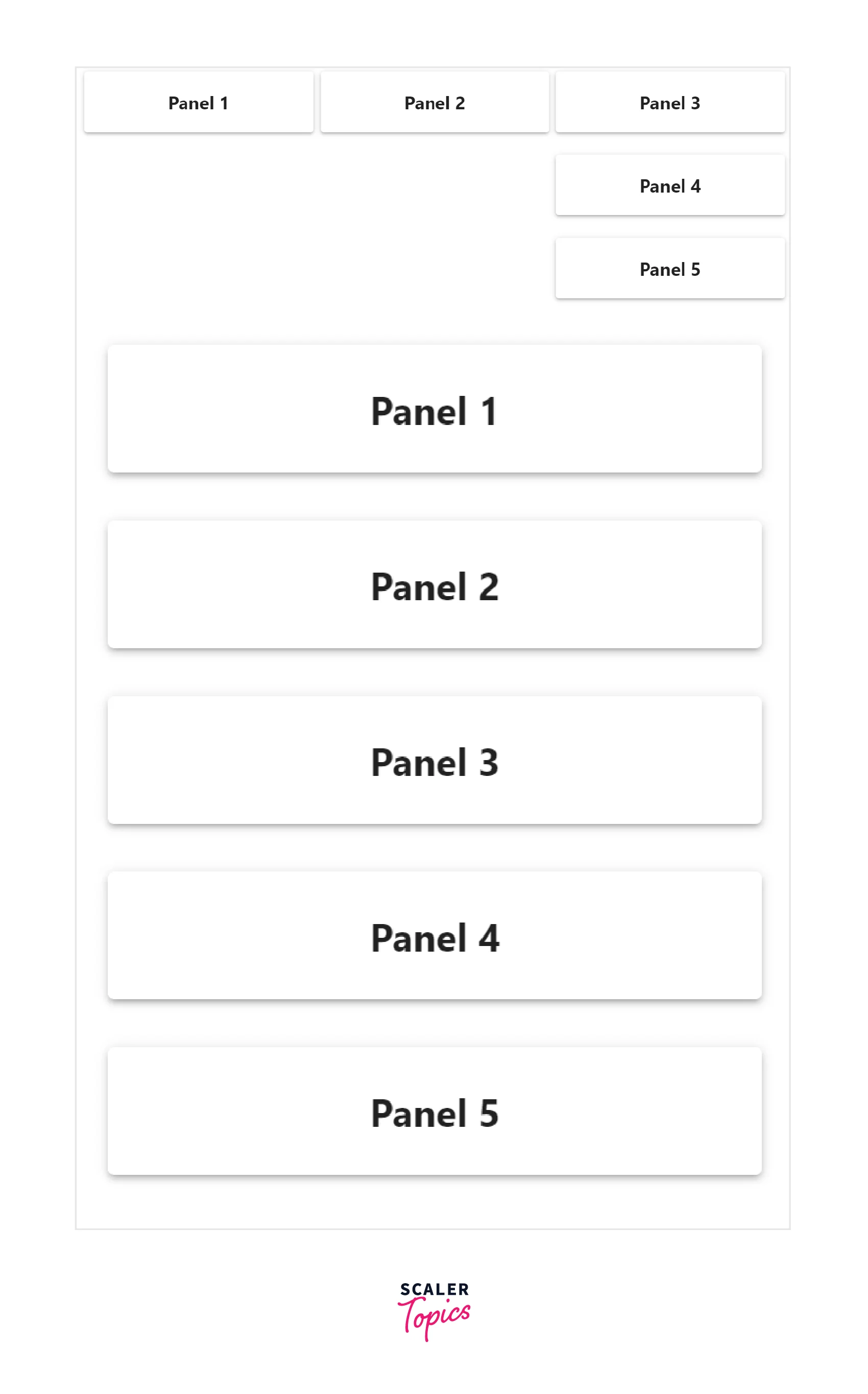
We can also resize the panels inside the grid using the panel resize property. The resize dragger at the bottom right of the panel can be used to resize the panel. Similar to the above property, the other panels will rearrange themselves according to the size modifications of the other panels.
- The first image shows the height to which the panel is to be resized.
- The second image shows the resizing of the panel using the dragger.
- The final image shows the relocation of panels 2 and 5 according to the increase in height of panel 1.
Note : Panels can be made completely resizable or can also have a fixed height or weight as a constraint. The resizing of a panel could be constrained by nearby panels having fixed positioning or fixed dimensions.
The above properties can be used to arrange panels within a grid. We can utilize the responsive breakpoints property to create a responsive grid layout that will modify itself according to the dimensions of the device.
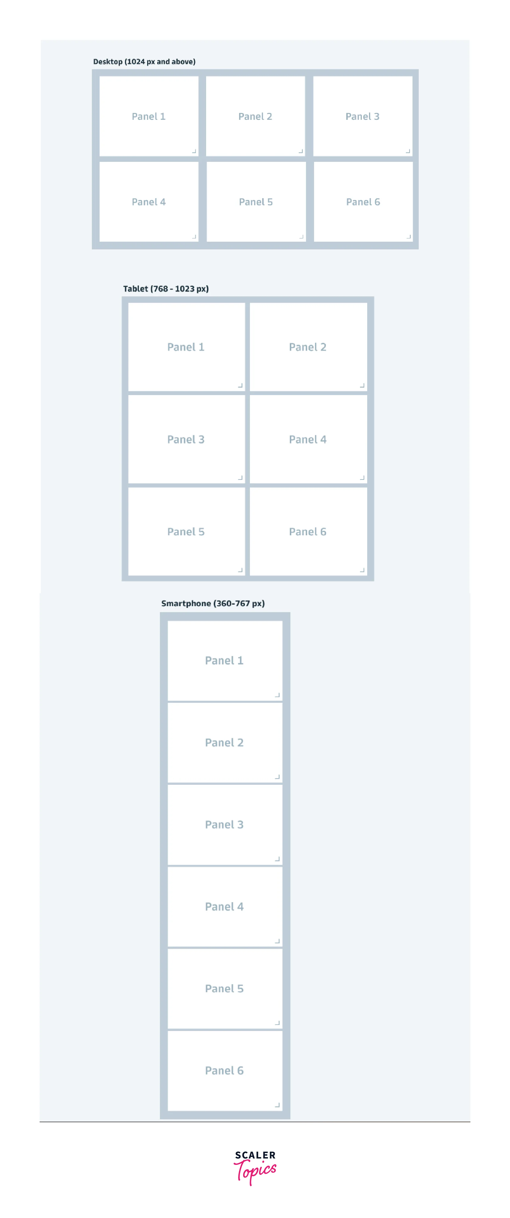
- The first image shows the grid layout on a desktop screen in which there are three panels per row.
- The first image shows the grid layout in a tablet in which there are two panels per row.
- The third image shows the grid layout becoming a column based on a mobile screen.
Material UI doesn't have the first two properties but provides default responsive breakpoints that can be used to implement responsive design. The breakpoints should be used as props in the Grid component and the length of the panel should be used as the value. The default props are,
- xs - extra small for a size of 0px to 600px
- sm - small for size from 600px to 900px.
- md - medium for size from 900px to 1200px.
- lg - large for size from 1200px to 1536px.
- xl - extra large for sizes greater than 1536px.
The following example shows a grid component that has a size of 4 for the smaller device and a size of 8 for medium devices and a size of 12 for larger devices.
The grid component with the prop container is the wrapper component that provides a grid layout. The props have to be passed to a Grid component that is present inside such grid layout components.
Guidelines
- React grid layout provides a flexible and customizable grid layout, but the legibility of a panel should be evaluated based on the number of panels within a row and the sizing of the panels.
- Labels, descriptions, and titles should be added to panels to use grid layout more effectively.
Why do We Use React Grid Layout?
- The react grid layout library can be used to create a responsive grid layout for different devices which provides a rich user experience.
- React grid layout library provides a draggable and resizable component that can be easily created and modified based on our needs.
- This library provides robust support for react as it is made especially for react applications.
- Multiple props are provided for further customization of our grid panels.
- Provides typescript support out of the box.
Features of React Grid Layout
The features of react grid layout library are,
- React grid layout is made compatible with server side applications.
- This library provides draggable and resizable panels for grid layout.
- We can also customize static panels and can also configure dimensions.
- The library is made with pure react without using jQuery.
- Implementation of bound checking for dragging and resizing is present.
- Responsive design can be implemented using responsive breakpoints.
- Easy option to add and remove panels without deleting the grid layout.
- Provides compatibilty with <React.StrictMode>.
- Utilization of CSS Transforms to place grid items.
- Serialization of layout and restoration is also possible
Installation
We can install the react grid layout package using either npm or yarn package manager and the following commands can be used for each package manager respectively,
NPM
YARN
After installation of the react grid layout, we have to include the stylesheets in our application. The following links have to be included,
We can include these styles in the index.html file using the link HTML tag,
React grid layout also provides full support for typescript, but the required types have to be installed separately using the package manager.
Material UI is a large library and has many different npm packages for different components. The Grid component is exported from the material UI's material package. The following commands can be used to install the library,
NPM
YARN
Material UI also provides full support for typescript and can types can be installed by the following command,
Examples for Understanding
We can create a grid layout in a few steps using the react grid layout library. The following example shows a simple grid layout,
Code
Explanation
- The GridLayout component is provided by the react grid layout library. The grid layout configuration object layout_Config should have the position of the panel along with the name and dimensions of the panel.
- The static property like at panel 1 can be used to prevent resizing or moving of the panel.
- The layout object should be passed to the layout prop of the GridLayout component. Other props are used to specify the structure such as rowHeight, className, cols etc...
- The styled() function is used to add styles to the Paper component and create the Item component. The elevation prop in Item shows the level of elevation.
The above example gives us a simple grid layout that can be dragged and modified. This layout is not responsive and we should use the Responsive component to make it responsive.
We can use the Responsive component with the WidthProvider function to create a responsive grid container.
Code
Explanation
- We can use the WidthProvider function to determine the width of the device in which the application runs and provide the width to the Responsive component.
- The layouts and cols props can be given for multiple breakpoints whose dimensions are specified in the breakpoints prop.
The above image shows the change in the responsive grid layout for small and medium breakpoint devices.
Material UI provides a Grid component which can also be used to implement the responsive grid layout
Explanation
The Grid component can be either a container or a grid item based on the prop item or container.The breakpoints props are passed into the Grid component to get the responsive design.
Conclusion
- React grid layout can be used to create a better user experience with responsive design.
- The react grid layout library provides draggable and resizable components to implement simple customization and design.
- Responsive grid layout can be created using the Responsive component of react grid layout library.
- Material UI provides a Grid component to create a grid layout with multiple props for customization.
- Material UI provides default breakpoints that can be used as props to design the dimensions of the grid layout.
- React grid layout library is compatible with server side applications and can also be serialized.
- This library also supports typescript and React.Strict mode.