React Popper
Overview
Poppers show descriptive text when users hover over, concentrate on, or tap an element. Because they give us the ability to provide the user with more information without adding any extra clutter to our UI. The text is hidden until the user hovers over the info icon, tooltips have evolved into a fundamental component of user interface design. They also enable us to simplify complex things. Poppers can be easily implemented in React with the help of the Popper component of material UI.
What is React Popper?
A popper can be used to display some content over some other content. It is a react-popper feature substitute. This component is offered to us by Material UI for React, and it is quite simple to integrate. It employs Popper.js, a third-party tool, for precise placement.
The React Popper can be used to position any UI element that pops out from your document's flow and floats close to a target element. A tooltip is the most typical example, although there are also popovers, drop-downs, and more examples. These might all be collectively referred to as react-popper elements.
API for React Popper
All the props that can be passed to the React Popper component of the material UI are described below.
| Props | Description |
|---|---|
| open | It is a boolean value that determines if the component is shown or not. The component is shown when it is true. It is false by default. |
| children | It is used to specify the react popper render function or node. |
| anchorEl | An HTML element, a virtual element, or a function that returns both. It is used to position the react popper. The return value will be passed as the Popper instance's reference object. |
| components | The components that were used in each slot in the Popper. either a component or a string that uses an HTML element. |
| componentsProps | The props used in the slots in the react popper. |
| container | It is an HTML element or some function that returns an HTML element. The portal children will be added to the container. Most of the time, it's just document.body because, by default, it uses the body of the document object at the top level. |
| disablePortal | It is a boolean value that determines if the children will be positioned under the parent component in the DOM hierarchy. It has a default value of false. |
| direction | It is used to specify the direction of the text. It accepts two values ltr(left to right) and rtl(right to left). The default value is ltr. |
| keepMounted | It is a boolean value that tells whether to keep the child elements in the DOM at all times. This tool can be helpful in SEO situations or when you want to increase the react-popper 's responsiveness. Its default value is false. |
| placement | It is used for Popper placement. It can have the following values: auto-end, auto-start, auto, bottom-end, bottom-start, bottom, left-end, left-start, left, right-end, right-start, right, top-end, top-start, top |
| modifiers | A plugin based architecture supports Popper.js, and the majority of its features are fully encapsulated modifiers. Every time Popper.js needs to calculate the popper's position, a modifier function is called. Modifiers should be extremely performant to prevent bottlenecks. |
| popperOptions | It is the options object that is passed to Popper.js. It contains the placement, modifiers, and the onFirstUpdate function. |
| popperRef | It is a reference that points to the react-popper object that is used. |
| slotProps | All the props used in each slot of the react popper. |
| slots | All the components utilized in each slot in the react-popper. It is a component or a string that uses an HTML element |
| sx | Defining system overrides and additional CSS styles are possible with the help of the system prop. |
| transition | Used to support the react-transition group or some Transition component. It is a boolean value. It is false by default. |
Features of React Popper
The react popper component has the following key characteristics :
- For precise positioning, Popper depends on the Popper.js third-party library.
- It is a different API from react popper. It encourages simplicity.
- It has a 24.9 kB gzipped size. Hence it is very lightweight.
- To prevent rendering issues, the children are the portal to the document's body. With disablePortal, you can disable this behavior.
- In contrast to the Popover component, the scroll is not blocked. Depending on the space that is available in the viewport, the Popper's placement changes.
- The react popper component is not hidden when you click away. Use ClickAwayListener if you require this behavior
- When a new Popper.js instance is created, the anchorEl is used as the reference object.
React Basic Popper
Let us start implementing the React Popper. For this, the first step will be to install material ui. Use the below command to install material-ui modules :
Now create a file for the basic react popper component. In the file write the below code:
Example:
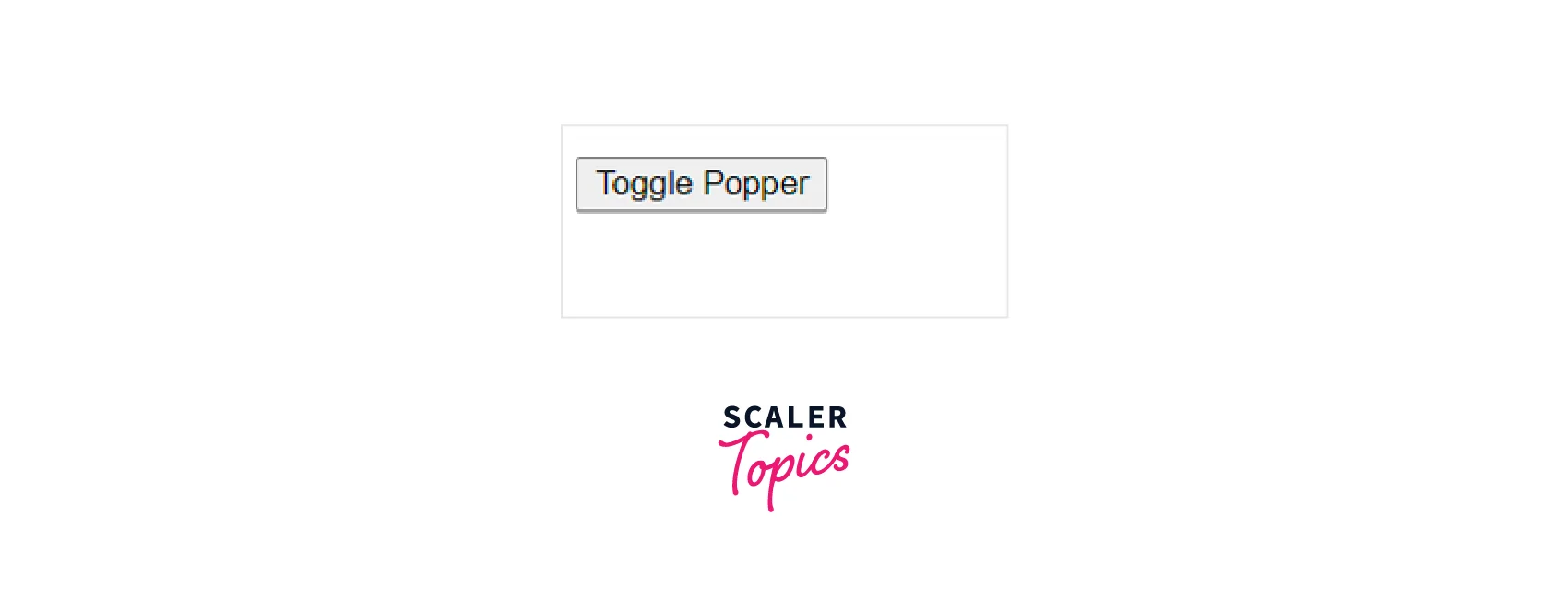
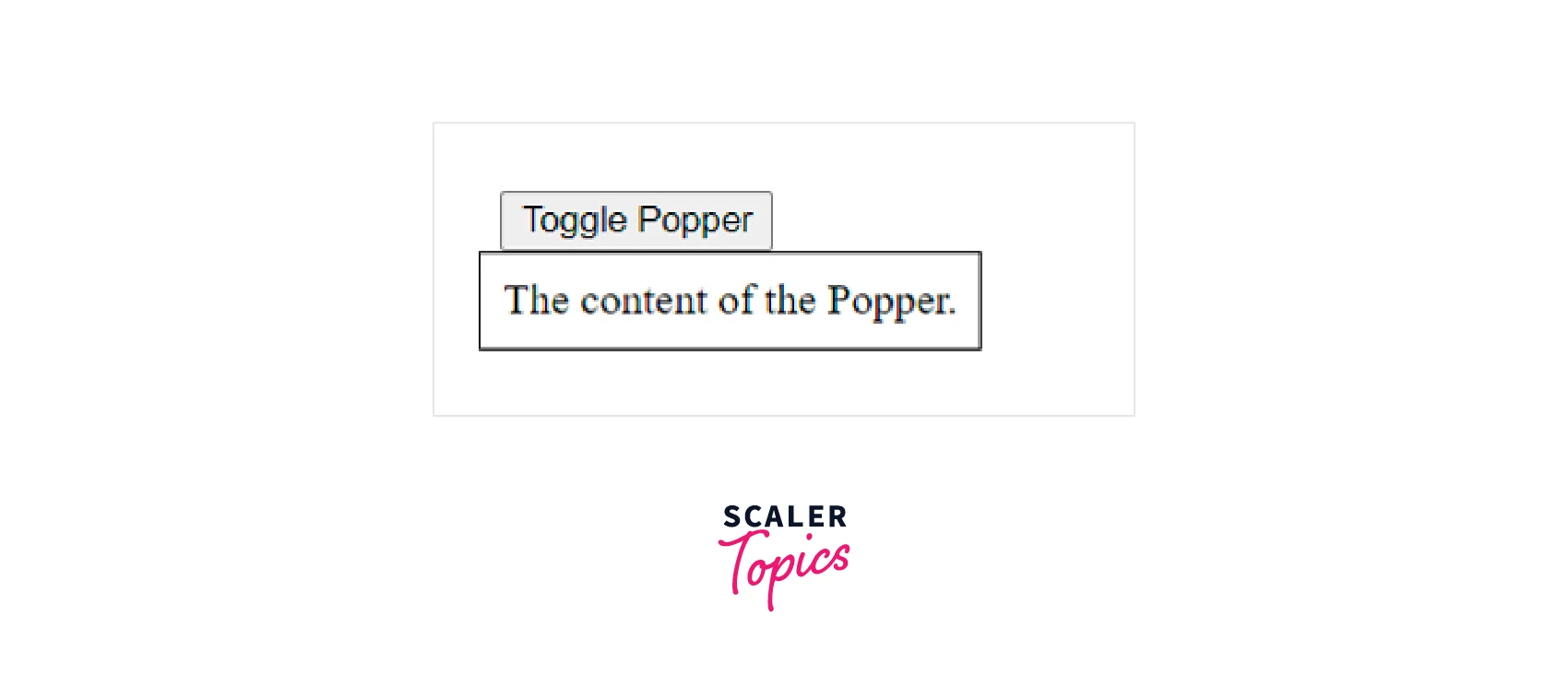
In the above code snippet, the Popper component has been imported along with the Box component from material-ui. A button has been created with an onClick handler. In the handler function, the value of the state variable anchorEl is toggled between null and the button element. Based on the anchorEl, the value of the open variable and the id of the react-popper changes. When the value of open is true, the Box component is shown. This is how you can easily implement the Basic Popper in your React project.
You will see the following output when you render the Basic react popper in your main App :
On clicking the button you will see the react popper as shown :
Transitions
With the help of a transition component and a render prop child, the Popper's open/close state can be animated. The following requirements should be satisfied by this component :
- The component should be a direct descendant of the react popper.
- When the enter transition begins, call the onEnter callback prop.
- Once the exit transition has been completed, call the onExited callback prop. When the Popper is closed and fully transitioned, these two callbacks enable popper the to unmount the child content.
React popper already includes support for react-transition-group.
Here is the code for adding Transitions :
Example:
In the above code, the Fade component has also been imported this time to add the Fade transition. The Fade component is made to wrap the Box component, and it is made the direct descendent of the react-popper. The TransitionProps is an object that contains a boolean value in, the onEnter callback function, and the onExit callback function.
You will see a fade effect when the react popper appears and disappears. You can also adjust the timeout for the animation.
React Positioned Popper
You can make use of the placement prop to adjust the position of the appearance of the react-popper component. The placement prop is used for Popper placement.
It can have the following values: 'auto-end' | 'auto-start' | 'auto' | 'bottom-end' | 'bottom-start' | 'bottom' | 'left-end' | 'left-start' | 'left' | 'right-end' | 'right-start' | 'right' | 'top-end' | 'top-start' | 'top'.
Here is an example of showing the use of the placement prop :
Example:
In the above code snippet, a grid of twelve buttons has been made with the help of the Grid component. Every button of the grid has an onClick handler that calls the handleClick function with a different value of placement. The value of placement changes the position of the react popper for every button.
You will see the following output :
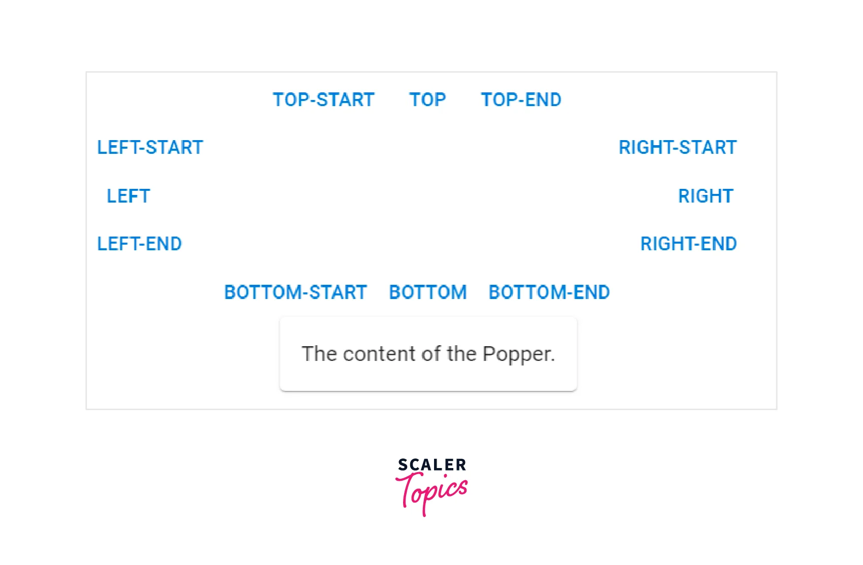
The output shows the Popper when the Bottom button was clicked.
Scroll Playground
The flip and the preventOverflow modifiers can be used to control how the react popper responds to the scroll event. Here is an example code using flip and preventOverflow modifiers.
Example:
Virtual Element
The anchorEl prop's value may refer to a false DOM element. You must make an object with the VirtualElement's shape.
Here is the code that shows the use of virtual elements.
Example:
In the above code, the react popper appears if the user selects some text from the paragraph. Hence the anchorElement is changing based on user activity. When some mouseUp event occurs, the handleMouseUp function is called. The window.getSelection() is used to get the selected text. If the selected text’s length is not zero, then the Popper is made visible by making the open true. If the selected text has a length of zero then the Popper is closed.
PopupState Helper
In most circumstances, a third-party package called material-ui-popup-state takes care of the popper state for you. The boilerplate for typical Menu, Popover, and Popper use cases is taken care of by the material-ui-popup-state. It also provides a Custom React Hook that connects the trigger, toggle, and popover/menu/popper components to the state and keeps track of the local state for a single popup.
Additionally, it offers a Render Props Component that passes state and mutation functions to a child render function while maintaining track of the local state for a single popup.
The material-ui-popup-state requires a material UI version greater than or equal to 5.0.0 and React version equal to or above 16.8.0.
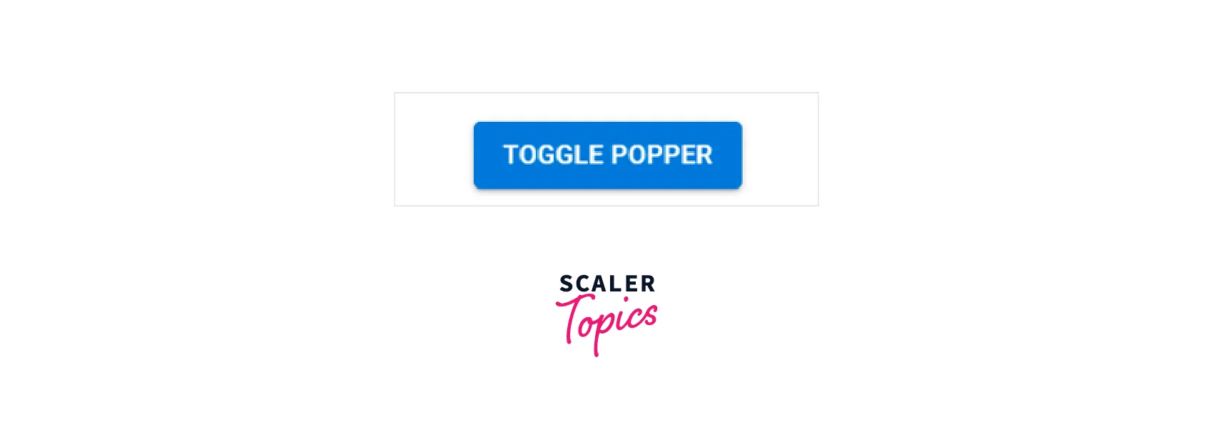
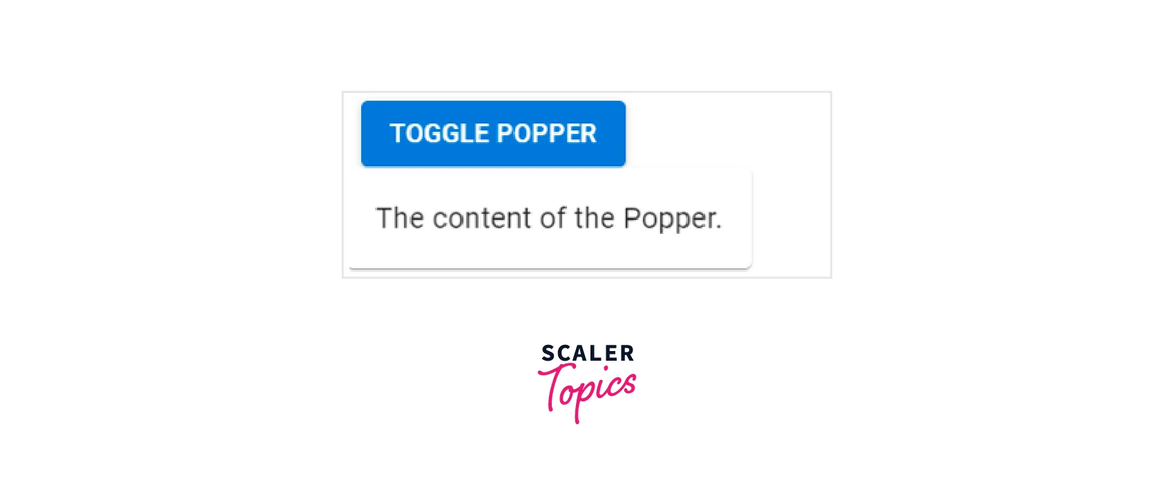
In the above code, the PopupState component has been imported from the material-ui-popup-state. The bindPopper is used to create props to control the react popper component. The bindToggle creates props for a component that toggles the popup when clicked. The react popper component and the Button are wrapped in the PopupState component. Hence we are not required to make use of hooks to work on toggle functionality. PopupState component handles it easily.
You will see the following output :
Using Popper Components in ReactJs
Now let us create an application in React and understand how to make use of the react popper component in it. To create an application in React using the create-react-app.
Now after the above command has been successfully executed, you will have a folder named popper-demo in the current directory, move to it using the following command.
Use the following command to install the material-ui modules after creating the ReactJS application.
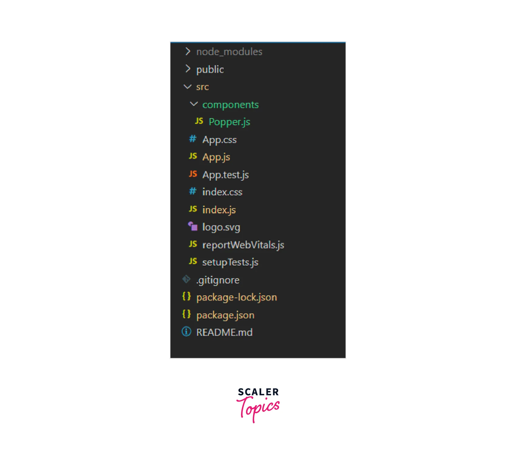
Now in the src folder make a new folder components. In the components folder make a file Popper.js.
Now your project structure will be like this :
Write the following code in the Popper.js file.
Import the react popper component in the main App.js file as shown :
Now run the code using the below command: npm start
You will now see the following output :
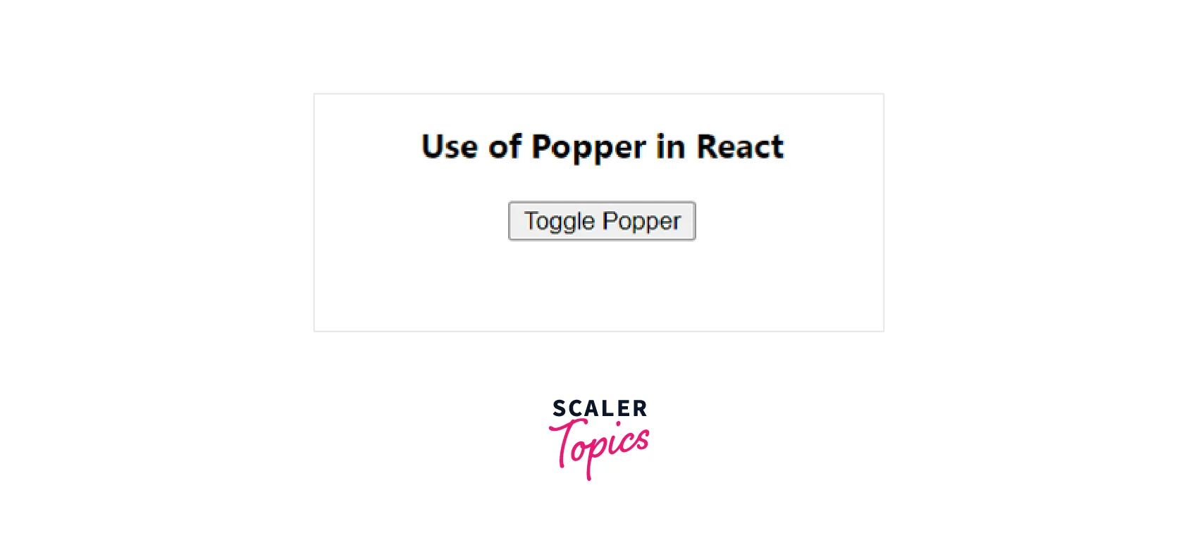
Now click on the button to view the react-popper:
Conclusion
- The React Popper can be used to position any UI element that pops out from your document's flow and floats close to a target element.
- A tooltip is the most typical example, although there are also popovers, drop-downs, etc.
- For precise positioning, react popper depends on the Popper.js third-party library.
- When a new Popper.js instance is created, the anchorEl is used as the reference object.
- With the help of a transition component and a render prop child, the popper's open/close state can be animated.
- The placement prop is used to adjust the position of the appearance of the react popper component.
- The anchorEl prop's value may refer to a false DOM element. Hence you should make an object with the VirtualElement's shape.
- A third-party package called material-ui-popup-state takes care of the popper state for you. For example, the boilerplate for typical Menu, Popover, and Popper use cases is taken care of.
