React Quill
Overview
Quill is a free, open-source rich text editor based on the WYSIWYG (what you see is what you get) principle. A rich text editor is used for editing rich text, supporting various styles, colors, fonts, spacing, etc. Moreover, you can add various audio, videos, and hyperlinks as well.
However, we have a lot of rich text editors available in the market but we prefer quill because it is easy to use, has awesome documentation, and has full customization support. React Quill is a wrapper on top of the quill editor that makes it easy to use and integrate with the React applications.
What is React-Quill
React-Quill is a react component that wraps Quill.js which is a free and open-source WYSIWYG text editor. It can be easily customized due to its modular and extensible architecture and expressive API.
You can easily start using react quill with the help of create-react-app or using browser bundles in react. Let us understand them in detail.
Using create-react-app
Before installing react quill in your application, make sure that you have installed react and react-dom and some way to load styles into your project like style-loader.
To install react-quill into the project, you have to write the below command into the terminal.
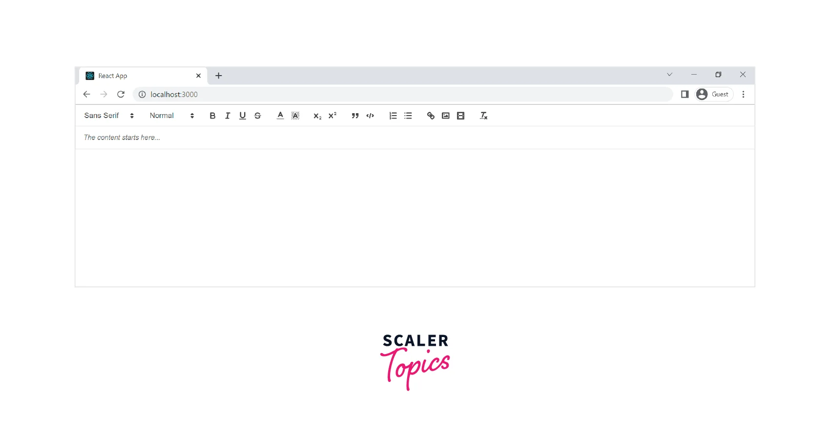
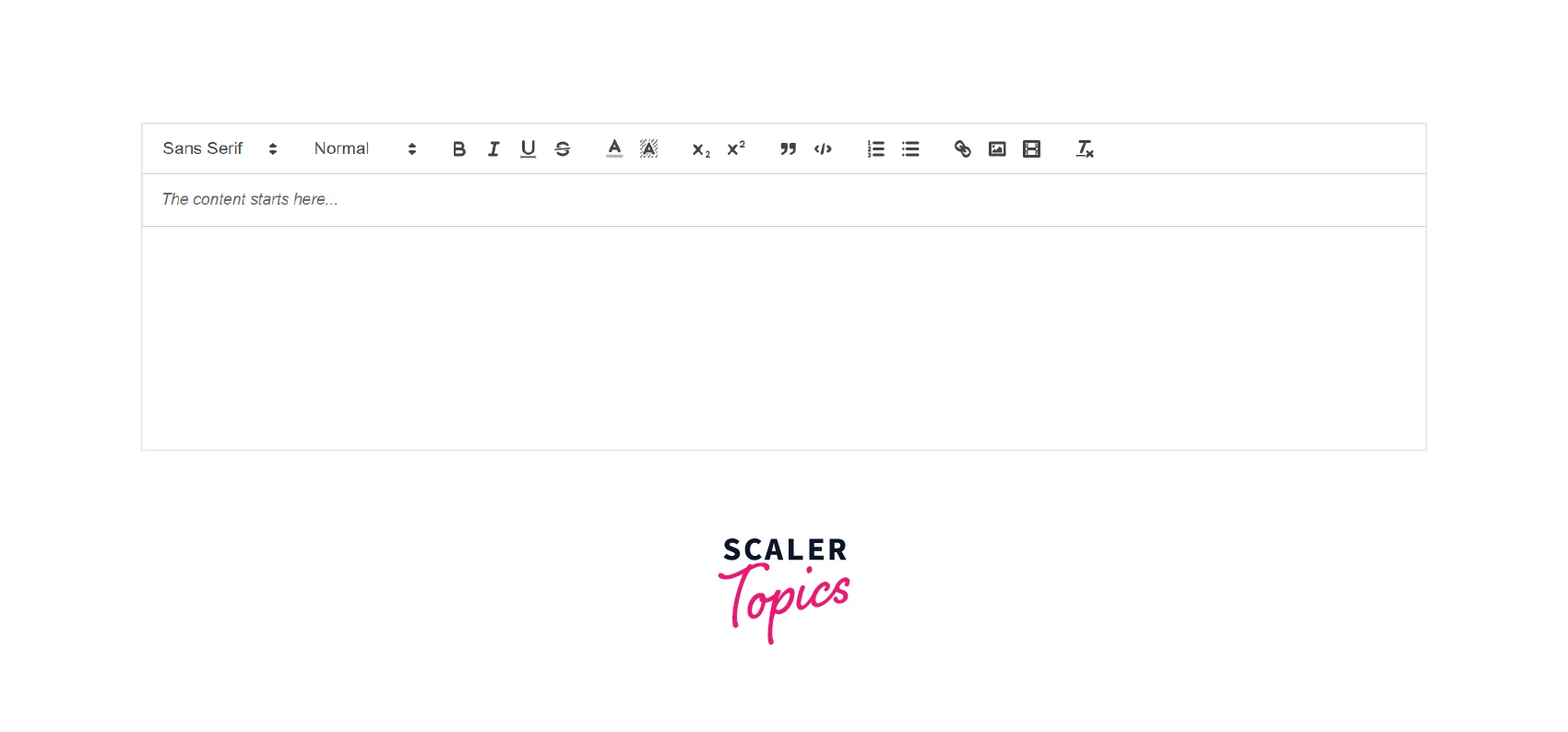
Now to use the react quill in the application, the below code will be used.
As you can see in the above code example, we have imported the react-quill and the react-quill snow theme into the project. Now, inside the ReactQuill component, we have used the theme=snow, setting its value and changing the value with an onChange method.
With Browser Bundle
For using the react-quill with browser bundles, we have to write the below code in the head tag of our application.
Moreover, add the rest of the code into the body section of our application.
Using the above boilerplate code, we can easily use the react quill in our project.
Transform Your Career
Choose from our industry-leading programs designed for career success
Modern Software and AI Engineering Program
Master full-stack development with AI integration

 +1000 more
Modern Data Science and ML with specialisation in AI
Advanced data science techniques with AI specialization
+1000 moreAdvanced AIML with Specialisation in Agentic AI
Deep dive into AIML with focus on Agentic systems
+1000 moreDevOps, Cloud & AI Platform Engineering
Build and manage AI-powered cloud infrastructure
+1000 moreAI Engineering Advanced Certification by IIT-Roorkee
Premier AI engineering certification from IIT-Roorkee
Usage of React Quill
With Controlled Mode Caveats
Components are expected to prohibit local stateful changes in controlled mode and only allow them to occur through onChange and value.
However, ReactQuill has to settle between the controlled and the uncontrolled mode and had to adopt a hybrid mode because Quill manages its changes and does not permit preventing edits. When a value deviates from the current state, it will still override the content even though it can’t stop the change.
Change to totally uncontrolled mode if you frequently need to change the DOM or utilize the Quill APIs urgently. ReactQuill will use defaultValue to initialize the editor but won’t attempt to reset it after that. However, the onChange callback will continue to function normally.
Using Deltas
In place of an HTML string, you can pass a Quill Delta for the value and defaultValue properties. You might want to employ deltas over HTML strings due to their many benefits. However, keep in mind that comparing HTML strings is cheaper than comparing Deltas for modifications, therefore it can be worthwhile to profile your usage habits.
You may wish to adhere to a format and use it consistently throughout because changing the value from an HTML string to a Delta or vice versa will result in a change, regardless of if they reflect the same page.
The delta object you receive from the onChange event should not be used as a value. This object just contains the most recent alterations, not the entire document, therefore using it will almost certainly result in an endless loop where the same changes are applied repeatedly. To get a Delta of the entire document during the event, use editor.getContents(). If you are certain that this is what you want, you can send the object through the new Delta() again to un-taint it. ReactQuill will stop you from making this mistake.
Themes
Quill editor supports the use of themes and comes with built-in themes. It includes a flat toolbar theme called snow that is widely known as the Quill's standard appearance. Moreover, it also uses a bubble theme which is very similar to the one used in the inline editor of Medium. However, a core theme must be added for modules like tooltip and toolbars to function.
To use a theme, firstly we need to include a stylesheet for the theme that needs to be used. You can either include it using create-react-app or using a CDN link as well, either way, would work.
Now, after importing the stylesheet to activate a theme, we simply need to pass the name of the theme to the theme prop. Otherwise, to use the core theme, just pass a false value such as null to the theme prop.
Examples for Understanding
Let us see some examples of toolbar features that we use to make a toolbar using react quill.
The toolbar is configured via a toolbar module.
Below would be the boilerplate code for the same.
You can use various options in the toolbar module that be used to make the toolbar for our editor. The available features can be grouped by nested arrays like in the below code example.
However, if you want to use default values for the options like background, fonts, and colors then simply set the key with an empty array.
Therefore, in this way you can add various features in the editor using react quill.
Turn Learning into Career Growth
Custom Toolbar Using React Quill
Now, as we have discussed how to use the various to make a toolbar using react quill, let us make one. A fully-fledged custom toolbar in a rich text editor.
Output:
Explanation
Therefore, as you can in the above code, we have used various features for a custom toolbar such as headers, fonts, colors, backgrounds, lists, images, videos, and scripts.
Now, to use these features, they need to be passed to the module prop. We have used a placeholder prop for highlighting where the content should start and improving the overall user interface of the editor.
However, to use this content practically we need to access it which is done using the useState hook. As soon as the value changes, the onChange calls the setValue function and it is visible in the terminal.
API References
Exports
Below are the two ways by which you can import the react quill into the project. One is using the ES6 standards and the other is using plain Javascript.
The Quill namespace mentioned above is the one on which you can call register.
Props
The different props that are used with the ReactQuill component are as follows-
id: It is the id to be applied to the DOM element.
className: The classes that need to be applied to the DOM element.
placeholder: It is the default value for an empty editor. The Quill API does not allow to change of this value dynamically.
theme: The name of the theme to be applied is passed to it. The default theme used is Snow. However, you can pass null to activate the core theme.
bounds: It is a selector used by React Quill to restrict the position of a popup.
onKeyPress(event): It is called after a key has been pressed and released.
onKeyDown(event): It is called after a key has been pressed but before it is released.
onKeyUp(event): It is called when a key is released.
value: It is the value of the as a controlled component. It can be a plain object representing delta or a string containing HTML.
defaultValue: It is the initial value for the editor as an uncontrolled component.
readOnly: The editor will not allow changing its contents if it is true.
onBlur(previousRange, source, editor): It is called when the editor loses focus. It will receive the selection range it had previously before losing focus.
modules: It is an object specifying which of the modules are enabled and their configuration.
formats: An array of formats are enabled during editing which is placed in this prop.
style: It is the object that contains custom CSS rules to be applied to the editor's contents. The rules should be specified in the CamelCase style.
tabIndex: The keyboard navigation order in which the editor and other controls on the page come into focus.
children: It is the single react element that will be used as the editing area for Quill in place of the div.
onChange(content, delta, source, editor): It is called back after the change with the new contents of the editor. Editor accessors like getHTML() will receive the HTML contents of the editor, a delta object indicating the change, the source of the change, and finally a read-only proxy.
preserveWhitespace: It prevents the Quill from collapsing continuous whitespaces on paste. However, if true, a pre tag will be used instead of a div tag for the editor area.
Methods
The following are the methods that can be invoked if you have a ref to a Quill node.
- blur() - It is used to remove the focus from the editor.
- getEditor() - It returns the Quill instance that backs the editor.
- makeUnprivilegedEditor: It creates an unprivileged editor.
- focus() - It is used to focus on the editor.
Unprivileged Editors
ReactQuill will make a limited subset of the Quill API accessible during events as the editor argument. As a result, access to harmful methods is restricted, preventing the possibility of ReactQuill losing sync with the component.
In most cases, you won't need to use this technique because the editor that event handlers may access is already non-privileged.
The following functions are offered by it, most of which are proxies for current Quill functions:
- getText()- It returns the string contents of the editor and not the HTML page.
- getContents() - It returns the Quill delta of the entire document.
- getHTML()- It returns the full HTML content of the editor.
- getLength() - It returns the length of the editor's contents.
- getSelection()- It returns the new selection range.
- getBounds() - It returns the size and pixel position of a selection in relation to the editor container for a specific point.
Scaler Placement Report and Statistics
Scaler learners achieved 2.5x salary growth with average post-Scaler CTC reaching ₹23L.
Using React Quill with NextJs
To use the React Quill in a NextJs project, first of all, we need to install it into our project.
To install it, we need to run the following command.
Now, we need to import the react quill within a NextJs component.
Using NextJS's dynamic import capability, we can integrate react-quill in a component. The lazy loading of external libraries is supported by this advanced NextJS feature. This enhances the performance of the initial load.
Below is the code example for the same.
Now let us see how to use the React Quill inside a component. Below is the code example for the same.
Output:
Explanation
Firstly, we have imported NextJs using its dynamic capability. After this, we made an IndexPage() function and used the useRef() function.
After we have a reference to the Quill node, we passed it to the ReactQuill component with the theme snow. Moreover, we have introduced the hook useState to access the content of the editor whenever it changes using the onChange() method
Conclusion
- React Quill is a free, open-source text editor based on WYSIWYG.
- We can make full customizations on the various features in the toolbar that we will make in the react quill text editor.
- It has various props such as themes, value, defaultValue, placeholder, and id.
- React Quill has built-in themes support. The Snow theme is considered Quill’s standard appearance.
- It has various methods like blur(), focus() that can be invoked if we have a reference to the Quill Node.
- React Quill can be used with NextJs with its dynamic import capability and useRef() method.
 Google
 Amazon
 Microsoft
 Flipkart
 Adobe1200+ more