React Radio Buttons
Overview
To leverage HTML components or third-party libraries for React, like material-UI, when working with a web project, you may need to employ a variety of form controls, such as text boxes, checkboxes, dropdowns, file uploads, or react radio buttons. The fundamentals of the radio button, how to use it in a group, and how to retrieve the selected radio button value on a change event are covered in this manual.
Introduction
A radio button is a form element that allows the user to select one option from a group of choices. React radio buttons are used when there are multiple options and only one option can be selected.
In React, you can create a radio button using the input element with the type attribute set to radio. Each radio button should have a unique value attribute that represents the value of the option.
You can group multiple react radio buttons together by wrapping them in a div element and adding a label for each option. To determine which radio button is selected, you can use the checked prop and set it to a boolean value that determines whether the radio button is selected or not. To handle the selection of a radio button, you can use the onChange event handler. This function will be called whenever the user selects a different radio button and you can use it to update the state of your component to reflect the new selection.
Here is an example of how to create a simple radio button group in React:
In this example, the RadioButtonGroup component renders a group of radio buttons with three options: Option 1, Option 2, and Option 3. The checked prop of each radio button is set to a boolean value that determines whether the radio button is selected or not. The handleChange prop is a function that is called when the user selects a different option.
To use this component, you can import it into your React app and render it like the above. This will render a group of radio buttons with the first option selected by default. When the user selects a different option, the handleChange function will be called and the selectedOption state variable will be updated to reflect the new selection.
Installation
For the installation use code given below:
import RadioGroup and RadioButton packages from the react-radio-buttons module to your code after that.
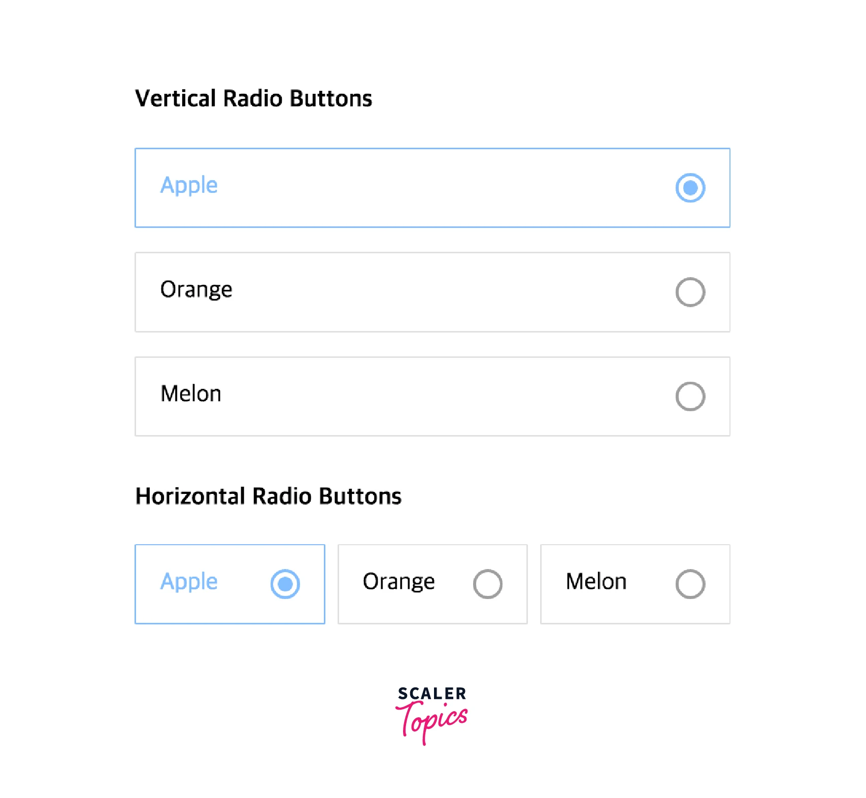
This is your average radio group:
By using react-radio-buttons, you can write like this :
How Radio Buttons Works in React.Js?
HTML components known as react radio buttons allow users to select one option from two or more possibilities.
We will learn how to use radio buttons in the React app in this lesson. React uses radio buttons in a slightly different way than standard HTML. But we'll discover how simple it is to include radio buttons in React.
A brief introduction to utilizing a radio button in React using an example, for beginners. First off, a radio button is just a form of HTML input field that can be rendered using React's JSX.
Let me provide a straightforward example to explain it to you. The application that we're going to create is as follows:
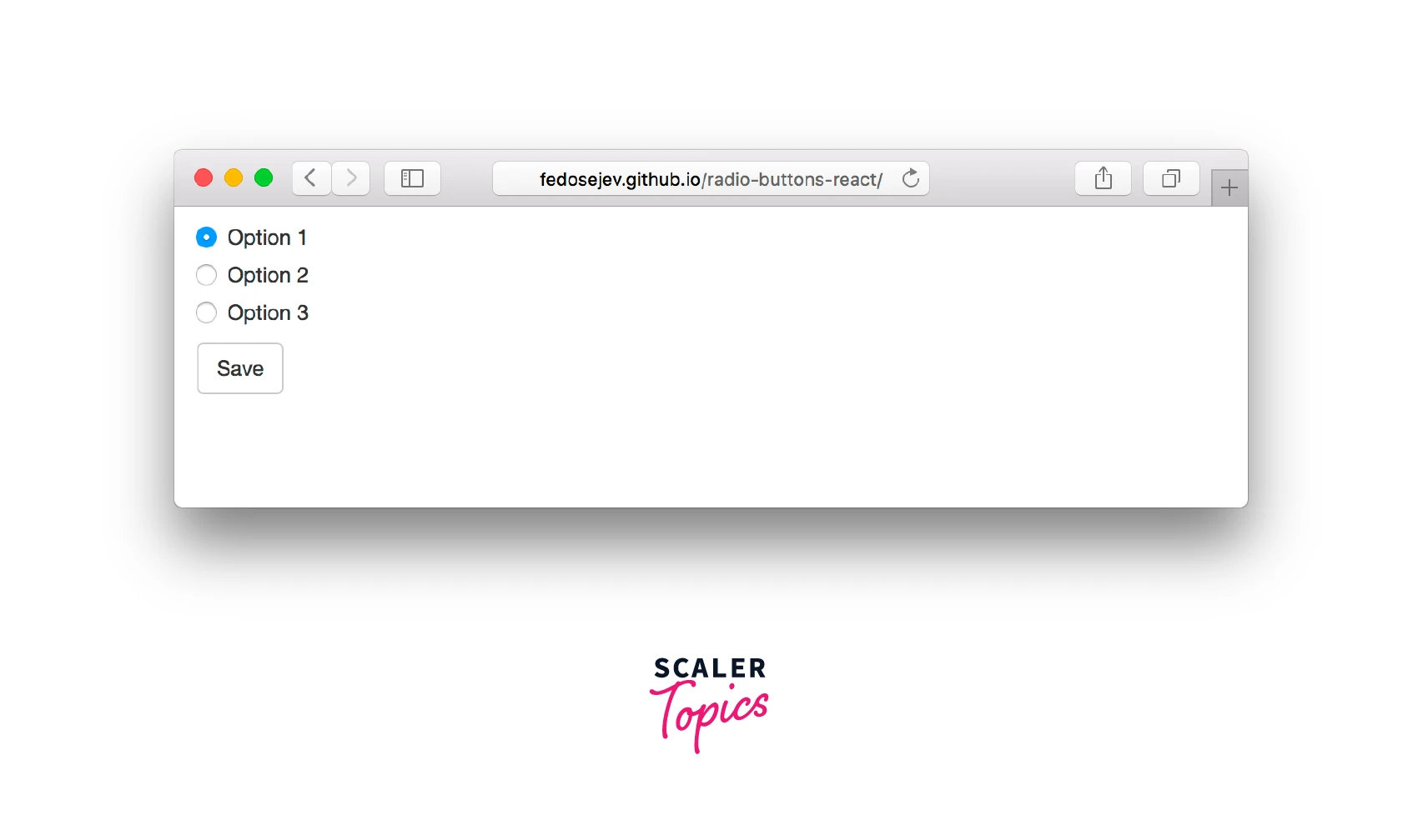
We'll start by creating new React.js component called Application:
Our component has not yet rendered anything. What ought it to produce? The above Figure makes it easy to see the following 2 user interface components:
- radio controls
- saving icon
Let's begin by developing items for react radio buttons. We'll write JSX code to construct a <form> element with three <input> components nested inside it in the render() function:
Quite a few <div> elements, that is! Do we actually require them?
Actually, no. Their goal is to use the Bootstrap grid concept to construct a layout. Don't worry if you are unfamiliar with Bootstrap; just concentrate on the <form> element:
Let's now examine the first input element in more detail:
It appears precisely like your typical HTML input> element aside from checked={true}. But it just appears to be one (on purpose, I guess). But since <input> is a React component here rather than an HTML element, it functions differently!
Value and checked are component attributes, just like they are for every other sort of React component. The checked property, on the other hand, is interactive since user actions can pick or deselect it by choosing a different radio button.
React will produce the following if you pass checked={true}

If checked={false}, React will render as follows:

We are aware that a React component must store the state to determine which object to render if it is able to render several objects. It is obvious that our <input> component has to render the selected and unselected radio buttons in their respective states.
Let's statefully implement our application component:
We have a selectedOption property in our state object with the starting value of option1. This instructs the radio button in our application component as to which to be picked. All other react radio buttons should obviously be deselected.
Each of the three radio buttons in our application has two states: selected and unselected. Indicating which radio button is expressly selected also indicates which should be unselected. A similar outcome may be obtained when creating radio buttons in HTML by grouping react radio buttons together using the name HTML attribute.
For each of the three <input> components, we must now supply a true or false value to the checked attribute. Only this time, the value for checked is determined by contrasting the state of the component with the name of the input:
Depending on the state of the component, the below are expressions:
this.state.selectedOption === 'option1', this.state.selectedOption === 'option2' and this.state.selectedOption === 'option3' will be evaluated as true or false, and it will then instruct React how to present our <input> elements: chosen or unselected.
But take note that we are currently rendering three react radio buttons with the first one chosen. Nothing occurs if I click on any other 2 options. They are not chosen. Alternatively, to be more precise, they are not represented in a distinct way.
And it should make sense to you because we don't change the state of our component when a user interacts with our radio buttons, thus we don't render them differently. As a result, our radio buttons "don't work" from the user's perspective.
How can we ensure that clicking on our radio buttons causes a change in the state of our component?
React provides an onChange attribute that we can use to handle changes in our <input> components:
Now, React will run the handleOptionChange function whenever a user selects one of our react radio buttons.
Let's add that function to our object representing the component specification:
The value of the <input> element that the user clicked on is referenced by the changeEvent object that handleOptionChange receives: changeEvent.target.value. We're invoking the setState() function to update the state of the component after assigning that value to the state object's selectedOption field.
Our radio buttons will now be rendered differently by React. From the perspective of the user, they are currently "working". And that is all that is necessary to use radio buttons in React. We manage the components of our <input>. Or, to be more precise, by the current state of our component and the user's ability to alter it by interacting with rendered radio buttons.
As an alternative, we could have made our input component uncontrolled by simply removing the value and checking attributes from the component.
According to the React documentation, uncontrolled components keep their own state because we, as developers, have no control over them. It is contained within the actual component. To group our components together (as with HTML elements) if we give up control, we must send the name property to them. This will ensure that when the user selects one radio button, the other ones become unselected.
Would it not be simpler? We would write less code because our component would be stateless.
True, but think about how you would instruct React as to which radio button should be chosen first. It wouldn't be easy because you don't have control.
We want React to call the handleFormSubmit function when a user submits our form. Let's define it on our object for the component specification:
As an argument, it receives a formSubmitEvent object. We then apply preventDefault() to it to stop the behaviour of the default form submission. Finally, we record the name of the chosen choice in a web browser's console. The name of the selected option is obtained from the state of our component:
How Do You Use Radio Buttons in React.Js?
React Radio Button Example
Using the render() method of a React component, we will build a simple form. A user can select his favorite color from a selection of five colors available on this form. The status of the radio buttons will change when a user presses the submit button.
Basic React App Set Up
Installing and configuring the fundamental React app will be the first step in demonstrating how radio buttons work.
Explore the react-radio-buttons project:
Run the following command to launch the React app:
Define React Radio Button State
We shall first set the react radio buttons' states. The user's selection refers to this radio button's current status. Since the user will select the color once the form is ready, we defined the color variable in state and gave it the empty (' ') value.
Install Axios in React
To install Axios in a React application, you will need to have Node.js and npm (the package manager for Node.js) installed on your computer.
Open a terminal window and navigate to the root directory of your React project. Run the following command to install Axios:
This will install Axios and add it as a dependency in your project's package.json file. Once Axios is installed, you can import it into your React components like this:
You can then use Axios to make HTTP requests in your React components. For example:
This will send a GET request to the /api/users endpoint and log the response data to the console.
Build React Form with React Render Method
The HTML form with react radio buttons and color values will be defined in this stage and placed inside the render() method. The Unordered Lists will be rendered as 5 Radio Buttons using this technique.
Let's examine what we filled out in the form. Each radio button has two properties checked and onChange, as well as color values.
In our form, the checked prop controls which radio button is selected based on its current color state.
Every radio button's state is verified against its corresponding value. The radio button is seen as being selected when the value is checked, setting it to true. The radio button will be in the unselected state if the value is false.
How is it Working?
In other words, when a user selects any radio button from the predefined group. The onChange event handler is then used to update the state using the color variable.
Finally, we created the onSubmit event handler and attached it to the main form using the onSubmit function. As a result, the value of the radio buttons is modified when the user presses the submit button.
Radio Button Selected State in React Using the state variable, we specify a Radio button's value. It changes a Radio button's selected value in React.
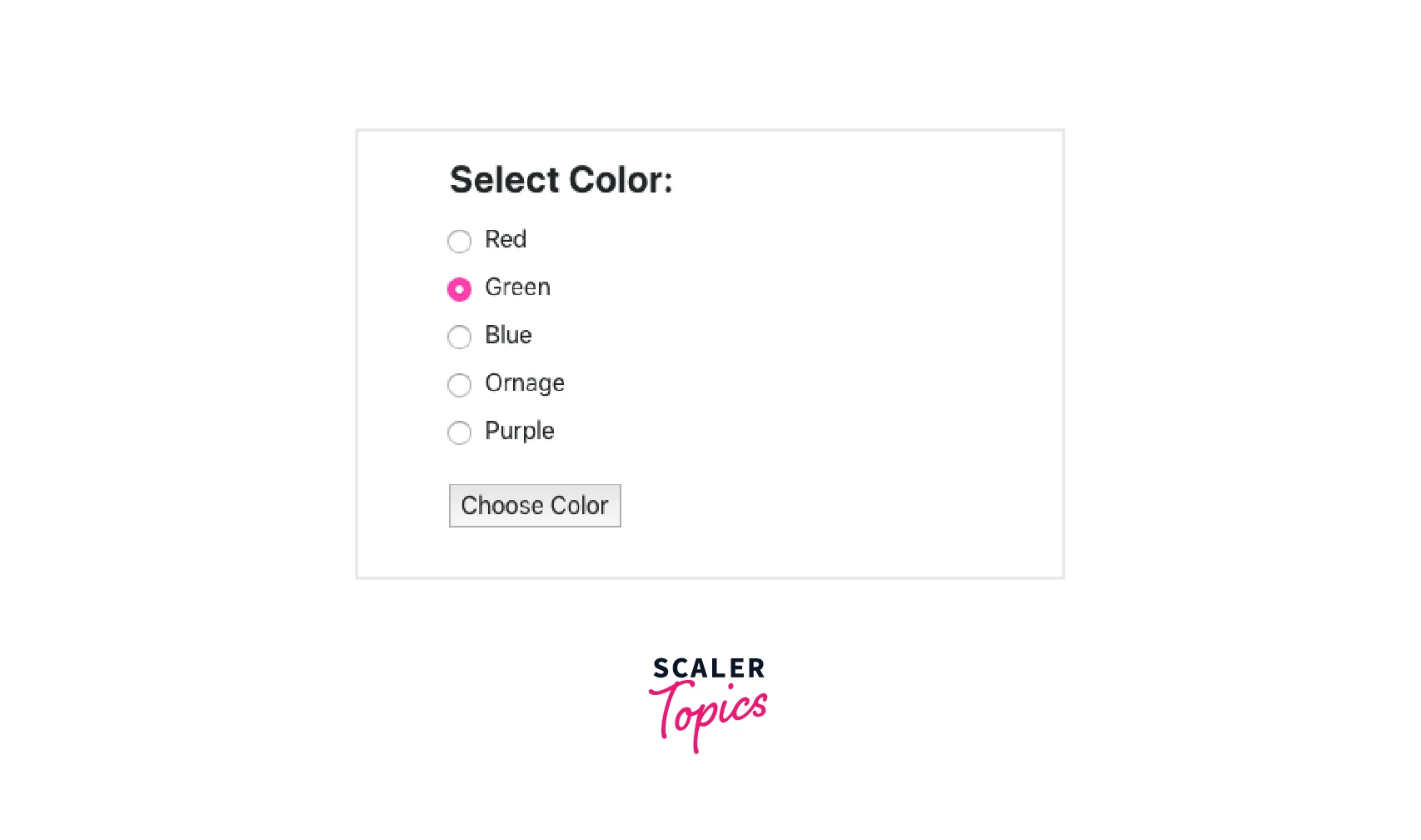
Your browser will see something similar to this:
Output
Include Event Handler in React Form
We will incorporate the event handler in this phase. When a user clicks on the radio button, this will set and update the state of the radio button.
The aforementioned technique will modify a Radio button's color value in response to user input.
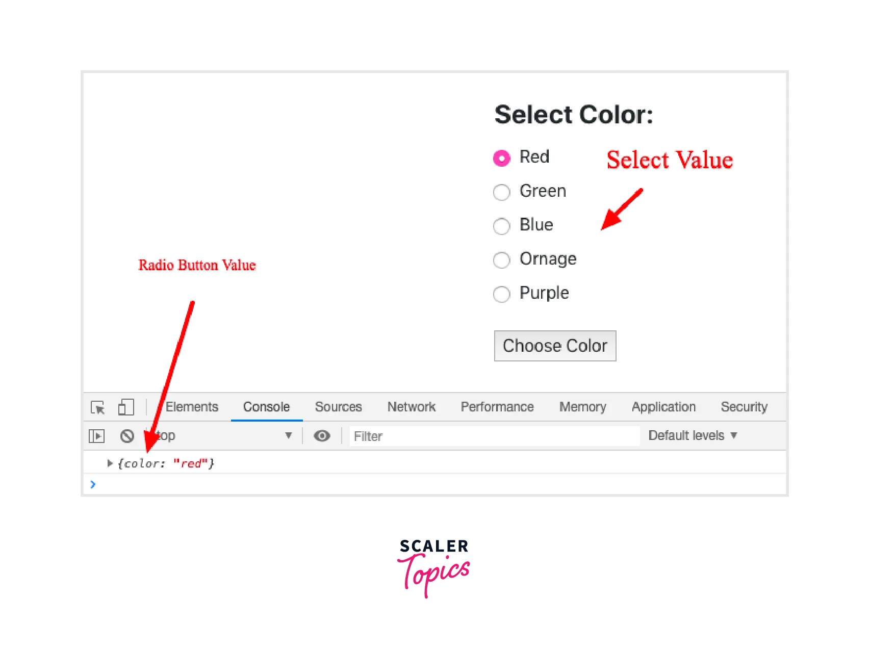
The onSubmit event handler for the form will be defined in this final phase. This event will occur when a user submits the form. Use the event.preventDefault() method to stop the problem with the submit button causing the page to be redirected.
Output
Radio Buttons from Third-party Libraries
HTML input with a radio button type is available. Take advantage of several third-party libraries that offer radio button components if you need to employ different styling:
- material-ui
- react-radio-buttons
- react-radio-button
- react-radio-button-group
- react-radio-group
React radio buttons are a form element that allows the user to select a single option from a list of options. There are several third-party libraries that you can use to implement radio buttons in your React application. Here are a few examples:
React Bootstrap
React Bootstrap is a library that provides pre-built React components for Bootstrap, a popular CSS framework. It includes a Radio component that you can use to create react radio buttons. To use React Bootstrap, you will need to install it and import the necessary components:
React Select
React Select is a library for creating customizable, feature-rich select inputs. It includes a Radio component that you can use to create radio buttons. To use React Select, you will need to install it and import the necessary components:
React Material-UI
React Material-UI is a library that provides pre-built React components for Material-UI, a popular UI framework. It includes a Radio component that you can use to create radio buttons. To use React Material-UI, you will need to install it and import the necessary components:
These are just a few examples of libraries that you can use to implement radio buttons in your React application.
React Radio Buttons API
Radio buttons are form elements used to choose one thing from a group of alternatives that are mutually incompatible. The container for the set of options is the RadioGroup component. Each of the options themselves uses the Radio component.
If a passed-in id is provided, it will be used to manage the label/radio association; otherwise, an auto-generated id will be used.
Example
Output
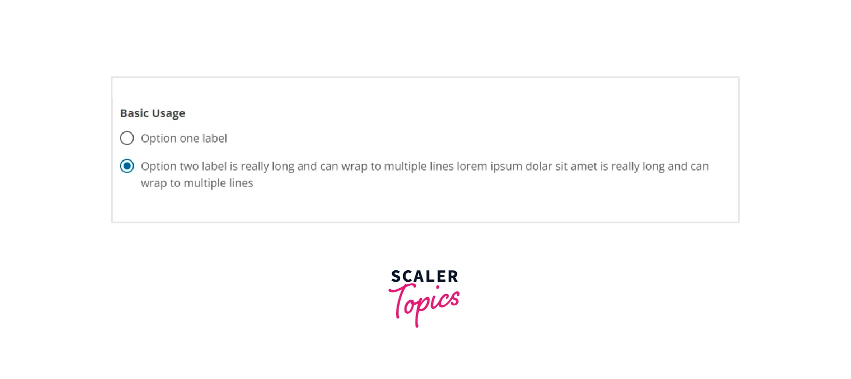
Default Selected Value
Use the value prop on RadioGroup to send in the value of the option you want to select in order to set a selected value as the default. Use the value prop on the RadioGroup to send in the value of the option you want to select in order to set a selected value as the default.
Example
Colors
The react radio buttons use the dominant hue of the theme by default. However, any other hue may be admitted.
Output

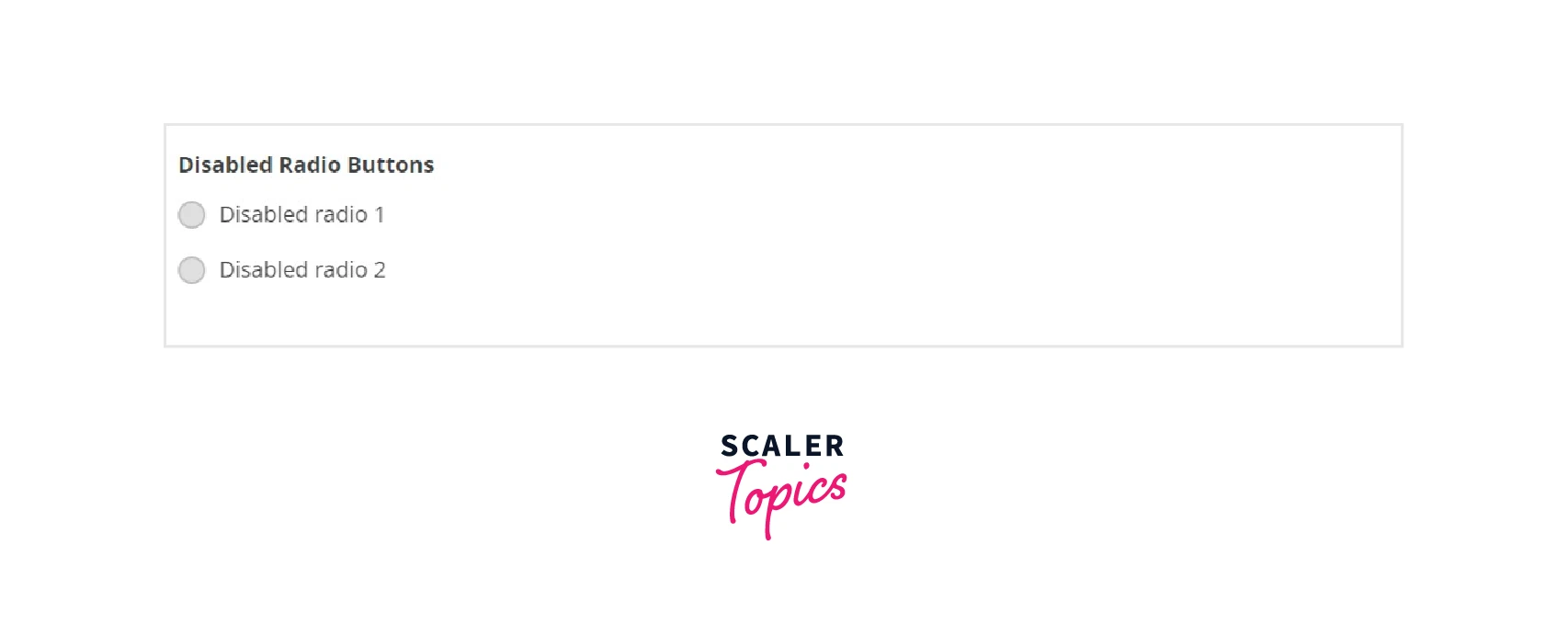
Disabled
Output
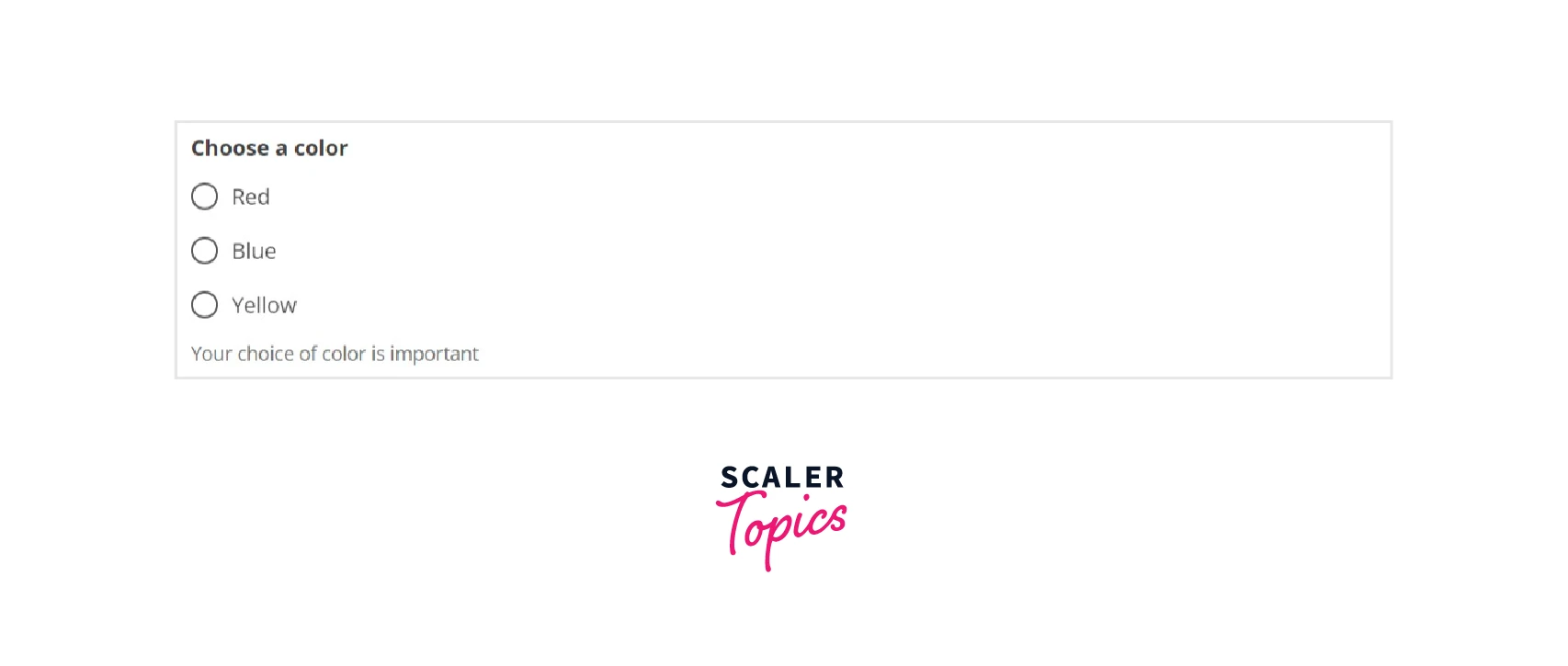
Helper Message
The collection of radio buttons is followed by the helperMessage. If there is an error message, it won't show up. can be a string or a node.
Output
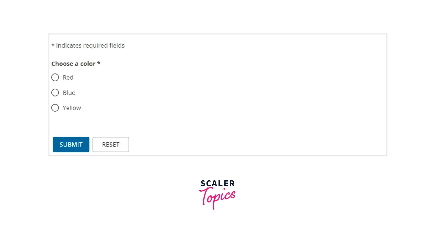
Required Fields / Error Message
If a choice is necessary, the required attribute can be communicated to the RadioGroup component. Additionally, you must make the user aware of the necessary field in the UI.
If a radio group has an errorMessage, the error message will be displayed below the fields and the radio buttons will be stylized to emphasize the error status. The error message will take the place of the helper text if one is present. can be a string or a node.
Output
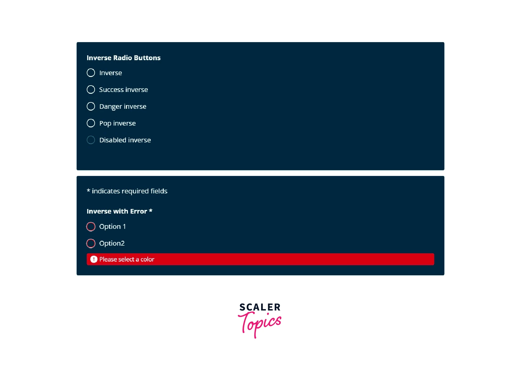
Inverse
When applied to the contained RadioGroup, the isInverse property, an optional boolean, flips the colours so that the radio buttons stand out more against a dark background.
Output
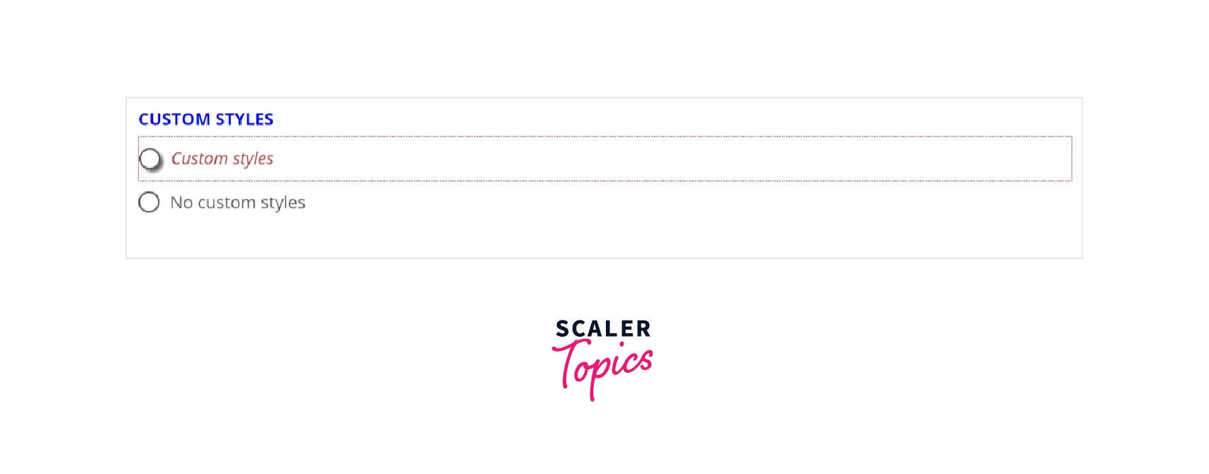
Custom Styles
Both the RadioGroup component and the Radio component can accept custom styles. The container will be affected by the containerStyle attribute. To style, the corresponding elements, additional labelStyle and inputStyle options are offered. When implementing custom styles, err on the side of caution.
Output
Conclusion
- A radio button is a form element that allows the user to select one option from a group of choices.
- Radio buttons are used when there are multiple options and only one option can be selected.
- For installation use: npm install react-radio-buttons --save, add import {RadioGroup, RadioButton} from 'react-radio-buttons' to your code after that.
- First we have learned how radio buttons in React.js work with an example and then how can we use react radio button with the given steps:
- Basic React App Set Up.
- Define React Radio Button State.
- Install Axios in react.
- Build React Form with React Render Method.
- Radio Button Selected State in React.
- Include Event Handler in React Form.
- Make advantage of several third-party libraries that offer radio button components if you need to employ different styling:
- material-ui
- react-radio-buttons
- react-radio-button
- react-radio-button-group
- React-radio-group
- The container for the set of options is the RadioGroup component. Each of the options themselves uses the Radio component.
React radio button API includes the following properties:
- Default Selected Value
- Colors
- Disabled
- Helper Message
- Required Fields / Error Message
- Inverse
