React Switch component
Overview
Making user interactions a priority when developing online applications. Utilizing forms is one of the key ways to provide for user interactions. For receiving various forms of user input, multiple form components are available. Most of the time, you need to ask users for boolean-like information, such as yes or no, true or false, enable or disable, on or off, etc. Traditionally, this type of input is collected using the checkbox form component. Toggle switches are widely used in place of checkboxes in modern interface designs.
Introduction
A toggle switch is an on/off switch. Toggle switches are best utilised for altering the status of system functionality and preferences. Toggles can be used in place of two radio buttons or a single checkbox to allow users to select between two competing states.
Switches are the preferred method for adjusting settings on mobile devices. The choice that the switch controls, as well as the state it is in, should be clearly depicted through the use of the accompanying inline label. It's a design feature that allows users to choose between two alternative states. Websites, mobile applications, and other software frequently use this.
A switch feels tangible. So rather than checking a checkbox, clicking or tapping, it feels like you're truly using a real-life switch. Because a toggle switch is not a native element in web development, developers have created methods to simulate it using only HTML and CSS. The react-switch can be used in React to construct a draggable toggle-switch component.
It offers the following features :
- Draggable using a mouse or a touch screen.
- Size, colour, and other options are easily customizable.
- Suitable for visually challenged people and those who are unable to use a mouse.
- Package size is reasonable - 2.5 kB gzipped.
- It has a sensible default style that can be easily modified. There is no need to import a separate CSS file because inline styles are used.
Installation
The react-switch needs installation using some package manager. In case of Node Package Manager(NPM) the following command can be used to install it :
In the case of yarn package manager, you can use the following command :
Label
The nesting of the switch component within the label tag ensures that the label text is read aloud to users with reduced vision who use screen readers and allows users to toggle the switch by clicking on the text. If you merely place some text next to the switch without putting it inside a label element, the screen reader will just say switch off, and the user will have no idea what it is for.
If you want to avoid nesting the switch inside a label tag, then you can make use of the htmlFor attribute on the element that you want to use as a label and set the value of htmlFor attribute as the id of the switch. You can also make use of the aria-labelledby or aria-label props to provide a label for the switch component.
Size
The height and the weight attributes of the switch are numerical values that determine the size of the switch component. The height and width of the background of the switch can be specified in pixels with the help of these two props. The height has a default value of 28, and the width has a default value of 56.
Color
The color of the switch can be changed with the help of four props that are offColor, onColor, offHandleColor and onHandleColor. They all accept the hex colour code in the form of a string. The handle color and the color of the background of the switch can be modified in both on and off states with the help of these props. All the four props with their default values are discussed in the below table.
| props | description |
|---|---|
| offColor | When the switch is not checked, it will take on this colour. It has a default value of #888. |
| onColor | When the switch is checked, it will take on this colour. It has a default value of #080. |
| offHandleColor | When the switch is not checked, the handle of the switch will take on this colour. It has a default value of #fff. |
| onHandleColor | When the switch is checked, the handle of the switch will take on this colour. It has a default value of #fff. |
Customization
The style of the switch can be customized by a number of props. All the props have been discussed in the below table.
| props | description |
|---|---|
| borderRadius | It is a number. The radius of the border of the switch and its handle. |
| handleDiameter | It is a number. The handle's diameter, measured in pixels. It will be two pixels smaller than the height of the switch by default. |
| uncheckedIcon | It is a boolean value or an element. When the switch is not checked, this icon will appear on it. If you don't want any icons, you can enter false. An svg is by default set as uncheckedIcon. |
| checkedIcon | It is a boolean value or an element .When the switch is checked, an icon will appear on it. If you don't want an icon, you can enter false. An svg is by default set as checkedIcon. |
| uncheckedHandleIcon | When the switch is not checked, this icon will appear on the handle. It accepts an element. |
| checkedHandleIcon | When the switch is checked, the element specified in checkedHandleIcon will appear on the handle. It accepts an element. |
| boxShadow | The handle's default box-shadow. The boxShadow has a predefined format. It accepts a string. |
| activeBoxShadow | When the handle is active or focused, it has a box-shadow. This should not be set to null because it is necessary for accessibility. It accepts a string and has the default value 0 0 2px 3px #3bf. |
Accessibility
There are two props that allow you to point to the switch element. The className and the id props can be specified to access and manipulate the switch element with the help of Javascript.
| props | description |
|---|---|
| className | It is a string. The outer shell of the switch is given the specified className. It can be used to position the switch component. |
| id | It is a string. The value specified as id is set as the id attribute of the checkbox embedded in the switch component. It can be used with the htmlFor attribute to associate a label with the switch. |
API
| props | description |
|---|---|
| onChange ([checked], [event], [id]) | When the user clicks or drags the switch, this function is called. It is given three arguments: checked, which is a boolean that indicates the checked prop's projected future state , the event object , and the id prop . |
| checked | It is a boolean value. The switch is set to checked, if true. It is not checked if it is false. It is a required prop , hence it must always be specified. |
| disabled | It is a boolean value. When the switch is disabled, it is no longer interactive and its colours are greyed out. It is false by default. |
React-switch Examples
Here are a set of examples of the usage of the react-switch.
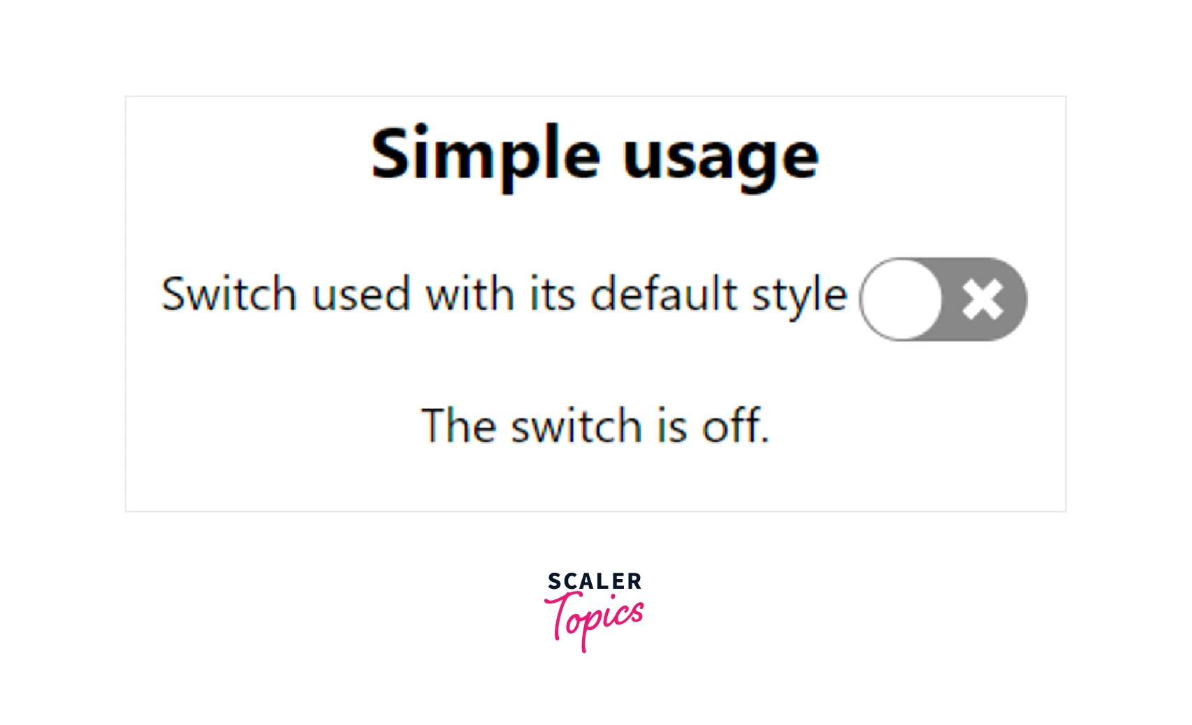
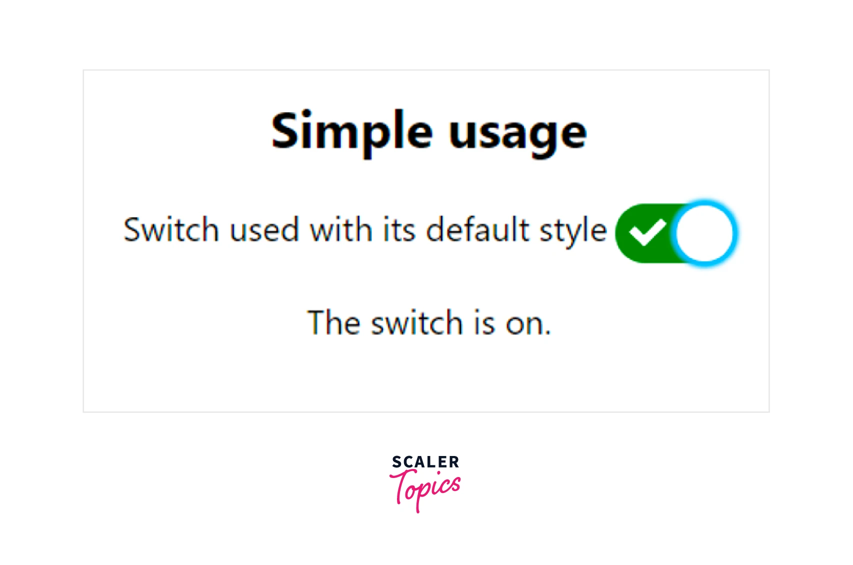
Simple Usage
Here is the code for creating a switch with the default styling. The javascript file for the SwitchComponent that can be used anywhere in the React app.
Example
The Switch.css contains the following code :
The following output will be shown for the above code :
Custom Styling
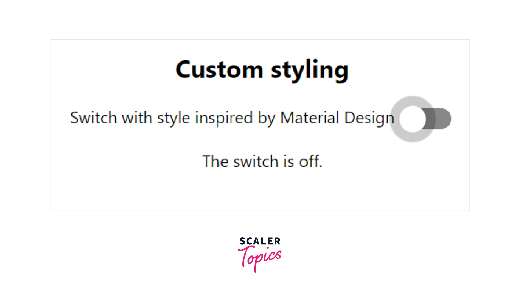
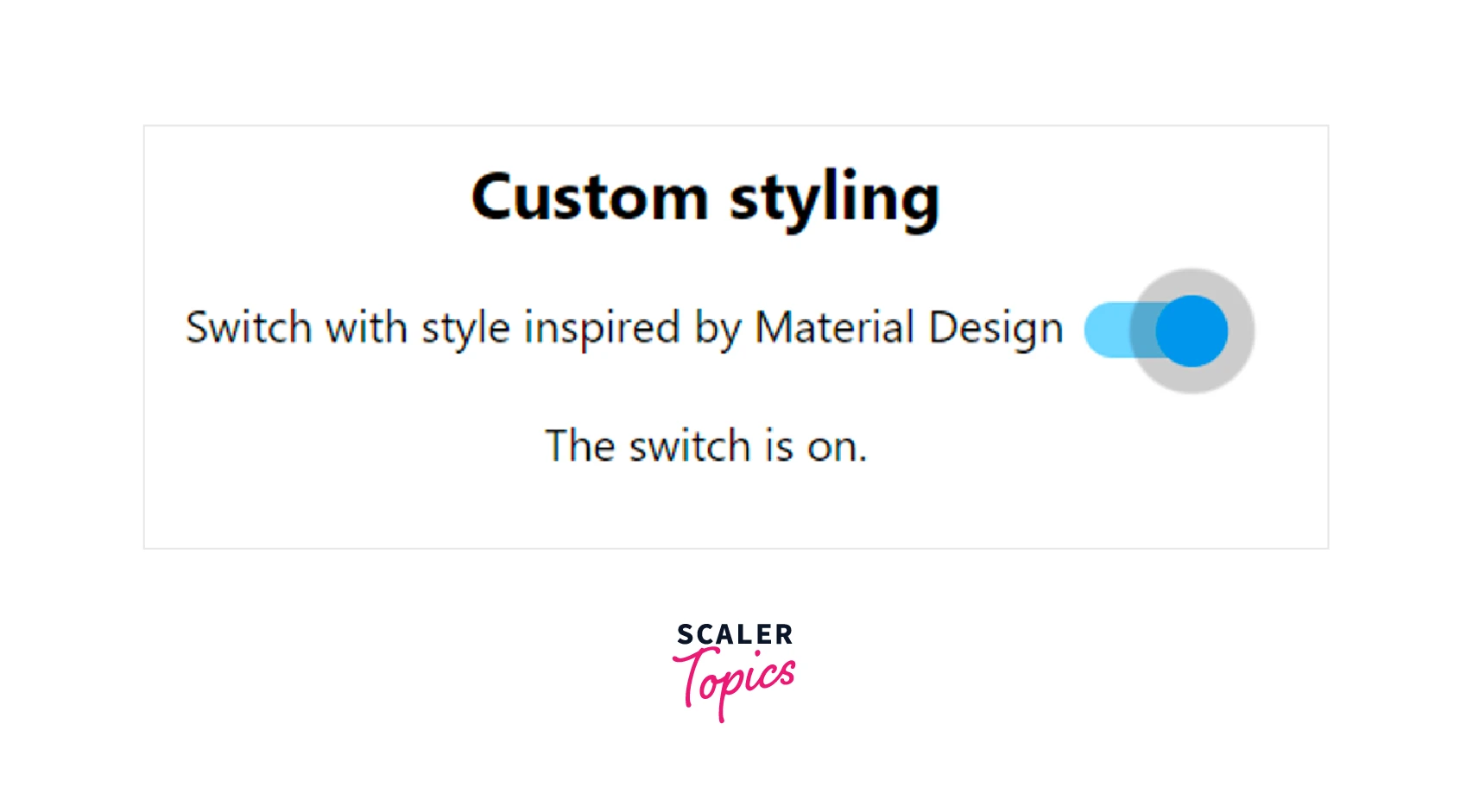
Here is the code for creating a switch with the custom styling inspired by MaterialDesign.
Example:
The following output will be shown for the above code :
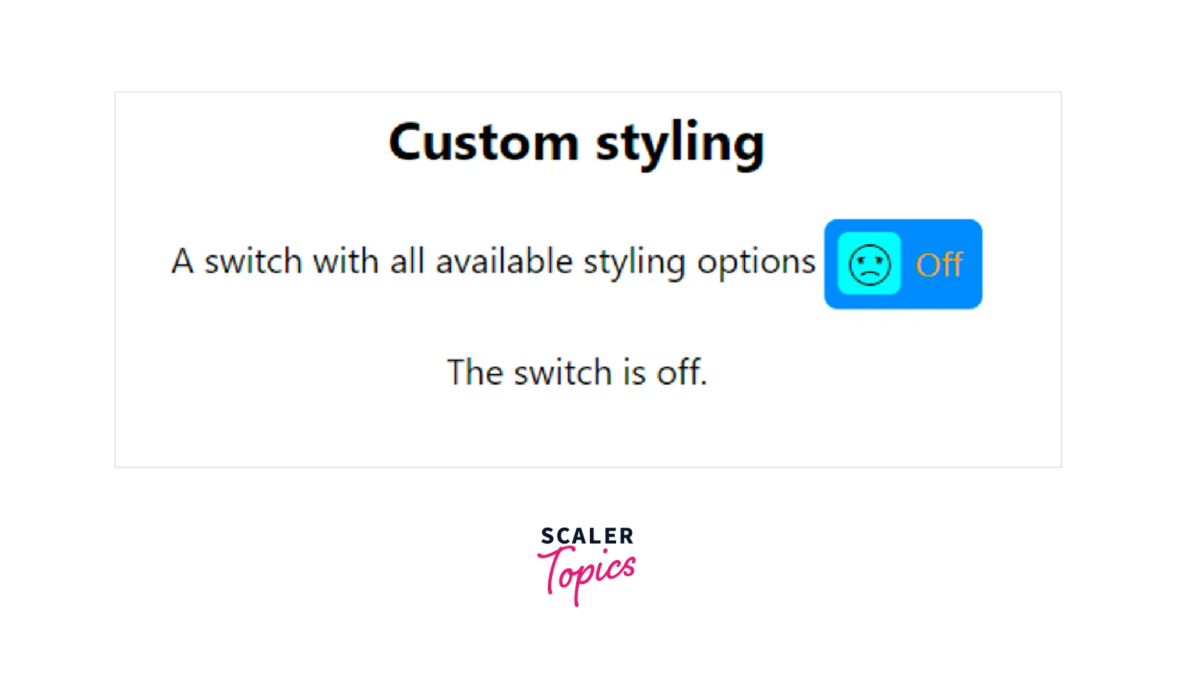
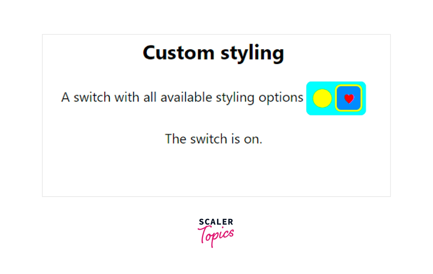
Switch with All Available Styling
A switch showing the use of all the available styling.
Example:
The following output will be shown for the above code :
Example:
Disabled Switch
The below code shows the use of the disabled prop. If a switch is disabled you can not click, drag or tap on it.
Example:
In the above code the checked prop has also been passed with the disable prop. Because of it the switch will always be checked. The code will have the following output :
Additional Props
All other props not included in the react-switch API will be passed as attributes to the nested element of the switch. In this case, we used the required attribute. Other examples include aria-*-attributes, tabIndex, name, and so on. If you include the below switch in a form then you won't be able to submit the form unless the Switch is checked.
Switch Which Cannot be Turned Back Off
To demonstrate how the switch handles situations where the state does not change in response to user action. In the below code the state will always have checked as true so the switch won’t have any changes on clicking.
Switch using Aria-Labelledby
Use this if you don't want clicking on the label to change the state of the switch.
In the above code, the paragraph’s id has been given in the aria-labelledby prop of the switch.
Switch with Invisible Label only Readable by Screen Readers
You can use the aria-label attribute if the meaning of the switch is obvious to sighted users but not to screen readers.
React Switch Components
There are a large number of switch components other than the react-switch that is discussed above. The switch component can also be imported from various libraries like material-ui, core-ui, Syncfusion, evergreen-ui, semantic-ui and many others.
You can either import the toggle switch component from these libraries or create one of your own. The toggle switch can be easily created in React. We will discuss this in the next section.
Getting Started with React Switch Component
To create a toggle switch component in React, the first step is to create a React app. To set up the application, use create-react-app. Run the following command to install create-react-app.
Start a new project using create-react-app command as follows :
In the src folder create a directory components in which you will be creating the switch component. Make a .js file with the name Switch.js and a .css file Switch.css in this directory.
Building a React Switch
Now the project environment has been set up and you can start building the switch component.
Building the React Switch Element using HTML
First you will have to write the JSX code for the switch. Write the following code in the Switch.js file :
Styling our React Switch with CSS
Now to style the checkbox that you created in the .js file, add the following code in the Switch.css file :
Example:
Using the React Switch Component
Now you need to import the component in your main file that is App.js . So render the component in the App.js file. Your App.js must be as shown below :
Now you can run the app by the below command and checkout the output on http://localhost:3000/.
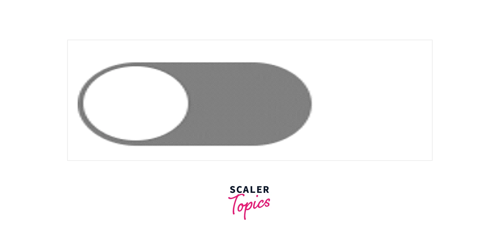
You will see the below output :
Handling onChange and Passing a Value Through Props
Till now the switch might appear to be functional but it is not attached to the state of the application. To make it completely functional we need to introduce two important attributes that are the checked and onChange. The checked attribute saves the current value of the input. It would be either true or false in our case.
The onChange attribute is an event handler that is called whenever the switch is toggled. This event handler will be used to update the component's current value. The switch component will be a stateless component. This means that state will be fed to the switch componenet by some parent component and the switch will act on the basis of the value passed.
So make the following changes in the Switch.js file :
Two props have been added in the Switch component and the values have been assigned to the various attributes of the input tag. isOn and handleToggle are passed in through props. The checked attribute is added, and it makes use of the value from the isOn prop. The handleToggle function prop is used by the onChange event handler.
Now you need to modify the App.js to pass the props in Switch component :
Because of the useState Hook, this parent component now contains state. That is, this component will pass the state value to our React switch component's isOn prop.
We also pass the handleToggle prop with the state setter function, setValue. As a result, when the Switch component is toggled and its value changes, it will call the handleToggle prop.
Changing the Background Color onChange
You might notice that there is not much visual difference yet if the switch is turned on. We can modify the switch so that its background changes when the switch turns on.
In the above code the style attribute has been added to the label tag. Now the switch will appear as follows when it will be turned on :

Specifying the Switch Color
It is a good practice to make the components that we create flexible. Hence it will be better if the background color is also specified by the parent component. Hence we can also pass the color as a prop.
The Switch component can be changed as follows :
You can now pass the color also as prop as shown in below code :
Now the output will be as follows :

Conclusion
- Toggle switches are frequently utilised in place of checkboxes in contemporary interface designs.
- The nesting of the switch component within the label tag ensures that the label text is read aloud.
- The height and the weight attributes of the switch are numerical values.
- The color of the switch can be changed with the help of four props that are offColor, onColor, offHandleColor and onHandleColor.
- There are two props that allow you to point to the switch element that are className and id.
- All other props not included in the react-switch API will be passed as attributes to the nested <input /> element of the switch.
- The switch component can also be imported from various libraries like material-ui, core-ui, Syncfusion, evergreen-ui, semantic-ui and many others.
