React Tabs
Overview
React Tabs is an easy and accessible tab component for ReactJS. This component is used to render and display a tabbed document interface to break complex interfaces into well-organized tabs between which the users can switch.
What are React Tabs?
In the course of developing React Applications, you must have come across some cases where there is text content you need to display, but making separate headings, like the usual ones, are making things very clumsy and the UI look large. In such cases, if you thought of making something where you can switch some tabs and not much scrolling is required, then here it is! React Tabs is the one you are looking for!
React Tabs is the component that makes using tabs easy and accessible in React. Tabs are user interface elements that render and show subsections to users thereby reducing space and organizing material into categories for quick access, they also help your apps seem cleaner by rendering content in smaller spaces. As a developer, it's crucial to comprehend how to use tabs because they are a common user interface element.
Why do you Need React Tabs?
Before we proceed further, let’s take a quick look at why we even need React Tabs in the first place. Can’t we just create them manually? Is the effort of making tabs in React manually even worth it? Well, a simple ans to this is a big NO! Why?
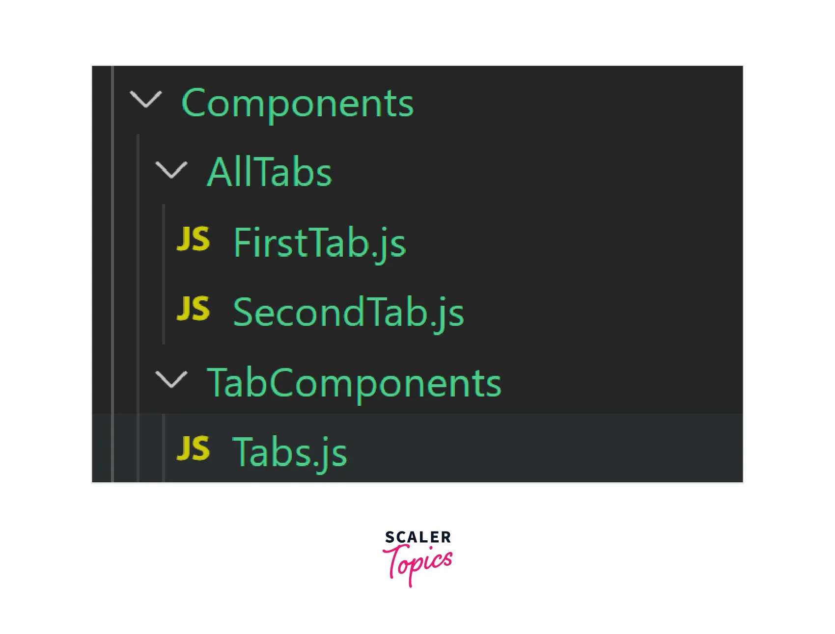
This is the basic structuring you will need to make the tabs in React. First is the Tabs.js file which will hold all the tabs. Then for each tab, we need to make separate files and export them. Oh then of course we will need a CSS file to make things look good! And finally, we will need some basic JavaScript to make the switching of tabs.
All these will seem like a lot of effort once we learn the react-tabs library! Let us now install it and get things started.
How to Install React Tabs?
First, we need to create a new ReactJS project using the npx command.
Once the new project is created, move inside the learn react-tabs folder using the:
Now, just like any other library we have installed and used so far, we will be installing React Tabs in the very same way, using our very familiar friend NPM.
Note:
- Version 5 or newer of react-tabs needs to react version 18 or newer
- Version 4 of react-tabs needs to react version 16.8 or newer
Let's install react-tabs now in our project folder as follows:
How to Use React Tabs?
Now that we have installed react-tabs, let’s use it to make our first tab.
Using react-tabs is very easy but you do need to add some CSS to make things look better. Let’s jump into the coding section to learn how to use React Tabs.
Now, let’s see what it looks like.
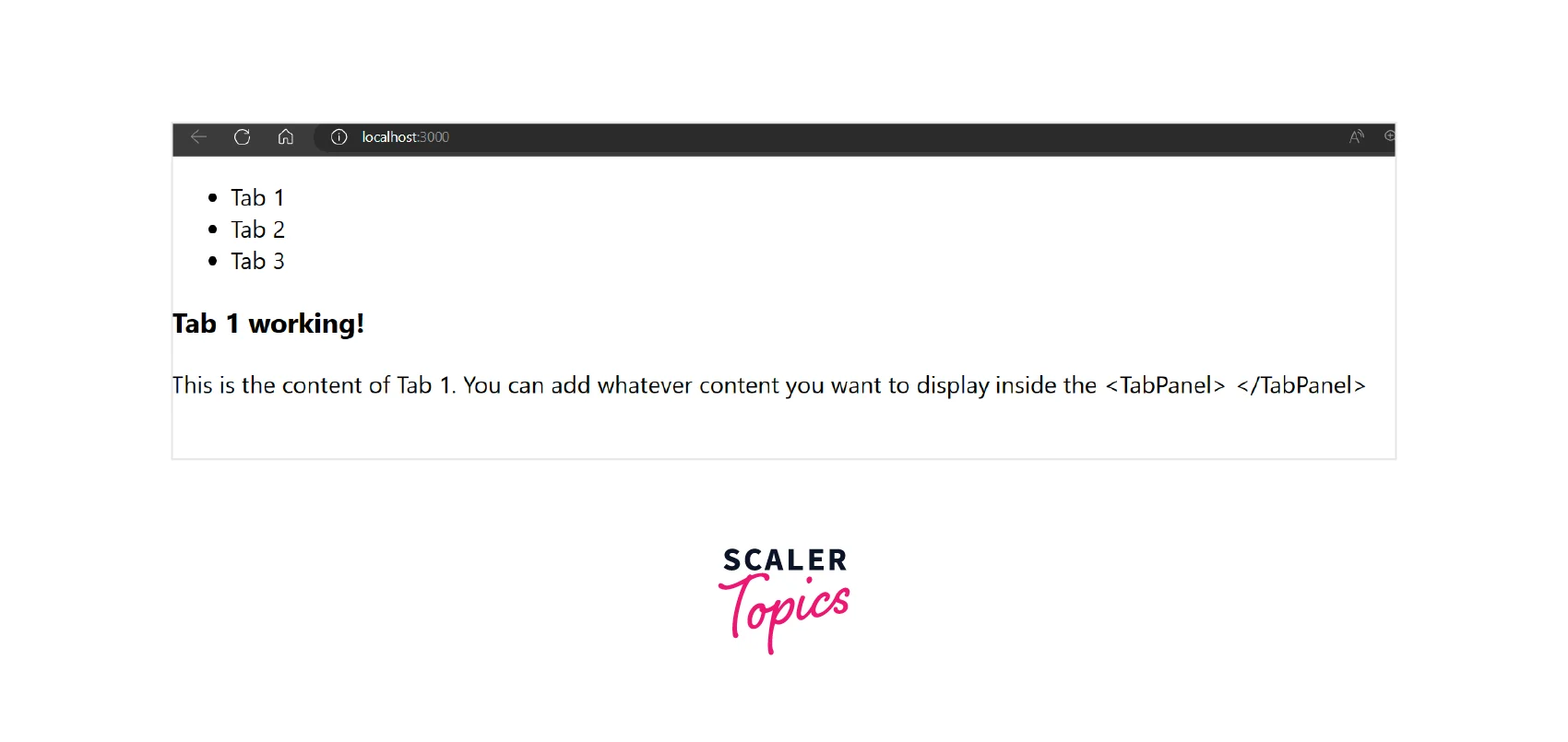
Things are working fine, but look very dull right? So, now, it’s time for some creativity and CSS!
“With great creativity comes greate (or huge) CSS files” - Anonymous.
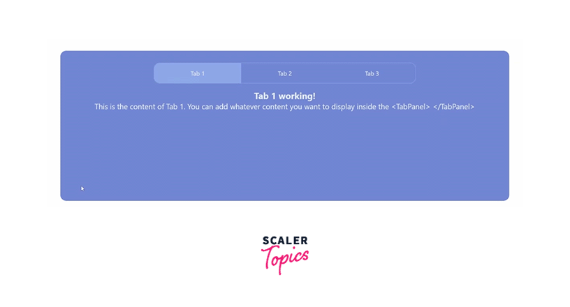
Now, let’s take a look at our beautiful tabs.
That’s it! Using react-tabs, you do not need to make any additional components section, or tabs section. You just write the ReactJS code for your content and then add some CSS to beautify it!
APIs in React Tabs
As you might have noticed in the code above, we have some APIs which we import from the react tabs like this:
react-tabs consists of 4 components (Tab, Tabs, TabList, and TabPanel) which all need to be used together to make our life easier. Let’s take a look at them individually.
Tabs
This <Tabs /> tag contains the entire tab component.
| Props Name | Data Type | Default Value | Function |
|---|---|---|---|
| className | string, Array | "react-tabs" | Give the outer <div /> of the tabs a unique class name. Additionally, you may provide a class name object or an array with the class names serving as the key and a boolean indicating whether or not the name should be included as the value. To offer various class names, go to the classnames documentation. |
| defaultFocus | defaultFocus | false | The tabs will be focused on the initial render if true is specified. This makes it possible to switch tabs right away after the initial render using the keyboard. |
| defaultIndex | number | 0 | The tab that ought to be open on the first render can be changed with this. Since this index is zero-based, the first tab is 0 and the second tab is 1. This cannot be used with selectedIndex since it can only be used in uncontrolled mode when react-tabs handles the currently chosen tab internally.. |
| direction | string | "ltr" | Give the component's direction, which can be either rtl or ltr. |
| disabledTabClassName | string | "react-tabs__tab--disabled" | Give disabled tabs a unique class name. Additionally, this setting may be made directly at the <Tab /> component. |
| disableUpDownKeys | bool | false | Deactivate the up & down arrow keys to switch tabs. |
| focusTabOnClick | focusTabOnClick | true | The tab that is clicked by default will also have a focus in the DOM. The tab will no longer be focused if false is set. Be careful that if set to false, keyboard navigation will not function after clicking. However, one may still use the keyboard to navigate by focusing on the tabs by hitting the tab key. |
| forceRenderTabPanel | boolean | false | Only the tab that is now active will by default be shown to DOM. All tabs will always be shown to the DOM if set to true. Additionally, each <TabPanel /> component's prop forceRender may be used to allow this. |
| onSelect | (index: number, lastIndex: number, event: Event) => ?boolean | undefined | Every time a tab is going to change, this event handler is invoked. It will be called together with the new index, the previous selection's lastIndex, and the underlying event, which is often either a keydown or click event. The user clicked on the currently active tab while index and lastIndex were equal. The callback has an optional false return value that may be used to undo the new tab transition. |
| selectedIndex | number | null | Set the tab that is presently chosen. The first tab is 0 and the second tab is 1, as this index is zero-based. Controlled mode is then activated, necessitating the setting of onSelect. Information about modes is available here. |
| selectedTabClassName | string | "react-tabs__tab--selected" | Used to provide a custom class name to the currently chosen or active tab. |
| selectedTabPanelClassName | string | "react-tabs__tab-panel--selected" | Used to provide a custom class name for the currently chosen or active tab panel. |
TabList
This is the parent of the <Tab /> component. One TabList component holds many Tab components.
| Props Name | Data Type | Default Value | Function |
|---|---|---|---|
| className | string, Array | "react-tabs__tab" | Used to provide the <ul /> a unique class name. Additionally, you may provide a class name object or an array with the class names serving as the key and a boolean indicating whether or not the name should be included as the value. To offer various class names, go to the classnames documentation. |
Tab
This <Tab /> contains the heading or title of the tags, i.e. where we click to switch tabs
| Props Name | Data Type | Default Value | Function |
|---|---|---|---|
| className | string, Array | "react-tabs**tab" | Give the <li /> class a unique class name. Additionally, you may provide a class name object or an array with the class names serving as the key and a boolean indicating whether or not the name should be included as the value. To offer various class names, go to the classnames documentation. |
| disabled | boolean | false | Disable this tab so that when it is clicked, nothing happens. A class name for the handicapped will also be added (see disabledClassName) |
| disabledClassName | string | "react-tabs**tab--disabled" | Give disabled tabs a unique class name. The prop disabledTabClassName on <Tabs /> may be used to set this option for all <Tab /> components. |
| selectedClassName | string | "react-tabs__tab--selected" | Give the active tab a custom class name. The prop selectedTabClassName on <Tabs /> may be used to set this option for all <Tab /> components |
| tabIndex | string | if selected "0" otherwise null | Enables switching between tabs by overriding the tabIndex. |
TabPanel
This <TabPanel /> contains the data to be displayed inside the tab. If there are 3 active tabs then there will be 3 tab panels.
| Props Name | Data Type | Default Value | Function |
|---|---|---|---|
| className | string, Array | "react-tabs**tab-panel" | Used to givethe containing the tab content a custom class name. Additionally, you may provide a class name object or an array with the class names serving as the key and a boolean indicating whether or not the name should be included as the value. To offer various class names, go to the classnames documentation. |
| forceRender | boolean | false | By default, only when the tab is active will the content of the tab be rendered. The tab will also be presented if inactive if true is set. The prop forceRenderTabPanel on <Tabs /> may also be used to enable this for all <TabPanel /> components. |
| selectedClassName | string | "react-tabs**tab-panel--selected" | Used to give the active tab panel a custom class name. The prop selectedTabPanelClassName on <Tabs /> allows this option to be configured for all <TabPanel /> components. |
What is the Difference Between Uncontrolled Vs Controlled Components?
React tabs offer two operational modes that alter the degree to which you are responsible for maintaining the state yourself.
Uncontrolled Mode
react-tabs operates in this manner by default, allowing the components to manage the state on an internal level. With defaultIndex and onSelect, you may listen for changes and alter the default tab.
You cannot force a tab change in this mode while the program is running.
Controlled Mode
The <Tabs /> component must receive selectedIndex to activate this mode.
react-tabs does not maintain any tab selection state internally in this mode; instead, the external application is in charge of handling all state management.
Additionally, this option demands you to create an onSelect handler. Because defaultIndex has no impact, it will raise an error.
The Different Stylings Available in React Tabs
By default, react tabs do not include any style loading. If desired, you may incorporate the given default stylesheets into your application.
Webpack
You may easily import the default stylesheet when using webpack and the proper loader (css-loader, sass-loader, less-loader, or style-loader).
SASS
You can quickly import the preset styles when using SASS.
LESS
You can quickly import the preset styles when using LESS.
Custom Design
You may also just copy the default style into your own CSS/SCSS/LESS file and make the necessary changes. You can always find out when classes change in the changelog, and we also count changes that affect style as major.
Custom Components:
Set tabsRole:
You must set its tabsRole if you wish to build your component that wraps the ones the library supplies. In react tabs, this value is used to determine a component's function.
tabsRole may take the following values:
- Tab
- TabPanel
- TabList
- Tabs
Pass through properties:
Note:
You must send any incoming props to the component you're wrapping because of the way react-tabs operates internally (it employs cloning to opaquely manage different aspects of the tab state). Using the spread and rest operators is the simplest method to accomplish this; for an example, see {...otherProps} below.
Conclusion
Now that we have been through the entirety of React Tabs, let us have a quick review of the things we have learned in this article.
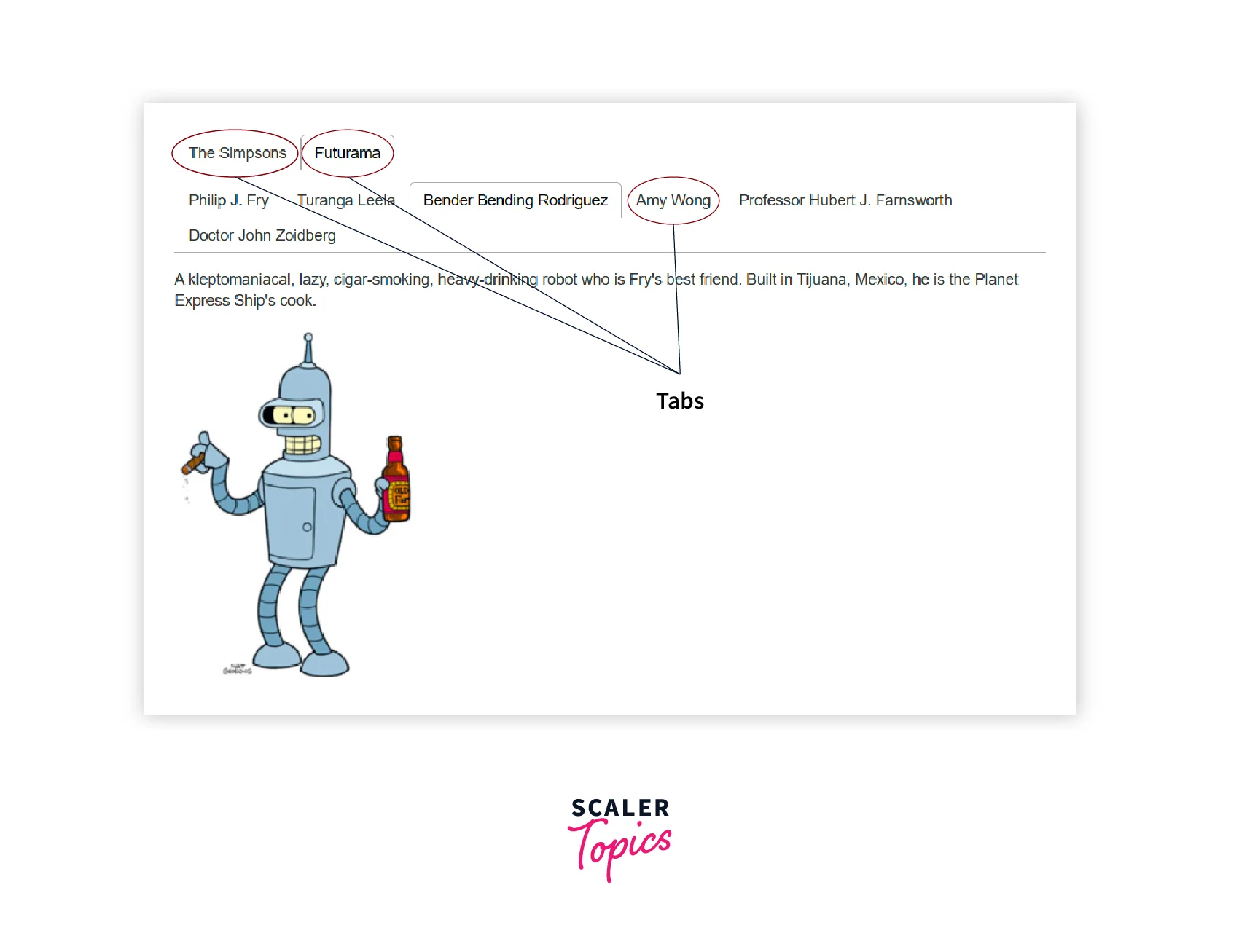
- Using tabs, we may navigate between similar content groupings that are organized at the same level of hierarchy.
- React Tabs (or, react-tabs) is a very easy and accessible NPM library that we can use to render and display tabs.
- Tabs are very common in websites, like e-commerce websites like Amazon or Flipkart we use tabs to navigate between the various product categories.
- react-tabs has 4 different APIs, Tab, Tabs, TabList, and TabPanel all of which are needed to be used at the same time.
- React Tabs provide two different operational modes:
- Uncontrolled Mode:
This is the default operational level, that allows the components to manage the state on an internal level. No tab change can be forced while the program is running. - Controlled Mode:
react-tabs does not maintain any tab selection state internally in this mode; instead, the external application is in charge of handling all state management.
- Uncontrolled Mode:
- The React Tabs, by default, do not have any styling. To add styling import various stylesheets like CSS, SASS, SCSS, LESS, or custom styling.