Regression Analysis in R
Overview
Regression analysis in R involves modelling the relationship between variables, typically using linear regression. It helps predict outcomes based on input factors. R's vast libraries like 'lm' facilitate model creation, coefficient estimation, and significance testing. Diagnostic tools like plots identify model adequacy. Result interpretation aids informed decision-making.
What is Regression Analysis in R?
As discussed earlier, regression analysis is a statistical technique used to examine the relationship between one or more independent variables (also known as predictors, features, or input variables) and a dependent variable (also known as the outcome or response variable).
The goal of regression analysis is to understand how changes in the independent variables are associated with changes in the dependent variable and to make predictions or inferences based on this relationship.
Regression analysis is immensely valuable in the field of healthcare to understand the relationship between various factors and patient outcomes. Consider a medical researcher investigating the effectiveness of a new drug in lowering blood pressure. They collect data from a sample of patients, recording variables such as age, weight, dosage of the drug, and initial blood pressure levels.
By applying regression analysis, the researcher can determine how each of these factors contributes to the reduction in blood pressure. This analysis not only provides insights into the drug's effectiveness but also identifies which patient characteristics or dosages might yield the best results.
Types of Regression Analysis in R
Linear Regression
Linear regression is a statistical technique that facilitates the analysis of relationships between a dependent variable and one or more independent variables. This method involves fitting a straight line to observed data points in a way that minimizes the difference between actual and predicted values. By using a linear equation, the goal is to capture the underlying trend between variables and make predictions based on this trend.
In its simplest form, known as simple linear regression, the relationship between the dependent variable (y) and the independent variable (x) is expressed as:
Where:
- y represents the dependent variable, which is the quantity being predicted.
- x represents the independent variable, acting as the predictor.
- β₀ is the intercept, denoting the value of y when x is zero.
- β₁ is the slope, indicating the rate of change in y for each unit change in x.
- ε denotes the error term, encompassing unexplained variations in y.
- Implementation of Linear Regression in R
Output
- Load Libraries:
We start by loading the required libraries. We load the ggplot2 library for data visualization and the dplyr library for data manipulation. - Load Data:
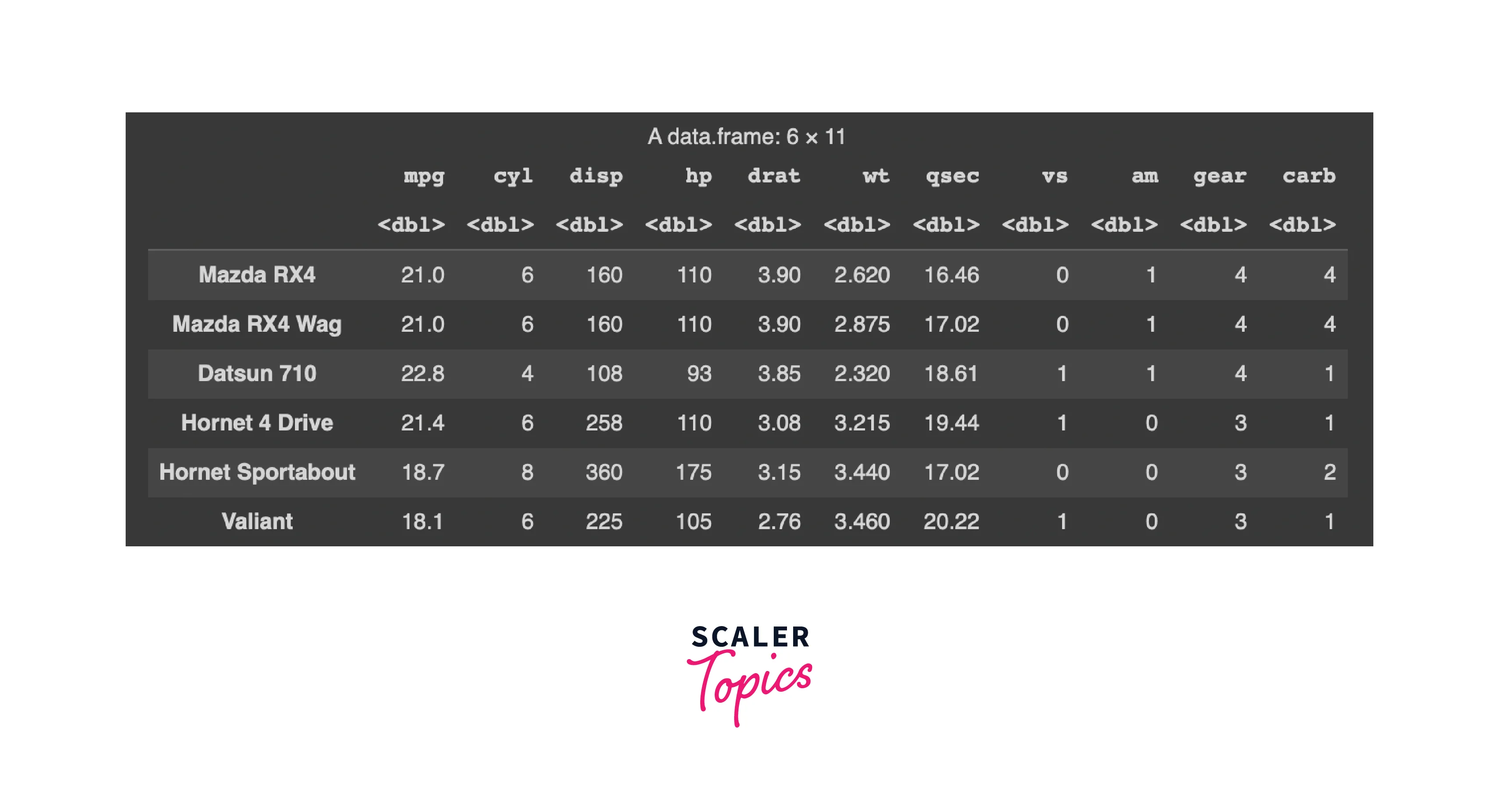
We load a built-in dataset called mtcars. This dataset contains information about various car models, including attributes like miles per gallon (mpg), weight (wt), horsepower (hp), and more. - Explore Data:
We use the head() function to display the first few rows of the mtcars dataset. This allows us to quickly inspect the structure of the data.Output
- Create Linear Regression Model:
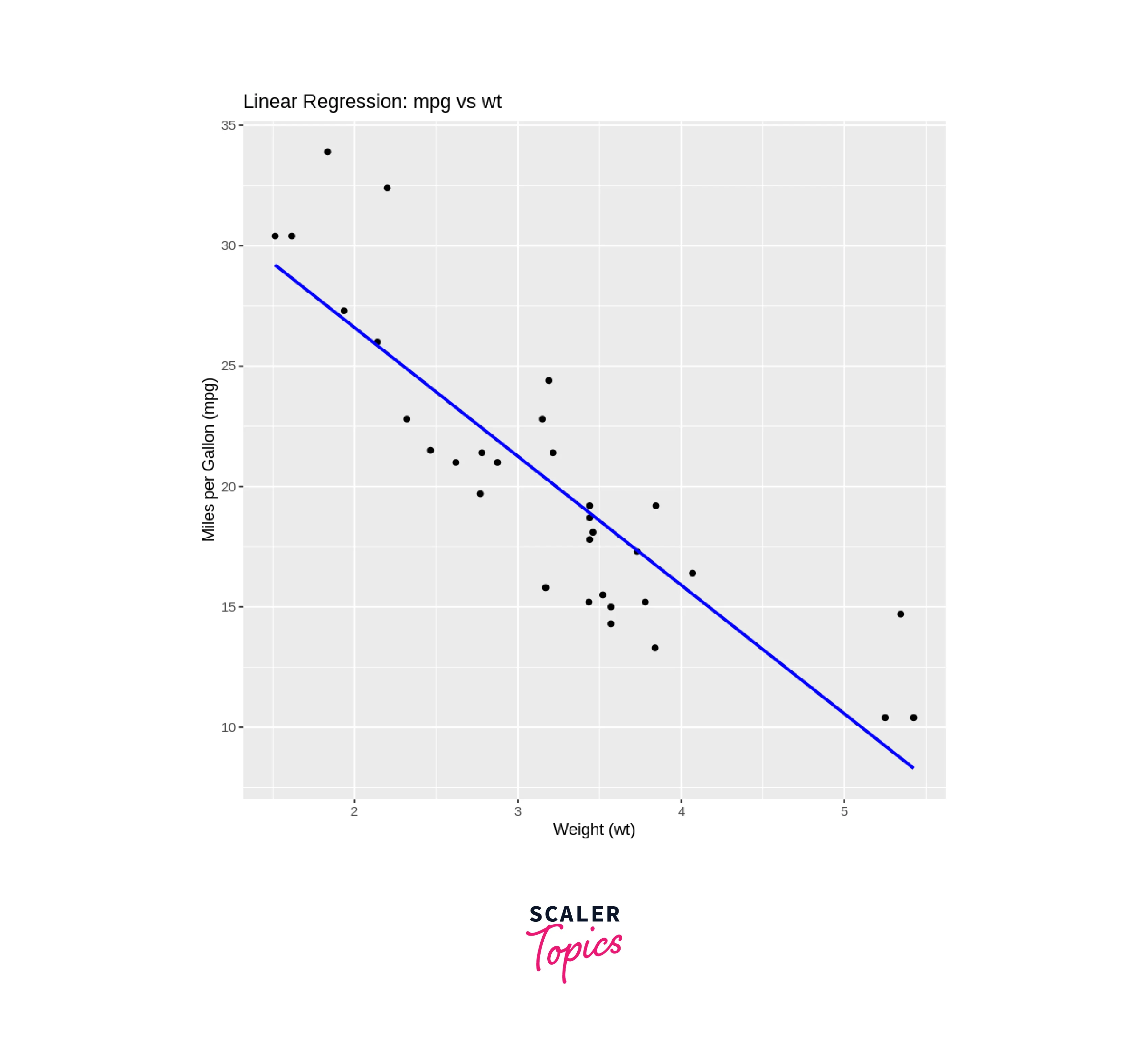
We create a linear regression model using the lm() function. In this case, we're trying to predict the mpg (miles per gallon) of cars based on the wt (weight) attribute. The formula mpg ~ wt specifies this relationship. - Print Model Summary:
We use the summary() function to display a summary of the linear regression model. The summary includes information about the coefficients, their significance (p-values), R-squared value, and more. This summary helps us understand the model's performance and the significance of the predictor (wt) in predicting the response variable (mpg).Output
- Visualize Data:
We use the ggplot2 package to create a scatter plot of the data. We use ggplot() to initialize the plot and aes() to specify the aesthetics (variables) for the plot. We set x = wt and y = mpg to indicate that we're plotting the weight (wt) on the x-axis and miles per gallon (mpg) on the y-axis. - geom_point():
This adds the actual data points to the plot as individual points. - geom_smooth(method = "lm", se = FALSE, color = "blue"):
This adds a linear regression line to the plot using the method = "lm" argument, indicating that we want to use linear regression to fit the line. The se = FALSE argument removes the confidence interval shading around the line. We set the line color to blue using the color argument. - labs(...):
This function is used to add labels to the plot, including the title and axis labels.
- Load Libraries:
Logistic Regression
Logistic regression serves as a statistical technique employed in scenarios involving binary classification objectives. The objective here is to forecast whether an observation pertains to either of two potential categories. Despite its nomenclature, logistic regression doesn't forecast a linear correlation in the manner linear regression does. Instead, it frames the likelihood of an instance affiliating with a specific class.
In binary logistic regression, the probability p of an event occurring (e.g., a positive class) is modelled using the logistic function, also known as the sigmoid function:
Where:
- p is the predicted probability of an event.
- x is the independent variable.
- β₀ is the intercept.
- β₁ is the coefficient associated with the independent variable.
The logistic function "squashes" the linear combination of the intercept and coefficient into a value between and , effectively representing the probability of the event occurring. If p is greater than , the prediction is assigned to the positive class; otherwise, it's assigned to the negative class.
-
Implementation of Logistic Regression in R
-
Load Libraries:
We start by loading the required libraries. We load the ggplot2 library for data visualization and the dplyr library for data manipulation. -
Load Data:
We load a built-in dataset called mtcars. This dataset contains information about various car models, including attributes like miles per gallon (mpg), weight (wt), horsepower (hp), and more. -
Explore Data:
We use the head() function to display the first few rows of the mtcars dataset. This allows us to quickly inspect the structure of the data.Output
-
Create Logistic Regression Model:
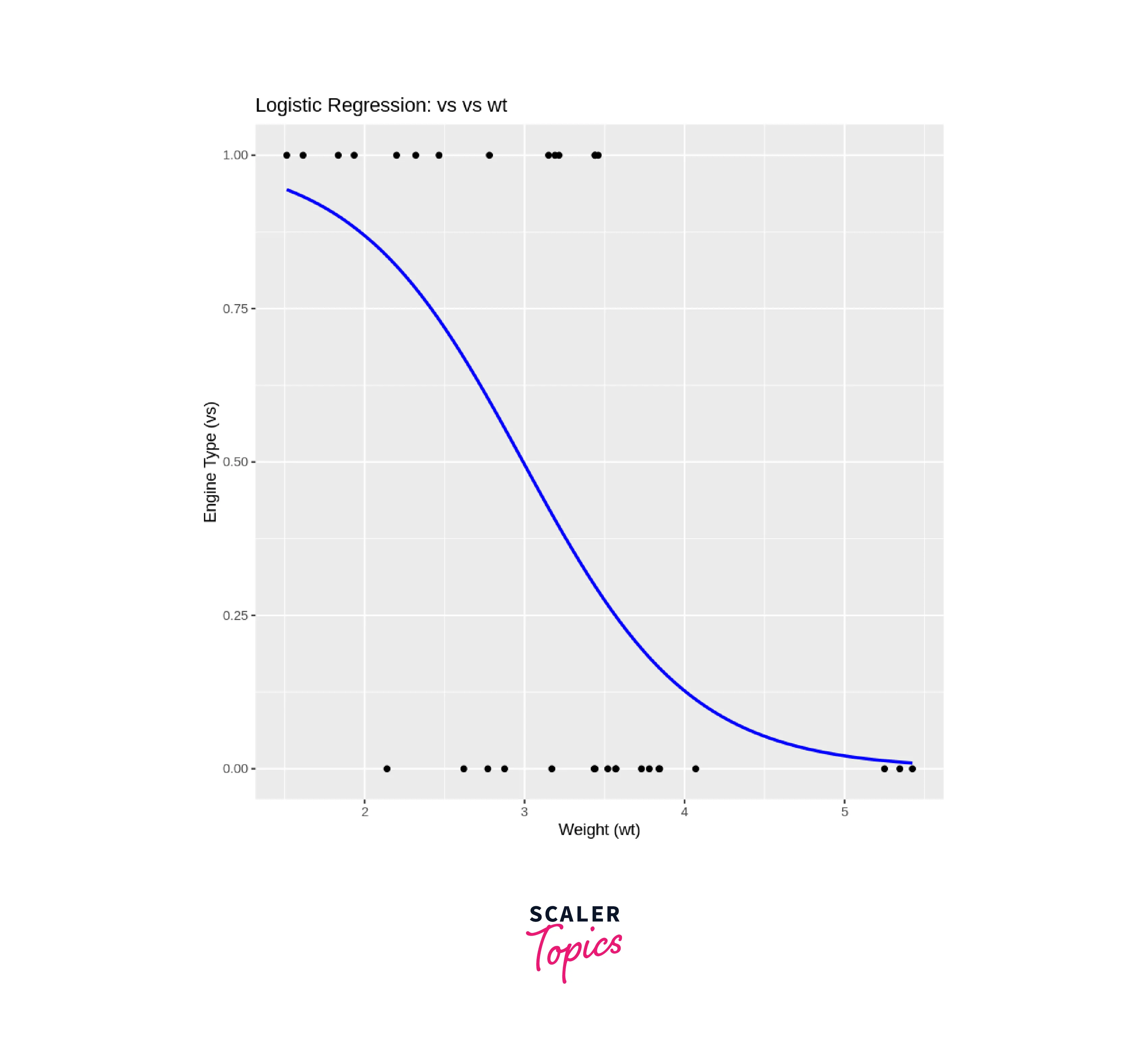
We create a logistic regression model using the glm() function. In this case, we're trying to predict the vs (categorical variable indicating engine type) of cars based on the wt (weight) attribute. The formula vs ~ wt specifies this relationship. We also set the family argument to "binomial" to indicate that this is a logistic regression. -
Print Model Summary:
We use the summary() function to display a summary of the logistic regression model. The summary includes information about the coefficients, their significance (p-values), deviance statistics, and more. This summary helps us understand the model's performance and the significance of the predictor (wt) in predicting the response variable (vs).Output
-
Visualize Data:
We use the ggplot2 package to create a scatter plot of the data. We use ggplot() to initialize the plot and aes() to specify the aesthetics (variables) for the plot. We set x = wt and y = vs to indicate that we're plotting the weight (wt) on the x-axis and the engine type (vs) on the y-axis. -
geom_point():
This adds the actual data points to the plot as individual points. -
geom_smooth(method = "glm", method.args = list(family = "binomial"), se = FALSE, color = "blue"):
This adds a logistic curve to the plot using the method = "glm" argument, indicating that we want to use logistic regression to fit the curve. The method.args argument is used to pass additional arguments to the glm() function, including the family argument set to "binomial". The se = FALSE argument removes the confidence interval shading around the curve. We set the curve color to blue using the color argument. -
labs(...):
This function is used to add labels to the plot, including the title and axis labels.
The output will include the model summary and a scatter plot with the data points and the fitted logistic curve. This example provides a basic overview of how to perform logistic regression in R, from loading libraries and data to creating the model, printing the model summary, and visualizing the results. In real-world scenarios, you may need to handle more complex datasets, perform feature engineering, and thoroughly evaluate the model's performance.
-
Conclusion
In summary, this article delves into the realm of regression analysis in R, shedding light on its significance, implementation, and distinct types: linear and logistic regression.
- Regression Analysis in R:
The article establishes that regression analysis is a pivotal statistical technique employed to comprehend relationships among variables. Particularly, linear regression emerges as a powerful tool for predicting outcomes based on input factors. Utilizing R's versatile libraries such as 'lm', analysts can effectively create models, estimate coefficients, and perform significance testing. Diagnostic tools and plots further contribute to assessing model adequacy, enabling informed decision-making. - Linear Regression:
The discussion on linear regression underscores its role in capturing the relationship between dependent and independent variables. Illustrated with the equation , the method emphasizes the intercept and slope coefficients. By employing a sample dataset and the 'ggplot2' library, the article walks through model creation, coefficient interpretation, and visualization. The linear regression model's insights empower data-driven decisions by identifying trends and predicting outcomes. - Logistic Regression:
Shifting focus to logistic regression, the article highlights its suitability for binary classification scenarios. Contrary to its name, logistic regression models the probability of an instance belonging to a specific class. The sigmoid function, elucidated through the equation , transforms the linear combination of coefficients into a probability value. The article demonstrates model creation, coefficient significance, and visualization using 'ggplot2', while illuminating how logistic regression informs binary decision-making.
In conclusion, this comprehensive guide navigates through regression analysis in R, elucidating its essential role in understanding relationships and making predictions. With linear regression's focus on predictive modelling and logistic regression's prowess in binary classification, R users can harness these techniques to extract insights, make informed decisions, and achieve success across various fields, from finance and healthcare to natural language processing and beyond.