How to Make Images Responsive with CSS?
 FREE
FREE
Overview
In today's world, devices come in a variety of sizes, from small mobile phones to large-screen desktops. As a result, when we add the image to a web page, it should automatically change the size of the device. This is referred to as a responsive image. Responsive images are a technique that allows web browsers to choose between numerous identical images of varying sizes or one of several similar images that best fit a specific device. The browser may obtain technical information about the device, such as screen size, resolution, orientation, internet connection speed, etc. In this tutorial, we will learn more about responsive images and how to use responsive image CSS on our website.
Pre-requisites
Should have familiarity with HTML <img> tag. Also, familiar with the height, width, max-width, and background-image properties of CSS.
How to Make Images Responsive with CSS?
A responsive image changes and responds to multiple screen sizes. In practice, this means that the image should contain the following characteristics/abilities:
- Various device pixel ratios should be able to render the image clearly. High-resolution screens do this by displaying high-resolution images, but low-resolution screens shouldn't have to deal with the extra pixels.
- Images must enlarge or contract to fit within a fluid (responsive) layout as it changes.
- Images must be made responsible for numerous resolutions so they can scale appropriately.
Different image formats are supported by different browsers. New formats, such as WebP, may not be compatible with all browsers, so images must also be provided in JPEG format.
Why Responsive Images?
At the beginning of the web, websites could only be viewed on desktop computers. As mobile technology advanced, more individuals began to use their smartphones to access the Internet. As a result, internet-capable gadgets come in a variety of sizes, orientations, and resolutions.
Responsive design has emerged as a solution to the variation in device capacity. Websites are built to be adaptable. Images can be found on every type of website. Responsive image CSS is a technique that allows web browsers to choose between numerous identical images of varying sizes or one of several similar images that best fit a specific device.
When adding images to a website, it is usually a bad idea to display a large image on a screen smaller than the size it was designed for. This can result in data waste for the user. Moreover, some mobile users might not want to waste bandwidth by downloading a large image designed for a desktop when a smaller image would be sufficient for their device. This issue can be solved by making the image responsive.
A responsive image will aid in making websites more accessible to users using devices other than a desktop computer. Vector images can be useful in various situations. Using vector images whenever possible is a solid first step toward responsive design.
Here are three major reasons why we must use responsive images:
- Render a high-quality image on many devices.
- Loading the correct image - Art direction
- For faster loading of web pages and saving bandwidth.
Setting the Width of the Image
The simplest method for making images responsive is to specify the width of the <img> element. By changing the width, the image will adjust to fit its container.
Use the max-width property of CSS if you want a responsive image up to a specific size. It will display the image width in pixels, up to 100% of the container's width. For example, consider that your image width is 300 pixels:
- If the container is 200px then the image will be 300px (max-width: 100% ).
- If the cotainer is 300px then the image will be 300px (max-width: 100% ).
- If the container is of 1400px, then the image will still remain 300px in size.
There are fixed sections, such as a fixed navigation menu, for which we must specify a height. The height and width are almost always symmetric. When the width of an image is reduced to accommodate responsiveness, the height is also reduced. If the width is fixed, so will the height.
Resolution Switching
When we compare HTML files to image files, we can see that image files have far greater file sizes. These images may be necessary for a large desktop screen but are not appropriate for mobile devices. The user is wasting bandwidth when the image resolution is much larger than the device's display. This is inconvenient for users in areas where Internet services are expensive or slow. For some users, the solution will be to deliver a reduced version of the file. This is possible with the srcset and sizes attributes.
Display Different Sizes
The srcset attribute returns a list of images with their width in w units. A comma separates each file. The sizes attribute specifies the conditions to be applied when selecting an image from the list provided by srcset. The browser will choose the first condition that matches. As a result, the files should be ordered from smaller to larger. The image file that most closely matches the slot will be chosen. Modern browsers support the srcset. The src attribute serves as a fallback solution for older browsers. Older browsers will display the image in the src element, whereas later versions will choose the suitable one from the srcset attribute.
The srcset and sizes attributes are complex, but if you format them as shown below, with a different part of the attribute value on each line, they're not too difficult to grasp. Each value contains a comma-separated list, and each list is divided into three sub-lists. Let's go over the contents of each now:
srcset specifies the size of each image and the set of images from which the browser can select. A comma separates each set of image information from the previous one. For each one, we write:
- A filename for an image (example-400w.png)
- A space
- The intrinsic width of the image in pixels (400w) – note that this employs the w unit rather than the px unit, as you might expect. The intrinsic size of an image is its true size, which can be determined by inspecting the image file on your computer (on a Mac, click the image in Finder and press Cmd + I to bring up the info screen).
sizes specify a collection of media criteria (for example, screen widths) and tell what image size to use when specific media circumstances are met. In this situation, we write before each comma:
- A media condition (max-width:600px) — a media condition defines a possible state for the screen. In this situation, we are defining "when the viewport width is 600 pixels or less."
- A space
- When the media condition is true, the width of the slot that the image will fill (400px)
As a result of these properties, the browser will:
- Consider its device width.
- Determine which of the media conditions in the sizes list is the first to be true.
- Examine the slot size assigned to the media query.
- Load the image referenced in the srcset list that is the same size as the slot or, if none exists, the first image larger than the slot size is chosen.
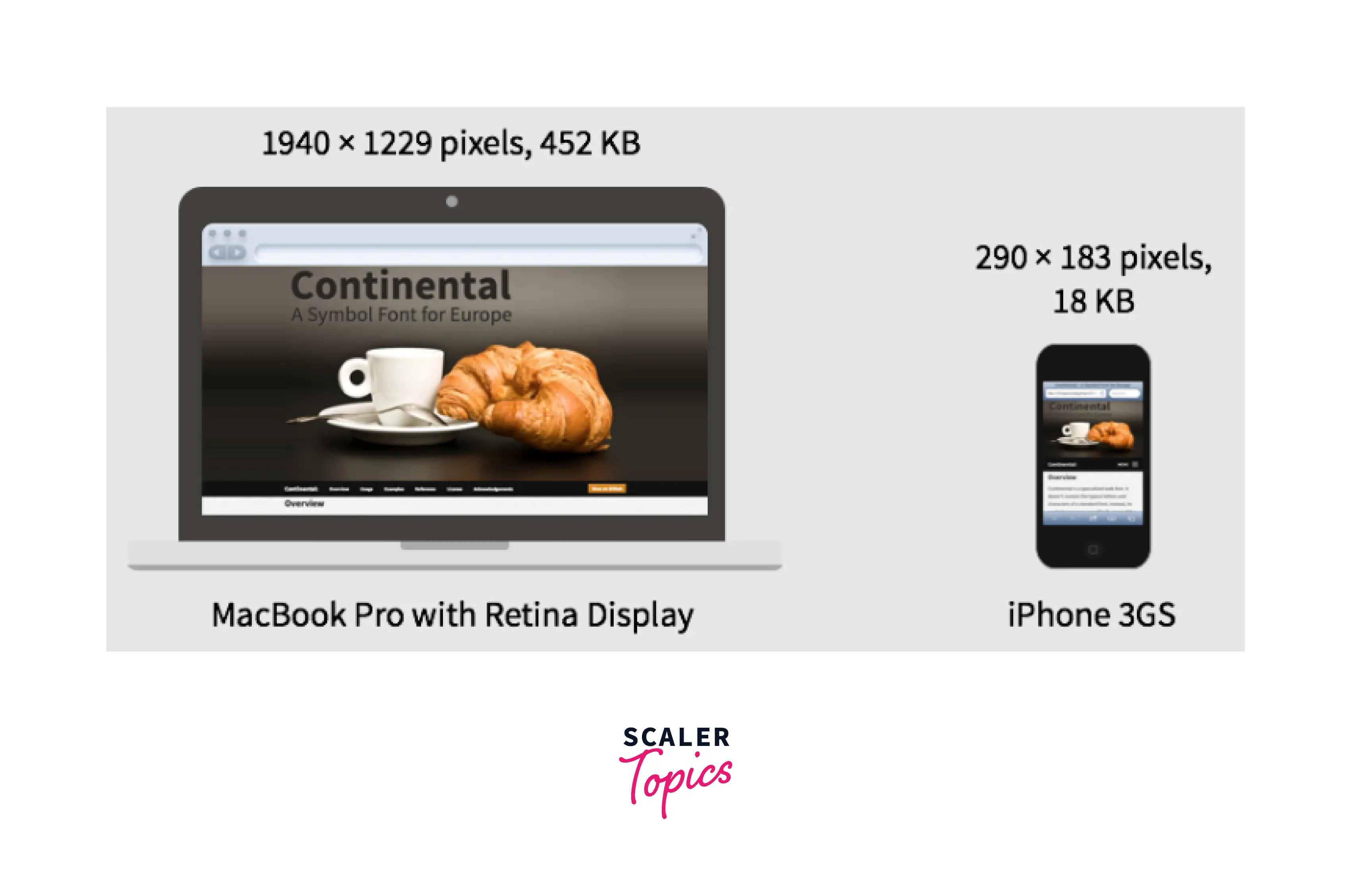
If a compatible browser with a viewport width of 400px loads the page at this point, the (max-width: 600px) media condition is true, and the browser selects the 400px slot. Because its intrinsic width (400w) is closest to the slot size, the example-400w.png will be loaded. The 800px image is 128KB on the disc, whereas the 400px version is only 53KB — a 53KB save. Consider if this was a page with a lot of pictures on it. This method could save mobile customers a lot of bandwidth.
These features will be ignored by older browsers that do not support them. Instead, such browsers will load the image specified in the src property as usual.
Same Display Size, Different Resolutions
If you offer several display resolutions, but everyone on the screen sees your image at the same real-world size, you can let the browser choose an appropriate resolution image by utilizing srcset with x-descriptors and without sizes.
However, the resolution of the devices may differ. In this case, the image on the high-resolution screen may be poor. For these devices, we can give extra images at better resolutions.
When the width of the image is specified in CSS, the browser automatically selects the relevant images. The first image will be used by low-resolution devices, while the high-resolution devices will use the last image.
In this situation, sizes are not required; the browser determines the resolution of the display and offers the most appropriate image from the srcset. The example-320w.png image will be loaded if the device viewing the page has a standard/low-resolution display, with one device pixel corresponding to each CSS pixel (the 1x is implied, so you don't need to provide it). The example-640w.png image will be loaded if the device has a high resolution of two device pixels per CSS pixel or greater. The 640px image is 93KB in size, but the 320px image is only 39KB in size.
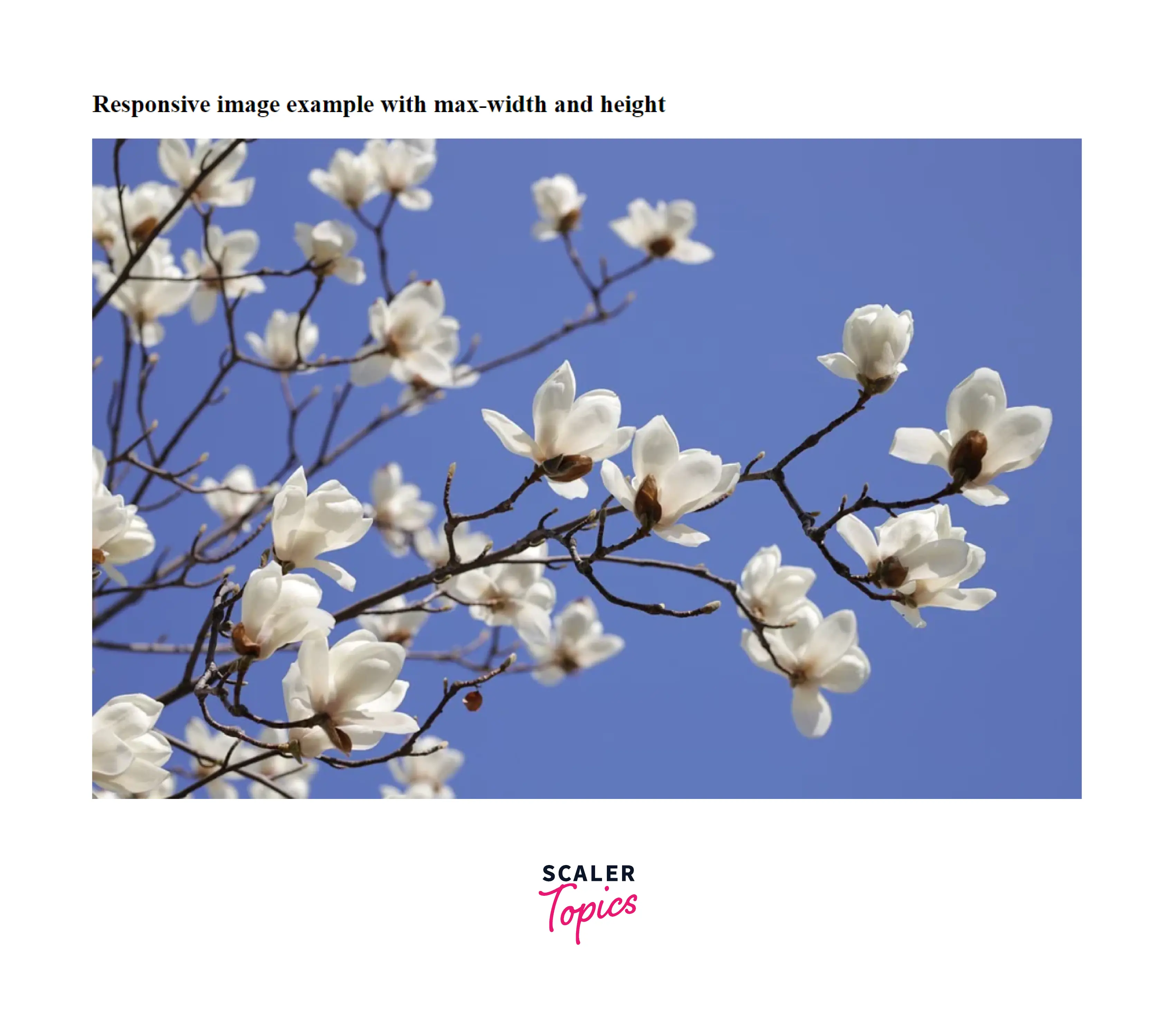
Example of Creating a Responsive Image Using the Max-width and Height Properties
Output of the above image:
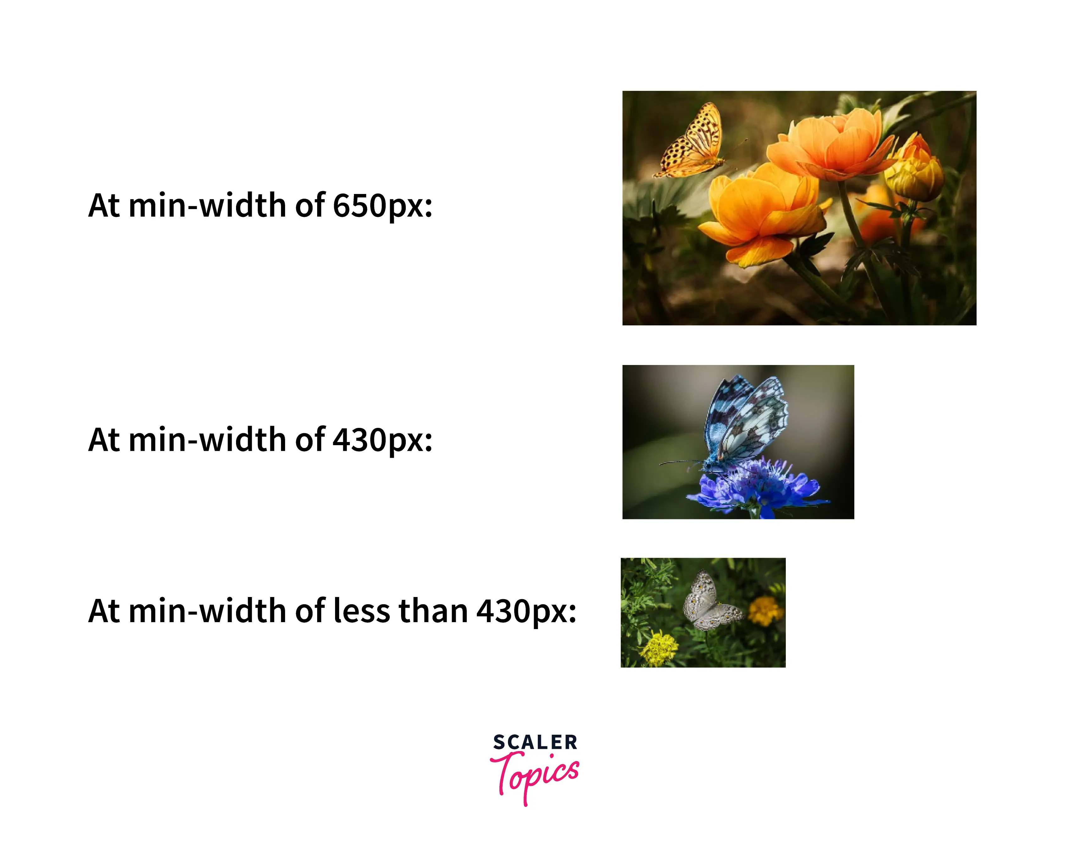
Example of Creating Multiple Responsive Images
The srcset element is required if you wish to set several images. The srcset specifies the set of images from which the browser can select. It is advised to use the srcset attribute with the <picture> element rather than the <img> element for effective functioning.
Output of the above code:
How to Make Background Images Responsive
Three techniques can be used to make images responsive by using CSS.
- The background image will scale and attempt to fit the content area when the background-size property is set to contain. The image will still maintain a proportional relationship between its width and height.
- When you set the background-size property to 100% 100%, the background image will stretch to fill the whole content area.
- When you set the background-size property to cover, the background image expands to fill the full content area. Please keep note that some of the background image might get cropped.
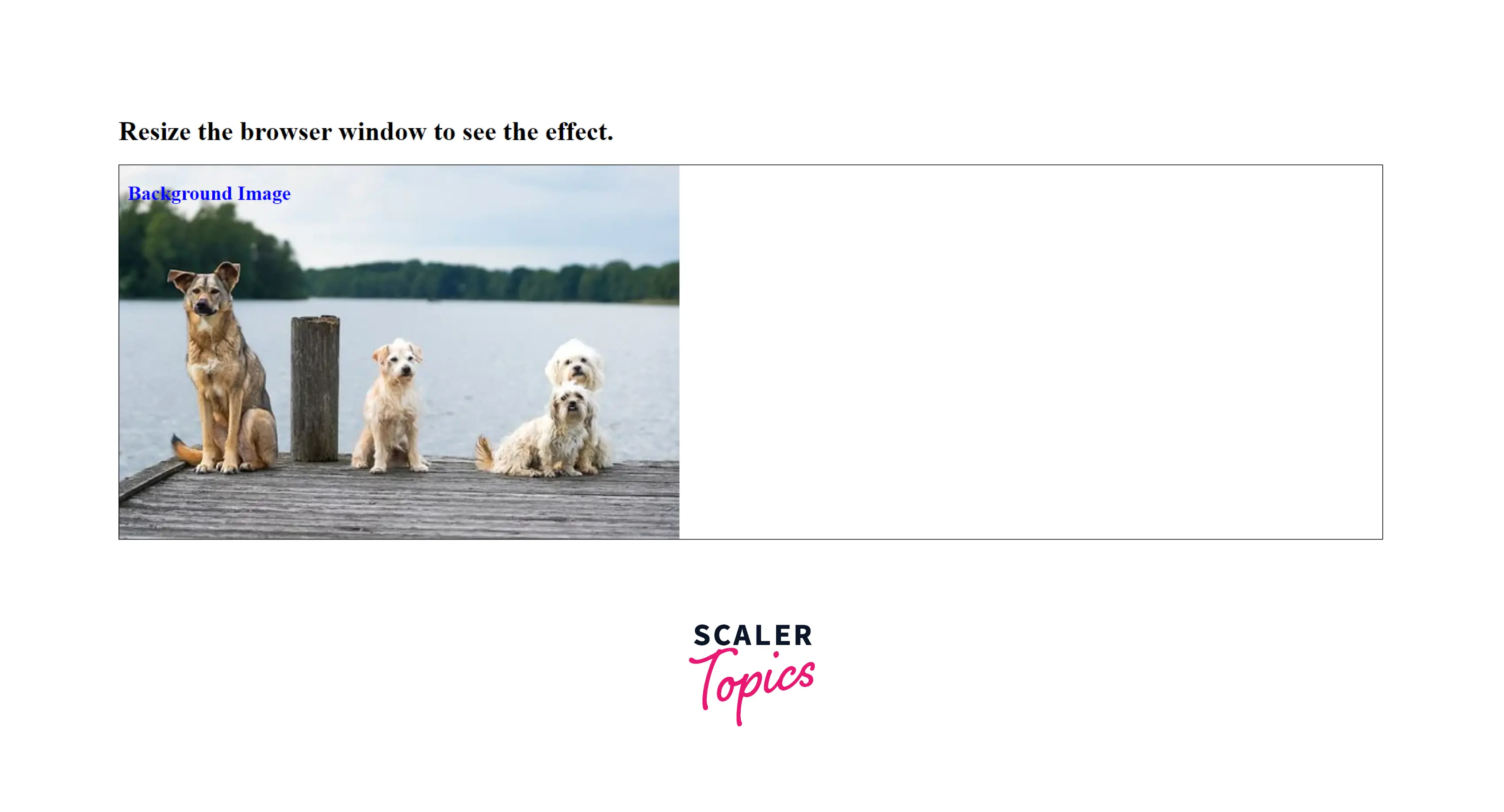
Example 1: In this example, we will use the background-size CSS property with the contain value to make an responsive image CSS.
Output of the above code:
Example 2: In this example, we will use the background-size CSS property with percentages to make an responsive image CSS.
Output of the above code:

Example 3: In this example, we will use the background-size property with the cover value to make an responsive image CSS.
Output of the above code:

Note: Use a media query to provide scaled-down versions of the background image for mobile device screens. This is an optional step, but considering the extensive use of mobile devices, it should be included.
The Object-Fit Property
CSS includes another object-fit property to give you additional control over your images. In addition to object-fit, you may use the object-position attribute to focus on a specific image region if necessary. Many people are unaware of the object-fit property, although it can be useful in dealing with height issues.
The object-fit property specifies how an element reacts to changes in the height and width of its content box. In conjunction with the object-position property, it is meant for images, videos, and other embeddable media formats.
Object-fit can be set to one of five different values:
| Value | Description |
|---|---|
| fill | It is the default value that expands the image to fit the content box regardless of aspect ratio. |
| contain | increases or decreases the image's size to fit the box while maintaining its aspect ratio. |
| cover | the image will fill the height and width of its box, retaining its aspect ratio but frequently cropping it in the process. |
| none | the image will ignore the parent's height and width and retain its original size. |
| scale-down | the image will compare the difference between none and contain in order to determine the size of the smallest concrete object. |
Why Can't We Just do This Using CSS or JavaScript?
When a page is loaded, the browser begins to download (preload) any images before the main parser begins to load and interpret the page's CSS and JavaScript. That approach is excellent for decreasing page load speeds in general, but it is ineffective for responsive images, necessitating the adoption of solutions such as srcset. For example, if you couldn't load the <img> element, then use JavaScript to detect the viewport width and dynamically modify the source image to a smaller one if required. By then, the original image would have already been loaded, and you would have also loaded the small image, which is even worse in terms of responsive image.
The srcset attribute does not substitute for the src attribute. Instead, the srcset attribute works in conjunction with the src attribute. A valid src property is still required, but the browser can now substitute its value with one of the possibilities provided in the srcset attribute.
The browser will not download larger images unless they are required. This conserves bandwidth.
Conclusion
- A responsive image is a type of image that adapts nicely to changes in screen resolution. Responsive images are a minor component of responsive web design, and its purpose is to ensure that images work properly on a variety of devices with varying sizes and resolutions.
- Responsive images are useful because they allow a user to save data while also displaying an image optimally.
- We can make a responsive image by using a background-size CSS property set to contain or cover.
- Responsive image CSS is a technique that allows web browsers to choose between numerous identical images of varying sizes or one of several similar images that best fit a specific device.
- There are various methods for creating responsive images, including using srcset and size attributes, picture elements, CSS and media queries, JavaScript, and responsive plugins.
- The img or source elements on srcset and sizes attributes allow you to define numerous image resources. These assist a user agent in determining the best image source to display.
- While resolution switching, we want to display identical images that are just larger or smaller depending on the device's resolution. One alternative is to use the srcset attribute on \<image> elements. This allows us to provide multiple extra source images and clues to assist the browser in selecting the appropriate one based on the user's device resolution.