What is Responsive Design Used in CSS Framework?
 FREE
FREE

Imagine you're reading this article to learn what Responsive Web Design is all about on your laptop and then decide to bookmark some key takeaways before calling it a day using your phone.
What if this same site on your phone appears clumsy, you find the texts overlapping on each other, the images not fitting onto the screen and you're dragging your fingers on the screen to make things work out?

Well, this is not something a user would wish for. Isn't it? We all want smooth user interaction with websites on any device, be it a mobile or a laptop.
One thing that might cross your mind is that, whether we need to develop different websites for different devices, and if it is so then won't it be tedious for the developers to build multiple websites serving the same purpose.
Here comes, The Responsive Web design into action! It helps developers to build sites keeping in mind the different screen sizes that would work on any device, or on any platform giving an amazing user experience to access the sites.
Let's delve deeper into what Responsive Web Design is all about!
What is Responsive Web Design?
Responsive Web Design is a way of building websites using HTML and CSS that would look good on all devices irrespective of the browser properties and device size.
Note: Always try to build a website that avoids horizontal scrolling.
CSS follows the following concepts to adapt the website to Responsive Web Design:
- Grid-Based Layout: A grid-based layout makes the site flexible for resizing relatively. Usually, a responsive grid view consists of 12 grids(columns) with a total width of 100% that can be changed according to the browser window.
- Images, videos, and other elements that can resize and be responsive across devices or viewport width.
- Media Queries: Media queries in CSS help to detect the size of the viewport. It uses the following two query components: a. Media type- screen, print, etc b. The query of a media feature and trigger size- The height, orientation, width, resolution, etc.
Example showing CSS snippets using media queries:
Quick guide to the ways to implement media queries:
Media queries can be implemented by any one of the three ways:-
- @import rule @import url(scalertopics.css)screen and (min-width:600px)
- Adding media query directly to the style sheet @media screen and (min-width:600px)
- Including query in the link <link rel="stylesheet" media="screen" and (min width:600px)">
Here's an example that uses Pure.CSS( A CSS framework by Yahoo) to design the responsive page for different device widths.
Checkout the output here.
Why Should We Use a CSS Framework?
CSS frameworks are basically a collection of various stylesheets built by developers that provide users with standard web design functions with already compiled stylesheets that demands minimal changes in the HTML file.
Frameworks ease down development by providing code snippets and a predefined structure that eases out writing the same code over and over again for building different sites. CSS frameworks are usually responsive in nature being compatible with all browser versions.
Using a CSS framework rather than monotonously writing CSS codes from scratch reduces time as well as leads to lesser bugs in the code.
Best Trending Responsive Designed CSS Framework
Pure CSS (Free & Open-Source CSS Framework)
Pure.CSS is a grid-based framework built by Yahoo that consists of six basic modules consisting of tables, grids, forms, buttons, base, and menus. It is a free and open-source framework that builds platform-independent web pages. The web pages built using Pure.css are responsive and easy to use. Check the official documentation of Pure.CSS here.
Skeleton (Free & Open-Source CSS Framework)
Skeleton is a CSS framework that provides a simple and responsive boilerplate to be used in smaller projects. It has several modules like the
- grid- It consists of 12 columns with a max-width of 960px.
- typography- It is set with rems as fluid measurements.
- buttons- Skeleton provides two types of buttons. They are the standard buttons and primary buttons.
- forms- Forms are styled with normalized inputs, selects, and buttons.
- lists- Basic styles for ordered and unordered lists are created in the skeleton.
Similarly, various properties for tables, media queries, and utilities are present that are responsive and easy to use. Check the official documentation of Skeleton here.
Montage (Free & Open-Source JavaScript Framework)
Montage.js is a free and open-source Javascript framework that is preferably used to build single-page applications and used by frontend devs. It provides a high-quality user experience and user interaction. Check the official documentation of Montage here.
Material UI (Free & Open-Source React UI Framework)
Material UI offers a collection of React components. The CSS preprocessor that comes built-in within Material UI provides extensive front-end functionalities. Material UI provides a responsive web design for any website and helps to ship the features faster. It is flexible and provides a seamless experience to both users well as developers. Check the official documentation of Material UI here.
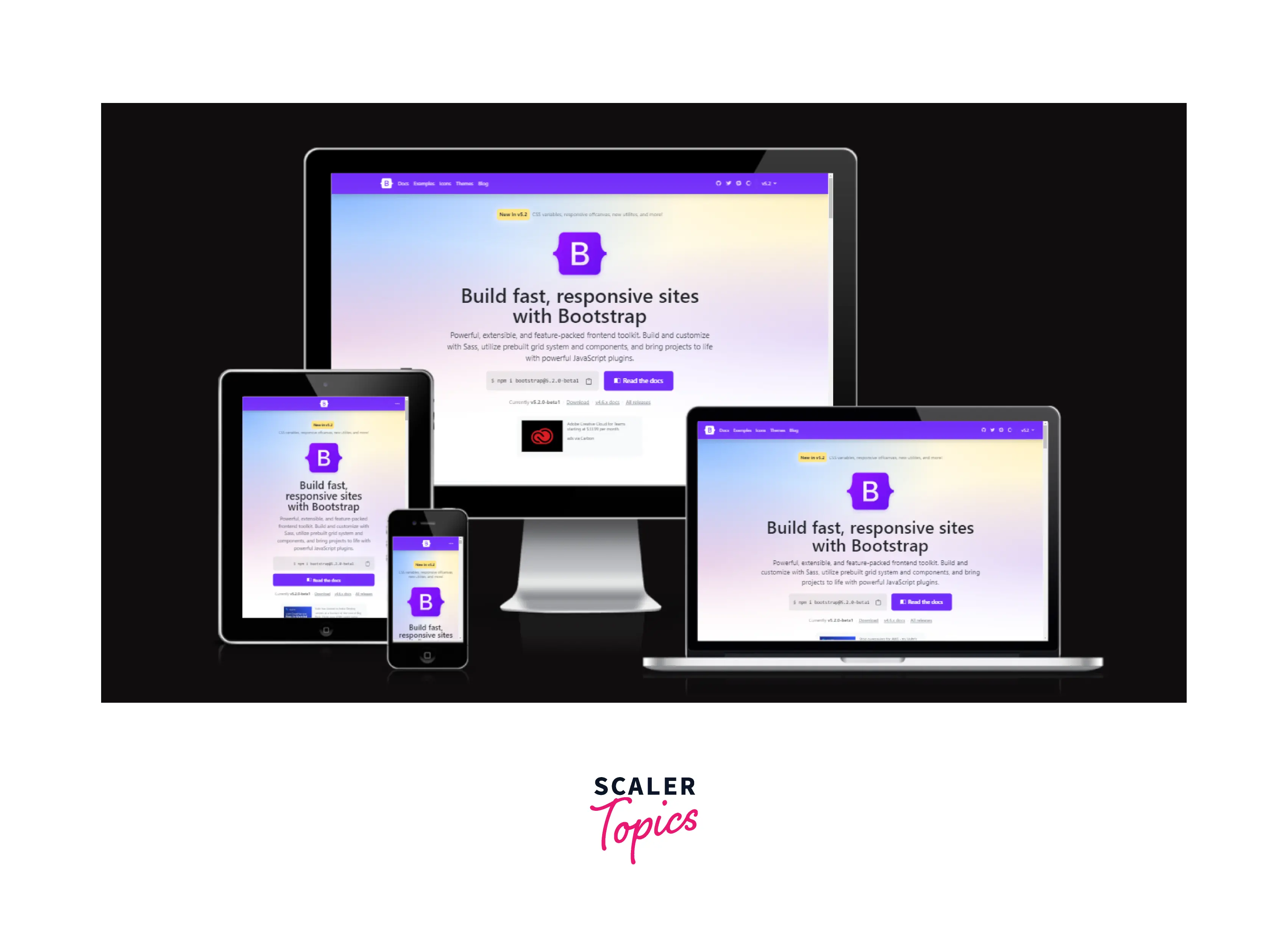
Bootstrap (Free & Open-Source CSS Framework)
Bootstrap is one of the most popularly used CSS frameworks. Popular sites like Airbnb, Walmart, Bloomberg, etc were built using this site. It is based on a 12-column grid system and follows a mobile-first approach. It also consists of J-Query functionalities. Bootstrap is a powerful and highly reliable frontend toolkit that makes Websites with a responsive web design and provides a smooth and flexible user experience. Check the official documentation of Bootstrap here.
Semantic UI (Free & Open-Source CSS Framework Based on LESS & jQuery)
Semantic UI uses concise HTML and intuitive Javascript and provides simplified debugging that allows to deploy the same code everywhere once the UI is developed. It builds responsive web design and beautiful layouts that provide options for customization and file size adjustments. Check the official documentation of Semantic UI here.
Foundation (Free & Open-Source Framework with UI Components)
Foundation is an advanced CSS framework that helps to build a responsive web design that is compatible with every device. It provides the foundation for sites and emails. It is semantic and follows a mobile-first approach and is thus customizable and professional. Check the official documentation of Foundation here.
Simple Grid (Free & Open-Source CSS Framework)
Simple Grid CSS is a light, simple and responsive CSS framework. It also consists of a 12-column grid where each column is contained within a row that is again contained within containers where each container has a maximum width of 960px. Check the official documentation of Simple Grid here.
Gumby (Free & Open-Source CSS Framework Based on Sass)
Gumby is a CSS framework powered by SASS consisting of a responsive grid system and UI toolkit. Although the framework now is retired and further development has stopped but one can definitely use the framework to build responsive web design. Check the official documentation of Gumby here.
Cascade (Free & Open-Source CSS Framework)
The term 'Cascade' as a CSS framework is inspired by CSS(Cascading stylesheet)itself. It uses an algorithm to determine a value for CSS properties with CSS declarations of different origin types at different layers. Check the official documentation of Cascade here.
Tailwind CSS
Tailwind CSS is a utility-first CSS framework that clubs small components together to construct a better user interface. It has a comparatively faster UI-building process that allows creating customized and responsive web designs. Hence, it is easier to make local changes. Check the official documentation of Tailwind here.
Bulma
Bulma is a responsive CSS framework that uses the simplest grid system based on flexbox that facilitates resizing and easy customization. Bulma can be used by using the pre-compiled .css file or installing the .sass file so that it can be customized according to the needs and requirements while building a website. Check the official documentation of Bulma here.
UIKit
UIKit is an open-source front-end framework that is compatible with all versions of web browsers. All it needs is a solid code editor or any of the autocomplete plugins. It is modular and provides powerful web interfaces. Check the official documentation of UIKit here.
W3.CSS
W3.CSS is a modern CSS framework that builds responsive web design and simplifies web development. It follows the mobile-first approach and uses standard CSS only. It is easy to learn and use and is compatible with all web browsers. Check the official documentation of W3.CSS here.
Positives And Negatives Of Responsive Design Frameworks
Browser Compatibility
By now we all know that webpages behave differently across different browsers having default settings varying across platforms. Frameworks for Responsive web designs are usually tested across browsers to ensure a smooth launch of a website. Hence, if browser-specific CSS codes are not written aptly then it makes it difficult to debug and validate code.
Customizing Files
Since, using a CSS framework requires downloading packages, contains styles, widgets, and files and some might need a certain type of configuration, it is preferred to work on the essentials of the website first and then download the required packages and installations. This would reduce confusion and minimize the downloading time it takes, otherwise.
Customizing Code
Although a boilerplate code is already provided in all CSS frameworks that is complete in itself and doesn't require much change but still sometimes the developer might need to override the existing CSS according to the needs of the webpage. So, intermediary knowledge of CSS is a must to customize CSS codes even if one uses a framework.
Accessibility
CSS frameworks provide accessibility by using segregated modules for all the properties of styles offered in CSS that prevents misuse of elements. It allows to override styles, provides aural stylesheets (they specify the way a document will sound when presented as speech), and allows access to alternative content.
Conclusion
- We've covered various aspects of Responsive Web Design by now and are familiar with various CSS frameworks used for building responsive web designs, it's quite evident that the responsiveness of a website across multiple devices is essential and plays a key role in providing a seamless user experience.
- From a development point of view, the use of a framework makes development easy, obscuring redundancy to write similar codes repeatedly.
- Using frameworks saves the time to delve deep into crucial CSS concepts and hence, provides flexibility.
So, now it's your turn, to build beautifully designed websites using any of the CSS frameworks listed above and boost your skills in Web development. Get yourself started!