Scatter Plot in Python

Overview
While creating dashboards in python, we can make use of various libraries offered by python of which, the scatter plot graph is the most popular of all which helps to visualize the relationship between two variables on a graph.
With the below module, we shall be exploring the concepts around scatter plots in python and practicing various examples that will help clear all the doubts around the scatter plot in python.

Pre-Requisites
A few pre-requisites before proceeding with this module are as follows:
- Basics of python.
- Matplotlib library
What is Scatter Plot in Python?
When we want to build graphs and visualize the relationship between two or more variables we make use of scatter plots in python. The scatter plot can be defined as a type of plot that illustrates the data as a collection of points or dots. The two-dimensional graph with an axis that is the x-axis and y-axis represents the position of a dot's data. The graph that is plotted for two sets of data along the two axes helps to visualize the relationship between the two or more core variables, that graph is defined as the scatter plot between the variables.
Here the information is gathered according to the movement of the data points along the two-axis whether the if the movement of data points is dependent on each other or not. Sometimes it is found that the data points are randomly arranged and distributed with no obvious pattern which depicts a lack of dependent relationship. Whenever you want to create the scatter plot in python, first import the matplotlib python library where you have two options to implement the scatter plot in python that is, via the pyplot.plot() or the pyplot.scatter() functions. While implementing, we can surely add more features to our scatter plots, such as changing the color, size, or even the shape of the data points.
So whats exactly is the difference between pyplot.scatter() vs pyplot.plot()?
Well, the major difference is when you work with pyplot.plot() then for any property we want to implement like color, shape, or size of data points it gets applied across all the data points present in the graph. While for pyplot.scatter(), we have control over each data point’s property like color, shape, and size of data points also.
The below diagram demonstrates what a scatter plot in python looks like:
matplotlib.pyplot.scatter()
While studying the various library, we may have come across the matplotlib while working on the dashboard and visualizations.
The Matplotlib is an extensive library for building static, animated, or even interactive visualizations in Python. It is widely used for graph plotting various plots implemented in python ( such as scatter plots, bar charts, pie charts, line plots, histograms, 3-D plots, etc.)
Out of all the methods explained in the matplotlib library, the scatter plots in python are widely implemented to visualize the relationship between variables (two or more depending on the number of variables). The scatter method uses the dots to demonstrate the relationship between the variables. We use the scatter() method from the matplotlib library to draw a scatter plot which helps to not only represent relations among variables but also provide significant information on if any change is brought in one can affect the other.

Syntax
The syntax for scatter plot in python is as follows:
The syntax explains the various parameters that can be passed in the matplotlib.pyplot.scatter() function.
Parameters
Now as seen above we have various parameters that are passed while implementing the scatter() method in scatter plot in python:
x_axis_data- Represents the data in an array format to be presented on the x-axis.
y_axis_data- Represents the data in an array format to be presented on the y-axis.
s- Represent the marker size. It could be a scalar or an array of sizes equal to the size of x or y.
c- Represent the color for the sequence of colors dedicated to markers. marker- Represent the marker style. The various types of markers that we can use while creating a scatter plot in python are: ['<‘,’s’,’p’,’H’,’D’,’d’,‘.’,’o’,’v’,’h’,’1′,”,”,’^’,’>’,’*’]
cmap- Represent the cmap name linewidths- Represents the width of the marker border edge color- Represents the border color of the marker alpha- Represents the blending value usually lying between 0 ( denoting transparent) and 1 (denoting opaque)
Note: All the above parameters except x_axis_data and y_axis_data are optional. If they are not explicitly mentioned then their default value is taken to be None.
Examples
Let us explore more scenarios where we shall be implementing the concepts around scatter plots in python. The below examples cover the scenario description along with code examples and explanations capturing it with visuals as well.
Let's dive in!
A Scatter Plot with 1000 Dots
Now let us start with a very basic scatter plot where we shall be creating a scatter plot in python with 1000 dots.
We plot the graph to showcase how we can allot 1000 data points as a scatter plot with the below-given code.
Code:
Output:
The output for the above code is as below:
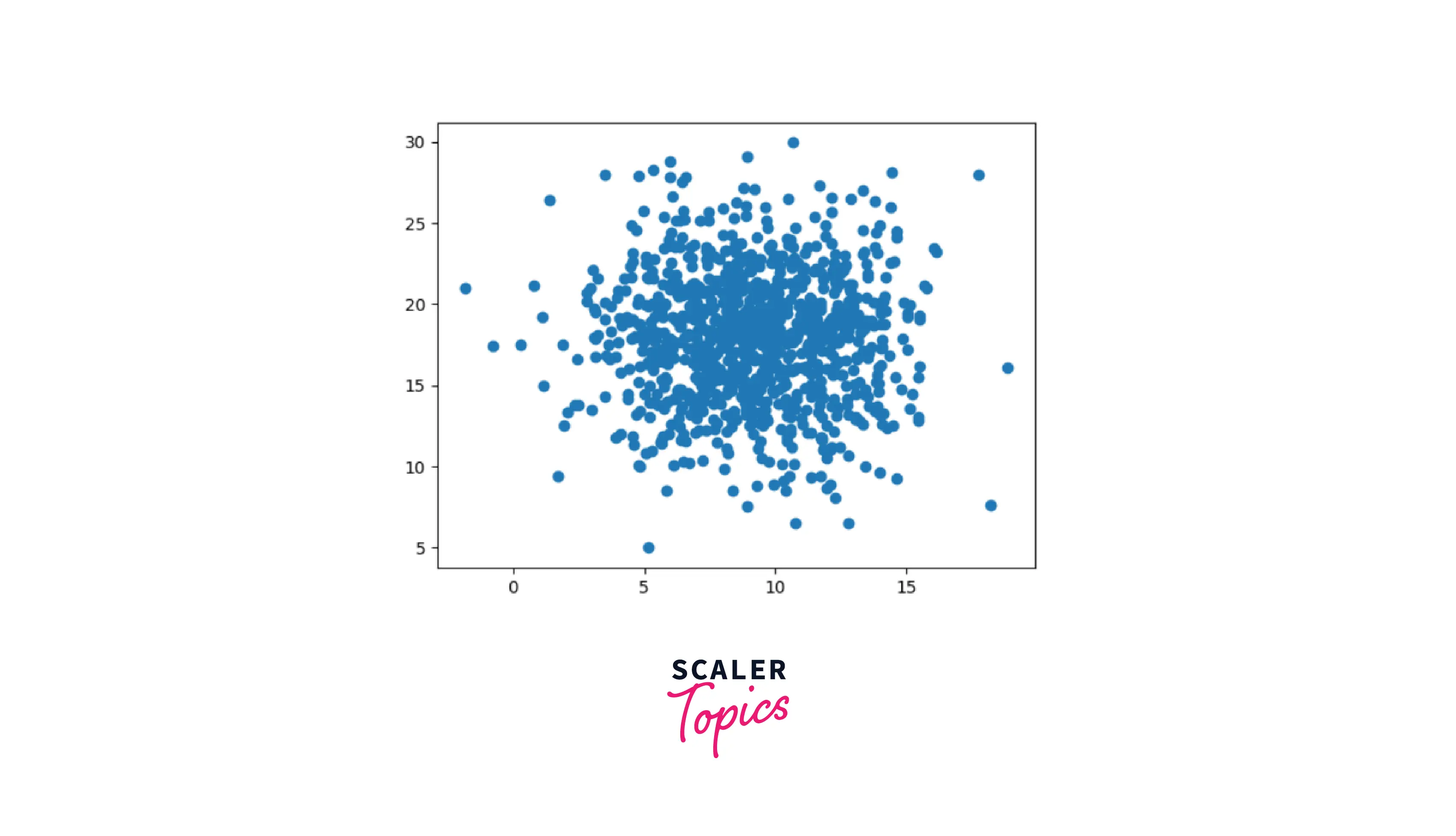
Explanation:
Here we have created a scatter plot plotting 1000 dots at once. This is a very easy-to-understand plot where we simply made use of the scatter plot syntax and defining value as shown in code to display the scatter plot in python with 1000 data points at once.
Scatter Plot with Different Shapes and Colors for Two Datasets
Now let's move to create a scatter plot where we shall be implementing the scenario where we shall learn how to draw a scatter plot in python with different shapes and colors for two datasets.
We shall be starting by importing the package and moving on to defining the two datasets ( the values of their coordinates) with their unique marker, color, and edge color. Finally, we shall be using the scatter function to plot the graph.
Code:
Output:
The output for the above code is as below:
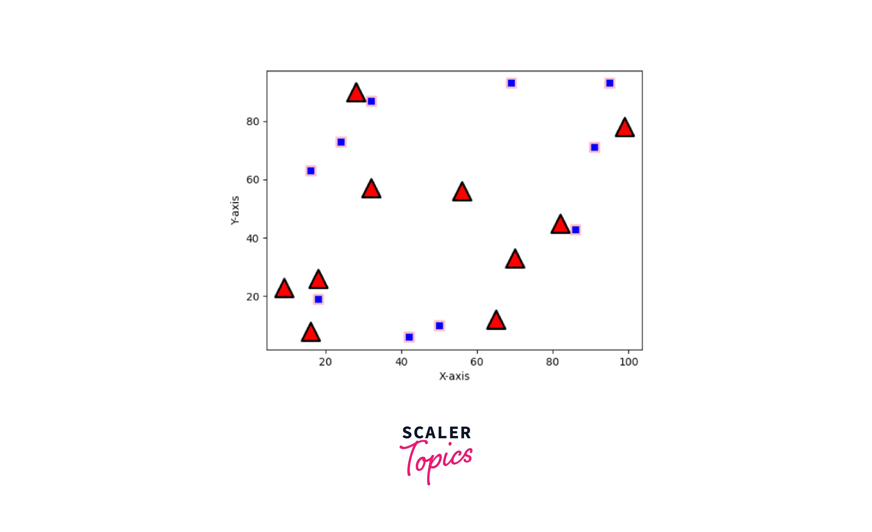
Explanation:
Here we are plotting the Scatter plot with different shapes and colors for two datasets. We have first started by giving the various positions to the dots defining their x-axis and y-axis. Then by making use of different parameters we bring the different shapes and colors to our visualizations.
Correlation with Scatter Plot
Now let us understand one very important concept of scatter plot in python which is, Correlation with Scatter plot in python. There are three major correlations in scatter plots in python as defined below:
-
Positive correlation: When the value of data points along the y-axis starts to increase with respect to the value of data points along the x-axis, then the variables are said to possess a positive correlation.
-
Negative correlation: When the value of data points along the y-axis starts to decrease concerning the value of data points along the x-axis, then the variables are said to possess a negative correlation.
-
Zero correlation: When the value of data points along the y-axis started to change randomly independent of the value of data points at the x-axis, then the variables are said to possess zero correlation signifying both the data sets are independent of each other.
Let us create a scatter plot in python to visualize the same as learned above.
Code:
Output:
The output for the above code is as below:
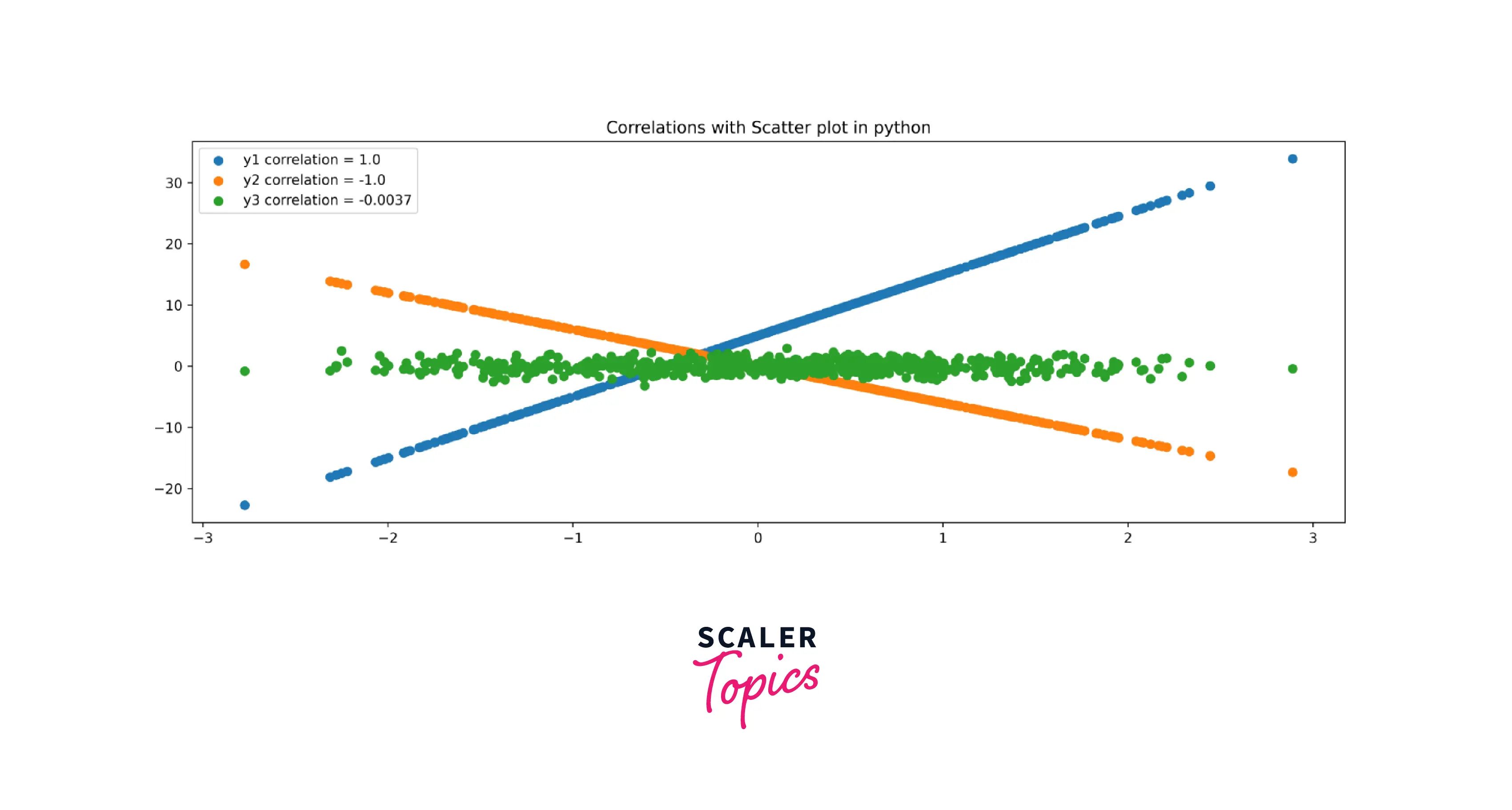
Explanation:
As seen above, we are creating a scatter plot in python to understand the relationship between the data points that are represented by the data dots having a position with the x-axis and y-axis. Here the f'y1 correlation denoted the positive correlations, the f'y2 correlation depicted the negative correlation, and the f'y3 correlation represented the zero correlation.
Changing the Color of Groups of Points
Let us learn to draw a scatter plot in python where we want to change the color of groups of points. To do so, we make use of the color ='' command to understand how we can be changing the color of groups of points while representing a scatter plot in python by simplifying passing the color function ( as a parameter ) with any random color of your choice.
Code:
Output:
The output for the above code is as below:
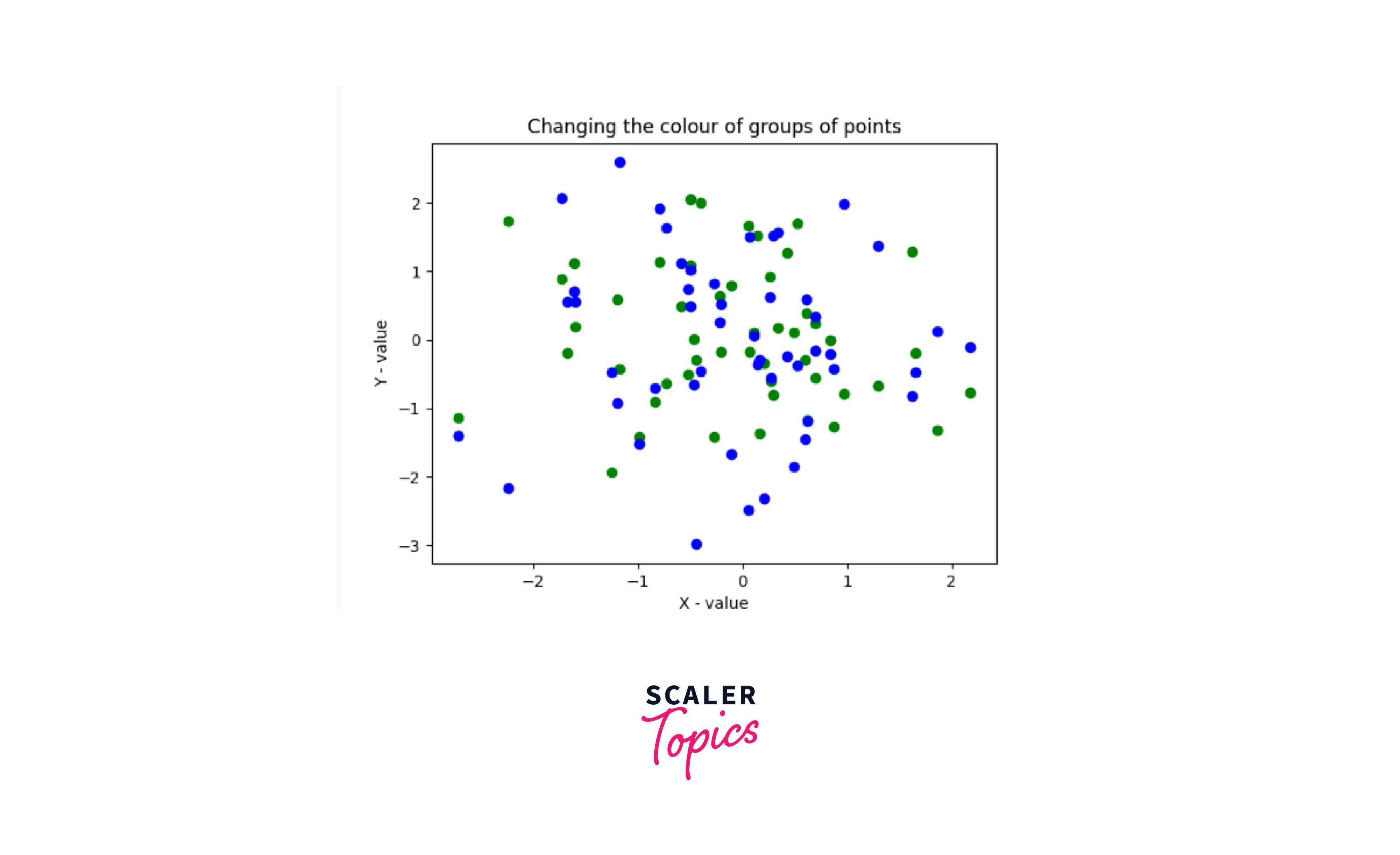
Explanation:
As can be seen above, we have plotted a scatter plot in python where we are Changing the color of groups of points. we made use of the color ='' command to assign different colors to the data points or dots to make the graph easy to interpret and understand.
Changing the Color and Marker
Let us learn to draw a scatter plot in python where we want to Change the Color and Marker of data points. To do so, we make use of the marker =_ command to understand how we can be Changing the Color and Marker while representing a scatter plot in python.
The various types of markers that we can use while creating a scatter plot in python are as below: ['<‘,’s’,’p’,’H’,’D’,’d’,‘.’,’o’,’v’,’h’,’1′,”,”,’^’,’>’,’*’]
Code:
Output:
The output for the above code is as below:
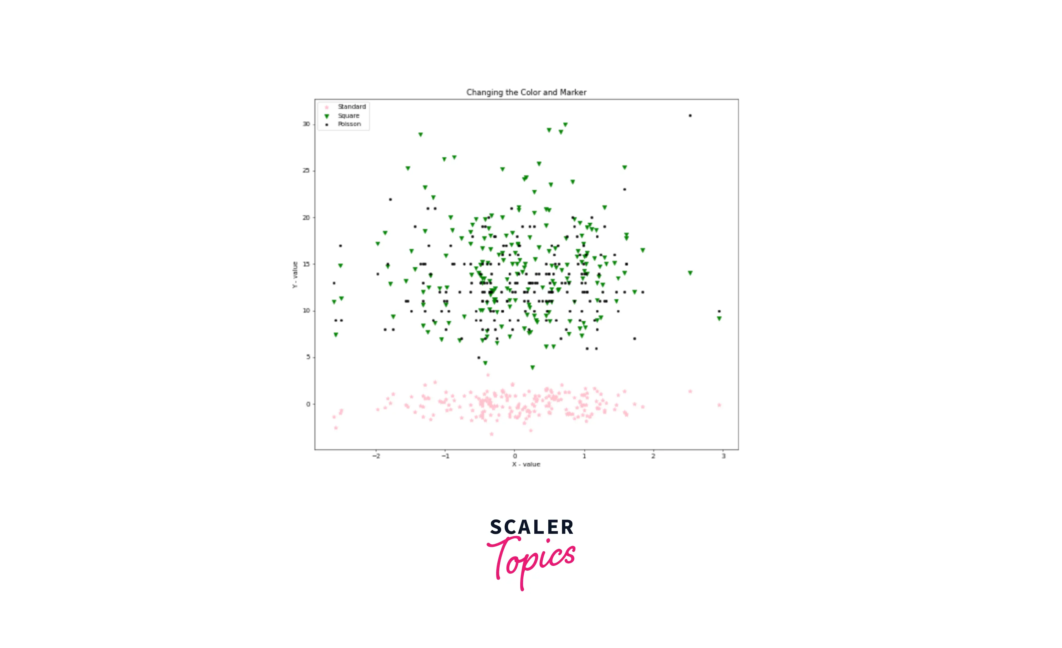
Explanation:
Here as seen above, we are creating a scatter plot to understand how we can be Changing the Color and Marker of the same. We used the scatter plot syntax to specify the color and marker for the different variables represented by the data points.
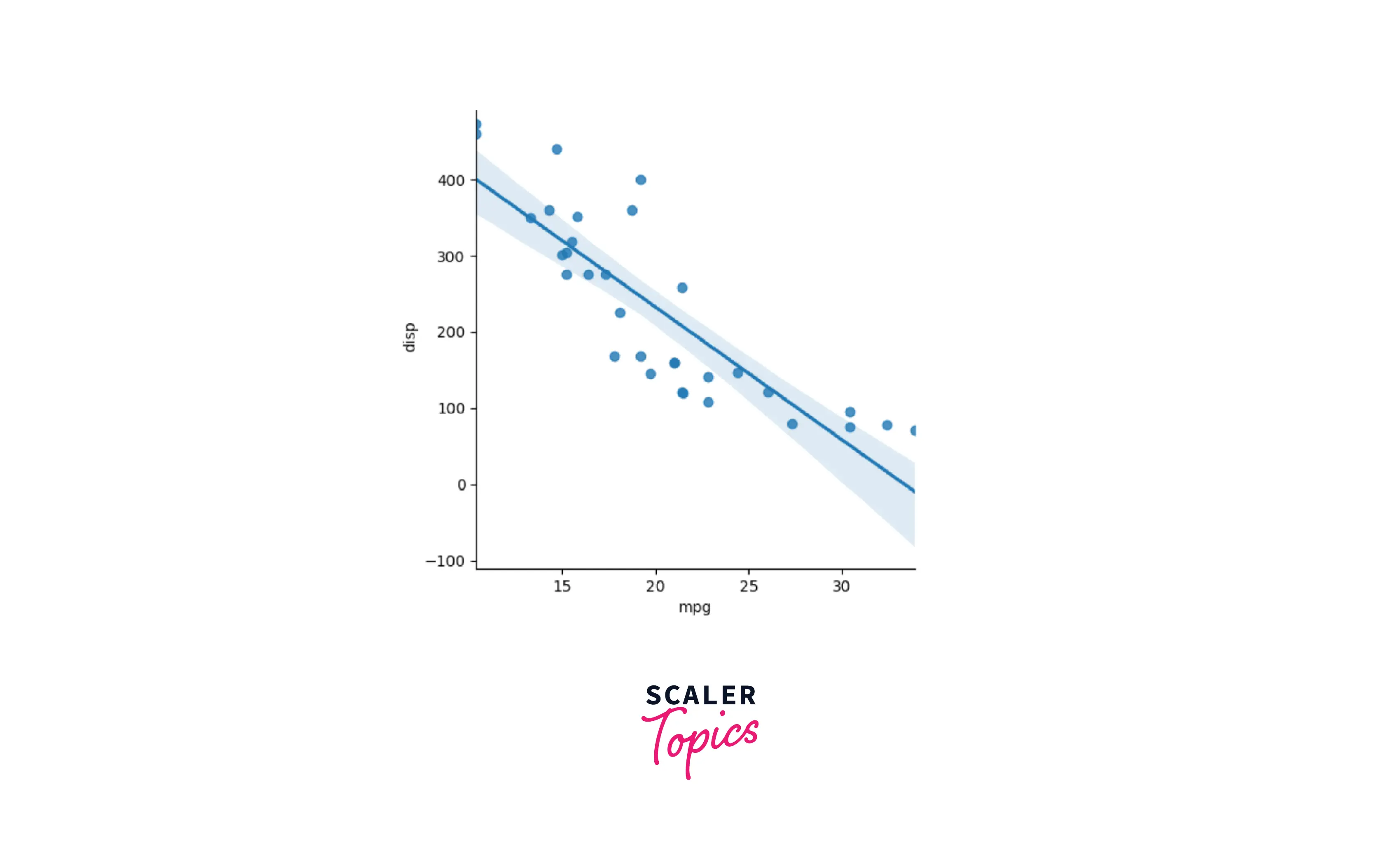
Scatter Plot with Linear Fit Plot Using Seaborn
Let us see how we can create a scatter plot with a linear fit plot using seaborn. We shall be making use of the lmplot() function in seaborn.
We shall be referring to the mtcars dataset from below links: https://www.kaggle.com/ruiromanini/mtcars/download
The below code explains the step-by-step process of how we can know after the graph is plotted whether the relationship between the two data sets is a linear fit relationship or not between the mpg and the disp column from the mtcars dataset.
Code:
Output:
The output for the above code is as below:
Explanation:
As can be seen above, we have plotted the Scatter Plot in python with a Linear fit plot using the Seaborn package. We used the sns.lmplot() function from the seaborn package to find out the linear relationship between the mpg and the disp column from the mtcars dataset. Here we marked the x-axis as 'mpg' and the y-axis as 'disp' along with data as the data frame.
Scatter Plot with Histograms Using Seaborn
Let us move forward to explore how we can create scatter plots with histograms using seaborn. We shall be using the joint plot function in the seaborn package to represent the distribution of both x and y values as histograms through the scatter plot in python for which we first import the seaborn package.
We shall be using the sns.jointplot() function with x, y, and dataset as arguments.
Code:
Output:
The output for the above code is as below:
Explanation:
As seen above, we are creating a Scatter Plot in python with Histograms using the seaborn library. Here we are getting the distribution plot for the x and y value as histograms using the sns.jointplot() function from the seaborn package.
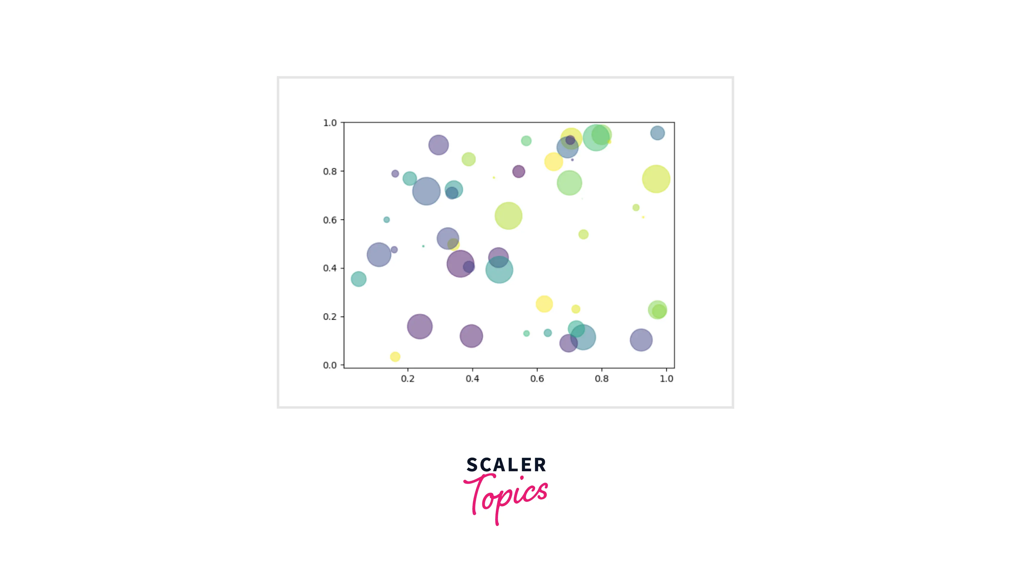
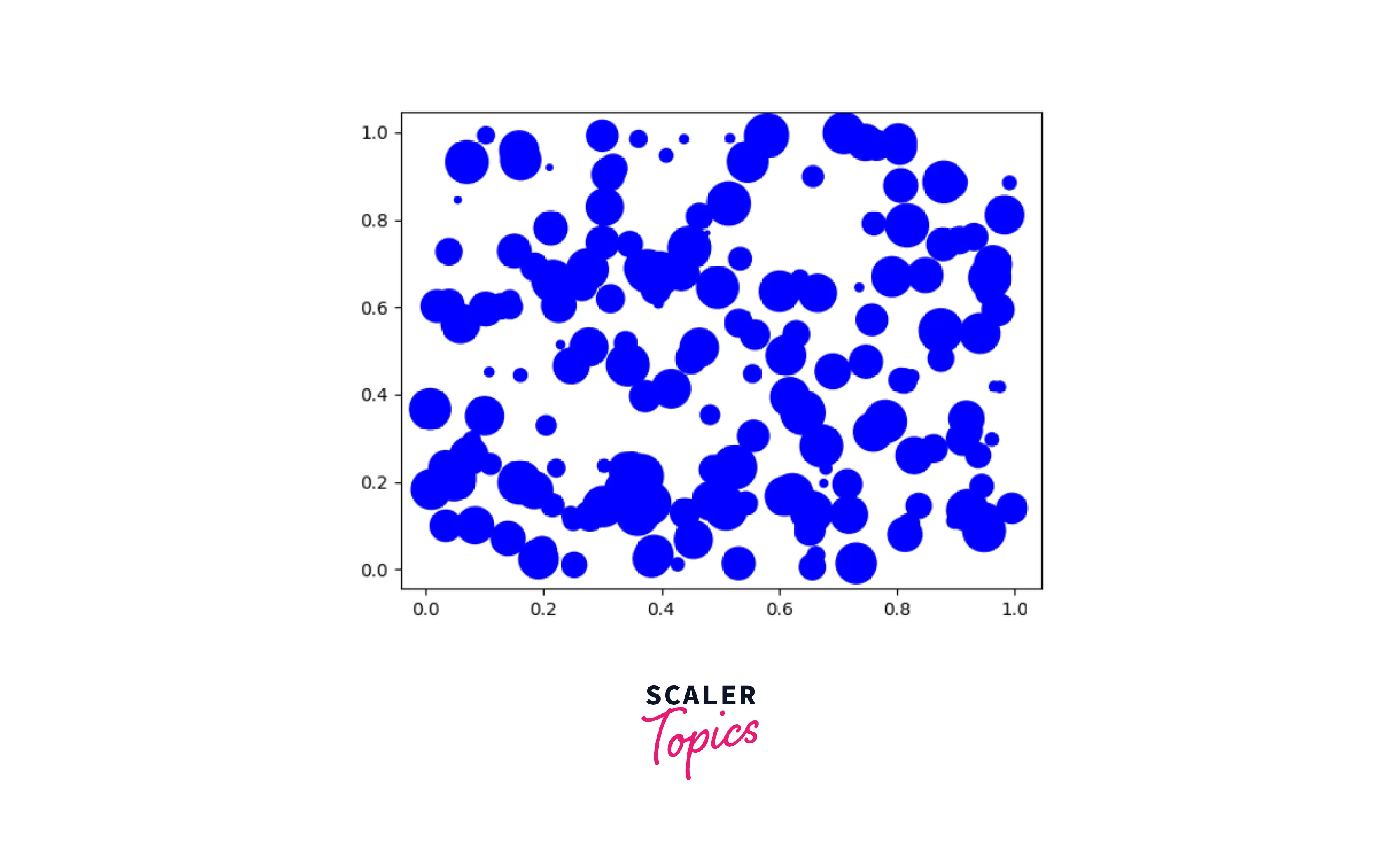
Bubble Plot
An interesting concept around the scatter plot is the bubble plot.
The bubble plot can be defined as the type of scatterplot where we can include a third dimension or a third variable. The size of the data dots or points represents the value given to this third variable.
Now to represent the bubble plot, the third variable representing the size of the data dots is added in the scatter plot in python denoted by s that explains the size of the data points.
Code:
Output:
The output for the above code is as below:
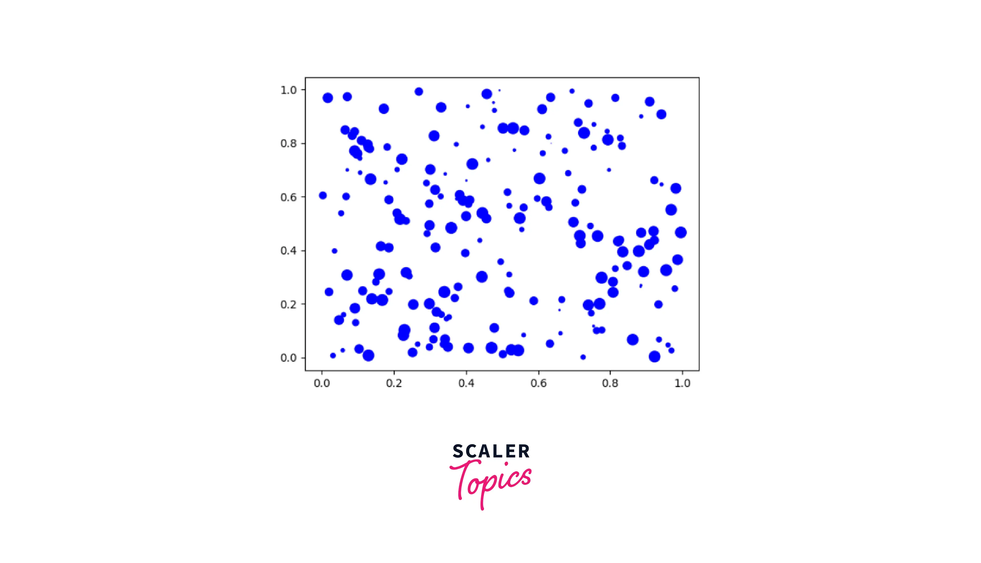
Explanation:
As seen above, we have added a third variable to the two-dimensional scatter plot in python. Here the third dimension is represented by the variable 's' whose value demonstrates the size of the dots along with the blue color of the dots as can be seen in the output.
Conclusion
-
The scatter plot can be defined as a type of plot that illustrates the data as a collection of points or dots. It defines the relationship between two variables that is, represented in a graph format in a two-dimensional space with data points plotted along the *X-axis and Y-axis.
-
The two options to implement the scatter plot in python that is via the pyplot.plot() or the pyplot.scatter()
-
There is three major correlation in the scatter plot in python as defined below:
-
Positive correlation: Linear relationship between data points of the Xaxis and Y-axis when the value of the Y-axis increases.
-
Negative correlation: Linear relationship between data points of the Xaxis and Y-axis when the value of the Y-axis is decreased.
-
Zero correlation: When the value of data points along the y-axis starts to change randomly independent of the value of data points at the x-axis.
-