Scatterplots in R Programming
Overview
Scatterplots are a cornerstone of data visualization, providing a clear and insightful way to understand the relationship between two continuous variables. In the world of statistical computing and graphics, R stands out as a powerful programming language, offering a myriad of methods to create captivating scatterplots.
R - Scatterplots
Scatterplots in R are an indispensable and fundamental tool for visualizing the relationship between two numerical variables. They enable us to identify patterns, correlations, and outliers in the data, making them an essential component of exploratory data analysis. With the ability to create scatterplots in R, we gain valuable insights into the underlying trends and distributions of our data. By utilizing the plot() function, we can easily generate scatterplots with customizable titles, axis labels, and point characteristics. The versatility of scatterplots in R allows us to delve deeper into our data and uncover valuable patterns and associations that might otherwise go unnoticed. As we explore different datasets and variables, the power of scatterplots in R becomes apparent, guiding us through the intricate relationships and dynamics present in our data. Whether you are a beginner or an experienced data analyst, mastering the art of scatterplots in R opens doors to a deeper understanding of data and empowers you to make informed decisions based on data-driven insights. So, let's embark on this journey to discover the wonders of scatterplots in R and harness their potential to visualize and understand our data like never before.
A. Syntax
As stated in the previous section in R, we can use the plot() function to construct a simple scatterplot:
B. Parameters
Let us now look at the parameters used in the plot() function.
- x: A vector that holds the values for the X-axis.
- y: A vector that contains the values for the Y-axis.
- main: The main title of the scatter plot.
- xlab: The label for the X-axis, which provides context for the X-axis values.
- ylab: The label for the Y-axis, explains the Y-axis values.
- col: The colour of the points in the scatter plot, allows us to distinguish different data points.
- pch: The symbol used for plotting points in the scatter plot, providing a visual representation of the data points.
By adjusting these parameters, we can create visually appealing and informative scatter plots that effectively represent the relationships between the numerical variables of interest in our data.
C. Example
Let's consider an example where we have two vectors, x and y, containing data points for two variables. We want to create a scatterplot to visualize their relationship.
Code:
Output:
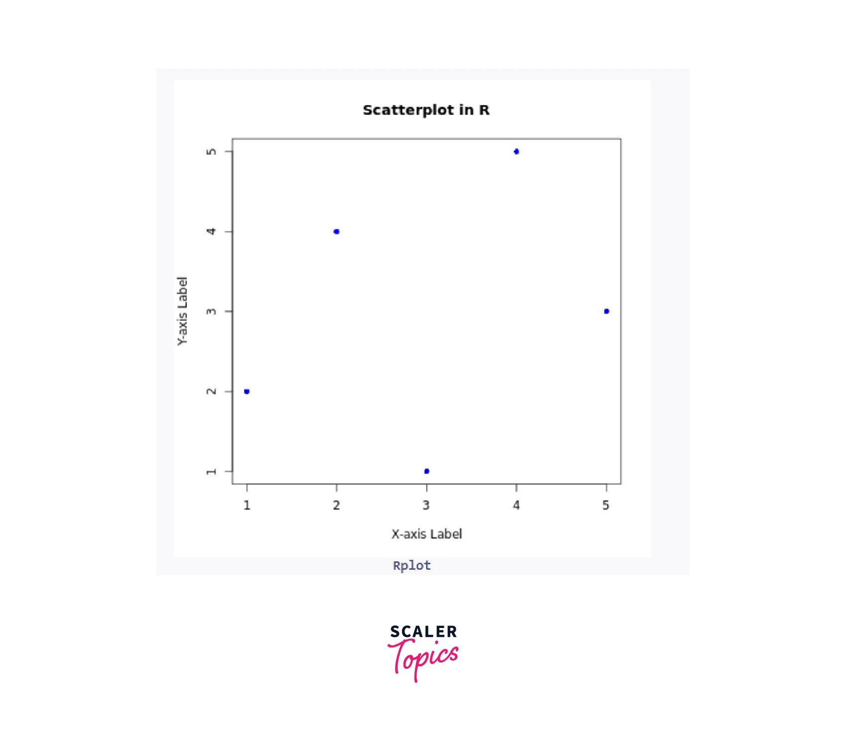
Create a Scatterplot in R
In R programming, generating scatterplots involves several key steps. Firstly, we need to identify the numerical variables from the input dataset that we want to examine for correlation. Afterward, we import the dataset into the R environment. To ensure successful importation, we can use the head() function to verify the data's initial contents.
Once the data is ready, we proceed to the crucial step of creating scatterplots in R. This involves applying the plot() function, where we specify the selected variables as parameters to construct the scatterplots. To further enhance the visualizations, we can leverage specific parameters such as colors, levels, point shape, size, and graph titles. By incorporating these additional features, we can improvise and customize the scatterplots in R programming to best suit our analysis and presentation needs. consider the following example:
Code:
Output:
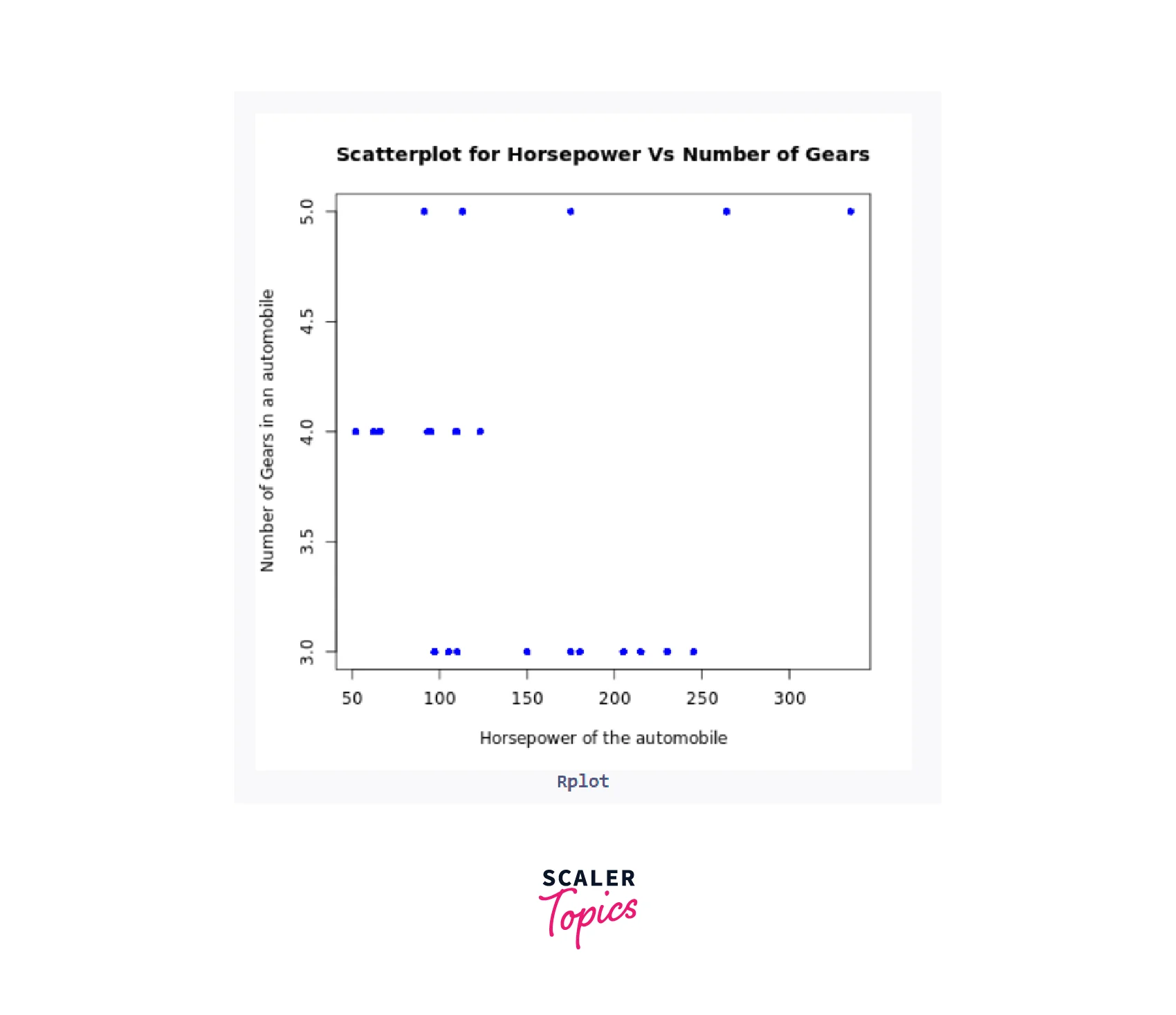
Scatterplot Matrices
When dealing with multiple variables, exploring the correlations between them is essential, and scatterplots in R provide an effective way to achieve this. One popular approach is to create a scatterplot matrix, which presents scatter plots of each variable against all others, offering a comprehensive view of their relationships.
A. Syntax
To generate a scatterplot matrix in R, we can use the pairs() function.
B. Parameters
- var1, var2, var3: The variables to be plotted on the scatterplot matrix.
- data: The dataframe containing the variables.
C. Example
For instance, consider the mtcars dataset with variables disp, wt, mpg, vs and hp:
Code:
Output:
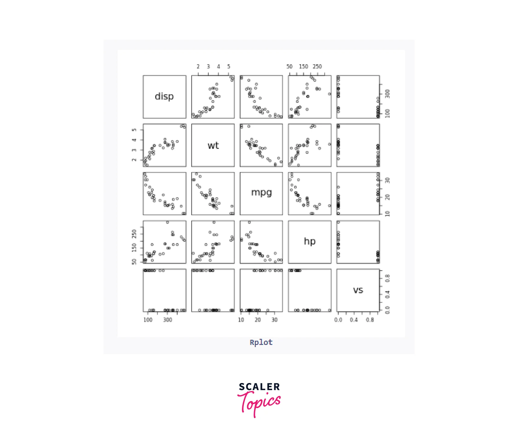
This code will produce a scatterplot matrix with five scatter plots, illustrating the correlations between these variables.
To add another dimension to the visualization, we can utilize the col argument if the dataset contains a factor variable. By specifying the factor variable, we can plot the groups with different colours, enhancing our understanding of the data:
Code:
Output:
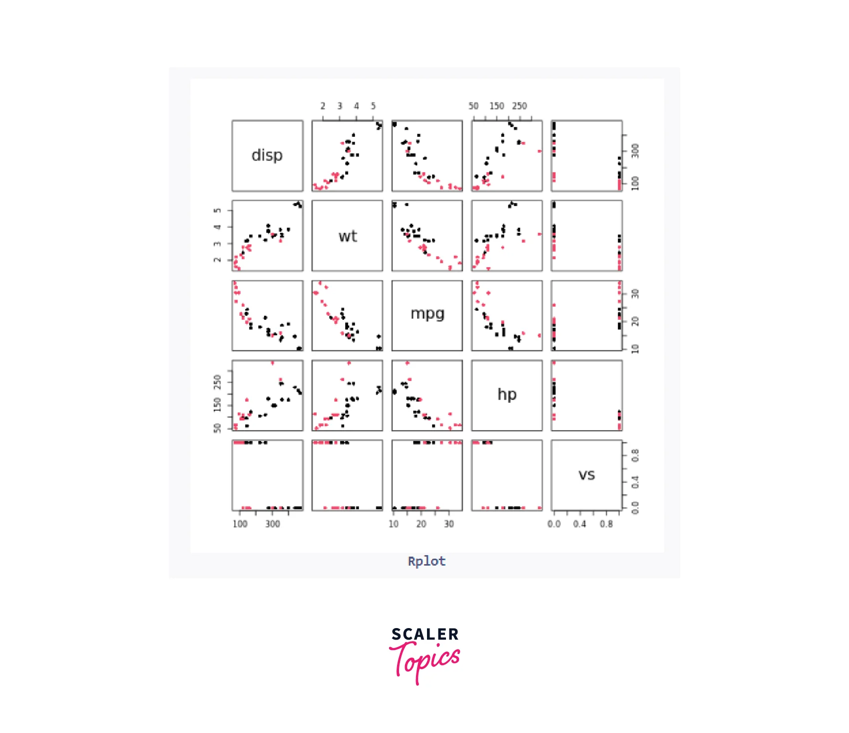
Additionally, the car package provides an alternative scatterplotMatrix function that includes kernel density estimates on the diagonal:
Code:
Output:
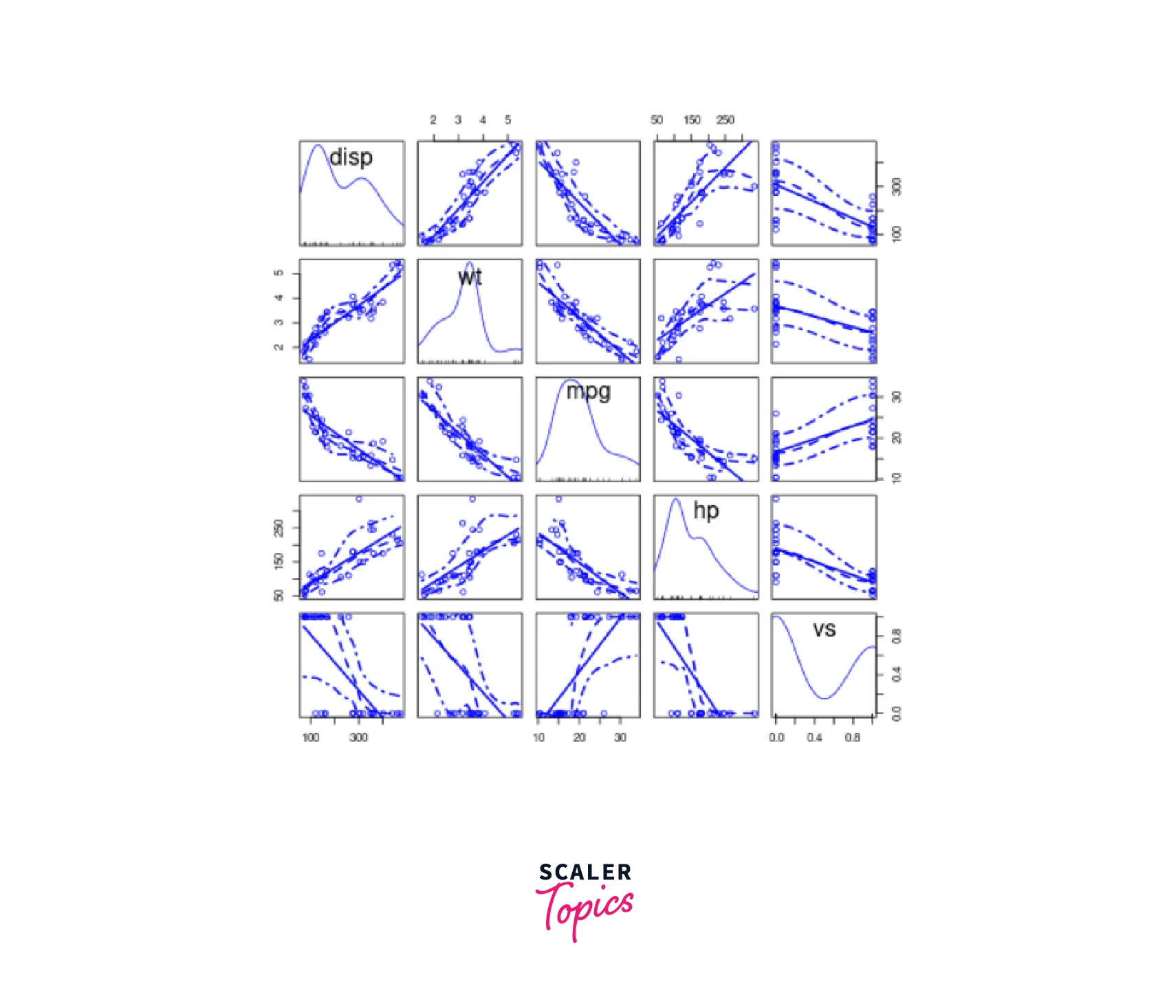
We can further customize the appearance of the scatterplot matrix using various arguments, such as adjusting colors and adding regression lines:
Code:
Output:
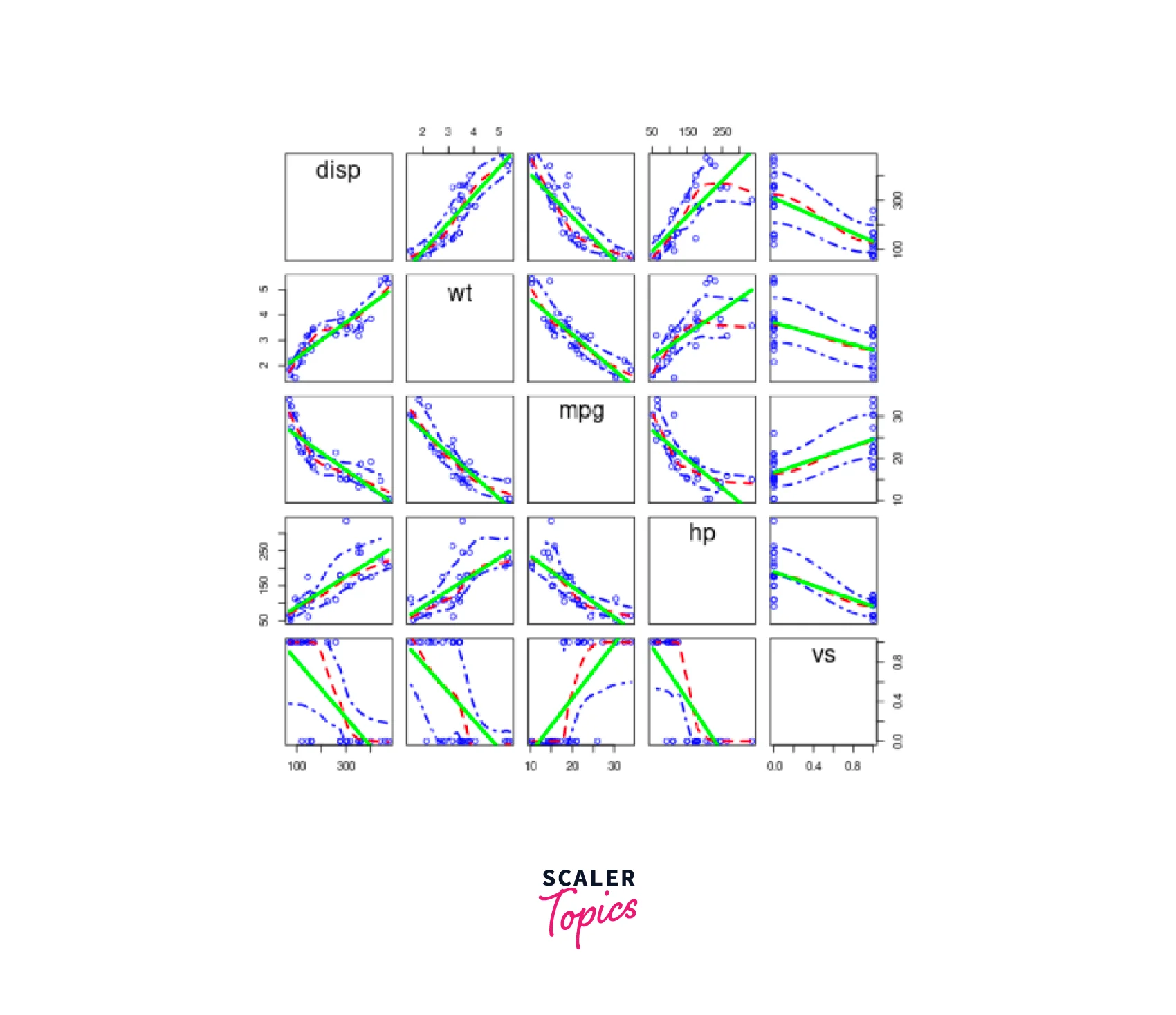
Another option is to use the cpairs function from the gclus package. First, we select the numeric variables of interest, create a correlation matrix, and then apply cpairs to generate a sorted and colored scatterplot matrix:
Code:
Output:
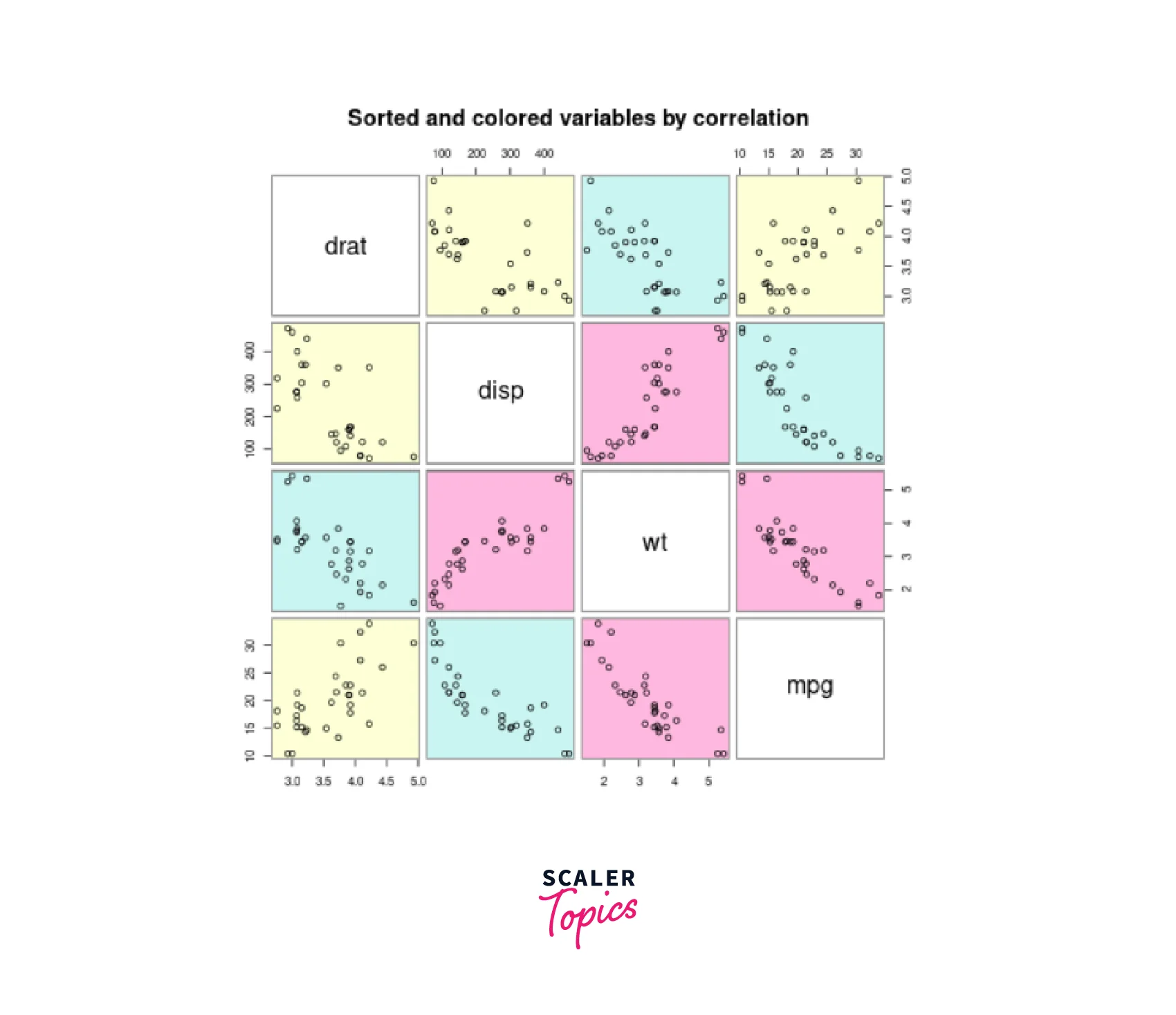
With these diverse approaches to creating scatterplot matrices, we can gain deeper insights into the relationships between multiple variables, making R scatterplots an invaluable asset for data analysis and visualization.
Scatterplot Using ggplot2
The ggplot2 package in R offers a flexible and powerful approach to data visualization. Creating scatterplots using ggplot2 provides more customization options and aesthetically pleasing plots.
Syntax:
To create a scatterplot using ggplot2, we use the ggplot() function along with the geom_point() layer:
Parameters:
- data: The dataframe containing the variables.
- *var1, var2: The variables to be plotted on the X-axis and Y-axis, respectively.
Example: Scatterplot using ggplot2
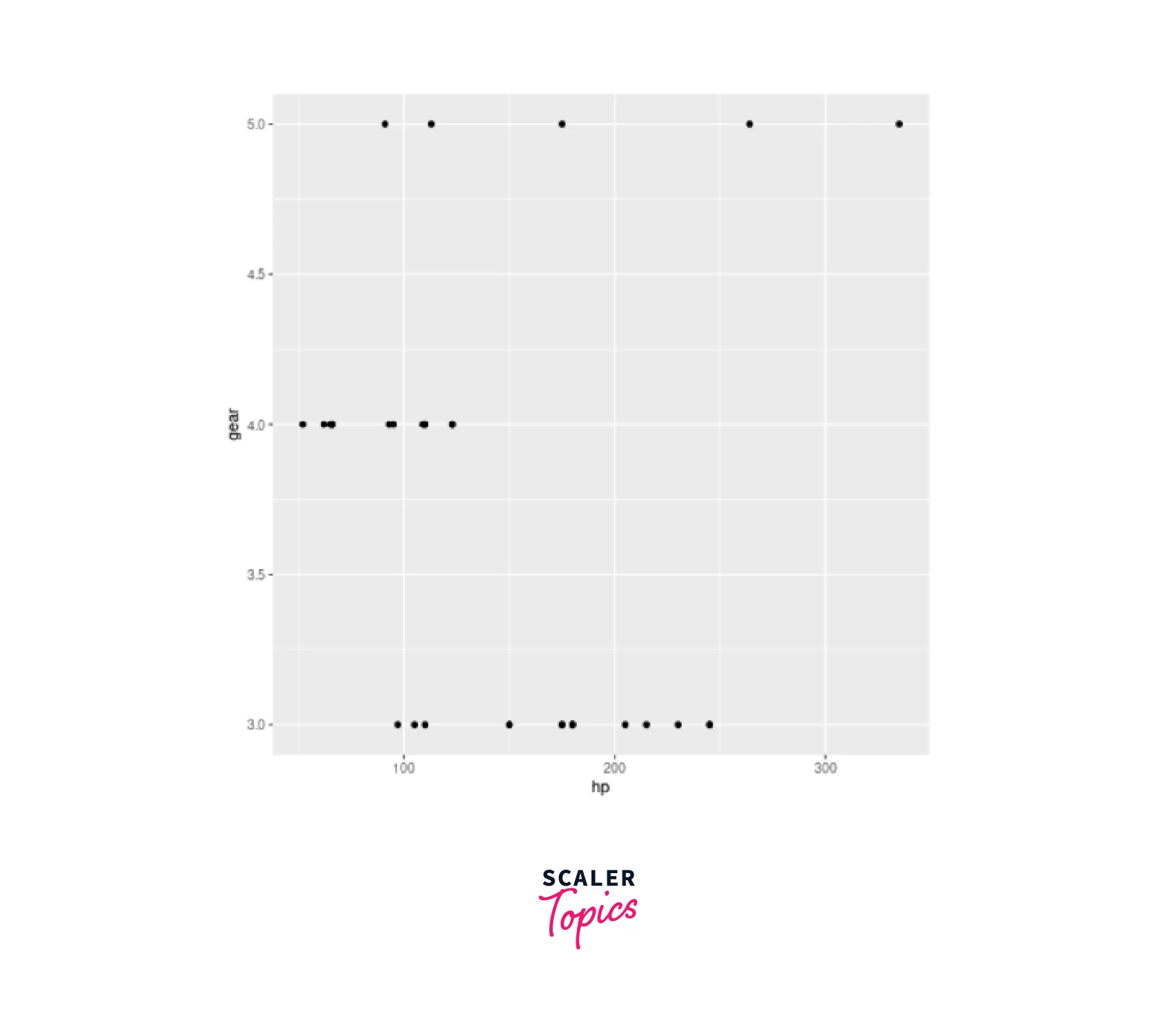
Let's continue with the previous example and create a scatterplot for the hp and gear variables.
Code:
Output:
A. Scatterplot with Groups
In some cases, we may want to visualize the relationship between two variables while considering a categorical variable as a grouping factor. This can be achieved by adding color or shape aesthetics to the scatterplot.
Syntax:
To create a scatterplot with groups, we modify the aes() function to include a grouping variable:
Parameters:
- group_var: The categorical variable to be used for grouping the data points.
Example: Scatterplot with Groups
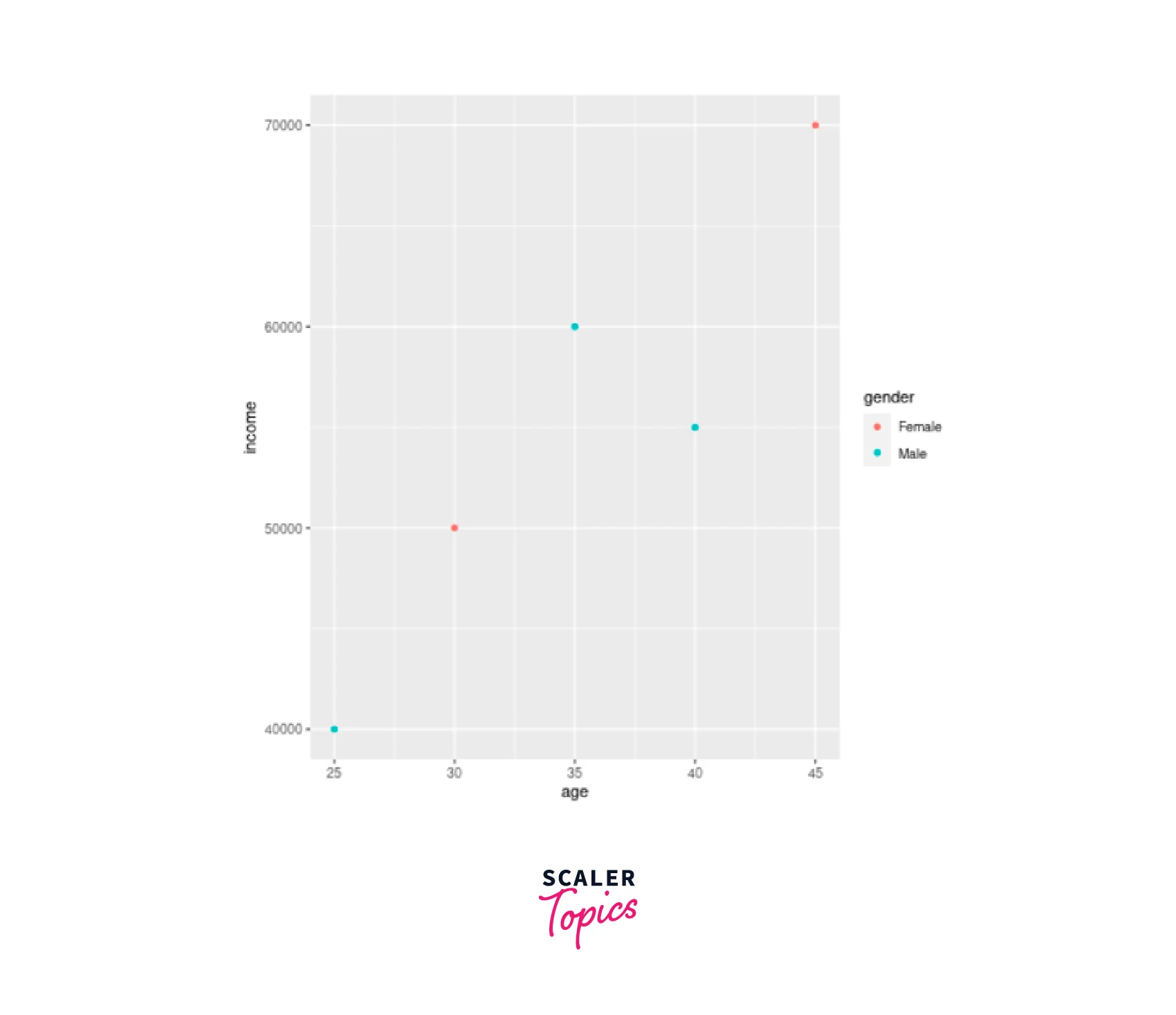
Assume we have a dataframe with a categorical variable gender. We'd like to make a scatterplot of age vs income in various colours for each gender.
Code:
Output:
B. Changes in Axis
To further enhance scatterplots, we can customize the axis limits and breaks to provide a better view of the data.
Syntax:
We use the scale_*_continuous() functions to adjust the axis:
Parameters:
- lower_limit, upper_limit: The desired lower and upper limits of the axis.
- start, end, step: The starting, ending, and step values for the axis breaks.
Example: Changing Axis Limits
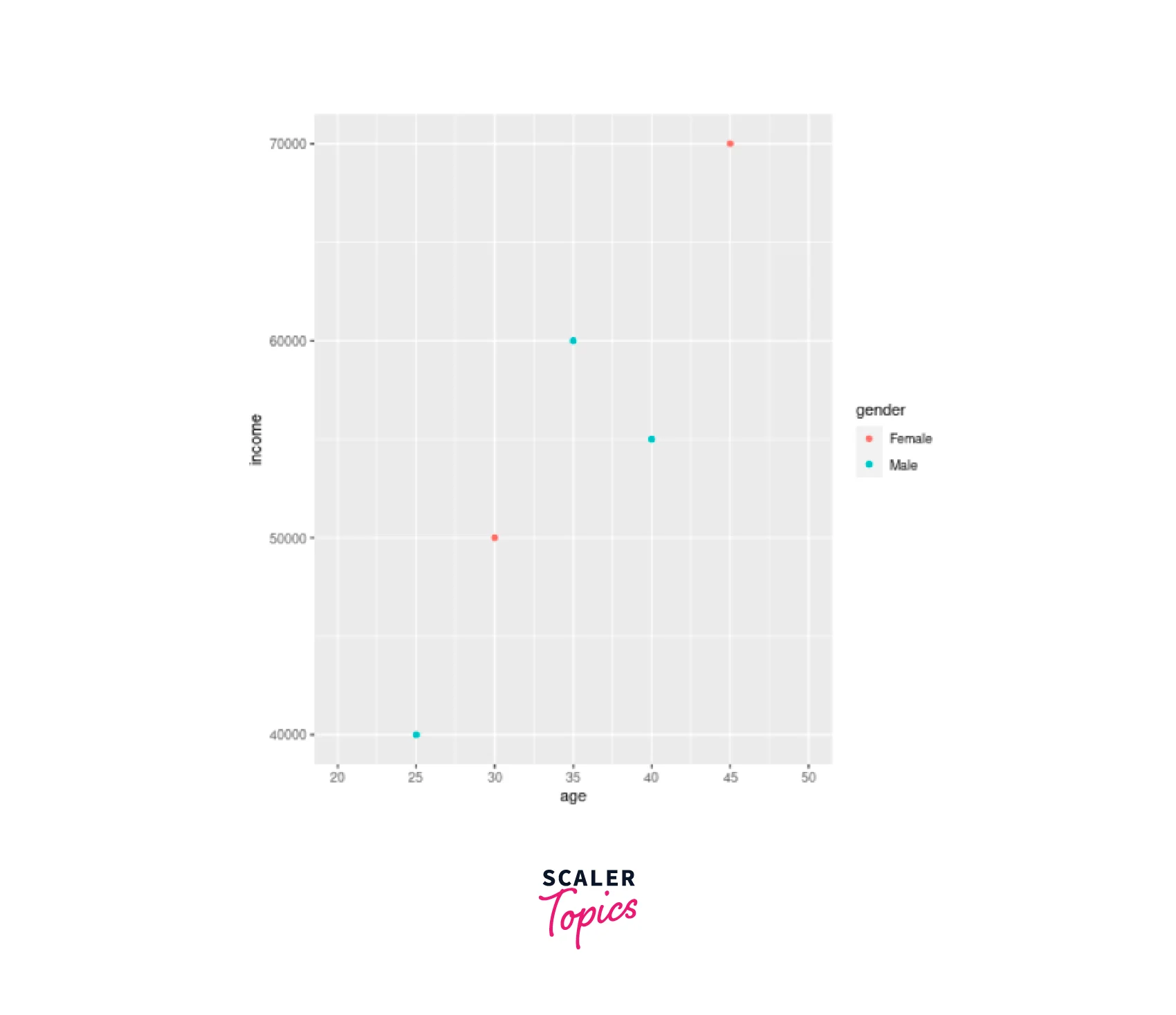
Let's modify the previous scatterplot to have custom axis limits and breaks on the X-axis.
Code:
Output:
C. Scatterplot with Fitted Values
Sometimes, it's essential to visualize the trend or a fitted line that represents the relationship between two variables. This can be achieved by adding a regression line to the scatterplot.
Syntax:
In ggplot2, we use the geom_smooth() layer to add a fitted line to the scatterplot:
Parameters:
- method: The method used for fitting the line. In this case, we use "lm" for linear regression.
Example: Scatterplot with Fitted Line
Let's enhance our previous scatterplot with a fitted line to represent the relationship between age and income.
Code:
Output :

Adding Title
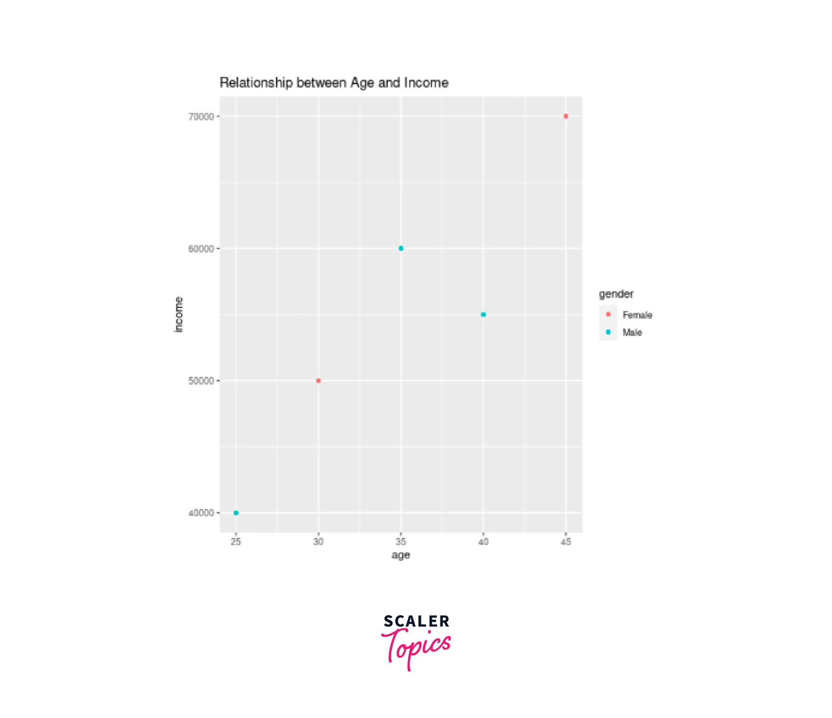
Titles are crucial for providing context and information about the scatterplot. We can add a main title using the labs() function.
Let's add a title to the previous scatterplot:
Code:
Output:
Adding Title with Dynamic Name
In some cases, we may want to add a dynamic title that includes variable names or other information. To add a dynamic title, we can use the paste() function inside the labs():
Code:
Output:

Adding Subtitle
Subtitles can provide additional information about the scatterplot or the data being presented. To add a subtitle, we use the labs() function and set the subtitle parameter:
Code:
Output:

Changing Names of X-axis and Y-axis
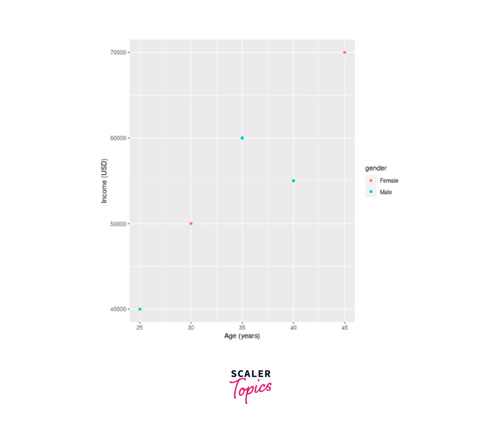
Customizing axis labels is essential to provide clarity about the data being presented. We use the xlab() and ylab() functions to change the names of the X-axis and Y-axis, respectively:
Code:
Output:
3D Scatterplot in R
In R, creating captivating 3D scatterplots is made possible by utilizing the scatterplot3d and rgl libraries. With the scatterplot3d function, you can easily produce static 3D plots that represent the relationship between three variables. To explore the full capabilities of this function, you can refer to the list of arguments by running ?scatterplot3d in your R environment.
First, make sure to install the \ library:
Next, you can generate a 3D scatterplot with randomly generated data for demonstration purposes.
Consider the following example:
Code:
Output:
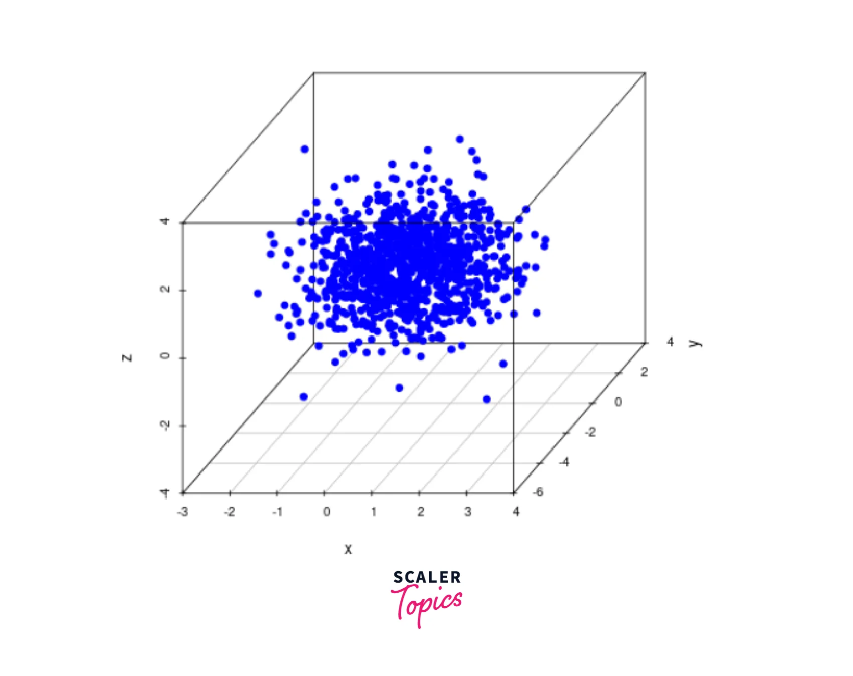
This code snippet will create a static 3D scatter plot in R, visually representing the relationships between the three variables (x, y, and z). By specifying the color, point shape (pch), and other customization options, you can further enhance the appearance of the scatterplot.
Alternatively, for a more interactive visualization experience, you can employ the plot3d function from the rgl package. The rgl library enables dynamic 3D plotting, allowing you to rotate, zoom in, and zoom out the scattergram, which proves invaluable when analyzing patterns within three-dimensional data.
First, install the rgl library:
Next, create an interactive 3D scatter plot using the plot3d function:
Code:
Output:
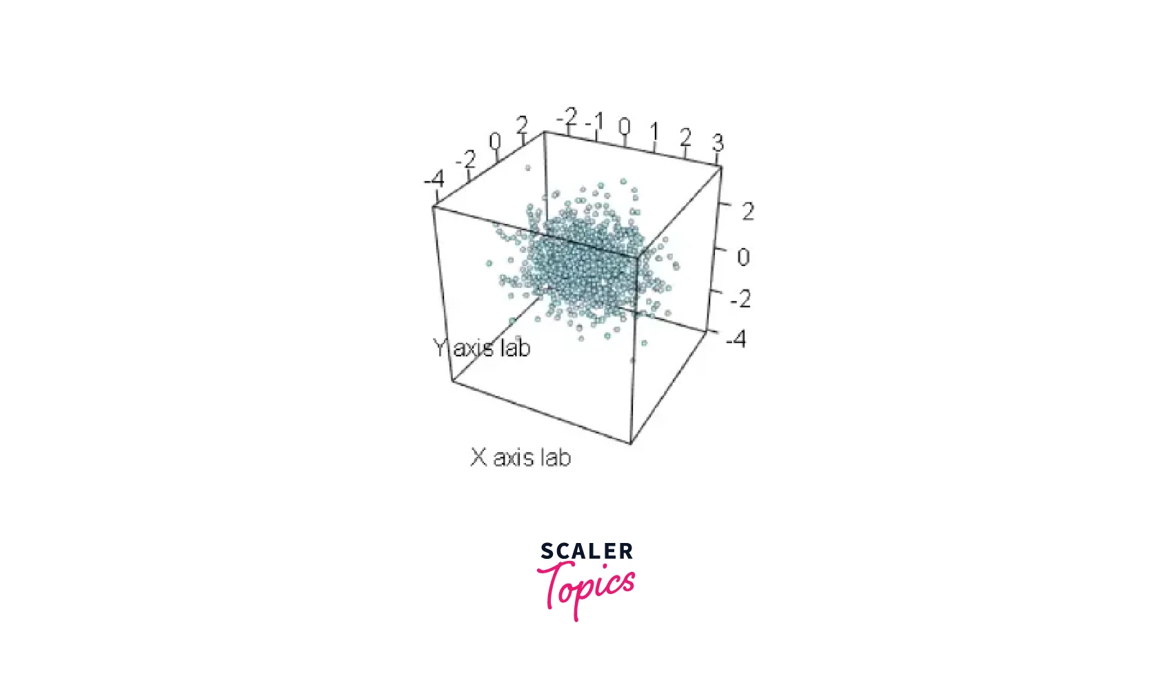
By specifying the data (x, y, and z), the type of plot (type), the radius of the observations (radius), and customizing the color (col) and axis labels (xlab, ylab, zlab), you can create an engaging and interactive 3D scatterplot that provides invaluable insights into complex data relationships.
Conclusion
- Scatterplots are a powerful tool in R for visualizing the relationships between two or more numerical variables.
- By exploring different methods and packages, such as the ggplot2 package for enhanced customization and the scatterplot3d package for 3D scatterplots, you can create compelling visualizations that aid in understanding your data better.
- Whether you are conducting exploratory data analysis or presenting results, scatterplots are an indispensable addition to your data visualization toolkit in R.
