How to Create a Search Bar in Flutter?
Overview
The search bar in Flutter is a basic UI feature given by any program or website we use to get the information we need. The basic search bar is simple to design, but the one we’re going to develop will search for components in real-time depending on an input substring. Let’s look at how to make a search bar. This article is based on one of the most general search bar components. In this article, we’ll create a search bar in Flutter from scratch by utilizing Flutter’s container widget and the numerous attributes provided by box decorating.
Creating the search bar widget
The initial step is to start a new project. Following that, we must empty the main.dart file and start a new MaterialApp. We’re utilizing Material Design for our app to make setup easier, our major focus will be on constructing the search bar rather than the app itself. Now, let’s make a new stateful widget called Search and send it to MaterialApp’s home property.
Implementing search functionality
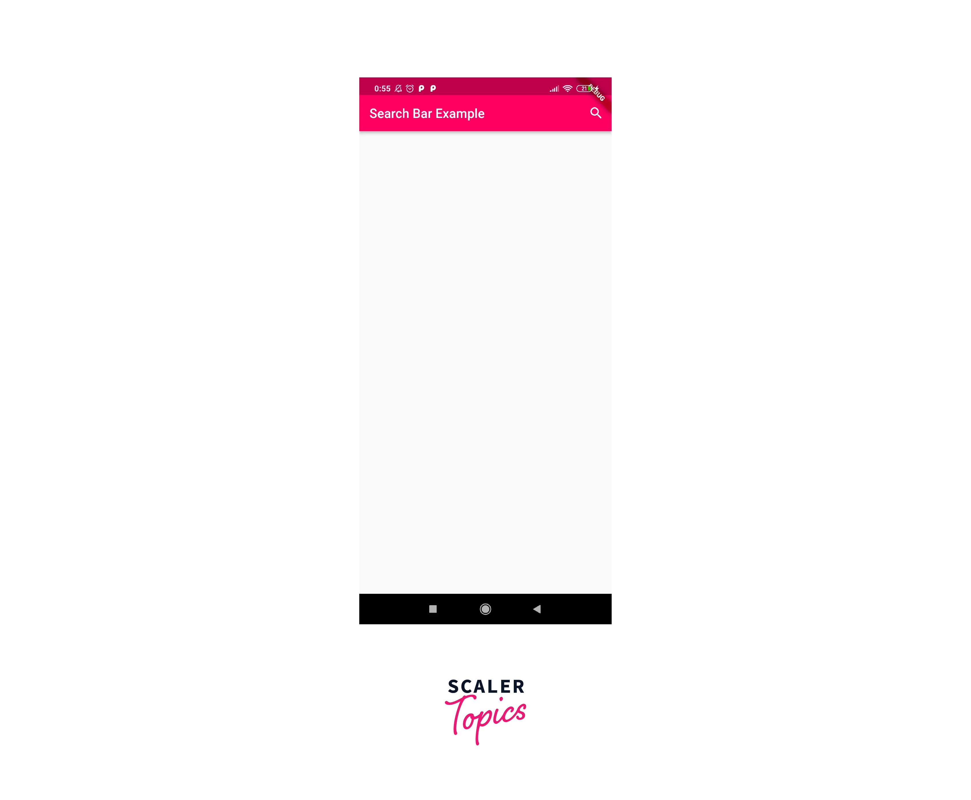
Because we are making a button that displays something (the search bar) when it is clicked, we will use the IconButton widget. This widget will generate a small animation when pressed, indicating that the user’s selection was registered by the app. We pass in the name to the icon parameter; you can see in the image below that I have chosen the magnifying glass icon to represent the search.
The image below depicts our app in its current state:

To initiate the state rebuild that will show the text field, we must create the onPressed feature. Once the text box is visible, we must also alter the existing magnifying glass search icon to a cancel icon. As the name says, the cancel button will be used to cancel the search activity. The next step is to add two variables to the HomeScreen widget: one for an icon and one for a widget. They will have the default search button as well as the AppBar headline.
Adding search suggestions
We must change the app's state to display the text field in the app bar when the search button is tapped. To change the state in this post, we will use the setState() method. In the IconButton's onPressed method, we call the setState function to update the state of the variables we previously specified (customIcon and customSearchBar). Then we execute an if-else condition to examine the current icon and make the appropriate decision.
SearchField is a class that extends SearchDelegate. The SearchDelegate requires four overrides to be applied. It also contains a list of search terms that will be displayed to the user when they first click the search box. These inquiries are essentially suggestions that show the user all of the possible possibilities. The user can choose from the offered alternatives.
Handling empty search results
One of the four overrides is now utilized to clear the search text. It is responsible for emptying the search recommendations. Because it is also an important component of the search bar. It improves user convenience since the user may clear the text all at once rather than having to empty the characters one by one. The icon will be set to icons.clear, and we'll instruct the button to transform the query to an empty string when hit.
Implementing search filters
As the user continues to type in the search field, we get at one of the most crucial queries of filtering material. We've found that practically every search bar displays the search suggestion result, and as the user continues to type, the search suggestions box becomes more accurate and nearer to the term the user is attempting to search for. We will implement this capability by comparing the text in the search bar's text field to the queries list. Then, using the ListView.Builder widget, any searches that match text will be shown on the UI.
Example Application
Here is what the complete code will look like.
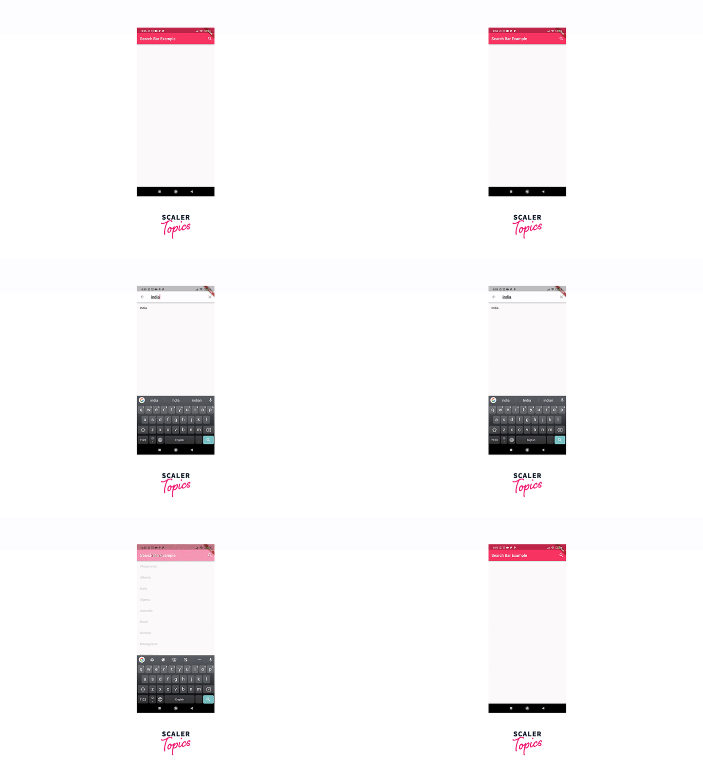
Output: Here is what the complete application will look like.

Optimizing search performance
Improve Your Search Bar
If clients aren’t utilizing your on-site search as frequently as they should, the issue might be with your search bar. If your search bar is difficult to locate or use, your clients may try to traverse the site on their own or, worse, move on to a better brand. Display your search bar prominently on both mobile and desktop sites. Make a second search button available next to the search text field. Put a search bar on each page. Put the search bar in the upper right corner, where most people expect to see it.
Add Search Ahead and Autocomplete Features
If your search bar is powered by an API or a plug-in, ensure sure autocomplete and search ahead are enabled. At this time, most internet users will expect your website to offer autocomplete choices. Autocomplete features are available on 82% of the top eCommerce websites. Autocomplete can assist searchers in accurately spelling words or finding the sites they need without ever having to visit a search page.
Utilise Product Filters
Product filters are vital for eCommerce businesses, whether your company has a few dozen or several thousand goods. Product filters enable consumers to limit what appears in search results. They may include size, brand, material, pricing, or color restrictions.
Configure an Advanced Search Option
Set up an advanced search button with specific terms, phrases, and alternatives for audiences to pick from, in addition to providing filters that customers may use when exploring your eCommerce inventory.
Permit Saved Searches
If you sell high-priced products with lengthy purchasing processes, make it simple for buyers to return to your website by allowing them to bookmark search results. Saved searches may contain pages visited, keywords used, or filters created. When clients return, their searches are still there, allowing them to contemplate converting.
Best practices
Best practices for search bar in Flutter include:
- Including a text field and a search button. Most search bars have two components: a search field where users enter their queries and a search button where users click to start a search. The pieces are often arranged horizontally on a single line.
- Site searchable websites often position the search bar in the top-right or top-center of the web page. Either location guarantees that the search feature is visible and accessible to those who require it.
- Icons are used by designers to graphically explain what a button or other website element performs. Icons take up less space and are easier to recognize than words. The magnifying glass icon is a well-known search sign.
- The size of your search bar will be determined by the prominence of the search bar on your site and the projected duration of a typical query. If a search is your key navigational tool, make it huge and prominently displayed on the page load. If it is put in the header, it should be scaled by the other header elements: large enough to be visible on a visual scan of the page, but not so huge that it steals attention.
- When the search box is not in focus, placeholder text displays in it. It is intended to elicit action from the user. A placeholder can aid users by offering sample searches such as "Try hats, jeans, bags..." or simply stating "Search...".
- Another method for assisting with search completion is Autocomplete. When the user starts typing, autocomplete displays options in a menu below the search. Predictions may be adjusted to your site's particular content, giving consumers confidence that they're getting what they're looking for.
- Don't overwhelm consumers with too many suggestions - one to ten is typically a decent range, depending on the size of your website and the amount of indexed information.
- Unless you anticipate your user base to be more technologically aware than the typical internet user, it's nearly always advisable to hide advanced search features such as categories, filters, and precise matching. This makes the UI tidy and easy to use.
- The proliferation of smartphones and tablets has influenced UI best practices across the board, including site search bars. Make sure your search box and button are visible and clickable.
Conclusion
- The search bar is a basic UI feature given by any program or website to allow a user to input a search query and submit it to a database or other information repository for processing.
- It consists of a text box where the user may input their search query and a button or icon that allows the user to submit the query.
- Some search bars contain extra functionality like autocomplete recommendations, filters, or recent searches.
- The search bar widget will search for components in real-time depending on an input substring.
- To initiate the state rebuild that will show the text field, we must create the onPressed feature and alter the existing magnifying glass search icon to a cancel icon.
- To improve search performance, consider enhancing your search bar, adding search ahead and autocomplete features, using product filters, and enabling advanced search options.
- Design your search bar with a text field and a search button, arranging them horizontally on a single line. Place the search bar in the top-right or top-center of the page, ensuring visibility and accessibility.
- Use icons to visually explain the functionality of the button or element.
- The size of the search bar depends on its prominence and the projected duration of a typical query.
- Placeholder text can elicit action when the search box is not in focus, while autocomplete displays options in a menu below the search.
- Avoid overwhelming users with too many suggestions, with one to ten suggestions typically sufficient depending on the website's size and indexed information.
- Hide advanced search features, such as categories, filters, and precise matching, to make the UI tidy and easy to use.
- The proliferation of smartphones and tablets has influenced UI best practices, so ensure your search box and button are visible and clickable.
