How to Add SliverAppBar to Flutter App
Overview
A SilverAppBar is a specific type of app bar widget in Flutter that provides a flexible and customizable app bar design for scrollable content. It is typically used in conjunction with a CustomScrollView widget to create a scrolling layout. The SilverAppBar Flutter widget allows you to customize various aspects of the app bar, such as the background color, title, leading and trailing widgets, and scrolling behavior. It also supports features like pinned app bars that remain visible even when scrolling, floating app bars that appear only when scrolling up, and snapping app bars that automatically adjust their position when scrolling.
Introduction
The SilverAppBar Flutter is a powerful and versatile widget in Flutter that serves as an app bar for scrollable content. It offers extensive customization options, allowing developers to create visually appealing and interactive app bar experiences. With features like pinned, floating, and snapping app bars, the SilverAppBar enhances the user experience by adapting to scrolling behavior. Whether it's displaying a title, leading and trailing widgets, or changing the background color, the SilverAppBar provides developers with the flexibility to design immersive and dynamic app bars that seamlessly integrate with scrollable content in Flutter applications.
Implementing a Basic SilverAppBar
To implement a basic SilverAppBar in Flutter, you can follow these steps:
-
Add the silver_app_bar package to your project's dependencies in the pubspec.yaml file.
-
Import the necessary packages in your Dart file, including
-
Within your Flutter widget tree, wrap your scrollable content (such as a ListView or CustomScrollView) with a CustomScrollView widget.
-
Inside the CustomScrollView, add a SliverAppBar widget. Customize its properties as desired, such as setting the title, background color, leading and trailing widgets, and behavior options (e.g., floating or pinned app bar).
-
Ensure that the CustomScrollView includes at least one sliver, such as a SliverList or SliverGrid, to provide the scrollable content below the app bar.
Customizing the SilverAppBar
The SilverAppBar in Flutter provides a flexible and customizable way to design the app bar for scrollable content. With its various properties and options, you can easily customize the appearance and behavior of the SilverAppBar to suit your app's needs.
Changing the Appearance of the SilverAppBar Using Properties and Style
Here are some common ways to customize the SilverAppBar's appearance:
| Property | Description |
|---|---|
| backgroundColor | Sets the background color of the SilverAppBar. |
| title | Customizes the title of the SilverAppBar. Allows modification of text style, alignment, and the addition of additional widgets. |
| leading | Adds a widget at the start of the app bar (e.g., an icon or button). |
| actions | Adds widgets at the end of the app bar (e.g., icons, buttons). |
| iconTheme | Adjusts the appearance of icons within the SilverAppBar. Allows customization of color, size, and other visual aspects of the icons. |
| elevation | Controls the elevation (raised appearance) of the SilverAppBar. Higher values result in a more raised appearance, while lower values make it appear flatter. |
| floating | Controls whether the app bar should float above the content based on scroll position. |
| pinned | Controls whether the app bar should remain pinned at the top based on scroll position. |
The following properties explain how we can style silverappbar in flutter.
Adding icons, actions, or menus to the SilverAppBar
In Flutter, you can add icons, actions, or menus to the SilverAppBar to enhance its functionality. Here are the steps to do so:
| Item | Description |
|---|---|
| Icons | To add icons to the SilverAppBar, you can use the leading and actions properties. The leading property typically contains an icon that represents navigation, such as a back button. |
| Actions | To add actions to the SilverAppBar, you can utilize the actions property. This property takes a list of widgets, and each widget can represent an action button. |
| Menus | To add menus to the SilverAppBar, you can use the actions property combined with a PopupMenuButton widget. The PopupMenuButton displays a menu when clicked and allows you to add various menu items. |
In this way we can add icons, actions, or menus to the SilverAppBar in Flutter.
Styling the SilverAppBar to Match the App's Theme or Brand
In Flutter, you can style the SilverAppBar to match your app's theme or brand by customizing its appearance. Here are a few ways to achieve this:
| Item | Description |
|---|---|
| Background color | You can set the background color of the SilverAppBar using the backgroundColor property. |
| Text and icon color | Customize the color of the title text and icons in the SilverAppBar using the textTheme and iconTheme properties, respectively. |
| Typography | Adjust the font style and size of the SilverAppBar's title using the textTheme property. By defining a custom TextStyle with the desired font family, weight, size, and color, you can create a cohesive look that reflects your app's branding. |
| Logo or app icon | Add your app's logo or icon to the SilverAppBar by including an Image widget in the leading property. |
| Transitions and animations | Apply animations or transitions to the SilverAppBar to enhance the visual appeal and user experience. You can use Flutter's animation APIs, such as AnimatedContainer or AnimatedOpacity, to create smooth transitions between different states of the app bar. |
Customizing the Floating Behavior
In Flutter, you can customize the floating behavior of a SilverAppBar Flutter to control how it interacts with the scrollable content in your app. Here are a few ways to achieve this:
| Item | Description |
|---|---|
| Floating behavior | By default, the SilverAppBar remains pinned at the top of the screen as the user scrolls. However, you can change this behavior by setting the floating property to true. When floating is enabled, the SilverAppBar will float on top of the scrollable content and become partially hidden when scrolling down. |
| Snap behavior | Along with the floating property, you can also enable the snap property to create a snap effect for the SilverAppBar. When snap is set to true, the SilverAppBar will snap into its fully visible or fully hidden position based on the user's scroll direction. |
| Elevation | You can adjust the elevation of the SilverAppBar using the elevation property. Higher elevation values create a sense of depth and make the SilverAppBar appear more prominent. |
| Scroll effects | Flutter provides various scroll effects that can be applied to the SilverAppBar, such as parallax effects or fading effects. These effects can be achieved using plugins or custom implementations and allow you to add visual enhancements to the scrolling behavior of the SilverAppBar. |
In this way, the floating behavior of silverappbar in Flutter can be implemented.
Adding AppBar inside SliverAppBar
To add an AppBar inside a SliverAppBar in Flutter, you can use the bottom property of the SliverAppBar. The bottom property accepts a PreferredSizeWidget, which allows you to add a custom widget, such as an AppBar, below the flexible space of the SliverAppBar. Here's how you can accomplish this:
-
Create a SliverAppBar widget and set its properties, such as expandedHeight, flexibleSpace, and pinned, according to your needs. The flexibleSpace property is where you'll add your custom AppBar.
-
Inside the flexibleSpace property of the SliverAppBar, you can use a FlexibleSpaceBar widget to create a flexible space. This flexible space can contain your custom AppBar.
-
Within the FlexibleSpaceBar, you can add a Column or any other layout widget to structure your content. Inside this layout widget, you can add your AppBar widget using the bottom property.
Here's an example of how you can implement this:
In this example, the SliverAppBar has a flexible space with a title and a background image. The custom AppBar is added using the bottom property of the SliverAppBar and contains a blue background color, no elevation, and leading and action icons.
By nesting an AppBar inside a SliverAppBar, you can achieve a visually appealing layout with scrolling behavior while retaining the functionality and styling of an AppBar.
Adding TabBar with SliverAppBar
To add a TabBar with a SliverAppBar in Flutter, you can combine the SliverAppBar with a CustomScrollView and TabBarView. Here's how you can implement it:
-
Wrap your entire screen content inside a NestedScrollView widget. This allows you to have a scrollable area with a SliverAppBar and TabBarView.
-
Create a TabController to manage the tabs. You can either create it as a stateful widget or use the DefaultTabController widget, which automatically manages the TabController for you. Set the length property of the TabController to the number of tabs you have.
-
Inside the NestedScrollView, add a SliverAppBar as the headerSliverBuilder. Customize the properties of the SliverAppBar according to your needs, such as expandedHeight, flexibleSpace, and pinned.
-
Within the SliverAppBar, set the bottom property to a TabBar widget. Pass the TabController as the controller property of the TabBar. Customize the appearance and behavior of the TabBar as desired, such as setting the tabs' text, color, and indicator color.
-
Below the headerSliverBuilder, add a SliverFillRemaining widget as the body of the NestedScrollView. Inside the SliverFillRemaining, wrap your content with a TabBarView widget. Pass the TabController as the controller property of the TabBarView. Each TabBarView child represents the content of a specific tab.
Here's an example of how you can implement a TabBar with a SliverAppBar:
In this example, we have two tabs represented by the TabBarView children. Each tab's content is wrapped inside a Center widget for simplicity, but you can customize it according to your requirements.
By combining the SliverAppBar, TabBar, and TabBarView within a NestedScrollView, you can create a scrollable screen with a flexible header and tabbed content.
Listening to SliverAppBar’s Status
To listen to the status changes of a SliverAppBar in Flutter, you can use the ScrollController and its addListener method. Here's how you can do it:
-
Create an instance of ScrollController and assign it to the controller property of the CustomScrollView widget that contains your SliverAppBar.
-
In the initState method of your widget, add a listener to the ScrollController using the addListener method. Pass a callback function that will be triggered whenever the scroll position changes.
-
In the callback function, you can access the ScrollController and check its properties to determine the current status of the SliverAppBar. For example, you can check the offset property to see if the SliverAppBar is expanded or collapsed.
Here's an example of how you can listen to the status changes of a SliverAppBar:
In this example, we create a _scrollController instance and add a listener to it in the initState method. The _handleScroll function is called whenever the scroll position changes, and it updates the _isAppBarExpanded variable based on the offset of the ScrollController. You can use this variable to track the expanded/collapsed status of the SliverAppBar and perform any desired actions or UI changes accordingly.
By listening to the status of the SliverAppBar through the ScrollController, you can dynamically update your UI or trigger specific behaviors based on the scroll position or the expanded/collapsed state of the SliverAppBar.
Handling Scrolling and Collapsing
To handle scrolling and collapsing of a SliverAppBar in Flutter, you can use a combination of the NestedScrollView and FlexibleSpaceBar widgets. Here's how you can achieve this:
-
Wrap your CustomScrollView with a NestedScrollView widget. The NestedScrollView allows you to create a scrollable area with multiple scrollable widgets.
-
Set the headerSliverBuilder property of the NestedScrollView to return a list of SliverAppBar widgets. Customize the SliverAppBar as desired, including its properties like expandedHeight, floating, pinned, etc.
-
Within the NestedScrollView, define a SliverToBoxAdapter with a Column as its child. This column will contain the content that will scroll beneath the SliverAppBar.
-
Inside the Column, add a FlexibleSpaceBar as one of its children. Customize the FlexibleSpaceBar with properties like background, centerTitle, etc., and include any desired content, such as titles, images, or icons.
-
Add other sliver widgets to the CustomScrollView as needed, such as SliverList, SliverGrid, or SliverFillRemaining, to display scrollable content below the SliverAppBar.
Here's an example implementation of handling scrolling and collapsing of a SliverAppBar in Flutter:
In this example, the SliverAppBar is set with an expandedHeight of 200 and pinned set to true, ensuring that it remains visible even when scrolling. The FlexibleSpaceBar contains an image as the background.
The NestedScrollView provides a scrollable area, and the CustomScrollView with its SliverToBoxAdapter and other sliver widgets allows for additional scrollable content beneath the SliverAppBar.
By using this approach, you can create a collapsible SliverAppBar that reacts to the scrolling behavior and provides an immersive user experience with a flexible and interactive header.
Handling Interactions and Navigation
To handle interactions and navigation with a SliverAppBar in Flutter, you can utilize various built-in widgets and callbacks. Here are some techniques to consider:
-
Adding Buttons and Actions:
- Inside the SliverAppBar, you can include buttons or actions using the actions property. For example, you can add an icon button for a specific action, such as opening a menu or performing a search.
- Define the onPressed callback for each button to specify the action to be taken when the button is pressed.
-
Implementing Gesture Detection:
- Wrap the SliverAppBar with a GestureDetector widget to detect gestures such as taps or swipes.
- Utilize gesture callbacks like onTap, onDoubleTap, onLongPress, etc., to trigger specific actions based on the user's interactions.
- For example, you can navigate to a different screen when the user taps on the SliverAppBar or perform custom operations based on the gestures.
-
Handling Navigation:
- To handle navigation when interacting with the SliverAppBar, you can use the Navigator widget or other navigation techniques available in Flutter.
- Define the navigation logic in the onPressed callback of buttons or gesture callbacks to navigate to a specific route or screen within your app.
-
Reacting to Scroll Events:
- You can listen to scroll events within a CustomScrollView using the ScrollController or the ScrollNotification callback.
- Based on the scroll position or other scroll-related information, you can update the appearance or behavior of the SliverAppBar or trigger other actions.
- For example, you can change the background color of the SliverAppBar as the user scrolls, or show or hide additional UI elements based on the scroll position.
By combining these techniques, you can create interactive and navigable SliverAppBar experiences in your Flutter app. Customizing the actions, gestures, and navigation logic allows you to enhance user interactions and provide a seamless and engaging user interface.
Example app
Certainly! Here's an example Flutter application that demonstrates how to add a SliverAppBar in a CustomScrollView:
Output:
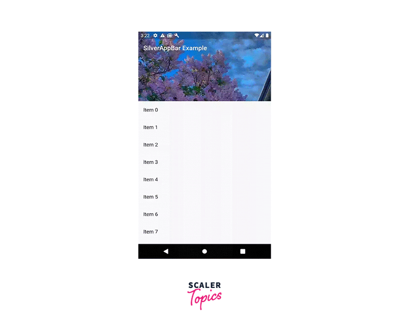
In this example, we create a CustomScrollView with two Sliver widgets:
- The first SliverAppBar displays a title and an expanded background image using FlexibleSpaceBar.
- The second SliverList contains a list of ListTile widgets.
Conclusion
-
The SilverAppBar widget in Flutter provides a flexible and customizable app bar design for scrollable content. It offers features like pinned, floating, and snapping app bars, enhancing the user experience by adapting to scrolling behavior.
-
Implementing a basic SilverAppBar involves adding the silver_app_bar package to dependencies, wrapping scrollable content with a CustomScrollView widget, and customizing the SliverAppBar properties.
-
The SilverAppBar can be customized by adjusting properties like background color, title, leading and trailing widgets, icon theme, and elevation. These customization options allow developers to create visually appealing and interactive app bars that align with their app's design aesthetic.
-
Adding icons, actions, and menus to the SilverAppBar enhances its functionality. Developers can utilize the leading and actions properties to add icons and actions, or combine the actions property with a PopupMenuButton widget to include menus.
-
Styling the SilverAppBar to match the app's theme or brand can be achieved by customizing properties like background color, text and icon color, typography, and incorporating the app's logo or icon. Applying transitions and animations further enhances the visual appeal of the SilverAppBar.